In today’s competitive business environment, organizations cannot afford to work without clear visibility into team performance. Whether you manage a small department or a large multi-location workforce, tracking tasks, completion rates, and time efficiency is crucial for success. This is where a Team Performance Dashboard in Excel comes into play.
This comprehensive guide will explain everything you need to know about creating, using, and optimizing a Team Performance Dashboard in Excel. We will cover its key features, benefits, best practices, and how it can help your organization boost productivity.
Click to Purchases Team Performance Dashboard in Excel
What is a Team Performance Dashboard in Excel?
A Team Performance Dashboard is a visual and interactive tool built in Excel that consolidates all team-related performance metrics in one place. It allows managers and decision-makers to:
-
Monitor progress against targets.
-
Track task completion rates.
-
Compare actual performance with planned targets.
-
Identify workload distribution.
-
Evaluate individual and team contributions.
Unlike manual reporting methods, an Excel dashboard automatically updates when you add new data, making it real-time and actionable.
Why Use Excel for a Team Performance Dashboard?
While many companies use specialized project management software, Excel remains one of the most popular platforms for creating dashboards due to its flexibility, cost-effectiveness, and familiarity.
Here are some reasons why Excel is a great choice:
-
No extra cost – No need to invest in expensive BI tools.
-
Customizable – You can design dashboards to suit your unique KPIs.
-
Easy to share – Excel files can be emailed or stored in shared drives.
-
Supports advanced features – PivotTables, slicers, conditional formatting, and charts.
Key Features of the Team Performance Dashboard in Excel
This ready-to-use dashboard comes with five analytical pages and multiple interactive elements for quick navigation and analysis.
Page Navigator
-
Located on the left side of the dashboard.
-
Allows instant access to different analytical pages.
-
Improves user experience and saves time.
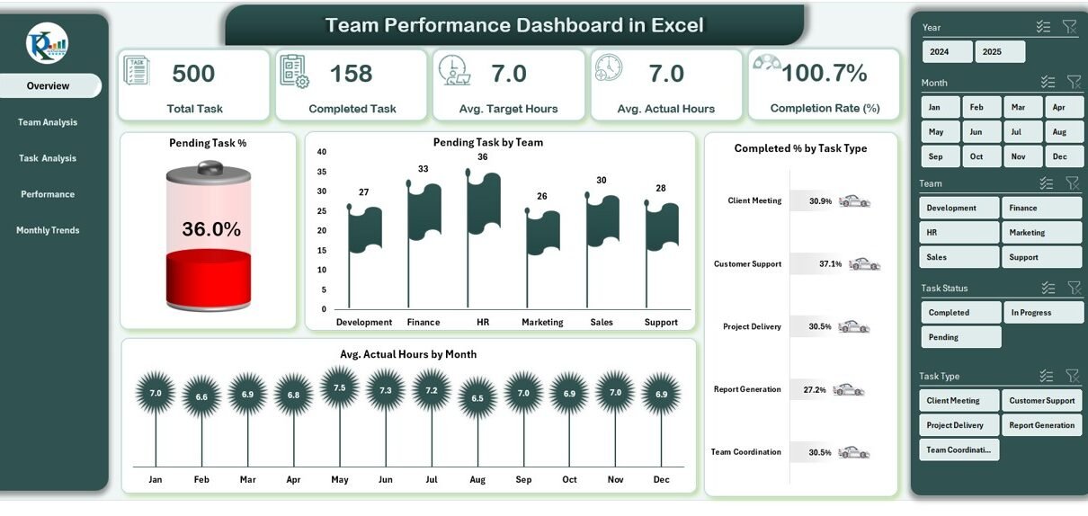
Overview Page
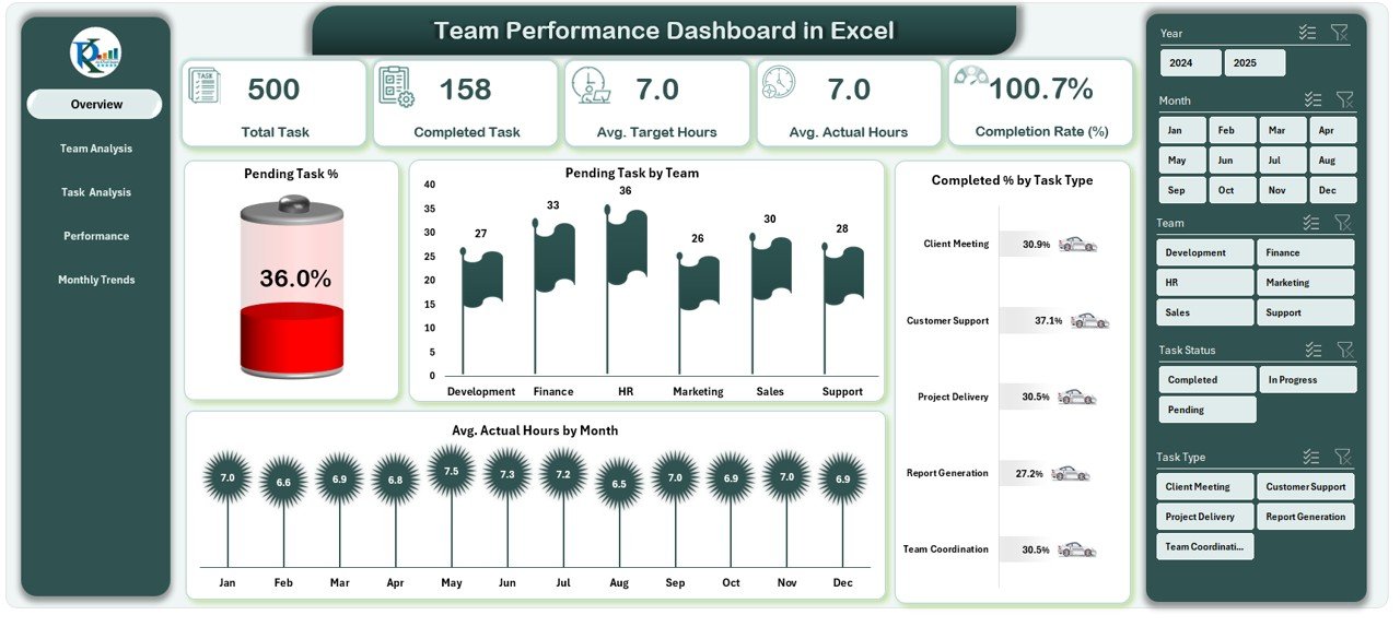
-
Displays 5 performance cards summarizing key metrics.
Click to Purchases Team Performance Dashboard in Excel
Includes 4 charts:
- Pending Task %
- Pending Task by Team
- Completed % by Task Type
- Avg. Actual Hours by Month
-
Designed for a quick at-a-glance view of overall team performance.
Team Analysis Page
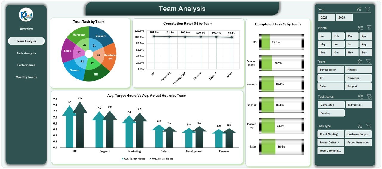
-
Focuses on team-based metrics.
Charts include:
- Total Task by Team
- Completion Rate (%) by Team
- Completed Task % by Team
- Avg. Target Hours Vs Avg. Actual by Team
-
Helps identify high-performing teams and teams needing support.
Task Analysis Page
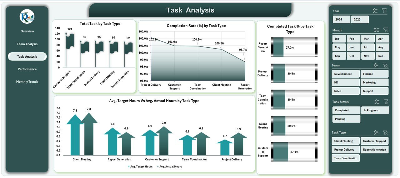
-
Provides insights into different task categories.
Charts include:
- Total Task by Task Type
- Completion Rate (%) by Task Type
- Completed Task % by Task Type
- Avg. Target Hours Vs Avg. Actual by Task Type
-
Ideal for analyzing workload distribution by task type.
Performance Analysis Page
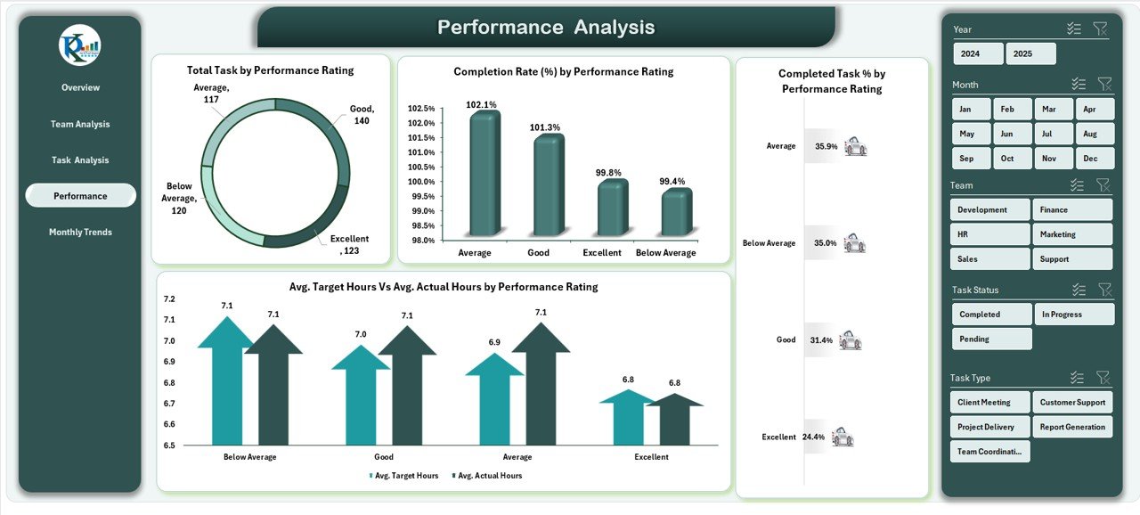
-
Measures productivity based on performance ratings.
Charts include:
- Total Task by Performance Rating
- Completion Rate (%) by Performance Rating
- Completed Task % by Performance Rating
- Avg. Target Hours Vs Avg. Actual by Performance Rating
-
Useful for HR and performance reviews.
Monthly Trends Page
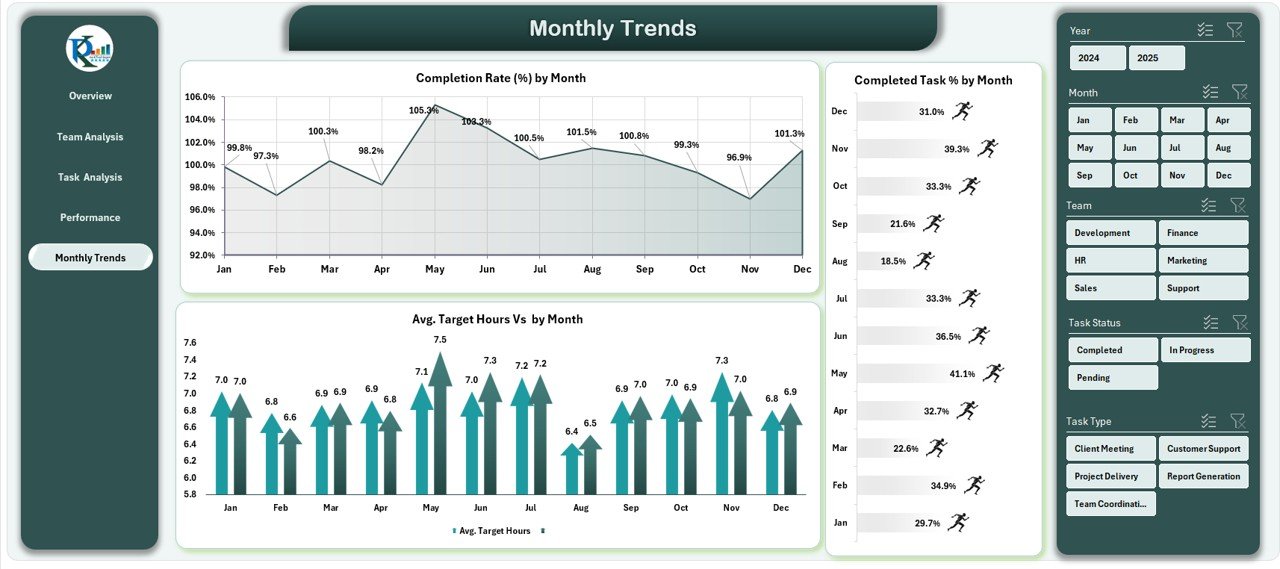
-
Tracks performance over time.
Charts include:
- Completion Rate (%) by Month
- Completed Task % by Month
- Avg. Target Hours Vs Avg. Actual by Month
-
Ideal for identifying seasonal patterns or performance dips.
Data Sheet
-
Stores raw performance data.
-
Feeds all dashboard charts and summaries.
Support Sheet
-
Contains reference values, dropdown lists, and supporting data for dynamic charts.
Advantages of a Team Performance Dashboard in Excel
Using this dashboard offers multiple benefits for managers, HR teams, and executives:
-
Real-time tracking – Instantly see updated performance metrics.
-
Better decision-making – Data-driven insights help in resource allocation.
-
Improved accountability – Team members know their performance is tracked.
-
Time savings – No need for manual reporting.
-
Customizability – Add or modify KPIs as per business needs.
-
Enhanced transparency – Everyone can see how the team is performing.
How to Use the Team Performance Dashboard in Excel
-
Enter Data in the Data Sheet – Include task names, team members, start date, completion date, target hours, and actual hours.
-
Refresh PivotTables – Ensure all charts display the latest numbers.
-
Use Slicers to Filter – View data by month, team, task type, or performance rating.
-
Analyze Trends – Look for recurring performance gaps or strengths.
-
Share Insights – Export charts or share the Excel file with stakeholders.
Best Practices for the Team Performance Dashboard in Excel
To get maximum value from your dashboard, follow these best practices:
-
Keep KPIs relevant – Only track metrics that align with your organizational goals.
-
Update data regularly – Ensure the dashboard reflects the latest information.
-
Use clear visuals – Avoid clutter; keep charts simple and readable.
-
Set benchmarks – Compare against industry standards or historical data.
-
Automate where possible – Use formulas and PivotTables to minimize manual work.
-
Review periodically – Adjust KPIs and dashboard design based on changing needs.
Opportunities for Improvement in Team Performance Dashboards
Even a well-designed dashboard can improve further. Here are some ideas:
-
Integrate with project management tools – Auto-import data from tools like Trello, Asana, or Jira.
-
Add performance forecasting – Use trend analysis to predict future output.
-
Include employee feedback – Combine productivity metrics with satisfaction surveys.
-
Enable mobile access – Optimize for viewing on tablets and smartphones.
Conclusion
A Team Performance Dashboard in Excel is an invaluable tool for organizations aiming to improve productivity, efficiency, and accountability. It brings all critical performance data into one interactive, easy-to-use platform, helping managers make informed decisions quickly.
By implementing best practices and keeping the dashboard updated, businesses can ensure that their teams work at their full potential while maintaining transparency and fairness.
Frequently Asked Questions (FAQs)
1. Can I customize the Team Performance Dashboard in Excel?
Yes. You can add or remove KPIs, change chart types, and modify slicers based on your organization’s needs.
2. Do I need advanced Excel skills to use the dashboard?
No. Basic Excel knowledge is enough for using it. However, creating or modifying complex formulas may require intermediate skills.
3. How often should I update the dashboard?
It depends on your workflow. For most teams, updating weekly or monthly works best, but some fast-paced environments may require daily updates.
4. Can this dashboard track individual employee performance?
Yes. You can filter by individual names in the slicers to see personal performance metrics.
5. Is Excel the best tool for a Team Performance Dashboard?
Excel is excellent for flexibility and low cost. However, for real-time multi-user access, integrating with online BI tools can be beneficial.
Visit our YouTube channel to learn step-by-step video tutorials