Running a theme park is not only about thrilling rides and happy visitors. Instead, it also involves managing operations, tracking performance, controlling costs, and improving guest satisfaction every single day. However, when teams rely on scattered Excel files or delayed reports, decision-making becomes slow and risky.
That is exactly why a Theme Parks KPI Dashboard in Power BI plays a critical role in modern theme park management.
In this detailed guide, you will learn what a Theme Parks KPI Dashboard in Power BI is, why it matters, how it works, its key features, advantages, best practices, and frequently asked questions. Moreover, this article also explains how you can use Excel as a data source to create a powerful, scalable, and easy-to-use KPI dashboard for theme park operations.
What Is a Theme Parks KPI Dashboard in Power BI?
A Theme Parks KPI Dashboard in Power BI is an interactive business intelligence solution designed to monitor, analyze, and track key performance indicators (KPIs) related to theme park operations.
Instead of reviewing multiple spreadsheets, managers can use one centralized dashboard to:
- Track monthly and yearly performance
- Compare actual values with targets
- Analyze trends over time
- Identify underperforming KPIs instantly
- Make data-driven decisions faster
Moreover, Power BI transforms raw Excel data into meaningful visual insights that are easy to understand and act upon.
Why Do Theme Parks Need a KPI Dashboard?
Theme parks operate in a highly dynamic environment. Visitor numbers fluctuate, operational costs change, and customer expectations rise continuously. Therefore, without real-time KPI tracking, management teams struggle to maintain control.
A Theme Parks KPI Dashboard in Power BI helps because it:
- Centralizes all KPIs in one view
- Tracks MTD and YTD performance
- Compares current year results with previous year data
- Highlights target achievements and misses visually
- Improves accountability across departments
As a result, theme park leaders gain clarity and confidence in their decisions.
How Does a Theme Parks KPI Dashboard in Power BI Work?
The dashboard works by connecting Power BI to an Excel data source. After that, Power BI processes the data, applies calculations, and displays insights using visuals, tables, and icons.
Excel as a Data Source
The dashboard uses a simple Excel file with three structured worksheets:
- Input_Actual
- Input_Target
- KPI Definition
Because of this structure, even non-technical users can update the data easily without touching Power BI formulas.
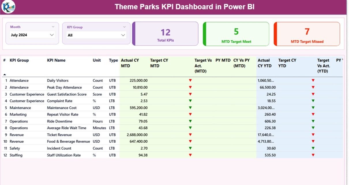
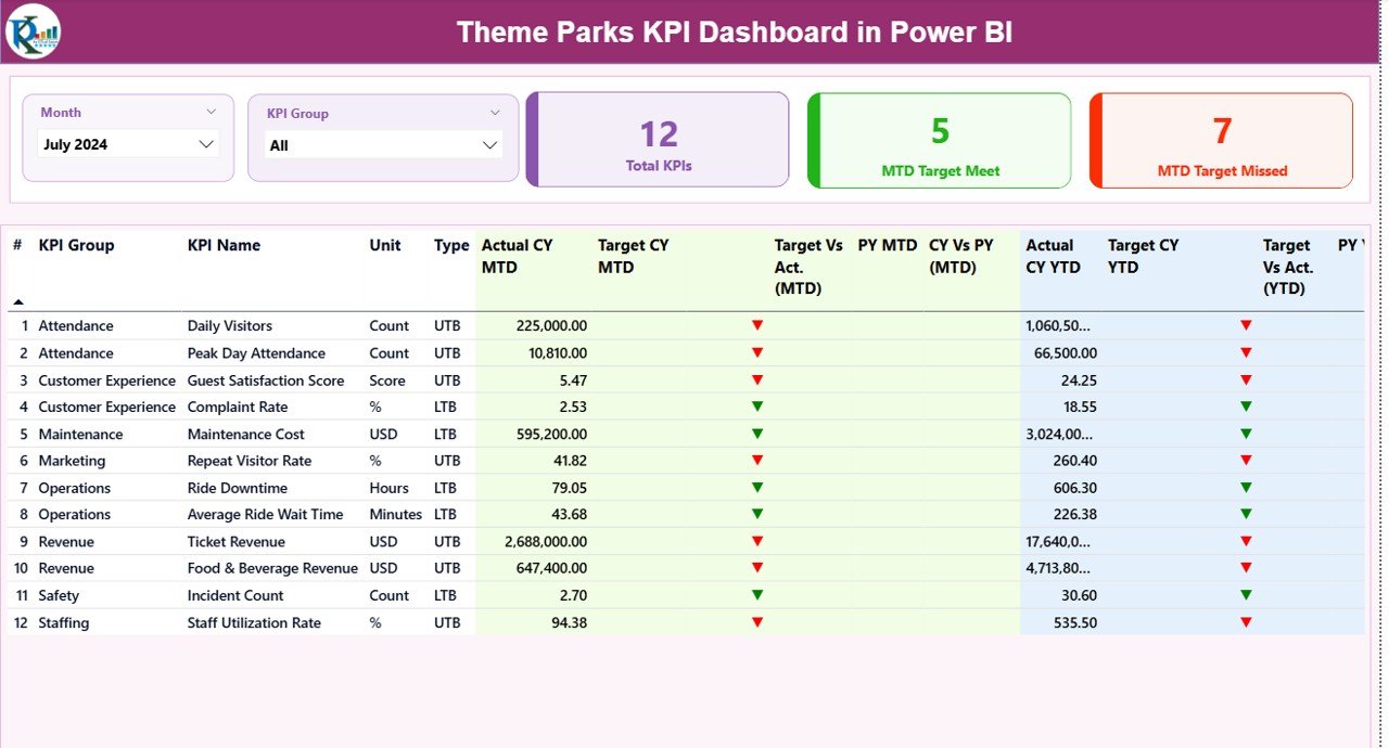
Key Pages of the Theme Parks KPI Dashboard in Power BI
This ready-to-use dashboard contains three powerful pages, each designed for a specific analytical purpose.
Summary Page: How Does It Provide a Complete KPI Overview?
The Summary Page acts as the main control center of the dashboard. It provides a high-level overview of all KPIs while allowing users to drill down into details when needed.
What Filters Are Available on the Summary Page?
At the top of the page, users can apply:
- Month slicer
- KPI Group slicer
These slicers instantly update all visuals and metrics on the page.
What KPI Cards Are Displayed on the Summary Page?
The dashboard displays three KPI cards:
- Total KPIs Count
- MTD Target Meet Count
- MTD Target Missed Count
These cards help managers quickly assess overall performance.
What Does the Detailed KPI Table Show?
Below the cards, the dashboard displays a comprehensive KPI table with the following columns:
- KPI Number – Unique sequence number for each KPI
- KPI Group – Category or department of the KPI
- KPI Name – Name of the KPI
- Unit – Measurement unit
- Type – UTB (Upper the Better) or LTB (Lower the Better)
How Does the Dashboard Track MTD Performance?
For Month-to-Date (MTD) tracking, the dashboard shows:
- Actual CY MTD
- Target CY MTD
- MTD Icon (▲ green or ▼ red)
- Target vs Actual (MTD %)
- Previous Year MTD
- CY vs PY (MTD %)
Because of these indicators, users can instantly identify which KPIs perform well and which ones need attention.
How Does the Dashboard Track YTD Performance?
For Year-to-Date (YTD) tracking, the dashboard includes:
- Actual CY YTD
- Target CY YTD
- YTD Icon (▲ green or ▼ red)
- Target vs Actual (YTD %)
- Previous Year YTD
- CY vs PY (YTD %)
As a result, managers can analyze long-term trends and seasonal impacts effectively.
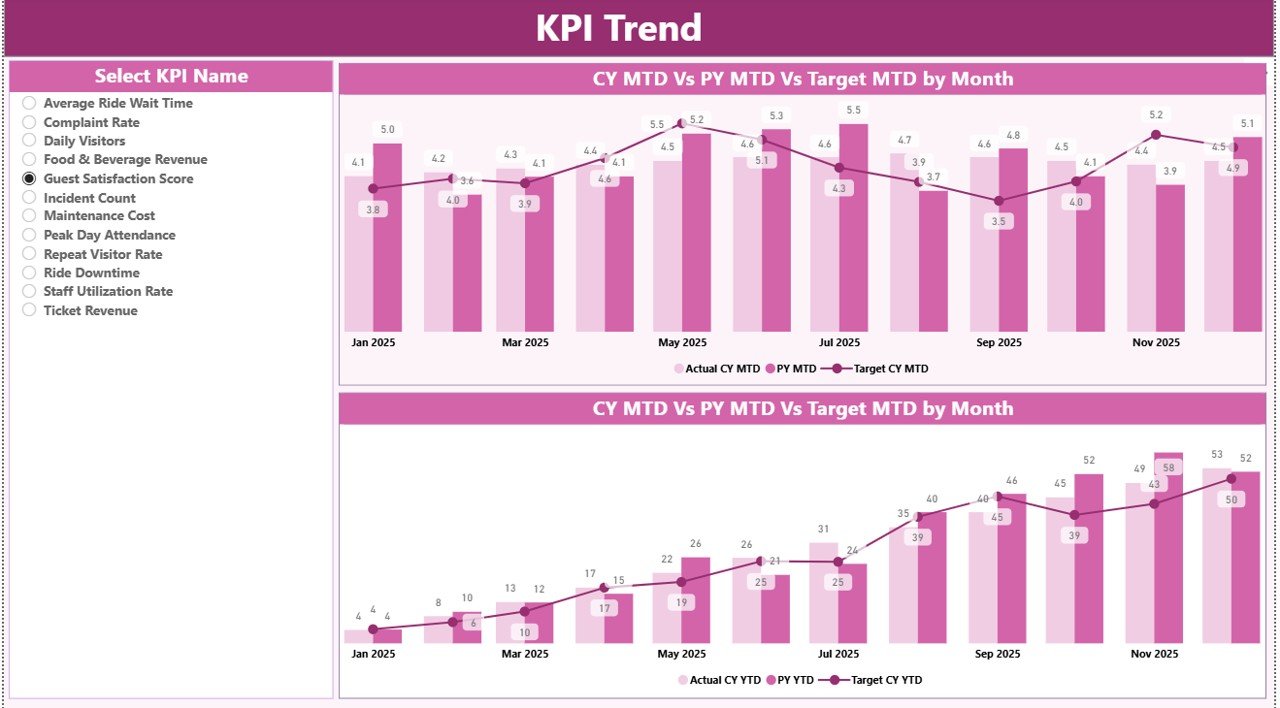
KPI Trend Page: How Can You Analyze KPI Trends Over Time?
The KPI Trend Page focuses on performance trends rather than summary metrics.
What Visuals Are Used on the KPI Trend Page?
This page includes two combo charts:
- MTD Trend Chart
- YTD Trend Chart
Each chart displays:
- Current Year Actual values
- Previous Year Actual values
- Target values
How Can Users Interact With the KPI Trend Page?
On the left side, users can select a KPI Name slicer. Once selected, the charts update automatically.
Therefore, this page helps users understand patterns, seasonality, and performance consistency.
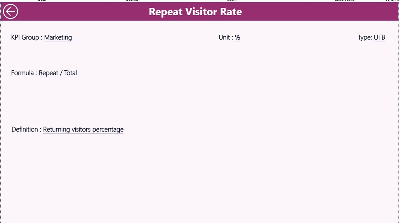
KPI Definition Page: Why Is It Important?
The KPI Definition Page acts as a reference guide for all KPIs.
What Information Does the KPI Definition Page Show?
This page displays:
- KPI Number
- KPI Group
- KPI Name
- Unit
- Formula
- KPI Definition
- KPI Type (UTB or LTB)
Why Is the KPI Definition Page Hidden?
The page remains hidden to keep the dashboard clean. However, users can drill through from the Summary Page to access KPI details when needed.
A Back button allows easy navigation to the main page.
How Is Data Managed in the Excel File?
The Excel file acts as the backbone of the dashboard.
Input_Actual Sheet: What Data Should You Enter?
In this sheet, users enter:
- KPI Name
- Month (first date of the month)
- MTD Actual values
- YTD Actual values
Because of this structure, updating actual performance data becomes fast and simple.
Input_Target Sheet: How Do You Define Targets?
In this sheet, users enter:
- KPI Name
- Month
- MTD Target values
- YTD Target values
As a result, the dashboard automatically compares actual performance against targets.
KPI Definition Sheet: Why Is It Critical?
This sheet defines the KPIs clearly. Users fill in:
- KPI Number
- KPI Group
- KPI Name
- Unit
- Formula
- Definition
- Type (UTB or LTB)
Therefore, all stakeholders follow the same KPI definitions, which eliminates confusion.
Advantages of Theme Parks KPI Dashboard in Power BI
Using a Theme Parks KPI Dashboard in Power BI offers several powerful benefits.
Centralized KPI Monitoring
Instead of checking multiple reports, teams can view all KPIs in one dashboard.
Faster Decision-Making
Because data updates instantly, managers can act quickly.
Clear Visual Indicators
Icons and color coding highlight performance gaps immediately.
Improved Accountability
Teams can track responsibility and ownership for each KPI.
Easy Data Management Using Excel
Non-technical users can update data without learning Power BI.
Scalable and Customizable
You can add more KPIs, months, or categories anytime.
Best Practices for the Theme Parks KPI Dashboard in Power BI
To get the most value from your dashboard, follow these best practices.
Define Clear KPIs
Always define KPIs clearly with formulas and business meaning.
Use UTB and LTB Correctly
Mark KPIs correctly as Upper the Better or Lower the Better.
Keep Excel Data Clean
Avoid blank rows, duplicates, and incorrect dates.
Update Data Regularly
Update actual and target data monthly for accurate insights.
Limit KPIs on the Summary Page
Focus only on critical KPIs to avoid clutter.
Train Users on Drill-Through Features
Show users how to access KPI definitions easily.
How Does This Dashboard Improve Theme Park Operations?
This dashboard helps theme parks:
- Improve operational efficiency
- Monitor performance against targets
- Compare current and previous year trends
- Identify underperforming KPIs early
- Support data-driven leadership decisions
As a result, theme parks can improve profitability and guest satisfaction simultaneously.
Conclusion: Why Should Theme Parks Use a KPI Dashboard in Power BI?
A Theme Parks KPI Dashboard in Power BI transforms raw Excel data into meaningful insights. It helps management teams track performance, compare trends, and take timely action. Moreover, the dashboard improves transparency, accountability, and strategic planning across the organization.
In today’s competitive entertainment industry, relying on intuition alone no longer works. Therefore, implementing a KPI dashboard becomes a smart and necessary decision for long-term success.
Frequently Asked Questions About Theme Parks KPI Dashboard in Power BI
What KPIs should a theme park track?
Theme parks should track attendance, revenue, operational efficiency, safety metrics, and guest satisfaction KPIs.
Can beginners use this Power BI dashboard?
Yes, because the dashboard uses Excel as a data source, beginners can manage it easily.
How often should the data be updated?
You should update the data monthly for accurate MTD and YTD tracking.
Can I customize the KPIs?
Yes, you can add, remove, or modify KPIs based on your business needs.
Does the dashboard support year-over-year analysis?
Yes, it compares current year performance with previous year data for both MTD and YTD.
Why is Power BI better than static Excel reports?
Power BI offers interactive visuals, slicers, and drill-through features that static reports cannot provide.
Visit our YouTube channel to learn step-by-step video tutorials