Think tanks play a vital role in shaping public policy, economic reforms, social programs, and strategic research. However, as research output grows and funding sources diversify, managing performance becomes more complex every year. Therefore, think tanks must track goals, research impact, funding efficiency, and operational performance with accuracy and speed. That is exactly where a Think Tanks KPI Dashboard in Power BI becomes essential.
This detailed guide explains what a Think Tanks KPI Dashboard in Power BI is, why it matters, how it works, and how organizations can use it effectively. Moreover, this article explores advantages, best practices, use cases, and frequently asked questions so you can confidently implement this dashboard in your organization.
Click to buy Think Tanks KPI Dashboard in Power BI
What Is a Think Tanks KPI Dashboard in Power BI?
A Think Tanks KPI Dashboard in Power BI is an interactive and visual performance management tool designed to track key performance indicators related to research, funding, policy influence, operations, and strategic goals.
Instead of managing multiple Excel files, reports, and manual updates, this dashboard consolidates all KPI data into a single Power BI solution. As a result, leadership teams, researchers, analysts, and administrators gain instant visibility into performance trends.
Moreover, the dashboard uses Excel as a data source, which makes it easy to update and maintain without complex systems. Since Power BI handles visualization and calculations, teams can focus more on insights and less on manual reporting.
Why Do Think Tanks Need a KPI Dashboard?
Think tanks operate in a knowledge-driven environment. However, knowledge alone does not guarantee success. Organizations must measure outcomes, efficiency, and impact consistently. Therefore, a KPI dashboard becomes a strategic necessity.
Here are the key reasons why think tanks need a KPI dashboard:
- Research output grows rapidly across themes and regions.
- Funding sources demand transparency and accountability.
- Policy impact requires measurable indicators.
- Leadership teams need real-time performance insights.
- Manual reports delay decision-making.
Consequently, a Think Tanks KPI Dashboard in Power BI helps organizations stay focused, data-driven, and accountable.
How Does the Think Tanks KPI Dashboard in Power BI Work?
The dashboard works through a structured and logical flow. First, users enter data into an Excel file. Then, Power BI connects to that file and transforms the data into interactive visuals.
Because the dashboard uses standardized KPI definitions, users can track performance consistently across months and years. Furthermore, slicers allow users to filter data by Month and KPI Group, which makes analysis faster and more focused.
What Are the Key Features of the Think Tanks KPI Dashboard in Power BI?
The dashboard includes three well-structured pages, each designed for a specific purpose. Let us explore them one by one.
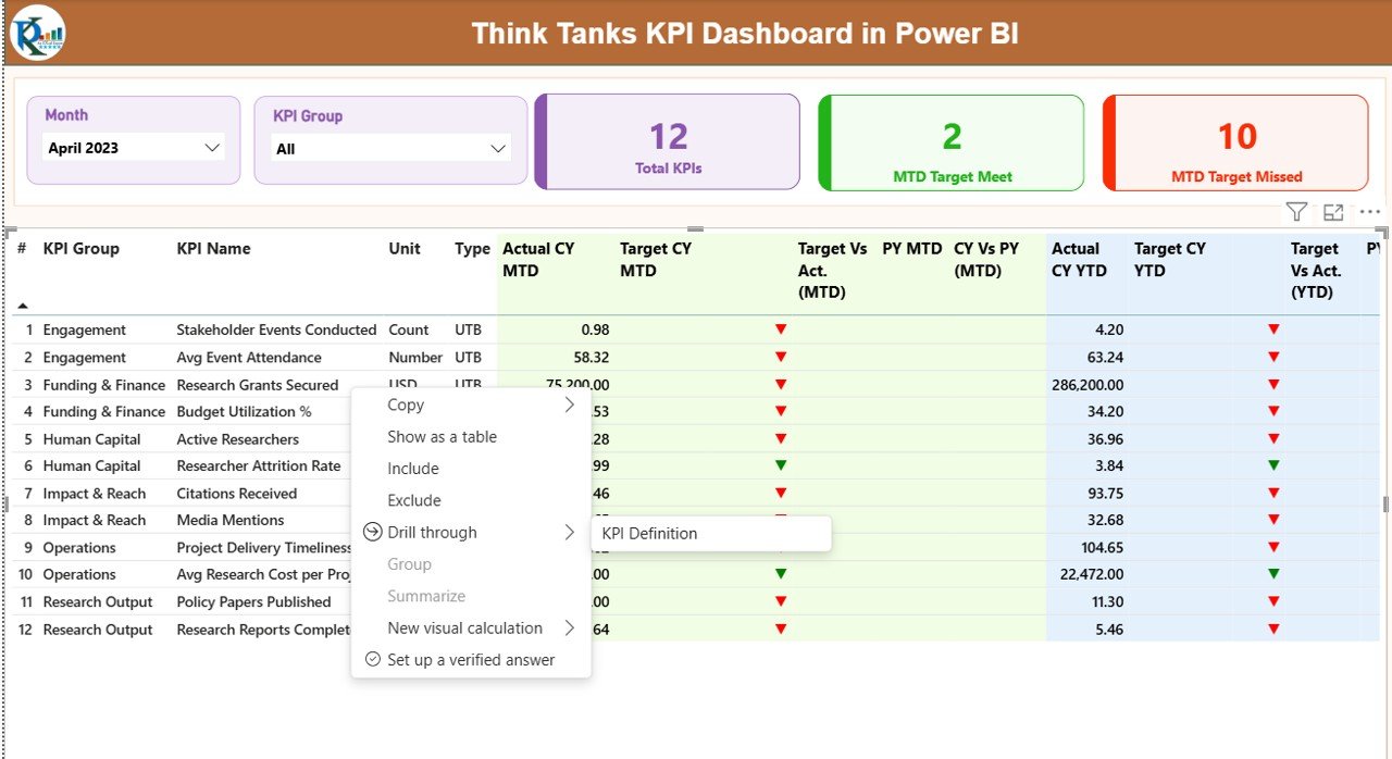
Summary Page Show
The Summary Page acts as the central performance hub. As soon as users open the dashboard, they see high-level performance metrics and detailed KPI data in one place.
Key Elements of the Summary Page
- Month Slicer for selecting reporting periods
- KPI Group Slicer for category-wise analysis
- Three KPI Cards:
Total KPIs Count
MTD Target Met Count
MTD Target Missed Count
Because these cards update instantly, decision-makers can quickly understand overall performance.
Detailed KPI Table on the Summary Page
Below the KPI cards, the dashboard displays a comprehensive KPI table with the following columns:
- KPI Number – Unique identifier for each KPI
- KPI Group – Category or functional group
- KPI Name – Name of the performance indicator
- Unit – Measurement unit (%, count, number, etc.)
- Type – UTB (Upper the Better) or LTB (Lower the Better)
Month-to-Date (MTD) Performance Metrics
- Actual CY MTD – Current year actual MTD value
- Target CY MTD – Current year target MTD value
- MTD Icon – ▲ or ▼ with green or red indicators
- Target vs Actual (MTD) – Actual ÷ Target
- PY MTD – Previous year MTD value
- CY vs PY (MTD) – Current ÷ Previous year
Year-to-Date (YTD) Performance Metrics
- Actual CY YTD – Current year actual YTD value
- Target CY YTD – Current year target YTD value
- YTD Icon – ▲ or ▼ indicator
- Target vs Actual (YTD) – Actual ÷ Target
- PY YTD – Previous year YTD value
- CY vs PY (YTD) – Current ÷ Previous year
Because all metrics appear on one screen, leaders can identify risks, trends, and achievements immediately.

Click to buy Think Tanks KPI Dashboard in Power BI
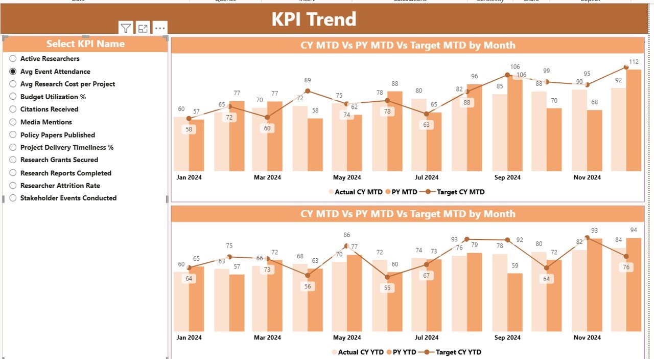
KPI Trend Page
The KPI Trend Page focuses on performance movement over time. Instead of static numbers, users see trends that reveal improvement or decline.
Features of the KPI Trend Page
- Two Combo Charts:
MTD Actual vs Target vs Previous Year
YTD Actual vs Target vs Previous Year
KPI Name Slicer on the left
Since users can select any KPI, they can analyze trends for research output, funding efficiency, policy engagement, or operational metrics.
As a result, teams can move from reactive reporting to proactive planning.
Click to buy Think Tanks KPI Dashboard in Power BI
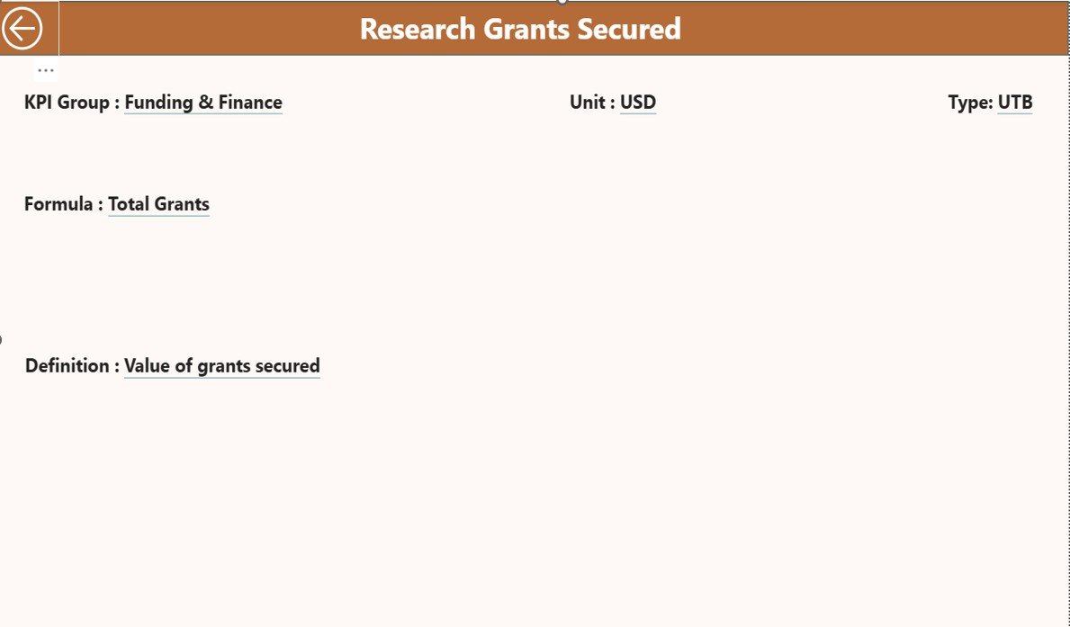
KPI Definition Page
The KPI Definition Page ensures clarity and transparency across the organization. Often, teams interpret KPIs differently. However, this page eliminates confusion.
Purpose of the KPI Definition Page
- Displays KPI Formula
- Explains KPI Definition
- Shows KPI Unit and Type
- Maintains consistency across teams
This page remains hidden by default. However, users can drill through from the Summary Page to view detailed KPI explanations. To return, users simply click the Back button located at the top-left corner.
Click to buy Think Tanks KPI Dashboard in Power BI
What Excel Data Is Required for This Dashboard?
The Think Tanks KPI Dashboard in Power BI uses Excel as its data source. This approach keeps the system simple and flexible.
Required Excel Worksheets
Input_Actual Sheet
In this sheet, users enter actual performance data:
- KPI Name
- Month (use first date of the month)
- MTD Value
- YTD Value
Input_Target Sheet
In this sheet, users enter target data:
- KPI Name
- Month (use first date of the month)
- MTD Target
- YTD Target
Click to buy Think Tanks KPI Dashboard in Power BI
KPI Definition Sheet
This sheet defines each KPI:
- KPI Number
- KPI Group
- KPI Name
- Unit
- Formula
- Definition
- Type (LTB or UTB)
Since Power BI refreshes automatically, updated Excel data instantly reflects on the dashboard.
What KPIs Can Think Tanks Track Using This Dashboard?
Think tanks can track a wide range of KPIs, including:
- Research publications count
- Policy briefs delivered
- Funding utilization rate
- Grant success ratio
- Stakeholder engagement score
- Event participation rate
- Project delivery timelines
- Budget variance percentage
Because the dashboard supports flexible KPI definitions, organizations can customize it to their mission.
Advantages of Think Tanks KPI Dashboard in Power BI
A Think Tanks KPI Dashboard in Power BI offers several strategic benefits.
- Centralized Performance Visibility
Instead of scattered reports, all KPIs appear in one dashboard. Therefore, leadership teams save time and gain clarity.
- Faster and Better Decision-Making
Since Power BI updates visuals instantly, decision-makers respond quickly to performance gaps.
- Improved Accountability
Clear targets and icons make it obvious when KPIs miss targets. As a result, teams take ownership.
- Historical Comparison Made Easy
MTD and YTD comparisons with previous years help organizations measure long-term progress.
- Simple Data Management with Excel
Because data entry happens in Excel, non-technical users can maintain the dashboard easily.
Who Can Benefit from This Dashboard?
This dashboard suits multiple roles within a think tank:
- Executive Directors
- Research Heads
- Program Managers
- Monitoring & Evaluation Teams
- Finance and Grants Teams
- Strategy and Policy Analysts
Moreover, funding agencies and board members can also review summarized performance reports.
Best Practices for the Think Tanks KPI Dashboard in Power BI
To maximize value, organizations should follow best practices.
- Define Clear and Measurable KPIs
Always select KPIs that align with mission goals. Avoid vague indicators.
- Maintain Accurate Excel Data
Ensure teams update actual and target data monthly without delay.
- Use Consistent KPI Definitions
Standard definitions prevent misinterpretation across departments.
- Review Trends Regularly
Analyze MTD and YTD trends during leadership meetings.
- Train Users on Dashboard Navigation
Short training sessions help teams use slicers and drill-through features effectively.
How Does This Dashboard Support Strategic Planning?
Because the dashboard highlights trends, gaps, and achievements, leadership teams can:
- Allocate resources more efficiently
- Improve research prioritization
- Strengthen funding proposals
- Demonstrate impact to stakeholders
As a result, the dashboard becomes a strategic planning tool, not just a reporting solution.
Conclusion
A Think Tanks KPI Dashboard in Power BI transforms how research organizations track performance, measure impact, and drive strategy. By combining Excel-based data input with Power BI visualization, this dashboard offers simplicity, clarity, and powerful insights.
Moreover, its structured design, KPI tracking logic, and drill-through capability ensure transparency and consistency. When implemented with best practices, this dashboard empowers think tanks to make data-driven decisions confidently and demonstrate their value effectively.
Frequently Asked Questions (FAQs)
What is a Think Tanks KPI Dashboard in Power BI used for?
It helps track research, funding, policy impact, and operational KPIs in a single interactive dashboard.
Can non-technical users update this dashboard?
Yes. Users update data in Excel, and Power BI automatically refreshes visuals.
How often should KPI data be updated?
Ideally, teams should update KPI data monthly to maintain accuracy.
Can organizations customize KPIs?
Yes. The KPI Definition sheet allows full customization of KPIs.
Does the dashboard support historical comparison?
Yes. It includes MTD and YTD comparisons with previous year data.
Is this dashboard suitable for small think tanks?
Absolutely. Both small and large think tanks can scale this dashboard easily.
Visit our YouTube channel to learn step-by-step video tutorials
Watch the step-by-step video tutorial:
Click to buy Think Tanks KPI Dashboard in Power BI