Transportation operations play a vital role in supply chain management, logistics, and business performance. Companies that handle deliveries, fleet management, or logistics services face constant challenges like rising fuel costs, delays, route inefficiencies, and underutilized vehicles. To address these challenges, managers require accurate data visualization tools.
A Transportation Dashboard in Excel provides exactly that. It transforms raw transportation data into interactive charts, KPIs, and insights that help businesses optimize their operations, cut costs, and improve on-time delivery performance.
In this article, we will explain everything about the Transportation Dashboard in Excel—its features, benefits, key components, and best practices. We will also share practical tips for using this dashboard to track performance metrics and ensure smooth transportation management.
Click to Purchases Transportation Dashboard in Excel
What Is a Transportation Dashboard in Excel?
A Transportation Dashboard is an Excel-based template that consolidates all transportation-related metrics in one place. Instead of analyzing endless rows of data, businesses can monitor real-time performance indicators through visually appealing charts, cards, and KPIs.
This dashboard is designed for:
-
Logistics companies
-
Retailers with delivery fleets
-
Manufacturing businesses with supply chains
-
E-commerce companies handling last-mile delivery
-
Transportation planners and analysts
By using slicers, pivot charts, and automated calculations, the dashboard allows managers to measure delivery performance, identify cost overruns, and make data-driven decisions.
Key Features of the Transportation Dashboard
This dashboard includes five analytical pages along with supporting sheets. Each page provides unique insights for managers.
Overview Page
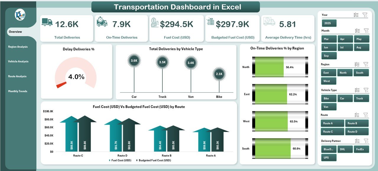
The Overview Page acts as the main landing screen. It includes slicers on the right side for easy filtering and five key performance cards that summarize transportation metrics.
Key visuals include:
-
Delayed Deliveries % – Measures the proportion of delayed shipments.
-
Total Deliveries by Vehicle Type – Shows how deliveries are distributed across trucks, vans, or other vehicles.
-
On-Time Deliveries % by Region – Highlights regional performance.
-
Fuel Cost vs Budgeted Fuel Cost (by Route) – Compares actual vs budgeted costs, identifying cost overruns.
This page is ideal for senior management to get a quick snapshot of performance.
Click to Purchases Transportation Dashboard in Excel
Region Analysis
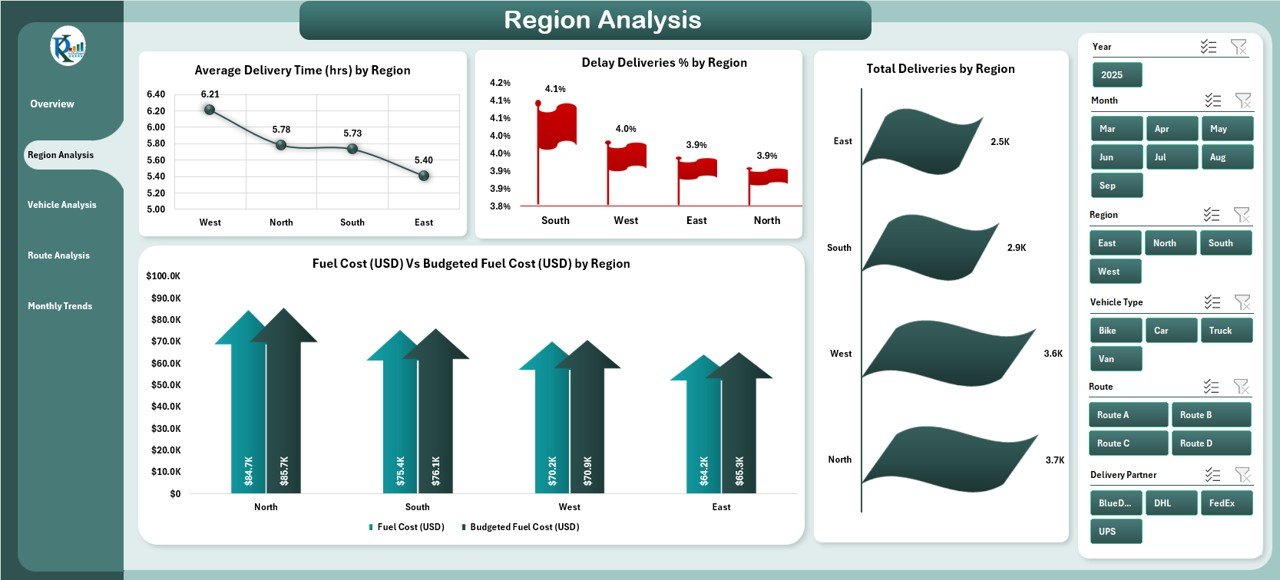
The Region Analysis Page provides insights into how transportation performs across different geographical regions.
Charts include:
-
Average Delivery Time (Hrs) by Region – Identifies areas where delivery times are longer than expected.
-
Delayed Deliveries % by Region – Highlights problematic regions with high delays.
-
Total Deliveries by Region – Shows delivery volume distribution.
-
Fuel Cost vs Budgeted Fuel Cost by Region – Helps track cost efficiency across territories.
This analysis is particularly useful for regional managers who want to pinpoint bottlenecks.
Vehicle Analysis
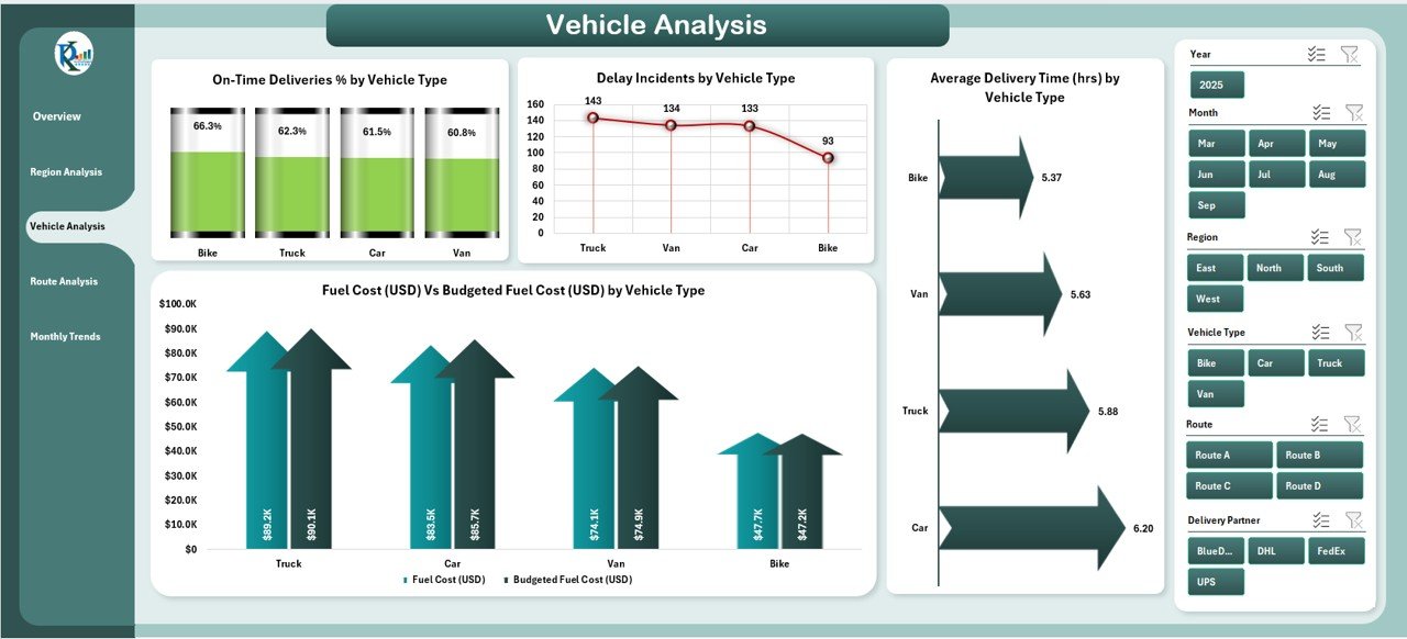
The Vehicle Analysis Page focuses on performance by vehicle type.
Charts include:
-
On-Time Deliveries % by Vehicle Type – Evaluates which vehicle type performs best.
-
Delay Incidents by Vehicle Type – Identifies underperforming assets.
-
Average Delivery Time (Hrs) by Vehicle Type – Measures efficiency of different fleets.
-
Cost vs Budgeted Fuel Cost by Vehicle Type – Highlights areas of overspending.
Fleet managers can use this to decide which vehicles are more reliable and fuel-efficient.
Route Analysis
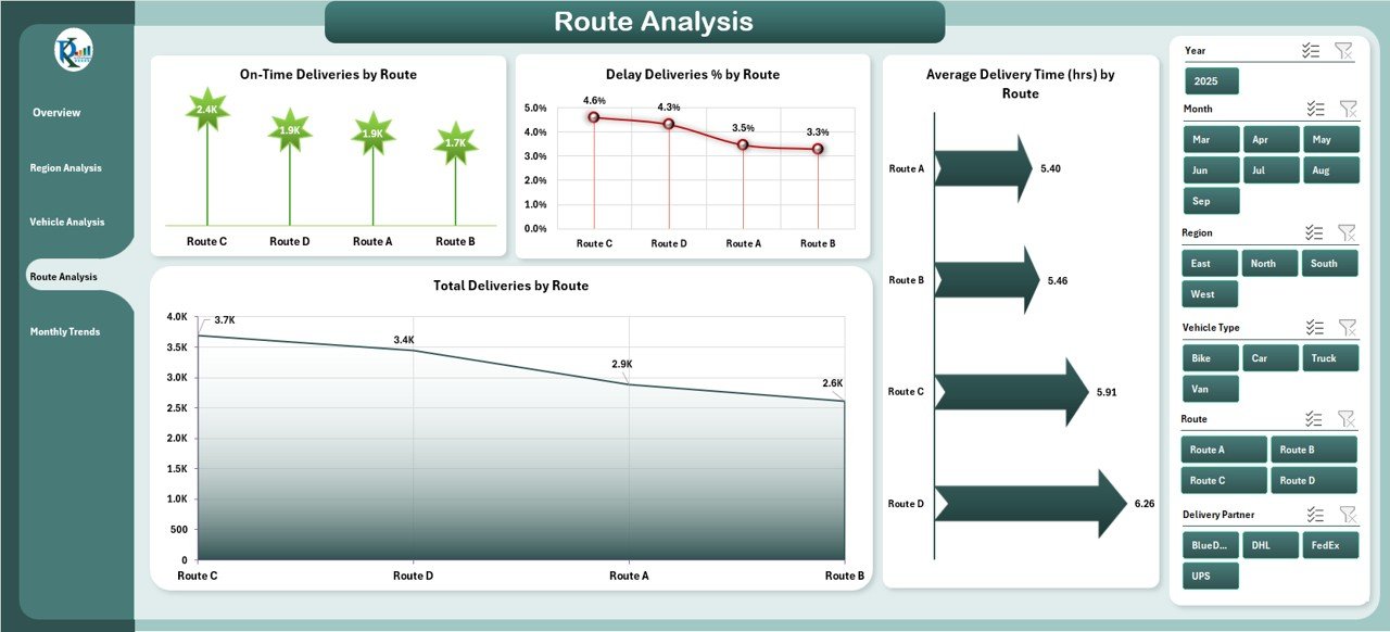
The Route Analysis Page provides detailed performance across delivery routes.
Charts include:
-
On-Time Deliveries % by Route
-
Delay Incidents by Route
-
Average Delivery Time (Hrs) by Route
-
Fuel Cost vs Budgeted Fuel Cost by Route
This view helps businesses identify problematic routes and redesign them for better efficiency.
Monthly Trends
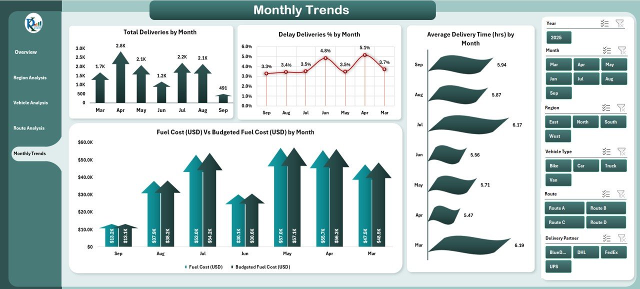
The Monthly Trends Page tracks performance over time.
Charts include:
-
Total Deliveries by Month
-
Delayed Deliveries % by Month
-
Average Delivery Time (Hrs) by Month
-
Fuel Cost vs Budgeted Fuel Cost by Month
This time-based analysis is crucial for spotting seasonal fluctuations and planning resources accordingly.
Support Sheets
-
Data Sheet – Stores raw transportation records, such as delivery dates, regions, vehicles, and costs.
-
Support Sheet – Provides reference lists for slicers, drop-downs, and data validation.
Advantages of Using a Transportation Dashboard in Excel
A well-structured transportation dashboard delivers multiple advantages:
✅ Centralized Data – Consolidates all transportation metrics in one place.
✅ Improved Decision-Making – Provides clear visualizations that simplify analysis.
✅ Cost Management – Tracks budgeted vs actual fuel costs for better financial control.
✅ Time Efficiency – Saves hours of manual reporting by automating calculations.
✅ Customizable – Easily adapted for different industries and company sizes.
✅ Error Reduction – Reduces the chance of misinterpretation compared to manual spreadsheets.
✅ Performance Tracking – Monitors delivery trends, vehicle utilization, and regional performance.
Opportunities for Improvement in Transportation Dashboards
Even though Excel dashboards are powerful, they come with challenges. Some areas for improvement include:
🔹 Scalability – Large datasets may slow down performance.
🔹 Integration – Manual data input can limit real-time tracking unless integrated with ERP/CRM systems.
🔹 Automation – More VBA automation could minimize repetitive tasks.
🔹 Visualization Options – Adding interactive maps or Power BI integration can provide deeper insights.
🔹 Mobile Accessibility – Dashboards in Excel are harder to view on mobile compared to web dashboards.
Best Practices for the Transportation Dashboard in Excel
To maximize the effectiveness of a transportation dashboard, follow these best practices:
📌 Define Key KPIs Early – Choose metrics that directly impact business outcomes (e.g., delivery time, fuel cost, on-time rate).
📌 Use Slicers and Filters – Provide dynamic filtering for users to drill into data.
📌 Automate Data Refresh – Connect the dashboard to external data sources or schedule updates.
📌 Apply Conditional Formatting – Use red/green arrows, progress bars, and color coding for quick insights.
📌 Validate Input Data – Ensure accuracy of raw data before generating reports.
📌 Keep It Simple – Avoid cluttered visuals; focus on clarity and usability.
📌 Monitor Regularly – Review the dashboard weekly or monthly to identify trends.
How to Use the Transportation Dashboard Effectively
-
Import Data – Load delivery logs, fuel expenses, and regional performance data into the data sheet.
-
Refresh Pivot Tables – Update calculations to reflect the latest numbers.
-
Apply Filters – Use slicers for regions, vehicle types, or time frames.
-
Interpret Results – Focus on trends such as rising costs, delayed regions, or underperforming vehicles.
-
Take Action – Redesign routes, schedule maintenance, or adjust budgets based on insights.
Conclusion
Transportation efficiency directly impacts customer satisfaction, operational costs, and business growth. With the Transportation Dashboard in Excel, managers gain a comprehensive tool to analyze performance and make informed decisions.
This dashboard covers overview, regional insights, vehicle analysis, route tracking, and monthly trends—all in one template. By following best practices, companies can achieve cost savings, reduce delays, and improve service quality.
Frequently Asked Questions (FAQs)
1. Who can use a Transportation Dashboard in Excel?
Any organization involved in logistics, deliveries, or supply chain management can use this dashboard. It is suitable for small businesses, large enterprises, and third-party logistics providers.
2. What data do I need to build a Transportation Dashboard?
You need delivery logs (date, region, vehicle type), cost data (fuel, maintenance), and performance metrics (on-time %, delay incidents, average delivery time).
3. Can I customize the dashboard for my business?
Yes, the dashboard is fully customizable. You can add or remove KPIs, change chart types, and update slicers to match your operations.
4. How does this dashboard help reduce costs?
By tracking budgeted vs actual costs and identifying inefficiencies in routes or vehicles, managers can take corrective action and reduce unnecessary spending.
5. Can this dashboard be connected to live data sources?
Yes, with Power Query or VBA automation, you can link the dashboard to external systems for real-time updates.
Visit our YouTube channel to learn step-by-step video tutorials