Managing transportation services is one of the most complex tasks in today’s fast-moving business world. From monitoring delivery times and fuel usage to controlling costs and ensuring customer satisfaction, transportation managers deal with many moving parts. A small delay in one area can easily create a chain reaction that impacts the entire supply chain.
This is where a Transportation Services KPI Dashboard in Excel becomes a game-changing tool. It provides a single platform to track, analyze, and improve performance across all areas of transportation operations. With this dashboard, companies can make better decisions, save costs, and deliver better service to customers.
In this article, we will explore everything you need to know about the Transportation Services KPI Dashboard in Excel—its features, advantages, best practices, and how businesses can use it effectively.
Click to Purchases Transportation Services KPI Dashboard in Excel
What Is a Transportation Services KPI Dashboard?
A Transportation Services KPI Dashboard is an Excel-based performance tracking tool that allows businesses to monitor their transportation and logistics operations in real time. Instead of juggling multiple spreadsheets or manual reports, managers can use this dashboard to visualize performance indicators in one place.
It tracks key performance indicators (KPIs) such as:
-
On-time delivery percentage
-
Average delivery time
-
Transportation cost per unit
-
Vehicle utilization rate
-
Fuel efficiency
-
Customer satisfaction with transport services
-
Compliance with service-level agreements (SLAs)
By consolidating all this information into one dashboard, transportation companies can keep operations efficient, reduce costs, and meet customer expectations.
Click to Purchases Transportation Services KPI Dashboard in Excel
Why Do Businesses Need a Transportation Services KPI Dashboard?
Transportation plays a vital role in every industry—retail, e-commerce, manufacturing, healthcare, and more. Delays, rising fuel prices, and inefficient processes can directly affect profitability.
A well-structured KPI dashboard helps businesses:
-
Track performance in real time instead of waiting for end-of-month reports.
-
Identify bottlenecks such as frequent delays, idle vehicles, or cost overruns.
-
Improve accountability by assigning KPIs to specific departments or managers.
-
Enhance decision-making with data-driven insights.
-
Reduce costs by monitoring fuel, vehicle maintenance, and driver efficiency.
-
Improve customer satisfaction with consistent and timely deliveries.
Structure of the Transportation Services KPI Dashboard in Excel
This dashboard comes with 7 well-organized worksheets, each serving a unique purpose. Let’s break them down:
1. Home Sheet
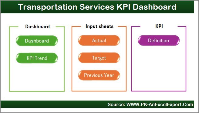
The Home sheet acts as the index page. It includes six navigation buttons that allow users to jump directly to different parts of the dashboard. This makes the file user-friendly and quick to navigate.
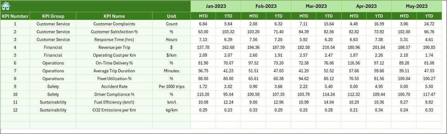
2. Dashboard Sheet
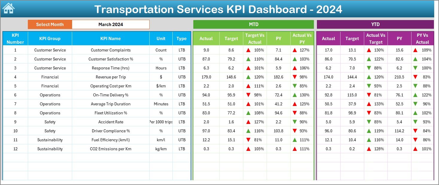
The Dashboard sheet is the main view where all KPIs are displayed.
-
At cell D3, you can select a month from a drop-down list. Once selected, all dashboard numbers update automatically.
-
You can view Month-to-Date (MTD) and Year-to-Date (YTD) numbers.
-
Data points shown include Actual, Target, and Previous Year values.
-
Variance analysis is included with Target vs Actual and Previous Year vs Actual comparisons.
-
Conditional formatting highlights trends with up and down arrows for easy understanding.
This sheet provides an instant snapshot of performance, making it the go-to page for senior management.
3. KPI Trend Sheet
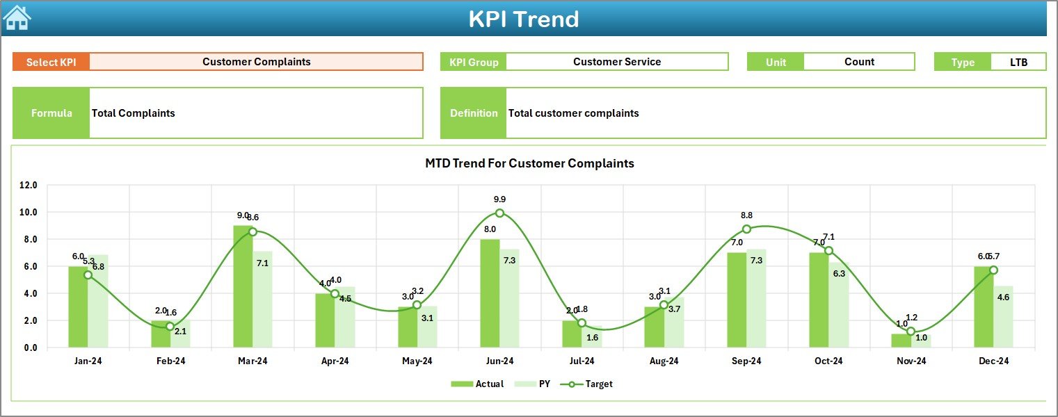
This sheet focuses on analyzing trends.
-
You can select a KPI name from the drop-down in cell C3.
-
The dashboard displays information such as KPI Group, Unit, Type (Lower the Better or Upper the Better), Formula, and Definition.
-
Trend charts for MTD and YTD are shown for Actual, Target, and Previous Year values.
This helps managers understand long-term performance patterns and identify areas for improvement.
4. Actual Numbers Input Sheet
This is where users enter actual numbers for both MTD and YTD.
-
At cell E1, you can input the first month of the year.
-
Once entered, the sheet auto-updates for the rest of the year.
-
This design keeps data input simple while maintaining accuracy.
5. Target Sheet
The Target Sheet is where you set targets for each KPI.
-
Targets can be entered for both MTD and YTD values.
-
This ensures performance is not only monitored but also measured against clear benchmarks.
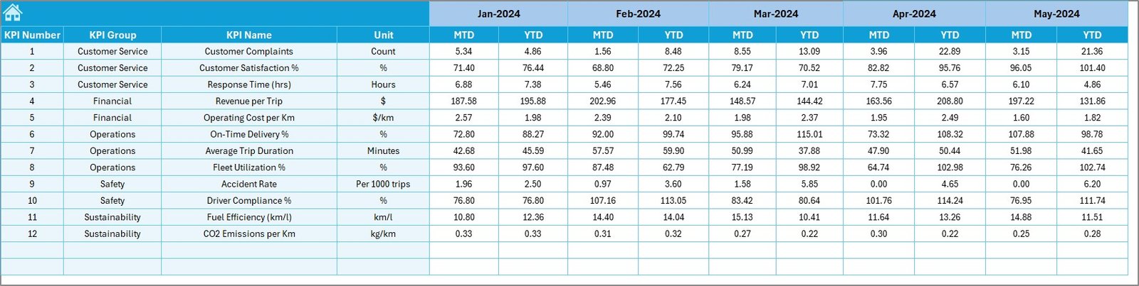
6. Previous Year Numbers Sheet
This sheet allows you to enter historical data.
-
Numbers for the previous year are entered here in the same format as the current year.
-
By comparing with historical data, companies can understand whether they are improving or falling behind.
7. KPI Definition Sheet
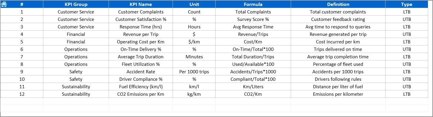
The KPI Definition sheet works like a reference library.
-
It lists each KPI’s Name, Group, Unit, Formula, and Definition.
-
This ensures consistency in reporting and clarity for anyone using the dashboard.
Key Features of the Transportation Services KPI Dashboard
Here are the standout features that make this Excel dashboard powerful:
📊 Interactive dashboard with slicers for easy navigation.
📈 MTD and YTD comparisons with variance analysis.
⏱ Trend charts to analyze performance over time.
🎯 Target vs Actual tracking for clear performance measurement.
🔄 Year-over-Year analysis to compare growth and efficiency.
📝 KPI definitions and formulas included for transparency.
💡 User-friendly design with drop-down selections and conditional formatting.
Advantages of Using a Transportation Services KPI Dashboard
Using this dashboard comes with many benefits. Some of the main advantages include:
-
Centralized Reporting – All KPIs are in one place for easy access.
-
Time Savings – Automates calculations and updates, reducing manual work.
-
Better Visibility – Managers can monitor operations at a glance.
-
Cost Control – Identifies unnecessary expenses and inefficiencies.
-
Improved Accountability – Each department can track its KPIs.
-
Enhanced Planning – Historical data and trends support better forecasting.
-
Increased Customer Satisfaction – On-time deliveries and reduced errors lead to happier customers.
Best Practices for the Transportation Services KPI Dashboard
To get the most out of this dashboard, businesses should follow a few best practices:
-
Keep Data Updated
Enter actuals and targets regularly to ensure insights are always accurate. -
Focus on Key Metrics
Avoid overcrowding the dashboard with too many KPIs. Track the most relevant ones. -
Use Historical Comparisons
Always compare with the previous year to measure growth effectively. -
Review Trends Monthly
Regular reviews help spot problems before they grow. -
Train the Team
Ensure managers and staff know how to use the dashboard effectively. -
Automate Where Possible
Use Excel formulas and conditional formatting to reduce manual errors.
Real-World Applications of a Transportation Services KPI Dashboard
This dashboard can be applied across industries. Here are some examples:
-
E-commerce – Track last-mile delivery performance and reduce late shipments.
-
Retail – Monitor transportation costs for bulk shipments and distribution.
-
Manufacturing – Ensure raw materials arrive on time for uninterrupted production.
-
Healthcare – Guarantee timely delivery of medical supplies and equipment.
-
Logistics Providers – Optimize fleet utilization and reduce idle time.
Conclusion
The Transportation Services KPI Dashboard in Excel is more than just a spreadsheet. It is a decision-making tool that helps businesses stay competitive in a fast-paced world. By tracking the right KPIs, analyzing trends, and comparing against targets, companies can improve efficiency, cut costs, and deliver better services to customers.
Whether you manage a small fleet or a global logistics network, this dashboard provides the insights you need to succeed.
Click to Purchases Transportation Services KPI Dashboard in Excel
Frequently Asked Questions (FAQs)
1. What KPIs should I track in transportation services?
You should track on-time delivery percentage, cost per shipment, fuel efficiency, vehicle utilization, and customer satisfaction.
2. Can I customize the Transportation Services KPI Dashboard?
Yes, the Excel dashboard is fully customizable. You can add or remove KPIs, adjust formulas, and modify charts based on your business needs.
3. How often should I update the dashboard?
You should update it monthly for MTD and YTD numbers. However, high-volume businesses may choose to update it weekly for greater accuracy.
4. Do I need advanced Excel skills to use this dashboard?
No, the dashboard is designed to be user-friendly. With simple drop-downs and automated formulas, anyone with basic Excel knowledge can use it.
5. How does this dashboard improve customer satisfaction?
By ensuring timely deliveries, reducing delays, and improving service reliability, the dashboard helps businesses meet customer expectations consistently.
6. Can small businesses use this dashboard?
Yes, it is suitable for businesses of all sizes. Small businesses can start with a few KPIs and expand as they grow.
Visit our YouTube channel to learn step-by-step video tutorials
Click to Purchases Transportation Services KPI Dashboard in Excel
Watch the step-by-step video tutorial: