Urban development plays a vital role in shaping cities and communities. To manage infrastructure projects, monitor growth, and ensure sustainability, city planners and administrators need accurate data. However, data alone is not enough. Without the right tools, decision-makers may struggle to interpret information and take timely action. This is where an Urban Development KPI Dashboard in Power BI comes in.
Power BI enables city authorities, consultants, and stakeholders to transform raw numbers into meaningful insights. With the help of interactive dashboards, they can track performance, evaluate trends, and make better policy decisions. In this article, we will explore the structure, features, advantages, best practices, and FAQs related to the Urban Development KPI Dashboard in Power BI.
Click to Purchases Urban Development KPI Dashboard in Power BI
What Is an Urban Development KPI Dashboard in Power BI?
An Urban Development KPI Dashboard in Power BI is a performance monitoring system designed to evaluate development projects and city-level KPIs. It brings together multiple data points into a single interface, making it easier to track progress against goals.
For example, authorities may want to monitor housing units built, road expansion, environmental compliance, or budget utilization. Instead of managing scattered spreadsheets, they can rely on one central dashboard to see both month-to-date (MTD) and year-to-date (YTD) performance.
This dashboard is built in Power BI and uses Excel as the data source, ensuring flexibility and ease of use.
Key Features of the Urban Development KPI Dashboard
The dashboard is structured into three pages within Power BI. Each page plays a unique role in delivering insights.
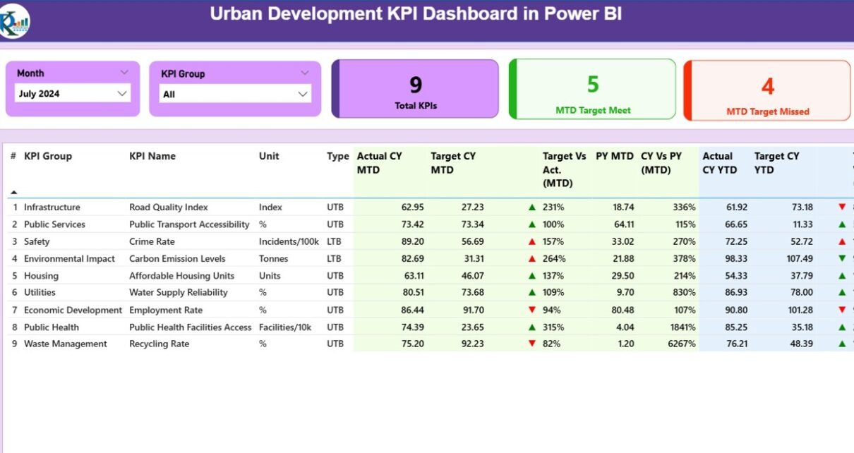
1. Summary Page
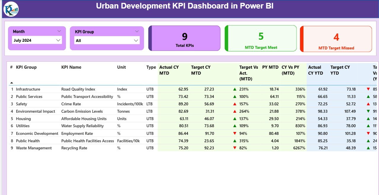
The Summary Page is the main entry point of the dashboard. It provides high-level performance information.
-
Slicers: Month and KPI Group slicers allow users to filter results quickly.
-
Cards: Three KPI cards show Total KPIs Count, MTD Target Met, and MTD Target Missed.
Detailed Table: This table captures the full view of KPIs with fields like:
- KPI Number
- KPI Group (category)
- KPI Name
- Unit of Measurement
- Type (LTB – Lower the Better, UTB – Upper the Better)
- Actual CY MTD vs Target CY MTD
- Variance icons (▲ green for success, ▼ red for shortfall)
- Target vs Actual % (MTD)
- Previous Year MTD (PY MTD) for comparison
- CY vs PY (MTD) percentage growth
- YTD performance with similar comparisons and status icons
This page ensures that stakeholders immediately see what is working and what requires attention.
KPI Trend Page
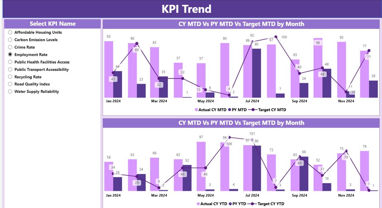
The KPI Trend Page provides a visual story of performance.
Click to Purchases Urban Development KPI Dashboard in Power BI
Two combo charts display:
- Actuals of Current Year
- Previous Year data
- Targets (both MTD and YTD)
-
A slicer on the left allows users to select a specific KPI for deeper analysis.
This page is ideal for identifying seasonal patterns or long-term improvements in urban KPIs.
KPI Definition Page
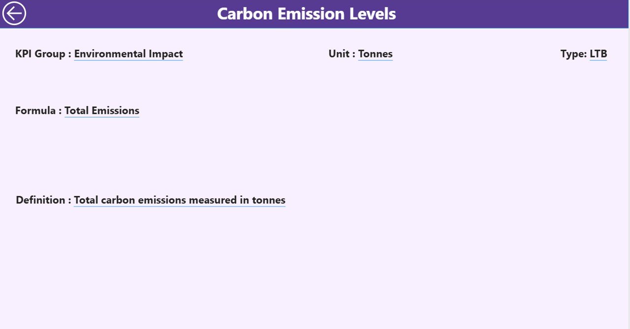
The KPI Definition Page is a hidden drill-through page.
-
It provides details such as KPI formula, description, and definition.
-
Users can drill through from the summary table to understand the exact meaning of each KPI.
-
A back button at the top-left corner brings users back to the main page.
This feature ensures that everyone interprets the KPIs consistently.
Excel Data Structure Behind the Dashboard
The dashboard pulls data from an Excel workbook. This keeps data management simple and user-friendly. The workbook contains three sheets:
-
Input_Actual Sheet
-
Records KPI Name, Month (first date of month), MTD, and YTD actuals.
-
-
Input_Target Sheet
-
Captures KPI Name, Month (first date of month), MTD, and YTD targets.
-
-
KPI Definition Sheet
-
Lists KPI Number, Group, Name, Unit, Formula, Definition, and Type (LTB or UTB).
-
This structure ensures easy updates. By simply refreshing the Power BI file after updating Excel, the dashboard displays new results.
Advantages of an Urban Development KPI Dashboard
Using Power BI for urban development monitoring offers several benefits:
✅ Centralized Monitoring – All KPIs are available in one place, reducing the need to switch between multiple reports.
✅ Data Accuracy – Linking directly to Excel ensures consistency between input data and output dashboards.
✅ Real-Time Decision Making – With updated MTD and YTD metrics, city officials can take quick corrective actions.
✅ Trend Visibility – Historical comparisons (CY vs PY) highlight improvement areas and setbacks.
✅ User-Friendly Interface – Icons, slicers, and combo charts simplify complex data.
✅ Better Accountability – KPI definitions ensure all stakeholders understand the same measurement standards.
Opportunities for Improvement
While the dashboard is effective, there are areas where it can be enhanced:
🔹 Automation: Integrating live data sources such as SQL databases or APIs can reduce manual updates.
🔹 Geospatial Analysis: Adding maps in Power BI can link KPIs to specific urban zones.
🔹 Mobile Optimization: Ensuring the dashboard works seamlessly on mobile devices for field staff.
🔹 Advanced Predictive Models: AI and machine learning can forecast urban KPI performance.
🔹 Stakeholder Custom Views: Creating role-based dashboards for different departments like housing, roads, or utilities.
Best Practices for the Urban Development KPI Dashboard
To maximize the impact of your dashboard, follow these best practices:
-
Keep KPIs Relevant
-
Select KPIs that directly relate to urban development goals such as housing, infrastructure, and environment.
-
-
Use Visual Cues Wisely
-
Employ icons and color coding (red vs green) to make results instantly clear.
-
-
Update Data Regularly
-
Refresh the dashboard at least monthly to maintain accuracy.
-
-
Enable Drill-Throughs
-
Provide access to KPI definitions so users understand the calculations.
-
-
Balance Detail and Simplicity
-
While detailed tables are important, summary cards and charts should provide a quick overview.
-
-
Train Users
-
Conduct training sessions so stakeholders know how to filter, drill, and interpret the data.
-
How Does Power BI Help Urban Development Projects?
Power BI serves as more than just a reporting tool. It enables cities to:
-
Consolidate project progress data.
-
Compare actual vs planned development targets.
-
Identify delays early.
-
Promote transparency by sharing dashboards with public stakeholders.
-
Provide a data-driven foundation for funding and policy decisions.
Conclusion
The Urban Development KPI Dashboard in Power BI provides a structured, user-friendly way to monitor city development initiatives. From housing projects to environmental indicators, it brings together crucial KPIs into one interactive platform.
By using Excel as the data source and Power BI as the visualization layer, authorities can ensure flexibility, scalability, and accuracy. With added features like slicers, drill-through pages, and trend charts, this dashboard becomes a valuable tool for city administrators, consultants, and policymakers.
Urban development is complex, but with the right dashboard, decisions become faster, smarter, and more transparent.
Frequently Asked Questions (FAQs)
1. What is the purpose of an Urban Development KPI Dashboard?
It helps monitor and evaluate city-level KPIs such as housing, infrastructure, and environment. It ensures that development projects stay aligned with goals.
2. Why use Power BI for urban development KPIs?
Power BI provides interactive charts, slicers, and drill-through capabilities, making data analysis simple and effective for decision-makers.
3. Can this dashboard work with real-time data?
Yes. While the base version uses Excel, you can connect it to databases or APIs for real-time monitoring.
4. What type of KPIs can be tracked?
KPIs can include infrastructure growth, housing projects, budget spending, environmental compliance, and citizen satisfaction scores.
5. Is the dashboard customizable?
Absolutely. You can add new KPIs, change chart types, or integrate advanced analytics based on requirements.
6. How often should the dashboard be updated?
Monthly updates are common, but weekly or real-time updates are possible if connected to live data sources.
7. Who can benefit from this dashboard?
City planners, government authorities, consultants, NGOs, and investors who are involved in urban development projects.
Visit our YouTube channel to learn step-by-step video tutorials
Youtube.com/@NeotechNavigators