The streaming industry grows every day as millions of users consume online content through mobile, TV, and web platforms. Because of rapid digital expansion, Video-on-Demand (VoD) companies must track their performance constantly. They need to monitor subscription trends, device usage, regional behavior, cost, revenue, user ratings, and watch duration. Without a structured reporting system, teams work blindly and make decisions without data support.
A Video-on-Demand (VoD) Dashboard in Excel solves this issue. It provides a powerful and easy way to understand platform performance. With clear visuals, interactive slicers, smart navigation, and dynamic charts, this dashboard becomes a complete analytics tool for streaming platforms.
In this article, you will learn how this dashboard works, what each page offers, and why Excel is still one of the best tools for VoD analysis. You will also explore advantages, best practices, and frequently asked questions.
Click to Purchases Video-on-Demand (VoD) Dashboard in Excel
What Is a Video-on-Demand (VoD) Dashboard in Excel?
A Video-on-Demand (VoD) Dashboard in Excel is a ready-to-use analytical template designed to track all major KPIs of a streaming platform. It visualizes metrics such as cost, revenue, profit, average rating, viewership trends, device usage, and region performance. Because it works inside Excel, teams do not need advanced software or complex tools.
This dashboard includes five interactive pages, a support sheet, and a data sheet. Together, they create a complete reporting structure that helps both analysts and business teams make clear, data-driven decisions.
Each page focuses on a different analytical area:
-
Overview Page
-
Genre Analysis
-
Device Analysis
-
Region Analysis
-
Monthly Trends
A page navigator appears on the left side to help users switch between pages quickly.
Why Do VoD Platforms Need KPI Dashboards?
Streaming platforms operate in a fast-changing environment. User preferences change quickly. Subscription plans need constant evaluation. Competition increases every year. Because of this, VoD platforms need accurate and updated information.
A KPI dashboard helps because it:
-
Shows real-time performance
-
Compares cost vs revenue
-
Highlights profit trends
-
Tracks device usage patterns
-
Monitors viewer satisfaction
-
Reveals genre preferences
-
Identifies growing regions
-
Shows month-wise trends
-
Helps marketing and technical teams understand user behavior
Without a dashboard, platforms make decisions without understanding their audience.
Key Features of the VoD Dashboard in Excel
This dashboard contains five detailed analytical pages, each with slicers and visual insights. Let’s explore each page.
Click to Purchases Video-on-Demand (VoD) Dashboard in Excel
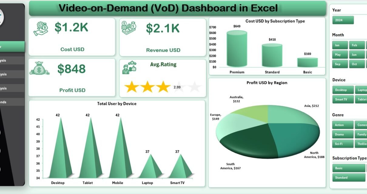
1. Overview Page – A Complete Snapshot of Platform Performance
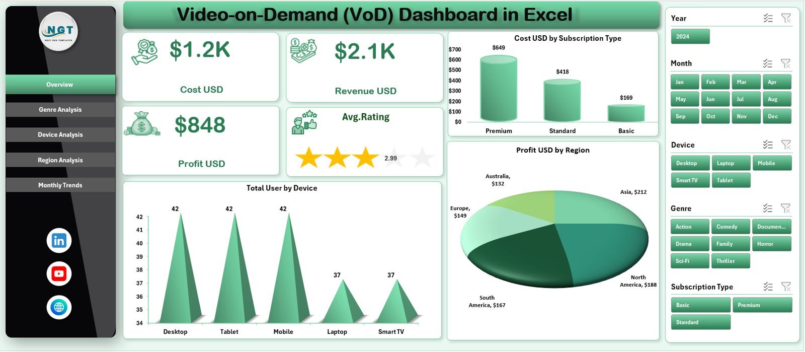
The Overview Page is the main page of the dashboard — it provides a clear summary of the platform’s overall performance.
✔ Right-Side Slicer
Users can select categories or filters easily, and the entire page updates instantly.
✔ Five KPI Cards
These cards highlight the most important metrics:
-
Cost (USD)
-
Revenue (USD)
-
Profit (USD)
-
Average Rating
These cards help users compare high-level performance quickly.
✔ Three Key Charts
The overview page includes:
• Cost USD by Subscription Type
This chart shows which subscription plan contributes the most to costs.
• Total Users by Device
Helps teams understand where users watch content — mobile, smart TV, laptop, tablet, or web.
• Profit USD by Region
Shows which regions generate the highest profit and which struggle with cost efficiency.
These visuals make the overview page a perfect summary for leadership teams and analysts.
2. Genre Analysis – Understanding Content Preferences
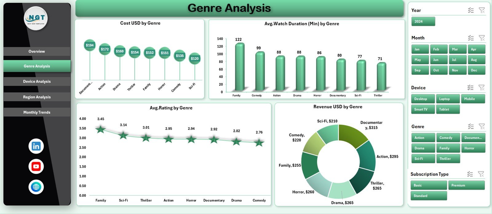
Genre analysis helps VoD platforms understand audience interests. The Genre Analysis Page uses a right-side slicer and shows four important charts.
✔ Charts Included:
• Cost USD by Genre
Shows which content genre requires higher production or licensing cost.
• Average Watch Duration (Min) by Genre
Helps identify genres that retain users longer.
• Average Rating by Genre
Shows viewer satisfaction levels across genres.
• Revenue USD by Genre
This tells which genres convert into higher revenue.
Because content strategy depends on user preference, genre analysis becomes essential for decision-making.
Click to Purchases Video-on-Demand (VoD) Dashboard in Excel
3. Device Analysis – Understanding Where Users Watch Content
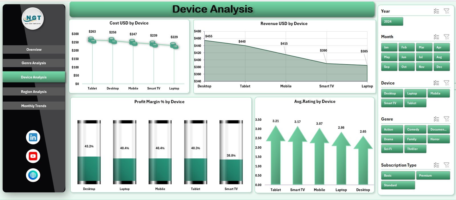
Device behavior is a key indicator for platform development, marketing, and content optimization. The Device Analysis Page shows device-based performance clearly.
✔ Charts Included:
• Cost USD by Device
Reveals where the platform incurs more streaming, hosting, or support cost.
• Revenue USD by Device
Shows devices contributing the most revenue.
• Profit Margin % by Device
Helps identify profitable device categories.
• Average Rating by Device
Shows viewer experience across devices.
Because different devices have different performance behavior, this page guides platform optimization decisions.
4. Region Analysis – Knowing Where Your Audience Lives
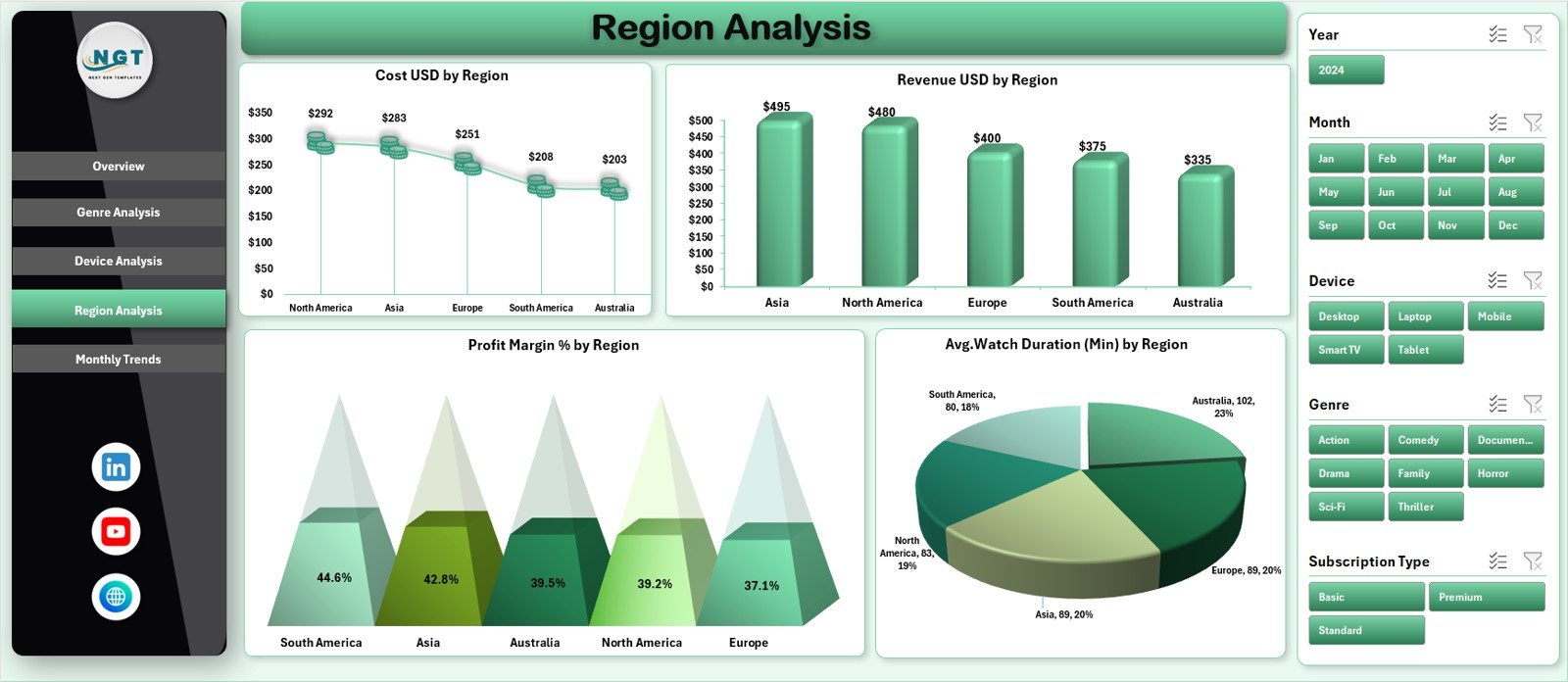
VoD platforms expand globally. Understanding regional behavior helps companies design targeted promotions, pricing, and content.
✔ Region-wise Charts:
• Cost USD by Region
Shows operational, hosting, and content cost across regions.
• Revenue USD by Region
Reveals the strongest revenue-generating regions.
• Profit Margin % by Region
Helps identify which regions operate profitably.
• Average Watch Duration (Min) by Region
Shows where users spend more time watching content.
This analysis supports expansion decisions, localization strategies, and pricing updates.
Click to Purchases Video-on-Demand (VoD) Dashboard in Excel
5. Monthly Trends – Tracking Growth Over Time
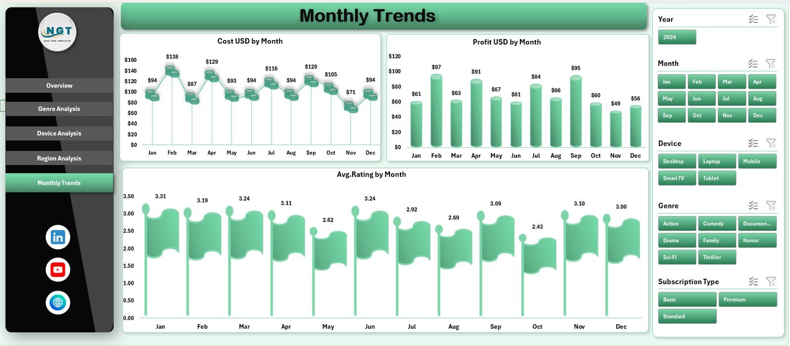
The Monthly Trends Page helps teams understand how the platform performs across months.
✔ Charts Included:
• Cost USD by Month
Shows fluctuations in hosting, production, and licensing expenses.
• Profit USD by Month
Highlights growth cycles, seasonal behavior, and profitability trends.
• Average Rating by Month
Helps teams track improvements in content quality and customer satisfaction.
This page supports forecasting, budgeting, and long-term planning.
Support Sheet and Data Sheet
While the main dashboard pages display charts and KPIs, the Support Sheet and Data Sheet manage background calculations and data storage.
✔ Support Sheet
Used for formulas, mapping, and internal logic.
✔ Data Sheet
Stores raw data for cost, revenue, ratings, devices, regions, subscriptions, and watch duration.
These sheets make the dashboard function smoothly and ensure high accuracy.
Advantages of the Video-on-Demand (VoD) Dashboard in Excel
This dashboard provides several key benefits for streaming companies.
1. Clear Visibility of Platform Performance
All important KPIs appear in one place, making decision-making easier.
2. Helps Identify Profitable Areas
Device-wise, region-wise, and genre-wise profit trends are clear and easy to understand.
3. Supports Content Strategy
Genre analysis helps identify which content attracts more users.
4. Improves User Experience
Ratings, watch duration, and device behavior help optimize platform performance.
5. Reduces Reporting Time
Teams no longer build reports manually. The dashboard updates automatically.
6. Ideal for Leadership Presentations
Charts and visuals make the dashboard perfect for meetings.
7. Easy to Customize
Excel makes it simple to add new KPIs, pages, or fields.
8. Helps with Budget Planning
Monthly trends and region analysis help forecasting and cost control.
9. Supports Marketing and Promotional Planning
Understanding user behavior helps design targeted campaigns.
10. Works Without Specialized Software
Anyone with Excel can use and understand the dashboard.
Click to Purchases Video-on-Demand (VoD) Dashboard in Excel
Best Practices for Using the VoD Dashboard in Excel
Follow these practices to get the best results:
1. Keep the Data Sheet Updated
Accurate data ensures accurate insights.
2. Use Slicers to Explore Deeper Insights
Filters help compare devices, regions, and genres.
3. Review Trends Monthly
Trend charts help detect early performance changes.
4. Track Ratings Carefully
Rating changes show user satisfaction levels.
5. Compare Cost and Revenue Together
This shows whether content remains profitable.
6. Do Not Overload the Dashboard
Keep visuals clean and focused.
7. Validate Data Before Refreshing
Avoid incorrect data entries.
8. Train Your Team
Help new users understand slicers and navigation buttons.
9. Update KPI Definitions as Needed
Streaming KPIs evolve as platforms grow.
10. Use the Dashboard for Strategy Meetings
This ensures data-driven decisions.
How the Dashboard Helps VoD Platforms Grow
This dashboard supports growth by:
-
Identifying top content genres
-
Understanding device performance
-
Finding strong regions
-
Detecting cost-heavy areas
-
Improving user satisfaction
-
Supporting content investment decisions
-
Helping forecast future growth
Because the dashboard visualizes everything clearly, teams understand exactly where to invest time and resources.
Conclusion
The Video-on-Demand (VoD) Dashboard in Excel is a complete analytical solution for streaming platforms. It tracks cost, revenue, profit, ratings, device usage, region behavior, and monthly trends — all inside a simple Excel file. With its five analytical pages, page navigator, data sheet, and support sheet, it becomes a powerful tool for decision-making.
VoD teams can use this dashboard to improve user experience, optimize spending, select winning content genres, and plan for future growth. When companies use smart KPIs and real-time insights, they move toward stronger results and a more loyal audience.
Click to Purchases Video-on-Demand (VoD) Dashboard in Excel
Frequently Asked Questions (FAQs)
1. What is a VoD Dashboard in Excel?
It is a visual reporting tool that tracks key metrics such as cost, revenue, ratings, region performance, and device behavior.
2. Who should use this dashboard?
Streaming companies, VoD analysts, content teams, marketing teams, and leadership.
3. Can I add more KPIs to the dashboard?
Yes. You can modify the data sheet and formulas easily.
4. Does this dashboard require advanced Excel knowledge?
No. Anyone with basic Excel skills can use it.
5. How often should I update the data sheet?
Monthly updates work best.
6. Can I compare performance by subscription type?
Yes. The overview page includes subscription-wise cost analysis.
7. Does the dashboard support multiple regions?
Yes. The region analysis page is designed for multi-country platforms.
8. Can I analyze watch duration?
Yes. Genre and region pages show watch duration insights.
9. Can I add new genres or devices?
Yes. The dashboard is fully customizable.
10. Is Excel enough for VoD analytics?
Yes. Excel provides flexibility, simplicity, and powerful visualization options.
Click to Purchases Video-on-Demand (VoD) Dashboard in Excel
Visit our YouTube channel to learn step-by-step video tutorials