Water scarcity has become one of the biggest global challenges. As freshwater resources decrease, many countries depend on water desalination plants to convert seawater into usable drinking water. However, desalination plants require continuous monitoring to ensure efficient operations, cost control, and optimal water production.
Therefore, organizations need a structured system that transforms operational data into meaningful insights. This is exactly where the Water Desalination KPI Dashboard in Power BI becomes extremely valuable.
The Water Desalination KPI Dashboard in Power BI is a ready-to-use analytics solution that helps organizations monitor key performance indicators (KPIs) related to desalination plant operations. The dashboard uses Power BI interactive visuals and Excel data sources to provide clear insights into plant performance, KPI trends, and target achievement.
In this comprehensive article, we will explore the Water Desalination KPI Dashboard in Power BI, including its features, dashboard pages, advantages, best practices, and how water utility companies can use it to improve operational efficiency.
Click to Purchases Water Desalination KPI Dashboard in Power BI
What is a Water Desalination KPI Dashboard in Power BI?
A Water Desalination KPI Dashboard in Power BI is an analytical reporting system designed to monitor the operational performance of desalination plants.
It tracks key metrics such as:
-
KPI target achievement
-
Monthly performance indicators
-
Year-to-date operational performance
-
Comparison with previous year performance
-
KPI trend analysis
Because Power BI provides interactive visuals and real-time analytics, plant managers can easily monitor performance and detect operational issues quickly.
Why Do Desalination Plants Need a KPI Dashboard?
Desalination plants operate complex systems that include pumps, filtration systems, membranes, and energy-intensive processes. Monitoring performance manually becomes difficult when organizations handle large amounts of operational data.
Without a structured KPI dashboard, organizations may face several challenges:
-
Lack of real-time performance insights
-
Difficulty comparing targets with actual performance
-
Limited visibility into monthly and yearly trends
-
Inefficient operational decision-making
-
Difficulty identifying underperforming KPIs
However, when organizations implement a Water Desalination KPI Dashboard in Power BI, they gain a centralized monitoring platform that simplifies performance analysis.
Click to Purchases Water Desalination KPI Dashboard in Power BI
Key Features of the Water Desalination KPI Dashboard in Power BI
The Water Desalination KPI Dashboard in Power BI is a ready-to-use dashboard that uses Excel as a data source. Users only need to update data in Excel, and Power BI automatically refreshes the dashboard visuals.
The dashboard contains three interactive pages in the Power BI Desktop file.
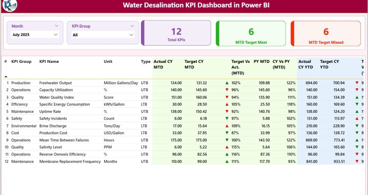
1. Summary Page – The Main Performance Monitoring Page
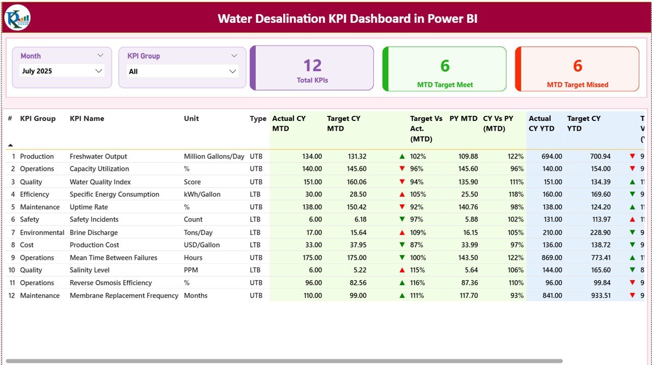
The Summary Page serves as the main dashboard where users can monitor all KPI performance indicators.
At the top of the dashboard, users can filter the data using two slicers:
-
Month slicer
-
KPI Group slicer
These slicers allow users to analyze performance based on specific time periods or KPI categories.
KPI Cards on the Summary Page
The summary section includes three KPI cards that provide an overview of KPI performance:
-
Total KPIs Count – Displays the total number of KPIs tracked in the dashboard
-
MTD Target Meet Count – Shows the number of KPIs that achieved the monthly target
-
MTD Target Missed Count – Displays the number of KPIs that failed to meet the monthly target
These indicators help managers quickly evaluate operational performance.
Detailed KPI Table
Below the KPI cards, the dashboard displays a detailed KPI table containing comprehensive performance metrics.
Information Displayed in the Table
The table includes the following columns:
-
KPI Number – Sequence number assigned to each KPI
-
KPI Group – Category of the KPI
-
KPI Name – Name of the performance indicator
-
Unit – Measurement unit used for the KPI
-
Type – Indicates whether the KPI is LTB (Lower the Better) or UTB (Upper the Better)
Monthly Performance Metrics
The dashboard includes multiple MTD (Month-to-Date) indicators:
-
Actual CY MTD – Actual KPI value for the current year month-to-date
-
Target CY MTD – Target KPI value for the same period
MTD Icon Indicator
The dashboard displays green ▲ and red ▼ icons to indicate KPI performance:
-
▲ Green indicates KPI target achieved
-
▼ Red indicates KPI target missed
Target vs Actual Comparison (MTD)
This column calculates the percentage difference between target and actual values.
Formula used:
Actual MTD / Target MTD
This metric shows how closely actual performance matches planned targets.
Previous Year Comparison (MTD)
The dashboard also includes historical comparison metrics:
-
PY MTD – Previous year month-to-date value
-
CY vs PY (MTD) – Comparison between current year and previous year
Formula used:
Current Year MTD / Previous Year MTD
This comparison helps identify performance improvements over time.
Year-To-Date Performance Metrics
The dashboard also includes YTD indicators:
-
Actual CY YTD – Actual performance for the current year
-
Target CY YTD – Target performance for the current year
YTD Icon Indicator
Similar to MTD icons, the dashboard shows:
-
▲ Green arrow when the KPI meets the target
-
▼ Red arrow when the KPI misses the target
Target vs Actual Comparison (YTD)
Formula used:
Actual YTD / Target YTD
This metric shows long-term KPI performance.
Previous Year Comparison (YTD)
The dashboard also tracks:
-
PY YTD – Previous year YTD performance
-
CY vs PY (YTD) – Current year vs previous year comparison
Formula used:
Current Year YTD / Previous Year YTD
Click to Purchases Water Desalination KPI Dashboard in Power BI
2. KPI Trend Page – How Do KPIs Perform Over Time?
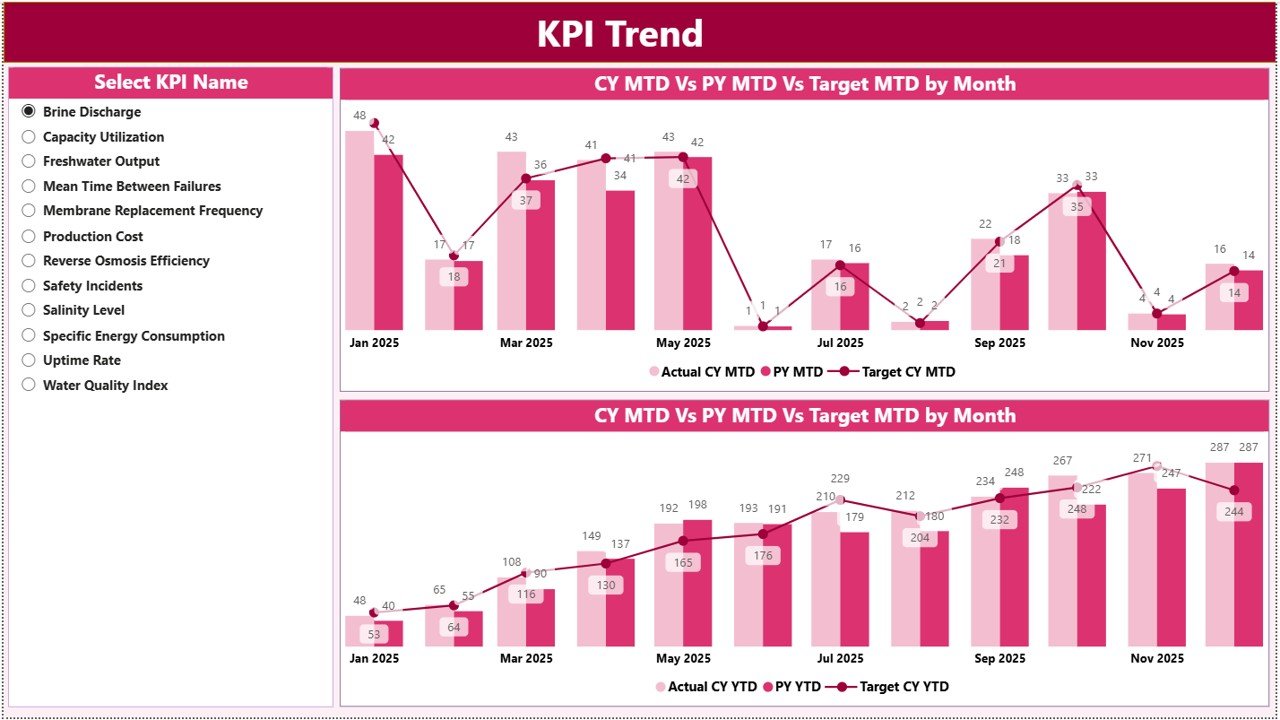
The KPI Trend Page provides trend analysis for individual KPIs.
On the left side, users can select the KPI name using a slicer.
Once a KPI is selected, the dashboard displays two combo charts.
Charts Displayed on the KPI Trend Page
-
MTD Trend Chart
-
YTD Trend Chart
Both charts show three values:
-
Current Year Actual
-
Previous Year Performance
-
Target Values
Because of these trend charts, managers can easily evaluate performance over time.
Click to Purchases Water Desalination KPI Dashboard in Power BI
3. KPI Definition Page – Understanding KPI Details
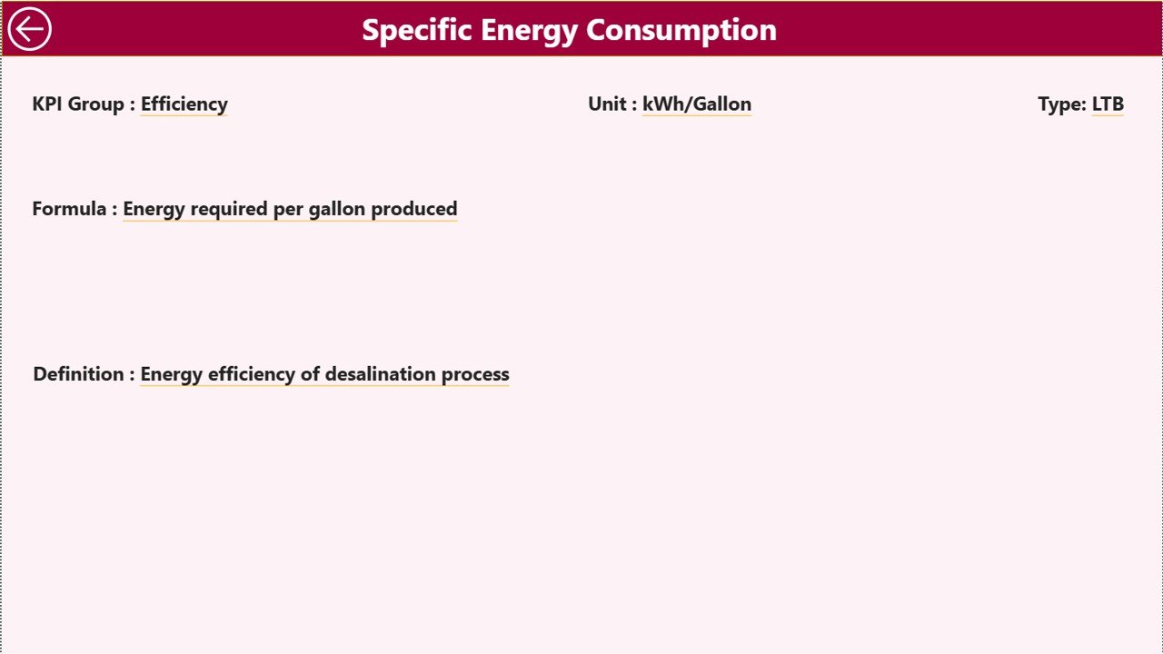
The KPI Definition Page provides detailed information about each KPI.
This page includes information such as:
-
KPI Formula
-
KPI Definition
-
KPI Group
-
Unit of Measurement
-
KPI Type (LTB or UTB)
This page works as a drill-through page, which means users can access it directly from the Summary Page.
The page remains hidden by default to keep the dashboard clean.
To return to the main dashboard, users simply click the Back Button located at the top-left corner.
Excel Data Source for the Dashboard
The Power BI dashboard uses an Excel file as the primary data source.
Users must update three worksheets in the Excel file.
1. Input_Actual Sheet
In this worksheet, users enter the actual KPI performance values.
Columns include:
-
KPI Name
-
Month (use the first date of the month)
-
MTD numbers
-
YTD numbers
2. Input_Target Sheet
This sheet contains the target KPI values.
Users must enter:
-
KPI Name
-
Month
-
MTD target values
-
YTD target values
3. KPI Definition Sheet
This sheet stores the KPI reference data.
Columns include:
-
KPI Number
-
KPI Group
-
KPI Name
-
Unit
-
Formula
-
Definition
-
KPI Type (LTB or UTB)
Advantages of the Water Desalination KPI Dashboard in Power BI
Organizations gain several advantages by using this dashboard.
Centralized KPI Monitoring
Managers can monitor all plant performance indicators in one dashboard.
Real-Time Performance Insights
Power BI provides real-time analytics and visual insights.
Target Achievement Tracking
The dashboard clearly shows which KPIs meet or miss targets.
Historical Performance Comparison
Previous year comparisons help track operational improvements.
Better Decision Making
Managers can quickly identify operational issues and take corrective action.
Interactive Data Exploration
Power BI slicers allow users to filter data by KPI group and month.
Opportunities for Improvement in Desalination KPI Analytics
Although the dashboard provides strong insights, organizations can improve analytics capabilities further.
IoT Data Integration
Desalination plants can integrate sensor data for real-time monitoring.
Predictive Maintenance
Advanced analytics can help predict equipment failures.
Energy Optimization Analytics
Energy cost analysis can help reduce operational expenses.
Click to Purchases Water Desalination KPI Dashboard in Power BI
Best Practices for Using the Water Desalination KPI Dashboard
Organizations should follow several best practices to maximize dashboard effectiveness.
Maintain Accurate Data Entry
Ensure that KPI actual and target values are entered correctly.
Update Data Monthly
Regular updates keep performance insights accurate.
Standardize KPI Definitions
Maintain consistent KPI formulas and definitions.
Monitor Underperforming KPIs
Focus on KPIs that repeatedly miss targets.
Train Team Members
Employees should understand how to use Power BI slicers and visuals.
Why Power BI is Ideal for Desalination KPI Monitoring
Power BI offers powerful analytics features that make it ideal for operational dashboards.
Key benefits include:
-
Interactive dashboards
-
Real-time data refresh
-
Advanced visual analytics
-
Easy integration with Excel data
-
Dynamic filtering and drill-through capabilities
Because of these capabilities, Power BI enables organizations to transform operational data into meaningful insights.
Conclusion
Water desalination plants play a critical role in solving global water shortages. However, plant managers must continuously monitor operational performance to ensure efficiency and sustainability.
The Water Desalination KPI Dashboard in Power BI provides a powerful solution for tracking plant KPIs, analyzing performance trends, and comparing results with targets.
By using interactive visuals, KPI comparisons, and trend analysis, this dashboard allows organizations to monitor desalination plant operations effectively.
Therefore, water utility companies, environmental agencies, and infrastructure managers should implement this Power BI KPI dashboard to improve operational efficiency and support data-driven decision-making.
Click to Purchases Water Desalination KPI Dashboard in Power BI
Frequently Asked Questions (FAQs)
What is a Water Desalination KPI Dashboard in Power BI?
It is an analytical dashboard used to track desalination plant KPIs, target performance, and operational trends using Power BI visuals.
What data source does the dashboard use?
The dashboard uses an Excel file as the primary data source.
What KPIs can be tracked in this dashboard?
Common desalination KPIs include:
-
Water production efficiency
-
Energy consumption
-
Operational cost
-
Plant utilization
-
System downtime
Can organizations customize the dashboard?
Yes. Power BI dashboards can be customized to include additional KPIs and visualizations.
Click to Purchases Water Desalination KPI Dashboard in Power BI
Visit our YouTube channel to learn step-by-step video tutorials