A Wealth Management KPI Dashboard in Power BI is a ready-to-use, interactive performance monitoring tool designed specifically for wealth managers, investment firms, private banks, and financial advisors. It helps decision-makers track critical performance indicators, compare actual results against targets, and understand trends over time—all in one centralized view.
Instead of relying on scattered Excel reports or static PDFs, this dashboard converts structured Excel data into dynamic visuals, KPI status indicators, and trend charts inside Power BI. As a result, leaders gain clarity, speed, and confidence while making strategic decisions.
Moreover, because wealth management depends heavily on metrics such as growth, efficiency, and consistency, a KPI-driven approach becomes essential. This dashboard delivers exactly that—without complexity.
Click to Purchases Wealth Management KPI Dashboard in Power BI
Why Do Wealth Management Firms Need a KPI Dashboard?
Wealth management businesses operate in a data-intensive environment. Assets under management, portfolio performance, client acquisition, advisory efficiency, and compliance KPIs must remain under constant watch.
However, manual reporting creates delays, errors, and blind spots. Therefore, firms need a real-time, structured, and visual approach.
A Wealth Management KPI Dashboard in Power BI helps firms:
-
Monitor monthly and yearly performance instantly
-
Compare targets vs actual results clearly
-
Identify underperforming KPIs early
-
Track performance against previous years
-
Align teams around measurable goals
As a result, firms improve accountability and performance simultaneously.
How Does the Wealth Management KPI Dashboard in Power BI Work?
This dashboard uses Excel as the data source and Power BI Desktop as the visualization layer. You only need to update data in Excel, and Power BI refreshes all visuals automatically.
The dashboard consists of three well-structured pages, each serving a specific purpose. Let’s explore them one by one.
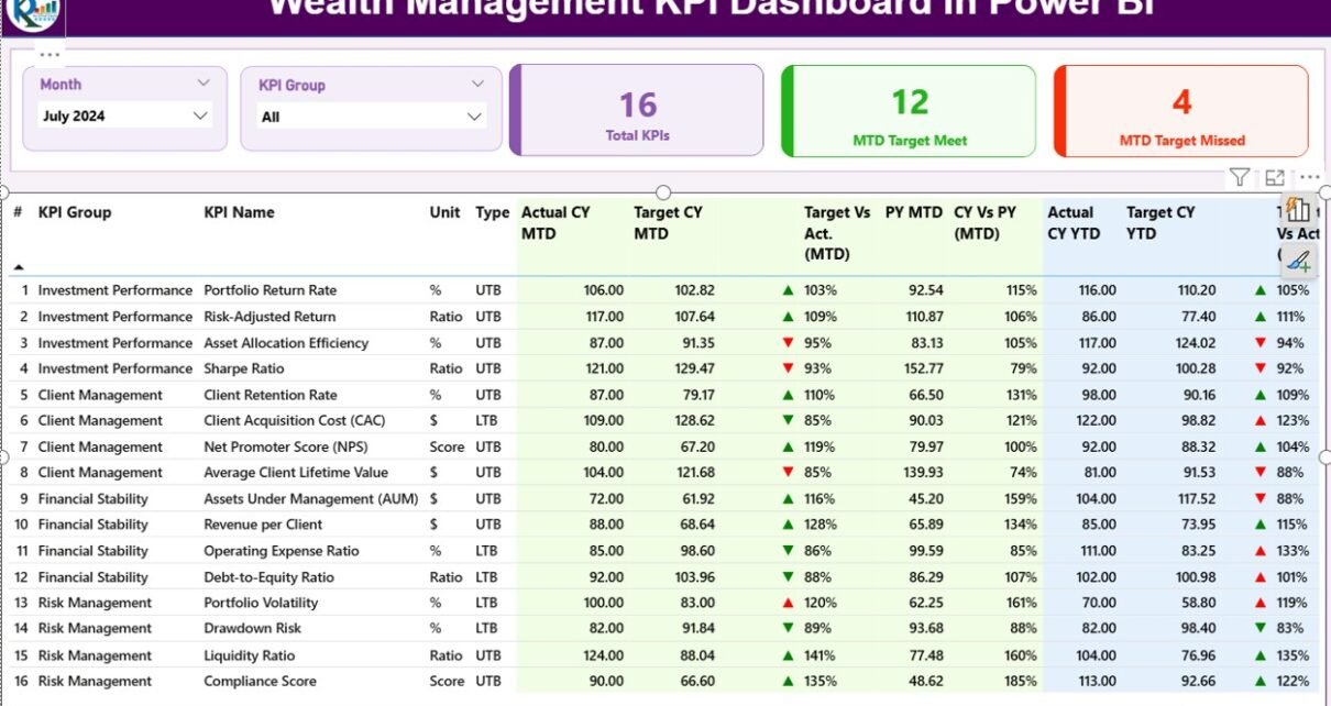
Summary Page: How Do You Monitor Overall KPI Performance?
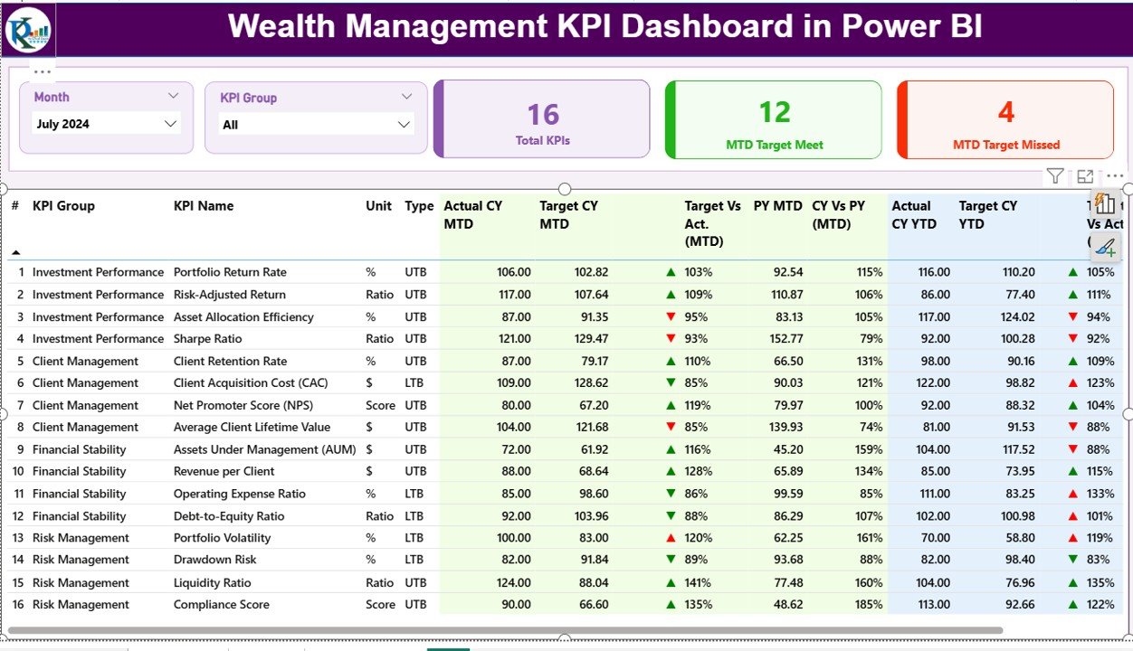
What Is the Purpose of the Summary Page?
The Summary Page acts as the control center of the Wealth Management KPI Dashboard. It provides a consolidated view of all KPIs for a selected month.
What Filters Are Available on the Summary Page?
At the top of the page, you can find:
-
Month slicer – to select the reporting month
-
KPI Group slicer – to filter KPIs by category
Because of these slicers, users can analyze performance dynamically without creating new reports.
Which KPI Cards Are Displayed?
This page displays three high-level KPI cards:
-
Total KPIs Count
-
MTD Target Met Count
-
MTD Target Missed Count
These cards immediately highlight how well the organization performs during the selected month.
What Does the KPI Detail Table Show?
Below the cards, the dashboard displays a detailed KPI performance table. This table includes the following fields:
Core KPI Information
-
KPI Number – Sequential identifier for each KPI
-
KPI Group – Category or functional group of the KPI
-
KPI Name – Name of the performance metric
-
Unit – Measurement unit (%, USD, count, etc.)
-
Type – UTB (Upper the Better) or LTB (Lower the Better)
MTD Performance Metrics
-
Actual CY MTD – Current year actual MTD value
-
Target CY MTD – Target value for current year MTD
-
MTD Icon – ▲ or ▼ indicator with green/red color
-
Target vs Actual (MTD) – Actual ÷ Target (%)
-
PY MTD – Previous year MTD value
-
CY vs PY (MTD) – CY MTD ÷ PY MTD (%)
YTD Performance Metrics
-
Actual CY YTD – Current year actual YTD value
-
Target CY YTD – Target YTD value
-
YTD Icon – Status indicator for YTD performance
-
Target vs Actual (YTD) – Actual ÷ Target (%)
-
PY YTD – Previous year YTD value
-
CY vs PY (YTD) – CY YTD ÷ PY YTD (%)
Thanks to conditional formatting, users can instantly identify strong and weak KPIs.
Click to Purchases Wealth Management KPI Dashboard in Power BI
KPI Trend Page: How Do You Analyze KPI Trends Over Time?
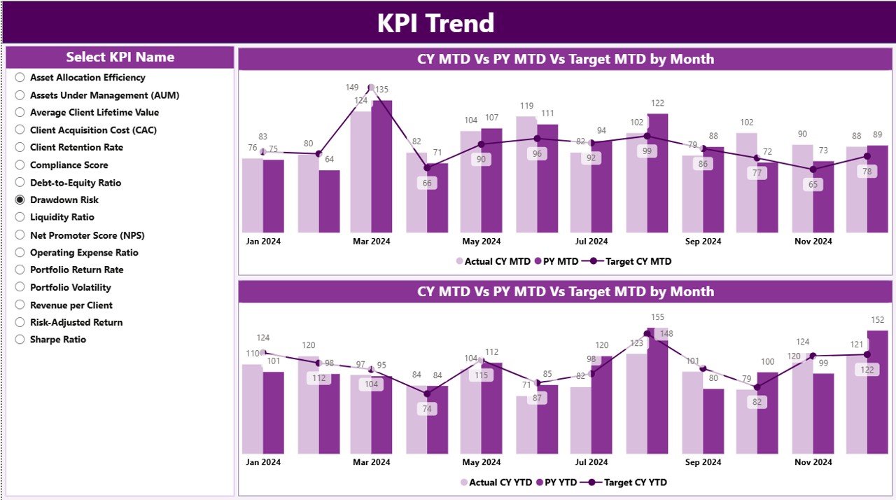
Why Is the KPI Trend Page Important?
While the summary page shows where you stand today, the KPI Trend Page explains how you got there. Trends provide context, direction, and insight.
What Type of Visuals Are Used?
This page includes two combo charts:
-
MTD Trend Chart – Actual CY vs PY vs Target
-
YTD Trend Chart – Actual CY vs PY vs Target
Because combo charts combine bars and lines, users can compare performance levels and trends at the same time.
How Do You Filter KPIs on This Page?
On the left side of the page, a KPI Name slicer allows users to select one KPI at a time. As soon as you select a KPI, both MTD and YTD charts update instantly.
Therefore, users can zoom into any KPI without switching reports.
KPI Definition Page: Why Is KPI Transparency Important?
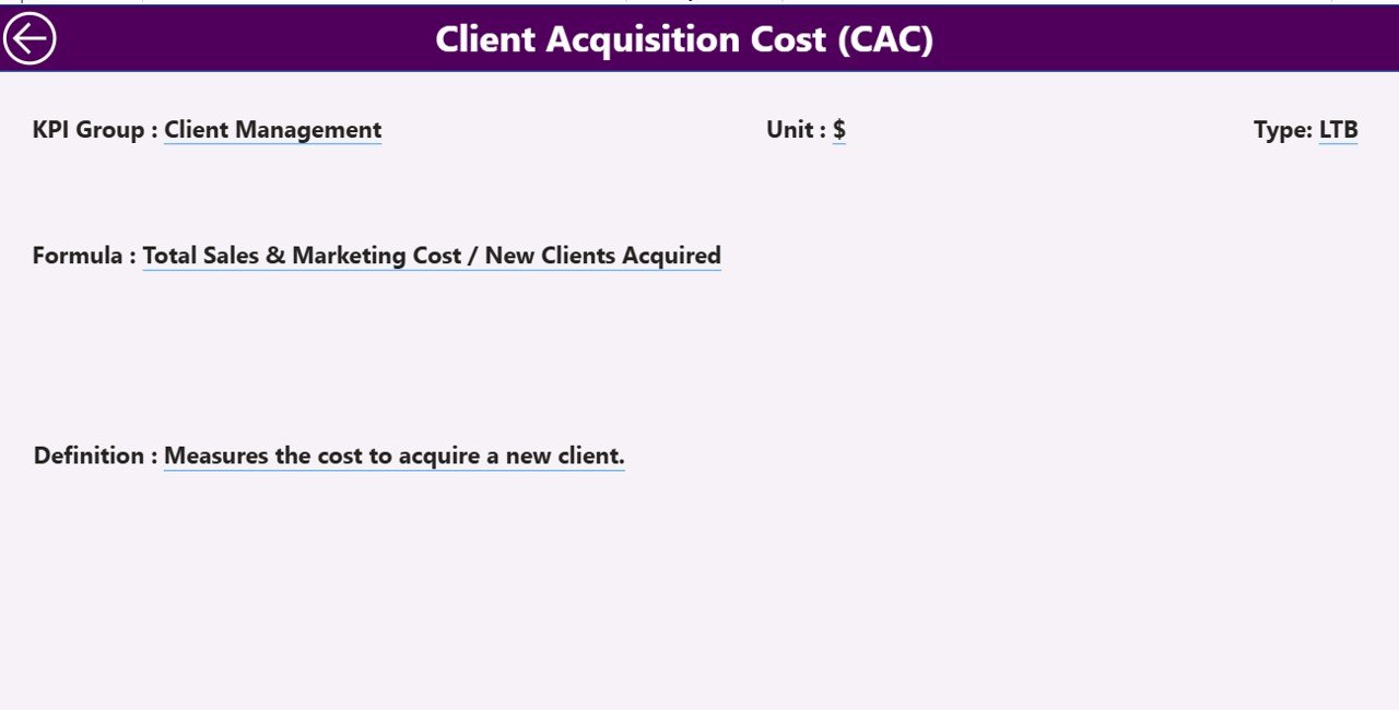
What Is the KPI Definition Page?
The KPI Definition Page is a hidden drill-through page designed for clarity and documentation. It helps users understand what each KPI means and how it is calculated.
What Information Does This Page Show?
This page displays:
-
KPI Number
-
KPI Group
-
KPI Name
-
Unit
-
Formula
-
KPI Definition
-
KPI Type (LTB or UTB)
Users can drill through from the summary page into this definition page.
How Do Users Navigate Back?
A Back button at the top-left corner allows users to return easily to the summary page. This improves usability and user experience.
Excel Data Structure: How Is the Data Captured?
The dashboard uses a structured Excel file as the data source. You only need to update three worksheets.
Input_Actual Sheet: How Do You Enter Actual Data?
In the Input_Actual sheet, users enter:
-
KPI Name
-
Month (use the first date of the month)
-
MTD Actual Value
-
YTD Actual Value
This structure ensures accurate time-based analysis.
Input_Target Sheet: How Do You Enter Target Data?
In the Input_Target sheet, users enter:
-
KPI Name
-
Month (first date of the month)
-
MTD Target Value
-
YTD Target Value
Because targets remain separate, performance comparison becomes clean and flexible.
KPI Definition Sheet: How Do You Maintain KPI Consistency?
The KPI Definition sheet contains master KPI information such as:
-
KPI Number
-
KPI Group
-
KPI Name
-
Unit
-
Formula
-
Definition
-
KPI Type (LTB or UTB)
This sheet ensures consistency, governance, and transparency across the dashboard.
Advantages of Wealth Management KPI Dashboard in Power BI
A well-designed KPI dashboard delivers powerful benefits. Here are the key advantages:
-
✅ Centralized performance monitoring
-
✅ Faster decision-making through visuals
-
✅ Clear target vs actual comparison
-
✅ MTD and YTD performance visibility
-
✅ Previous year comparison for benchmarking
-
✅ Reduced manual reporting effort
-
✅ Better stakeholder communication
-
✅ Strong KPI governance and transparency
As a result, wealth management teams operate more efficiently and strategically.
How Does This Dashboard Improve Business Decisions?
Because the dashboard shows real-time performance status, leaders can:
-
Act quickly on underperforming KPIs
-
Reallocate resources effectively
-
Set realistic future targets
-
Improve client service quality
-
Strengthen long-term planning
Therefore, the dashboard does not just report—it drives action.
Best Practices for the Wealth Management KPI Dashboard in Power BI
Click to Purchases Wealth Management KPI Dashboard in Power BI
To maximize value, follow these best practices:
-
✅ Define clear KPIs with measurable outcomes
-
✅ Maintain accurate and timely Excel data updates
-
✅ Use consistent KPI naming conventions
-
✅ Review KPI definitions regularly
-
✅ Align KPI groups with business functions
-
✅ Validate target values before publishing
-
✅ Train users on slicers and drill-through features
-
✅ Keep visuals simple and focused
When you follow these practices, the dashboard remains reliable and scalable.
Who Can Use This Dashboard Effectively?
This dashboard suits a wide range of roles:
-
Wealth Managers
-
Portfolio Managers
-
Investment Analysts
-
Relationship Managers
-
Finance Leaders
-
Senior Management
-
Strategy Teams
Because of its simplicity, even non-technical users can use it confidently.
Can This Dashboard Scale with Business Growth?
Yes, it can.
Because the structure separates input data, definitions, and visuals, users can:
-
Add new KPIs easily
-
Extend historical data over years
-
Modify targets without redesigning visuals
-
Customize KPI groups for new business lines
Therefore, the dashboard grows with your organization.
Conclusion: Why Should You Use a Wealth Management KPI Dashboard in Power BI?
The Wealth Management KPI Dashboard in Power BI transforms raw performance data into meaningful insights. It replaces static reports with dynamic visuals, empowers teams with real-time clarity, and aligns strategy with measurable execution.
By combining Excel-based data entry with Power BI visualization, this solution delivers flexibility, simplicity, and power—all in one system.
If you want better visibility, faster decisions, and stronger KPI control, this dashboard becomes an essential tool for your wealth management operations.
Frequently Asked Questions (FAQs)
What is a Wealth Management KPI Dashboard in Power BI?
A Wealth Management KPI Dashboard in Power BI is an interactive reporting solution that tracks performance metrics using Excel data and visualizes them in Power BI.
Do I need Power BI Service to use this dashboard?
No. You can use the dashboard in Power BI Desktop. However, you can publish it to Power BI Service if needed.
Can I customize KPIs and targets?
Yes. You can modify KPIs, targets, and definitions directly in the Excel file without changing the Power BI report.
Does this dashboard support MTD and YTD analysis?
Yes. The dashboard supports both Month-to-Date (MTD) and Year-to-Date (YTD) analysis along with previous year comparisons.
Is this dashboard suitable for non-technical users?
Absolutely. The interface uses slicers, tables, and clear visuals, making it easy for business users.
Can I add more KPIs later?
Yes. The design supports scalable KPI additions.
Visit our YouTube channel to learn step-by-step video tutorials