Wealth management works best when you track your investments with clarity and confidence. Investors need fast access to portfolio performance, ROI, risk exposure, growth trends, and satisfaction ratings. However, when data sits in spreadsheets and multiple financial tools, reviewing performance becomes difficult and time-consuming.
A Wealth Tech Dashboard in Power BI solves this problem with a clean, interactive, and smart analytics system. It combines all investment KPIs into one dashboard and helps you make informed decisions. Since Power BI supports dynamic slicers, charts, and drill-down insights, you can explore your investment performance from every angle with just a few clicks.
In this detailed article, you will learn everything about the Wealth Tech Dashboard—how it works, its structure, its benefits, best practices, and answers to common questions. You will also see how each page delivers powerful financial insights with simple visuals.
Click to Purchases Wealth Tech Dashboard in Power BI
What Is a Wealth Tech Dashboard in Power BI?
A Wealth Tech Dashboard in Power BI is an advanced reporting tool that helps investors and wealth managers track financial KPIs in a visually rich format. It shows investment amount, current value, portfolio growth, ROI, risk distribution, satisfaction rating, trends, and performance by region, channel, and product category.
Because the dashboard uses slicers and connected visuals, you get a real-time understanding of investment health. This makes portfolio reviews clearer, faster, and smarter.
The dashboard includes five core pages:
-
Overview Page
-
Investment Channel Analysis
-
Product Category Analysis
-
Region Analysis
-
Monthly Trends
Each page offers a complete analytical view and helps you compare multiple financial dimensions.
Why Do Investors Need a Wealth Tech Dashboard?
Wealth management involves multiple activities:
-
Tracking investment returns
-
Monitoring portfolio risk
-
Measuring customer satisfaction
-
Comparing regional performance
-
Understanding product category movements
-
Studying monthly ROI trends
-
Reviewing investment channels
-
Evaluating portfolio growth
Because all these metrics matter, investors need a tool that brings everything together. A Power BI Wealth Tech Dashboard provides:
-
Fast insights
-
Better clarity
-
Real-time comparisons
-
Accuracy with no manual work
-
Professional visual analytics
-
One dashboard for all investment KPIs
This makes investment review easier for wealth managers, analysts, customers, and decision makers.
Complete Structure of the Wealth Tech Dashboard
The Wealth Tech Dashboard includes five structured pages, each designed to provide deep insights.
Click to Purchases Wealth Tech Dashboard in Power BI
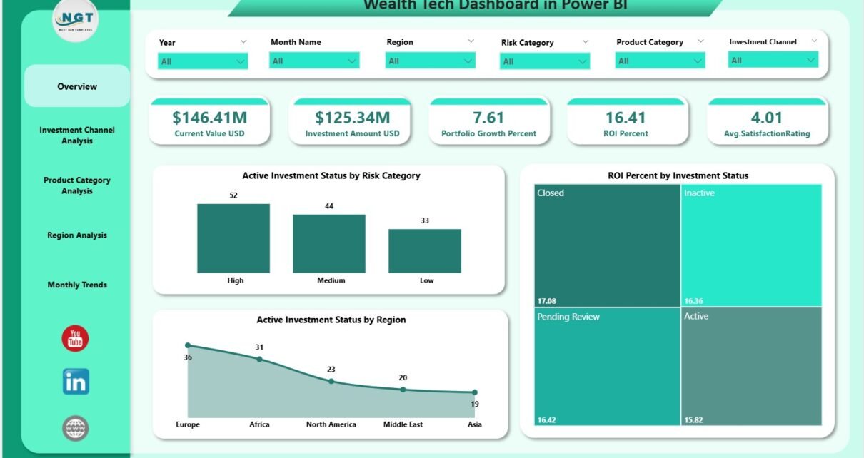
1. Overview Page – Your Complete Portfolio Snapshot
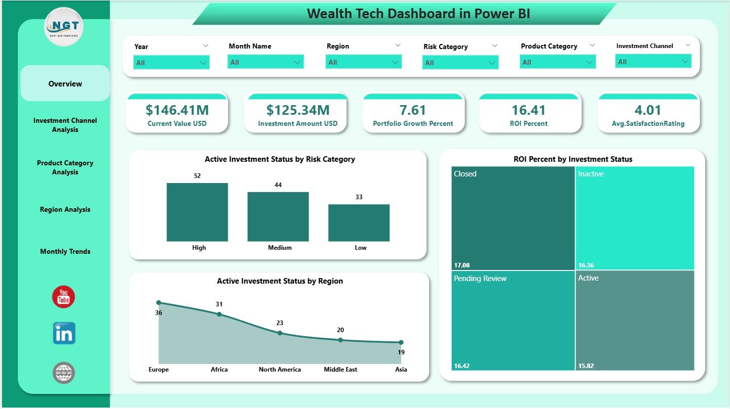
The Overview Page serves as the main financial performance screen. It includes slicers for filtering the data, along with five important KPI cards:
✔ Current Value (USD)
Shows how much your investments are worth today.
✔ Investment Amount (USD)
Shows the total amount invested.
✔ Portfolio Growth (%)
Tracks how much your portfolio has grown over time.
✔ ROI (%)
Shows your return on investment clearly.
✔ Average Satisfaction Rating
Measures customer satisfaction with the overall wealth management service.
These cards help you check your portfolio performance instantly.
Charts on the Overview Page
The page includes three analytical charts:
1. Active Investment Status by Risk Category
Shows how investment distribution looks across Low, Medium, and High risk levels.
2. ROI Percentage by Investment Status
Helps you understand how active, closed, or pending investments perform in terms of ROI.
3. Active Investment Status by Region
Shows how different regions contribute to active investments.
These visuals help investors detect risk exposure, ROI differences, and regional strengths quickly.
Click to Purchases Wealth Tech Dashboard in Power BI
2. Investment Channel Analysis – Understand Where Investments Come From

This page explains how each investment channel performs. Channels may include:
-
Online platforms
-
Advisors
-
Mobile apps
-
Branch banking
-
Third-party portals
The page includes slicers along with three key charts:
✔ Investment Amount (USD) by Investment Channel
Shows how much each channel contributes to your total investment.
✔ High Risk Category (%) by Investment Channel
Helps you understand risk concentration across channels.
✔ Current Value (USD) by Investment Channel
Shows how the value of investments grows through each channel.
This page helps wealth managers and financial advisors identify strong and weak channels.
3. Product Category Analysis – Track Product-Level Performance

Investors often use multiple products such as:
-
Mutual funds
-
Bonds
-
ETFs
-
Insurance
-
Retirement products
-
Digital investment products
This page shows KPI insights for each product category.
Charts in This Page:
-
Current Value (USD) by Product Category
Shows how much value each product category holds. -
Portfolio Growth (%) by Product Category
Helps you see which categories perform best. -
Investment Amount (USD) by Product Category
Shows how much you invested in each category.
This page helps you identify profitable products and balance your investment portfolio.
Click to Purchases Wealth Tech Dashboard in Power BI
4. Region Analysis – Compare Performance Across Geographies

Different regions show different investment patterns, customer engagement, and portfolio returns. This page shows you all regional insights with slicers and charts.
Charts in This Page:
1. Current Value (USD) by Region
Shows which region holds the highest investment value.
2. Average Satisfaction Rating by Region
Reveals how customers feel about their investments in each location.
3. ROI (%) by Region
Shows which region yields the highest return.
This helps wealth advisors and businesses grow their regional strategies easily.
5. Monthly Trends – Understand Your Investment Journey
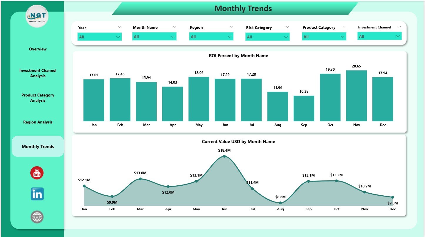
The Monthly Trends page reveals how your portfolio moves over time.
Charts in This Page:
✔ ROI (%) by Month Name
Shows how your ROI changes from month to month.
✔ Current Value (USD) by Month Name
Shows how your investment value moves throughout the year.
Trend charts help investors:
-
Identify growth patterns
-
Spot low-performance months
-
Improve long-term financial planning
This page is useful during quarterly or yearly review meetings.
Click to Purchases Wealth Tech Dashboard in Power BI
Key Benefits of Using a Wealth Tech Dashboard in Power BI
The dashboard brings several strong advantages:
1. Clear and Fast Performance Insights
You see every important financial KPI at one glance.
2. Better Decision-Making
Real-time insights help you take smart investment decisions confidently.
3. Complete Portfolio Monitoring
You can track investment amount, growth, ROI, satisfaction, risk, and trends.
4. Easy to Understand Visuals
Charts, cards, and slicers make insights clear for investors at every level.
5. Multi-Dimensional Analysis
You can view performance by:
-
Region
-
Channel
-
Product category
-
Month
-
Risk
-
Investment status
6. Accurate and Automated Reporting
Remove manual work and avoid calculation errors.
7. Helps in Portfolio Optimization
You can identify:
-
Best performing regions
-
High-performing product categories
-
Strong investment channels
-
Risk-heavy areas
This helps investors adjust their strategy easily.
Best Practices for Using a Wealth Tech Dashboard
You can get maximum value by following these best practices:
1. Refresh the Dashboard Regularly
Ensure your investment data stays updated.
2. Enter Accurate Values
Correct investment numbers ensure reliable insights.
3. Use Slicers During Review Meetings
Slicers help you filter the dashboard and present insights clearly.
4. Analyze Trends Before Taking Decisions
Monthly trend charts reveal deeper insights that you should review first.
5. Compare Channels and Regions Frequently
This helps identify new investment opportunities.
6. Track Customer Satisfaction
Always monitor satisfaction ratings to improve investor experience.
7. Review Risk Exposure
High-risk categories need attention for better portfolio balance.
Conclusion
A Wealth Tech Dashboard in Power BI gives investors and wealth managers a powerful way to visualize portfolio performance. It brings all metrics—investment amount, growth, ROI, risk, satisfaction, and trends—into one interactive dashboard. With multiple pages that present region-wise, channel-wise, and product-wise insights, you get complete visibility into your investments.
The dashboard offers the perfect combination of simplicity, clarity, and smart analytics. Whether you manage personal investments or run a wealth advisory business, this Power BI dashboard helps you make better and faster financial decisions.
Click to Purchases Wealth Tech Dashboard in Power BI
Frequently Asked Questions (FAQs)
1. What is a Wealth Tech Dashboard in Power BI?
It is an analytics tool that tracks investment KPIs such as ROI, growth, satisfaction, and risk.
2. Who can use this dashboard?
Investors, wealth managers, financial advisors, banks, and investment firms can use it.
3. How many pages does this dashboard have?
It includes 5 pages: Overview, Investment Channel Analysis, Product Category Analysis, Region Analysis, and Monthly Trends.
4. Can I use this dashboard for multiple portfolios?
Yes, you can modify data sources to track multiple portfolios.
5. Does this dashboard show monthly trends?
Yes, it includes ROI and Current Value charts for each month.
6. Do I need advanced Power BI skills to use it?
No, basic Power BI skills are enough to operate the dashboard.
7. Can I customize this dashboard?
Yes, you can add more KPIs and charts based on your requirements.
8. Does the dashboard support region and channel analysis?
Yes, both are included with detailed charts.
Click to Purchases Wealth Tech Dashboard in Power BI
Visit our YouTube channel to learn step-by-step video tutorials