Web development teams work in a fast-moving and competitive environment. Every sprint, deployment, and release demands speed, quality, and accountability. However, when teams track performance using scattered Excel files or manual status updates, they lose clarity and control. Therefore, organizations increasingly rely on a Web Development KPI Dashboard in Power BI to measure results, identify gaps, and improve outcomes.
In this detailed guide, you will learn what a Web Development KPI Dashboard in Power BI is, why it matters, how it works, page-wise dashboard structure, key KPIs, advantages, best practices, and frequently asked questions. Moreover, this article uses clear language, smooth transitions, and practical explanations so both technical and non-technical readers can benefit.
Click to Purchases Web Development KPI Dashboard in Power BI
What Is a Web Development KPI Dashboard in Power BI?
A Web Development KPI Dashboard in Power BI is a ready-to-use, interactive performance monitoring solution that tracks and visualizes key performance indicators related to web development activities.
Instead of reviewing multiple reports for delivery timelines, bug fixes, quality metrics, and productivity, this dashboard consolidates all critical KPIs into one unified view. As a result, development managers, project leads, and stakeholders gain instant visibility into performance.
Because the dashboard runs on Microsoft Power BI, users benefit from interactive visuals, slicers, drill-through functionality, and automated calculations. Additionally, the dashboard uses Excel as a data source, which makes data entry simple and flexible.
Why Do Web Development Teams Need a KPI Dashboard?
Web development projects involve many moving parts. Developers handle multiple tasks, timelines shift, and quality expectations remain high. Therefore, teams must track performance accurately and consistently.
A Web Development KPI Dashboard in Power BI helps because it:
-
Centralizes performance data in one place
-
Tracks progress against targets in real time
-
Highlights underperforming KPIs instantly
-
Improves accountability across teams
-
Supports data-driven decision-making
Moreover, when teams visualize KPIs monthly and year-to-date, they spot trends early and take corrective actions faster.
How Does a Web Development KPI Dashboard in Power BI Work?
The dashboard works through a simple yet powerful data flow:
-
Data Entry in Excel
Users enter actual values, targets, and KPI definitions in structured Excel sheets. -
Data Modeling in Power BI
Power BI connects to Excel and applies relationships, measures, and calculations. -
Interactive Visualization
The dashboard displays KPIs using tables, cards, icons, and combo charts. -
Analysis and Decision-Making
Managers use slicers, filters, and drill-through options to analyze performance deeply.
Because this process remains straightforward, even non-technical users can maintain and use the dashboard effectively.
What Are the Key Pages in a Web Development KPI Dashboard in Power BI?
This ready-to-use dashboard includes three well-structured pages, each designed for a specific analytical purpose.
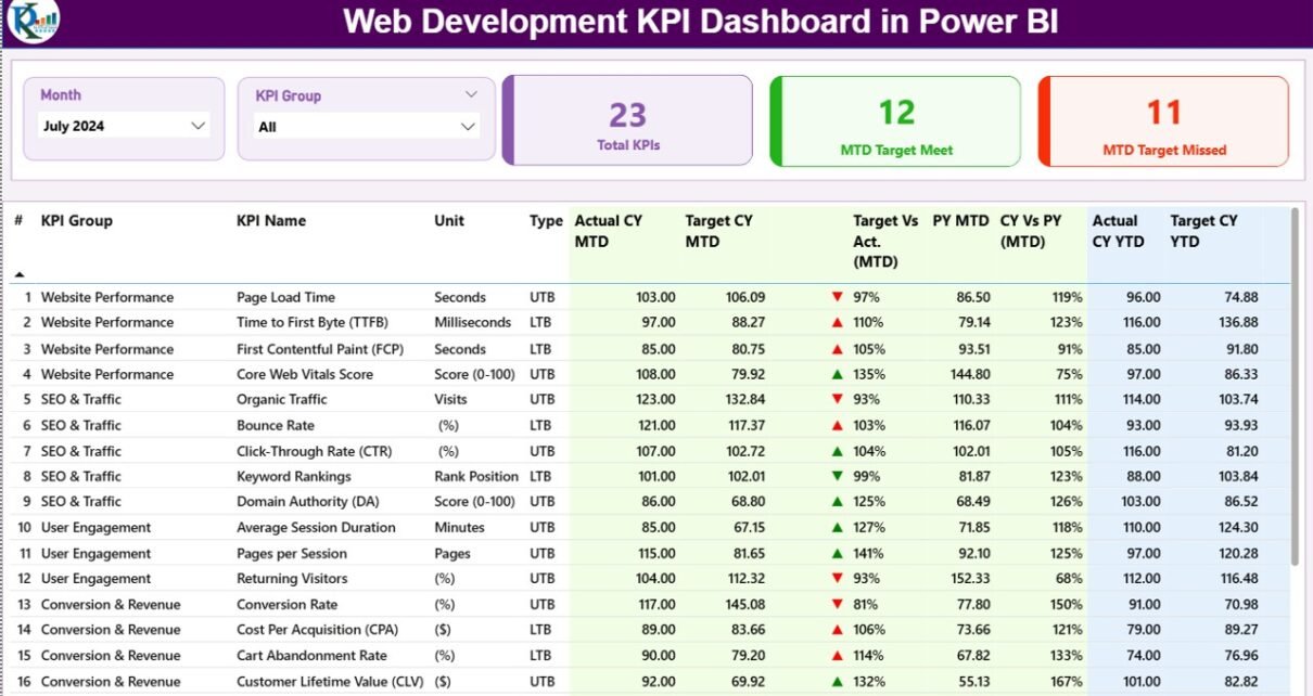
What Is Shown on the Summary Page?

The Summary Page acts as the control center of the dashboard. It provides a high-level overview of all KPIs at once.
Top-Level Controls
At the top of the page, you will find:
-
Month Slicer – Select any month to view MTD and YTD performance
-
KPI Group Slicer – Filter KPIs by category such as Development, Quality, Performance, or Delivery
KPI Summary Cards
Just below the slicers, three key cards display:
-
Total KPIs Count
-
MTD Target Met Count
-
MTD Target Missed Count
These cards instantly show overall performance status.
Detailed KPI Table
Click to Purchases Web Development KPI Dashboard in Power BI
The detailed table presents each KPI with complete performance metrics:
-
KPI Number – Sequence number of the KPI
-
KPI Group – Category of the KPI
-
KPI Name – Name of the performance metric
-
Unit – Measurement unit (%, hours, count, etc.)
-
Type – UTB (Upper the Better) or LTB (Lower the Better)
MTD Metrics Explained
-
Actual CY MTD – Current year month-to-date actual value
-
Target CY MTD – Current year month-to-date target value
-
MTD Icon – ▲ or ▼ icon in green or red to show performance status
-
Target vs Actual (MTD) – Actual ÷ Target (percentage)
-
PY MTD – Previous year MTD value
-
CY vs PY (MTD) – Current MTD ÷ Previous year MTD
YTD Metrics Explained
-
Actual CY YTD – Current year year-to-date actual
-
Target CY YTD – Current year year-to-date target
-
YTD Icon – ▲ or ▼ icon for YTD performance
-
Target vs Actual (YTD) – Actual ÷ Target
-
PY YTD – Previous year YTD value
-
CY vs PY (YTD) – Current YTD ÷ Previous year YTD
Because the table includes icons and percentages, users immediately understand performance without deep analysis.
What Is the KPI Trend Page Used For?
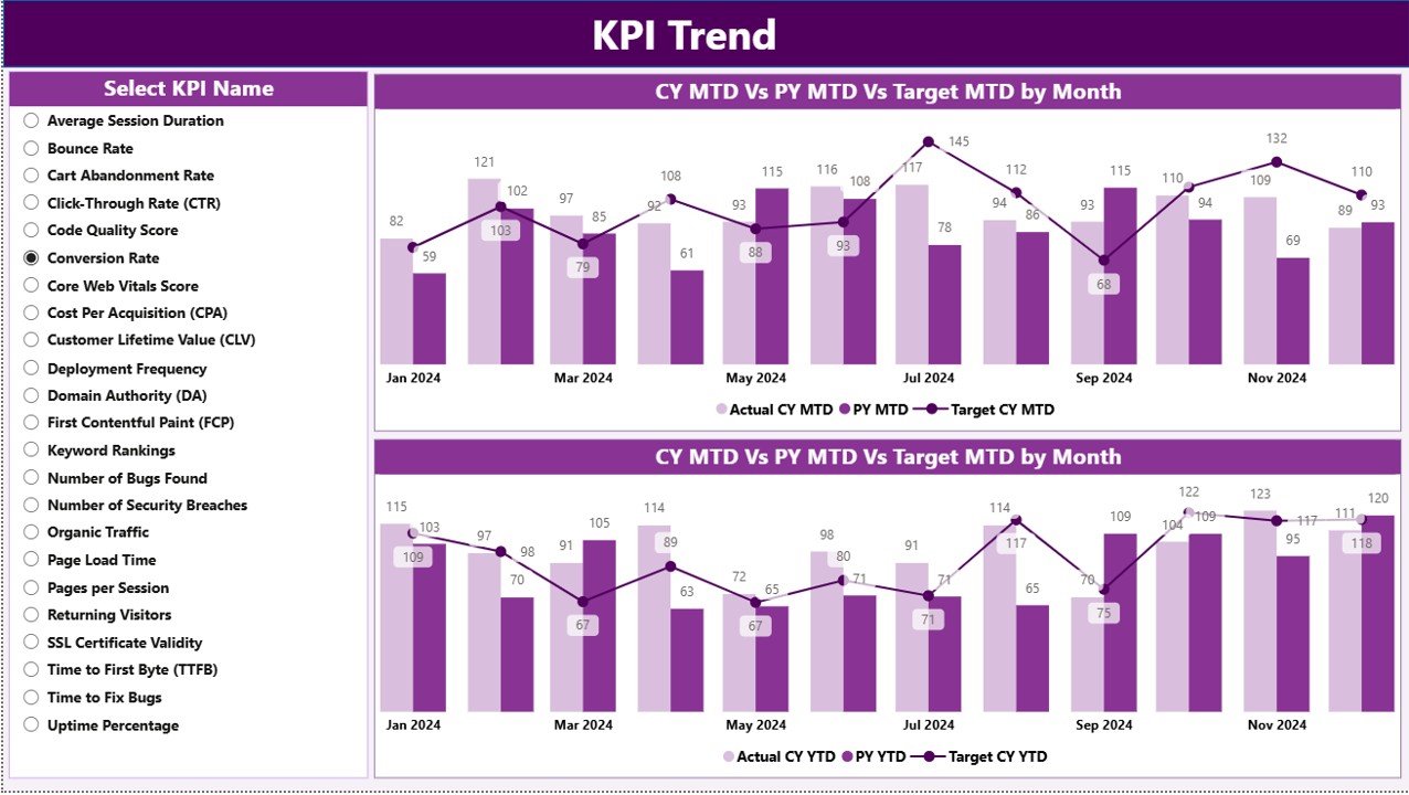
The KPI Trend Page focuses on time-based analysis. It helps users understand how KPIs evolve over months.
Key Features of the KPI Trend Page
-
KPI Name Slicer on the left side
-
Two Combo Charts:
-
MTD Actual vs Target vs Previous Year
-
YTD Actual vs Target vs Previous Year
-
These charts allow users to compare current performance against targets and historical benchmarks. Therefore, teams quickly identify improvement or decline trends.
What Is the KPI Definition Page?

The KPI Definition Page acts as a detailed reference section.
Why Is This Page Important?
-
Explains the formula for each KPI
-
Describes the business meaning of the KPI
-
Clarifies whether the KPI is UTB or LTB
This page remains hidden and works as a drill-through page. Users access it directly from the Summary Page. Moreover, a back button helps users return easily.
How Is the Excel Data Structured for This Dashboard?
Click to Purchases Web Development KPI Dashboard in Power BI
The dashboard uses an Excel file as its data source. This design keeps data entry simple and controlled.
What Is Stored in the Input_Actual Sheet?
In the Input_Actual sheet, users enter:
-
KPI Name
-
Month (first date of the month)
-
MTD Actual Value
-
YTD Actual Value
This sheet captures real performance data.
What Is Stored in the Input_Target Sheet?
In the Input_Target sheet, users enter:
-
KPI Name
-
Month (first date of the month)
-
MTD Target Value
-
YTD Target Value
This sheet defines performance expectations.
What Is Stored in the KPI Definition Sheet?
The KPI Definition sheet stores master data:
-
KPI Number
-
KPI Group
-
KPI Name
-
Unit
-
Formula
-
Definition
-
Type (UTB or LTB)
Because this sheet standardizes KPIs, it ensures consistency across reports.
What Are Common KPIs Tracked in a Web Development Dashboard?
Typical web development KPIs include:
-
Sprint Velocity
-
On-Time Delivery Rate
-
Bug Fix Rate
-
Code Review Completion Time
-
Page Load Time
-
Deployment Frequency
-
Defect Density
-
Rework Percentage
However, teams can easily customize KPIs based on project goals.
Advantages of a Web Development KPI Dashboard in Power BI
A Web Development KPI Dashboard delivers several clear advantages:
-
✅ Centralized performance tracking
-
✅ Real-time MTD and YTD analysis
-
✅ Visual status indicators for quick decisions
-
✅ Improved accountability across teams
-
✅ Easy Excel-based data management
-
✅ Drill-through capability for deeper insights
-
✅ Scalability for multiple projects and teams
Because of these benefits, organizations improve delivery speed and quality simultaneously.
Best Practices for the Web Development KPI Dashboard in Power BI
To maximize value, follow these best practices:
Keep KPIs Relevant
Track only meaningful KPIs aligned with business goals.
Maintain Clean Excel Data
Use consistent KPI names and proper date formats.
Review KPIs Monthly
Monthly reviews help catch issues early.
Use UTB and LTB Correctly
Define KPI direction clearly to avoid misinterpretation.
Train Users
Educate users on slicers, drill-throughs, and icons.
Update Targets Regularly
Adjust targets as project complexity changes.
How Does This Dashboard Support Better Decision-Making?
Because the dashboard combines actuals, targets, and historical data, managers make informed decisions quickly. They no longer rely on assumptions. Instead, they use real numbers, trends, and comparisons.
As a result, teams prioritize tasks better, allocate resources efficiently, and improve delivery outcomes.
Conclusion
A Web Development KPI Dashboard in Power BI transforms how teams track, analyze, and improve performance. By combining Excel-based data input with interactive Power BI visuals, this dashboard delivers clarity, control, and confidence.
Moreover, the structured pages, KPI definitions, and trend analysis ensure that every stakeholder understands performance metrics clearly. Therefore, organizations that adopt this dashboard gain a strong competitive advantage in project delivery and quality management.
Frequently Asked Questions (FAQs)
What is a Web Development KPI Dashboard in Power BI?
It is an interactive reporting tool that tracks web development performance using KPIs in Power BI.
Can non-technical users use this dashboard?
Yes, because the data entry happens in Excel and visuals are intuitive.
Can I add new KPIs?
Yes, you can easily add new KPIs through the KPI Definition sheet.
Does this dashboard support monthly and yearly analysis?
Yes, it supports both MTD and YTD performance tracking.
Is this dashboard customizable?
Yes, you can customize KPIs, targets, visuals, and slicers.
Why use Power BI instead of Excel only?
Power BI provides better visuals, interactivity, and scalability than Excel alone.
Visit our YouTube channel to learn step-by-step video tutorials