Introduction
The Women in Tech Communities Dashboard in Power BI is a powerful, ready-to-use solution designed to help organizations and communities better understand, visualize, and promote women’s participation in technology fields. This intuitive dashboard allows you to effortlessly update your data through the Excel Data sheet and refresh the visuals with a simple click, ensuring accurate and up-to-date insights.

Click to Purchases Women in Tech Communities Dashboard in Power BI
Key Features of Women in Tech Communities Dashboard in Power BI
- Easy Data Integration: Update your data in the Excel Data sheet and refresh the dashboard instantly.
- Interactive Visuals: Engaging charts and graphs that highlight key metrics about women in tech communities.
- Comprehensive Metrics: Track participation, growth, event attendance, job roles, and diversity statistics.
- Customizable Pages: Multiple dashboard pages focusing on distinct aspects of women’s involvement in technology.
- Trend Analysis: Visualize the progress and changes over time to understand long-term impacts.
- User-Friendly Interface: Designed for both technical and non-technical users to navigate with ease.
- Data Refresh Capability: Simply refresh from the Excel Ribbon’s Data tab to update visuals without hassle.
Dashboard Pages Explanation
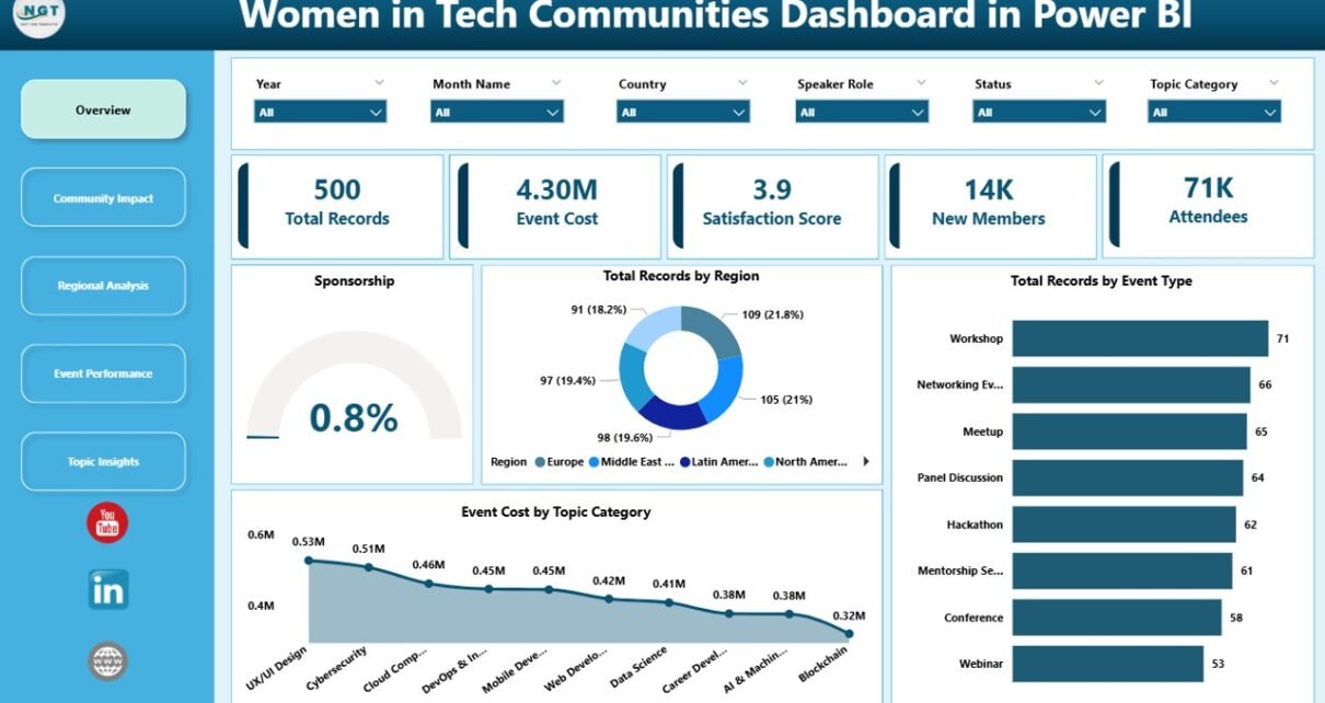
1. Overview Page
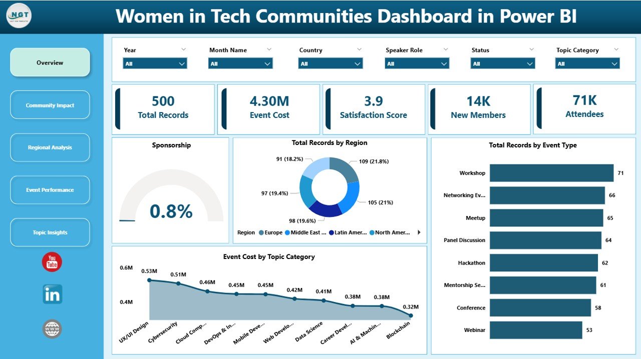
This page offers a snapshot of the overall participation of women in various tech communities, including total members, growth rate, and demographic distribution.
Click to Purchases Women in Tech Communities Dashboard in Power BI
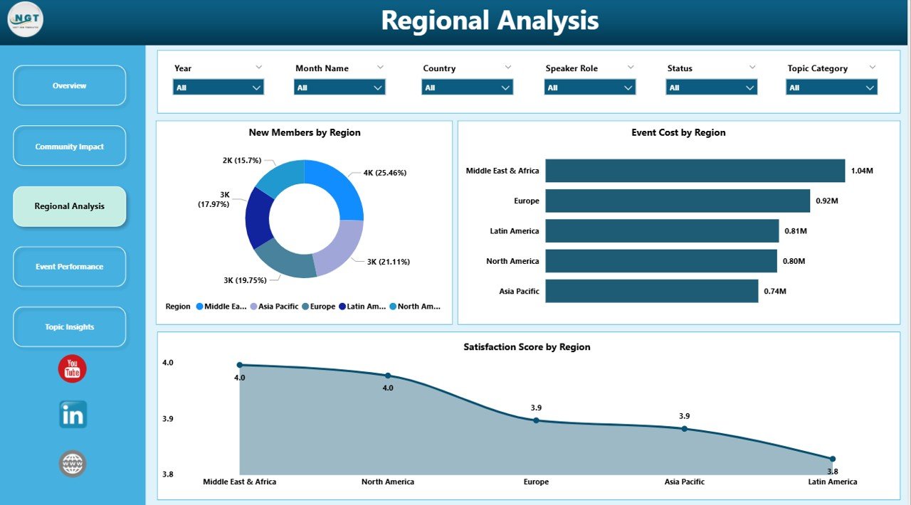
2. Participation Metrics
Analyze detailed statistics such as event attendance, active contributors, and membership trends categorized by role and region.
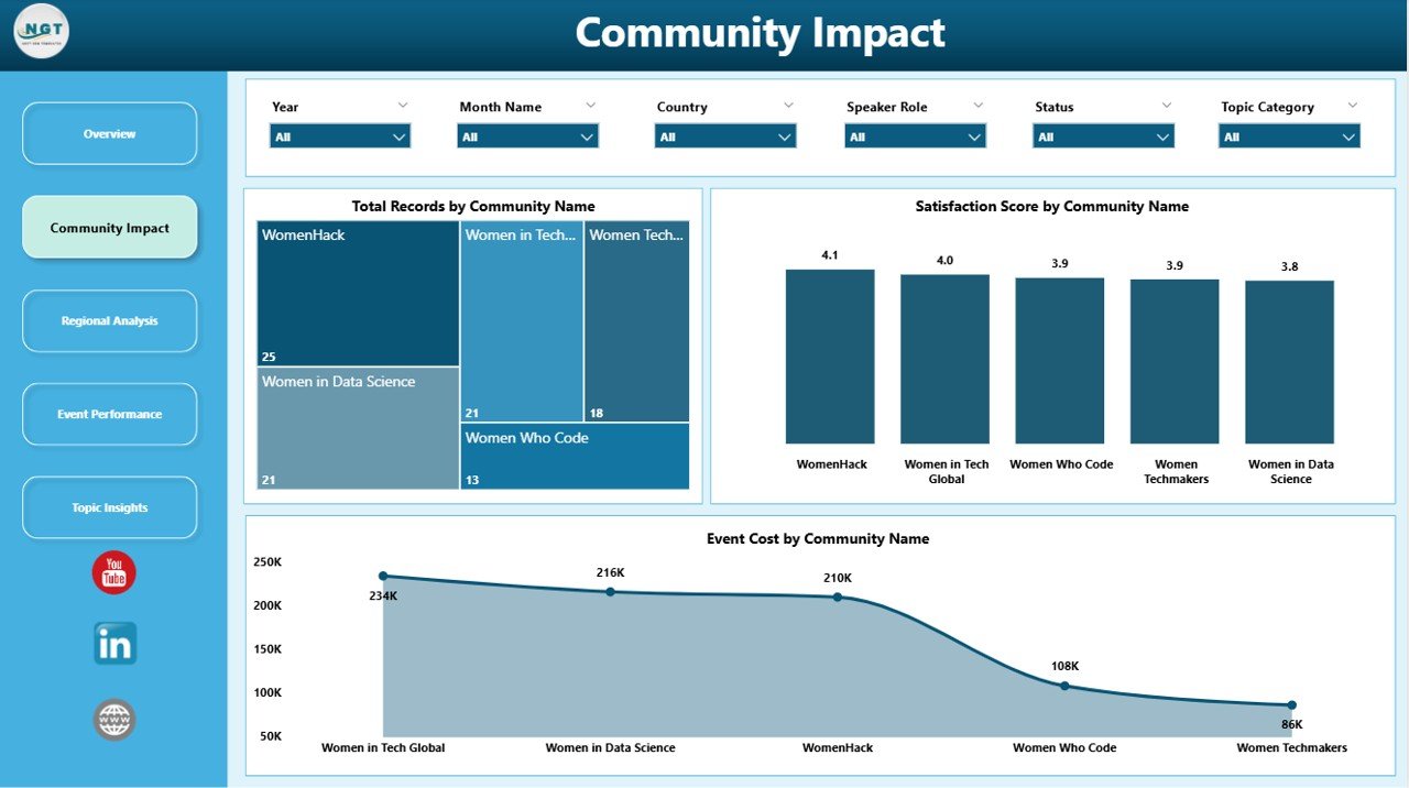
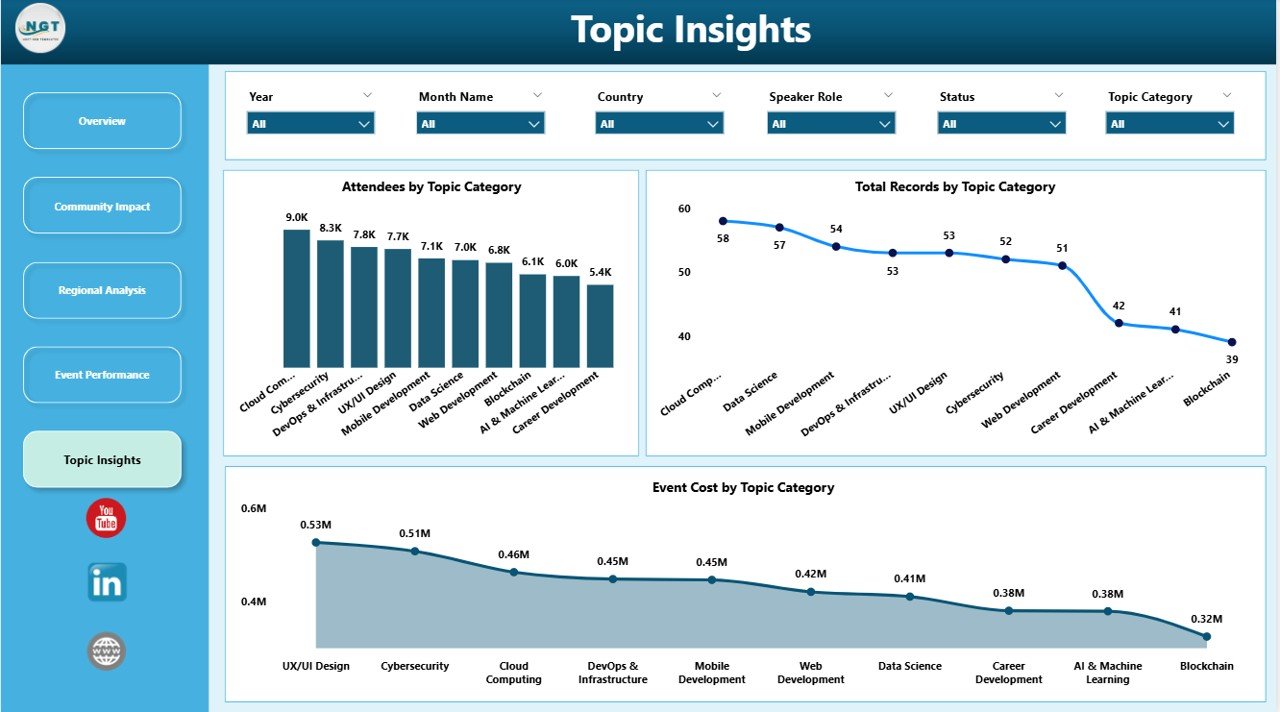
3. Diversity & Inclusion Insights
Focus on the diversity within women’s tech communities, highlighting representation by ethnicity, age group, and education background.
4. Growth and Impact Analysis
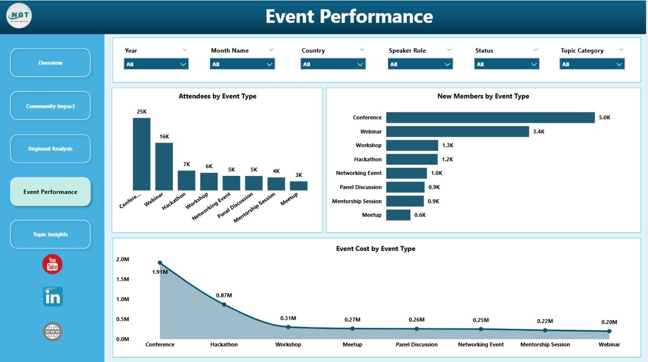
Track the growth trajectory of women in these communities over time and the impact of community-driven initiatives or programs.
5. Feedback & Engagement
Monitor engagement levels from surveys or feedback forms integrated into some community programs to assess satisfaction and suggestions.
Advantages of Women in Tech Communities Dashboard in Power BI
- Time-Saving: Pre-built and ready to use, reducing setup time.
- Accurate Data Representation: Dynamic refresh ensures your insights are always current.
- Improved Decision-Making: Enables leaders to identify gaps and opportunities in women’s participation.
- Clear Visibility: Easily shareable reports foster transparency across departments and stakeholders.
- Encourages Inclusion: Highlights actionable insights to promote diversity in tech organizations.
-
Click to Purchases Women in Tech Communities Dashboard in Power BI
Opportunities for Improvement
- Introduce predictive analytics for forecasting membership trends.
- Add mobile-friendly views to increase accessibility on smartphones and tablets.
- Enhance integration with community event management tools for real-time updates.
- Incorporate sentiment analysis from feedback to better understand community feelings.
Best Practices
- Regularly update your Excel data source to keep the dashboard relevant.
- Use filters and slicers to drill down into specific regions, roles, or age groups.
- Share dashboard reports via Power BI service for wider community collaboration.
- Combine dashboard insights with initiatives to increase women’s involvement in tech.
- Train team members on how to refresh and interpret data for maximum benefit.
FAQs
How do I update the dashboard data?
Simply input your new data into the Data sheet in the Excel workbook and click Refresh All under the Data tab in the Excel ribbon. Your dashboard will instantly update with the latest information.
Can I customize the dashboard visuals?
Yes! Since this dashboard is built in Power BI, you can customize charts, colors, and layouts to align with your branding or specific data needs.
Is this dashboard suitable for beginners?
Absolutely. With its straightforward data update process and interactive interface, users at all skill levels can effectively utilize this dashboard.
Conclusion
The Women in Tech Communities Dashboard in Power BI is an essential tool for tracking, analyzing, and promoting women’s participation in technology fields. With its intuitive interface, dynamic data refresh, and insightful visualizations, it empowers organizations to make data-driven decisions fostering diversity and inclusion. Update your data regularly, leverage the dashboard insights, and amplify your impact within the tech community.
For more guidance and a detailed demo, visit our YouTube channel to watch the demo.
Learn more about Power BI capabilities from Microsoft Power BI Documentation.
Click to Purchases Women in Tech Communities Dashboard in Power BI