Vocational schools play a major role in developing skilled workers for industries like healthcare, technology, hospitality, construction, automotive services, and many more. Because vocational training programs run with a skill-based structure, schools handle many KPIs such as tuition fees, scholarships, academic performance, attendance, student satisfaction, and placement outcomes. When this important information remains scattered across Excel sheets, manual logs, and disconnected systems, academic teams struggle to understand performance clearly.
A Vocational Schools Dashboard in Power BI solves this problem. It brings all important KPIs into one visual and interactive dashboard. You can analyze tuition fee trends, study placement statistics, check scholarship distribution, review academic scores, compare satisfaction ratings, and track attendance across programs, regions, and campuses with just a few clicks.
This in-depth article explains everything about the dashboard—its pages, features, benefits, best practices, and commonly asked questions. You will also learn how Power BI transforms raw vocational school data into clear, actionable insights.
Click to Purchases Vocational Schools Dashboard in Power BI
What Is a Vocational Schools Dashboard in Power BI?
A Vocational Schools Dashboard in Power BI is a ready-to-use reporting solution created for vocational training institutes, technical schools, community colleges, skill-development centers, and workforce training organizations. It helps administrators, faculty, and management teams track all important operational and academic KPIs in one place.
This dashboard provides complete visibility into:
-
Tuition fee collection
-
Scholarship distribution
-
Student satisfaction
-
Student academic performance
-
Attendance trends
-
Program-level statistics
-
Campus-wide performance
-
Placement outcomes
-
Month-wise trends
-
Regional differences
Because the dashboard runs on Power BI, you get automation, slicers, filters, drill-down options, and dynamic visuals that make reporting easier and faster.
Click to Purchases Vocational Schools Dashboard in Power BI
Why Do Vocational Schools Need a Power BI Dashboard?
Vocational schools collect large amounts of data every month. Without a proper dashboard:
-
You spend too much time preparing reports.
-
You cannot track tuition trends easily.
-
You struggle to measure program effectiveness.
-
You fail to spot low attendance programs.
-
You cannot compare regions and campuses.
-
You miss scholarship allocation patterns.
-
You lack clarity on placement performance.
But when you use this dashboard:
-
You understand performance quickly.
-
You make decisions based on data, not assumptions.
-
You improve student learning outcomes.
-
You measure every program with transparency.
-
You improve campus-level planning.
A Power BI dashboard turns complicated data into simple, visual insights.
Click to Purchases Vocational Schools Dashboard in Power BI
Key Features of the Vocational Schools Dashboard in Power BI
This dashboard contains five powerful pages, each designed to provide deep insights into a specific area. It helps schools monitor financial performance, student satisfaction, academic quality, and placement outcomes with ease.
Let’s explore each page in detail.
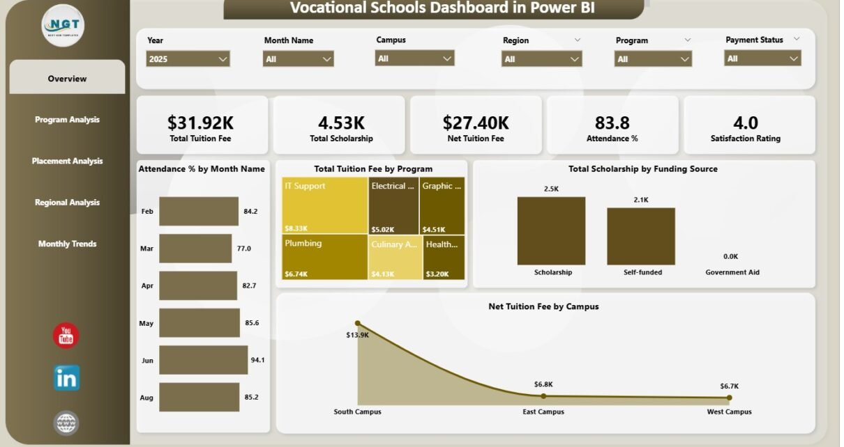
1. Overview Page – The Complete Performance Summary
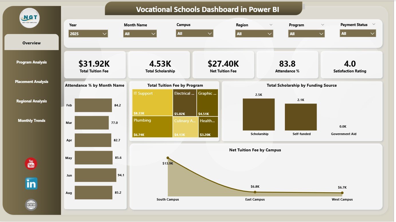
The Overview Page works as the main dashboard page. It gives a quick view of the most important KPIs.
✔ This page shows 6 important cards:
-
Total Tuition Fee
-
Total Scholarship
-
Net Tuition Fee
-
Average Score
-
Attendance Percentage
-
Student Satisfaction Rating
These cards help administrators understand the overall health of the vocational school instantly.
✔ The page also includes 4 powerful charts:
1. Total Tuition Fee by Program
This shows which programs generate the highest and lowest tuition income.
2. Total Scholarship by Funding Source
This chart helps you identify funding support patterns.
3. Net Tuition Fee by Campus
Schools can compare income across different campuses.
4. Attendance % by Month Name
This helps school leaders track attendance behavior across months.
The Overview Page is ideal for directors, principals, and department heads who need quick insights.
Click to Purchases Vocational Schools Dashboard in Power BI
2. Program Analysis Page – Measure Academic Impact
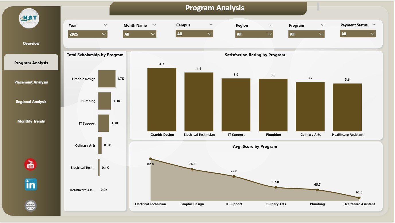
The Program Analysis Page gives a deeper view into each vocational program.
It includes three main charts:
✔ 1. Satisfaction Rating by Program
You learn which programs create the best learning experiences.
✔ 2. Total Scholarship by Program
You understand how scholarships distribute across programs.
✔ 3. Average Score by Program
This helps measure academic quality for each program.
This page helps academic teams improve learning outcomes, update teaching methods, and support struggling programs.
3. Placement Analysis Page – Track Employability Outcomes
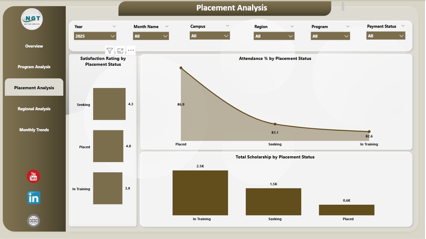
Vocational education focuses heavily on real-world skills and job readiness. The Placement Analysis Page helps schools track placement performance clearly.
This page contains three meaningful charts:
✔ 1. Attendance % by Placement Status
You understand whether regular attendance influences placement success.
✔ 2. Satisfaction Rating by Placement Status
You compare satisfaction between placed and non-placed students.
✔ 3. Total Scholarship by Placement Status
This shows whether scholarship students achieve better placement rates.
This page helps career services, placement cells, and industry relations teams improve employability outcomes.
Click to Purchases Vocational Schools Dashboard in Power BI
4. Regional Analysis Page – Compare Campus & Region Performance
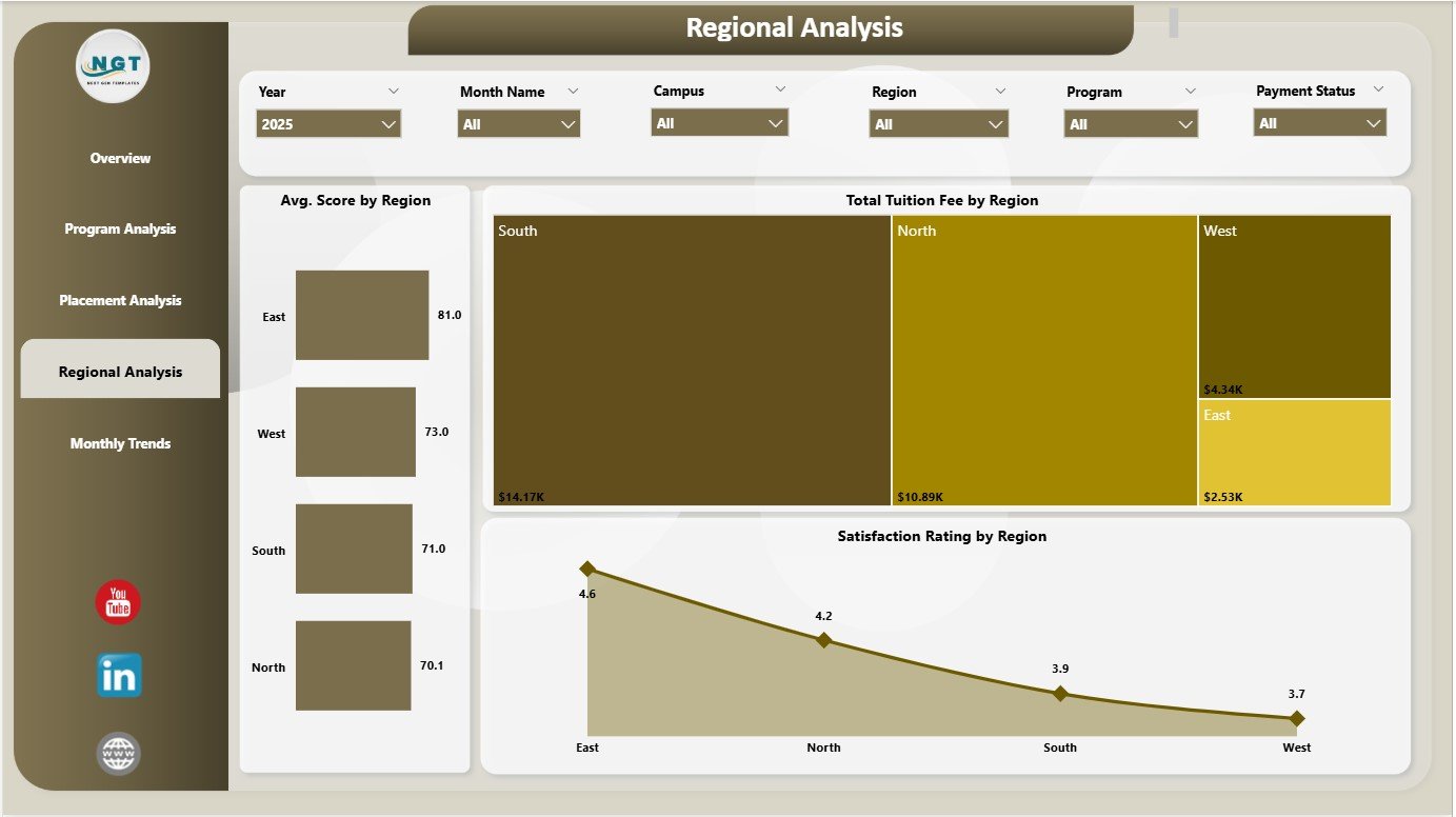
Vocational schools often operate across multiple regions. This page helps analyze performance at the regional level.
This page includes:
✔ 1. Total Tuition Fee by Region
You see which region generates the highest income.
✔ 2. Average Score by Region
This highlights which region performs well academically.
✔ 3. Satisfaction Rating by Region
You understand regional differences in student experience.
This regional comparison helps school management design better strategies and allocate resources more effectively.
5. Monthly Trends Page – Understand Monthly Movement
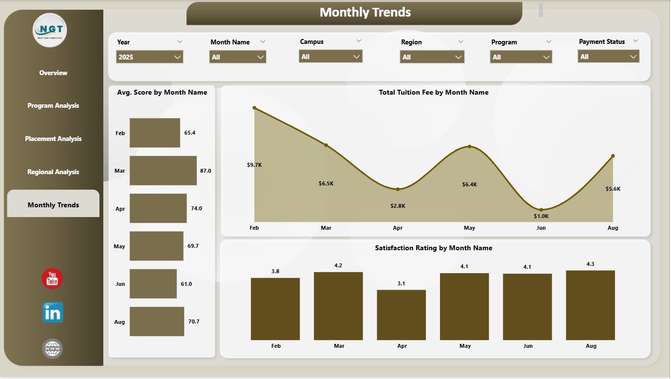
This page tells you how performance changes month-to-month.
It includes:
✔ Total Tuition Fee by Month Name
Helps track seasonal patterns in admission or fee collection.
✔ Average Score by Month Name
Shows academic consistency and improvement areas.
✔ Satisfaction Rating by Month Name
Highlights changes in student experience across the year.
This page is useful for planning events, exams, skill workshops, and admission cycles.
Click to Purchases Vocational Schools Dashboard in Power BI
Advantages of the Vocational Schools Dashboard in Power BI
This dashboard delivers powerful benefits for administrators, academic teams, placement officers, counselors, and financial departments.
1. You get instant access to all performance metrics
Everything appears in one place—no more manual reporting.
2. You understand tuition and scholarship patterns clearly
Schools can plan budgets and scholarship policies easily.
3. You improve academic quality
Average score and satisfaction data help strengthen teaching methods.
4. You track placement performance accurately
You see which factors drive placement success.
5. You compare multiple regions and campuses
Regional insights help in making strategic decisions.
6. You identify low-performing programs
You can redesign curriculum or provide support quickly.
7. You improve student satisfaction
Satisfaction rating trends highlight problem areas early.
8. You strengthen monthly planning
Month-wise patterns help in exam planning, training schedules, and resource allocation.
Click to Purchases Vocational Schools Dashboard in Power BI
Best Practices for Using the Vocational Schools Dashboard
Follow these tips to get maximum value from the dashboard:
✔ 1. Update the data regularly
Monthly updates ensure accurate and meaningful insights.
✔ 2. Track satisfaction ratings closely
Satisfaction is directly connected to admission growth and placement results.
✔ 3. Compare regions before planning expansions
Regional performance reveals strong and weak areas.
✔ 4. Analyse attendance trends twice a month
Low attendance often signals academic or engagement problems.
✔ 5. Review program-wise KPIs weekly
This helps teams act early.
✔ 6. Use placement analysis for curriculum improvement
Placement performance reflects training effectiveness.
✔ 7. Combine tuition and scholarship KPIs for financial planning
It helps design balanced pricing and funding structures.
✔ 8. Train staff to use Power BI properly
Better understanding leads to better decisions.
Conclusion
A Vocational Schools Dashboard in Power BI is the perfect tool for monitoring performance across programs, campuses, regions, and months. With five powerful pages—Overview, Program Analysis, Placement Analysis, Regional Analysis, and Monthly Trends—it offers complete visibility into academic strength, financial performance, student satisfaction, and employability outcomes.
Vocational schools grow faster when they use data wisely. This dashboard helps them set strong goals, improve performance, identify issues early, and make smarter decisions that benefit both students and the institution.
Click to Purchases Vocational Schools Dashboard in Power BI
Frequently Asked Questions (FAQs)
1. Who should use the Vocational Schools Dashboard in Power BI?
Academic heads, school directors, placement teams, finance officers, and administrators should use it.
2. Does the dashboard support multiple programs and campuses?
Yes, it compares performance across programs, campuses, and regions.
3. Can I add more charts to the dashboard?
Yes, Power BI allows you to add or customize visuals anytime.
4. Do I need technical skills to use this dashboard?
No. Basic filtering and slicer knowledge is enough.
5. How often should I update the data?
Monthly updates are ideal for accurate reporting.
6. Does the dashboard work on Power BI Desktop and Power BI Service?
Yes, it works on both.
7. Can I add more KPIs later?
Yes, you can modify the data model to add more KPIs.
8. Can it be used by government-funded training programs?
Yes, it works for both private and government vocational institutions.
Click to Purchases Vocational Schools Dashboard in Power BI
Visit our YouTube channel to learn step-by-step video tutorials