Customer experience plays the most important role in defining the success of any business. When customers enjoy smooth service, fast response times, and helpful support, they stay loyal for a long time. However, tracking customer-related KPIs becomes difficult when the data stays scattered in multiple sheets. This is exactly where a Customer Experience Dashboard in Excel brings real value.
A well-designed dashboard brings all experience-related metrics into one single place. It helps managers understand issues, track service performance, and take quick decisions. In this detailed guide, you will learn everything about the Customer Experience Dashboard in Excel, its benefits, key features, best practices, and common questions.
What Is a Customer Experience Dashboard in Excel?
Click to Purchases Customer Experience Dashboard in Excel
A Customer Experience Dashboard in Excel is a smart tool that displays all customer support and satisfaction metrics visually. It turns raw customer service data into clear charts, cards, and tables. This helps teams quickly monitor CSAT scores, response times, ticket resolution, churn risk, and customer feedback patterns.
Since the dashboard is created in Excel, businesses of all sizes can use it easily without any special technical skills. The dashboard uses real-time data, slicers, and filters to update the visuals instantly.
Why Do Businesses Need a Customer Experience Dashboard?
Businesses need a Customer Experience Dashboard because it helps them:
-
Monitor customer satisfaction in real time
-
Identify service issues before they impact customer loyalty
-
Improve agent performance through quick insights
-
Track problem areas, complaint trends, and product issues
-
Make data-driven decisions instead of guessing
-
Keep all teams on the same page for customer goals
When businesses track their customer experience properly, they improve retention, brand trust, and overall performance.
Key Features of the Customer Experience Dashboard in Excel
This dashboard includes 5 analytical pages, a page navigator, and a dedicated data sheet.
Let’s go through each page in detail.
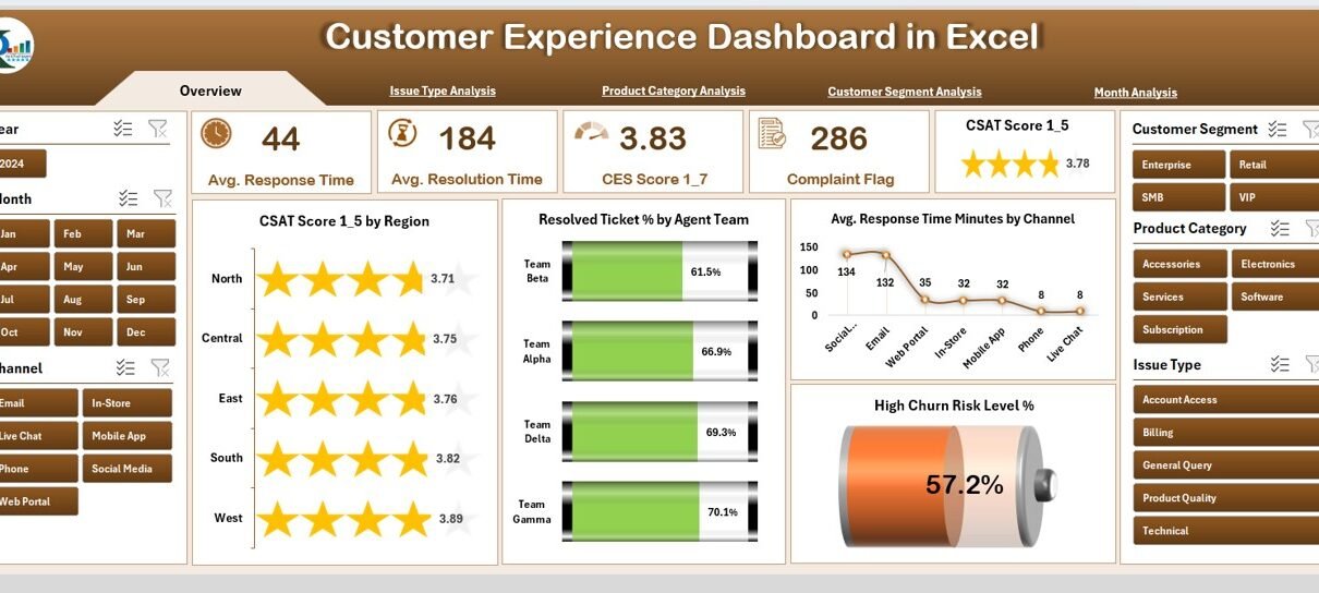
1. Overview Page – The Main Control Panel
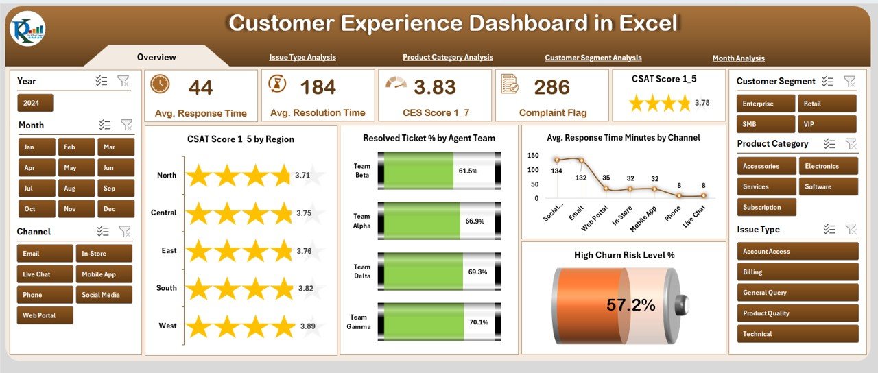
The Overview Page works as the dashboard’s home screen. It provides a quick summary of top customer-related KPIs.
Features of the Overview Page
-
Page Navigator on the left side
-
Right-side slicers to filter the dashboard
-
Five important KPI cards
-
Four essential charts
KPI Cards Include
-
CSAT Score
-
Resolved Ticket Percentage
-
Average Response Time (Minutes)
-
High Churn Risk Level (%)
Charts Included
-
CSAT Score by Region
-
Resolved Ticket % by Agent Team
-
Average Response Time by Channel
-
High Churn Risk Level (%)
This page gives a complete performance overview at a glance.
2. Issue Type Analysis Page
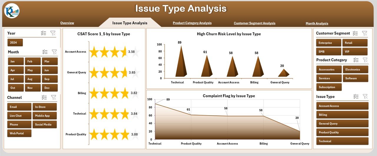
This page helps teams understand which issue types affect customers the most.
Key Charts on This Page
-
CSAT Score by Issue Type
-
High Churn Risk Level by Issue Type
-
Completed Flag by Issue Type
These insights help leaders identify major service gaps and improve issue handling methods.
3. Product Category Analysis Page
Click to Purchases Customer Experience Dashboard in Excel
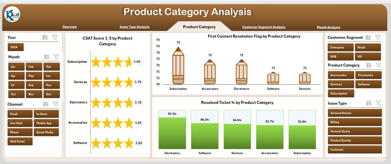
Different products attract different types of customer concerns. This page shows product-wise experience insights.
Charts Included
-
CSAT Score by Product Category
-
First Contact Resolution (FCR) Flag by Product Category
-
Resolved Ticket % by Product Category
This helps teams understand product-level satisfaction and performance gaps.
4. Customer Segment Analysis Page
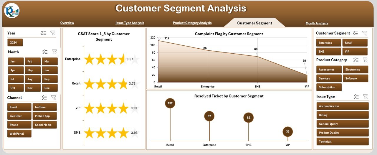
Every customer segment behaves differently. Understanding those patterns helps teams personalize strategies.
Charts Included
-
CSAT Score by Customer Segment
-
Complaint Flag by Customer Segment
-
Resolved Ticket Metrics by Customer Segment
This page supports targeted improvement and segment-wise strategy building.
5. Month Analysis Page
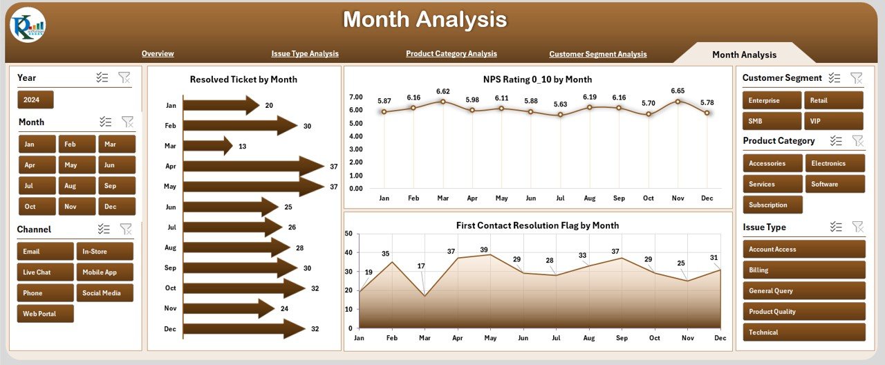
Customer performance changes every month. This page helps monitor the trends.
Charts Included
-
Resolved Ticket by Month
-
NPS Rating by Month
-
First Contact Resolution Flag by Month
These insights help track monthly performance growth and seasonal patterns.
How Does the Customer Experience Dashboard Work?
The dashboard uses a clean Data Sheet where all records are stored. All pages use pivot tables and sliced visuals. When users apply filters, the charts update instantly. This helps teams see data from every angle in just a few clicks.
What Are the Main Components of Customer Experience Planning?
A Customer Experience Dashboard includes:
-
Customer satisfaction scores
-
Ticket handling metrics
-
Response time analysis
-
Customer churn indicators
-
Complaint flags
-
Issue type trends
-
Product support performance
-
Monthly performance reports
These components help businesses create a complete customer experience plan.
Advantages of the Customer Experience Dashboard in Excel
Here are the top advantages of using this dashboard:
⭐ 1. Quick Decision Making
Managers see real-time visuals and act quickly on customer issues.
⭐ 2. Improved Customer Satisfaction
Teams spot issues faster and improve service quality.
⭐ 3. Transparent Performance Tracking
All KPIs stay visible, so everyone stays aligned with business goals.
⭐ 4. No Technical Skills Required
The dashboard runs in Excel, so anyone can use it.
⭐ 5. Easy Customization
Teams can add new KPIs, pages, or charts without advanced tools.
⭐ 6. Better Team Coordination
Agent teams perform better when they have clear performance insights.
⭐ 7. Helps Reduce Churn
The dashboard highlights high-risk customers so teams can take action early.
Best Practices for Using the Customer Experience Dashboard
Click to Purchases Customer Experience Dashboard in Excel
To get the best results, follow these practices:
✔ Update Data Regularly
Keep the data sheet updated so charts show the most recent performance.
✔ Use Filters for Deep Analysis
Filters help users explore region-wise, product-wise, or segment-wise service insights.
✔ Monitor Patterns Every Month
Monthly trends help teams spot seasonal spikes or drops.
✔ Focus on CSAT, NPS, and FCR
These three KPIs define overall customer satisfaction.
✔ Review Issue Types Frequently
Issue-based analysis helps teams fix problem areas quickly.
✔ Track Agent Team Performance
Agent-level metrics help managers reward high performers and coach others.
✔ Customize the Dashboard
Add new KPIs or charts based on your company’s needs.
How to Build a Customer Experience Dashboard in Excel?
You can build a dashboard in Excel by following these steps:
-
Collect customer support and feedback data
-
Clean and organize the data
-
Create pivot tables
-
Insert pivot charts
-
Add slicers for filtering
-
Design KPI cards for quick highlights
-
Arrange all visuals neatly
-
Add a page navigator to improve usability
With these steps, you can build a dashboard similar to professional business tools.
What KPIs Should You Track in a Customer Experience Dashboard?
Here are the most important KPIs:
-
Customer Satisfaction Score (CSAT)
-
Net Promoter Score (NPS)
-
First Contact Resolution (FCR)
-
Average Response Time
-
Ticket Resolution Rate
-
Complaint Frequency
-
Customer Churn Risk
-
Issue Type Performance
-
Agent Performance Metrics
Tracking these KPIs helps ensure a complete analysis.
How Does Excel Make Customer Experience Tracking Easier?
Excel offers several benefits:
-
User-friendly interface
-
No coding needed
-
Easy to create pivot charts
-
Supports slicers and filters
-
Simple data upload process
-
Customizable dashboards
-
Suitable for small and large teams
Excel allows businesses to create a flexible and powerful dashboard without expensive software.
Common Mistakes to Avoid While Using Customer Experience Dashboards
Avoid the following mistakes:
-
Not updating customer data
-
Using too many unnecessary charts
-
Ignoring trends from monthly analysis
-
Not reviewing issue-type variations
-
Overlooking product-level performance gaps
-
Using complex designs that confuse users
Keeping the dashboard simple and updated delivers better results.
Conclusion
A Customer Experience Dashboard in Excel helps businesses improve service quality, support efficiency, and customer loyalty. It brings all customer-related KPIs into one easy-to-read visual format. With clear charts, cards, and slicers, it becomes simple for teams to track issues, monitor performance, and make fast decisions.
This dashboard is an essential tool for businesses that want to improve customer satisfaction, reduce churn, and build long-term customer relationships. When used consistently with best practices, it becomes a powerful system for improving the complete customer journey.
Frequently Asked Questions (FAQs)
1. What is a Customer Experience Dashboard?
A Customer Experience Dashboard displays customer-related KPIs like CSAT, NPS, and ticket resolution in a visual format.
2. Why should I use Excel for customer experience tracking?
Excel is easy to use, requires no coding, and supports pivot charts and slicers that update in real time.
3. How many pages does this dashboard include?
The dashboard includes 5 analytical pages: Overview, Issue Type, Product Category, Customer Segment, and Month Analysis.
4. Can I customize the dashboard?
Yes, you can easily add new KPIs, charts, and filters based on your business requirements.
5. What KPIs should I track?
You should track CSAT, NPS, FCR, response time, ticket resolution rate, complaint frequency, and churn risk.
6. Does the dashboard work for all industries?
Yes, any business that handles customer support and feedback can use the dashboard.
7. How often should I update the data?
You should update the data weekly or monthly based on your reporting needs.
Visit our YouTube channel to learn step-by-step video tutorials
Click to Purchases Customer Experience Dashboard in Excel