Smart cities continue to grow across the world, and every city leader wants better ways to track development activities, measure performance, and improve public services. However, many smart-city teams still depend on scattered spreadsheets and outdated manual reports. This slows decision-making and hides patterns that matter. Because of this, a Smart Cities Development Dashboard in Excel becomes a powerful tool for modern city planning and administration.
This dashboard brings all critical metrics—investment, budgets, approvals, funding sources, project progress, and high-priority indicators—into one interactive place. City planners, government officials, engineers, consultants, and administrative teams gain instant clarity without learning complex tools. Excel already exists everywhere, so anyone can use this dashboard with confidence.
In this article, you will explore what this dashboard is, how it works, what pages it includes, and how it supports faster, smarter, and more transparent city development. You will also learn the advantages, best practices, and common questions so you understand its complete value.
Click to Purchases Smart Cities Development Dashboard in Excel
What Is a Smart Cities Development Dashboard in Excel?
A Smart Cities Development Dashboard in Excel is a ready-to-use reporting system that tracks all major smart-city development KPIs in one place. It uses slicers, cards, charts, and page navigation buttons to present clean insights. As soon as users update the data sheet, the entire dashboard updates automatically. This encourages quick review, faster planning, and data-driven decision-making.
Smart city projects deal with budgets, funding, operations, zones, cities, and monthly trends. Therefore, a structured dashboard removes confusion and helps stakeholders monitor growth with a single click.
This dashboard becomes helpful for:
-
Urban development teams
-
Government project departments
-
Smart-city consultants
-
Finance and budgeting units
-
Data analysis teams
-
Planning and monitoring cells
Since it works inside Excel, the learning curve stays low. Anyone can explore insights without technical knowledge.
Key Features of the Smart Cities Development Dashboard in Excel
This dashboard includes a page navigator on the left side, which allows smooth movement across different analytical pages. Users explore the entire smart-city development lifecycle from overview to detailed analysis.
The Excel file contains five dynamic analytics pages, each designed with slicers, charts, and high-priority metrics.
Let’s explore every page in detail.
1. Overview Page – The Complete Development Snapshot
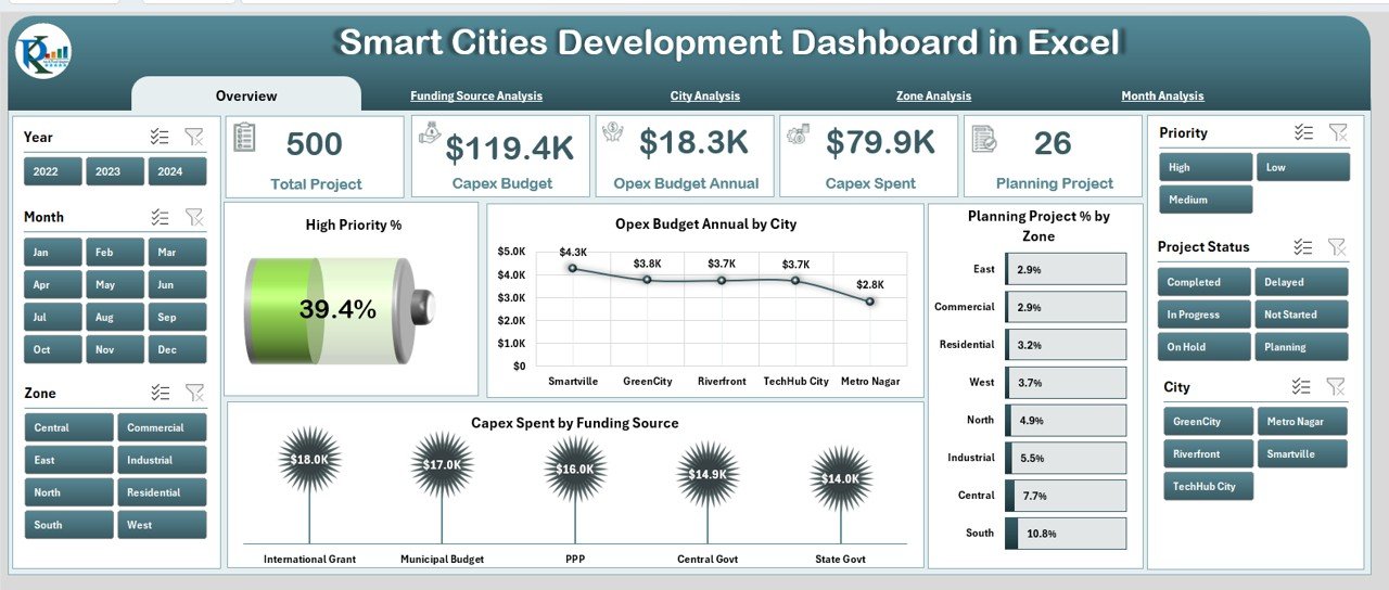
The Overview Page acts as the dashboard’s core. Decision-makers visit this page first because it presents a high-level picture of the city’s development status.
Elements You See on This Page
-
A right-side slicer panel for city-wide filtering
-
Five smart KPI cards
-
Four important charts
Key Charts and Metrics
-
High Priority %
Shows how many projects need immediate attention. -
Opex Budget Annual by City
Helps you compare annual operational expenditure across cities. -
Planning Project % by Zone
Shows the current level of planning activity across zones. -
Capex Spend by Funding
Helps track how capital funds are being spent by funding source.
Because this page summarizes the entire project space, teams gain instant visibility into financial patterns, priority levels, and planning workflows. As a result, strategic meetings become faster and more focused.
2. Funding Source Analysis – Understand Where the Money Comes From
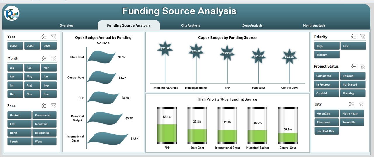
Smart-city projects depend on multiple funding sources such as government grants, partner agencies, internal budgets, and private investments. This page helps leaders understand financial dependency and spending behavior.
Key Features on This Page
-
Right-side slicer panel
-
Three focused charts
Charts Included
-
Opex Budget Annual by Funding Source
Compares operational budgets based on source. -
Capex Budget by Funding Source
Shows capital budget distribution across funding bodies. -
High Priority % by Funding Source
Helps teams understand which funding source supports risky or urgent projects.
This page becomes essential for budgeting teams because it highlights funding gaps and spending pressure zones instantly.
3. City Analysis – Compare Development Across Cities
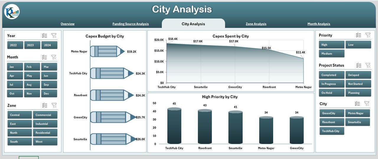
Smart-city progress varies from one location to another. The City Analysis Page highlights these variations.
What You See on This Page
-
Right-side slicer
-
Three city-focused charts
Charts Included
-
Capex Budget by City
Shows capital investment in each city. -
Capex Spend by City
Compares how much each city actually spent. -
High Priority % by City
Identifies which cities need urgent support.
These charts help state-level or region-level authorities understand which cities move on track, which lag behind, and where more attention is required.
4. Zone Analysis – Track Specific Development Areas
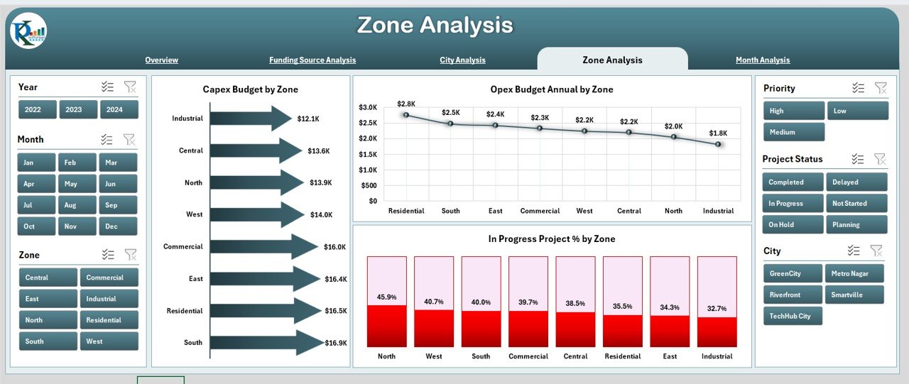
Every smart-city plan divides work zones based on geographical boundaries or administrative sectors. The Zone Analysis Page helps teams track performance at this sub-city level.
Key Elements
-
Right-side slicer
-
Three powerful charts
Charts Included
-
Capex Budget by Zone
Shows capital allocation per zone. -
Opex Budget Annual by Zone
Helps compare operational budgets. -
In-Progress Project % by Zone
Reveals how many projects started and remain active.
This zone-level visibility helps teams remove bottlenecks and speed up progress.
Click to Purchases Smart Cities Development Dashboard in Excel
5. Month Analysis – Monitor Monthly Budget and Spend Trends
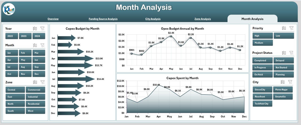
Smart-city leaders must monitor monthly trends for better forecasting and scheduling. The Month Analysis Page helps teams understand seasonality, funding cycles, and project execution speed.
Charts Included
-
Capex Budget by Month
Shows how investment changes throughout the year. -
Opex Budget Annual by Month
Highlights monthly operational expenditure. -
Capex Spend by Month
Tracks how spending varies every month.
Because this page shows month-over-month patterns, teams improve planning accuracy and resource allocation.
Support Sheet
This sheet contains reference calculations or formulas that support the dashboard visuals. Users do not modify this sheet often, but it stays important for managing invisible logic behind charts.
Data Sheet
This is the input sheet where users update all actual, budget, zone, city, and funding-related data. As soon as values change, the dashboard refreshes automatically.
Teams only need to maintain this sheet, which makes the dashboard simple for all users.
Why Do Cities Need a Smart Cities Development Dashboard in Excel?
Modern cities run hundreds of development projects each year—roads, water systems, parks, transport, digital systems, safety programs, and more. Without a structured dashboard, decision-makers struggle to track:
-
Budgets
-
Funding sources
-
Priorities
-
Project progress
-
Monthly trends
-
City-level performance
-
Zone-wise development
A modern dashboard solves all these problems. It creates one central place for insights, communication, and decision-making.
Advantages of the Smart Cities Development Dashboard in Excel
This dashboard offers several benefits for planning, budgeting, and execution teams. Let’s explore them.
⭐ 1. Gain a Single Source of Truth
All stakeholders view the same numbers, charts, and updates. This removes confusion and reduces unnecessary manual reporting.
⭐ 2. Improve Budget Transparency
The dashboard shows how Opex and Capex budgets flow across cities, zones, and funding sources. Leaders make better decisions with real financial clarity.
⭐ 3. Track High-Priority Projects Easily
The high-priority percentage helps leaders focus on risk areas and plan interventions quickly.
⭐ 4. Identify Performance Gaps Faster
City-level and zone-level charts reveal slow-moving regions and smart opportunities for improvement.
⭐ 5. Reduce Manual Work
Teams stop building separate reports for each meeting. The dashboard gives real-time, auto-refreshed insights.
⭐ 6. Encourage Data-Driven Decisions
Charts and KPIs guide planning discussions. Leaders make decisions based on facts, not assumptions.
⭐ 7. Easy To Use for All
Since it runs inside Excel, anyone can use it without training. It works for small teams, big organizations, and cross-functional departments.
⭐ 8. Improve Collaboration
Teams share one dashboard instead of multiple files. Everyone stays aligned throughout the year.
Best Practices for Using a Smart Cities Development Dashboard in Excel
Click to Purchases Smart Cities Development Dashboard in Excel
To get the best results, follow these simple yet effective practices.
✅ 1. Update the Data Sheet Regularly
Daily or weekly updates improve accuracy. Teams can track trends in real time.
✅ 2. Use Standard Naming Conventions
Use consistent names for zones, cities, and funding sources. This avoids slicer duplicates.
✅ 3. Review Monthly Trends Before Meetings
Check the Month Analysis Page before preparing reports. This helps you explain performance changes clearly.
✅ 4. Compare Budget vs Spend Frequently
Frequent reviews reduce overspending risks and support better forecasting.
✅ 5. Track High-Priority Projects Every Week
This helps teams remove blockers early.
✅ 6. Use Filters Wisely
Slicers support detailed analysis. Use them to explore patterns that may stay hidden.
✅ 7. Keep the Data Sheet Clean
Avoid merged cells, blank rows, or inconsistent values. The dashboard works best with clean datasets.
✅ 8. Share the Dashboard With All Stakeholders
More visibility helps everyone participate in progress discussions.
Conclusion
Smart cities need smart tools, and the Smart Cities Development Dashboard in Excel becomes a powerful way to manage complex projects, budgets, zones, cities, and funding structures. It simplifies reporting, encourages data-driven thinking, reduces manual work, and ensures every team works with clarity. Because it runs inside Excel, the dashboard stays accessible and easy for anyone to use.
From overview metrics to month-wise spend analysis, every page adds value and supports better decision-making. When teams follow the best practices, they gain full control over development projects and improve transparency across the entire smart-city ecosystem.
This dashboard takes smart-city management to a higher level, and it helps teams work faster, smoother, and more confidently.
Frequently Asked Questions (FAQs)
1. What is the purpose of a Smart Cities Development Dashboard in Excel?
The dashboard helps teams track budgets, spending, priorities, and project progress in one place. It supports faster and better decision-making.
2. Who can use this dashboard?
Urban development teams, consultants, government departments, engineers, finance teams, and analysts can use it easily.
3. Do I need technical knowledge to use the dashboard?
No. The dashboard runs inside Excel, so anyone can use it without learning advanced tools.
4. Can I customize the dashboard?
Yes. Users can customize charts, slicers, or KPIs based on their project needs.
5. How often should I update the data sheet?
Update it weekly or monthly for accurate results. Frequent updates help you analyze trends better.
6. Can this dashboard work for multi-city projects?
Yes. The dashboard includes pages for cities, zones, months, and funding sources. It works perfectly for multi-city development programs.
7. Does the dashboard support long-term planning?
Yes. Monthly and annual budget charts help leaders plan resources more effectively.
Visit our YouTube channel to learn step-by-step video tutorials