Power distribution plays a critical role in modern infrastructure. Every industry, city, and utility company depends on a stable and efficient power distribution system to run operations smoothly. However, managing power assets, load, outages, maintenance, and regional performance becomes difficult when data stays scattered across multiple spreadsheets and reports.
This is exactly where a Power Distribution Dashboard in Excel adds massive value.
A Power Distribution Dashboard in Excel brings all power distribution data into one interactive, visual, and easy-to-understand dashboard. As a result, power utilities, energy managers, and operations teams can track performance, detect risks early, and take data-driven decisions faster.
In this detailed guide, you will learn what a Power Distribution Dashboard in Excel is, how it works, what pages it includes, its advantages, best practices, and frequently asked questions. In addition, you will understand how this dashboard helps improve efficiency, reliability, and decision-making.
Click to Purchases Power Distribution Dashboard in Excel
What Is a Power Distribution Dashboard in Excel?
A Power Distribution Dashboard in Excel is a ready-to-use analytical tool designed to monitor and analyze power distribution operations. It converts raw electrical data into meaningful insights using KPIs, charts, slicers, and summary cards.
Instead of reviewing dozens of manual reports, users see all key distribution metrics on one screen. Moreover, since it is built in Excel, most users can operate it without learning new software.
This dashboard typically tracks:
-
Energy billed and supplied
-
Asset health and overload conditions
-
Maintenance status
-
Peak load trends
-
Regional performance
-
Monthly analysis
Because Excel allows flexibility and customization, organizations can easily adapt the dashboard to their specific power network and reporting needs.
Why Do Power Utilities Need a Power Distribution Dashboard?
Power utilities face multiple operational challenges every day. For example, assets age, demand fluctuates, maintenance schedules change, and outages require instant attention. When teams manage this data manually, errors increase and response time slows down.
A Power Distribution Dashboard in Excel solves these problems by:
-
Centralizing all power data
-
Providing real-time or periodic insights
-
Highlighting risks through visuals
-
Supporting faster decision-making
As a result, managers gain better control over operations while improving reliability and efficiency.
How Does a Power Distribution Dashboard in Excel Work?
A Power Distribution Dashboard in Excel works by connecting structured data to dynamic visuals. First, users enter or import power distribution data into a Data Sheet. Then, formulas, pivot tables, and charts process this data.
Next, slicers allow users to filter insights by:
-
Region
-
Asset type
-
Maintenance type
-
Month
Because of this interactive setup, users can instantly explore patterns, compare metrics, and identify problem areas.
What Are the Key Components of the Power Distribution Dashboard in Excel?
The Power Distribution Dashboard in Excel includes the following key components:
✅ Page Navigator
-
Located on the left side
-
Allows quick switching between pages
-
Improves usability and navigation
✅ Slicers
-
Placed on the right side
-
Enable easy filtering by different dimensions
-
Update all charts dynamically
✅ KPI Cards
-
Display key summary metrics at a glance
-
Help decision-makers focus on critical numbers
✅ Charts and Visuals
-
Show performance trends and comparisons
-
Make complex data easier to understand
What Pages Are Included in the Power Distribution Dashboard in Excel?
This Power Distribution Dashboard in Excel contains five well-structured analytical pages, each designed to answer specific business questions.
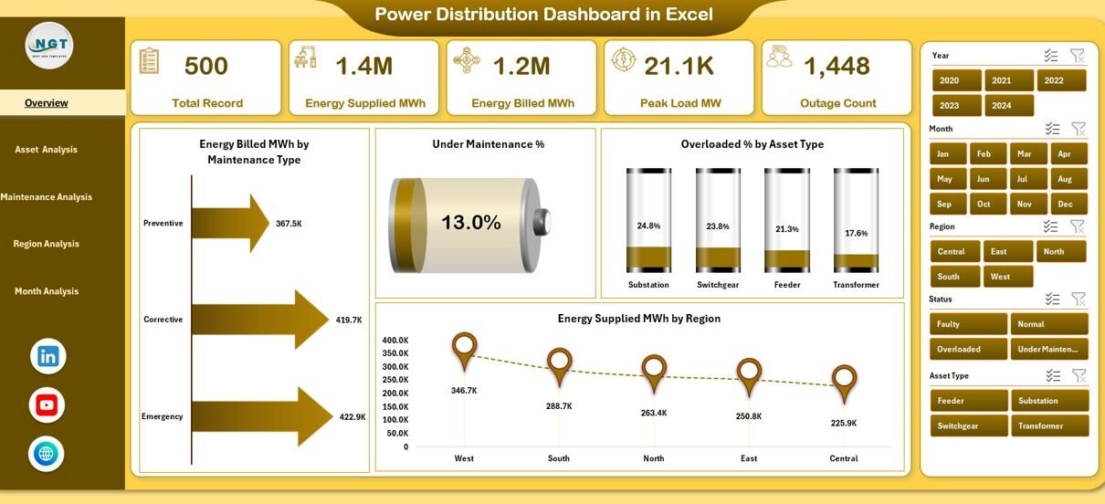
Overview Page – What Is the Overall Power Distribution Performance?
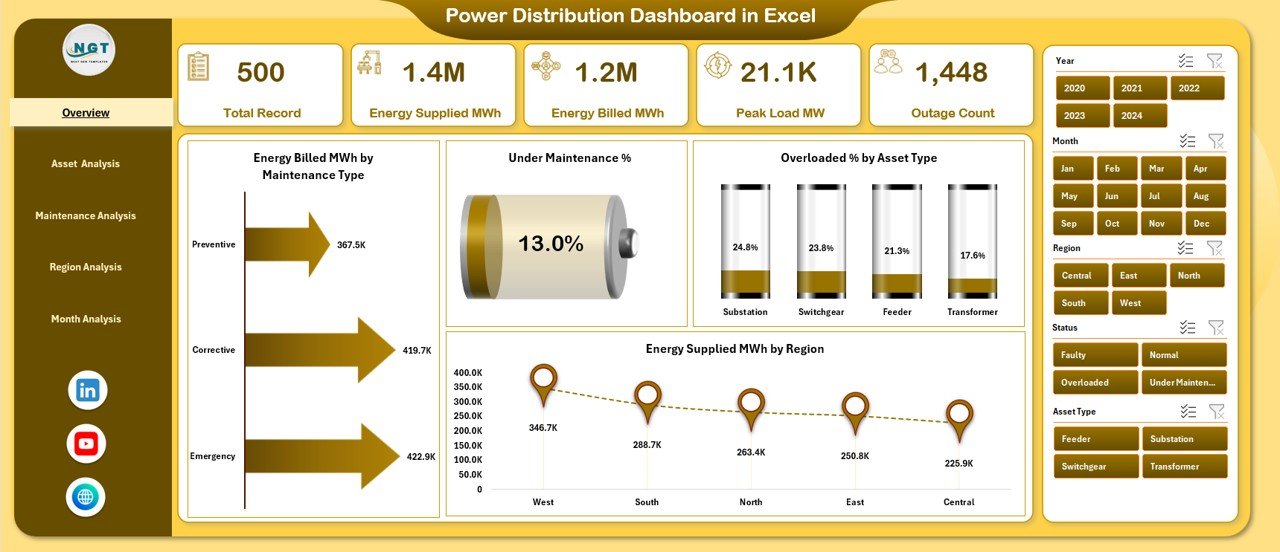
The Overview Page acts as the main snapshot of the entire power distribution system.
Key Features of the Overview Page:
-
Right-side slicers for filtering
-
5 KPI cards for instant insights
-
High-level operational charts
Charts Included on the Overview Page:
-
High Energy Billed MWh by Maintenance Type
-
Under Maintenance %
-
Overloaded % by Asset Type
-
Energy Supplied MWh by Region
Why This Page Matters:
This page helps leadership quickly understand overall system health. Moreover, it highlights inefficiencies and risk areas that require immediate attention.
Asset Analysis Page – How Are Power Assets Performing?
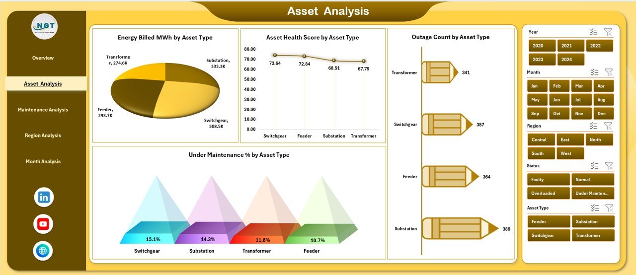
The Asset Analysis Page focuses on asset-level performance and reliability.
Key Features of the Asset Analysis Page:
-
Right-side slicers for filtering
-
Asset-specific operational insights
Charts Included on the Asset Analysis Page:
-
Energy Billed MWh by Asset Type
-
Asset Health Score by Asset Type
-
Outage Count by Asset Type
-
Under Maintenance % by Asset Type
Why This Page Matters:
This page helps asset managers identify weak assets. Consequently, teams can prioritize repairs, reduce outages, and extend asset life.
Click to Purchases Power Distribution Dashboard in Excel
Maintenance Analysis Page – Is Maintenance Improving or Hurting Performance?
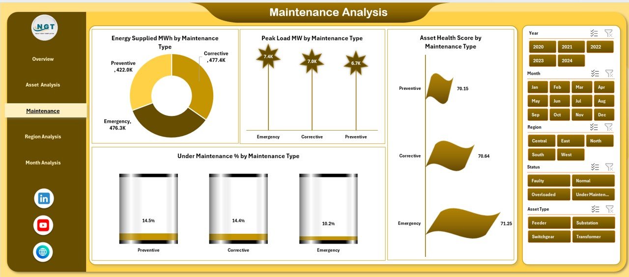
The Maintenance Analysis Page evaluates how different maintenance types impact power distribution.
Key Features of the Maintenance Analysis Page:
-
Right-side slicers for maintenance comparison
-
Clear visibility into maintenance effectiveness
Charts Included on the Maintenance Analysis Page:
-
Energy Billed MWh by Maintenance Type
-
Peak Load MW by Maintenance Type
-
Asset Health Score by Maintenance Type
-
Under Maintenance % by Maintenance Type
Why This Page Matters:
This page allows operations teams to assess maintenance strategies. As a result, they can optimize schedules, reduce downtime, and improve load management.
Region Analysis Page – Which Regions Perform Better?
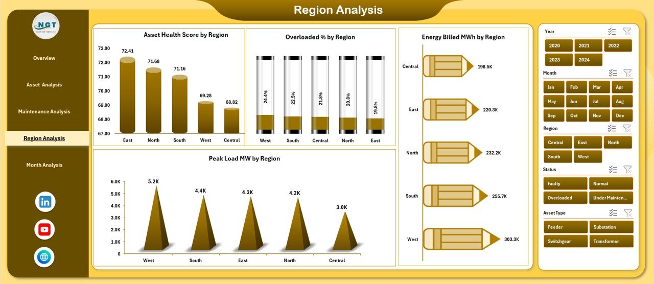
The Region Analysis Page compares power performance across different geographic regions.
Key Features of the Region Analysis Page:
-
Right-side slicers for geographic filtering
-
Regional benchmarking visuals
Charts Included on the Region Analysis Page:
-
Energy Billed MWh by Region
-
Overloaded % by Region
-
Asset Health Score by Region
-
Peak Load MW by Region
Why This Page Matters:
This page helps identify high-risk regions. Therefore, utilities can allocate resources efficiently and improve regional reliability.
Month Analysis Page – How Does Performance Change Over Time?
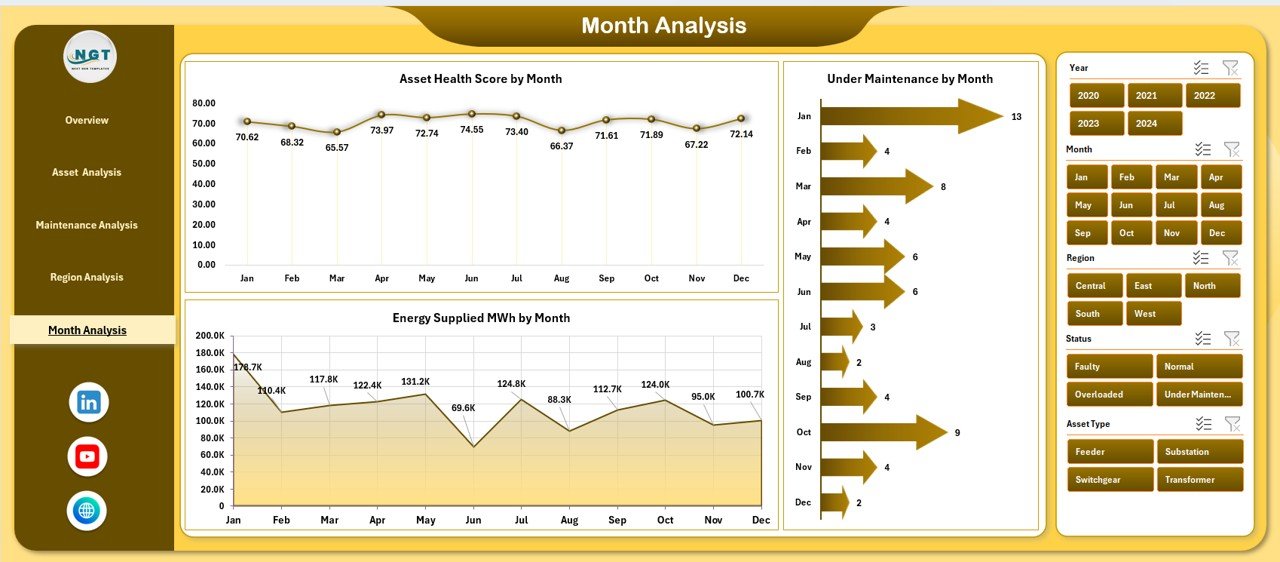
The Month Analysis Page analyzes trends across months.
Key Features of the Month Analysis Page:
-
Right-side slicers for time-based filtering
-
Clear monthly trend visuals
Charts Included on the Month Analysis Page:
-
Asset Health Score by Month
-
Under Maintenance % by Month
-
Energy Supplied MWh by Month
Why This Page Matters:
This page helps identify seasonal patterns. Moreover, it supports better forecasting and future planning.
What Role Do Data and Support Sheets Play?
Data Sheet
-
Stores raw power distribution data
-
Acts as the foundation of all analysis
-
Ensures consistency and accuracy
Support Sheet
-
Contains lookup tables and helper calculations
-
Improves dashboard performance and scalability
Because of this structure, the dashboard remains clean, organized, and efficient.
Advantages of Power Distribution Dashboard in Excel
Click to Purchases Power Distribution Dashboard in Excel
A Power Distribution Dashboard in Excel offers several powerful advantages.
✅ Centralized Information
-
All power data stays in one place
-
Reduces dependency on multiple reports
✅ Faster Decision-Making
-
Visual insights simplify analysis
-
Managers act quickly on risks
✅ Improved Asset Reliability
-
Early detection of overloads and outages
-
Better maintenance planning
✅ Cost and Energy Efficiency
-
Highlights high energy losses
-
Supports cost control initiatives
✅ Easy Customization
-
Excel allows flexible formulas and layouts
-
Users can modify KPIs easily
✅ No Advanced Tools Required
-
Runs entirely in Excel
-
No coding or expensive software needed
Who Can Use a Power Distribution Dashboard in Excel?
This dashboard benefits a wide range of users, including:
-
Power utility companies
-
Energy distribution firms
-
Infrastructure managers
-
Smart city planners
-
Electrical maintenance teams
-
Energy consultants
Because Excel remains widely used, both technical and non-technical users can effectively use this dashboard.
Best Practices for the Power Distribution Dashboard in Excel
Following best practices ensures maximum value from your dashboard.
✅ Keep Data Clean and Updated
-
Validate inputs regularly
-
Remove duplicate records
✅ Use Consistent Units
-
Standardize units like MWh and MW
-
Avoid mixing measurement formats
✅ Limit KPIs to What Matters
-
Focus on actionable metrics
-
Avoid clutter
✅ Use Clear Slicer Labels
-
Make filters intuitive
-
Improve user experience
✅ Review Trends Regularly
-
Monitor monthly and regional changes
-
Adjust strategies proactively
✅ Secure the File
-
Protect formulas and structure
-
Avoid accidental changes
How Does This Dashboard Improve Decision-Making?
The Power Distribution Dashboard in Excel improves decision-making by:
-
Showing risks visually
-
Highlighting inefficiencies instantly
-
Supporting what-if analysis
-
Enabling data-backed strategies
As a result, leaders move from reactive to proactive management.
Conclusion
A Power Distribution Dashboard in Excel transforms how power utilities and energy teams manage distribution networks. Instead of relying on scattered reports and manual analysis, users gain a clear, interactive, and centralized view of operations.
With pages like Overview, Asset Analysis, Maintenance Analysis, Region Analysis, and Month Analysis, this dashboard delivers actionable insights at every level. Moreover, its Excel-based design ensures flexibility, affordability, and ease of use.
If you want better visibility, smarter maintenance planning, and improved energy efficiency, a Power Distribution Dashboard in Excel becomes an essential tool.
Frequently Asked Questions (FAQs)
What is a Power Distribution Dashboard in Excel used for?
A Power Distribution Dashboard in Excel tracks energy supply, asset health, maintenance status, and regional performance in one interactive view.
Can I customize the Power Distribution Dashboard in Excel?
Yes, Excel allows full customization of KPIs, charts, and layouts based on operational needs.
Do I need advanced Excel skills to use this dashboard?
No, basic Excel knowledge is enough to interact with slicers and charts.
How often should I update the dashboard data?
You should update the data daily, weekly, or monthly depending on operational requirements.
Is this dashboard suitable for large power networks?
Yes, with proper data structure, the dashboard can support both small and large power distribution systems.
Can this dashboard support decision-making for maintenance planning?
Yes, the maintenance analysis page clearly shows asset condition, peak loads, and downtime trends.
Visit our YouTube channel to learn step-by-step video tutorials