Managing a modern pathology laboratory involves much more than just processing samples and generating test reports. Today, lab owners and managers must track turnaround time, pending tests, delayed reports, revenue trends, test costs, and city-wise performance on a daily basis. However, many labs still rely on manual Excel sheets or fragmented reports, which slows down decision-making.
That is exactly where a Pathology Labs Dashboard in Excel becomes a powerful and practical solution.
In this detailed article, you will understand what a Pathology Labs Dashboard in Excel is, why it is essential, how it works, how each dashboard page helps management, and how to use best practices for reliable insights. In addition, you will also explore its advantages and frequently asked questions at the end.
Click to Purchases Pathology Labs Dashboard in Excel
What Is a Pathology Labs Dashboard in Excel?
A Pathology Labs Dashboard in Excel is a ready-to-use analytical tool designed to convert raw pathology lab data into meaningful insights through interactive charts, KPI cards, and slicers.
Instead of reviewing multiple Excel sheets and manual reports, this dashboard provides a single performance control center. Because of this centralized approach, lab managers can track operational efficiency, monitor test status, analyze revenue, and identify delays instantly.
Moreover, Excel dashboards allow labs to avoid costly BI tools while still achieving professional-level analytics.
Why Do Pathology Labs Need a Dashboard in Excel?
Pathology labs deal with large volumes of diagnostic data every day. Therefore, managing this data manually creates delays, errors, and visibility gaps.
A Pathology Labs Dashboard in Excel helps because:
-
Lab managers can identify pending and delayed tests immediately
-
Management teams can monitor revenue and cost trends daily
-
Operations teams can analyze turnaround time lab-wise
-
Decision-makers can compare performance by test category, city, and month
As a result, labs gain better operational control and improved service quality.
How Does a Pathology Labs Dashboard in Excel Work?
The dashboard works by connecting structured lab data to pivot tables, charts, and slicers within Excel. Once you update the data sheet, the dashboard refreshes automatically.
Core Components of the Dashboard
-
Data Sheet – Stores all test-related records
-
Support Sheet – Handles calculated fields and mapping logic
-
Dashboard Pages – Visual performance summaries
-
Slicers (Silencers) – Filter insights instantly
Because everything stays inside Excel, users do not require advanced technical skills.
Key Features of the Pathology Labs Dashboard in Excel
This dashboard comes with several professionally designed features that simplify performance monitoring.
✅ Page Navigator for Easy Navigation
The page navigator sits on the left side, allowing users to move quickly between analytical pages. Consequently, users reduce time spent searching for insights.
✅ Right-Side Slicers for Quick Filtering
Each dashboard page includes right-side slicers, enabling instant filtering by lab, test category, city, or month. Therefore, analysis becomes faster and more focused.
✅ KPI Cards for Instant Insights
The dashboard includes 5 KPI cards on the overview page. These cards provide quick visibility into core performance metrics.
✅ Fully Automated Charts
All charts update automatically when users change slicers or refresh data.
Dashboard Pages Explained in Detail
This Pathology Labs Dashboard in Excel includes five powerful analytical pages, each designed for a specific purpose.
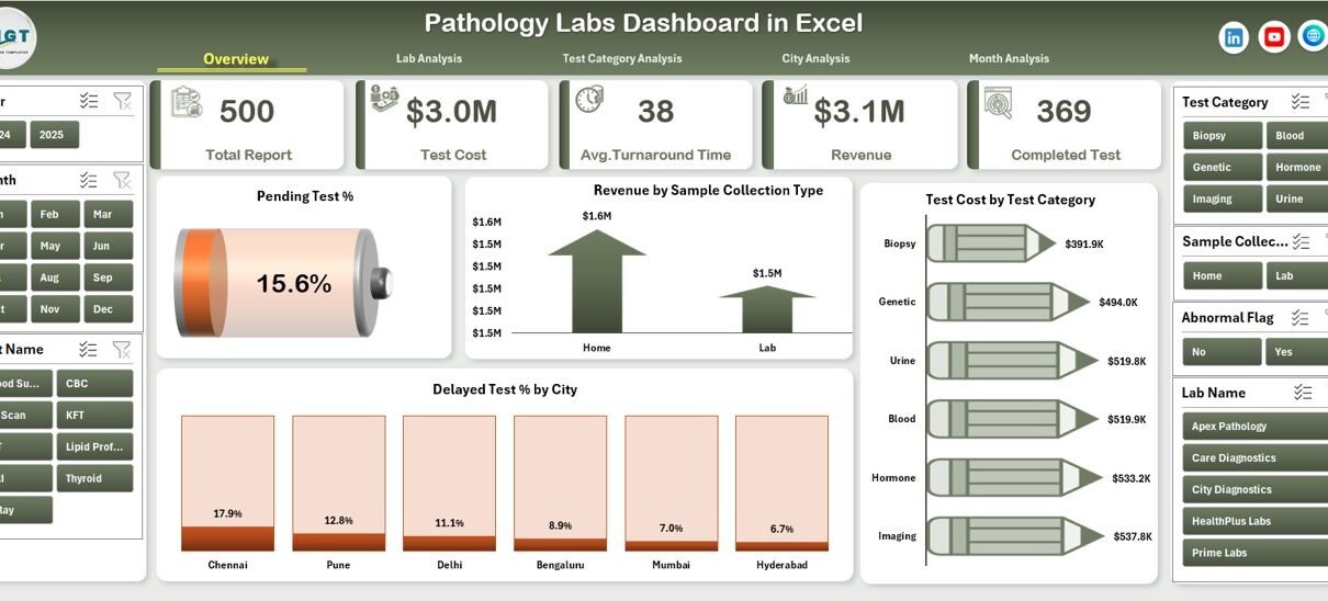
1. What Does the Overview Page Show?
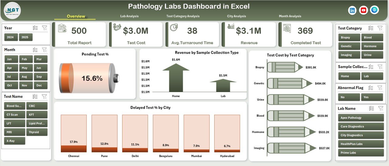
The Overview Page acts as the executive summary of the entire pathology lab operation.
Key Elements of the Overview Page
-
Five KPI Cards showing high-level metrics
-
Right-side slicers for instant filtering
-
Four analytical charts for quick trend analysis
Charts Available on the Overview Page
-
Pending Test % – Highlights unfinished tests
-
Revenue by Sample Collection Type – Shows income contribution by sample source
-
Test Cost by Test Category – Analyzes diagnostic cost efficiency
-
Delayed Test % by City – Identifies risk areas geographically
Because of this structure, decision-makers can instantly identify operational issues and revenue patterns.
2. How Does Lab Analysis Help Improve Performance?
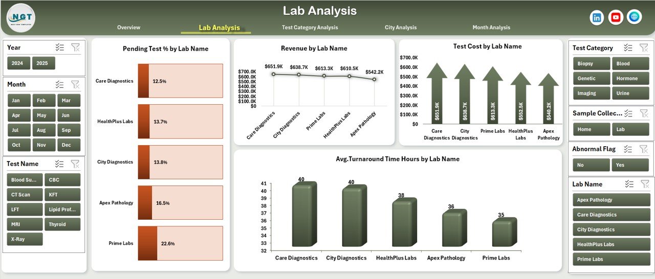
The Lab Analysis Page focuses on lab-wise performance comparison.
Why Lab Analysis Matters
Click to Purchases Pathology Labs Dashboard in Excel
Different labs often perform at different efficiency levels. Therefore, management needs visibility into lab-specific performance.
Charts on the Lab Analysis Page
-
Pending Test % by Lab Name
-
Revenue by Lab Name
-
Test Cost by Lab Name
-
Average Turnaround Hours by Lab Name
Using this page, managers can quickly identify underperforming labs and take corrective action promptly.
3. What Can You Learn from Test Category Analysis?
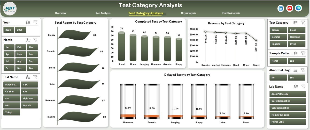
The Test Category Analysis Page evaluates performance based on diagnostic test types.
Why Test Category Analysis Is Important
Some test categories generate higher revenue but take longer processing time. Others remain cost-intensive. Therefore, understanding test-wise trends becomes crucial.
Charts on the Test Category Analysis Page
-
Total Reports by Test Category
-
Completed Tests by Test Category
-
Revenue by Test Category
-
Delayed Test % by Test Category
As a result, labs can optimize resource allocation and pricing strategies.
4. How Does City Analysis Improve Geographic Performance?
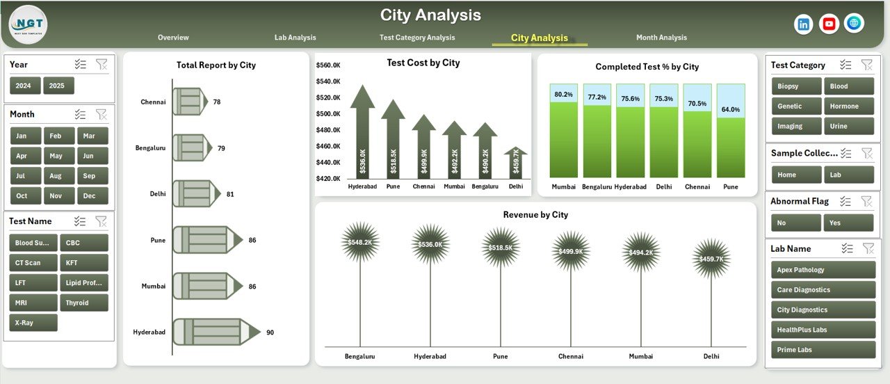
The City Analysis Page helps labs evaluate regional performance across cities.
Benefits of City Analysis
City-wise insights reveal demand patterns, turnaround challenges, and cost differences.
Charts on the City Analysis Page
-
Total Reports by City
-
Test Cost by City
-
Revenue by City
-
Completed Test % by City
Because of these insights, management can decide expansion strategies and staffing requirements city-wise.
5. What Insights Does Month Analysis Provide?
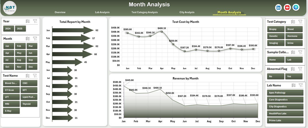
The Month Analysis Page focuses on time-based trends.
Why Month-Based Analysis Is Useful
Seasonal trends often affect diagnostic volumes and revenue. Therefore, month-wise analysis supports better planning.
Charts on the Month Analysis Page
-
Total Reports by Month
-
Test Cost by Month
-
Revenue by Month
Using these visuals, labs can forecast demand and allocate budgets more efficiently.
Advantages of Pathology Labs Dashboard in Excel
The Pathology Labs Dashboard in Excel offers several strong advantages.
✅ Centralized Performance Monitoring
All KPIs stay in one dashboard, eliminating multiple reports.
✅ Faster Decision-Making
Managers instantly spot delays, pending tests, and revenue dips.
✅ Cost-Effective Solution
Excel dashboards eliminate the need for expensive BI tools.
✅ User-Friendly Interface
Non-technical users can easily filter and analyze data.
✅ Scalable Design
Labs can expand data volume without redesigning the dashboard.
Best Practices for the Pathology Labs Dashboard in Excel
Following best practices ensures accurate insights and long-term usability.
✅ Maintain Clean Data Structure
Always use consistent formats for lab names, cities, and test categories.
✅ Refresh Data Regularly
Frequent data updates ensure real-time insights.
✅ Use Standard Naming Conventions
Standardized fields reduce calculation errors.
✅ Review KPIs Weekly
Weekly dashboard reviews help identify bottlenecks early.
✅ Train Staff on Dashboard Usage
Basic training maximizes adoption and benefit.
How Does This Dashboard Support Operational Efficiency?
This dashboard supports efficiency by:
-
Reducing report preparation time
-
Improving lab turnaround visibility
-
Highlighting delayed tests before escalation
-
Supporting revenue optimization decisions
Consequently, labs operate smoother and deliver better patient service.
Who Can Benefit from a Pathology Labs Dashboard in Excel?
Click to Purchases Pathology Labs Dashboard in Excel
This dashboard proves valuable for:
-
Pathology lab owners
-
Operations managers
-
Finance and billing teams
-
Quality control teams
-
Regional managers
How Easy Is It to Customize This Dashboard?
Customization remains simple because the dashboard uses Excel-native features. Users can add new labs, cities, or test categories without structural changes.
Conclusion: Why Choose a Pathology Labs Dashboard in Excel?
A Pathology Labs Dashboard in Excel transforms raw lab data into actionable insights. Instead of dealing with scattered reports and manual calculations, labs gain a centralized, visual, and automated performance monitoring system.
Because the dashboard simplifies analysis, improves transparency, and supports faster decisions, it becomes an essential tool for modern pathology labs aiming for operational excellence and sustained growth.
Frequently Asked Questions (FAQs)
❓ What data is required for a Pathology Labs Dashboard in Excel?
You need test records including test category, lab name, city, test cost, revenue, status, and turnaround time.
❓ Can small pathology labs use this dashboard?
Yes, small and medium labs can easily use and scale this dashboard.
❓ Does the dashboard update automatically?
Yes, charts and KPIs update automatically after refreshing data.
❓ Can this dashboard handle multiple cities and labs?
Yes, it supports multi-city and multi-lab analysis.
❓ Do users need Excel expertise to operate it?
No, basic Excel knowledge is sufficient.
Visit our YouTube channel to learn step-by-step video tutorials