Memes and viral content now sit at the heart of digital culture. Brands, creators, agencies, and social media teams rely on memes to boost engagement, build communities, and stay relevant. However, while creativity fuels virality, data sustains success. Without proper performance tracking, even the most creative meme strategy becomes guesswork.
That is exactly where the Meme and Viral Content Creation KPI Dashboard in Excel becomes a powerful solution.
In this detailed, SEO-friendly, and easy-to-understand article, you will learn what a Meme and Viral Content Creation KPI Dashboard in Excel is, why it matters, how it works, worksheet-wise structure, advantages, best practices, and frequently asked questions. Moreover, this article expands your provided information with practical insights so you can confidently use this dashboard in real-world meme marketing and viral content operations.
Click to Purchases Meme and Viral Content Creation KPI Dashboard in Excel
What Is a Meme and Viral Content Creation KPI Dashboard in Excel?
A Meme and Viral Content Creation KPI Dashboard in Excel is a ready-to-use performance tracking tool designed to measure, analyze, and visualize the effectiveness of memes and viral content campaigns.
Instead of managing multiple spreadsheets for engagement, reach, shares, and growth, this dashboard consolidates all critical KPIs into one structured Excel file. Consequently, content creators, social media managers, and marketing teams gain instant clarity on what works and what does not.
Moreover, because the dashboard runs entirely in Excel, teams can update data easily without relying on advanced tools or complex software.
Why Do Meme Creators and Social Media Teams Need a KPI Dashboard?
Memes move fast. Trends change daily. Platforms evolve constantly. Therefore, creators must evaluate performance quickly and accurately.
Common Challenges Without a KPI Dashboard
-
Engagement data scattered across platforms
-
No clear comparison between months
-
Difficulty tracking viral growth patterns
-
Manual calculations causing errors
-
Poor visibility into target achievement
However, a Meme and Viral Content Creation KPI Dashboard in Excel eliminates these challenges by providing a centralized and structured reporting system.
How Does the Meme and Viral Content Creation KPI Dashboard in Excel Work?
The dashboard follows a simple and creator-friendly workflow.
-
First, users enter actual engagement data
-
Then, they input target benchmarks
-
Next, they add previous year or historical numbers
-
Finally, the dashboard calculates MTD, YTD, and comparison metrics automatically
As a result, creators shift from intuition-based decisions to data-driven strategies.
Click to Purchases Meme and Viral Content Creation KPI Dashboard in Excel
What Are the Key Features of the Meme and Viral Content Creation KPI Dashboard in Excel?
This dashboard includes powerful features designed for clarity, speed, and creativity-focused teams.
🔹 Monthly Performance Tracking
-
Month selection using a drop-down
-
Instant refresh of all KPIs
🔹 MTD and YTD Analysis
-
Short-term momentum tracking
-
Long-term growth measurement
🔹 Target vs Actual Comparison
-
Performance benchmarking
-
Goal achievement monitoring
🔹 Previous Year Comparison
-
Viral growth analysis
-
Trend benchmarking
🔹 Visual Performance Indicators
-
Green and red arrows
-
Up and down conditional formatting
How Many Worksheets Are Included in the Dashboard?
The Meme and Viral Content Creation KPI Dashboard in Excel contains 7 well-structured worksheets, each designed for a specific purpose.
1️⃣ What Is the Home Sheet in This Dashboard?

The Home Sheet works as the navigation hub.
Key Highlights of the Home Sheet
-
Clean and simple index layout
-
6 navigation buttons
-
One-click access to major sheets
Therefore, users navigate the dashboard smoothly without searching for tabs.
Click to Purchases Meme and Viral Content Creation KPI Dashboard in Excel
2️⃣ What Does the Dashboard Sheet Show?
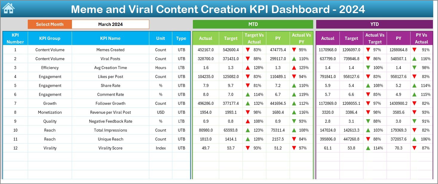
The Dashboard Sheet serves as the central performance overview.
Month Selection (Cell D3)
-
Select the reporting month
-
Entire dashboard updates automatically
This feature allows quick analysis of any period.
MTD Performance Section
This section focuses on Month-to-Date performance.
-
MTD Actual – Current month engagement
-
MTD Target – Planned engagement goal
-
Previous Year MTD – Historical benchmark
-
Target vs Actual % – Actual ÷ Target
-
PY vs Actual % – Actual ÷ Previous Year
Conditional arrows highlight performance success or decline instantly.
YTD Performance Section
This section measures Year-to-Date growth.
-
YTD Actual – Cumulative engagement
-
YTD Target – Planned yearly goal
-
Previous Year YTD – Historical cumulative performance
-
Target vs Actual % – Actual ÷ Target
-
PY vs Actual % – Actual ÷ Previous Year
As a result, teams balance viral spikes with sustainable growth.
3️⃣ What Is the KPI Trend Sheet and Why Is It Critical?
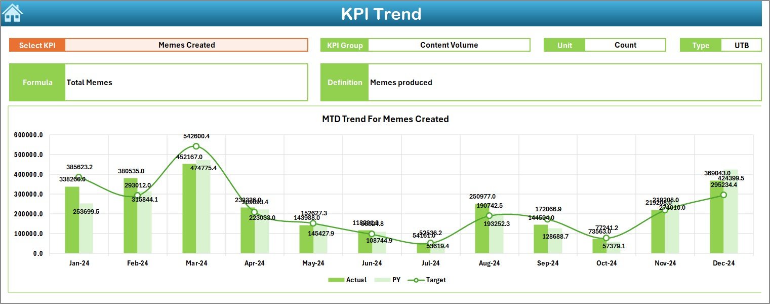
The KPI Trend Sheet reveals performance movement over time.
Key Elements of the KPI Trend Sheet
-
KPI selection drop-down at cell C3
-
KPI Group
-
KPI Unit
-
KPI Type (Lower the Better / Upper the Better)
-
KPI Formula and Definition
Trend Charts Included
-
MTD Trend Chart
-
Actual
-
Target
-
Previous Year
-
-
YTD Trend Chart
-
Actual
-
Target
-
Previous Year
-
Because of these visuals, creators quickly identify what content formats go viral consistently.
Click to Purchases Meme and Viral Content Creation KPI Dashboard in Excel
4️⃣ What Is the Actual Numbers Input Sheet?
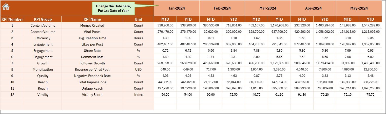
The Actual Numbers Input Sheet captures real performance data.
How to Use This Sheet
-
Enter MTD and YTD actual numbers
-
Change the month using cell E1
-
Input the first month of the year as the base
As a result, calculations remain accurate and consistent.
5️⃣ What Is the Target Sheet Used For?

The Target Sheet stores planned benchmarks.
Data Captured in This Sheet
-
KPI-wise MTD targets
-
KPI-wise YTD targets
-
Monthly performance goals
This structure ensures disciplined content growth tracking.
6️⃣ Why Is the Previous Year Number Sheet Important?

The Previous Year Number Sheet supports historical analysis.
Key Benefits
-
Stores last year’s MTD data
-
Stores last year’s YTD data
-
Enables CY vs PY comparisons
Therefore, teams measure growth beyond short-term virality.
7️⃣ What Is the KPI Definition Sheet?

The KPI Definition Sheet ensures KPI clarity and governance.
Information Stored
-
KPI Name
-
KPI Group
-
Unit
-
Formula
-
KPI Definition
This sheet prevents misinterpretation and confusion across teams.
Advantages of Meme and Viral Content Creation KPI Dashboard in Excel
Using this dashboard delivers clear benefits.
✅ Clear Performance Visibility
All viral KPIs appear in one place.
✅ Faster Content Decisions
Creators adjust strategies quickly.
✅ Improved Engagement Tracking
MTD and YTD metrics reveal momentum.
✅ Data-Driven Creativity
Creativity aligns with measurable outcomes.
✅ Strong Historical Insights
Past performance guides future trends.
✅ Easy Adoption
Excel-based design reduces learning curve.
Click to Purchases Meme and Viral Content Creation KPI Dashboard in Excel
Best Practices for Meme and Viral Content Creation KPI Dashboard in Excel
To maximize dashboard value, follow these best practices.
🔹 Define KPIs Clearly
Always document formulas and definitions.
🔹 Update Data Regularly
Monthly updates ensure accuracy.
🔹 Set Realistic Targets
Base targets on historical performance.
🔹 Monitor Trends Weekly
Trends reveal viral potential early.
🔹 Classify KPI Types Correctly
Use LTB and UTB wisely.
🔹 Balance Virality and Consistency
Focus on sustainable growth, not just spikes.
How Does This Dashboard Support Meme Marketing Strategy?
This dashboard helps teams:
-
Identify high-performing meme formats
-
Optimize posting schedules
-
Improve engagement strategies
-
Track community growth
-
Align creativity with measurable results
Therefore, teams move from random posting to strategic content planning.
Conclusion: Why Use a Meme and Viral Content Creation KPI Dashboard in Excel?
A Meme and Viral Content Creation KPI Dashboard in Excel transforms creative chaos into structured performance insights. Because it combines Excel simplicity with powerful analytics, teams gain clarity without complexity.
Moreover, this dashboard supports smarter decisions, consistent growth, and sustainable virality. If you want to turn memes into measurable success, this dashboard becomes an essential tool.
Click to Purchases Meme and Viral Content Creation KPI Dashboard in Excel
Frequently Asked Questions (FAQs)
❓ What is a Meme and Viral Content Creation KPI Dashboard in Excel?
It is an Excel-based tool used to track and analyze meme engagement, reach, and viral performance.
❓ Who can use this dashboard?
Content creators, meme pages, social media managers, agencies, and brands.
❓ Does it support MTD and YTD analysis?
Yes. It tracks both short-term and long-term performance.
❓ Can KPIs be customized?
Absolutely. Users can add or modify KPIs easily.
❓ Does this dashboard support year-over-year comparison?
Yes. It compares current performance with previous year data.
❓ How often should data be updated?
Monthly updates work best for reliable insights.
Click to Purchases Meme and Viral Content Creation KPI Dashboard in Excel
Visit our YouTube channel to learn step-by-step video tutorials