Managing purchasing operations in a refinery is never simple. Refineries deal with high-value raw materials, multiple vendors, strict compliance rules, and continuous cost pressure. Therefore, procurement teams must track performance daily, monthly, and yearly with absolute clarity. However, when purchasing data stays scattered across Excel files and static reports, teams lose visibility and control. As a result, cost overruns, delayed orders, and supplier inefficiencies increase.
That is exactly why a Refinery Purchasing KPI Dashboard in Power BI plays a critical role in modern refinery operations. This ready-to-use dashboard converts raw purchasing data into meaningful KPIs, visual indicators, trends, and comparisons. Consequently, refinery procurement teams gain complete control over purchasing performance and make faster, data-driven decisions.
In this detailed and SEO-friendly guide, you will learn everything about the Refinery Purchasing KPI Dashboard in Power BI. We will cover what it is, how it works, its page structure, KPI logic, Excel data design, advantages, best practices, and frequently asked questions. By the end, you will clearly understand why this dashboard is essential for refinery purchasing excellence.
What Is a Refinery Purchasing KPI Dashboard in Power BI?
A Refinery Purchasing KPI Dashboard in Power BI is a centralized performance monitoring and analytics solution designed to track, analyze, and evaluate key purchasing KPIs in refinery operations.
Instead of managing procurement data in multiple Excel files, emails, and manual reports, this dashboard consolidates all KPIs into one interactive Power BI report. As a result, purchasing managers, finance teams, and leadership gain real-time insights into cost efficiency, supplier performance, and purchasing effectiveness.
Moreover, this dashboard uses Excel as its data source. Therefore, it remains simple to maintain while still delivering enterprise-level analytics.
Why Do Refineries Need a Purchasing KPI Dashboard?
Refineries operate in a highly competitive and cost-sensitive environment. Even a small purchasing inefficiency can result in significant financial impact. Therefore, refinery teams must monitor purchasing KPIs consistently.
A Refinery Purchasing KPI Dashboard helps because:
- It centralizes purchasing data in one place
- It provides instant visibility into MTD and YTD performance
- It highlights target achievements and misses clearly
- It supports better supplier and cost management decisions
Consequently, refineries improve governance, reduce risks, and control costs more effectively.
How Does the Refinery Purchasing KPI Dashboard in Power BI Work?
The dashboard works by combining structured Excel data with interactive Power BI visuals. First, users enter actual, target, and KPI definition data into Excel sheets. Then, Power BI processes this data using predefined calculations and relationships. Finally, the dashboard displays KPIs through cards, tables, charts, and indicators.
Because of this design, users can update data easily without modifying the Power BI model.
Key Pages of the Refinery Purchasing KPI Dashboard in Power BI
This ready-to-use dashboard includes three powerful pages. Each page serves a specific analytical purpose.
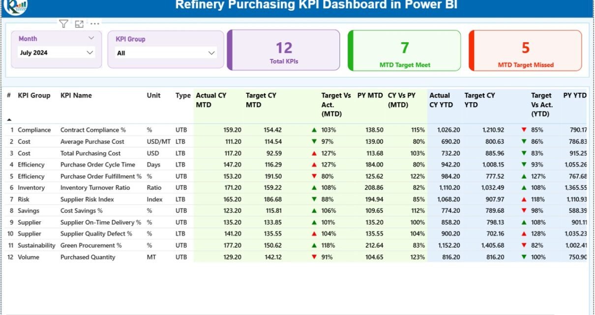
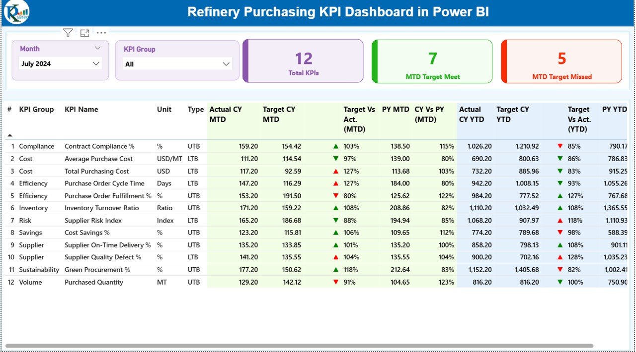
Summary Page: How Does It Provide a Complete KPI Overview?
The Summary Page acts as the main landing page of the dashboard. It delivers a high-level overview of purchasing performance at a glance.
Key Elements of the Summary Page
Month & KPI Group Slicers
At the top, users can filter data by:
- Month
- KPI Group
Because of these slicers, users can focus on specific periods or purchasing categories instantly.
KPI Summary Cards
The dashboard displays three important KPI cards:
- Total KPIs Count
- MTD Target Met Count
- MTD Target Missed Count
These cards quickly show how many purchasing KPIs perform well and how many need attention.
Detailed KPI Performance Table
Below the cards, the dashboard shows a detailed KPI table with rich performance metrics.
KPI Number
- Displays the sequence number of each KPI
KPI Group
- Shows the purchasing category or group
KPI Name
- Displays the name of the purchasing KPI
Unit
- Indicates the unit of measurement
Type (LTB or UTB)
- LTB (Lower the Better) for cost, delays, or defects
- UTB (Upper the Better) for savings, compliance, or efficiency
MTD Performance Metrics
- Actual CY MTD: Actual value for the current year month-to-date
Target CY MTD: Target value for the current year month-to-date
MTD Icon:
▲ Green icon for target met
▼ Red icon for target missed
Target vs Actual (MTD):
Formula: Actual MTD / Target MTD
PY MTD: Previous year MTD value
CY vs PY (MTD):
Formula: Current Year MTD / Previous Year MTD
YTD Performance Metrics
Actual CY YTD: Actual year-to-date value
Target CY YTD: Target year-to-date value
YTD Icon: Visual indicator for YTD performance
Target vs Actual (YTD):
Formula: Actual YTD / Target YTD
PY YTD: Previous year YTD value
CY vs PY (YTD):
Formula: Current Year YTD / Previous Year YTD
Because of this structured table, users can analyze purchasing performance deeply without switching reports.
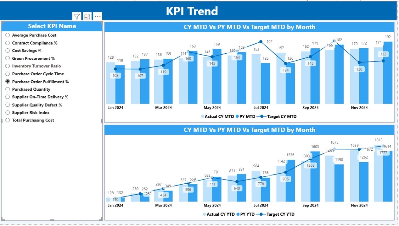
KPI Trend Page: How Can You Track Purchasing Trends Over Time?
The KPI Trend Page focuses on trend analysis. It helps users understand how purchasing KPIs change over time.
Key Features of the KPI Trend Page
Two combo charts:
One for MTD trends
One for YTD trends
Displays:
Current Year Actual
Previous Year Actual
Target values
KPI Selection Slicer
On the left side, users can select a specific KPI. As soon as users select a KPI, charts update automatically. Therefore, trend analysis becomes quick and intuitive.
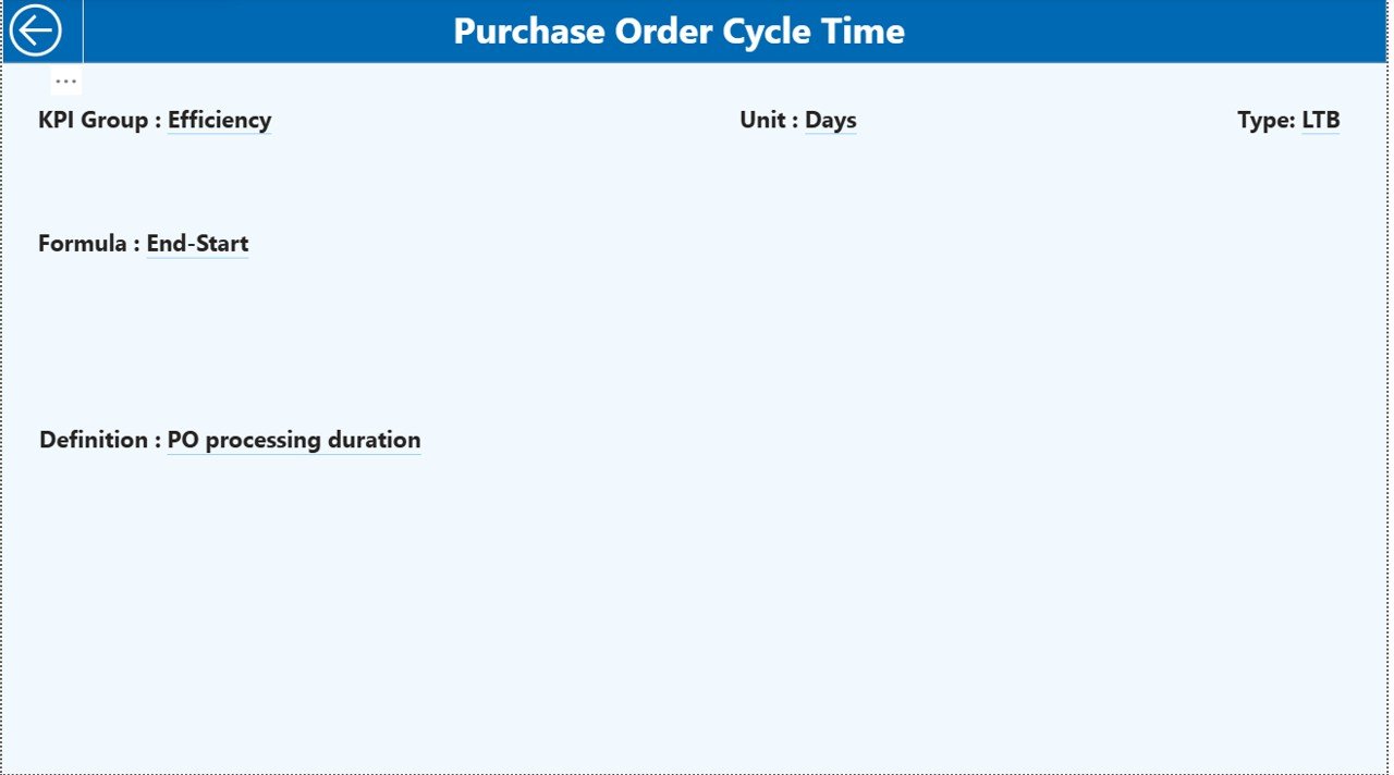
KPI Definition Page: Why Is It Important?
The KPI Definition Page acts as a drill-through page. It remains hidden from the main navigation to maintain a clean design.
What Does This Page Show?
KPI Formula
KPI Definition
KPI Purpose
KPI Type (LTB or UTB)
Users can drill through from the Summary Page to view KPI details. Then, they can return easily using the back button on the top-left corner.
Because of this design, users understand KPIs clearly without cluttering the main dashboard.
Excel Data Structure: How Is the Data Maintained?
The dashboard uses Excel as the data source, which keeps data entry simple and flexible.
Input_Actual Sheet
In this sheet, users enter:
KPI Name
Month (first date of the month)
MTD Actual Value
YTD Actual Value
This sheet captures actual purchasing performance.
Input_Target Sheet
In this sheet, users enter:
KPI Name
Month (first date of the month)
MTD Target Value
YTD Target Value
This sheet defines purchasing goals and benchmarks.
KPI Definition Sheet
In this sheet, users define:
- KPI Number
- KPI Group
- KPI Name
- Unit
- Formula
- Definition
- Type (LTB or UTB)
Because of this separation, data remains clean, structured, and scalable.
What Are the Key Purchasing KPIs Tracked in Refineries?
Although KPIs vary by refinery, common purchasing KPIs include:
- Purchase Cost Variance
- Supplier On-Time Delivery
- Procurement Cycle Time
- Cost Savings Achieved
- Contract Compliance Rate
- Emergency Purchase Percentage
- Vendor Performance Score
This dashboard supports all such KPIs easily.
Advantages of Refinery Purchasing KPI Dashboard in Power BI
Why Should Refineries Use This Dashboard?
- Centralized purchasing performance monitoring
- Clear MTD and YTD visibility
- Instant identification of target misses
- Easy Excel-based data entry
- Interactive filters and visuals
- Strong governance and accountability
Because of these advantages, refinery procurement teams work smarter and faster.
Best Practices for the Refinery Purchasing KPI Dashboard in Power BI
To maximize dashboard value, follow these best practices:
- Define clear KPI formulas and ownership
- Use consistent units and measurement standards
- Update Excel data regularly
- Review MTD performance weekly
- Analyze YTD trends monthly
- Focus on LTB and UTB logic correctly
- Train users on slicers and drill-through features
By following these practices, refineries ensure accurate insights and better decisions.
How Does This Dashboard Improve Decision-Making?
This dashboard transforms purchasing data into insights. Therefore, decision-makers can:
- Identify cost overruns early
- Improve supplier negotiations
- Track savings initiatives
- Strengthen compliance
- Improve purchasing efficiency
As a result, refineries protect margins and improve operational excellence.
Who Can Use the Refinery Purchasing KPI Dashboard?
This dashboard benefits:
- Procurement Managers
- Purchasing Analysts
- Finance Teams
- Supply Chain Managers
- Refinery Leadership
- Operations Heads
Because of its simple design, both technical and non-technical users can use it easily.
Conclusion: Why Is the Refinery Purchasing KPI Dashboard Essential?
The Refinery Purchasing KPI Dashboard in Power BI delivers clarity, control, and confidence in procurement decision-making. It eliminates manual reporting, reduces data confusion, and highlights performance gaps clearly. Moreover, it supports strategic planning through trend analysis and KPI comparisons.
In today’s cost-focused refinery environment, this dashboard is not optional. Instead, it is a strategic necessity.
Frequently Asked Questions (FAQs)
What is a Refinery Purchasing KPI Dashboard in Power BI?
It is an interactive Power BI report that tracks and analyzes purchasing KPIs using Excel data.
Can I customize KPIs in this dashboard?
Yes, you can add, modify, or remove KPIs easily through the Excel KPI Definition sheet.
Does this dashboard support MTD and YTD analysis?
Yes, it supports both MTD and YTD performance with target and previous year comparisons.
Is Excel mandatory as a data source?
Yes, this dashboard uses Excel for simplicity and flexibility.
Can non-technical users use this dashboard?
Yes, the dashboard design remains user-friendly and intuitive.
Does it support LTB and UTB KPIs?
Yes, it fully supports both Lower the Better and Upper the Better KPI logic.
Visit our YouTube channel to learn step-by-step video tutorials
Watch the step-by-step video tutorial: