Managing student exchange programs requires accuracy, transparency, and continuous performance tracking. However, many universities, colleges, and education agencies still rely on scattered Excel files and manual reports. As a result, decision-makers struggle to understand trends, monitor targets, and take timely actions.
That is exactly where a Student Exchange Programs KPI Dashboard in Power BI becomes a powerful solution.
This detailed guide explains what a Student Exchange Programs KPI Dashboard in Power BI is, why institutions need it, how it works, and how to use it effectively. Moreover, you will learn about dashboard pages, KPIs, advantages, best practices, and frequently asked questions. By the end of this article, you will clearly understand how this dashboard transforms student exchange data into actionable insights.
Click to buy Student Exchange Programs KPI Dashboard in Power BI
What Is a Student Exchange Programs KPI Dashboard in Power BI?
A Student Exchange Programs KPI Dashboard in Power BI is a ready-to-use analytical tool designed to monitor, track, and evaluate the performance of student exchange initiatives across institutions, countries, and academic periods.
Instead of reviewing raw data manually, this dashboard converts exchange program data into clear KPIs, visuals, and trends. Therefore, administrators can instantly understand program success, target achievement, and year-over-year performance.
Moreover, Power BI ensures interactive analysis, real-time filtering, and consistent reporting across departments.
Why Do Institutions Need a Student Exchange Programs KPI Dashboard?
Student exchange programs involve multiple stakeholders, targets, and timelines. However, without structured reporting, institutions face several challenges.
Here is why this dashboard becomes essential:
- It centralizes all exchange program KPIs in one view
- It eliminates manual reporting and calculation errors
- It improves transparency across departments
- It supports data-driven decisions
- It tracks both short-term and long-term performance
Because of these benefits, institutions gain better control and confidence in managing international education initiatives.
How Does a Student Exchange Programs KPI Dashboard in Power BI Work?
This dashboard uses Excel as the data source and Power BI as the visualization and analytics layer. As a result, users can maintain data easily while enjoying advanced reporting.
Data Flow Overview
- Data entry happens in structured Excel sheets
- Power BI connects directly to the Excel file
- KPIs calculate automatically
- Visuals update instantly based on slicers
Therefore, users spend less time preparing reports and more time analyzing insights.
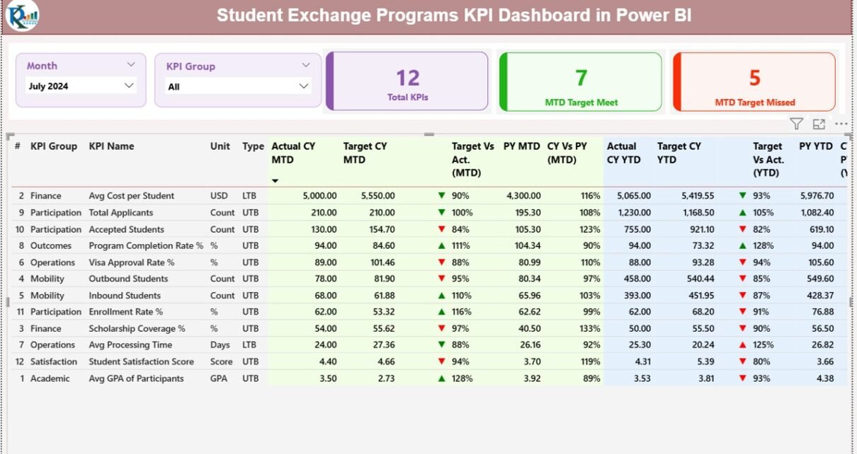
What Are the Key Pages in the Student Exchange Programs KPI Dashboard?
This Power BI dashboard includes three well-structured pages, each designed for a specific purpose.
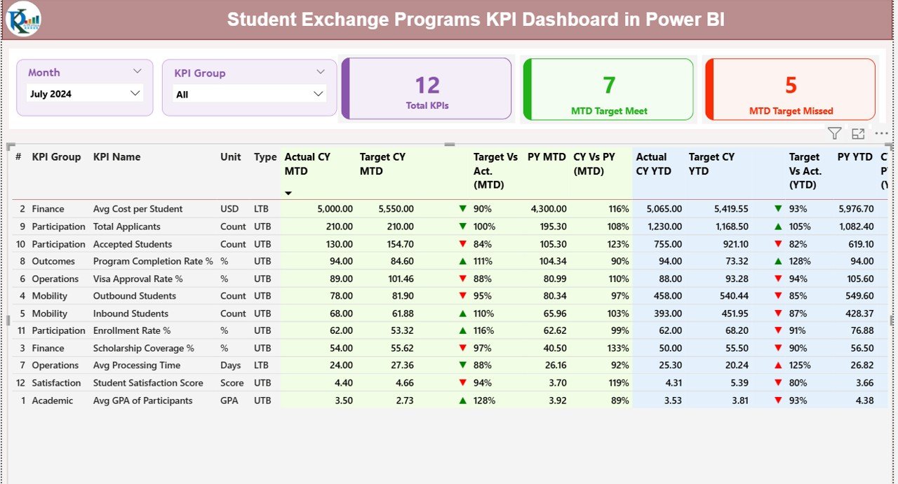
Summary Page Show
The Summary Page acts as the main control center of the dashboard. It provides a high-level overview of all KPIs.
Key Elements on the Summary Page
Interactive Slicers
- Month slicer for period-based analysis
- KPI Group slicer for category-level filtering
Because of these slicers, users can instantly customize the dashboard view.
KPI Cards
- Total KPIs Count
- MTD Target Meet Count
- MTD Target Missed Count
These cards provide quick performance signals at a glance.
Detailed KPI Table
The table includes comprehensive KPI-level details:
- KPI Number – Unique sequence identifier
- KPI Group – Category of the KPI
- KPI Name – Name of the performance metric
- Unit – Measurement unit
- Type – UTB (Upper the Better) or LTB (Lower the Better)
- Actual CY MTD – Current Year Month-to-Date value
- Target CY MTD – Target Month-to-Date value
- MTD Icon – Green ▲ or Red ▼ to indicate performance
- Target vs Actual (MTD) – Actual ÷ Target
- PY MTD – Previous Year MTD value
- CY vs PY (MTD) – Current ÷ Previous Year
- Actual CY YTD – Year-to-Date actual
- Target CY YTD – Year-to-Date target
- YTD Icon – Performance indicator
- Target vs Actual (YTD) – Actual ÷ Target
- PY YTD – Previous Year YTD value
- CY vs PY (YTD) – Current ÷ Previous Year
As a result, users gain full KPI visibility without switching pages.
Click to buy Student Exchange Programs KPI Dashboard in Power BI
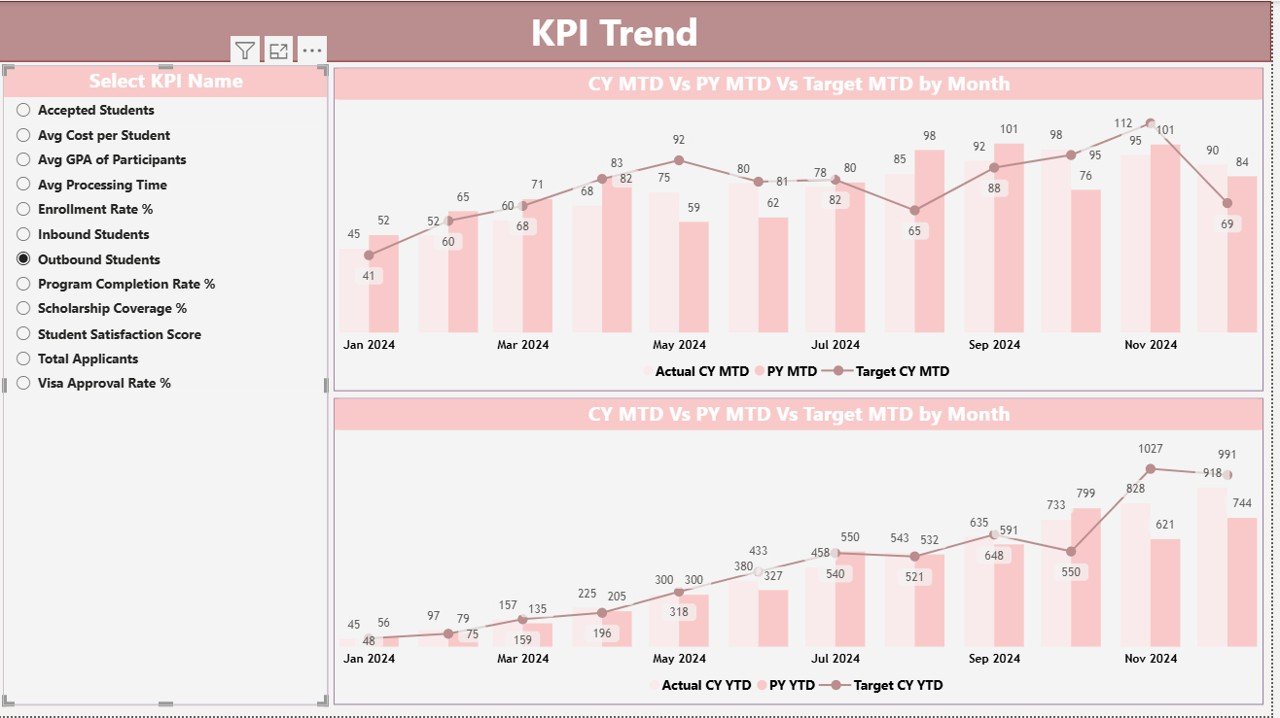
KPI Trend Page
The KPI Trend Page focuses on performance trends over time.
Key Features of the KPI Trend Page
- KPI selection slicer on the left
- Two combo charts for MTD and YTD
- Comparison of Current Year Actual, Previous Year Actual, and Targets
Because of this setup, users can easily identify:
- Growth patterns
- Seasonal trends
- Target gaps
- Performance consistency
Therefore, institutions can act proactively instead of reacting late.
Click to buy Student Exchange Programs KPI Dashboard in Power BI
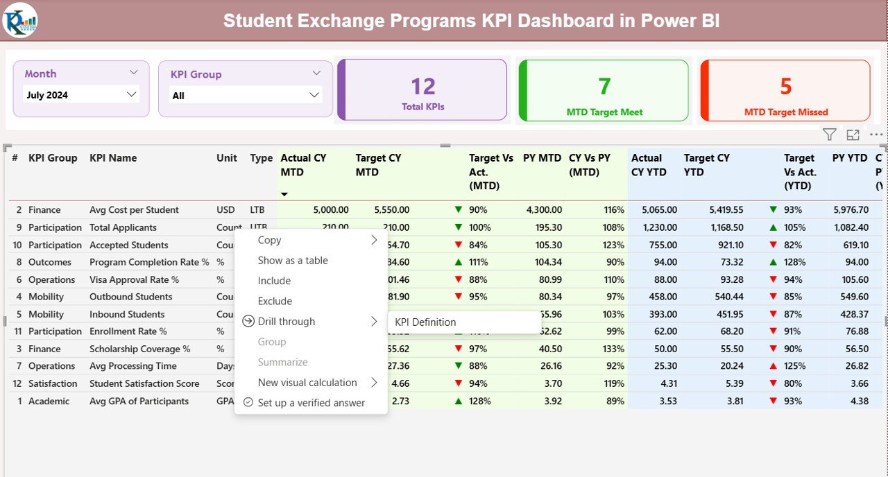
KPI Definition Page
The KPI Definition Page serves as a drill-through page for deeper understanding.
What Information Does It Contain?
- KPI Formula
- KPI Definition
- KPI Unit
- KPI Type (UTB or LTB)
This page stays hidden by default. However, users can drill through from the Summary Page to view details.
Moreover, a back button allows easy navigation to the main dashboard.
Click to buy Student Exchange Programs KPI Dashboard in Power BI
How Is Excel Used as the Data Source?
This dashboard uses a structured Excel file with three worksheets. Because of this design, data entry remains simple and controlled.
Input_Actual Sheet
In the Input_Actual sheet, users enter:
- KPI Name
- Month (first date of the month)
- MTD Actual values
- YTD Actual values
This sheet captures real performance numbers.
Click to buy Student Exchange Programs KPI Dashboard in Power BI
Input_Target Sheet
In the Input_Target sheet, users enter:
- KPI Name
- Month
- MTD Target values
- YTD Target values
As a result, the dashboard can calculate performance gaps accurately.
KPI Definition
In the KPI Definition sheet, users define:
- KPI Number
- KPI Group
- KPI Name
- Unit
- Formula
- Definition
- Type (UTB or LTB)
This sheet ensures consistency and clarity across all KPIs.
What KPIs Can Be Tracked Using This Dashboard?
Institutions can track a wide range of student exchange KPIs, such as:
- Number of outgoing exchange students
- Number of incoming exchange students
- Partner university participation rate
- Application acceptance ratio
- Visa approval success rate
- Student satisfaction score
- Program completion rate
- Budget utilization
- Scholarship distribution
Because of this flexibility, the dashboard adapts to different education systems.
Advantages of Student Exchange Programs KPI Dashboard in Power BI
Using this dashboard offers several practical benefits.
- Centralized Performance Tracking
All KPIs stay available in one dashboard, which improves clarity and consistency.
- Real-Time Insights
As soon as data updates, visuals refresh automatically.
- Reduced Manual Effort
Users no longer calculate percentages or trends manually.
- Better Decision-Making
Clear visuals support faster and more confident decisions.
- Improved Accountability
Target tracking ensures teams stay responsible for outcomes.
- Scalable Design
Institutions can add more KPIs without redesigning the dashboard.
Who Can Use a Student Exchange Programs KPI Dashboard?
This dashboard suits multiple stakeholders:
- Universities and colleges
- International relations departments
- Education consultants
- Government education bodies
- Program coordinators
- Academic administrators
Because of its simplicity, both technical and non-technical users can use it easily.
How Does Power BI Improve Student Exchange Reporting?
Power BI adds advanced capabilities that Excel alone cannot deliver.
Key Power BI Benefits
- Interactive slicers and filters
- Drill-through analysis
- High-performance visuals
- Secure data sharing
- Consistent reporting
Therefore, institutions gain professional-grade analytics without complex systems.
Best Practices for the Student Exchange Programs KPI Dashboard in Power BI
Following best practices ensures accurate and reliable insights.
- Maintain Clean Excel Data
Always validate entries before refreshing Power BI.
- Standardize KPI Definitions
Use consistent units, formulas, and naming conventions.
- Review KPIs Regularly
Remove outdated KPIs and add relevant ones.
- Use Monthly Data Updates
Regular updates improve trend accuracy.
- Train Users
Educate stakeholders on slicers and drill-through options.
- Monitor Target Quality
Set realistic and measurable targets.
How Does This Dashboard Support Strategic Planning?
This dashboard supports planning in several ways:
- Identifies underperforming regions
- Highlights successful exchange partnerships
- Tracks year-over-year growth
- Supports funding allocation decisions
Therefore, leadership teams can align strategy with data.
How Can Institutions Customize This Dashboard?
Customization remains simple and flexible.
Institutions can:
- Add new KPI groups
- Modify KPI formulas
- Change visuals
- Adjust slicers
- Add more trend charts
As a result, the dashboard grows with institutional needs.
Conclusion
A Student Exchange Programs KPI Dashboard in Power BI transforms complex exchange program data into clear, actionable insights. Instead of relying on manual reports, institutions gain real-time visibility into performance, targets, and trends.
Because the dashboard combines Excel data entry with Power BI analytics, it delivers flexibility, accuracy, and scalability. Moreover, structured KPIs, trend analysis, and drill-through details support smarter decisions at every level.
If your institution manages student exchange programs, this dashboard becomes an essential performance management tool.
Frequently Asked Questions About Student Exchange Programs KPI Dashboard in Power BI
What is the main purpose of a Student Exchange KPI Dashboard?
It tracks, analyzes, and visualizes exchange program performance using KPIs.
Can non-technical users use this dashboard?
Yes, the dashboard uses simple slicers and visuals.
Do I need Power BI Service to use it?
No, Power BI Desktop works for analysis.
Can I add more KPIs later?
Yes, the design supports easy KPI expansion.
Is Excel mandatory as a data source?
This version uses Excel, but other sources can be connected.
How often should data be updated?
Monthly updates work best for trend analysis.
Can this dashboard track multiple institutions?
Yes, by adding institution-level filters.
Does it support year-over-year comparison?
Yes, both MTD and YTD comparisons are included.
Visit our YouTube channel to learn step-by-step video tutorials
Watch the step-by-step video tutorial:
Click to buy Student Exchange Programs KPI Dashboard in Power BI