Forestry organizations operate in a complex environment. On one side, they manage natural resources responsibly. On the other side, they must meet productivity, sustainability, safety, and compliance goals. Therefore, forestry teams need clear, timely, and reliable performance insights.
That is exactly where a Forestry KPI Dashboard in Power BI becomes essential. This dashboard transforms raw forestry data into meaningful visuals, trends, and KPIs that support better planning and faster decisions.
In this detailed guide, you will learn what a Forestry KPI Dashboard in Power BI is, why it matters, how it works, its structure, key features, advantages, best practices, and common questions. Moreover, this article explains how a ready-to-use dashboard helps forestry managers monitor performance with confidence.
What Is a Forestry KPI Dashboard in Power BI?
A Forestry KPI Dashboard in Power BI is an interactive performance management and reporting tool built using Microsoft Power BI. It tracks, analyzes, and visualizes key forestry performance indicators in one centralized view.
Instead of reviewing multiple Excel sheets, forestry teams can monitor operational, environmental, and productivity KPIs in a single dashboard. As a result, managers gain instant visibility into Month-to-Date (MTD) and Year-to-Date (YTD) performance.
Moreover, this dashboard uses Excel as a data source. Therefore, users can easily update data without advanced technical skills. Once the Excel file updates, Power BI refreshes the visuals automatically.
Why Do Forestry Organizations Need a KPI Dashboard?
Forestry operations involve harvesting, conservation, compliance, safety, and sustainability. However, manual reporting creates delays and errors. Therefore, a KPI dashboard becomes a necessity rather than a luxury.
Here is why forestry organizations rely on a Power BI KPI dashboard:
-
🌲 Centralizes forestry performance data
-
🌲 Tracks sustainability and operational efficiency
-
🌲 Highlights underperforming KPIs instantly
-
🌲 Supports data-driven decision-making
-
🌲 Saves time on manual reporting
Furthermore, regulatory pressure and environmental responsibility continue to grow. Because of that, forestry teams must monitor KPIs clearly and consistently.
How Does a Forestry KPI Dashboard in Power BI Work?
A Forestry KPI Dashboard in Power BI works through a simple yet powerful workflow:
-
Data Entry in Excel
Forestry teams enter actual and target KPI data in predefined Excel sheets. -
Data Model in Power BI
Power BI connects to the Excel file and creates relationships between tables. -
DAX Calculations
The dashboard calculates MTD, YTD, and year-over-year comparisons. -
Interactive Visuals
Users analyze data using slicers, tables, and combo charts. -
Performance Monitoring
Managers track KPI status using red and green indicators.
As a result, teams move from static reports to dynamic insights.
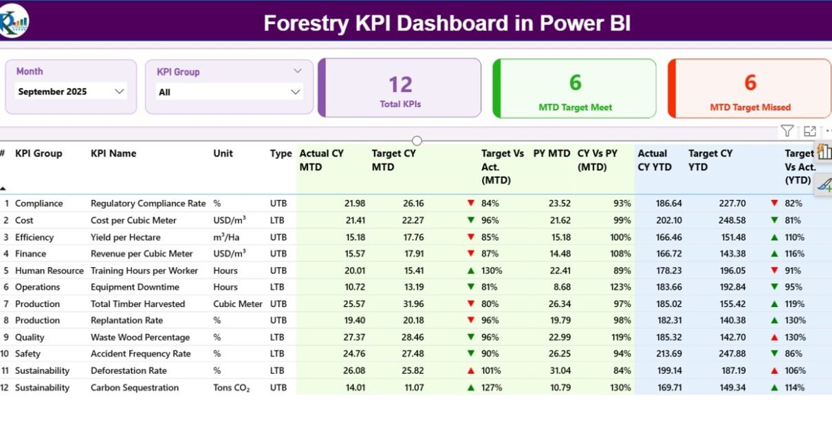
What Are the Key Pages in the Forestry KPI Dashboard in Power BI?
This ready-to-use Forestry KPI Dashboard contains three structured pages. Each page serves a specific analytical purpose.
1) Summary Page: How Does It Provide a Complete KPI Overview?
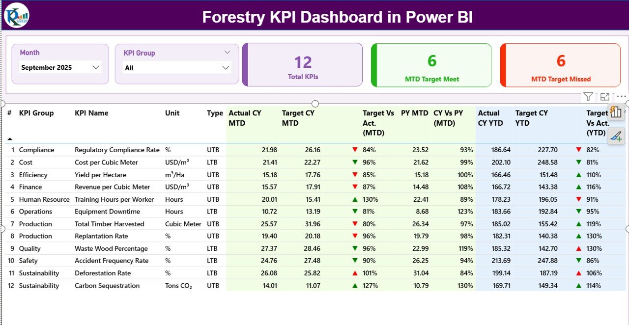
The Summary Page acts as the heart of the dashboard. It gives a complete snapshot of forestry performance at a glance.
Top Section: Slicers and KPI Cards
At the top of the page, you will find:
-
Month Slicer – Select the reporting month
-
KPI Group Slicer – Filter KPIs by category
In addition, three KPI cards display:
-
Total KPIs Count
-
MTD Target Met Count
-
MTD Target Missed Count
These cards immediately show how the forestry operation performs against its targets.
Detailed KPI Table: What Information Does It Show?
Below the cards, a detailed table presents in-depth KPI information:
-
KPI Number – Sequential identifier
-
KPI Group – Category or functional group
-
KPI Name – Name of the forestry KPI
-
Unit – Unit of measurement
-
Type – UTB (Upper the Better) or LTB (Lower the Better)
MTD Performance Columns
The dashboard shows multiple MTD metrics:
-
Actual CY MTD – Current year actual value
-
Target CY MTD – Current year target value
-
MTD Icon – ▲ or ▼ indicator with green/red color
-
Target vs Actual (MTD) – Actual ÷ Target
-
PY MTD – Previous year MTD value
-
CY vs PY (MTD) – Current year ÷ Previous year
Therefore, users can quickly compare performance trends.
YTD Performance Columns
Similarly, YTD metrics include:
-
Actual CY YTD
-
Target CY YTD
-
YTD Icon – Status indicator
-
Target vs Actual (YTD)
-
PY YTD
-
CY vs PY (YTD)
As a result, managers track both short-term and long-term forestry performance.
2) KPI Trend Page: How Can You Analyze Performance Over Time?
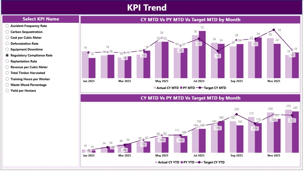
The KPI Trend Page focuses on trend analysis. Instead of reviewing numbers only, users visualize performance movement.
Key Features of the KPI Trend Page
-
🎯 KPI Name slicer on the left
-
📊 Two combo charts
-
📈 Actual vs Target vs Previous Year
The first combo chart shows MTD trends, while the second shows YTD trends. Consequently, users identify seasonal patterns and performance gaps easily.
3) KPI Definition Page: Why Is It Important for Governance?
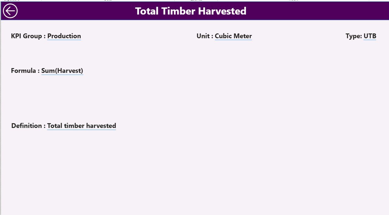
The KPI Definition Page improves transparency and governance. This page remains hidden and works as a drill-through page.
From the Summary Page, users can right-click any KPI and drill through to see:
-
KPI Formula
-
KPI Definition
-
KPI Unit
-
KPI Type (UTB or LTB)
To return, users simply click the Back button at the top-left corner.
What Excel Data Structure Supports the Dashboard?
The Forestry KPI Dashboard uses Excel as its data source. This design keeps the solution flexible and user-friendly.
Excel Workbook Structure
The Excel file contains three worksheets:
1) Input_Actual Sheet
In this sheet, users enter:
-
KPI Name
-
Month (first date of the month)
-
MTD Actual Value
-
YTD Actual Value
This sheet captures real forestry performance data.
2) Input_Target Sheet
In this sheet, users enter:
-
KPI Name
-
Month (first date of the month)
-
MTD Target Value
-
YTD Target Value
This structure ensures accurate target comparisons.
3) KPI Definition Sheet
This sheet defines KPI metadata:
-
KPI Number
-
KPI Group
-
KPI Name
-
Unit
-
Formula
-
Definition
-
Type (UTB or LTB)
Therefore, every KPI remains well-documented and standardized.
Which KPIs Can You Track in a Forestry KPI Dashboard?
A Forestry KPI Dashboard can track multiple performance dimensions, such as:
-
🌳 Timber yield per hectare
-
🌳 Reforestation rate
-
🌳 Harvest efficiency
-
🌳 Compliance incidents
-
🌳 Carbon sequestration
-
🌳 Safety incidents
-
🌳 Equipment utilization
-
🌳 Cost per cubic meter
Moreover, organizations can customize KPIs based on operational goals.
Advantages of a Forestry KPI Dashboard in Power BI
A Forestry KPI Dashboard in Power BI delivers several powerful benefits:
-
✅ Centralized performance monitoring
-
✅ Real-time insights with Excel refresh
-
✅ Clear MTD and YTD visibility
-
✅ Easy identification of underperforming KPIs
-
✅ Improved sustainability tracking
-
✅ Reduced manual reporting effort
Additionally, Power BI visuals improve communication with stakeholders.
How Does Power BI Improve Forestry Decision-Making?
Power BI transforms forestry data into actionable insights. Instead of guessing, managers rely on facts.
Because of interactive slicers and visuals:
-
Managers respond faster to issues
-
Teams align on performance goals
-
Leadership tracks progress objectively
Therefore, forestry operations become more efficient and accountable.
Best Practices for the Forestry KPI Dashboard in Power BI
To maximize value, follow these best practices:
-
🔹 Define clear and measurable KPIs
-
🔹 Maintain consistent KPI definitions
-
🔹 Update Excel data regularly
-
🔹 Use UTB and LTB indicators correctly
-
🔹 Review trends monthly and quarterly
-
🔹 Train users on slicers and drill-through
By following these practices, dashboards stay reliable and impactful.
Who Can Benefit from a Forestry KPI Dashboard?
This dashboard benefits multiple roles:
-
Forestry Managers
-
Sustainability Officers
-
Operations Teams
-
Compliance Teams
-
Senior Leadership
-
Environmental Analysts
As a result, the entire organization gains clarity.
How Is This Dashboard Better Than Manual Excel Reports?
Manual Excel reports consume time and increase errors. In contrast, a Power BI dashboard:
-
Automates calculations
-
Visualizes trends instantly
-
Reduces repetitive work
-
Improves data accuracy
Therefore, forestry teams work smarter, not harder.
Conclusion: Why Should You Use a Forestry KPI Dashboard in Power BI?
A Forestry KPI Dashboard in Power BI brings clarity, control, and confidence to forestry performance management. It combines structured Excel data with powerful Power BI visuals to deliver real-time insights.
By using this ready-to-use dashboard, forestry organizations can monitor KPIs, improve sustainability, and make data-driven decisions consistently.
Frequently Asked Questions (FAQs)
What is a Forestry KPI Dashboard in Power BI?
It is an interactive dashboard that tracks forestry KPIs using Excel data and Power BI visuals.
Can I customize KPIs in the dashboard?
Yes, you can add, remove, or modify KPIs through the Excel source file.
Does this dashboard support MTD and YTD analysis?
Yes, it shows both MTD and YTD performance with comparisons.
Do I need advanced Power BI skills to use it?
No, basic Power BI knowledge is enough to operate this dashboard.
Is Excel mandatory as a data source?
This version uses Excel, but Power BI can connect to other data sources as well.
Visit our YouTube channel to learn step-by-step video tutorials