Managing a convenience store involves fast decisions, thin margins, and constant monitoring. However, many store owners and managers still depend on scattered Excel files, daily sales registers, and manual reports. As a result, tracking sales trends, understanding customer behavior, and controlling costs become difficult and time-consuming.
That is exactly where a Convenience Stores Dashboard in Excel delivers real value.
In this detailed and practical article, you will learn what a Convenience Stores Dashboard in Excel is, why it is important, how it works, its page-wise structure, key features, advantages, best practices, and frequently asked questions. By the end of this guide, you will clearly understand how this ready-to-use Excel dashboard helps convenience store owners and retail managers make faster and smarter decisions.
Click to Purchases Convenience Stores Dashboard in Excel
What Is a Convenience Stores Dashboard in Excel?
A Convenience Stores Dashboard in Excel is a structured, visual, and interactive reporting tool designed to track key retail metrics such as units sold, sales amount, transactions, cost, and gross profit.
Instead of checking multiple sheets or long sales reports, this dashboard presents all critical store performance data in one place. Moreover, it uses Excel’s built-in features such as pivot tables, charts, slicers, and formulas to convert raw data into meaningful insights.
As a result, store managers can monitor daily performance, compare regions or shifts, and identify profitable product categories with ease.
Why Do Convenience Stores Need a Dashboard in Excel?
Convenience stores operate in a high-volume, low-margin environment. Therefore, even small inefficiencies can impact profitability. However, manual reporting often leads to delayed insights and errors.
A Convenience Stores Dashboard in Excel solves these challenges because:
-
It provides real-time visibility into sales and profit
-
It reduces manual reporting effort
-
It improves decision-making speed
-
It helps identify high-performing products, regions, and shifts
-
It supports cost control and profit analysis
Because Excel remains widely used and flexible, this dashboard becomes an ideal solution for both small stores and multi-location retail chains.
What Are the Key Features of a Convenience Stores Dashboard in Excel?
This ready-to-use Convenience Stores Dashboard in Excel comes with a well-structured design and multiple analytical pages. Each page focuses on a specific business question. Moreover, a Page Navigator ensures smooth navigation across all pages.
Page Navigator
The Page Navigator, located on the left side, allows users to move easily between different analytical pages. As a result, users can explore insights without scrolling or searching through sheets.
How Is the Convenience Stores Dashboard Structured?
This dashboard includes five interactive pages in the Excel desktop application file. Each page uses slicers and charts to deliver focused insights.
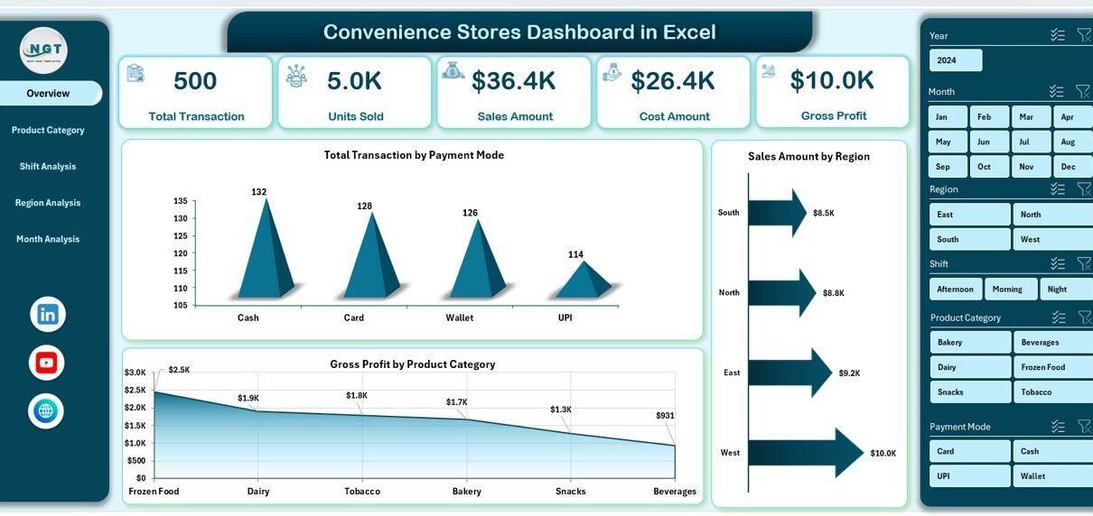
1. Overview Page: What Is the Overall Store Performance?
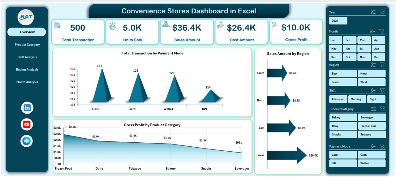
The Overview Page acts as the central summary of the entire dashboard. It provides a quick snapshot of store performance.
Key Elements of the Overview Page
-
Right-side slicer for quick filtering
-
Four KPI cards highlighting key metrics
-
Four analytical charts for high-level insights
Charts on the Overview Page
-
Total Transactions by Payment Mode
This chart shows how customers pay—cash, card, or digital. As a result, managers can understand customer payment preferences. -
Sales Amount by Region
This chart compares sales performance across different regions. Therefore, managers can identify high-revenue areas quickly. -
Gross Profit by Product Category
This chart highlights which product categories generate the highest profit. Consequently, managers can focus on profitable items. -
Additional performance comparison visuals
These visuals support quick decision-making at a glance.
Because this page summarizes everything, managers can review store health within minutes.
2. Product Category Analysis: Which Products Drive Sales and Profit?
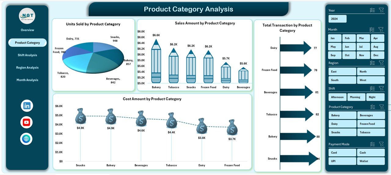
The Product Category Analysis Page focuses on understanding product-level performance. Since convenience stores sell a wide range of items, this analysis becomes critical.
Key Elements of the Product Category Analysis Page
-
Right-side slicer for filtering data
-
Four detailed charts focused on product categories
Charts on the Product Category Analysis Page
-
Units Sold by Product Category
This chart shows which categories sell the most units. As a result, inventory planning becomes easier. -
Sales Amount by Product Category
This chart highlights revenue contribution by each category. Therefore, managers can prioritize high-revenue products. -
Total Transactions by Product Category
This chart reveals how often customers buy from each category. Consequently, it supports promotion planning. -
Cost Amount by Product Category
This chart shows cost distribution across categories. As a result, managers can control expenses more effectively.
Together, these charts help balance volume, revenue, and cost across product categories.
Click to Purchases Convenience Stores Dashboard in Excel
3. Shift Analysis: How Does Performance Vary by Shift?
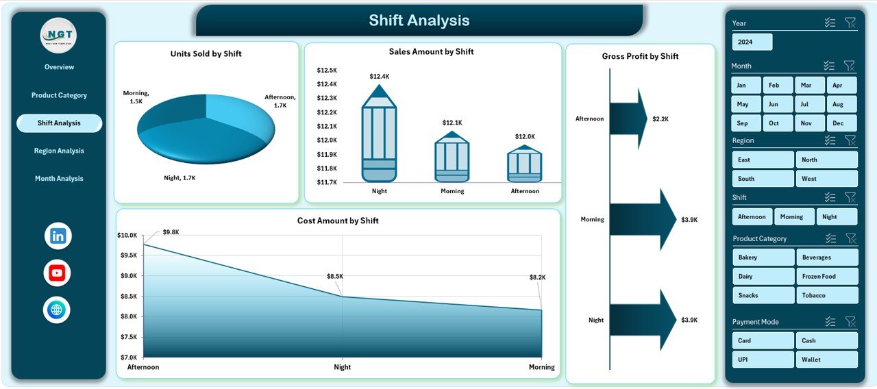
Convenience stores often operate across multiple shifts. Therefore, understanding shift-wise performance becomes essential.
Key Elements of the Shift Analysis Page
-
Right-side slicer for dynamic filtering
-
Four shift-based charts
Charts on the Shift Analysis Page
-
Units Sold by Shift
This chart compares sales volume across morning, evening, and night shifts. -
Sales Amount by Shift
This chart highlights which shift generates the most revenue. -
Total Gross Profit by Shift
This chart shows profit contribution by shift. As a result, managers can optimize staffing and promotions. -
Cost Amount by Shift
This chart tracks cost behavior across shifts, helping control operational expenses.
With this analysis, managers can improve staffing efficiency and maximize profit per shift.
4. Region Analysis: Which Regions Perform Better?
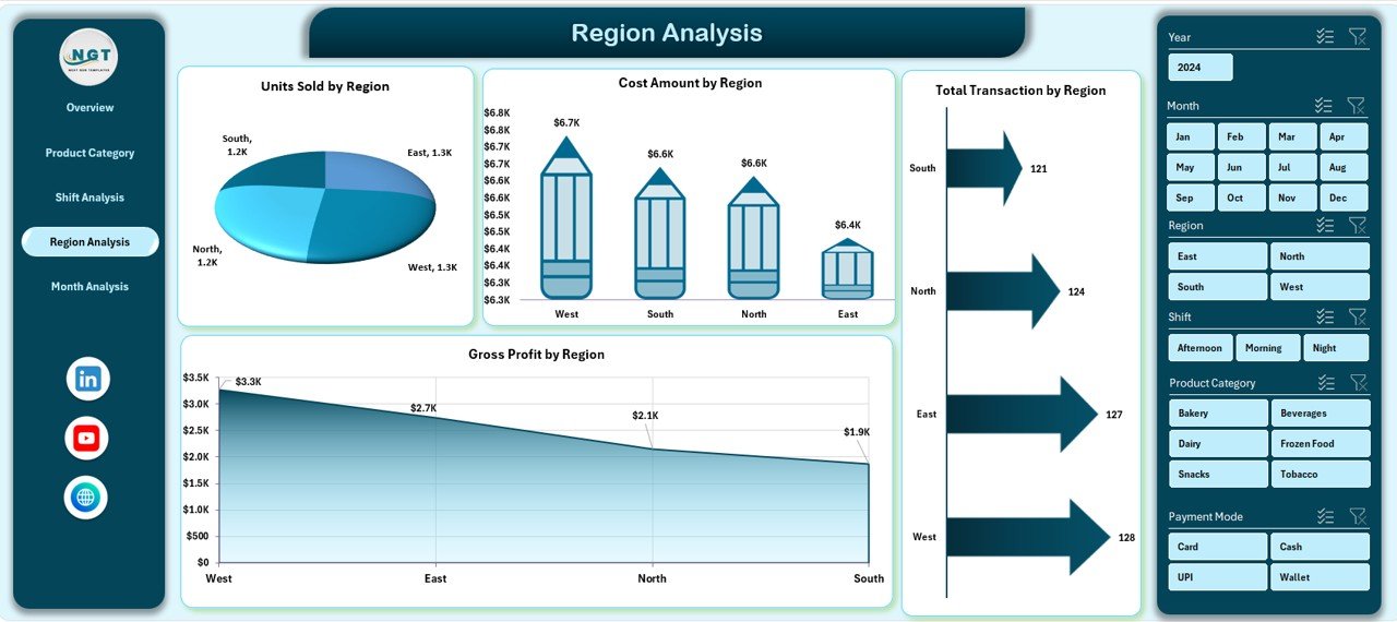
For stores operating across multiple regions, performance often varies due to location, customer behavior, and competition.
Key Elements of the Region Analysis Page
-
Right-side slicer for region filtering
-
Four region-based charts
Charts on the Region Analysis Page
-
Units Sold by Region
This chart compares sales volume across regions. -
Total Transactions by Region
This chart highlights customer activity by region. -
Gross Profit by Region
This chart identifies the most profitable regions. -
Cost Amount by Region
This chart shows cost distribution across locations.
As a result, managers can allocate resources and marketing budgets more effectively.
Click to Purchases Convenience Stores Dashboard in Excel
5. Month Analysis: How Does Performance Change Over Time?
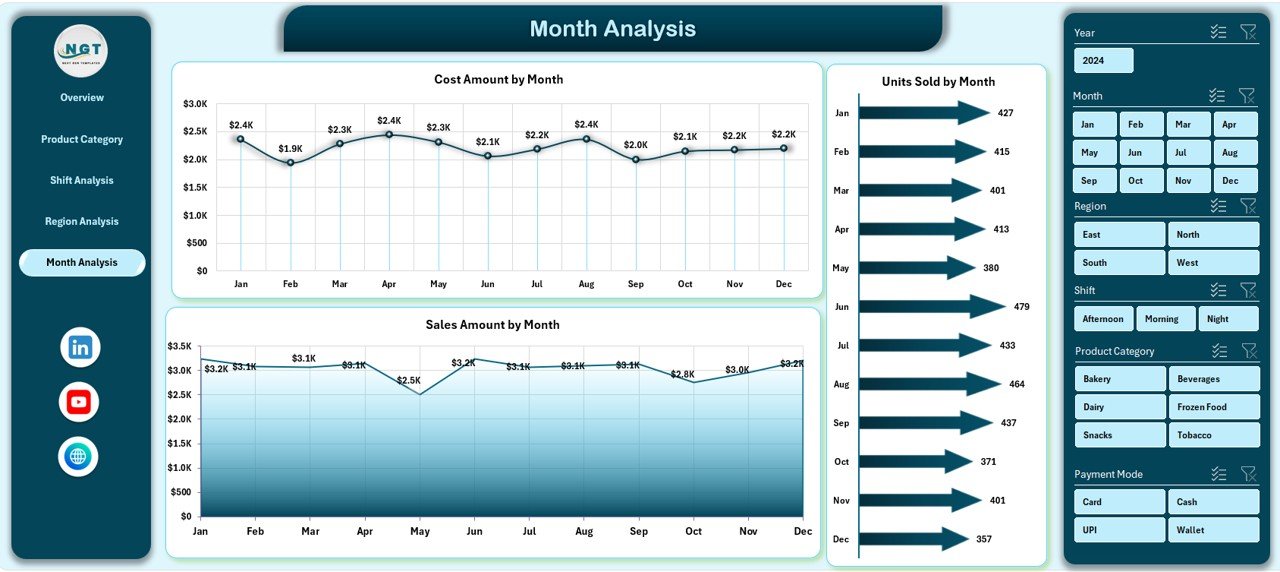
Tracking trends over time helps identify seasonality and growth patterns. Therefore, the Month Analysis Page focuses on time-based performance.
Key Elements of the Month Analysis Page
-
Right-side slicer for month selection
-
Three trend-based charts
Charts on the Month Analysis Page
-
Units Sold by Month
This chart shows monthly sales trends. -
Gross Profit by Month
This chart highlights profit movement over time. -
Cost Amount by Month
This chart tracks monthly cost patterns.
With this analysis, managers can plan promotions, forecast demand, and control expenses proactively.
What Is the Role of the Support Sheet and Data Sheet?
Support Sheet
The Support Sheet stores lookup tables, helper calculations, and structured references. As a result, it keeps the dashboard clean and organized.
Data Sheet
The Data Sheet contains the raw transactional data. This data feeds all pivot tables and charts. Therefore, users only need to update this sheet to refresh the entire dashboard.
Advantages of a Convenience Stores Dashboard in Excel
Using a Convenience Stores Dashboard in Excel delivers multiple business benefits.
Key Advantages
-
📊 Centralized reporting for all store metrics
-
⏱️ Faster decision-making with real-time insights
-
📈 Improved sales and profit visibility
-
💰 Better cost control and margin analysis
-
🔍 Clear product, region, shift, and month comparisons
-
🔄 Easy data updates without technical skills
-
💼 Professional and management-ready reporting
Because of these advantages, this dashboard becomes a powerful tool for daily operations and strategic planning.
Best Practices for Using a Convenience Stores Dashboard in Excel
Click to Purchases Convenience Stores Dashboard in Excel
To get maximum value from the dashboard, follow these best practices.
Best Practices You Should Follow
-
✅ Update the Data Sheet regularly to ensure accuracy
-
✅ Use consistent product, region, and shift names
-
✅ Review the Overview Page daily for quick insights
-
✅ Analyze Product Category and Shift pages weekly
-
✅ Monitor monthly trends for seasonal planning
-
✅ Protect formulas and pivot structures from accidental edits
-
✅ Train store managers to use slicers effectively
By following these practices, you ensure reliable insights and long-term usability.
Who Can Use a Convenience Stores Dashboard in Excel?
This dashboard suits a wide range of users.
-
Convenience store owners
-
Retail chain managers
-
Store supervisors
-
Operations managers
-
Finance and MIS teams
-
Business analysts
Because Excel remains familiar, adoption becomes quick and easy.
Conclusion: Is a Convenience Stores Dashboard in Excel Worth It?
Absolutely.
A Convenience Stores Dashboard in Excel transforms raw sales data into actionable insights. It simplifies reporting, improves visibility, and supports smarter decisions. Moreover, it reduces dependency on manual reports and improves operational efficiency.
If you want better control over sales, profit, cost, and performance, this dashboard becomes an essential tool for your convenience store business.
Frequently Asked Questions (FAQs)
What is a Convenience Stores Dashboard in Excel used for?
A Convenience Stores Dashboard in Excel helps track sales, transactions, cost, and profit across products, regions, shifts, and months in one interactive report.
Can I use this dashboard for multiple stores?
Yes, you can include multiple stores or regions in the Data Sheet and analyze them using slicers.
Do I need advanced Excel skills to use this dashboard?
No, basic Excel knowledge is enough. You only need to update data and use slicers.
How often should I update the data?
You should update the data daily or weekly, depending on your reporting needs.
Can I customize charts and KPIs?
Yes, you can easily customize charts, KPIs, and layouts based on your business requirements.
Does this dashboard support decision-making?
Yes, it provides clear insights that support pricing, staffing, inventory, and regional decisions.
Visit our YouTube channel to learn step-by-step video tutorials