In today’s fast-moving Knowledge Sharing and Collaboration Dashboard, companies must share knowledge quickly. Teams work across departments. Employees join from different locations. Moreover, organizations rely on collaboration to drive innovation.
However, many companies still track training sessions, collaboration meetings, and knowledge programs in scattered Excel files. As a result, managers struggle to measure session cost. They cannot track satisfaction scores properly. They also fail to understand which departments actively share knowledge.
Click to Purchases Knowledge Sharing and Collaboration Dashboard in Power BI
So, how can you monitor knowledge rating, session cost, collaboration type, duration hours, and satisfaction scores in one powerful system?
The answer is simple.
You need a Knowledge Sharing and Collaboration Dashboard in Power BI.
This detailed guide will help you understand everything about this dashboard. You will learn:
-
What a Knowledge Sharing and Collaboration Dashboard in Power BI is
-
Why organizations need it
-
A detailed explanation of all 5 dashboard pages
-
Key KPIs included
-
Advantages of the Knowledge Sharing and Collaboration Dashboard in Power BI
-
Best Practices for the Knowledge Sharing and Collaboration Dashboard
-
Frequently Asked Questions with Answers
Let’s explore step by step.
What Is a Knowledge Sharing and Collaboration Dashboard in Power BI?
A Knowledge Sharing and Collaboration Dashboard in Power BI is an interactive business intelligence tool. It helps organizations track, measure, and improve knowledge exchange across teams.
Instead of reviewing long spreadsheets, managers can see:
-
Session cost by knowledge type
-
Satisfaction score by collaboration type
-
Knowledge rating by location
-
Duration hours by knowledge type
-
Total sessions by department or month
Moreover, Power BI transforms raw data into visual insights. Therefore, leaders can make quick decisions based on facts, not assumptions.
Why Do Organizations Need a Knowledge Sharing and Collaboration Dashboard?
Many companies invest heavily in training and collaboration programs. However, they rarely measure their impact properly.
Without a structured dashboard:
-
Managers cannot track session expenses
-
HR teams cannot measure employee satisfaction
-
Leadership cannot identify knowledge gaps
-
Departments cannot compare performance
On the other hand, a Power BI dashboard provides real-time insights. As a result, organizations improve knowledge quality and reduce unnecessary costs.
Detailed Explanation of All 5 Dashboard Pages
This Knowledge Sharing and Collaboration Dashboard includes 5 powerful pages in the Power BI Desktop application.
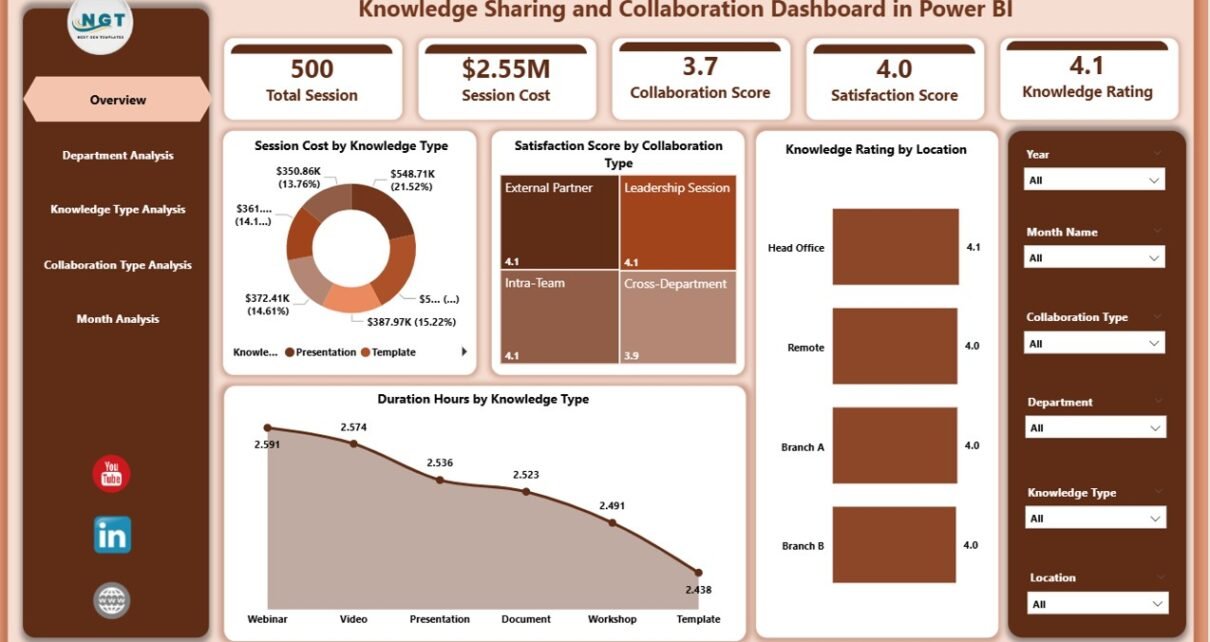
1️⃣ Overview Page – What Can You See at a Glance?
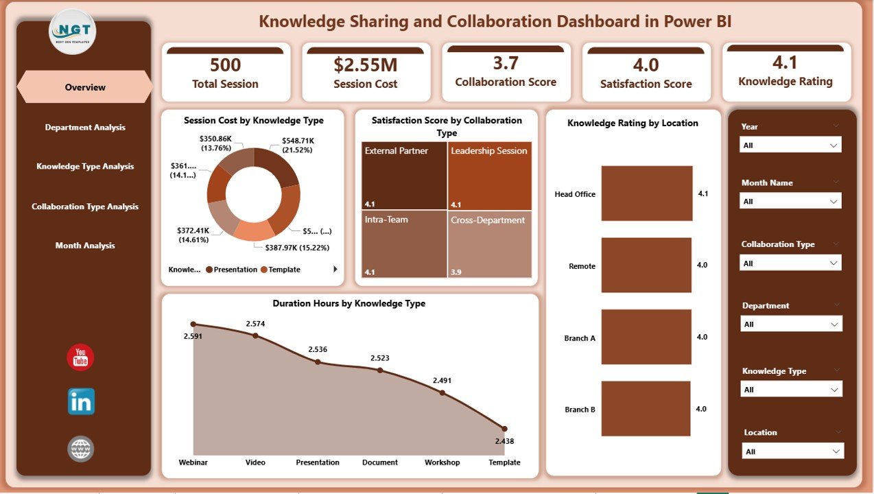
The Overview Page acts as the central command center. It gives a snapshot of overall knowledge-sharing performance.
Key Cards and Metrics:
-
Session Cost by Knowledge Type
-
Satisfaction Score by Collaboration Type
-
Knowledge Rating by Location
-
Duration Hours by Knowledge Type
Moreover, slicers allow users to filter data by:
-
Department
-
Month
-
Knowledge Type
-
Collaboration Type
-
Location
Therefore, managers can quickly compare trends.
Why Is the Overview Page Important?
Because it provides:
-
Quick decision-making support
-
High-level KPI visibility
-
Instant cost and satisfaction tracking
As a result, leaders identify areas that need improvement immediately.
2️⃣ Department Analysis – Which Departments Share Knowledge Effectively?
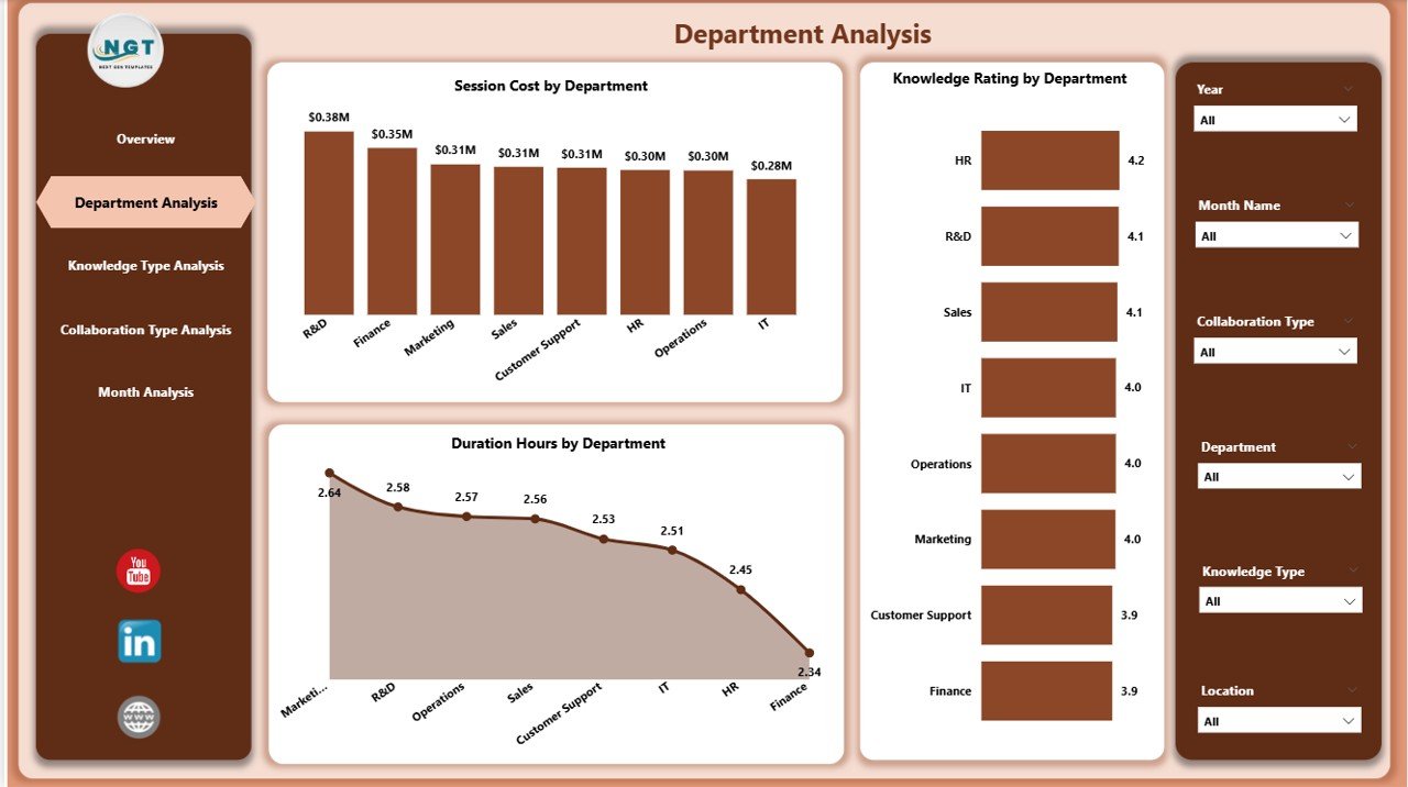
The Department Analysis page focuses on performance at the departmental level.
Charts Included:
-
Session Cost by Department
-
Knowledge Rating by Department
-
Duration Hours by Department
Now, managers can clearly see:
-
Which department invests more in training
-
Which department receives better knowledge ratings
-
How long sessions last in each department
For example, if the IT department spends more but receives lower ratings, managers can review session quality. Therefore, this page supports performance comparison and accountability.
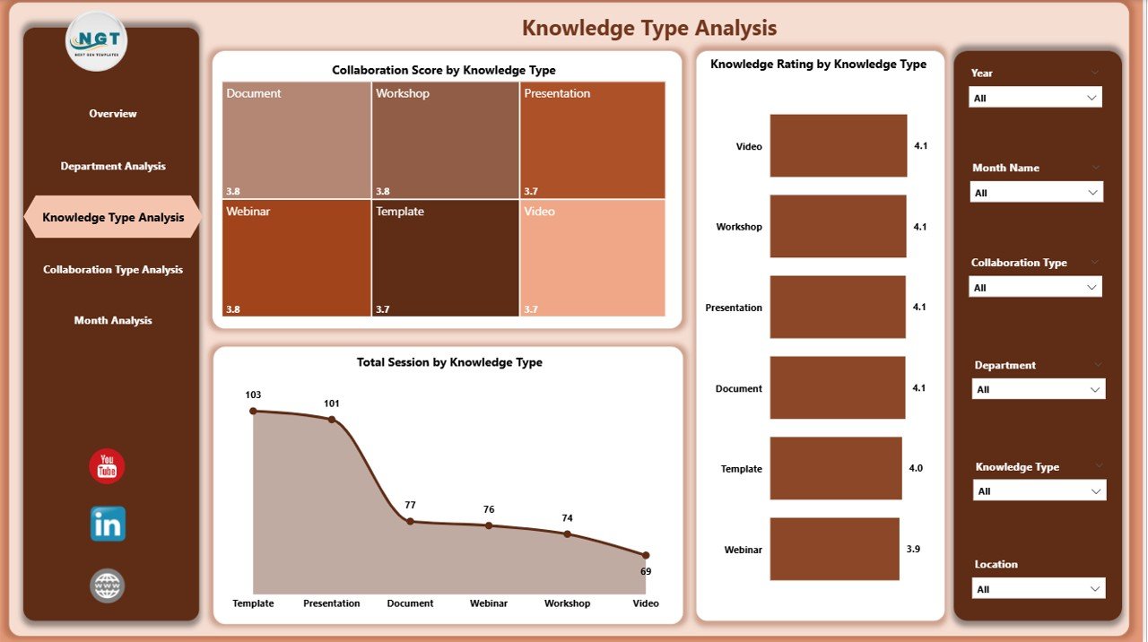
3️⃣ Knowledge Type Analysis – Which Knowledge Category Performs Best?
Organizations conduct various types of knowledge sessions such as:
-
Technical training
-
Soft skills workshops
-
Compliance training
-
Leadership development
-
Product knowledge sessions
The Knowledge Type Analysis page includes:
-
Knowledge Rating by Knowledge Type
-
Collaboration Score by Knowledge Type
-
Total Session by Knowledge Type
As a result, companies can identify which knowledge category drives higher satisfaction and engagement.
For instance:
-
If technical training shows high ratings but low collaboration scores, managers can redesign interaction methods.
-
If soft skills sessions receive high collaboration scores, companies can expand similar programs.
Therefore, this page helps improve training strategies.
Click to Purchases Knowledge Sharing and Collaboration Dashboard in Power BI
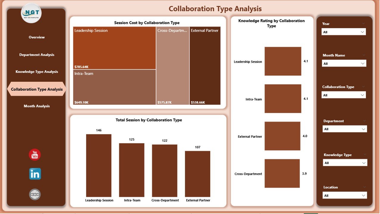
4️⃣ Collaboration Type Analysis – Which Collaboration Method Works Best?
Organizations use multiple collaboration methods such as:
-
Workshops
-
Virtual Meetings
-
Webinars
-
Group Discussions
-
Brainstorming Sessions
This page includes:
-
Knowledge Rating by Collaboration Type
-
Session Cost by Collaboration Type
-
Total Session by Collaboration Type
Now, leaders can compare which format delivers better results.
For example:
-
If webinars cost less but receive lower ratings, managers may add interactive features.
-
If workshops cost more but deliver higher satisfaction, leadership may increase in-person sessions.
Thus, companies optimize collaboration methods effectively.
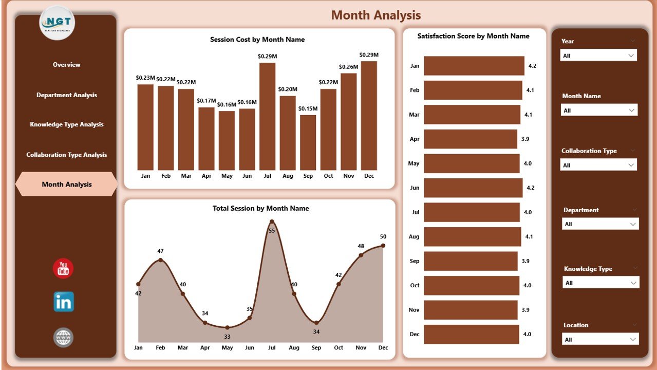
5️⃣ Month Analysis – How Does Performance Change Over Time?
Trend analysis plays a crucial role in improvement.
The Month Analysis page includes:
-
Satisfaction Score by Month
-
Session Cost by Month
-
Total Session by Month
Because this page tracks monthly trends, organizations can:
-
Identify seasonal spikes
-
Compare quarterly performance
-
Track budget usage
-
Monitor improvement initiatives
For example, if satisfaction drops in March, managers can investigate root causes immediately.
Key KPIs Included in the Dashboard
A strong dashboard depends on meaningful KPIs. This dashboard includes:
-
Session Cost
-
Satisfaction Score
-
Knowledge Rating
-
Duration Hours
-
Total Sessions
-
Collaboration Score
Each KPI provides actionable insight. Moreover, Power BI calculates these metrics dynamically. Therefore, data updates automatically when users refresh the report.
Advantages of Knowledge Sharing and Collaboration Dashboard in Power BI
1️⃣ Improves Decision-Making
Because the dashboard shows real-time metrics, managers make faster decisions. They no longer rely on guesswork.
2️⃣ Enhances Employee Engagement
When companies track satisfaction scores, they understand employee feedback. Therefore, they design better programs.
3️⃣ Controls Training Costs
The session cost metric helps leadership control budget allocation. As a result, organizations reduce waste.
4️⃣ Identifies Knowledge Gaps
By comparing departments and knowledge types, managers identify weak areas. Consequently, they plan corrective actions.
5️⃣ Supports Data-Driven Culture
Moreover, this dashboard promotes transparency. Teams see measurable results. Therefore, they focus on improvement.
How Does This Dashboard Improve Organizational Collaboration?
This dashboard creates visibility. Visibility creates accountability. Accountability drives improvement.
When departments see performance comparisons:
-
They improve session quality
-
They increase collaboration
-
They focus on satisfaction
Furthermore, leadership aligns knowledge initiatives with business goals.
Best Practices for the Knowledge Sharing and Collaboration Dashboard
To get maximum value, organizations must follow best practices.
1️⃣ Define Clear KPIs
First, define measurable goals. For example:
-
Target satisfaction score: 4.5/5
-
Target session cost reduction: 10%
Clear targets guide performance tracking.
2️⃣ Maintain Data Accuracy
Second, ensure accurate data entry. Because incorrect data leads to wrong decisions, teams must validate information regularly.
3️⃣ Use Interactive Filters Effectively
Encourage managers to use slicers. Therefore, they can analyze specific departments or time periods easily.
4️⃣ Review Dashboard Monthly
Do not ignore the dashboard. Instead, review it during monthly management meetings.
5️⃣ Train Teams on Interpretation
Moreover, train department heads to interpret insights correctly. Otherwise, they may misread trends.
How Can Organizations Implement This Dashboard Successfully?
Implementation requires structured planning.
-
Collect historical data
-
Clean and standardize the dataset
-
Import data into Power BI
-
Build calculated measures
-
Design interactive visuals
-
Test with stakeholders
-
Deploy to management
After deployment, gather feedback. Then refine visuals for better clarity.
What Makes Power BI Ideal for Knowledge Sharing Dashboards?
Power BI offers:
-
Interactive visuals
-
Real-time updates
-
Data modeling capabilities
-
Drill-down features
-
Cloud sharing options
Because Power BI integrates with Excel, SharePoint, and databases, organizations connect multiple data sources easily.
Moreover, Power BI provides secure data sharing. Therefore, leaders control access levels effectively.
Common Challenges in Knowledge Sharing and How This Dashboard Solves Them
Challenge 1: Low Engagement
Solution: Track satisfaction and collaboration scores.
Challenge 2: High Training Costs
Solution: Monitor session cost by department and month.
Challenge 3: Poor Quality Feedback
Solution: Analyze knowledge rating trends.
Challenge 4: Lack of Accountability
Solution: Compare departmental performance.
Thus, the dashboard addresses real business problems.
How Does This Dashboard Support HR and Learning Teams?
HR teams use this dashboard to:
-
Evaluate training effectiveness
-
Track employee feedback
-
Improve learning strategies
-
Optimize training budgets
Additionally, learning teams measure knowledge impact across locations.
Conclusion
Click to Purchases Knowledge Sharing and Collaboration Dashboard in Power BI
Knowledge drives growth. Collaboration drives innovation. However, organizations must measure both effectively.
The Knowledge Sharing and Collaboration Dashboard in Power BI transforms scattered data into meaningful insights. It helps track session cost, satisfaction score, knowledge rating, and collaboration effectiveness.
Moreover, it supports data-driven decision-making. It enhances transparency. It improves employee engagement. Most importantly, it aligns knowledge initiatives with business strategy.
Therefore, organizations that implement this dashboard gain a competitive advantage.
If you want structured, measurable, and powerful knowledge tracking, this dashboard offers the perfect solution.
Frequently Asked Questions with Answers
1. What is a Knowledge Sharing and Collaboration Dashboard in Power BI?
It is an interactive dashboard that tracks training sessions, collaboration programs, satisfaction scores, and session costs in one centralized system.
2. Who can use this dashboard?
HR managers, learning teams, department heads, and senior leadership can use it.
3. How often should organizations update the dashboard?
Organizations should update the dashboard monthly. However, they can also refresh data weekly if required.
4. Can this dashboard integrate with Excel data?
Yes. Power BI connects easily with Excel, databases, and cloud sources.
5. How does this dashboard improve collaboration?
It measures collaboration effectiveness. Therefore, managers identify successful methods and improve weaker areas.
6. Is this dashboard suitable for remote teams?
Yes. It tracks virtual sessions, webinars, and workshops. Therefore, remote teams benefit greatly.
Visit our YouTube channel to learn step-by-step video tutorials