In today’s fast-moving business environment, companies must manage internal and external communication with clarity and control. However, many teams still rely on scattered Excel sheets and manual reports. As a result, leaders struggle to track budgets, measure engagement, and evaluate communication impact.
So, how can organizations monitor budget allocation, actual costs, engagement rate, and campaign performance in one structured system?
The answer is simple.
Click to Purchases Corporate Communications Dashboard in Power BI
You need a Corporate Communications Dashboard in Power BI.
In this complete guide, you will learn:
-
What a Corporate Communications Dashboard in Power BI is
-
Why organizations need it
-
Detailed explanation of all 5 dashboard pages
-
Key metrics you can track
-
Advantages of the Corporate Communications Dashboard in Power BI
-
Best Practices for the Corporate Communications Dashboard in Power BI
-
Frequently Asked Questions with Answers
Let us explore everything step by step.
What Is a Corporate Communications Dashboard in Power BI?
A Corporate Communications Dashboard in Power BI is a ready-to-use performance monitoring solution. It helps organizations track communication campaigns, budgets, audience engagement, and departmental performance in one interactive system.
Instead of reviewing multiple reports, communication leaders can:
-
Monitor Completed % of campaigns
-
Compare Budget Allocated vs Actual Cost
-
Analyze Engagement Rate %
-
Track performance by Department, Channel, Communication Type, and Month
Moreover, Power BI provides dynamic slicers, drill-through features, and real-time visualization. Therefore, decision-makers can quickly identify gaps and improve strategy.
Why Do Organizations Need a Corporate Communications Dashboard?
Corporate communication affects brand image, employee engagement, stakeholder trust, and marketing success. However, without structured reporting, teams face serious challenges.
For example:
-
Managers cannot track overspending quickly
-
Teams cannot measure engagement accurately
-
Leaders cannot compare department performance
-
Budget planning becomes reactive instead of strategic
Therefore, organizations need a centralized dashboard that delivers:
-
Real-time visibility
-
Clear performance comparison
-
Actionable insights
-
Better financial control
A Corporate Communications Dashboard in Power BI solves all these problems.
Detailed Explanation of All 5 Dashboard Pages
Now let us understand each page of this dashboard in detail.
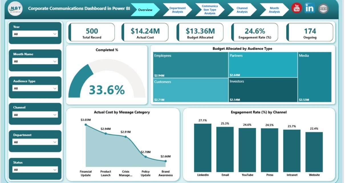
1️⃣ Overview Page – The Command Center
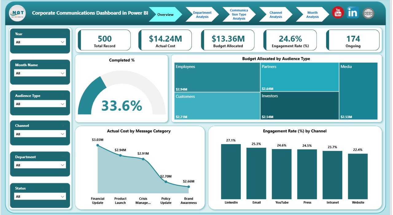
The Overview Page acts as the main summary page of the dashboard. It gives leadership teams a quick snapshot of overall communication performance.
Key Elements on This Page:
🔹 Slicers
Users can filter data by:
-
Month
-
Department
-
Communication Type
-
Channel
-
Audience Type
As a result, users can customize insights instantly.
🔹 5 KPI Cards
The Overview Page displays five powerful KPI cards:
-
Completed %
-
Total Budget Allocated
-
Total Actual Cost
-
Engagement Rate %
-
Total Records
These cards immediately show performance status.
🔹 Charts Included:
-
Budget Allocated by Audience Type
-
Actual Cost by Message Category
-
Engagement Rate % by Channel
Therefore, leadership teams can see where money goes and how audiences respond.
Click to Purchases Corporate Communications Dashboard in Power BI
2️⃣ Department Analysis – Who Performs Best?
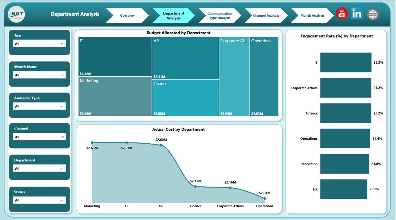
The Department Analysis page focuses on performance comparison across departments.
Since communication strategies differ across departments, this page helps management identify strengths and weaknesses.
Charts Included:
-
Budget Allocated by Department
-
Actual Cost by Department
-
Engagement Rate % by Department
With this page, leaders can:
-
Identify high-spending departments
-
Detect cost inefficiencies
-
Compare engagement effectiveness
Consequently, they can optimize department budgets and improve accountability.
3️⃣ Communication Type Analysis – What Works Best?
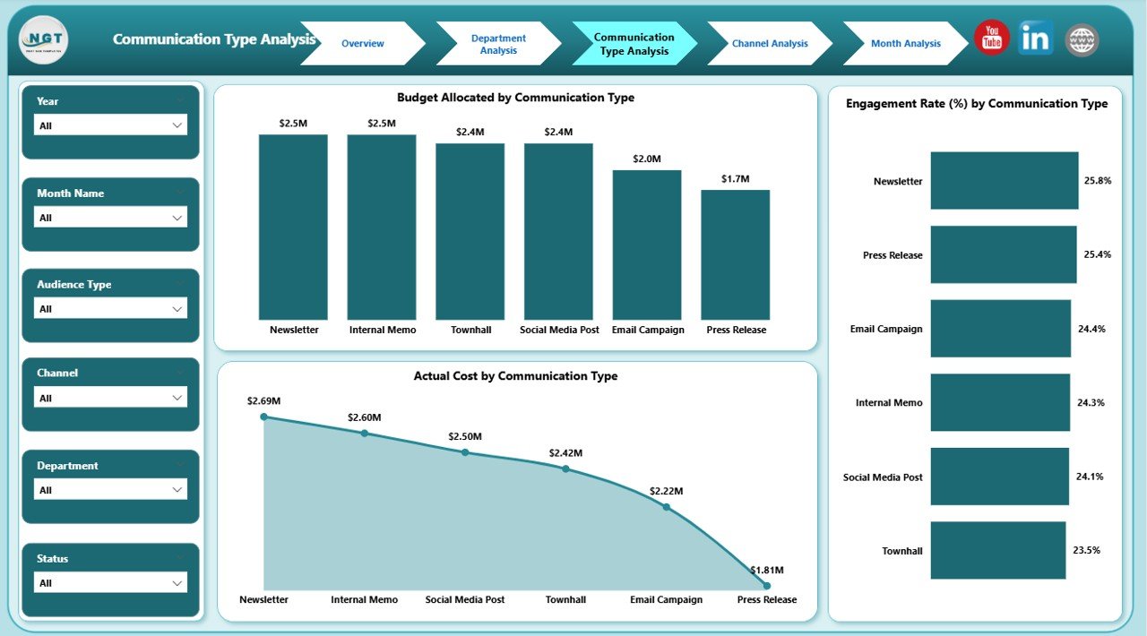
Organizations use various communication types such as:
-
Email Campaigns
-
Press Releases
-
Social Media Posts
-
Internal Newsletters
-
Events
This page helps evaluate which communication type delivers the best results.
Charts Included:
-
Budget Allocated by Communication Type
-
Actual Cost by Communication Type
-
Engagement Rate % by Communication Type
Because of this breakdown, teams can focus more on high-performing communication formats.
Click to Purchases Corporate Communications Dashboard in Power BI
4️⃣ Channel Analysis – Which Channel Drives Engagement?
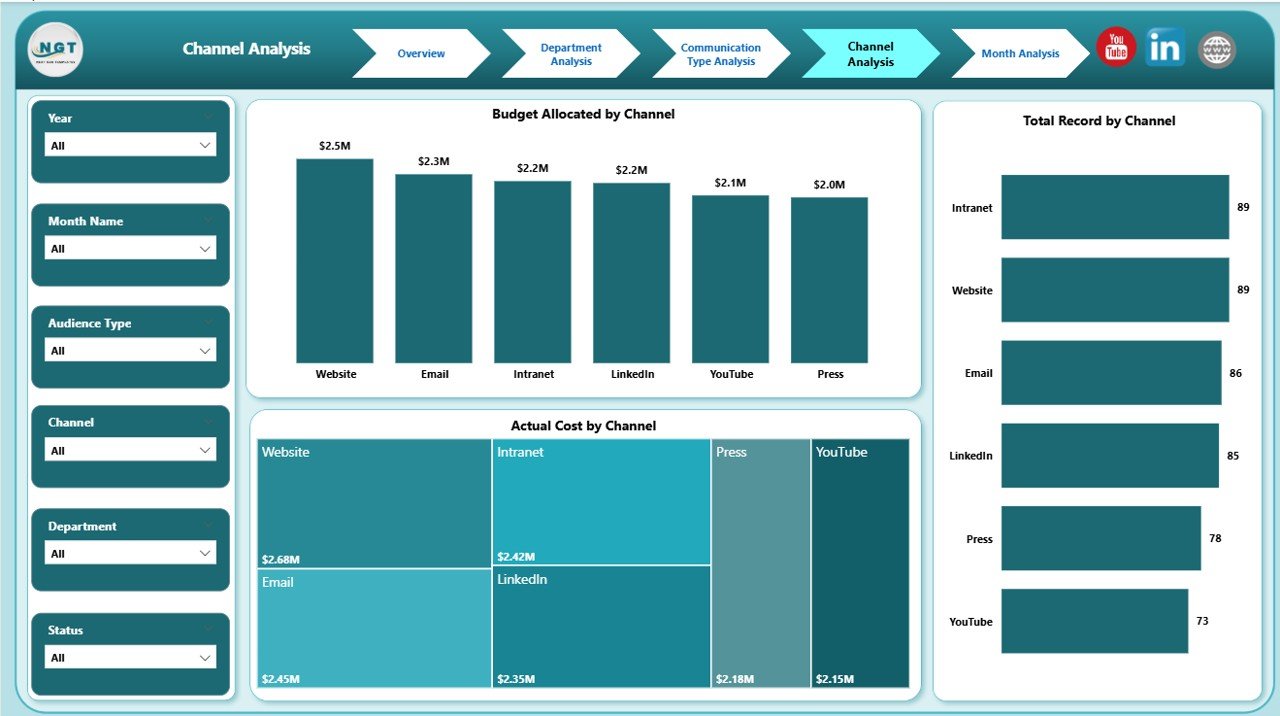
Different channels deliver different impact. For example:
-
LinkedIn may drive professional engagement
-
Email may drive internal engagement
-
Events may create stronger brand recall
Therefore, this page analyzes performance by channel.
Charts Included:
-
Budget Allocated by Channel
-
Actual Cost by Channel
-
Total Records by Channel
This analysis helps teams:
-
Allocate budget wisely
-
Avoid overspending
-
Improve channel ROI
5️⃣ Month Analysis – How Performance Changes Over Time?
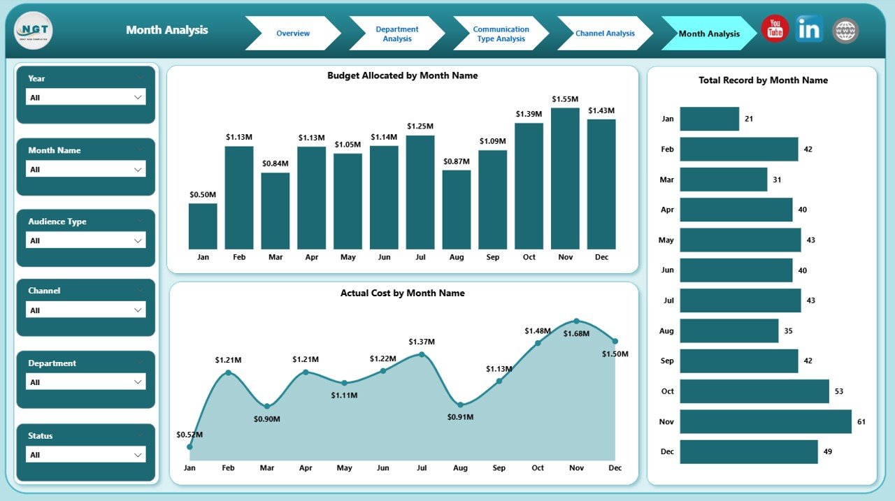
Trends matter. Therefore, this page analyzes monthly performance.
Charts Included:
-
Budget Allocated by Month
-
Actual Cost by Month
-
Total Records by Month
As a result, users can:
-
Identify peak communication months
-
Detect seasonal patterns
-
Monitor budget consistency
-
Improve annual planning
This page supports long-term strategic decisions.
Key Metrics Included in the Dashboard
This dashboard tracks essential KPIs such as:
-
Completed %
-
Budget Allocated
-
Actual Cost
-
Engagement Rate %
-
Total Communication Records
-
Cost per Campaign
-
Department-wise Spending
-
Channel-wise Engagement
These KPIs help communication teams stay aligned with business goals.
Advantages of Corporate Communications Dashboard in Power BI
Now let us explore the key benefits.
1️⃣ Centralized Data Management
Instead of using multiple files, teams can manage all communication data in one dashboard.
2️⃣ Real-Time Insights
Power BI updates data automatically. Therefore, leaders always see current performance.
3️⃣ Better Budget Control
Because the dashboard compares budget vs actual cost, teams can prevent overspending.
4️⃣ Improved Decision Making
Since the dashboard provides visual insights, leaders make faster and smarter decisions.
5️⃣ Performance Transparency
Department-wise and channel-wise comparison increases accountability.
6️⃣ Strategic Planning Support
Monthly analysis and trend tracking improve long-term planning.
Best Practices for the Corporate Communications Dashboard in Power BI
To maximize the value of this dashboard, follow these best practices:
✔ Maintain Clean Data
Ensure accurate data entry in your source file.
✔ Update Data Regularly
Update monthly or weekly data to keep insights relevant.
✔ Use Slicers Effectively
Encourage users to apply filters for deeper insights.
✔ Monitor Engagement Trends
Track engagement rate consistently to adjust strategies.
✔ Review Budget Variance
Compare budget and actual cost monthly to control spending.
✔ Train Team Members
Provide basic Power BI training for better usage.
Click to Purchases Corporate Communications Dashboard in Power BI
How to Implement the Corporate Communications Dashboard?
Follow these simple steps:
-
Prepare structured Excel data source
-
Define KPIs clearly
-
Import data into Power BI
-
Create relationships
-
Design visual charts
-
Add slicers for filtering
-
Test performance
-
Publish to Power BI Service
Within a few days, your organization can start tracking communication performance professionally.
Who Can Benefit from This Dashboard?
This dashboard suits:
-
Corporate Communication Managers
-
Marketing Teams
-
HR Communication Teams
-
Public Relations Teams
-
Corporate Strategy Leaders
-
CFO and Finance Teams
Any organization that manages structured communication campaigns can benefit.
Conclusion
Corporate communication directly impacts brand reputation, employee engagement, and stakeholder trust. However, without structured reporting, organizations lose clarity and control.
The Corporate Communications Dashboard in Power BI provides a complete solution. It centralizes data, tracks budget and engagement, and delivers real-time insights.
Therefore, if you want to improve communication performance, increase accountability, and optimize spending, this dashboard becomes a powerful tool.
Start using the Corporate Communications Dashboard in Power BI today and transform your communication strategy into a data-driven success system.
Frequently Asked Questions with Answers
1. What is a Corporate Communications Dashboard in Power BI?
It is a performance tracking dashboard that monitors communication budgets, engagement rate, and campaign performance using interactive Power BI visuals.
2. What KPIs can I track in this dashboard?
You can track Completed %, Budget Allocated, Actual Cost, Engagement Rate %, Total Records, and more.
3. Can I customize the dashboard?
Yes. You can modify charts, KPIs, and filters based on your organization’s needs.
4. Does this dashboard support monthly analysis?
Yes. The Month Analysis page helps you monitor trends and budget allocation month by month.
5. Is this dashboard suitable for large organizations?
Yes. It supports multiple departments, channels, and communication types.
6. Do I need advanced Power BI skills to use it?
No. Basic Power BI knowledge helps, but the dashboard remains user-friendly.
Visit our YouTube channel to learn step-by-step video tutorials