Civil rights organizations fight for justice, equality, and human dignity every single day. However, passion alone does not create measurable impact. Data creates impact. Clear reporting builds trust. Strong monitoring improves results.
Yet many organizations still manage performance using scattered Excel files. As a result, leaders struggle to track advocacy campaigns, legal case progress, community outreach numbers, donor funding, and operational efficiency.So, how do you track everything in one structured system?You need a Civil Rights Organizations KPI Dashboard in Power BI.This ready-to-use dashboard centralizes all key performance indicators in one interactive Power BI file. Moreover, it connects with an Excel data source, so you can update numbers easily without complex tools. Instead of creating manual reports every month, you simply select a month and instantly review MTD and YTD results.
Click to buy Civil Rights Organizations KPI Dashboard in Power BI
In this detailed guide, you will learn:
- What a Civil Rights Organizations KPI Dashboard in Power BI is
- Why advocacy groups need it
- A complete explanation of all 3 dashboard pages
- How Excel data feeds the dashboard
- Key KPIs to track
- Advantages of Civil Rights Organizations KPI Dashboard in Power BI
- Best Practices for the Civil Rights Organizations KPI Dashboard
- Frequently Asked Questions with Answers
Let us explore everything step by step.
What Is a Civil Rights Organizations KPI Dashboard in Power BI?
A Civil Rights Organizations KPI Dashboard in Power BI is a ready-to-use performance monitoring tool designed specifically for advocacy groups, nonprofit organizations, human rights foundations, and community justice programs.
Instead of using disconnected spreadsheets, this dashboard centralizes:
- Advocacy campaign performance
- Legal case tracking
- Community outreach metrics
- Donor engagement KPIs
- Policy impact measurement
- Operational efficiency indicators
Because it runs in Power BI, you get interactive slicers, dynamic calculations, drill-through capability, and visual indicators. Therefore, you do not just see numbers — you understand performance clearly.
Why Do Civil Rights Organizations Need a KPI Dashboard?
Civil rights organizations operate in complex environments. They manage limited budgets. They handle sensitive legal cases. They report to donors and boards. Moreover, they face public accountability.
Without structured KPI tracking:
- Leaders miss performance gaps
- Donors question impact
- Teams waste time creating manual reports
- Campaigns lose direction
However, when you implement a KPI dashboard:
- You monitor results monthly
- You compare actual vs target instantly
- You track year-over-year growth
- You improve decision-making
Therefore, a KPI dashboard does not just show numbers. It strengthens governance and transparency.
What Are the Key Features of the Civil Rights Organizations KPI Dashboard in Power BI?
This dashboard includes 3 powerful pages inside the Power BI Desktop file. Each page plays a critical role.
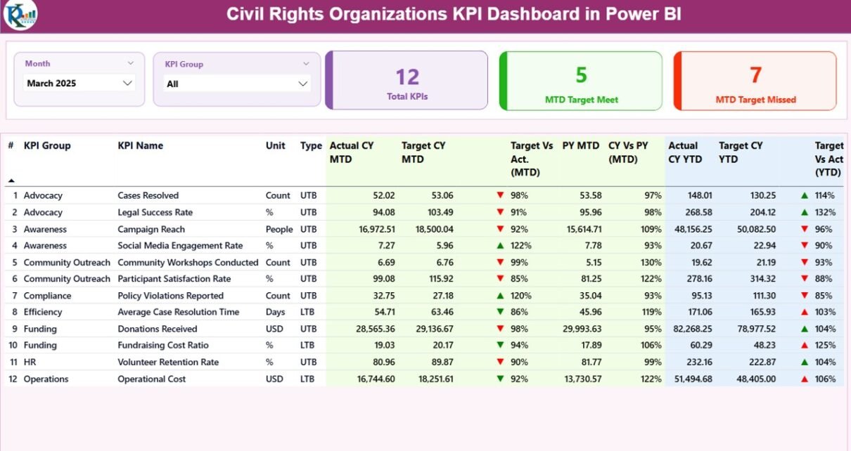
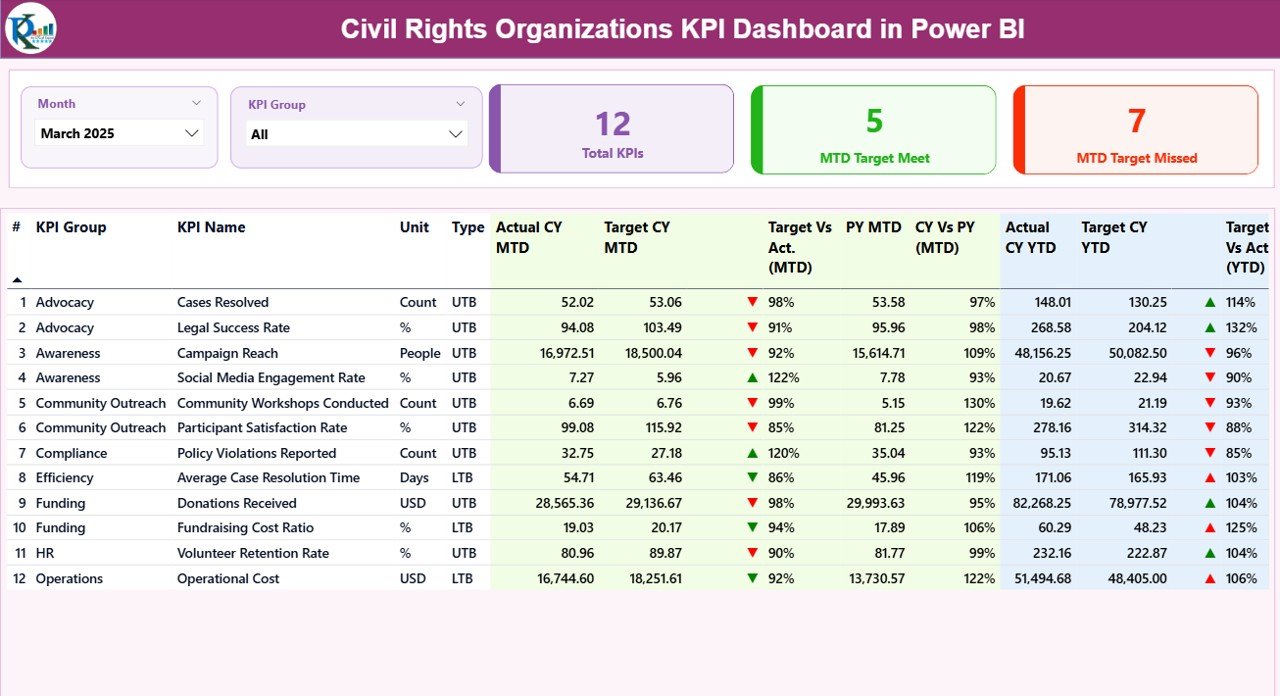
What Does the Summary Page Show?
The Summary Page acts as the main control center of the dashboard.
Top Section – Interactive Slicers
At the top, you see:
- Month slicer
- KPI Group slicer
Therefore, you can filter results by specific month or KPI category.
KPI Performance Cards
Right below the slicers, you see 3 powerful cards:
- Total KPIs Count
- MTD Target Meet Count
- MTD Target Missed Count
These cards instantly show overall performance status. As a result, leadership can quickly understand whether the organization meets goals.
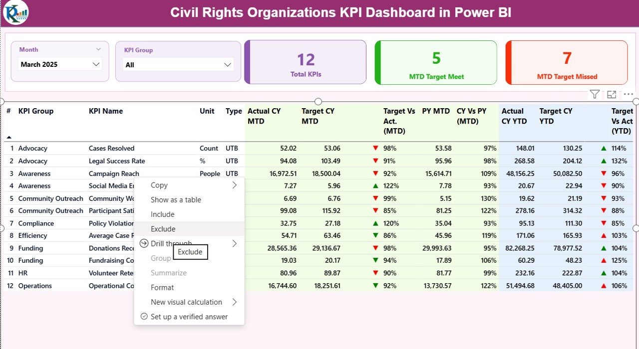
Detailed KPI Performance Table
The summary page also shows a structured KPI table with complete information:
- KPI Number – Sequence number
- KPI Group – Category of KPI
- KPI Name – Name of KPI
- Unit – Unit of measurement
- Type – LTB (Lower the Better) or UTB (Upper the Better)
- Actual CY MTD – Current year month-to-date value
- Target CY MTD – Current target value
- MTD Icon – ▲ Green or ▼ Red indicator
- Target Vs Act. (MTD) – Actual ÷ Target
- PY MTD – Previous year MTD value
- CY Vs PY (MTD) – Current ÷ Previous Year
- Actual CY YTD – Year-to-date actual
- Target CY YTD – Year-to-date target
- YTD Icon – Visual performance indicator
- Target Vs Act. (YTD) – Actual ÷ Target
- PY YTD – Previous year YTD
- CY Vs PY (YTD) – Year-over-year comparison
Because the dashboard uses conditional formatting icons, users immediately identify performance trends. Therefore, leaders save time and focus on action.
Click to buy Civil Rights Organizations KPI Dashboard in Power BI
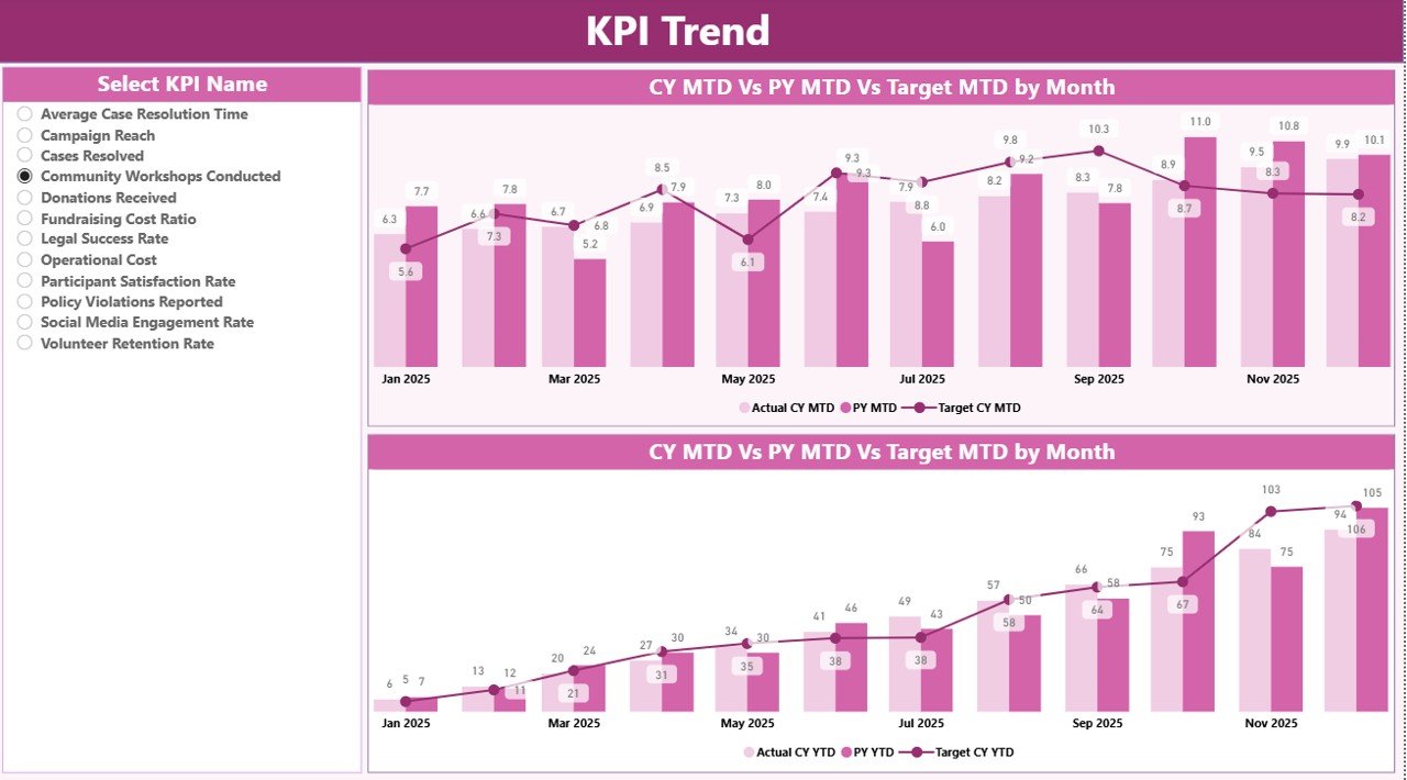
What Does the KPI Trend Page Show?
The KPI Trend Page provides deep performance analysis.
On this page:
- You see 2 combo charts
- You compare Current Year, Previous Year, and Target
- You analyze both MTD and YTD performance
Additionally, a KPI Name slicer on the left allows you to select any KPI. Once you choose a KPI, the charts update instantly.
Therefore, instead of reviewing static reports, you analyze trends visually.
For example:
- If legal case resolution improves steadily, you see growth.
- If outreach participation declines, you notice it immediately.
Because trend analysis drives strategy, this page becomes essential for long-term planning.
Click to buy Civil Rights Organizations KPI Dashboard in Power BI
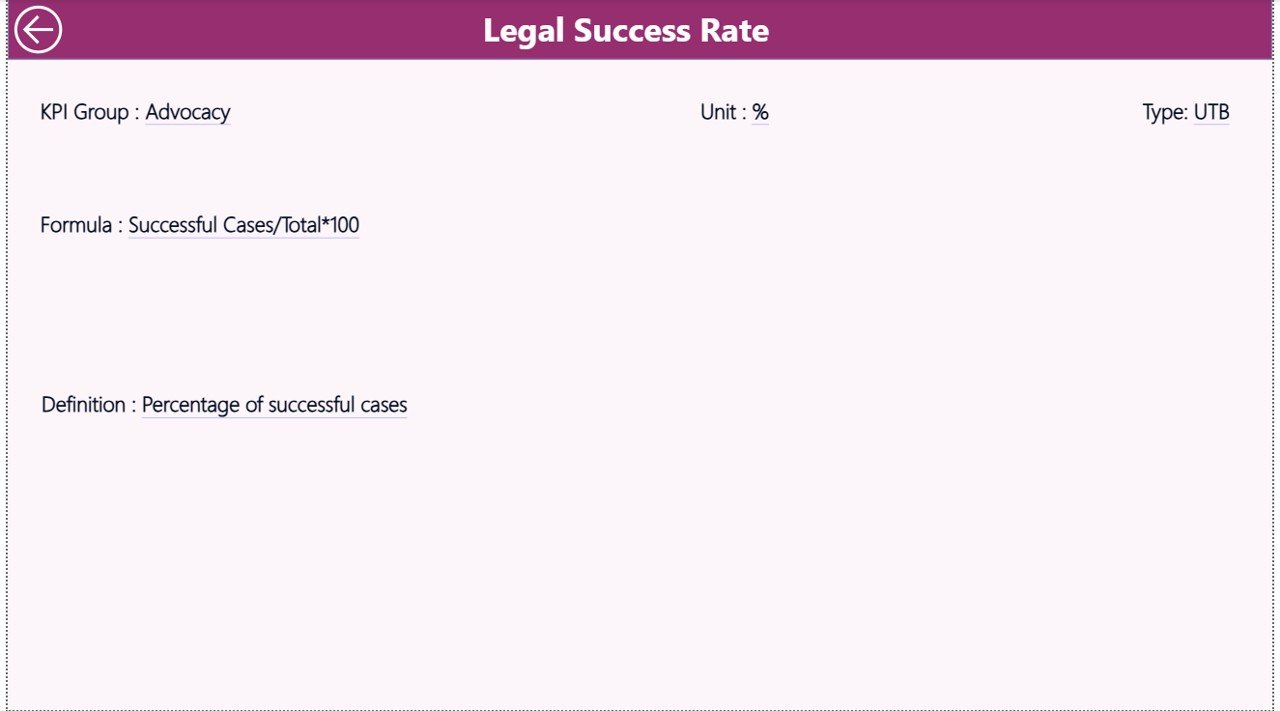
What Is the KPI Definition Page?
The KPI Definition Page works as a drill-through page. The dashboard keeps it hidden to maintain clean design.
From the summary page, you can:
- Right-click on any KPI
- Drill through to view full KPI details
Here, you see:
- KPI Formula
- KPI Definition
- Unit
- KPI Type
Therefore, this page ensures clarity and standardization. Every team member understands how you calculate each KPI.
To return, simply click the back button on the top left corner.
Click to buy Civil Rights Organizations KPI Dashboard in Power BI
How Does Excel Data Feed the Dashboard?
This Power BI dashboard connects with an Excel file. That file contains three worksheets.
Input_Actual Sheet
In this sheet, you enter:
- KPI Name
- Month (first date of month)
- MTD numbers
- YTD numbers
Because you only update numbers, data entry stays simple.
Click to buy Civil Rights Organizations KPI Dashboard in Power BI
Input_Target Sheet
Here, you fill:
- KPI Name
- Month
- Target MTD
- Target YTD
As a result, you compare actual performance against defined targets.
KPI Definition Sheet
This sheet contains:
- KPI Number
- KPI Group
- KPI Name
- Unit
- Formula
- Definition
- Type (LTB or UTB)
Because definitions stay centralized, you avoid confusion.
Which KPIs Should Civil Rights Organizations Track?
Although each organization differs, most civil rights groups track KPIs across major categories:
Advocacy & Campaign KPIs
- Campaign success rate
- Policy adoption rate
- Petition signatures
- Public engagement rate
Legal & Case KPIs
- Case resolution rate
- Average case duration
- Cases won vs lost
- Legal cost per case
Community Outreach KPIs
- Community events conducted
- Training sessions delivered
- Awareness program attendance
- Volunteer participation rate
Financial & Donor KPIs
- Fund utilization rate
- Donor retention rate
- Grant approval rate
- Cost per beneficiary
Operational KPIs
- Employee productivity
- Administrative cost ratio
- Complaint resolution time
Because the dashboard supports unlimited KPIs, you can customize it fully.
Advantages of Civil Rights Organizations KPI Dashboard in Power BI
Now let us explore the major advantages.
Improves Transparency
You clearly show performance to donors, boards, and stakeholders. Therefore, you build trust.
Strengthens Decision-Making
Because leaders see real-time comparisons, they make faster decisions.
Saves Reporting Time
Instead of creating monthly PowerPoint reports, you simply refresh the dashboard.
Enhances Accountability
Every department sees target vs actual performance. As a result, teams stay focused.
Supports Data-Driven Strategy
Trend analysis helps you plan long-term campaigns effectively.
Provides Year-Over-Year Comparison
You do not just see monthly results. Instead, you compare with previous year performance.
Best Practices for the Civil Rights Organizations KPI Dashboard
To get maximum benefit, follow these best practices:
Define Clear KPI Ownership
Assign one person responsible for each KPI.
Update Data Monthly
Enter data on the first week of every month.
Review KPI Definitions Quarterly
Because strategies evolve, update definitions when needed.
Use Consistent Units
Avoid mixing percentages and counts incorrectly.
Focus on Actionable KPIs
Track only KPIs that influence decision-making.
Train Your Team
Ensure team members understand drill-through and slicer usage.
Backup Your Excel File
Always maintain a data backup for security.
How Does This Dashboard Improve Donor Reporting?
Donors demand clarity. They want measurable outcomes. They expect transparency.
With this dashboard:
- You show campaign performance visually
- You demonstrate budget utilization
- You present year-over-year growth
- You justify funding requests with data
Therefore, fundraising becomes easier and more professional.
How Can Leadership Use This Dashboard Strategically?
Leadership teams can:
- Identify underperforming KPIs
- Allocate resources effectively
- Improve campaign strategies
- Adjust policy focus
- Monitor operational efficiency
Because Power BI updates visuals instantly, leadership stays informed at all times.
Conclusion
Civil rights organizations work tirelessly to protect equality and justice. However, without structured performance tracking, impact becomes hard to measure.
The Civil Rights Organizations KPI Dashboard in Power BI provides a powerful solution. It centralizes data. It simplifies reporting. It enhances transparency. Most importantly, it empowers leaders to make data-driven decisions.
Instead of relying on scattered spreadsheets, you gain one professional, interactive, and strategic dashboard.
Therefore, if you want to improve accountability, strengthen reporting, and drive measurable impact, this dashboard becomes an essential tool.
Frequently Asked Questions with Answers
Is this dashboard suitable for small nonprofit organizations?
Yes. Small and large organizations can use it. You simply adjust the number of KPIs.
Do I need advanced Power BI skills to use it?
No. You only update the Excel file. Power BI automatically refreshes visuals.
Can I add more KPIs?
Yes. You can easily expand the KPI definition sheet.
What does LTB and UTB mean?
LTB means Lower the Better. UTB means Upper the Better.
Can I customize KPI groups?
Yes. You can define your own KPI groups inside the KPI Definition sheet.
How often should I update the dashboard?
You should update it monthly. However, some organizations update weekly.
Does this dashboard support year-over-year comparison?
Yes. It calculates CY vs PY for both MTD and YTD.
Can I share this dashboard with board members?
Yes. You can export it as PDF or share Power BI reports securely.
Watch the step-by-step video tutorial:
Visit our YouTube channel to learn step-by-step video tutorials
Click to buy Civil Rights Organizations KPI Dashboard in Power BI