Policy advocacy groups work to create change. They run campaigns, influence decision-makers, mobilize communities, and track outcomes. However, many organizations still rely on manual Excel summaries or scattered reports. As a result, leaders struggle to measure impact clearly.
So, how can advocacy organizations track campaign performance, stakeholder engagement, and target achievement in one powerful system?
The answer is clear.
You need a Policy Advocacy Groups KPI Dashboard in Power BI.
This ready-to-use dashboard converts structured Excel data into interactive, real-time visual insights. Moreover, it allows leadership teams to analyze MTD and YTD performance, compare results against targets, and review year-over-year impact instantly.
In this guide, you will learn:
-
What a Policy Advocacy Groups KPI Dashboard in Power BI is
-
Why advocacy organizations need it
-
A detailed explanation of all 3 dashboard pages
-
How Excel data integrates with Power BI
-
Advantages of Policy Advocacy Groups KPI Dashboard in Power BI
-
Best Practices for the Policy Advocacy Groups KPI Dashboard
-
Frequently Asked Questions with Answers
Let’s explore everything step by step.
Click to Purchases Policy Advocacy Groups KPI Dashboard in Power BI
What Is a Policy Advocacy Groups KPI Dashboard in Power BI?
A Policy Advocacy Groups KPI Dashboard in Power BI is an interactive performance monitoring tool built using Microsoft Power BI. It connects to an Excel file where users enter KPI data. Then, Power BI transforms that data into dynamic visuals.
Instead of static monthly reports, you can:
-
Monitor Month-to-Date (MTD) results
-
Track Year-to-Date (YTD) performance
-
Compare Target vs Actual performance
-
Compare Current Year vs Previous Year
-
Drill through to view KPI definitions and formulas
Therefore, you gain full transparency across campaigns and programs.
Moreover, Power BI enables slicers and drill-through functionality. As a result, users can filter data instantly and explore details without complex formulas.
Click to Purchases Policy Advocacy Groups KPI Dashboard in Power BI
Why Do Policy Advocacy Groups Need a KPI Dashboard in Power BI?
Advocacy success depends on measurable outcomes. However, without structured tracking, organizations face challenges such as:
-
Difficulty measuring campaign effectiveness
-
Limited visibility into stakeholder engagement
-
Inconsistent performance reporting
-
Delayed leadership decisions
-
Weak donor reporting
Therefore, a KPI dashboard becomes essential.
It helps organizations:
-
Track campaign performance in real time
-
Identify underperforming initiatives
-
Align targets with actual results
-
Improve strategic planning
-
Present professional reports to donors and boards
Furthermore, visual dashboards increase clarity. Instead of long spreadsheets, leadership teams see performance indicators clearly.
What Pages Are Included in the Policy Advocacy Groups KPI Dashboard?
This Power BI solution includes 3 interactive pages:
1️⃣ Summary Page
2️⃣ KPI Trend Page
3️⃣ KPI Definition Page (Drill-Through)
Let us break down each page in detail.
Click to Purchases Policy Advocacy Groups KPI Dashboard in Power BI
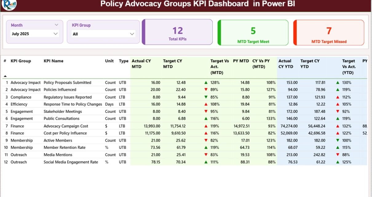
1️⃣ What Does the Summary Page Show?
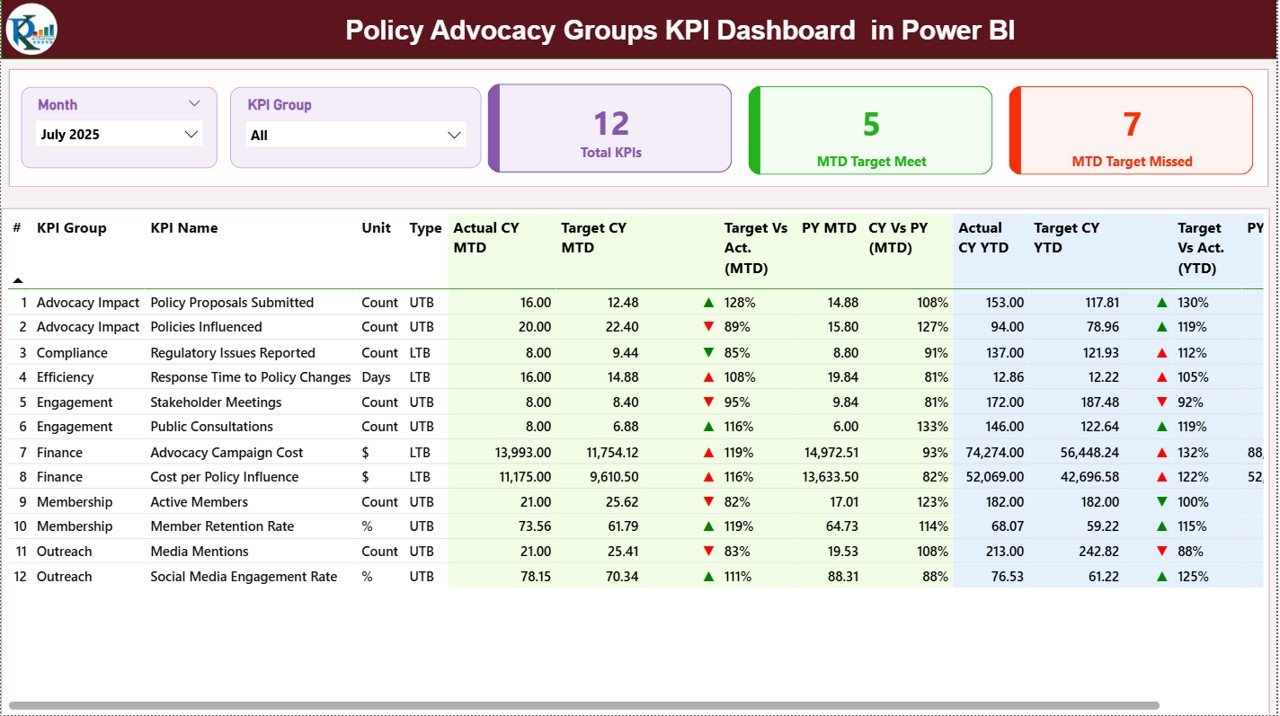
The Summary Page serves as the central performance overview.
🔹 Slicers at the Top
At the top of the dashboard, you will find:
-
Month Slicer
-
KPI Group Slicer
These slicers allow dynamic filtering. Therefore, you can analyze performance by month or by KPI category instantly.
🔹 KPI Cards for Quick Insights
The dashboard displays 3 important KPI cards:
-
Total KPIs Count
-
MTD Target Meet Count
-
MTD Target Missed Count
These cards provide immediate performance status.
For example, if 20 KPIs exist and 15 meet targets, leadership instantly understands performance strength.
🔹 Detailed KPI Table
Below the KPI cards, the dashboard shows a comprehensive KPI table with the following fields:
-
KPI Number (Sequence)
-
KPI Group
-
KPI Name
-
Unit
-
Type (LTB or UTB)
-
Actual CY MTD
-
Target CY MTD
-
MTD Icon (▲ Green / ▼ Red)
-
Target vs Actual (MTD %)
-
PY MTD
-
CY vs PY (MTD %)
-
Actual CY YTD
-
Target CY YTD
-
YTD Icon
-
Target vs Actual (YTD %)
-
PY YTD
-
CY vs PY (YTD %)
🔹 Understanding KPI Type
-
LTB (Lower the Better) – Example: Cost per Campaign
-
UTB (Upper the Better) – Example: Stakeholder Engagement Rate
Therefore, the dashboard evaluates performance correctly depending on KPI type.
🔹 Performance Icons
The ▲ (Green) and ▼ (Red) icons provide instant clarity. As a result, users quickly identify target achievements or misses without analyzing each number manually.
Click to Purchases Policy Advocacy Groups KPI Dashboard in Power BI
2️⃣ What Does the KPI Trend Page Display?
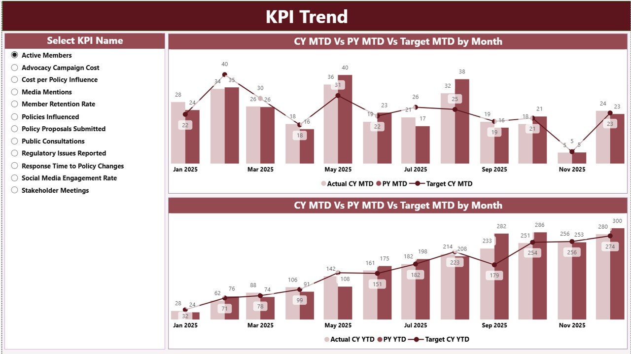
The KPI Trend Page focuses on visual trend analysis.
On the left side, you will find a KPI Name slicer.
Once selected, the page displays:
-
MTD Combo Chart (Actual, Target, Previous Year)
-
YTD Combo Chart (Actual, Target, Previous Year)
These combo charts allow you to analyze performance trends over time.
For example:
If campaign reach declines for three months in a row, the trend chart highlights the pattern clearly. Therefore, teams can adjust strategy quickly.
Moreover, trend analysis supports long-term impact evaluation.
3️⃣ What Is the KPI Definition Page?
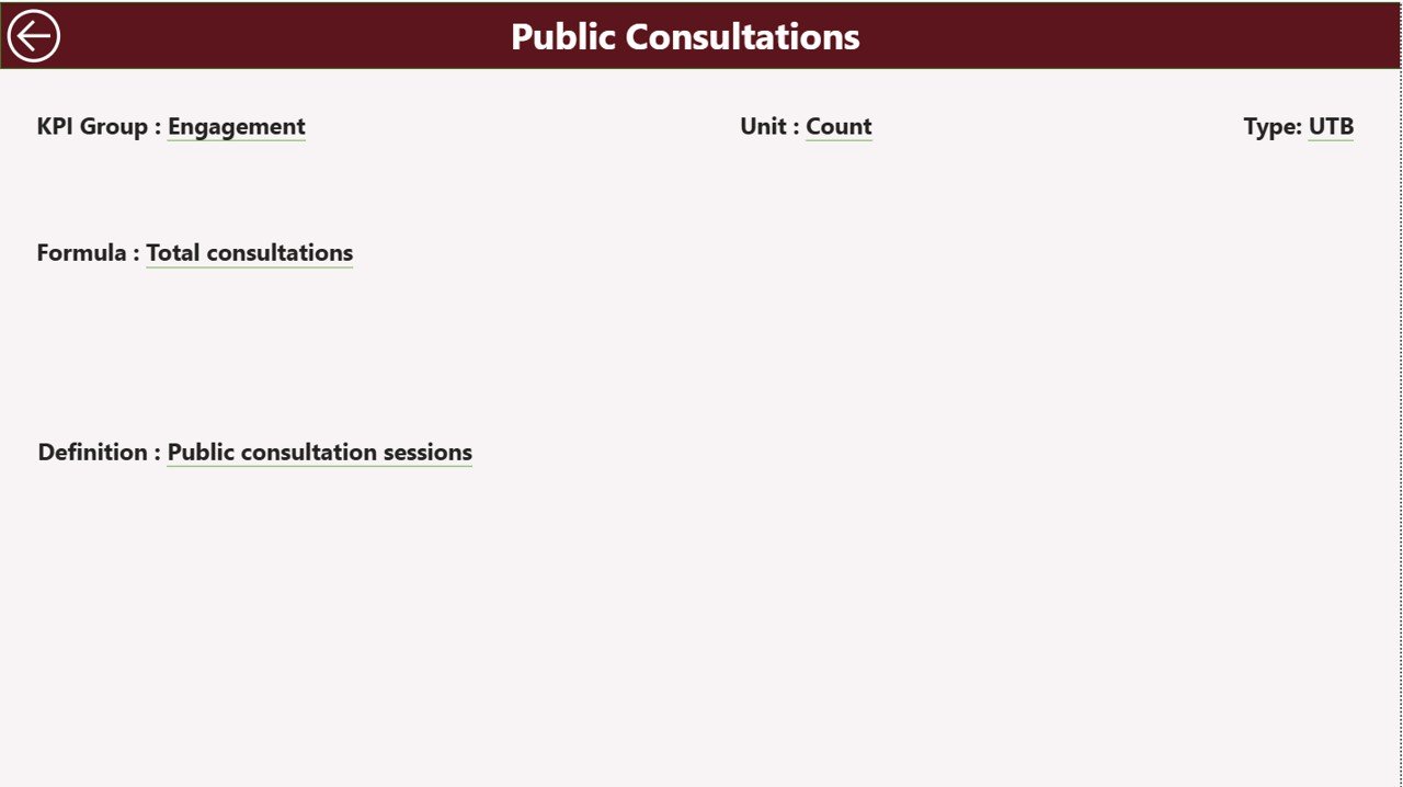
The KPI Definition Page functions as a drill-through page. It remains hidden in the navigation menu.
From the Summary Page, users can drill through to view:
-
KPI Formula
-
KPI Definition
-
KPI Unit
-
KPI Type (LTB or UTB)
This feature increases transparency.
Furthermore, during board meetings or audits, teams can explain KPI calculations clearly.
To return to the main page, simply click the back button located at the top left corner.
Click to Purchases Policy Advocacy Groups KPI Dashboard in Power BI
How Does Excel Data Connect to the Power BI Dashboard?
This dashboard uses an Excel file as its data source. You must fill three worksheets in Excel:
1️⃣ Input_Actual Sheet
Here, you enter:
-
KPI Name
-
Month (Use first date of the month)
-
MTD Actual Number
-
YTD Actual Number
After updating, refresh Power BI to see updated performance.
2️⃣ Input_Target Sheet
Here, you enter:
-
KPI Name
-
Month
-
MTD Target Number
-
YTD Target Number
Therefore, you can compare actual performance against targets accurately.
3️⃣ KPI Definition Sheet
Here, you define:
-
KPI Number
-
KPI Group
-
KPI Name
-
Unit
-
Formula
-
Definition
-
Type (LTB or UTB)
This structured approach ensures data consistency and clarity.
What KPIs Can Policy Advocacy Groups Track?
Advocacy organizations can monitor KPIs such as:
-
Campaign Reach
-
Policy Meetings Conducted
-
Stakeholder Engagement Rate (%)
-
Social Media Engagement
-
Petition Signatures Collected
-
Media Mentions
-
Fundraising Amount
-
Volunteer Participation Rate
-
Event Attendance
-
Policy Adoption Rate
For example, if engagement rate drops below 5%, teams can redesign outreach strategy immediately.
Click to Purchases Policy Advocacy Groups KPI Dashboard in Power BI
Advantages of Policy Advocacy Groups KPI Dashboard in Power BI
Now, let us explore the major advantages.
1️⃣ Real-Time Performance Monitoring
You refresh data and view updated KPIs instantly.
2️⃣ Clear Target Achievement Tracking
Automatic calculations show Target vs Actual percentages.
3️⃣ Year-over-Year Comparison
You analyze growth using CY vs PY comparison.
4️⃣ Interactive Filtering
Slicers allow quick performance segmentation.
5️⃣ Visual Trend Analysis
Charts simplify performance review.
6️⃣ Transparency for Donors
Structured KPI reporting builds trust.
7️⃣ Scalable and Customizable
You can add new KPIs easily in Excel.
8️⃣ Improved Strategic Decisions
Leadership makes informed decisions quickly.
Best Practices for the Policy Advocacy Groups KPI Dashboard
To maximize results, follow these best practices:
1️⃣ Update Excel Data Monthly
Maintain consistent data entry.
2️⃣ Use First Date of Month
Ensure consistent date structure.
3️⃣ Define KPIs Clearly
Document formula and definitions accurately.
4️⃣ Review Trends Regularly
Analyze KPI Trend page during leadership meetings.
5️⃣ Set Realistic Targets
Avoid unrealistic benchmarks.
6️⃣ Validate Data Before Refresh
Double-check numbers before updating Power BI.
7️⃣ Train Team Members
Ensure everyone understands KPI logic.
How Does This Dashboard Improve Advocacy Impact?
This dashboard improves impact because:
-
It increases visibility
-
It enhances accountability
-
It supports data-driven strategy
-
It highlights performance gaps
-
It strengthens donor reporting
As a result, advocacy organizations operate more efficiently and professionally.
Click to Purchases Policy Advocacy Groups KPI Dashboard in Power BI
Who Should Use This Dashboard?
This dashboard benefits:
-
Policy Advocacy Groups
-
NGOs
-
Non-Profit Organizations
-
Social Impact Organizations
-
Campaign Managers
-
Fundraising Teams
-
Program Directors
Moreover, any organization that tracks advocacy impact can implement this solution.
Conclusion
Policy advocacy demands measurable results. However, manual reporting slows progress and reduces clarity.
The Policy Advocacy Groups KPI Dashboard in Power BI offers a modern and structured solution. It centralizes KPI tracking, simplifies comparisons, and delivers real-time visual insights.
Furthermore, its Excel-based data input ensures ease of use, while Power BI provides powerful analytics.
If you want transparency, accountability, and measurable impact, this dashboard provides exactly what you need.
Click to Purchases Policy Advocacy Groups KPI Dashboard in Power BI
Frequently Asked Questions with Answers
1️⃣ What tools do I need to use this dashboard?
You need Microsoft Power BI Desktop and Microsoft Excel.
2️⃣ Can I customize KPIs?
Yes. You can update KPI definitions and add new KPIs in Excel.
3️⃣ Does the dashboard update automatically?
After refreshing Power BI, it reflects updated Excel data.
4️⃣ What does LTB and UTB mean?
LTB means Lower the Better. UTB means Upper the Better.
5️⃣ Is this dashboard suitable for small NGOs?
Yes. It works for both small and large advocacy organizations.
6️⃣ How often should I update data?
You should update data monthly. However, you can update it more frequently if required.
Click to Purchases Policy Advocacy Groups KPI Dashboard in Power BI
Visit our YouTube channel to learn step-by-step video tutorials