The printing and publishing industry moves fast. Clients demand quality. Deadlines stay tight. Costs fluctuate daily. Meanwhile, profit margins shrink when businesses fail to track performance clearly.
However, many printing companies still rely on scattered spreadsheets. As a result, managers waste time compiling reports. Moreover, they struggle to identify profitable clients, best-selling product types, and high-performing print technologies.
So, how can printing and publishing companies monitor everything in one structured system?
The answer is simple.
Click to Purchases Printing and Publishing Dashboard in Excel
You need a Printing and Publishing Dashboard in Excel.
In this detailed guide, you will learn:
-
What a Printing and Publishing Dashboard in Excel is
-
Why your business needs it
-
A complete breakdown of all 5 dashboard pages
-
Advantages of using this dashboard
-
Best practices for implementation
-
Frequently Asked Questions with answers
Let us explore everything step by step.
What Is a Printing and Publishing Dashboard in Excel?
A Printing and Publishing Dashboard in Excel is a ready-to-use, interactive performance tracking tool designed specifically for printing businesses.
It helps you:
-
Track delivery performance
-
Monitor profit margins
-
Compare printing costs vs revenue
-
Analyze client types
-
Evaluate product types
-
Assess print technologies
-
Study monthly performance trends
Instead of switching between multiple files, you can view everything in one Excel desktop file. Therefore, decision-making becomes faster and more accurate.
Why Do Printing and Publishing Companies Need a Dashboard?
Printing businesses operate with thin margins. Therefore, even small inefficiencies reduce profitability.
For example:
-
A 3% increase in defect rate can reduce repeat orders.
-
A 5% drop in on-time delivery can affect client trust.
-
Rising printing costs can silently reduce profits.
However, when you use a structured dashboard:
-
You identify performance gaps instantly.
-
You compare revenue and cost side by side.
-
You detect profitable client segments.
-
You monitor product performance easily.
As a result, you move from guesswork to data-driven decisions.
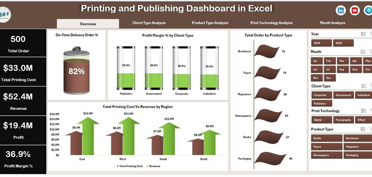
Overview of the Printing and Publishing Dashboard in Excel
This dashboard includes a Page Navigator located on the left side. Therefore, users can move easily across all analytical pages.
The Excel file contains 5 analytical pages plus support sheets and a structured data sheet.
Let us now understand each page in detail.
1️⃣ Overview Page – What Does It Show?
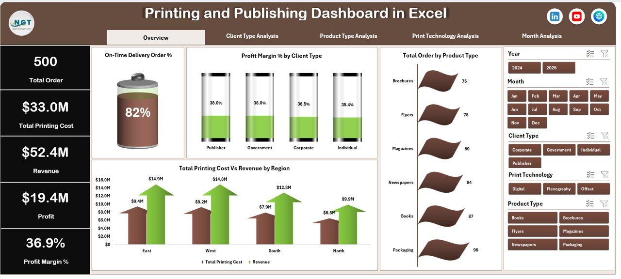
The Overview Page acts as the control center of the dashboard.
It includes:
-
Right-side slicer (filter panel)
-
4 KPI cards
-
4 dynamic charts
KPI Cards Display:
Click to Purchases Printing and Publishing Dashboard in Excel
-
Total Orders
-
Total Revenue
-
Total Printing Cost
-
Profit Margin %
Because these cards update instantly based on slicer selection, you always see real-time filtered insights.
Charts on the Overview Page
-
On-Time Delivery Order %
-
Tracks delivery performance.
-
Helps you maintain client satisfaction.
-
-
Profit Margin % by Client Type
-
Shows which client category generates better returns.
-
Helps in pricing strategy decisions.
-
-
Total Orders by Product Type
-
Identifies best-selling printed products.
-
Helps optimize production planning.
-
-
Total Printing Cost vs Revenue by Region
-
Compares cost and income side by side.
-
Reveals high-performing regions.
-
Therefore, this page provides a complete snapshot of business health.
2️⃣ Client Type Analysis – Which Clients Generate More Profit?
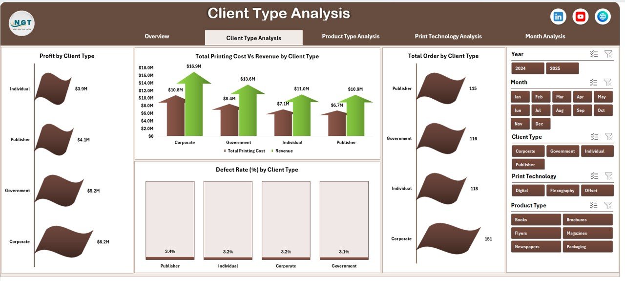
This page focuses on client segmentation.
It includes:
-
Right-side slicer
-
4 analytical charts
Charts Included:
-
Profit by Client Type
-
Total Orders by Client Type
-
Total Printing Cost vs Revenue by Client Type
-
Defect Rate % by Client Type
Because client profitability varies, this page helps you:
-
Identify high-value clients
-
Reduce defect rates in specific segments
-
Optimize client pricing
-
Focus marketing efforts
For example, corporate clients may bring high revenue but lower margins. Meanwhile, publishing houses may bring stable orders. Therefore, segmentation analysis improves strategy.
3️⃣ Product Type Analysis – Which Products Perform Best?
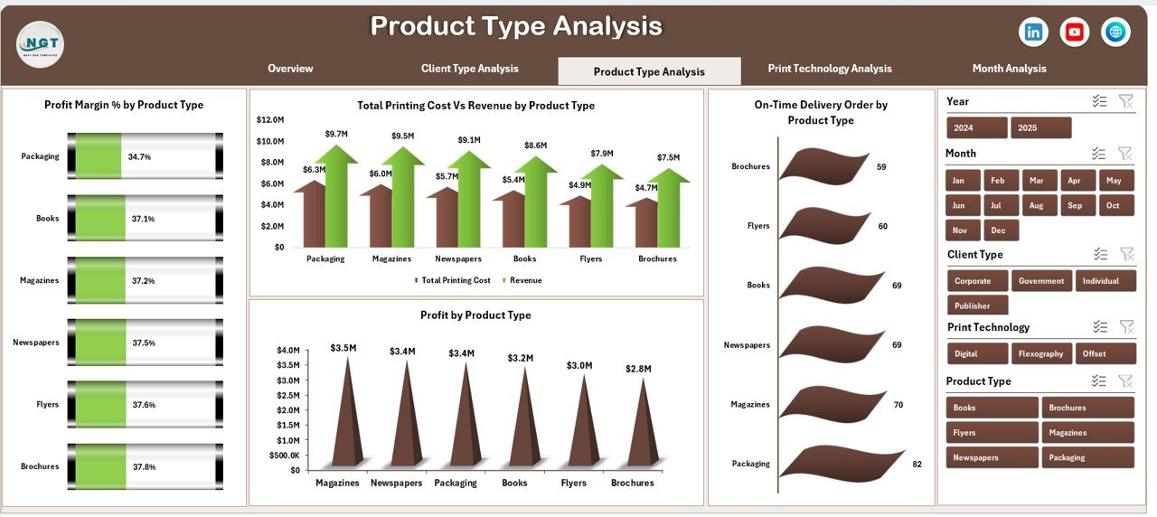
Printing companies produce various items such as:
-
Books
-
Magazines
-
Flyers
-
Brochures
-
Packaging materials
This page analyzes product performance.
Charts on This Page:
-
Profit by Product Type
-
On-Time Delivery Order % by Product Type
-
Total Printing Cost vs Revenue by Product Type
-
Profit Margin % by Product Type
-
Click to Purchases Printing and Publishing Dashboard in Excel
As a result, you can:
-
Eliminate low-margin products
-
Improve production scheduling
-
Focus on high-demand categories
-
Increase pricing where needed
Therefore, product-based insights directly improve profitability.
4️⃣ Print Technology Analysis – Which Technology Brings Higher Returns?
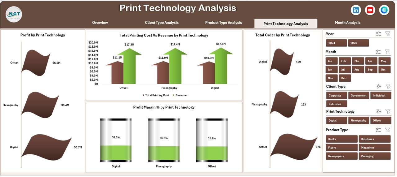
Printing businesses use technologies such as:
-
Offset Printing
-
Digital Printing
-
Flexographic Printing
-
Screen Printing
Each technology has different cost structures.
Charts Included:
-
Profit by Print Technology
-
Total Orders by Print Technology
-
Total Printing Cost vs Revenue by Print Technology
-
Profit Margin % by Print Technology
Because technology affects cost efficiency, this page helps you:
-
Invest wisely in machines
-
Optimize machine utilization
-
Reduce downtime losses
-
Improve operational efficiency
Consequently, technology-based decisions become data-driven.
5️⃣ Month Analysis – How Does Performance Change Over Time?
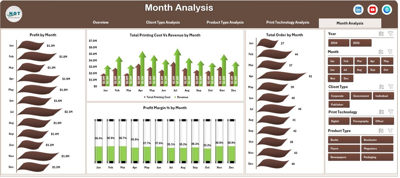
Seasonal trends affect printing demand.
For example:
-
Book printing rises during academic seasons.
-
Packaging demand increases before festivals.
-
Corporate materials increase at financial year-end.
This page includes:
-
Profit by Month
-
Total Orders by Month
-
Total Printing Cost vs Revenue by Month
-
Profit Margin % by Month
Therefore, you can:
-
Detect seasonal trends
-
Prepare inventory accordingly
-
Allocate workforce efficiently
-
Improve forecasting accuracy
Support Sheet and Data Sheet
Support Sheet
The support sheet contains:
-
Helper calculations
-
Pivot table backend
-
KPI calculations
-
Lookup values
Because it organizes formulas neatly, the dashboard remains clean and fast.
Data Sheet
The structured data sheet includes:
-
Order ID
-
Client Type
-
Product Type
-
Print Technology
-
Region
-
Order Date
-
Delivery Date
-
Revenue
-
Printing Cost
-
Defect Rate %
-
On-Time Delivery Status
Since data follows a tabular format, pivot tables update automatically.
Advantages of Printing and Publishing Dashboard in Excel
Let us now explore the major advantages.
1. Centralized Reporting
You monitor all KPIs in one file. Therefore, you save time.
2. Improved Profit Tracking
You compare cost and revenue side by side. As a result, you protect margins.
3. Better Client Insights
You identify profitable client segments. Moreover, you improve retention strategy.
4. Product Optimization
You focus on high-demand products. Consequently, you reduce waste.
5. Technology Efficiency
You evaluate machine performance clearly. Therefore, you improve ROI.
6. Real-Time Filtering
Because slicers update charts instantly, analysis becomes interactive.
7. Easy to Use
Excel remains familiar to most users. Therefore, no complex software training is required.
Best Practices for the Printing and Publishing Dashboard in Excel
To get maximum value, follow these best practices.
1. Keep Data Clean
-
Avoid duplicate entries
-
Use consistent product names
-
Maintain proper date formats
2. Update Data Regularly
Update the data sheet weekly or monthly. Therefore, insights stay relevant.
3. Monitor KPIs Consistently
Do not check the dashboard once a quarter. Instead, review it weekly.
4. Focus on Key Metrics
Avoid adding too many KPIs. Instead, track:
-
Profit Margin %
-
On-Time Delivery %
-
Defect Rate %
-
Revenue Growth
5. Use Insights for Action
Data alone does not improve performance. However, action based on data does.
For example:
-
If defect rate rises, investigate quality issues.
-
If profit margin drops, review pricing.
-
If delivery performance declines, optimize scheduling.
How Can This Dashboard Improve Business Growth?
Click to Purchases Printing and Publishing Dashboard in Excel
Let us connect everything.
When you:
-
Track delivery performance
-
Monitor cost efficiency
-
Analyze client segmentation
-
Study product trends
-
Evaluate technology performance
You make smarter decisions.
Consequently:
-
Profit increases
-
Client satisfaction improves
-
Operational waste reduces
-
Strategic planning strengthens
Therefore, this dashboard becomes a powerful management tool.
Conclusion
The printing and publishing industry demands precision, speed, and profitability. However, without structured reporting, businesses lose visibility.
The Printing and Publishing Dashboard in Excel provides clarity. It combines client analysis, product insights, technology evaluation, and monthly performance tracking in one dynamic system.
Because it uses interactive slicers, pivot charts, and KPI cards, managers gain instant insights. Moreover, they take faster and smarter decisions.
If you want better control over your printing business, this dashboard gives you the advantage.
Frequently Asked Questions (FAQs)
1. Can small printing businesses use this dashboard?
Yes. Small and medium businesses can use it easily because Excel remains simple and accessible.
2. Do I need advanced Excel skills?
No. You only need basic knowledge of updating data tables and using slicers.
3. Can I customize the KPIs?
Yes. You can add or modify KPIs based on your business needs.
4. Does the dashboard update automatically?
Yes. Once you update the data sheet, pivot tables and charts refresh instantly.
5. Can I add more pages?
Yes. You can extend the dashboard with additional pivot-based analysis pages.
6. Is this better than manual reporting?
Absolutely. Manual reporting wastes time. However, this dashboard provides structured insights within seconds.
Visit our YouTube channel to learn step-by-step video tutorials