In today’s digital ecosystem, IoT service providers manage thousands of connected devices, real-time data streams, uptime commitments, and strict SLAs. However, many organizations still rely on fragmented Excel reports and manual calculations. As a result, leaders struggle to monitor service quality, performance trends, and revenue impact clearly.
So, how can you monitor all IoT KPIs in one interactive and intelligent reporting system?
You need an IoT Services KPI Dashboard in Power BI.
This ready-to-use dashboard helps you track operational, financial, and service KPIs dynamically. Moreover, it allows you to compare Month-to-Date (MTD) and Year-to-Date (YTD) performance instantly. Therefore, you can identify performance gaps early and make faster decisions.
In this detailed guide, you will learn:
-
What an IoT Services KPI Dashboard in Power BI is
-
Why IoT businesses need it
-
Detailed explanation of all 3 dashboard pages
-
Excel data structure behind the dashboard
-
Advantages of using this dashboard
-
Best practices for implementation
-
Frequently Asked Questions with Answers
Let us explore everything step by step.
Click to Purchases IoT Services KPI Dashboard in Power BI
What Is an IoT Services KPI Dashboard in Power BI?
An IoT Services KPI Dashboard in Power BI is an interactive reporting solution built in Microsoft Power BI Desktop. It connects with structured Excel data and transforms raw IoT metrics into powerful visual insights.
Instead of analyzing multiple spreadsheets, you can:
-
Monitor SLA compliance
-
Track device uptime
-
Compare Actual vs Target
-
Analyze Year-over-Year performance
-
Identify underperforming KPIs instantly
Because Power BI provides interactive visuals, you can slice data by month and KPI group dynamically. As a result, performance review becomes simple and actionable.
Why Do IoT Service Providers Need a Power BI KPI Dashboard?
IoT environments operate continuously. Devices transmit data every second. Customers expect uninterrupted services. Therefore, service providers must monitor performance in real time.
However, without structured reporting:
-
SLA breaches increase
-
Downtime affects customer trust
-
Incident resolution delays grow
-
Revenue leaks go unnoticed
-
Management decisions slow down
An IoT KPI Dashboard in Power BI solves these challenges by offering:
-
Centralized KPI visibility
-
Automated calculations
-
Clear performance icons
-
Trend analysis
-
Drill-through capabilities
As a result, leaders gain complete operational clarity.
Click to Purchases IoT Services KPI Dashboard in Power BI
How Is the IoT Services KPI Dashboard Structured?
This dashboard includes 3 powerful pages inside the Power BI Desktop file. Each page serves a specific purpose.
Let us examine them in detail.
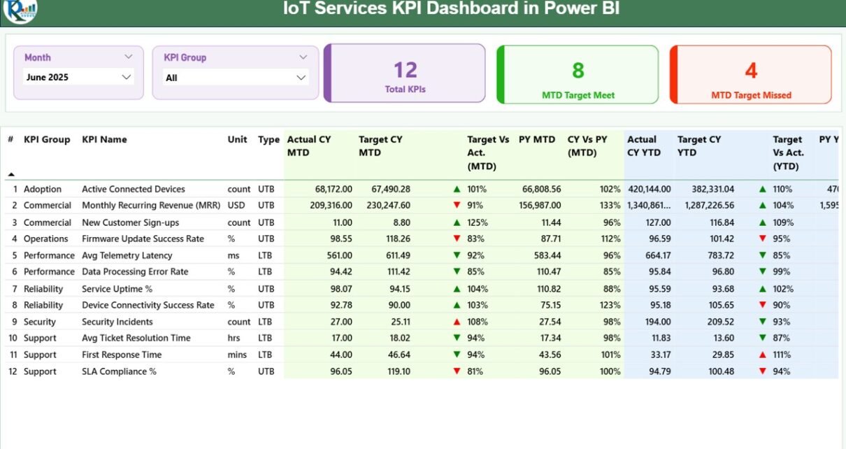
1️⃣ What Does the Summary Page Show?
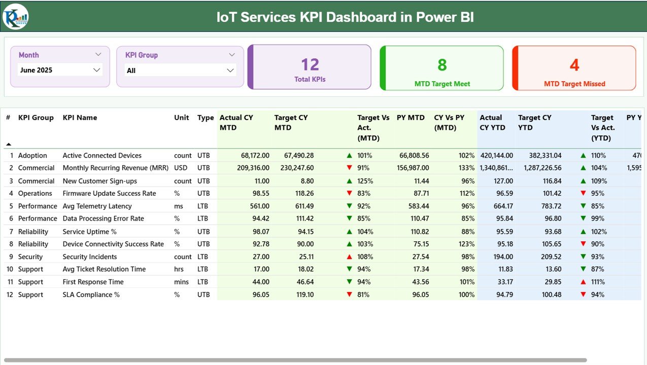
The Summary Page acts as the main performance overview screen.
Top Section – Slicers & KPI Cards
At the top, you will see:
-
Month slicer
-
KPI Group slicer
These slicers allow you to filter performance dynamically.
Additionally, you will find three KPI cards:
-
Total KPIs Count
-
MTD Target Meet Count
-
MTD Target Missed Count
Because of these cards, you can quickly assess performance health.
Detailed KPI Performance Table
Below the cards, the dashboard displays a structured table containing:
KPI Identification Columns
-
KPI Number
-
KPI Group
-
KPI Name
-
Unit
-
Type (LTB – Lower the Better / UTB – Upper the Better)
MTD Section
-
Actual CY MTD
-
Target CY MTD
-
MTD Icon (▲ Green / ▼ Red)
-
Target Vs Actual (MTD %)
-
PY MTD
-
CY Vs PY (MTD %)
The dashboard calculates:
Target Vs Actual (MTD)
= Actual MTD / Target MTD
CY Vs PY (MTD)
= Current Year MTD / Previous Year MTD
Because of percentage comparisons and icons, you can identify KPI performance instantly.
YTD Section
Similarly, the YTD section includes:
-
Actual CY YTD
-
Target CY YTD
-
YTD Icon (▲ Green / ▼ Red)
-
Target Vs Actual (YTD %)
-
PY YTD
-
CY Vs PY (YTD %)
The calculations follow:
Target Vs Actual (YTD)
= Actual YTD / Target YTD
CY Vs PY (YTD)
= Current Year YTD / Previous Year YTD
Therefore, you get complete short-term and long-term performance visibility.
Click to Purchases IoT Services KPI Dashboard in Power BI
2️⃣ How Does the KPI Trend Page Help?
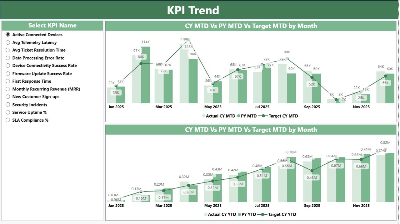
The KPI Trend Page focuses on deep analysis.
Here, you will see:
-
KPI Name slicer on the left
-
Two combo charts
MTD Trend Combo Chart
This chart compares:
-
Current Year Actual (MTD)
-
Previous Year Actual (MTD)
-
Target (MTD)
Because of this comparison, you can detect monthly performance movement clearly.
YTD Trend Combo Chart
Similarly, this chart compares:
-
Current Year Actual (YTD)
-
Previous Year Actual (YTD)
-
Target (YTD)
Therefore, you can monitor cumulative growth patterns.
If performance declines steadily, you can intervene early. On the other hand, if trends improve consistently, you can replicate success strategies.
3️⃣ What Is the KPI Definition Page?
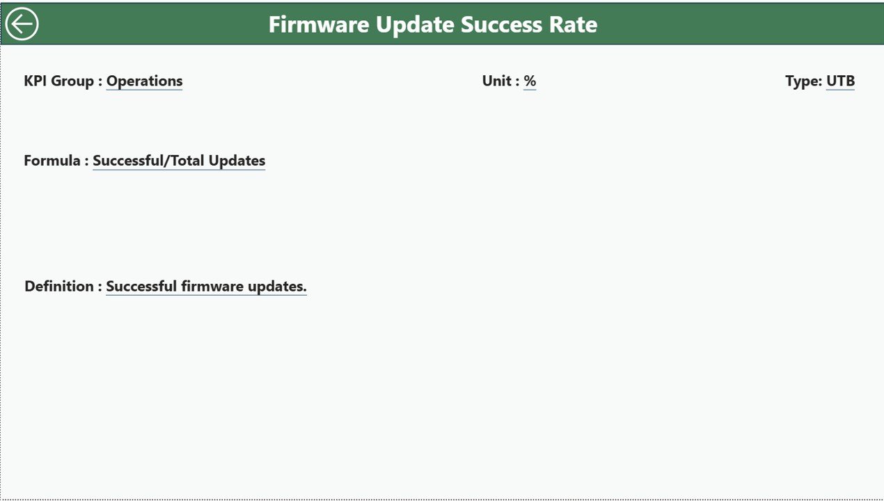
The KPI Definition Page works as a drill-through page.
It remains hidden by default. However, you can drill through from the Summary Page to view detailed KPI information.
Here, you can see:
-
KPI Formula
-
KPI Definition
-
KPI Group
-
KPI Type
-
Unit
Because of this documentation, you maintain transparency and consistency.
To return to the main page, simply click the back button on the top-left corner.
Click to Purchases IoT Services KPI Dashboard in Power BI
What Excel Data Structure Powers This Dashboard?
The dashboard uses an Excel file as the data source. This Excel file contains 3 worksheets.
1️⃣ Input_Actual Sheet
In this sheet, you enter:
-
KPI Name
-
Month (use first date of month)
-
MTD Number
-
YTD Number
Because the model connects directly to this sheet, your actual data updates visuals automatically.
2️⃣ Input_Target Sheet
Here, you enter:
-
KPI Name
-
Month
-
MTD Target
-
YTD Target
Targets allow the dashboard to calculate variance and performance percentage.
3️⃣ KPI Definition Sheet
In this sheet, you define:
-
KPI Number
-
KPI Group
-
KPI Name
-
Unit
-
Formula
-
Definition
-
Type (LTB or UTB)
This structured approach ensures consistency across reports.
What KPIs Can You Track in an IoT Services Dashboard?
You can track multiple operational, financial, and service KPIs.
Operational KPIs
-
Device Uptime %
-
Network Availability
-
Mean Time to Repair (MTTR)
-
Incident Resolution Time
-
SLA Compliance Rate
Financial KPIs
-
Service Revenue
-
Cost per Device
-
Maintenance Cost
-
Customer Acquisition Cost
Service Quality KPIs
-
Response Time
-
Ticket Closure Rate
-
Customer Satisfaction Score
Because you can classify KPIs as LTB or UTB, the icon logic adjusts automatically.
Click to Purchases IoT Services KPI Dashboard in Power BI
Advantages of IoT Services KPI Dashboard in Power BI
Now let us explore its major advantages.
1. Interactive Reporting
You can filter by month and KPI group instantly. Therefore, analysis becomes flexible.
2. Clear Performance Indicators
Icons and percentages highlight KPI status quickly.
3. Real-Time Comparisons
You can compare:
-
Actual vs Target
-
Current Year vs Previous Year
As a result, you identify gaps immediately.
4. Drill-Through Capability
You can explore KPI formulas and definitions in detail.
5. Visual Trend Monitoring
Combo charts help you understand performance patterns easily.
6. Scalable for Growth
Because Power BI handles large datasets efficiently, this dashboard scales as your IoT business grows.
How Does This Dashboard Improve IoT Business Performance?
This dashboard improves operations in multiple ways.
Better SLA Monitoring
You can track SLA compliance percentage monthly and YTD.
Faster Decision-Making
Since visuals update instantly, leadership decisions improve.
Improved Cost Control
You can monitor revenue and cost trends clearly.
Enhanced Accountability
Because KPIs remain transparent, teams stay aligned with targets.
Click to Purchases IoT Services KPI Dashboard in Power BI
Best Practices for the IoT Services KPI Dashboard in Power BI
To maximize results, follow these best practices.
1. Standardize KPI Definitions
Ensure every KPI has a clear formula and unit.
2. Use Accurate Data Entry
Always enter the first date of the month correctly in Excel.
3. Review KPIs Monthly
Conduct monthly performance meetings using the dashboard.
4. Align KPIs with Business Goals
Avoid tracking irrelevant metrics.
5. Monitor Both MTD and YTD
Short-term and long-term performance analysis improves strategy.
6. Keep Excel Data Clean
Remove duplicates and validate values regularly.
How to Implement IoT KPI Dashboard Successfully?
Follow these steps:
-
Define KPIs clearly
-
Enter KPI definitions
-
Fill target sheet
-
Input actual data monthly
-
Review summary page
-
Analyze trends
-
Take corrective action
Because of this structured process, implementation becomes smooth.
Click to Purchases IoT Services KPI Dashboard in Power BI
Conclusion: Why Should You Use an IoT Services KPI Dashboard in Power BI?
IoT service businesses operate in complex environments. However, without structured reporting, performance gaps remain hidden.
The IoT Services KPI Dashboard in Power BI provides:
-
Interactive KPI monitoring
-
MTD and YTD tracking
-
Target vs Actual comparison
-
Previous Year benchmarking
-
Drill-through transparency
-
Dynamic trend analysis
Therefore, you gain full visibility into operational stability, service quality, and financial performance.
If you want smarter IoT performance management, this dashboard delivers clarity, speed, and control.
Frequently Asked Questions with Answers
1. What is an IoT Services KPI Dashboard in Power BI?
It is an interactive Power BI report that tracks IoT service KPIs using structured Excel data.
2. Can I customize KPIs?
Yes. You can modify KPIs in the Excel source file and refresh the dashboard.
3. Does the dashboard show MTD and YTD performance?
Yes. It displays both MTD and YTD comparisons dynamically.
4. What does LTB and UTB mean?
LTB means Lower the Better. UTB means Upper the Better.
5. Can I compare performance with previous year?
Yes. The dashboard shows CY vs PY percentages for both MTD and YTD.
6. Is this suitable for large IoT service companies?
Yes. Power BI supports large datasets efficiently.
7. Do I need advanced Power BI knowledge?
No. Basic Power BI understanding allows you to use and refresh this dashboard easily.
Click to Purchases IoT Services KPI Dashboard in Power BI
Visit our YouTube channel to learn step-by-step video tutorials