Smart grid services keep modern power systems reliable, efficient, and ready for the future. However, many utility teams still track performance using scattered files, email updates, and different tools. As a result, they lose visibility, miss trends, and take slower decisions.
So, what should you do instead?
You should use a Smart Grid Services KPI Dashboard in Excel. It gives you one clear view of KPI performance, and it helps you compare Actual vs Target and Actual vs Previous Year with simple indicators. Moreover, it supports both MTD (Month-to-Date) and YTD (Year-to-Date) tracking, so you always know where you stand.
In this guide, you will learn what this dashboard is, why it matters, which KPIs you can track, how the Excel template works (sheet by sheet), and how to use it to improve operational control, service reliability, and reporting speed.
Click to Purchases Smart Grid Services KPI Dashboard in Excel
What Is a Smart Grid Services KPI Dashboard in Excel?
A Smart Grid Services KPI Dashboard in Excel is a ready-to-use performance tracking tool that helps utilities and smart grid service teams monitor KPI results in a structured way.
Instead of working with multiple reports, you manage KPIs in one dashboard and view:
-
MTD Actual vs Target
-
MTD Actual vs Previous Year (PY)
-
YTD Actual vs Target
-
YTD Actual vs Previous Year (PY)
Additionally, the dashboard highlights performance using up/down arrow indicators (conditional formatting). Therefore, teams can instantly spot whether performance moves in the right direction.
Why Do Smart Grid Teams Need KPI Tracking?
Smart grid operations involve many moving parts: metering, automation, outage response, grid stability, customer service, and compliance. Therefore, KPI tracking becomes essential.
Here is why it matters:
-
You improve reliability because you track outage and restoration KPIs regularly.
-
You reduce losses because you monitor billing accuracy and technical losses.
-
You improve customer trust because you track service response and complaint resolution.
-
You strengthen planning because you compare current performance with targets and last year.
-
You speed up decisions because Excel dashboards give quick insights without extra tools.
Moreover, KPI dashboards help leadership see trends clearly and review performance in monthly and quarterly meetings.
What Makes This Smart Grid KPI Dashboard Template Powerful?
This template is designed for simplicity and speed. At the same time, it delivers professional KPI reporting.
Here are the key features:
-
Ready-to-use KPI dashboard in Excel
-
Month selector to change the entire dashboard view
-
MTD and YTD performance tracking
-
Actual vs Target and Actual vs Previous Year comparisons
-
Conditional formatting arrows for quick performance signals
-
KPI Trend charts for both MTD and YTD
-
Clean input structure for Actual, Target, and Previous Year numbers
Because the template uses a structured setup, you can update numbers monthly and generate insights instantly.
What Worksheets Are Included in This Smart Grid KPI Dashboard?
This Excel template includes 7 worksheets, each designed for a specific purpose. Let’s walk through them in a simple and practical way.
1) Home Sheet: How Does the Navigation Work?
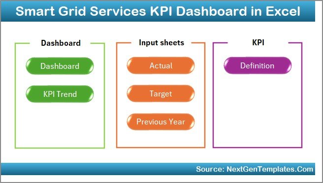
The Home sheet works like an index page. It includes 6 buttons that help you jump to key sheets quickly.
So, instead of scrolling and searching, you click a button and go directly to:
-
Dashboard
-
KPI Trend
-
Input sheets
-
KPI Definition
As a result, your workbook feels like a professional reporting tool.
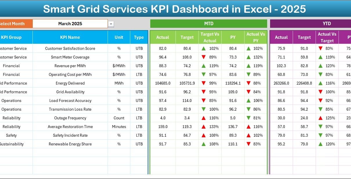
2) Dashboard Sheet: How Does Monthly KPI Performance Show Up?
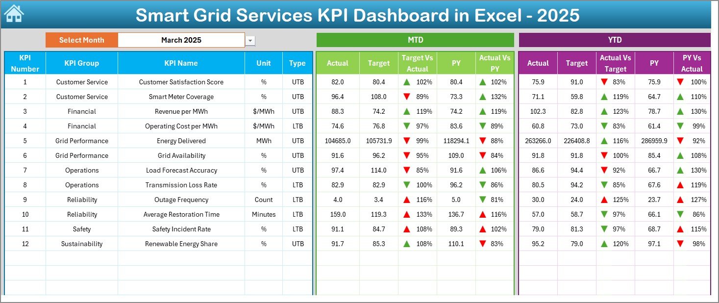
The Dashboard sheet is the main reporting view. Here, you see all KPIs together.
✅ Month Selection (Range D3)
You select the month from the dropdown on D3, and then the full dashboard updates for that month.
This sheet shows:
MTD Section
-
MTD Actual
-
MTD Target
-
MTD Previous Year
-
Target vs Actual (with arrows)
-
PY vs Actual (with arrows)
YTD Section
-
YTD Actual
-
YTD Target
-
YTD Previous Year
-
Target vs Actual (with arrows)
-
PY vs Actual (with arrows)
Because of these comparisons, you can identify:
-
Where you missed targets
-
Where you improved vs last year
-
Which KPIs need urgent action
-
Click to Purchases Smart Grid Services KPI Dashboard in Excel
3) KPI Trend Sheet: How Can You Analyze a Single KPI in Detail?
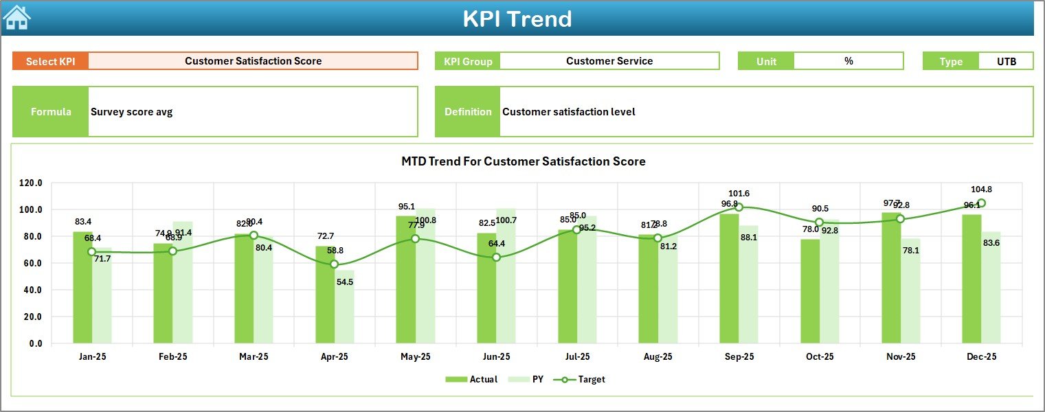
The KPI Trend sheet helps you deep-dive into one KPI at a time.
✅ KPI Selection (Range C3)
You select a KPI name from the dropdown in C3.
Then, the sheet displays:
-
KPI Group
-
KPI Unit
-
KPI Type (Lower the Better or Upper the Better)
-
KPI Formula
-
KPI Definition
Moreover, it shows trend charts for:
-
MTD Trend (Actual, Target, PY)
-
YTD Trend (Actual, Target, PY)
Therefore, you can track performance direction month by month instead of relying on a single number.
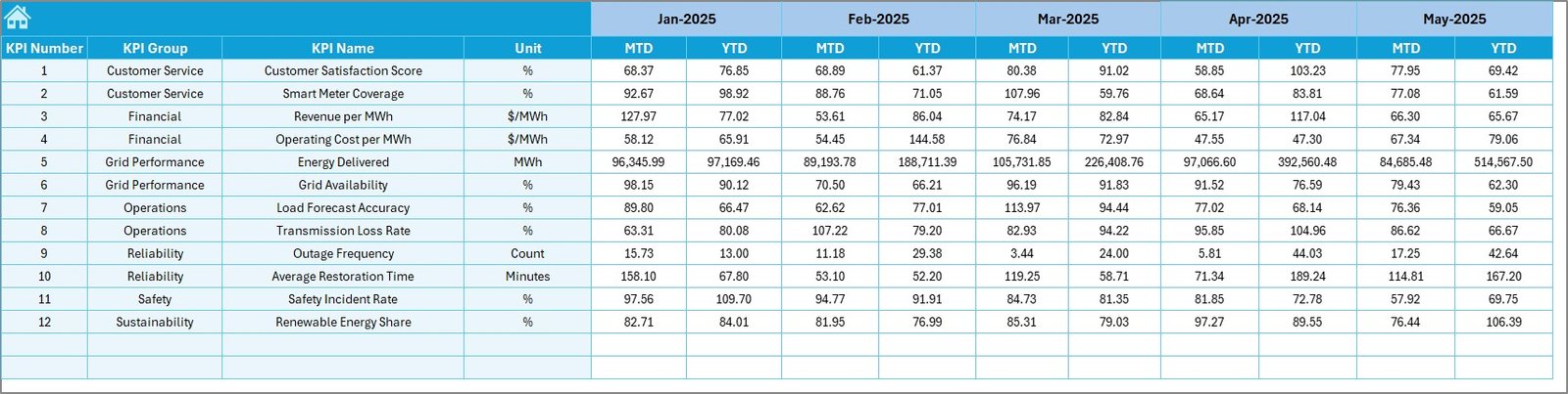
4) Actual Numbers Input Sheet: Where Do You Enter the Current Year Actuals?
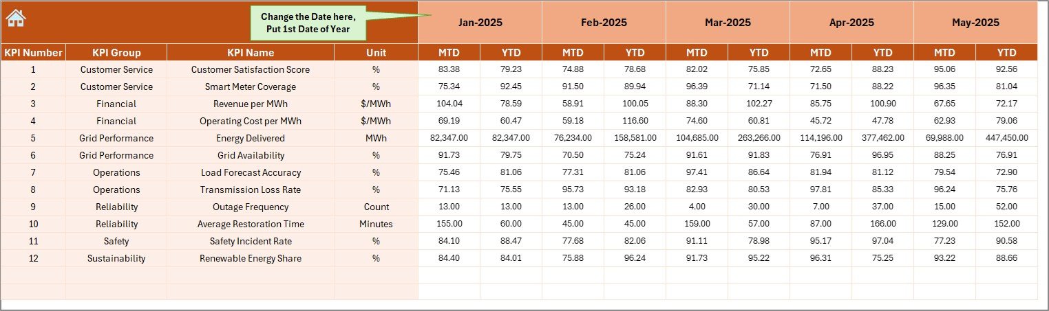
This sheet is for entering the Actual numbers.
Important points:
-
You input MTD and YTD actual values for each KPI.
-
You set the first month of the year in E1.
-
You can change months from E1, and the sheet adjusts the monthly structure.
As a result, data entry becomes faster and consistent.
5) Target Sheet: How Do You Set Targets for KPIs?
In the Target sheet, you enter target numbers for each KPI:
-
MTD Targets
-
YTD Targets
Because targets drive performance tracking, this sheet becomes essential for management reporting. Moreover, you can update targets if business goals change.
6) Previous Year Numbers Sheet: How Do You Compare Performance with Last Year?
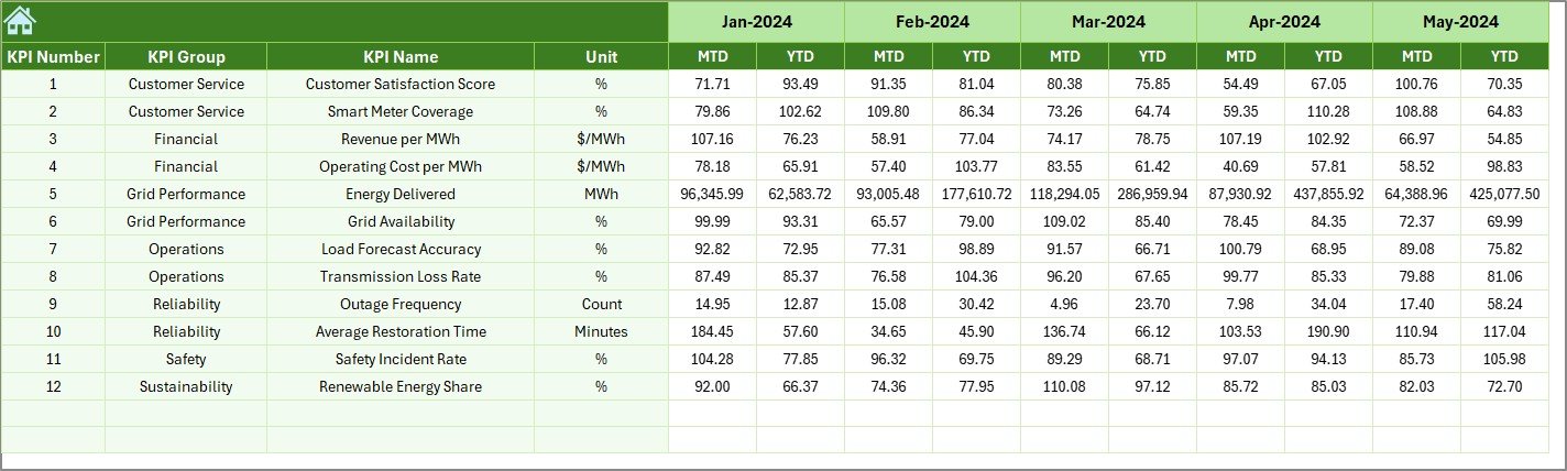
This sheet stores previous year KPI values for the same structure.
You enter:
-
MTD Previous Year values
-
YTD Previous Year values
Therefore, the dashboard can show year-over-year improvement using PY vs Actual comparisons.
7) KPI Definition Sheet: Where Do KPI Names and Formulas Come From?
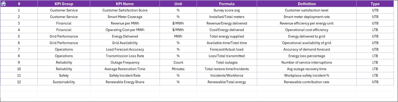
The KPI Definition sheet is the backbone of the dashboard.
Here you enter:
-
KPI Name
-
KPI Group
-
Unit
-
Formula
-
KPI Definition
Because KPI consistency matters, this sheet ensures everyone uses the same meaning for every KPI.
Click to Purchases Smart Grid Services KPI Dashboard in Excel
Which KPIs Should You Track for Smart Grid Services?
Different organizations track different KPIs. However, most smart grid service teams rely on a few key KPI categories. Below are practical KPI examples you can include in your dashboard.
Reliability KPIs
-
SAIDI (System Average Interruption Duration Index)
-
SAIFI (System Average Interruption Frequency Index)
-
CAIDI (Customer Average Interruption Duration Index)
-
Outage Restoration Time
-
Feeder Availability %
Smart Meter KPIs
-
Smart Meter Read Success Rate %
-
Communication Failure Rate %
-
Meter Tamper Alerts Count
-
Remote Connect/Disconnect Success %
Grid Efficiency KPIs
-
Technical Loss %
-
Non-Technical Loss %
-
Voltage Compliance %
-
Transformer Overload Events
Customer Service KPIs
-
Complaint Resolution Time
-
First Contact Resolution %
-
Billing Accuracy %
-
Service Request Closure Rate
Asset and Maintenance KPIs
-
Preventive Maintenance Compliance %
-
Average Repair Time
-
Equipment Failure Rate
-
Work Order Backlog
Cybersecurity & Compliance KPIs
-
Security Patch Compliance %
-
Incident Response Time
-
Audit Non-Compliance Count
-
Data Privacy Requests Closed %
You can start with 10 to 20 KPIs and expand later. Also, you can group them using KPI Groups in the KPI Definition sheet.
Click to Purchases Smart Grid Services KPI Dashboard in Excel
How Do You Use This Smart Grid KPI Dashboard Step by Step?
If you want smooth reporting, follow this workflow each month:
Step 1: Update KPI Definitions (Only When Needed)
-
Add or edit KPI names, units, formulas, and definitions.
-
Keep KPI names consistent across sheets.
Step 2: Enter Actual Numbers
-
Go to the Actual Numbers Input sheet.
-
Fill MTD and YTD values for the selected month.
Step 3: Enter Targets
-
Go to the Target sheet.
-
Fill MTD and YTD targets.
Step 4: Enter Previous Year Numbers
-
Go to the Previous Year Number sheet.
-
Add MTD and YTD values from last year.
Step 5: Review Dashboard
-
Go to the Dashboard sheet.
-
Select month in D3.
-
Review arrows for quick performance signals.
Step 6: Analyze Trends
-
Go to KPI Trend.
-
Select KPI in C3.
-
Review MTD and YTD trend charts.
Because this flow stays simple, you can complete monthly updates quickly.
How Does Conditional Formatting Help in KPI Monitoring?
Smart grid operations move fast. Therefore, teams need quick signals.
This dashboard uses up/down arrows to show:
-
Target vs Actual performance direction
-
Previous Year vs Actual performance direction
So, your leadership team does not need to read long tables. Instead, they see arrows and act faster.
Moreover, conditional formatting reduces reporting time and improves accuracy in review meetings.
Who Can Use a Smart Grid Services KPI Dashboard in Excel?
This template fits many roles and departments, such as:
-
Smart Grid Operations Teams
-
Distribution Utilities
-
Meter Data Management Teams
-
Grid Automation Teams
-
Outage Management Teams
-
Maintenance & Asset Teams
-
Utility Customer Service Teams
-
Energy Consultants and Analysts
-
Power Sector Project Managers
Because Excel is widely available, most teams can use it without extra tools.
Advantages of Smart Grid Services KPI Dashboard in Excel
A dashboard should deliver value quickly. Here are the biggest advantages of using this Smart Grid KPI Dashboard template:
✅ 1) You Track All KPIs in One Place
You avoid scattered files. Therefore, you reduce confusion and reporting delays.
✅ 2) You Improve Monthly Reporting Speed
You update inputs and the dashboard updates instantly. As a result, you save time every month.
✅ 3) You Compare Target vs Actual Clearly
Targets guide performance. Therefore, this dashboard helps you stay aligned with goals.
✅ 4) You Benchmark Against Previous Year
You understand if performance improved. Moreover, you can justify investments and upgrades.
✅ 5) You Identify Issues Early
Arrows and comparisons highlight problem KPIs quickly. Therefore, you can act before issues grow.
✅ 6) You Support Better Decision Making
Trend charts show direction. As a result, you make decisions based on patterns, not guesses.
Best Practices for the Smart Grid Services KPI Dashboard in Excel
Click to Purchases Smart Grid Services KPI Dashboard in Excel
To get the best results, follow these practical best practices:
1) Keep KPI Definitions Clear
-
Use simple definitions.
-
Keep one owner per KPI.
-
Avoid changing KPI meaning mid-year.
2) Update Data on a Fixed Schedule
-
Update MTD weekly (if required).
-
Update full month results on a set date.
3) Use the Same Units Everywhere
-
Keep units consistent (%, minutes, count, kWh, etc.).
-
Avoid mixing units in one KPI.
4) Review Trends, Not Only Current Values
-
A KPI might look good today, but the trend might fall.
-
Therefore, always check the KPI Trend sheet.
5) Validate Inputs Before Presenting
-
Double-check actuals and targets.
-
Match previous year numbers carefully.
6) Group KPIs by Function
-
Reliability
-
Metering
-
Loss reduction
-
Customer service
-
Maintenance
This grouping improves clarity and helps stakeholders focus on their area.
7) Keep the KPI List Focused
-
Start with the most important KPIs.
-
Then expand slowly as the team matures.
Common Mistakes to Avoid While Tracking Smart Grid KPIs
Even a great dashboard can fail if teams make common errors. Avoid these:
-
You change KPI names frequently, so comparisons break.
-
You enter MTD and YTD incorrectly, so trends become wrong.
-
You set targets without business logic, so review meetings lose value.
-
You skip previous year numbers, so YOY insights disappear.
-
You track too many KPIs, so teams lose focus.
Instead, keep the dashboard clean and accurate.
Conclusion: Why This KPI Dashboard Helps Smart Grid Teams Win
Smart grid services demand accuracy, speed, and clear decision-making. Therefore, teams need a structured KPI system that shows performance clearly and consistently.
The Smart Grid Services KPI Dashboard in Excel helps you track all KPIs in one place, compare Actual vs Target and Actual vs Previous Year, and monitor both MTD and YTD results with trend charts. Moreover, the Home sheet navigation and clean input sheets make the template easy to use for any team.
If you want faster reporting and stronger control over smart grid performance, this dashboard template fits perfectly.
Frequently Asked Questions (FAQs)
1) What is the best way to track smart grid KPIs in Excel?
You should use a structured KPI dashboard with separate input sheets for Actual, Target, and Previous Year. Then, you should view results through a central dashboard with MTD and YTD comparisons.
2) How many KPIs should a smart grid dashboard include?
You should start with 10 to 20 KPIs. Then, you can expand as your team improves maturity and data quality.
3) How does the month selection work in this dashboard?
You select the month from the dropdown in Dashboard sheet range D3. Then, the whole dashboard updates automatically for that month.
4) What is the difference between MTD and YTD in KPI tracking?
MTD shows performance for the current month up to date. On the other hand, YTD shows performance from the start of the year up to the selected month.
5) Why should I compare KPIs with previous year numbers?
Previous year comparison shows improvement or decline. Therefore, it helps you set realistic goals and justify operational improvements.
6) Can I add new KPIs to this Excel dashboard?
Yes. You can add KPIs in the KPI Definition sheet and then update the input sheets accordingly. After that, the dashboard will track them.
7) Who should use this dashboard in a utility company?
Operations, metering, reliability teams, asset maintenance, analysts, and leadership can all use it because it gives a clear KPI view.
8) How often should smart grid KPIs be reviewed?
You should review critical KPIs weekly, and you should review full KPI results monthly. Also, you should review trends quarterly for planning.
Visit our YouTube channel to learn step-by-step video tutorials