Airline catering plays a critical role in the aviation industry. Every day, airlines serve thousands of meals to passengers across different routes and airports. Because of this high demand, airline catering teams must manage food preparation, delivery timing, costs, and service quality very carefully.
However, many airline catering companies still rely on scattered spreadsheets and manual reports. As a result, managers struggle to monitor performance, control meal costs, and track service quality. Without a centralized system, it becomes difficult to understand which airline partnership performs best or which meal category generates the most revenue.
Therefore, organizations need a powerful analytics system that can track catering performance in one place.
Click to Purchases Airline Catering Dashboard in Power BI
This is where the Airline Catering Dashboard in Power BI becomes extremely useful.
A Power BI dashboard allows airline catering teams to monitor operational performance, analyze costs, evaluate service ratings, and track revenue trends through interactive visual reports. Instead of reviewing multiple files, managers can quickly understand the entire catering operation using clear charts and metrics.
In this article, you will learn what an Airline Catering Dashboard in Power BI is, why airlines need it, what features it includes, which KPIs matter most, and how businesses can use it effectively.
What is an Airline Catering Dashboard in Power BI?
An Airline Catering Dashboard in Power BI is an interactive analytics tool that helps airline catering companies monitor operational performance, meal delivery efficiency, and financial results.
Power BI transforms raw catering data into visual insights using charts, cards, and filters. Because of this, managers can quickly analyze large volumes of data without reviewing complicated spreadsheets.
For example, the dashboard can show:
-
On-time meal delivery percentage
-
Catering costs by meal category
-
Service ratings from airlines
-
Cost per meal at different airports
-
Revenue generated from meal services
Moreover, Power BI allows users to apply filters and slicers. As a result, managers can analyze data by airline, airport, meal type, or time period.
This type of dashboard helps catering companies make faster decisions and improve operational efficiency.
Why Do Airlines and Catering Companies Need a Catering Dashboard?
Airline catering involves multiple moving parts. Catering teams must coordinate with airlines, airports, kitchens, and logistics teams. At the same time, they must control food quality, delivery timing, and operational costs.
However, when companies manage catering operations manually, several problems appear.
For instance:
-
Managers cannot easily track delivery performance
-
Cost overruns remain unnoticed
-
Service quality becomes difficult to monitor
-
Revenue analysis becomes slow and inaccurate
Therefore, companies need a centralized reporting system.
An Airline Catering Dashboard in Power BI solves these challenges by providing real-time insights into catering operations. Consequently, managers can monitor performance, identify issues quickly, and improve overall service quality.
Click to Purchases Airline Catering Dashboard in Power BI
Key Features of the Airline Catering Dashboard in Power BI
The Airline Catering Dashboard includes five powerful analytical pages inside the Power BI desktop file. Each page focuses on a different aspect of catering performance.
Because of this structured design, managers can easily navigate through operational insights.
Let us explore each page in detail.
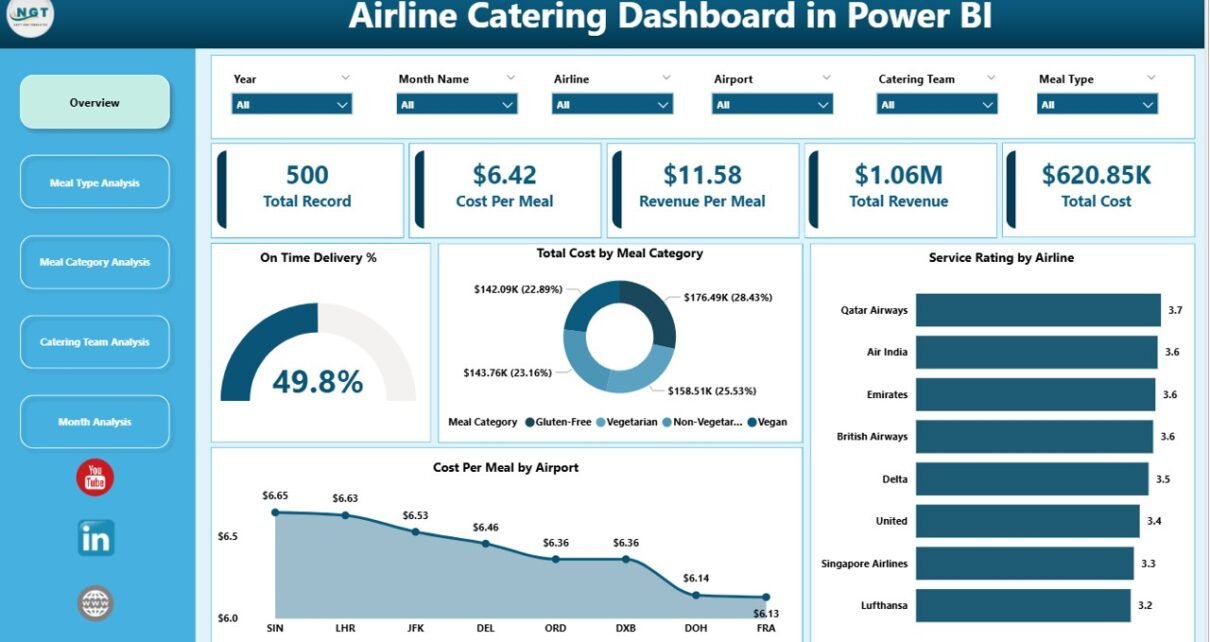
1. Overview Page – Monitor Key Catering KPIs
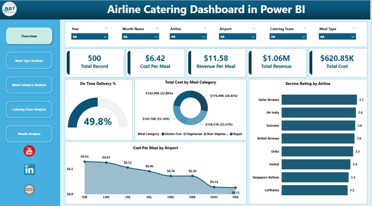
The Overview Page acts as the main control panel of the dashboard. This page provides a quick summary of airline catering performance.
Additionally, users can apply slicers to filter data based on airlines, airports, meal categories, or time periods.
KPI Cards on the Overview Page
The dashboard highlights several important catering performance metrics:
-
On-Time Delivery % – Measures how many meals were delivered on schedule
-
Total Cost by Meal Category – Tracks operational cost for each meal category
-
Service Rating by Airline – Shows customer satisfaction levels
-
Cost Per Meal by Airport – Compares meal costs across airports
Because these KPIs appear on the main page, managers can immediately understand operational performance.
2. Meal Type Analysis – Evaluate Catering Costs by Meal Type
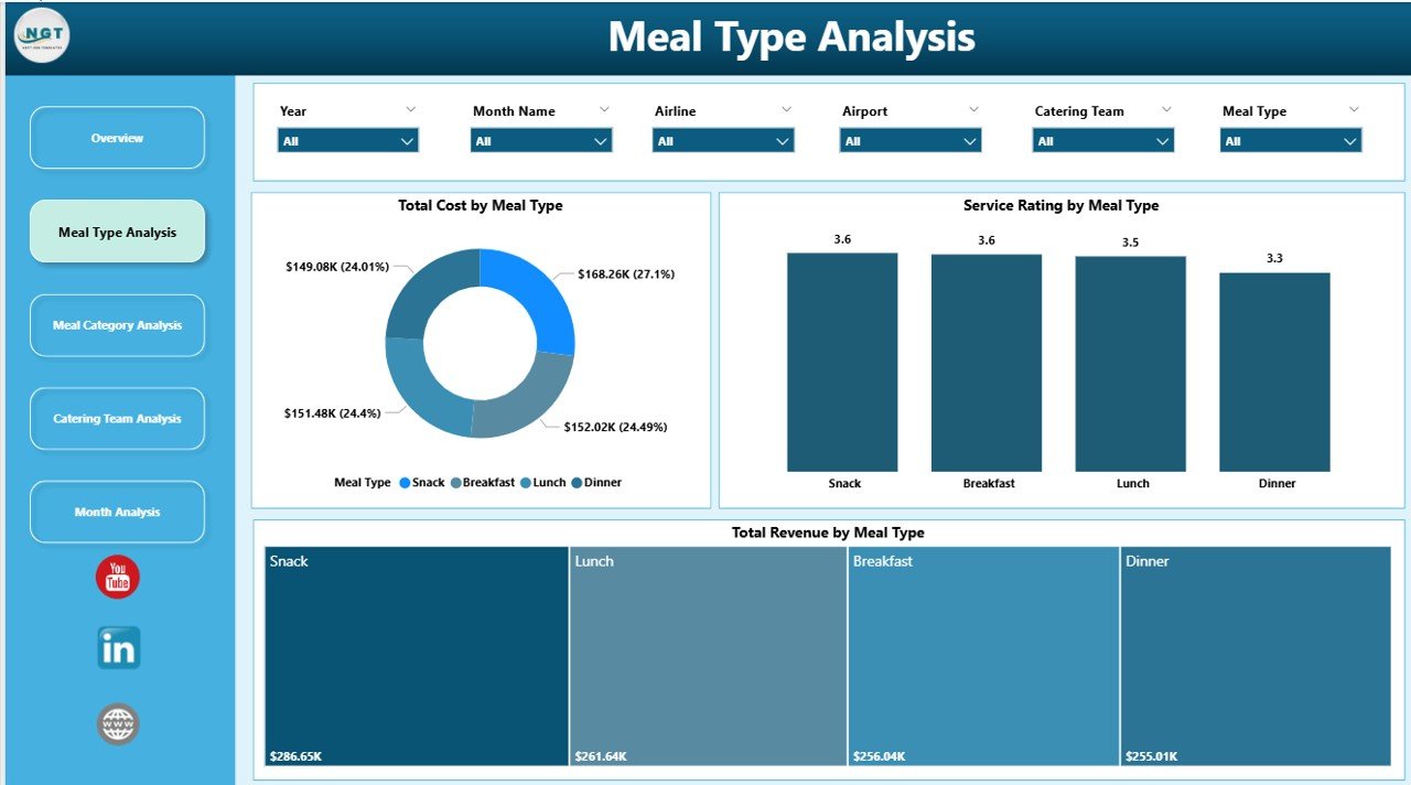
The Meal Type Analysis Page helps managers analyze how different meal types perform in terms of cost, service quality, and revenue.
Airlines usually offer multiple meal types such as:
-
Economy meals
-
Business class meals
-
First class meals
-
Special meals (vegetarian, vegan, gluten-free)
Therefore, analyzing meal type performance becomes very important.
Charts Included on This Page
Click to Purchases Airline Catering Dashboard in Power BI
The dashboard displays three powerful charts:
-
Total Cost by Meal Type
-
Service Rating by Meal Type
-
Total Revenue by Meal Type
These charts allow catering managers to identify which meal types generate the highest revenue and which ones require better cost control.
3. Meal Category Analysis – Understand Food Category Performance
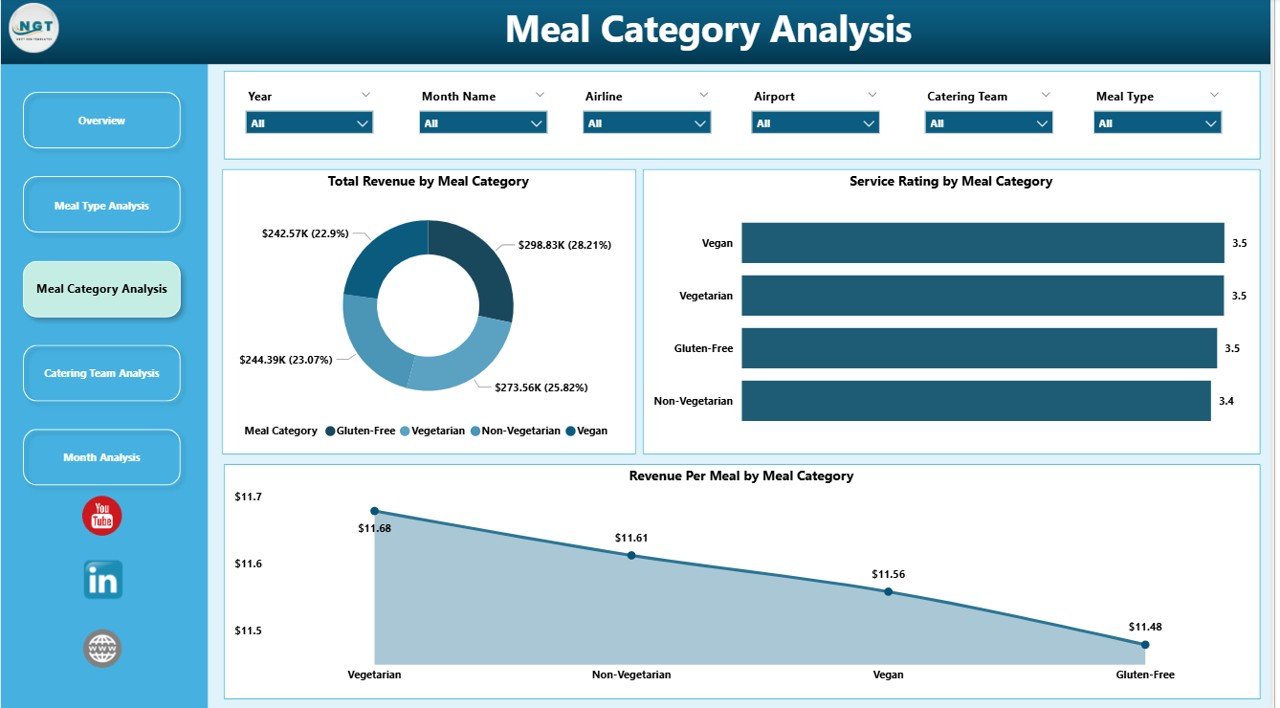
Airline catering companies prepare a wide variety of meal categories. These categories may include:
-
Breakfast meals
-
Lunch meals
-
Dinner meals
-
Snacks
-
Special dietary meals
Therefore, tracking performance by meal category helps organizations improve menu planning.
Charts Available on This Page
The Meal Category Analysis page includes:
-
Total Cost by Meal Category
-
Service Rating by Meal Category
-
Total Revenue by Meal Category
These charts help managers evaluate which meal categories perform well and which ones require improvement.
For example, if breakfast meals generate high costs but low ratings, the catering team can review the menu and adjust preparation processes.
4. Catering Team Analysis – Monitor Team Performance
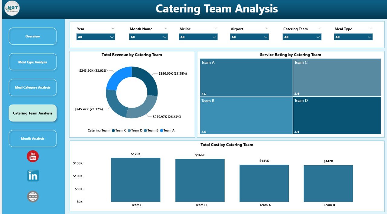
Airline catering operations involve multiple catering teams working across different airports or kitchens. Each team handles food preparation, packaging, and delivery coordination.
Because of this, team performance analysis becomes essential.
The Catering Team Analysis Page helps managers monitor how each catering team performs.
Key Charts on This Page
The dashboard provides three charts:
-
Total Cost by Catering Team
-
Service Rating by Catering Team
-
Total Revenue by Catering Team
Using these insights, managers can identify high-performing teams and support teams that require improvement.
Additionally, organizations can allocate resources more effectively.
5. Month Analysis – Track Catering Performance Over Time
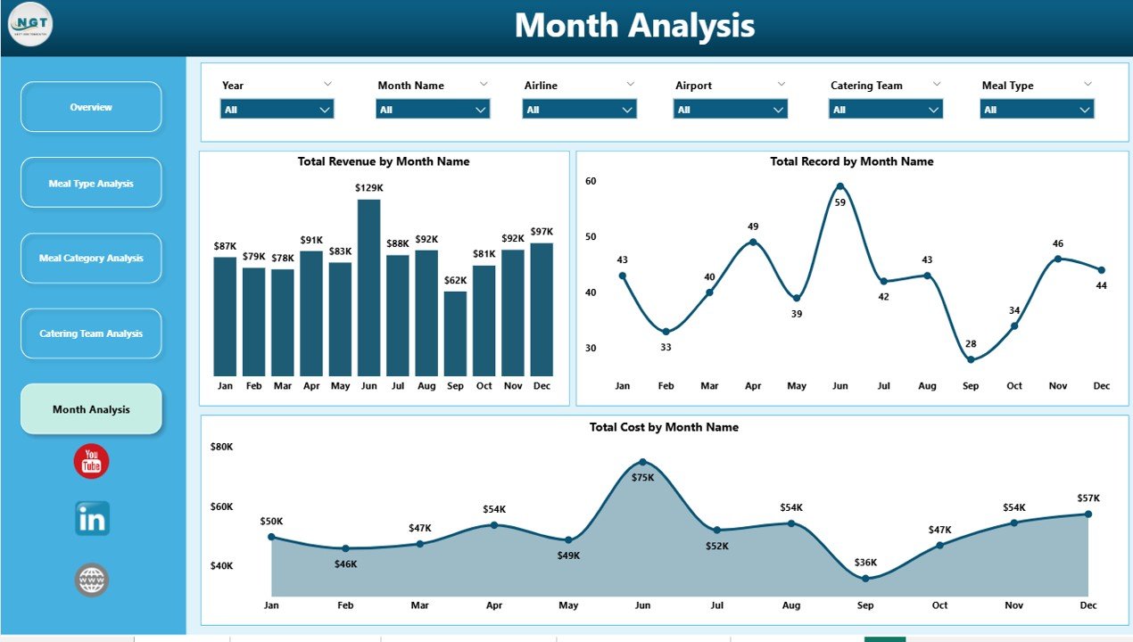
The Month Analysis Page helps managers understand how catering operations perform across different months.
Seasonal demand often affects airline catering. For example:
-
Summer travel increases meal demand
-
Holiday seasons create higher passenger traffic
-
Off-season periods reduce catering volume
Therefore, month-wise analysis becomes very important.
Charts Included on This Page
This section includes:
-
Total Cost by Month
-
Total Record by Month
-
Total Revenue by Month
These visuals help organizations track performance trends and forecast future demand.
Important KPIs for Airline Catering Analytics
Click to Purchases Airline Catering Dashboard in Power BI
Every airline catering company should monitor several key performance indicators.
Some of the most important KPIs include:
Operational KPIs
-
On-Time Meal Delivery Percentage
-
Meals Prepared Per Flight
-
Meal Preparation Time
-
Catering Team Productivity
Financial KPIs
-
Total Catering Revenue
-
Cost Per Meal
-
Operational Cost by Airport
-
Profit Margin per Airline Contract
Customer Experience KPIs
-
Service Rating by Airline
-
Passenger Satisfaction Score
-
Complaint Rate
Tracking these KPIs helps companies maintain service quality while controlling operational costs.
Advantages of Airline Catering Dashboard in Power BI
Organizations gain several advantages by using a Power BI dashboard for airline catering analytics.
1. Centralized Data Monitoring
Power BI consolidates catering data into one platform. As a result, managers no longer need to analyze multiple spreadsheets.
2. Faster Decision Making
Visual dashboards provide instant insights. Therefore, managers can quickly identify problems and take action.
3. Improved Cost Management
The dashboard helps organizations track meal costs across categories, airports, and teams. Consequently, managers can control expenses more effectively.
4. Better Service Quality Monitoring
Service rating charts allow organizations to measure airline satisfaction and improve catering performance.
5. Clear Performance Comparison
Managers can compare catering teams, meal types, and airports. This comparison helps organizations identify best practices.
How Does Power BI Improve Airline Catering Analytics?
Power BI provides several advanced capabilities that make airline catering analytics more powerful.
Interactive Visual Reports
Power BI transforms raw data into interactive charts and dashboards.
Real-Time Data Monitoring
Organizations can connect Power BI to live data sources. As a result, managers always see updated performance metrics.
Drill-Down Analysis
Users can drill down into detailed information. For example, they can analyze catering costs by airport or airline.
Automated Reporting
Power BI automatically updates reports when data changes. Therefore, organizations save time and reduce manual reporting work.
Best Practices for the Airline Catering Dashboard in Power BI
To achieve the best results, organizations should follow several best practices when using an Airline Catering Dashboard.
Keep the Dashboard Simple
Always design dashboards with clear visuals and minimal clutter. This approach improves readability.
Focus on Key Metrics
Track only the most important KPIs that affect catering operations.
Use Consistent Data Sources
Reliable data ensures accurate analysis. Therefore, organizations should maintain consistent data collection processes.
Update Data Regularly
Frequent updates ensure the dashboard always reflects the latest operational performance.
Train Staff to Use the Dashboard
Managers and analysts should understand how to interpret dashboard insights effectively.
Click to Purchases Airline Catering Dashboard in Power BI
How Can Airlines Use This Dashboard to Improve Catering Operations?
Airlines and catering companies can use this dashboard in several ways.
For example:
-
Identify which meal categories generate the most revenue
-
Monitor airline service satisfaction levels
-
Control operational costs across airports
-
Evaluate catering team productivity
-
Track seasonal demand patterns
Because of these insights, companies can optimize catering operations and improve profitability.
Conclusion
Airline catering operations require careful coordination, cost control, and service quality management. However, traditional reporting methods make it difficult to track performance effectively.
The Airline Catering Dashboard in Power BI solves this problem by providing a centralized and interactive analytics platform.
Through five powerful analysis pages, organizations can monitor catering performance from multiple perspectives, including meal types, meal categories, catering teams, and monthly trends.
As a result, managers gain clear insights that help them control costs, improve service quality, and increase operational efficiency.
Therefore, airline catering companies that adopt data-driven dashboards can achieve better decision-making and stronger operational performance.
Frequently Asked Questions (FAQs)
What is an Airline Catering Dashboard in Power BI?
An Airline Catering Dashboard in Power BI is an interactive reporting tool that helps airline catering companies monitor operational performance, costs, revenue, and service quality using visual charts and analytics.
Why is a catering dashboard important for airlines?
A catering dashboard helps airlines track meal delivery performance, control operational costs, monitor service ratings, and analyze revenue trends in a centralized system.
What KPIs should airline catering companies track?
Airline catering companies should track KPIs such as on-time delivery percentage, cost per meal, catering revenue, service ratings, and catering team productivity.
Can Power BI integrate with airline catering data systems?
Yes. Power BI can connect with various data sources such as Excel files, databases, cloud systems, and ERP platforms used in airline operations.
Who can benefit from the Airline Catering Dashboard?
Several professionals can benefit from this dashboard, including:
-
Airline operations managers
-
Catering service providers
-
Airport catering teams
-
Business analysts
-
Airline management teams
Click to Purchases Airline Catering Dashboard in Power BI
Visit our YouTube channel to learn step-by-step video tutorials