Modern organizations rely heavily on data-driven decision-making. Therefore, tracking performance using Key Performance Indicators (KPIs) has become essential for businesses, knowledge centers, and service organizations. However, many teams still struggle with scattered spreadsheets, manual reports, and inconsistent KPI tracking systems.
As a result, leaders often find it difficult to evaluate performance quickly, identify performance gaps, and take corrective action on time.
This is exactly where the Knowledge Hubs KPI Dashboard in Power BI becomes extremely valuable.
The Knowledge Hubs KPI Dashboard in Power BI is a ready-to-use and interactive analytics solution that helps organizations monitor KPI performance, compare targets with actual results, analyze trends, and identify areas for improvement. Moreover, the dashboard transforms raw KPI data stored in Excel into powerful and easy-to-understand visual insights.
Because Power BI offers advanced visualization capabilities, users can quickly analyze performance trends, track KPI progress, and make better strategic decisions.
In this detailed guide, we will explore everything about the Knowledge Hubs KPI Dashboard in Power BI, including its features, dashboard structure, benefits, best practices, and frequently asked questions.
Click to Purchases Knowledge Hubs KPI Dashboard in Power BI
What is a Knowledge Hubs KPI Dashboard in Power BI?
A Knowledge Hubs KPI Dashboard in Power BI is an interactive reporting tool designed to monitor and analyze organizational performance indicators. It allows managers and analysts to track KPI results against targets and previous year data.
Instead of reviewing multiple spreadsheets, decision-makers can easily view performance metrics in a centralized dashboard.
Moreover, Power BI dashboards provide visual indicators, charts, and interactive filters that simplify complex KPI analysis.
Organizations can use this dashboard to monitor areas such as:
-
Operational efficiency
-
Service quality
-
Productivity metrics
-
Financial performance
-
Department performance
-
Knowledge management KPIs
As a result, leaders gain a clear understanding of performance trends and KPI achievements.
Why Do Organizations Need a KPI Dashboard?
Many organizations collect large amounts of performance data. However, data alone does not provide value unless teams can analyze and interpret it effectively.
Without a dashboard system, organizations face several challenges.
For example:
-
KPI data remains scattered across multiple files
-
Performance reports require manual calculations
-
Managers cannot quickly compare targets with actual results
-
Identifying performance trends becomes difficult
Therefore, organizations increasingly adopt Power BI KPI dashboards to transform raw data into actionable insights.
Because dashboards automate calculations and visualizations, leaders can focus on decision-making instead of data processing.
Key Features of the Knowledge Hubs KPI Dashboard in Power BI
The Knowledge Hubs KPI Dashboard provides a structured and easy-to-use interface for monitoring KPI performance. Moreover, the dashboard uses Excel as the data source and Power BI for data visualization.
The Power BI dashboard contains three well-designed pages, each serving a specific purpose.
Dashboard Structure of Knowledge Hubs KPI Dashboard in Power BI
The dashboard contains three analytical pages that provide different levels of performance insights.
These pages include:
-
Summary Page
-
KPI Trend Page
-
KPI Definition Page
Each page plays an important role in KPI monitoring and analysis.
Click to Purchases Knowledge Hubs KPI Dashboard in Power BI
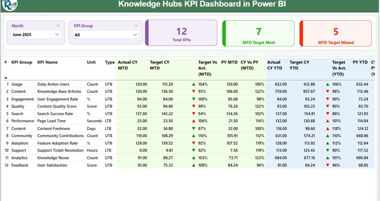
1. Summary Page – The Main Performance Overview
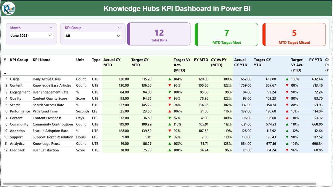
The Summary Page acts as the central interface of the dashboard. Managers can quickly evaluate the performance of all KPIs from this page.
At the top of the page, users can find two interactive slicers:
-
Month slicer
-
KPI Group slicer
These slicers allow users to filter KPI data based on the selected month and KPI category.
KPI Cards on the Summary Page
The dashboard displays three important KPI cards that provide quick insights into performance.
These include:
-
Total KPIs Count – Shows the total number of KPIs tracked in the dashboard.
-
MTD Target Meet Count – Displays the number of KPIs that achieved their targets for the month.
-
MTD Target Missed Count – Shows the number of KPIs that failed to meet the monthly target.
These KPI cards help managers quickly understand the overall performance status of the organization.
KPI Details Table on the Summary Page
Below the KPI cards, the dashboard displays a detailed KPI table containing several performance metrics.
This table provides a complete view of KPI performance.
KPI Information Columns
The table contains the following fields:
KPI Number
This column displays the sequence number of the KPI.
KPI Group
This represents the category or department associated with the KPI.
KPI Name
This shows the name of the specific performance indicator.
Unit
This field displays the measurement unit used for the KPI.
Type
The type indicates whether the KPI follows:
-
LTB (Lower the Better)
-
UTB (Upper the Better)
This classification helps determine whether higher or lower values indicate better performance.
KPI Performance Metrics
The table also includes several performance indicators that measure KPI progress.
MTD Performance Metrics
Actual CY MTD
Shows the actual KPI value for the current year month-to-date.
Target CY MTD
Displays the target KPI value for the same period.
MTD Icon Indicator
The dashboard uses visual icons to indicate KPI performance.
-
▲ Green icon – Target achieved
-
▼ Red icon – Target missed
These indicators allow users to instantly understand KPI performance.
Target vs Actual (MTD)
This column shows the percentage difference between the actual value and the target value.
Formula used:
Actual MTD / Target MTD
PY MTD (Previous Year MTD)
Displays the KPI value for the same period in the previous year.
CY vs PY (MTD)
Shows the percentage comparison between the current year MTD and the previous year MTD.
Formula used:
Current Year MTD / Previous Year MTD
YTD Performance Metrics
The dashboard also includes Year-to-Date (YTD) performance metrics.
These metrics provide a long-term view of KPI performance.
Actual CY YTD
Shows the current year cumulative KPI value.
Target CY YTD
Displays the YTD target for the KPI.
YTD Icon Indicator
The dashboard again uses color-coded arrows to represent performance.
-
▲ Green arrow – Target achieved
-
▼ Red arrow – Target missed
Target vs Actual (YTD)
Displays the percentage difference between the actual YTD value and the target.
Formula used:
Actual YTD / Target YTD
PY YTD
Shows the previous year YTD KPI value.
CY vs PY (YTD)
Displays the comparison percentage between the current year and the previous year YTD values.
Formula used:
Current Year YTD / Previous Year YTD
2. KPI Trend Page – Analyze KPI Performance Trends
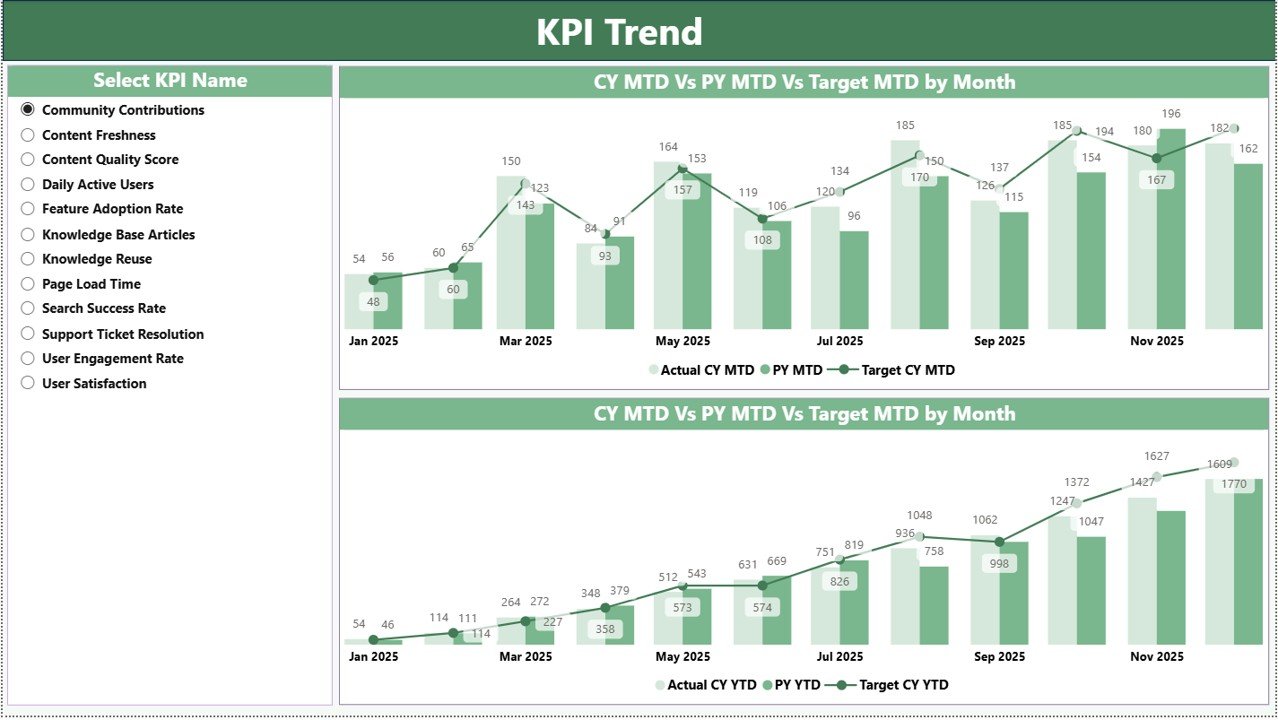
The KPI Trend Page helps users analyze how KPI performance changes over time.
This page includes two combo charts that display KPI performance for:
-
MTD metrics
-
YTD metrics
The charts compare three important values:
-
Current Year Actual
-
Previous Year Actual
-
Target Values
Because of this comparison, managers can easily identify performance patterns and trends.
Interactive KPI Selection
The dashboard includes a KPI Name slicer on the left side of the page.
Using this slicer, users can:
-
Select a specific KPI
-
Analyze performance trends
-
Compare targets with actual values
As a result, users can perform detailed KPI analysis for individual indicators.
3. KPI Definition Page – Detailed KPI Information
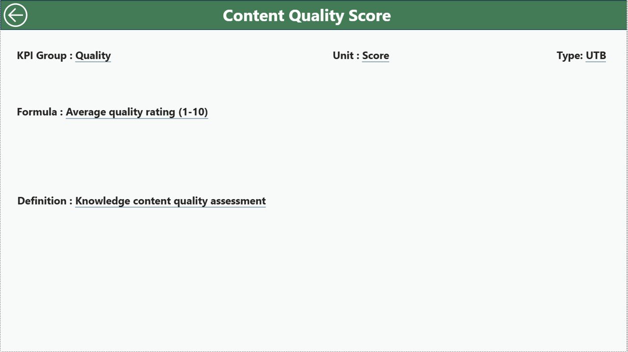
The KPI Definition Page provides additional details about each KPI.
This page includes information such as:
-
KPI Formula
-
KPI Definition
-
KPI Unit
-
KPI Category
-
KPI Type (LTB or UTB)
Moreover, this page works as a drill-through page.
Users can simply right-click a KPI on the Summary Page and drill through to view its detailed definition.
The page remains hidden in the navigation to keep the dashboard interface clean.
However, users can easily return to the main page using the Back Button located at the top left corner.
Excel Data Source of the Dashboard
The Knowledge Hubs KPI Dashboard in Power BI uses Excel as its data source.
Therefore, users only need to update the Excel file to refresh the dashboard data.
The Excel file contains three worksheets.
1. Input_Actual Sheet
This sheet stores the actual KPI values.
Users must fill the following information:
-
KPI Name
-
Month (First day of the month)
-
MTD values
-
YTD values
Once the data updates, Power BI automatically reflects the changes.
2. Input_Target Sheet
This worksheet stores KPI target values.
Users must enter:
-
KPI Name
-
Month
-
Target MTD values
-
Target YTD values
Power BI then compares these targets with actual results.
3. KPI Definition Sheet
This sheet contains detailed information about each KPI.
Users must fill the following columns:
-
KPI Number
-
KPI Group
-
KPI Name
-
Unit
-
Formula
-
Definition
-
KPI Type (LTB or UTB)
This information helps users understand the logic behind each KPI.
Click to Purchases Knowledge Hubs KPI Dashboard in Power BI
Advantages of the Knowledge Hubs KPI Dashboard in Power BI
Organizations gain many benefits when they implement a KPI dashboard.
1. Centralized KPI Monitoring
Managers can track all KPIs in one place instead of reviewing multiple spreadsheets.
2. Real-Time Performance Insights
Because the dashboard connects with Excel data, users can update KPI values and instantly refresh the dashboard.
3. Faster Decision-Making
Visual indicators and charts allow leaders to identify performance issues quickly.
4. Improved KPI Accountability
Teams can clearly see which KPIs meet targets and which require improvement.
5. Historical Performance Comparison
The dashboard allows organizations to compare current performance with previous year results.
6. Interactive Data Exploration
Slicers and filters allow users to explore KPI data in detail.
Best Practices for Using the Knowledge Hubs KPI Dashboard in Power BI
To get the best results from the dashboard, organizations should follow several best practices.
Define KPIs Clearly
Organizations should define KPIs carefully before tracking them.
Each KPI must include:
-
Clear definition
-
Calculation formula
-
Measurement unit
-
Performance target
Maintain Consistent Data Entry
Teams should update Excel data regularly and maintain consistent formats.
This practice ensures accurate dashboard insights.
Review KPI Trends Regularly
Managers should review KPI trends monthly or quarterly.
Regular analysis helps identify performance issues early.
Focus on Actionable KPIs
Organizations should track KPIs that directly influence business performance.
Avoid tracking unnecessary metrics.
Use Visual Insights for Strategy
Leaders should use dashboard insights to guide strategic decisions.
Data-driven strategies improve organizational performance.
Who Can Benefit from the Knowledge Hubs KPI Dashboard?
Many industries can benefit from KPI dashboards.
Examples include:
-
Knowledge management teams
-
Shared services centers
-
Consulting firms
-
Finance departments
-
HR teams
-
Operations teams
-
IT service management teams
-
Business analysts
Any organization that tracks performance metrics can benefit from this dashboard.
Conclusion
The Knowledge Hubs KPI Dashboard in Power BI provides a powerful solution for monitoring and analyzing performance indicators.
Instead of relying on manual reports, organizations can use this interactive dashboard to track KPI progress, compare targets with actual results, and analyze performance trends.
Moreover, the dashboard simplifies KPI monitoring through clear visuals, performance indicators, and interactive filters.
Because it uses Excel as the data source, organizations can easily maintain and update KPI data without complex technical knowledge.
Therefore, companies that adopt KPI dashboards gain better visibility into their operations, improve decision-making, and drive continuous performance improvement.
Frequently Asked Questions (FAQs)
What is a KPI dashboard in Power BI?
A KPI dashboard in Power BI is a visual reporting tool that tracks key performance indicators using charts, tables, and interactive filters.
Why should organizations use KPI dashboards?
Organizations use KPI dashboards to monitor performance, identify trends, and make data-driven decisions.
What is the difference between MTD and YTD?
-
MTD (Month-to-Date) shows KPI performance for the current month.
-
YTD (Year-to-Date) shows cumulative KPI performance for the entire year.
What does LTB and UTB mean in KPIs?
-
LTB (Lower the Better) means lower values indicate better performance.
-
UTB (Upper the Better) means higher values indicate better performance.
Can Power BI connect to Excel data?
Yes. Power BI can easily connect to Excel files and automatically refresh dashboard data.
How often should KPI dashboards be updated?
Organizations usually update KPI dashboards monthly or weekly depending on their reporting needs.
Click to Purchases Knowledge Hubs KPI Dashboard in Power BI
Visit our YouTube channel to learn step-by-step video tutorials