Modern businesses increasingly adopt virtual office services to reduce operational costs, improve flexibility, and expand global reach. As this industry grows rapidly, service providers must track operational performance, customer satisfaction, service efficiency, and revenue growth.
However, managing large volumes of operational data manually becomes difficult. Therefore, companies need a data-driven solution that converts raw operational data into meaningful insights.
This is where the Virtual Office Services KPI Dashboard in Power BI becomes extremely valuable.
Click to Purchases Virtual Office Services KPI Dashboard in Power BI
A well-designed KPI dashboard helps virtual office providers monitor business performance, track service efficiency, analyze operational trends, and make informed strategic decisions. Moreover, Power BI transforms raw data into interactive visuals, charts, and performance indicators, which allows managers to identify issues quickly and take corrective actions.
In this comprehensive guide, you will learn everything about the Virtual Office Services KPI Dashboard in Power BI, including its structure, features, benefits, best practices, and frequently asked questions.
What is a Virtual Office Services KPI Dashboard in Power BI?
A Virtual Office Services KPI Dashboard in Power BI is a business intelligence tool designed to track and analyze key performance indicators related to virtual office services.
Virtual office providers typically offer services such as:
-
Business address services
-
Mail handling and forwarding
-
Call answering services
-
Meeting room bookings
-
Co-working space access
-
Administrative support services
Since these services generate large amounts of operational data, businesses must monitor performance continuously.
Therefore, organizations use Power BI dashboards to monitor KPIs such as:
-
Customer acquisition rate
-
Service utilization
-
Revenue growth
-
Customer retention
-
Operational efficiency
-
Service request response time
As a result, decision makers can easily analyze performance trends and improve service quality.
Why Do Virtual Office Service Providers Need KPI Dashboards?
Virtual office businesses operate in a competitive and service-driven environment. Because customer satisfaction and operational efficiency directly impact profitability, companies must measure performance regularly.
A KPI dashboard provides several benefits.
It centralizes business data
First, the dashboard gathers data from multiple sources into one centralized view. Consequently, managers can access all performance information in one place.
It improves decision making
When leaders see real-time metrics, they make faster and more accurate decisions.
It identifies operational issues
For example, if customer response time increases, the dashboard highlights the issue immediately.
It tracks business growth
Additionally, businesses can monitor revenue trends, service demand, and customer engagement over time.
Therefore, a KPI dashboard becomes an essential tool for virtual office service providers, business center operators, and coworking space managers.
Click to Purchases Virtual Office Services KPI Dashboard in Power BI
Key Features of the Virtual Office Services KPI Dashboard in Power BI
The Virtual Office Services KPI Dashboard in Power BI is a ready-to-use solution that simplifies performance tracking.
This dashboard captures data through an Excel file, and Power BI transforms that data into powerful visual insights.
The dashboard contains three interactive pages.
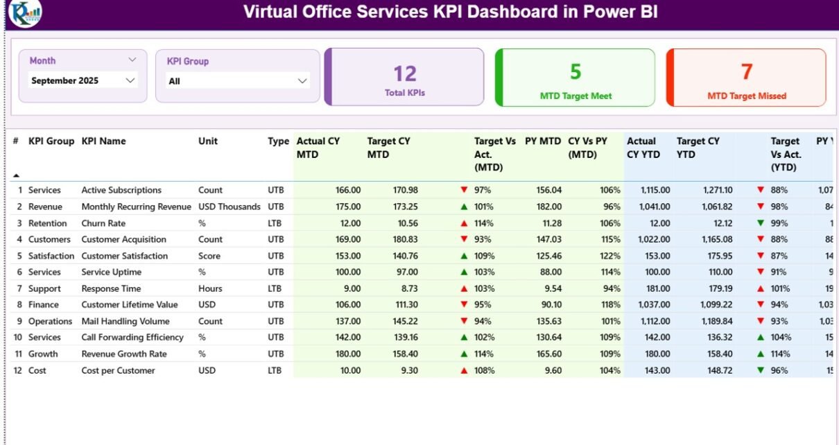
1. Summary Page – The Main Dashboard Overview
The Summary Page acts as the central control panel of the dashboard. Here, managers can quickly review the overall performance of all KPIs.
At the top of the page, users can find interactive slicers.
Month Slicer
Users can select a specific month to analyze performance for that period.
KPI Group Slicer
This filter allows users to analyze KPIs by category or operational group.
Because these slicers instantly refresh the dashboard, users can quickly analyze different time periods and KPI categories.
KPI Performance Cards
Below the slicers, the dashboard displays three important KPI cards:
-
Total KPIs Count – Shows the number of KPIs tracked in the dashboard
-
MTD Target Meet Count – Shows the number of KPIs meeting targets
-
MTD Target Missed Count – Displays the KPIs that fall below targets
These cards provide a quick performance snapshot. As a result, managers instantly understand overall performance.
Detailed KPI Performance Table
Below the KPI cards, the dashboard shows a detailed table containing important KPI metrics.
The table includes the following information.
KPI Number
This field shows the sequence number of the KPI.
KPI Group
This column identifies the category of the KPI.
KPI Name
It displays the name of the performance indicator.
Unit
This column defines the unit of measurement for the KPI.
Type
The KPI type indicates the measurement direction.
Two common types include:
-
LTB (Lower the Better)
-
UTB (Upper the Better)
For example:
-
Response time uses LTB
-
Revenue growth uses UTB
Month-To-Date KPI Metrics
The dashboard tracks several MTD metrics.
Actual CY MTD
This metric shows the actual value for the current year month-to-date.
Target CY MTD
This shows the expected performance target.
MTD Icon Indicator
The dashboard uses visual indicators:
-
▲ Green arrow → Target achieved
-
▼ Red arrow → Target missed
Therefore, users can instantly understand KPI performance.
Target vs Actual (MTD)
This metric calculates performance percentage using:
Actual MTD / Target MTD
Previous Year MTD
This value shows performance for the same period in the previous year.
Current Year vs Previous Year (MTD)
This comparison shows growth or decline using:
Current Year MTD / Previous Year MTD
Consequently, managers can track year-over-year performance trends.
Year-To-Date KPI Metrics
Click to Purchases Virtual Office Services KPI Dashboard in Power BI
The dashboard also tracks YTD performance metrics.
Actual CY YTD
Shows current year cumulative performance.
Target CY YTD
Displays the expected yearly target.
YTD Icon Indicator
Similar to the MTD icon, this visual indicator shows performance status.
Target vs Actual (YTD)
Calculated using:
Actual YTD / Target YTD
Previous Year YTD
Shows last year’s cumulative performance.
Current Year vs Previous Year (YTD)
Calculated using:
Current Year YTD / Previous Year YTD
Therefore, managers can analyze long-term performance trends.
2. KPI Trend Page – Performance Analysis Over Time
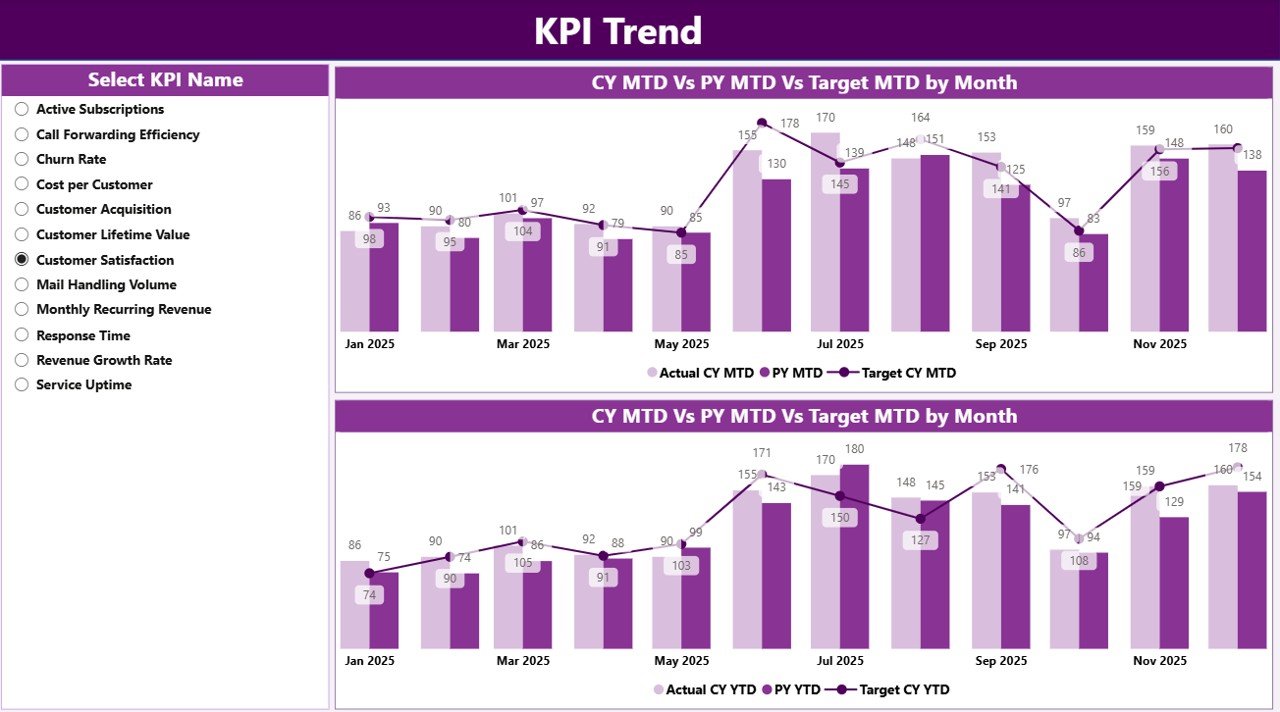
While the summary page shows the current performance, the KPI Trend Page focuses on historical trends.
This page includes two combo charts.
These charts compare:
-
Current Year Actual values
-
Previous Year Actual values
-
Target values
The dashboard shows these comparisons for both:
-
MTD performance
-
YTD performance
Additionally, users can select any KPI using the KPI Name slicer available on the left side.
As a result, managers can quickly analyze the performance history of any specific KPI.
This trend analysis helps businesses identify:
-
Growth patterns
-
Seasonal performance changes
-
Performance gaps
-
Improvement opportunities
3. KPI Definition Page – Understanding KPI Metrics
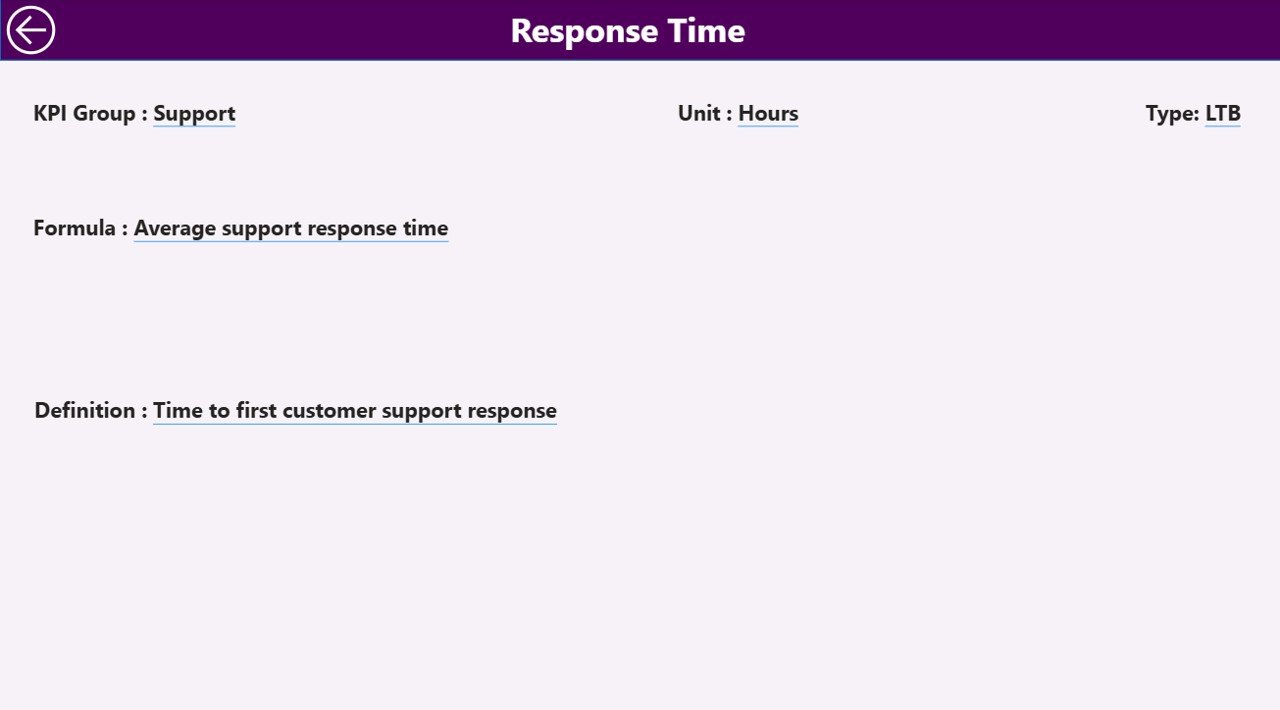
The KPI Definition Page acts as a drill-through page.
This page remains hidden by default, but users can access it by drilling through from the Summary Page.
This page contains important KPI details such as:
-
KPI Formula
-
KPI Definition
-
KPI Group
-
KPI Type
-
Unit of measurement
Therefore, users can clearly understand how each KPI works.
A Back Button is available at the top left corner so users can quickly return to the main dashboard.
Excel Data Source Used in the Dashboard
Click to Purchases Virtual Office Services KPI Dashboard in Power BI
The Virtual Office Services KPI Dashboard in Power BI uses an Excel file as the primary data source.
This Excel file contains three worksheets.
1. Input_Actual Sheet
In this sheet, users enter actual KPI values.
The required columns include:
-
KPI Name
-
Month (use the first day of the month)
-
MTD values
-
YTD values
Once users update the Excel data, Power BI automatically refreshes the dashboard.
2. Input_Target Sheet
This sheet stores KPI target values.
The columns include:
-
KPI Name
-
Month
-
Target MTD
-
Target YTD
These targets allow the dashboard to calculate performance comparisons.
3. KPI Definition Sheet
This sheet contains KPI metadata.
Users must enter the following details:
-
KPI Number
-
KPI Group
-
KPI Name
-
Unit
-
Formula
-
Definition
-
KPI Type (LTB or UTB)
Because this sheet defines the KPI logic, it ensures that all metrics remain consistent.
Advantages of Virtual Office Services KPI Dashboard in Power BI
A well-designed dashboard provides numerous benefits.
Real-Time Performance Monitoring
First, managers can instantly monitor operational performance.
Instead of reviewing multiple reports, they see all metrics in one interactive dashboard.
Faster Decision Making
Because the dashboard displays real-time data, decision makers can quickly identify problems and implement solutions.
Improved Operational Efficiency
When businesses track service metrics regularly, they can optimize processes and reduce inefficiencies.
Better Customer Experience
By monitoring response times, service usage, and satisfaction metrics, companies can improve customer service quality.
Data-Driven Strategy
Additionally, companies can analyze historical data and plan long-term strategies.
Therefore, the dashboard supports strategic business growth.
Best Practices for the Virtual Office Services KPI Dashboard
Organizations must follow best practices to get the best results from their dashboards.
Choose the Right KPIs
First, companies must identify the most relevant KPIs for their services.
Examples include:
-
Customer acquisition rate
-
Active client count
-
Meeting room utilization
-
Mail processing time
-
Customer satisfaction score
Maintain Data Accuracy
Data accuracy directly affects dashboard insights.
Therefore, teams must regularly verify the data entered into the Excel source file.
Update Data Frequently
Frequent data updates help managers monitor current performance.
For example:
-
Daily updates for service operations
-
Monthly updates for revenue metrics
Use Clear KPI Definitions
Each KPI must have a clear formula and definition.
This ensures that everyone understands how performance is measured.
Monitor Performance Trends
Businesses should regularly analyze trend charts to identify growth patterns and performance gaps.
Opportunities for Improvement in KPI Dashboards
Click to Purchases Virtual Office Services KPI Dashboard in Power BI
Although dashboards provide strong insights, businesses should continuously improve them.
Here are some improvement opportunities.
Add More Advanced Visuals
Organizations can include:
-
Heatmaps
-
Geographic analysis
-
Service utilization charts
Integrate Multiple Data Sources
Instead of relying only on Excel, companies can integrate:
-
CRM systems
-
Billing systems
-
Customer support platforms
Add Predictive Analytics
Advanced dashboards can include forecasting models to predict future trends.
Implement Automated Data Refresh
Automation ensures the dashboard always displays the latest information.
Conclusion
The Virtual Office Services KPI Dashboard in Power BI offers a powerful solution for tracking and analyzing business performance.
Because virtual office service providers manage multiple operational processes, they must rely on data-driven tools to monitor efficiency and growth.
This dashboard converts raw Excel data into meaningful insights using interactive charts, KPI cards, and performance indicators.
As a result, managers can easily track targets, analyze trends, compare historical data, and improve operational performance.
Moreover, organizations that adopt KPI dashboards gain a strong competitive advantage because they make faster and smarter decisions.
Therefore, implementing a Power BI KPI dashboard can significantly enhance business visibility, operational control, and strategic planning for virtual office service providers.
Frequently Asked Questions (FAQs)
What is a KPI dashboard in Power BI?
A KPI dashboard in Power BI is an interactive reporting tool that visualizes key performance indicators using charts, tables, and data models.
Why should virtual office service providers use KPI dashboards?
Virtual office providers use KPI dashboards to monitor operational performance, track service usage, analyze customer metrics, and improve decision making.
What data sources can Power BI use for KPI dashboards?
Power BI can use multiple data sources such as:
-
Excel files
-
SQL databases
-
CRM systems
-
Cloud services
-
APIs
How often should KPI dashboards be updated?
Most businesses update KPI dashboards monthly or weekly. However, some organizations update data daily for operational metrics.
Visit our YouTube channel to learn step-by-step video tutorials