Nonprofit Fundraising Dashboard in Power BI
The Nonprofit Fundraising Dashboard in Power BI is a professionally designed analytics template built specifically for nonprofit organizations, NGOs, charitable foundations, and community development agencies that need a centralized view of their fundraising operations. This Power BI dashboard template includes 5 interactive pages that track donations, monitor campaign performance, analyze donor behavior, evaluate program-level funding, and compare regional fundraising effectiveness. Whether you manage a small charity or a large-scale nonprofit, this dashboard gives your team the data-driven insights needed to make smarter fundraising decisions.Nonprofit Fundraising Dashboard in Power BI
With built-in KPI cards, dynamic charts, and interactive slicers, the Nonprofit Fundraising Dashboard in Power BI transforms raw donation data into actionable intelligence. It tracks key metrics including Total Donations, Total Fulfilled, Total Pledged, Total Records, Fulfillment Percentage, Average Donation Per Record, Average Donor Rating, and Acquisition Cost — all across 5 purpose-built dashboard pages.Nonprofit Fundraising Dashboard in Power BI
👉 Click here to Purchase the Nonprofit Fundraising Dashboard in Power BI
Key Features of the Nonprofit Fundraising Dashboard in Power BI
- 5 Interactive Dashboard Pages — Overview, Campaign Analysis, Donor Insights, Program Analysis, and Regional PerformanceNonprofit Fundraising Dashboard in Power BI
- KPI Cards — Instantly view Total Donations, Total Fulfilled, Total Pledged, and Total Records
- Campaign Tracking — Compare donations by campaign, analyze donation channels, and track monthly trends
- Donor Intelligence — Break down donor types, acquisition costs, payment methods, and recurring patterns
- Program-Level Analysis — Evaluate funding and fulfillment rates across different program areas
- Regional Comparison — Compare pledged vs fulfilled amounts and donor ratings across geographic regions
- Dynamic Slicers — Filter by campaign, region, donor type, date range, and more for instant insights
- Ready-to-Use .pbix File — Open in free Power BI Desktop and connect your data
Dashboard Pages Explained
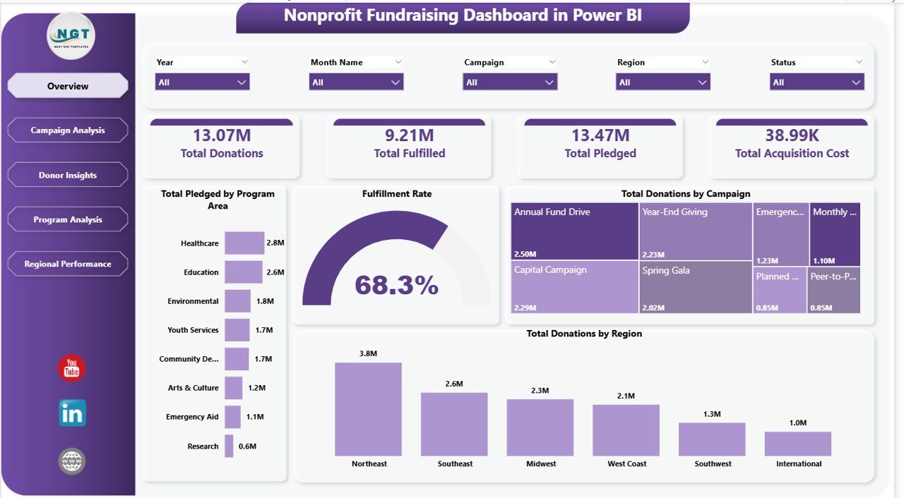
1. Overview Page
The Overview page serves as the fundraising command center for your nonprofit. At the top, high-level KPI cards display Total Donations, Total Fulfilled, Total Pledged, and Total Records, giving leadership an instant pulse on fundraising health. Below the cards, interactive charts visualize Fulfillment Percentage to show how much of pledged amounts have been collected, Total Donations by Region to identify geographic fundraising strengths, and Total Donations by Campaign to compare which initiatives drive the most revenue. Multiple slicers allow users to filter the entire dashboard by campaign, region, date, donor type, and other dimensions for quick scenario analysis.Nonprofit Fundraising Dashboard in Power BI
Nonprofit Fundraising Dashboard in Power BI – Overview Page
2. Campaign Analysis
The Campaign Analysis page provides a detailed breakdown of fundraising campaign performance. It features Total Records vs Completed Donations by Campaign, which highlights the conversion rate from donor records to actual completed donations for each campaign. The Average Donation Per Record by Campaign chart reveals which campaigns attract the highest-value donors. Total Donations by Donation Channel shows whether online, offline, events, or direct mail channels are most effective. Total Records by Month tracks seasonal fundraising trends so your team can time campaigns for maximum impact.Nonprofit Fundraising Dashboard in Power BI

Campaign Analysis
3. Donor Insights
The Donor Insights page helps your organization understand who your donors are and how to retain them. Total Donations vs Total Acquisition Cost by Donor Type compares revenue generated against the cost of acquiring each donor segment, providing a clear ROI picture. Total Records vs Recurring Donors by Donor Type shows which segments are most likely to become repeat contributors. Total Donations by Payment Method reveals donor preferences for credit card, bank transfer, check, or digital wallets. Total Records by Region maps your donor base geographically to guide targeted outreach.Nonprofit Fundraising Dashboard in Power BI
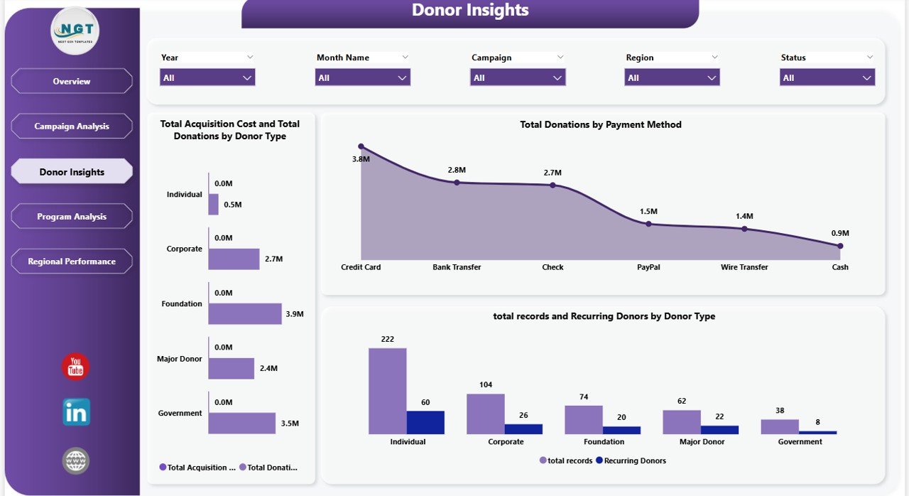
Donor Insights
4. Program Analysis
The Program Analysis page connects fundraising results to your organization’s programs and initiatives. Total Donations vs Total Fulfilled by Program Area shows which programs attract the most funding and which have the highest fulfillment rates. Total Records by Program Area reveals donor interest across different mission areas. Total Donations by Status breaks down donations into completed, pending, and cancelled categories. Total Donations vs Total Records by Recurring helps identify which programs generate the most sustainable recurring revenue streams.

Program Analysis
5. Regional Performance
The Regional Performance page provides geographic fundraising intelligence. Total Fulfilled vs Total Pledged by Region compares actual collections against commitments across different areas, highlighting regions with strong follow-through and those that need attention. Average Donor Rating by Region reveals geographic differences in donor satisfaction and engagement quality. Total Donations by Year shows multi-year fundraising trends to help your organization set realistic annual goals and identify long-term growth patterns.

Regional Performance
Advantages of the Nonprofit Fundraising Dashboard in Power BI
- Centralized Fundraising Intelligence — Consolidate donation data from multiple campaigns, channels, and regions into a single interactive dashboard
- Board-Ready Reporting — Present clean, professional visuals directly to your board of directors, grant committees, and stakeholders
- Donor Retention Insights — Understand recurring donation patterns and acquisition costs to optimize donor engagement strategies
- Campaign ROI Tracking — Compare campaign performance side-by-side to allocate resources to the most effective fundraising initiatives
- Zero Coding Required — Simply replace sample data with your own and all visuals update automatically
If you are looking for more Power BI Dashboard Templates, NextGenTemplates offers a wide collection across industries and departments. You may also want to explore the Fundraising Campaign KPI Dashboard in Power BI for a KPI-focused approach, or the Nonprofit Organizations KPI Dashboard in Power BI for a broader nonprofit metrics view.
Opportunities for Improvement
- Connect to live data sources like Salesforce Nonprofit Cloud, Bloomerang, or DonorPerfect for real-time donation tracking
- Add a dedicated Donor Retention page with churn rate analysis and lapsed donor identification
- Include event-specific fundraising tracking for galas, auctions, and peer-to-peer campaigns
- Add grant tracking with application status, deadlines, and award amounts
- Integrate email campaign metrics to correlate donation spikes with outreach efforts
Best Practices for Using This Dashboard
- Update data weekly during active campaigns to monitor progress in real time
- Use slicers strategically — filter by specific campaigns during board meetings to present focused results
- Compare year-over-year trends on the Regional Performance page to set realistic annual fundraising goals
- Monitor acquisition cost ratios on the Donor Insights page to ensure sustainable donor recruitment
- Share via Power BI Service so team members can access the dashboard from any browser without installing software
For alternative formats, check out the Nonprofit Fundraising Dashboard in Excel or the Nonprofit Fundraising Dashboard in HTML. The Civic Engagement Platforms Dashboard in Power BI is another great option for organizations focused on community impact metrics.
Explore Relevant Templates
- Nonprofit Fundraising Dashboard in HTML — Browser-based version requiring no software installation
- Nonprofit Fundraising Dashboard in Excel — Excel-powered alternative for teams without Power BI
- Fundraising Campaign KPI Dashboard in Power BI — KPI scorecard focused on campaign metrics
- Nonprofit Organizations KPI Dashboard in Power BI — Broader nonprofit KPI tracking
- Civic Engagement Platforms Dashboard in Power BI — Community and civic engagement analytics
Frequently Asked Questions
What is the best Power BI dashboard for nonprofit fundraising analytics?
The Nonprofit Fundraising Dashboard in Power BI is purpose-built for nonprofit fundraising with 5 interactive pages covering donations overview, campaign effectiveness, donor intelligence, program-level funding, and regional performance. It tracks over 8 key metrics and includes dynamic slicers for instant filtering.
How do I track donor acquisition cost in Power BI?
The Donor Insights page in this dashboard includes a Total Donations vs Total Acquisition Cost by Donor Type chart that compares the revenue generated from each donor segment against the cost of acquiring them, giving you a clear donor ROI picture.
Can I connect this dashboard to my nonprofit CRM?
Yes. Power BI supports connections to popular nonprofit CRMs like Salesforce Nonprofit Cloud, Bloomerang, DonorPerfect, and Raiser’s Edge. You can replace the sample data source with a direct connection to your CRM for live reporting.
How many KPIs does this nonprofit dashboard track?
The dashboard tracks Total Donations, Total Fulfilled, Total Pledged, Total Records, Fulfillment Percentage, Average Donation Per Record, Average Donor Rating, and Acquisition Cost across 5 dedicated pages with over 15 interactive visualizations.
Is Power BI Desktop free to use with this template?
Yes. Power BI Desktop is a free application from Microsoft that you can download and install on Windows. You only need a paid Power BI Pro license if you want to share reports through the Power BI Service cloud platform.
Can this dashboard be used for grant reporting?
The Program Analysis page tracks Total Donations vs Total Fulfilled by Program Area, which can serve as a foundation for grant reporting by showing how funds were allocated and utilized across different programs. You can customize it further to add grant-specific metrics.
Conclusion
The Nonprofit Fundraising Dashboard in Power BI empowers nonprofit organizations with a complete visual analytics solution for tracking donations, evaluating campaigns, understanding donors, monitoring programs, and comparing regional performance. With 5 interactive pages, dynamic slicers, and professional-grade visualizations, this template is ready for board presentations, stakeholder reports, and day-to-day fundraising management. Download the template today and transform your fundraising data into actionable insights.
👉 Click here to Purchase the Nonprofit Fundraising Dashboard in Power BI
🎥 Visit our YouTube channel for step-by-step video tutorials: Youtube.com/@PK-AnExcelExpert