Startup Burn Rate Dashboard in Power BI is a comprehensive, ready-to-use Power BI dashboard template designed to give startup founders, CFOs, finance teams, and investors complete visibility into cash burn, revenue trends, department-level spending, and growth metrics — all from a single interactive report. Whether you are tracking your monthly burn rate to extend runway, analyzing expense categories to cut costs, or presenting financial health to your board of directors, this dashboard delivers the insights you need across 5 professionally designed pages with built-in slicers for instant filtering.
For startups navigating the complex landscape of fundraising, budget management, and growth optimization, having a centralized Power BI dashboard is no longer optional — it’s essential. This template transforms raw financial data into actionable charts, KPI cards, and filterable analytics that auto-update when you replace the sample data with your own.
Click here to Purchase Startup Burn Rate Dashboard in Power BI
Key Features of Startup Burn Rate Dashboard in Power BI
The Startup Burn Rate Dashboard in Power BI includes 5 interactive dashboard pages — Overview, Expense Breakdown, Department View, Runway Trend, and Growth Metrics. The Overview page displays 5 KPI cards showing Total Revenue, Total Burn, Avg Cash Balance, Total Churn, and Over Budget Rate at a glance. Built-in slicers enable instant filtering across all pages by Region, Department, Expense Category, Funding Stage, and Month, empowering founders to drill down into the exact data they need.
The template features 12+ dynamic charts covering budget analysis, burn tracking, department comparisons, MRR trends, and customer growth metrics. Every visual is connected to slicers, so changing a single filter updates the entire report in real time. The professional layout is designed to be investor-ready — perfect for board meetings, pitch decks, and quarterly financial reviews.
If you’re looking for this dashboard in other platforms, check out the Startup Burn Rate Dashboard in Excel or the Startup Burn Rate Dashboard in HTML on NextGenTemplates.
Dashboard Pages Explanation
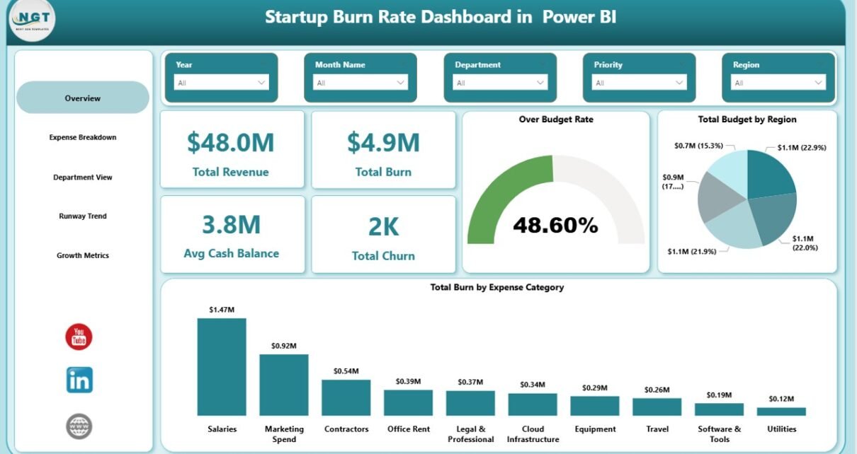
1. Overview Page
The Overview page serves as the executive summary of your startup’s financial health. On the top section, 5 KPI cards display Total Revenue, Total Burn, Avg Cash Balance, Total Churn, and Over Budget Rate — providing instant visibility into the most critical startup metrics. Below the cards, two analytical charts — Total Budget by Region and Total Burn by Expense Category — break down spending patterns across geography and expense types. Multiple slicers allow you to filter the entire dashboard with a single click.
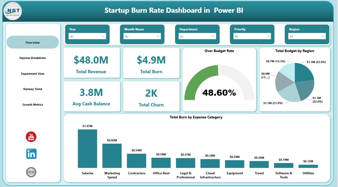
Overview Page
2. Expense Breakdown
The Expense Breakdown page provides granular analysis of where your startup’s money is going. This page features Total Burn by Priority to identify which spending categories are most urgent, Budget Variance by Expense Category to highlight where actuals deviate from budgets, and Total Budget and Total Burn by Expense Category for a side-by-side comparison of planned vs actual spending. This page is essential for CFOs and finance teams who need to identify cost-saving opportunities and optimize resource allocation.
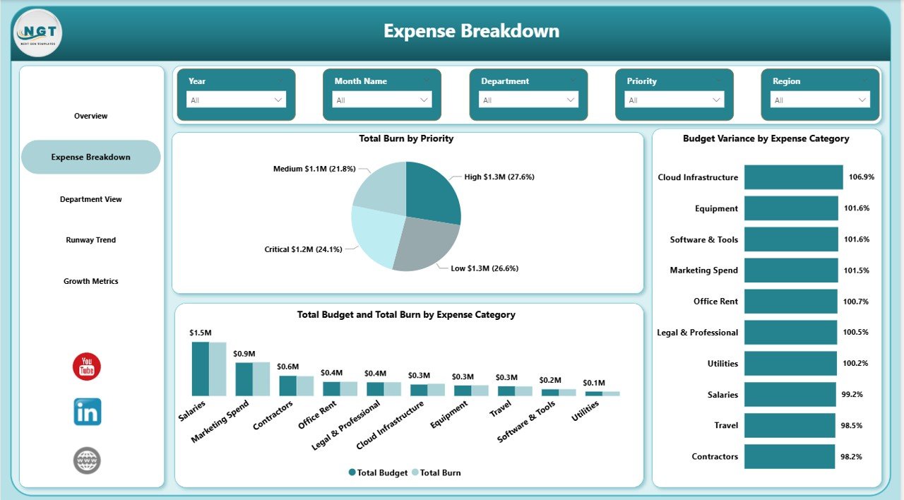
Expense Breakdown
3. Department View
The Department View page enables managers to compare performance across teams. It displays Total Burn by Department to show which teams are consuming the most resources, Over Budget Rate by Department to flag teams exceeding their budgets, and Total Revenue by Department to identify which departments are generating the most income. This cross-departmental comparison helps leadership make informed decisions about headcount, budget reallocation, and team efficiency.
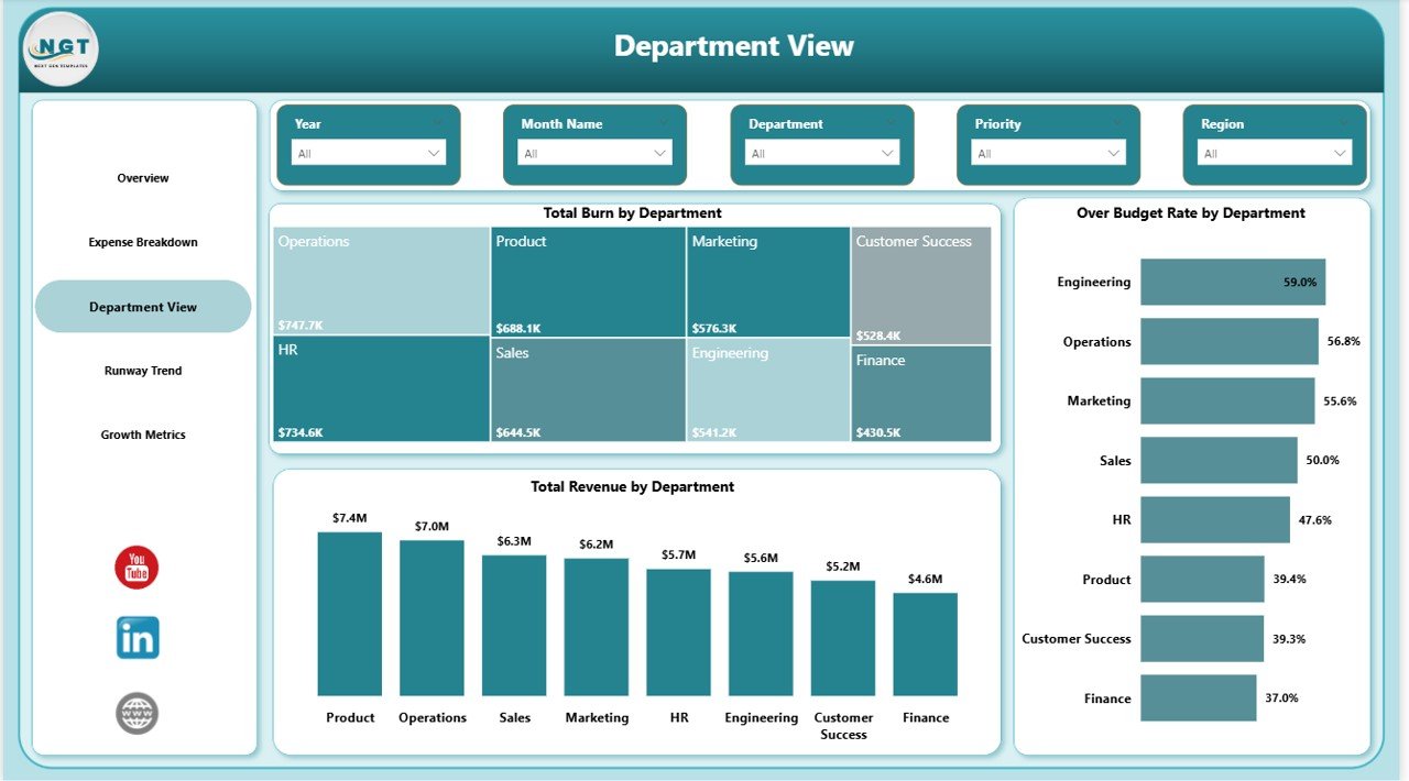
Department View
4. Runway Trend
The Runway Trend page focuses on the time-series analysis that every startup needs to forecast survival. It tracks Total MRR by Month Name to show recurring revenue trajectory, Total Churn by Month Name to quantify customer losses over time, and Avg Cash Balance by Month Name to monitor liquidity. Together, these charts help founders answer the critical question: “How many months of runway do we have left?”
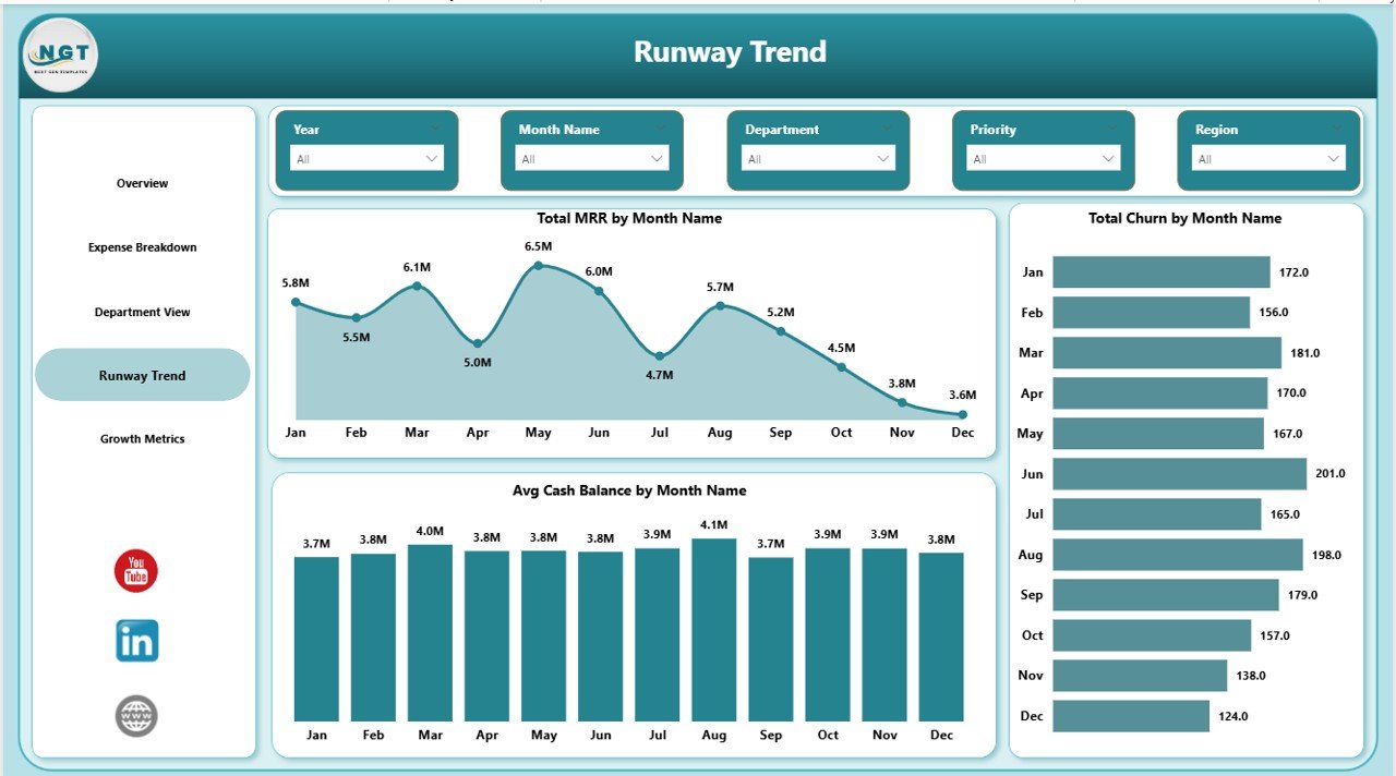
Runway Trend
5. Growth Metrics
The Growth Metrics page focuses on acquisition and scaling performance. It analyzes Total New Customers by Month Name to measure customer acquisition momentum, Total MRR by Funding Stage to understand how revenue correlates with investment rounds, and Total Budget by Status to track spending commitments across approved, pending, and completed budgets. This page is particularly useful for investors and board members evaluating growth trajectory.
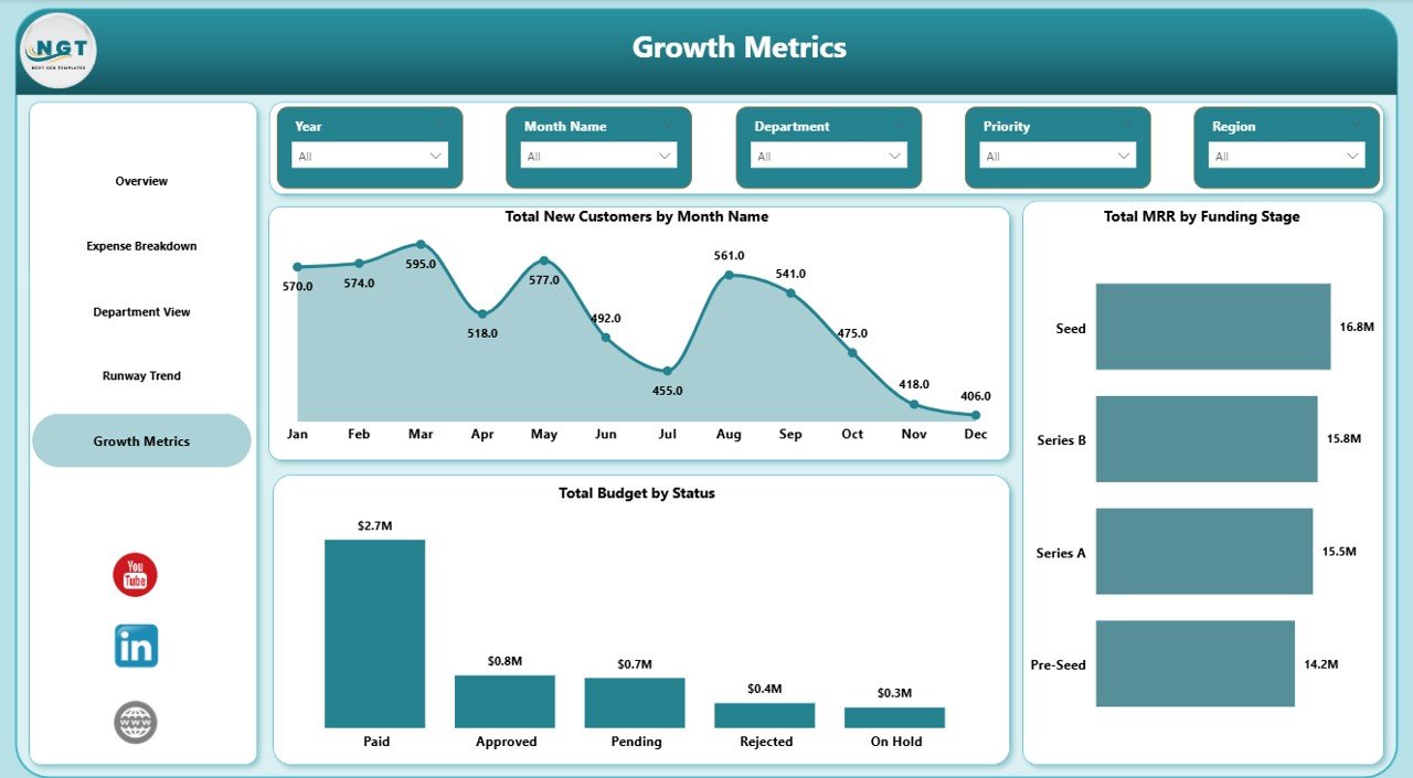
Growth Metrics
Advantages of Startup Burn Rate Dashboard in Power BI
- Centralized Financial Visibility — Consolidate revenue, expenses, cash balance, churn, and growth data into a single interactive report instead of juggling multiple spreadsheets
- Investor-Ready Presentations — Professional design and layout that can be directly shared with board members, VCs, and angel investors during quarterly reviews
- Real-Time Slicer Filtering — Instantly drill down by Region, Department, Expense Category, Funding Stage, or Month across all 5 dashboard pages
- Department Accountability — Compare burn rates, revenue contribution, and over-budget rates across departments to identify inefficiencies and optimize team budgets
- Runway Forecasting — Monthly MRR trends, cash balance tracking, and churn analysis help founders estimate how long the startup can sustain current spending
- Zero Learning Curve — Replace the sample data with your own and every chart, KPI, and slicer updates automatically — no DAX or modeling skills required
Opportunities for Improvement
- Custom DAX Measures — Power users can add calculated columns or DAX measures like Net Burn Rate (Burn minus Revenue), Gross Margin, or CAC Payback Period for deeper analysis
- Data Source Integration — Connect the dashboard directly to live data sources such as QuickBooks, Stripe, or a SQL database to eliminate manual data entry
- Additional Pages — Add pages for Cohort Analysis, Unit Economics, or Investor Reporting to extend the dashboard beyond the 5 included pages
- Conditional Formatting — Apply color-coded alerts (red/yellow/green) to KPI cards that trigger when burn rate exceeds thresholds or cash balance drops below target
- Row-Level Security — Implement Power BI RLS to restrict which department data each team lead can view, adding a governance layer for larger startups
Best Practices
- Update Data Monthly — Refresh your data at the start of each month to keep all 5 dashboard pages current for board meetings and internal reviews
- Set Budget Targets — Define clear monthly and quarterly budget targets so the Budget Variance chart on the Expense Breakdown page delivers actionable insights
- Use Slicers Strategically — Filter by Funding Stage to compare pre-seed vs Series A spending patterns, or by Department to isolate engineering vs marketing burn
- Share via Power BI Service — Publish the report to Power BI Service to share interactive dashboards with stakeholders who don’t have Power BI Desktop installed
- Track Trends Over Time — Use the Runway Trend page regularly to identify whether your MRR growth is outpacing churn and whether cash balance is stabilizing
Explore Relevant Templates
- Startup Burn Rate Dashboard in Excel — The same burn rate analytics in a familiar Excel format with pivot tables and charts
- SaaS Financial Model Dashboard in Google Sheets — Track MRR, ARR, CAC, LTV, and subscription metrics for SaaS businesses
- Logistics Tech Startups Dashboard in Power BI — Monitor logistics startup KPIs and operational metrics in Power BI
- Small Business CFO Dashboard in Excel — Complete CFO-level financial analytics for small businesses
- Startup Burn Rate Dashboard in Excel (Blog Post) — Detailed walkthrough of the Excel version
Frequently Asked Questions
What is a startup burn rate dashboard and why do I need one?
A startup burn rate dashboard is a visual analytics tool that tracks how quickly your startup is spending its available cash. The Startup Burn Rate Dashboard in Power BI provides this visibility across 5 interactive pages, helping founders monitor Total Revenue, Total Burn, Cash Balance, Churn, and Over Budget Rate to make data-driven financial decisions and extend runway.
What KPIs does the Startup Burn Rate Dashboard in Power BI track?
This dashboard tracks 5 key performance indicators: Total Revenue, Total Burn, Avg Cash Balance, Total Churn, and Over Budget Rate. These KPIs are displayed as interactive cards on the Overview page and drive the analysis across all 5 dashboard pages including Expense Breakdown, Department View, Runway Trend, and Growth Metrics.
Do I need advanced Power BI skills to use this template?
No advanced skills are required. Simply download the .pbix file, open it in Power BI Desktop (free from Microsoft), replace the sample data with your own startup financial data, and all charts, KPIs, and slicers update automatically. No DAX formulas or data modeling knowledge is needed.
Can I connect this dashboard to live data sources?
Yes. Since this is a standard Power BI .pbix file, you can connect it to live data sources like SQL databases, Excel files, Google Sheets via connectors, or cloud platforms like QuickBooks and Stripe using Power BI’s built-in data connectors.
How is this different from the Excel and HTML versions?
The Power BI version offers interactive slicers, cross-page filtering, and the ability to publish to Power BI Service for cloud-based sharing. The Excel version uses pivot tables and charts, while the HTML version runs in any web browser.
Who should use this startup burn rate dashboard?
This dashboard is designed for startup founders, CFOs, finance teams, investors, VCs, and board members who need centralized visibility into cash burn, expense breakdowns, department spending, runway forecasts, and growth metrics. It is suitable for seed-stage through Series B startups of any industry.
Conclusion
The Startup Burn Rate Dashboard in Power BI is the complete financial analytics solution for startups that need to track cash burn, optimize expenses, and present data-driven insights to investors. With 5 interactive pages, 5 KPI cards, 12+ dynamic charts, and powerful slicers, this template transforms complex financial data into clear, actionable visuals that auto-update with your own data. Download it today and take control of your startup’s financial health.
Click here to Purchase Startup Burn Rate Dashboard in Power BI
Visit our YouTube channel for step-by-step video tutorials on Power BI dashboards and more:
👉 Youtube.com/@PK-AnExcelExpert