Identity verification teams are expected to move fast while keeping fraud, compliance risk, and onboarding friction under control. A single provider export may show requests and results, but leadership usually needs a wider view: fees, cost, gross profit, verification success, failed checks, fraud flags, latency, provider quality, and manual review workload. The Digital Identity Platforms Dashboard in Excel turns those records into a structured reporting workbook with 5 dashboard pages, 5 headline KPI cards, multiple slicers, a Data sheet, and a Support sheet powered by pivot tables.
This template is built for teams that already collect identity verification data and want a practical Excel dashboard instead of another recurring reporting tool. Replace the sample rows, click Refresh All from Excel’s Data tab, and the workbook updates the charts and cards automatically.
Click here to get the Digital Identity Platforms Dashboard in Excel
Key Features of Digital Identity Platforms Dashboard in Excel
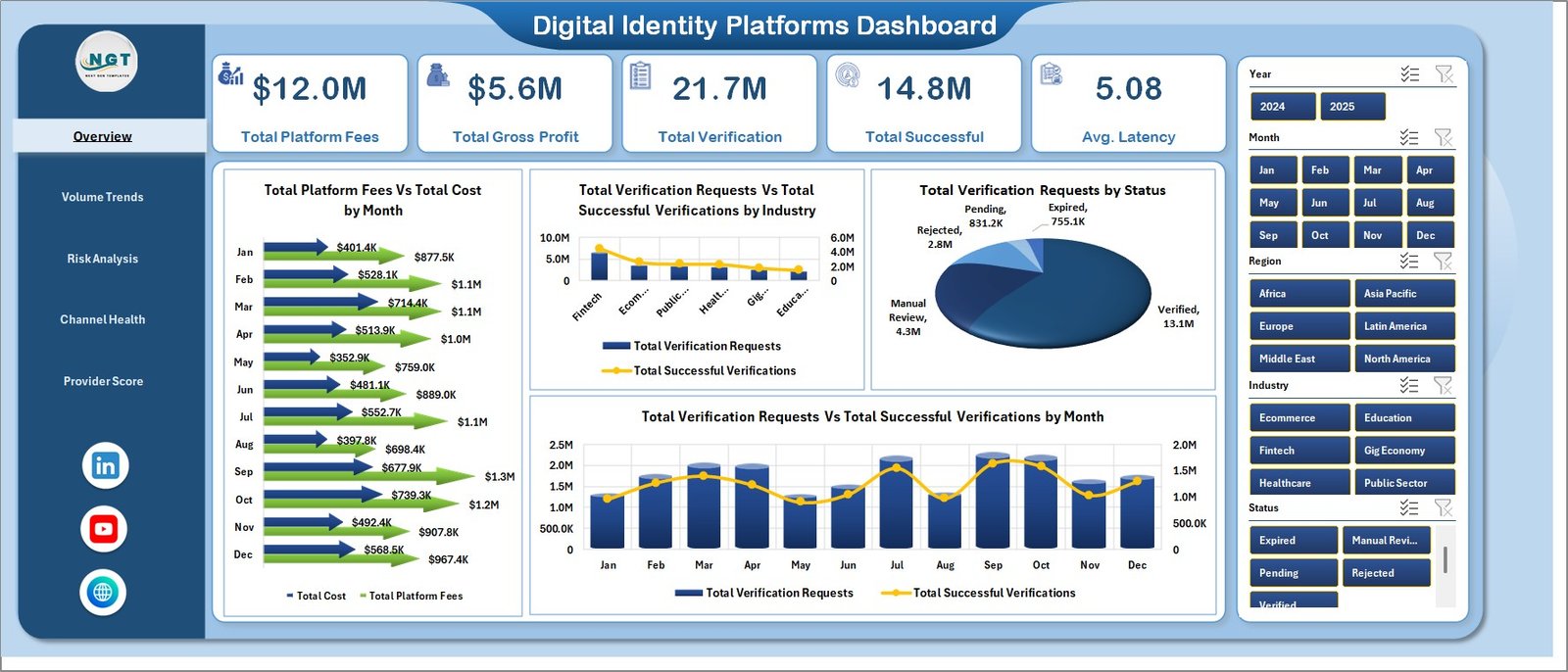
Five dashboard pages: Overview, Volume Trends, Risk Analysis, Channel Health, and Provider Score give leaders and analysts different ways to inspect identity verification performance.
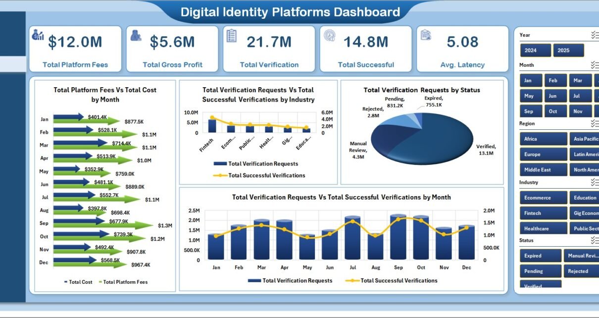
Executive KPI cards: The Overview page includes Total Platform Fees, Total Gross Profit, Total Verification, Total Successful, and Avg. Latency for a quick performance snapshot.
Verification, risk, and provider analytics: The workbook covers monthly fees, costs, industry demand, status mix, region success, fraud flags by risk tier, failed verifications, manual reviews, provider profitability, and quarterly success percentage.
Slicer-driven analysis: Multiple slicers let users filter the dashboard quickly without rewriting formulas or rebuilding charts.
Editable Excel structure: The Data sheet stores the records, and the Support sheet contains pivot tables that drive the dashboard pages. For general Excel guidance, Microsoft maintains a useful Excel help center.
Dashboard Pages Explanation
1. Overview Page
The Overview Page summarizes the full identity verification operation. At the top, KPI cards show Total Platform Fees, Total Gross Profit, Total Verification, Total Successful, and Avg. Latency so users can understand volume, profit, and speed before drilling into charts.
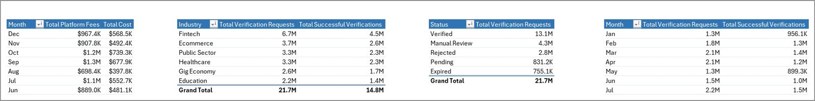
Total Platform Fees by Month: This chart shows how provider fees change over time. It helps teams spot demand spikes, billing shifts, or months where verification traffic became more expensive.
Total Cost by Month: This chart tracks the monthly cost side of identity verification. Comparing it with platform fees helps teams understand whether gross profit is improving or shrinking.
Total Verification Requests by Industry: This chart shows which industries generate the most verification demand. It is useful for segment planning and account review meetings.
Total Successful Verifications by Industry: This chart shows successful checks by industry. Teams can use it to identify segments where document quality, provider coverage, or onboarding flow may need improvement.
Total Verification Requests by Status: This chart splits requests by status. It helps reviewers see whether failed, pending, successful, or manual-review cases are dominating the workflow.
Total Verification Requests by Month: This chart shows monthly request volume. It is helpful for capacity planning and monthly operations reviews.
Total Successful Verifications by Month: This chart shows successful verification movement over time. Comparing it with request volume gives a simple view of process quality.
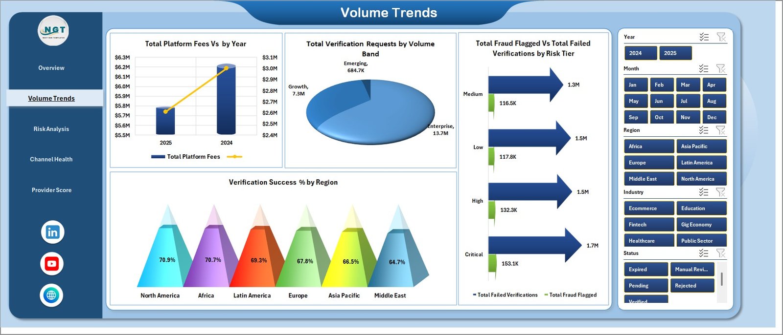
2. Volume Trends
The Volume Trends sheet is designed for scale and growth analysis. Total Platform Fees by Year gives a long-term view of identity platform spend, while Total Verification Requests by Volume Band shows whether demand is coming from low, medium, or high-volume customer groups.
Total Fraud Flagged by Risk Tier and Total Failed Verifications by Risk Tier connect traffic volume with risk. Verification Success % by Region shows where the verification process performs well and where regional issues may need investigation.
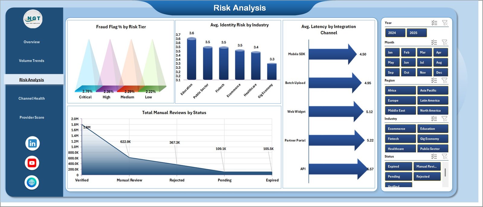
3. Risk Analysis
The Risk Analysis tab focuses on suspicious activity, identity risk, latency, and manual reviews. Fraud Flag % by Risk Tier shows whether higher-risk tiers are producing a larger fraud share, while Avg. Identity Risk by Industry compares risk exposure across industries.
Avg. Latency by Integration Channel shows which channel is fastest or slowest. Total Manual Reviews by Status helps supervisors understand where human review time is being spent.
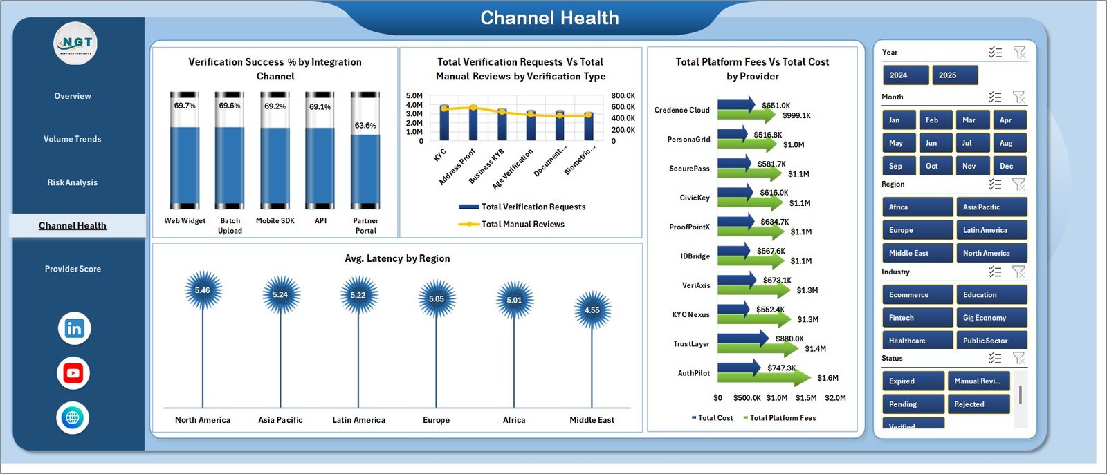
4. Channel Health
The Channel Health page compares integration channels, verification types, regions, and providers. Verification Success % by Integration Channel shows where checks are completing successfully, and Total Verification Requests by Verification Type explains which checks are most common.
Total Manual Reviews by Verification Type highlights which verification types require more human attention. Avg. Latency by Region shows regional speed differences, while Total Platform Fees by Provider and Total Cost by Provider support vendor cost review.
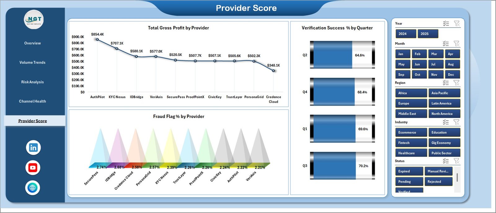
5. Provider Score
The Provider Score sheet is built for vendor comparison. Total Gross Profit by Provider shows which providers create the strongest financial return after costs, and Fraud Flag % by Provider shows where risk quality differs.
Verification Success % by Quarter adds a time-based quality view. It helps teams see whether success rates are stable, improving, or slipping across quarterly reviews.
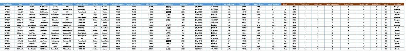
6. Data Sheet Tab
The Data sheet is the input layer. Add your records in the same format as the sample data, keeping field names and column structure consistent so the pivot tables can refresh cleanly.
7. Support Sheet Tab
The Support sheet contains the pivot tables used by the dashboard. After updating the Data tab, go to the Data tab in the Excel Ribbon and click Refresh All. The pivots and charts refresh together, and the sheet can remain hidden during normal use.
Digital Identity Platforms Dashboard in Excel vs. Google Sheets vs. Paid CRM/SaaS – Feature Comparison
| Feature | Excel dashboard | Google Sheets alternative | Paid identity/SaaS reporting |
|---|---|---|---|
| Cost | $17.99 one-time | Low one-time or internal build cost | Monthly or annual subscription |
| Platform | Microsoft Excel desktop | Browser-based spreadsheet | Vendor-hosted platform |
| Setup time | Under 10 minutes after data replacement | Depends on sharing and formulas | Often requires onboarding |
| Provider profitability | Built in | Possible with custom setup | Depends on plan and export options |
| Real-time team collaboration | Limited unless stored on OneDrive or SharePoint | Strong | Strong |
| Mobile access | Limited for heavy dashboard work | Good for viewing | Usually good |
| Customizable fields | Fully editable workbook | Editable with permissions | Often limited by vendor schema |
| Year-1 cost at 5 users | $17.99 plus Excel already used | Low if self-managed | Can reach hundreds or thousands |
Who Should Use This Template
This template is useful for digital identity providers, fintech onboarding teams, compliance analysts, trust and safety teams, marketplace operations managers, SaaS product managers, and finance teams that need a clear view of verification costs and outcomes.
It is also useful for consultants who prepare identity verification performance reports for clients and need a repeatable Excel framework.
Real-World Use Cases
Aisha, fintech operations lead: She refreshes weekly verification exports and reviews successful checks, failed checks, fraud flags, manual review workload, and average latency before the onboarding meeting.
Daniel, vendor manager: He uses Provider Score to compare gross profit, cost, success percentage, and fraud flag percentage before negotiating provider contracts.
Meera, compliance analyst: She filters the Risk Analysis page by industry and risk tier to prepare monthly governance summaries.
Advantages of Digital Identity Platforms Dashboard in Excel
It keeps verification analytics in a familiar tool. Teams that already use Excel can review the dashboard without learning a new BI platform.
It connects risk and finance in one view. Many identity reports show only volume or status. This workbook adds platform fees, cost, gross profit, fraud flags, and latency to the same reporting model.
It is easy to refresh. Update the Data sheet and use Refresh All. The Support sheet feeds the charts and KPI cards.
It supports vendor review. Provider-level gross profit, cost, fraud flag percentage, and success percentage make vendor conversations more data-driven.
Opportunities for Improvement
This is an Excel reporting template, not a live identity verification platform. It does not verify documents, perform biometric checks, screen sanctions lists, or call a KYC API. It also does not include a live connector to identity vendors. Teams that need automated workflow routing, real-time decisioning, or case management should use this dashboard alongside their operational platform.
Best Practices
Keep provider names, region names, status values, industry names, risk tiers, and channel names consistent in the Data sheet. Small spelling differences can split pivot results into separate items.
Refresh the workbook after every major data update. Review the Support sheet if a chart does not look right, then hide it again for day-to-day use.
Use slicers during review meetings instead of creating many duplicate reports. This keeps the workbook easier to maintain and reduces manual reporting work.
Explore Relevant Templates
- Digital Identity Platforms Dashboard in Excel – the template discussed in this article.
- E-Learning Apps Dashboard in Excel – platform usage and revenue reporting for EdTech.
- Healthcare IT Cybersecurity Calendar in Excel – IT security planning and compliance scheduling.
- Browse Excel dashboard templates.
Frequently Asked Questions
What does the Digital Identity Platforms Dashboard in Excel track?
It tracks platform fees, total cost, gross profit, verification requests, successful verifications, failed verifications, fraud flags, manual reviews, risk tiers, industries, regions, providers, statuses, channels, and latency.
Can I replace the sample data?
Yes. Replace the sample records in the Data sheet with your own identity verification data, then click Refresh All in Excel.
Does the workbook connect directly to KYC or identity APIs?
No. It is designed for exported or manually maintained data. You can still use it with API exports if you place the final records into the Data sheet format.
Can I customize the dashboard pages?
Yes. You can edit charts, colors, formulas, pivot tables, field names, and workbook layout inside Excel.
Who is this template best for?
It is best for compliance, fintech, SaaS, marketplace, identity provider, onboarding, finance, and operations teams that need visibility into verification performance.
Is this a one-time purchase?
Yes. The template is available as a one-time download from NextGenTemplates.
About the Author
Built by PK – Microsoft Certified Professional with 15+ years of Excel, Google Sheets, and Power BI experience. Founder of NextGenTemplates, reaching 300K+ subscribers across YouTube channels. Every template is hand-built and tested before release.
Conclusion
The Digital Identity Platforms Dashboard in Excel gives identity and compliance teams a practical way to review verification activity without building a report from scratch. It combines business metrics, verification volume, risk signals, latency, manual reviews, channel performance, and provider scorecards in one workbook.
For teams that already export verification records and want a clean Excel reporting layer, this dashboard can save setup time and make recurring reviews easier. Visit YouTube.com/@PKAnExcelExpert for step-by-step Excel tutorials.