The Influencer Collectives Dashboard in Excel is built for teams that need to report creator collective performance without spending hours rebuilding charts every week. Influencer campaigns can involve many moving parts: platforms, regions, campaign goals, creator tiers, payouts, impressions, clicks, engagement rates, quality ratings, and final revenue. When those numbers live only in raw rows, budget decisions become slow and subjective.
This dashboard solves that problem with 5 analytical dashboard pages, 4 high-level KPI cards, multiple slicers, a structured Data sheet, and a Support sheet with pivot tables. Add or update your data, refresh the workbook, and review revenue, spend, profit, creator ROI, audience performance, and operational status in one Excel file.
You can review the product draft here: Influencer Collectives Dashboard in Excel.
Influencer Collectives Dashboard in Excel
Key Features of Influencer Collectives Dashboard in Excel
- 4 KPI cards – Total Revenue, Net Profit, Total Impressions, and Total Spend give leaders a fast executive summary.
- 5 dashboard pages – Overview, Channel Mix, Creator ROI, Audience, and Operations separate each decision area clearly.
- Multiple chart views – analyze performance by month, platform, content type, campaign goal, tier, collective, influencer, brand category, region, and status.
- Interactive slicers – filter the dashboard quickly and see the same report from different business angles.
- Editable Data sheet – replace the sample data in the same format and keep the template reusable.
- Dynamic Support sheet – pivot tables feed the dashboard so you can refresh all visuals after updating the data.
Dashboard Pages Explanation
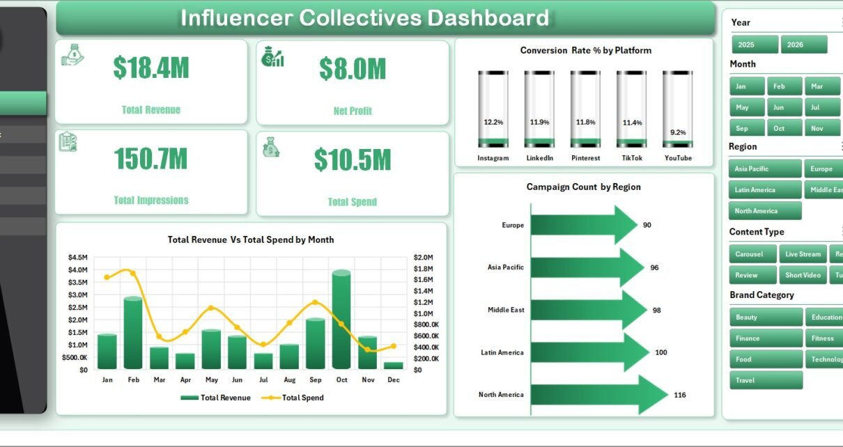
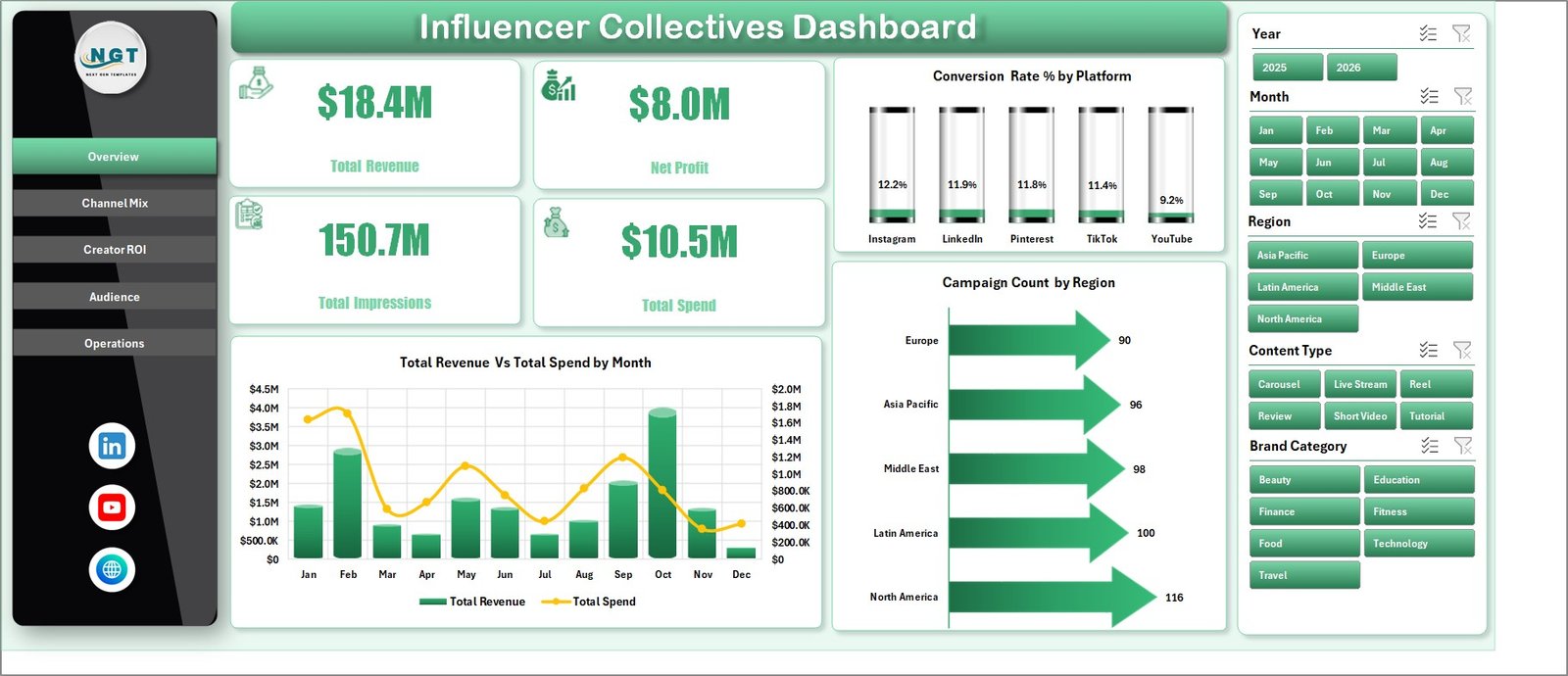
1. Overview Page
The Overview page is the executive view. At the top, it shows Total Revenue, Net Profit, Total Impressions, and Total Spend. These cards are useful for quickly answering whether the collective campaign portfolio is growing profitably and whether the spend level is aligned with reach.
Total Revenue and Total Spend by Month compares money earned against money invested over time. This chart helps you identify whether higher monthly spend is producing stronger revenue or simply increasing cost.
Conversion Rate % by Platform compares how efficiently each platform converts audience activity into outcomes. Use it to decide whether platforms such as Instagram, TikTok, YouTube, or others deserve more budget.
Campaign Count by Region shows where campaigns are concentrated geographically. It helps teams compare regional coverage and spot under-served markets.
Overview Page
2. Channel Mix
The Channel Mix page focuses on platform and content distribution. It helps answer where budget is going, which content types are creating action, which campaign goals produce conversions, and which influencer tiers deliver reach.
Total Revenue and Total Spend by Platform compares platform cost against return side by side. This makes it easier to see which platform is efficient and which one may be over-funded.
Total Engagements and Total Clicks by Content Type shows how formats perform beyond impressions. It helps separate content that only gets viewed from content that drives measurable action.
Total Conversions by Campaign Goal explains which goal types are producing the most final outcomes. Use this to compare awareness, traffic, conversion, and other campaign objective categories.
Total Impressions by Tier shows how reach changes across creator tiers. This is useful when deciding whether micro, mid-tier, macro, or celebrity-level creators should receive future investment.
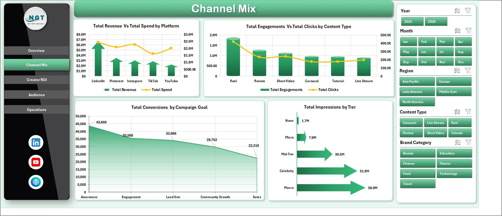
Channel Mix
3. Creator ROI
The Creator ROI page looks at performance from the creator and collective perspective. It is the page to use when the question is not just which platform worked, but which influencers, tiers, collectives, and brand categories produced worthwhile returns.
Conversion Rate % by Tier compares efficiency across influencer tiers. A smaller tier may outperform a larger one if the audience is more targeted and responsive.
Total Revenue by Collective shows which creator collectives are driving the most revenue. This is helpful for renewal decisions and collective-level negotiations.
Total Revenue and Total Payout by Influencer compares return against creator compensation. It helps identify profitable influencers and creators whose payouts may not be matched by revenue.
Total Revenue and Total Spend by Brand Category shows which brand categories are producing the best financial outcomes. Use it to decide where future partnerships or campaign themes should focus.
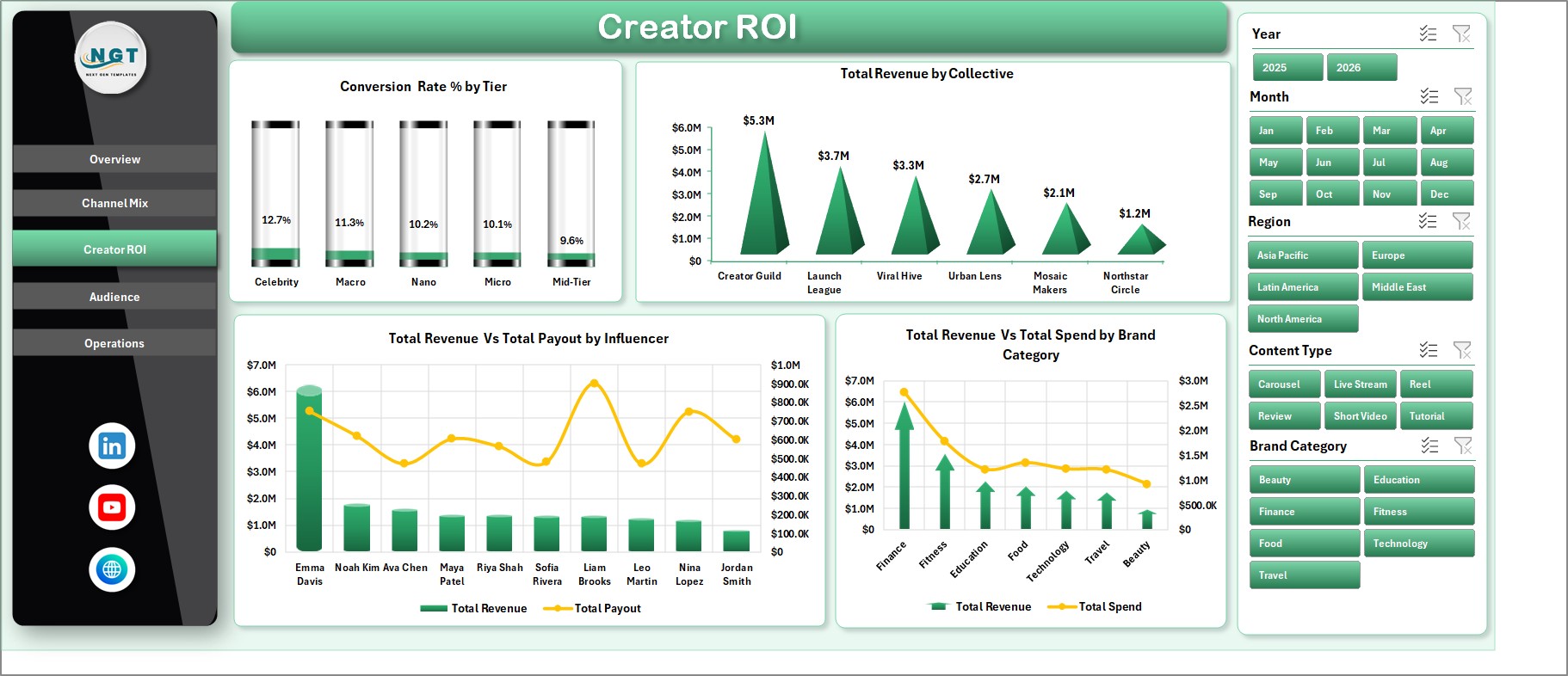
Creator ROI
4. Audience
The Audience page focuses on reach, traffic, engagement, campaign intent, and content quality. It is useful when you want to understand whether the campaign is attracting the right audience and whether that attention is turning into clicks.
Total Impressions and Total Clicks by Region compares awareness and traffic across markets. If a region has high impressions but low clicks, the message or creator fit may need review.
Engagement Rate % by Brand Category shows which categories are creating stronger audience interaction. This can guide campaign positioning and product category priorities.
Campaign Count by Campaign Goal shows how the campaign portfolio is distributed by objective. It helps confirm whether the team is investing enough in awareness, conversion, retention, or other goals.
Avg. Quality Rating by Content Type compares content quality across formats. This helps creative teams see which content types are not only performing but also meeting brand standards.
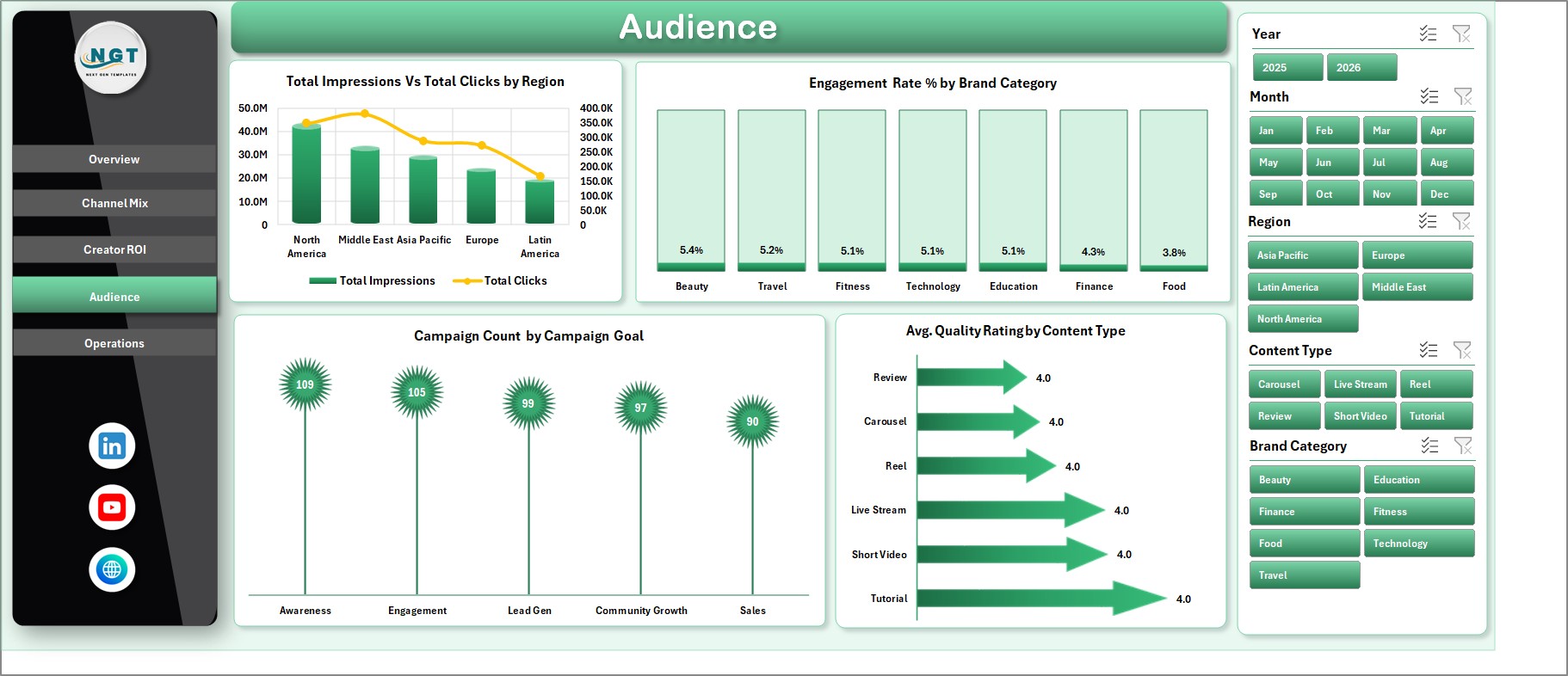
Audience
5. Operations
The Operations page is designed for campaign monitoring and delivery review. It helps managers track financial outcomes by status, monthly delivery volume, and collective quality.
Total Revenue and Total Spend by Status compares campaign value across statuses such as active, completed, paused, or planned. This helps reveal whether money is stuck in low-performing or unfinished work.
Total Impressions by Month shows delivery momentum over time. If impressions drop while spend remains steady, it may signal creator fatigue, seasonality, or campaign execution issues.
Avg. Quality Rating by Collective compares execution quality across collectives. This can support partner reviews, renewals, and quality improvement conversations.
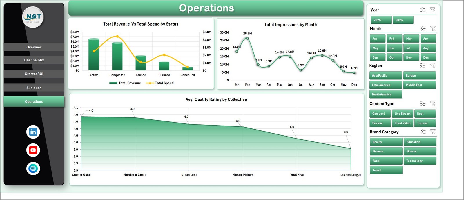
Operations
6. Data Sheet Tab
The Data sheet is the input table for the entire workbook. Add your influencer campaign records in the same format shown in the sample data. Once the records are updated, the pivot tables and dashboard visuals can refresh from this single source.
Data Sheet tab
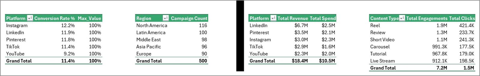
7. Support Sheet
The Support sheet contains the pivot tables used to build the dashboard dynamically. After updating the Data sheet, go to the Data tab in the Excel Ribbon and click Refresh All. All pivots and charts will refresh. You can keep this sheet hidden during normal use.
Support sheet tab
Influencer Collectives Dashboard in Excel vs. Google Sheets vs. Paid CRM/SaaS – Feature Comparison
| Feature | Influencer Collectives Dashboard in Excel | Google Sheets Alternative | Paid Influencer SaaS |
|---|---|---|---|
| Cost | $17.99 one-time | $9.99-$17.99 one-time | $1,000+/month |
| Platform | Microsoft Excel desktop | Browser-based spreadsheet | Vendor-hosted SaaS |
| Setup time | Under 10 minutes | Under 10 minutes | Several days or more |
| Real-time collaboration | Limited unless shared through OneDrive | Strong Google Drive collaboration | Usually included |
| Mobile access | Limited in Excel mobile | Good in Google Sheets mobile | Usually included |
| Customizable fields | Fully editable workbook | Fully editable sheet | Often limited to vendor schema |
| Share with link | Possible via cloud storage | Built in | Built in |
| Year-1 cost at 5 users | $17.99 total | $9.99-$17.99 total | $12,000+ |
| Creator ROI reporting | Built in with Excel charts | Possible with Sheets charts | Built in with integrations |
| Best use case | Manual reporting and budget review | Collaborative reporting | Discovery, contracts, payments, and API integrations |
Who Should Use This Template
This template is best for influencer marketing managers, creator agencies, brand partnership teams, campaign analysts, and marketing consultants who already collect campaign data and need fast reporting in Excel. It is especially useful for teams that report campaign performance weekly or monthly and need consistent visuals for leadership or clients.
It is not the right fit if you require automatic social platform API imports, influencer discovery, contract workflows, payment processing, or enterprise approval routing. In those cases, a paid influencer SaaS tool may be a better fit.
Real-World Use Cases
Maya manages creator collectives for a beauty brand. She uses the Overview page before weekly meetings to show revenue, spend, impressions, and net profit. When leadership asks which platform deserves more spend, she opens Channel Mix and compares revenue and spend by platform.
Daniel runs reporting for a creator agency. He uses Creator ROI to compare revenue and payout by influencer. This gives him a neutral way to discuss renewals, renegotiate fees, and prioritize creators who bring better return.
Priya is a freelance influencer marketing consultant. She updates the Data sheet after each campaign cycle, refreshes all pivots, and uses the Audience and Operations pages to prepare client-ready screenshots for monthly reporting.
Advantages of Influencer Collectives Dashboard in Excel
- It keeps all campaign reporting in one familiar Excel workbook.
- It separates executive, channel, creator, audience, and operations views so the dashboard is easier to explain.
- It avoids monthly software fees for teams that only need structured reporting.
- It gives users full control over formulas, data, formatting, and layout.
- It supports repeat reporting because the Data sheet can be updated and refreshed.
Opportunities for Improvement
This is a manual-entry Excel dashboard, so it does not automatically pull data from Instagram, TikTok, YouTube, or influencer platforms. Teams with very high campaign volume may need a database or SaaS workflow before the data reaches Excel. The dashboard also depends on consistent data entry, so dropdown values, date formats, and campaign names should be kept clean.
Best Practices
- Keep a backup copy before replacing sample data.
- Use consistent names for platforms, collectives, campaign goals, tiers, and regions.
- Refresh all pivots after every data update.
- Keep the Support sheet hidden once the dashboard is ready for end users.
- Use slicers during review meetings instead of creating many one-off files.
- Review payout versus revenue regularly so creator partnerships stay profitable.
Microsoft also provides guidance on refreshing PivotTables and connected data in Excel here: Refresh PivotTable data.
Explore Relevant Templates
For related creator and marketing reporting, explore Influencer Campaign Dashboard in Excel, Social Media Influencer Tracking Dashboard in Google Sheets, Digital Creators Guilds Dashboard in Excel, and DIY Craft Marketplaces Dashboard in Excel.
Frequently Asked Questions
What is the Influencer Collectives Dashboard in Excel?
It is an Excel dashboard template for tracking influencer collective campaign performance across revenue, spend, net profit, impressions, conversions, audience, creator ROI, and operations.
How many pages are included?
The workbook includes Overview, Channel Mix, Creator ROI, Audience, Operations, Data Sheet, and Support Sheet tabs.
What should I update first?
Start with the Data sheet. Replace the sample rows with your own campaign records while keeping the same column structure.
How do I refresh the dashboard?
After updating the data, go to the Data tab in the Excel Ribbon and click Refresh All. This refreshes pivot tables and connected charts.
Can I hide the Support sheet?
Yes. The Support sheet contains pivot tables used by the dashboard and can stay hidden during normal use.
Does this template require VBA or macros?
No. It is designed around Excel tables, pivots, charts, and slicers.
Who is this dashboard best for?
It is best for influencer marketing teams, creator agencies, brand partnership managers, and analysts who need repeatable campaign reporting in Excel.
About the Author
Built by PK – Microsoft Certified Professional with 15+ years of Excel, Google Sheets, and Power BI experience. Founder of NextGenTemplates, reaching 300K+ subscribers across YouTube channels. Every template is hand-built and tested before release.
Conclusion
The Influencer Collectives Dashboard in Excel is a practical reporting system for teams that want to understand revenue, spend, profit, platform mix, creator ROI, audience quality, and operations without paying for a large SaaS platform. Update the Data sheet, refresh the pivots, and use the dashboard pages to make cleaner decisions about creators, collectives, platforms, and campaign goals.
For more Excel dashboard tutorials and template walkthroughs, visit YouTube.com/@PKAnExcelExpert.