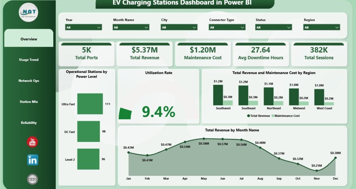
EV Charging Stations Dashboard in Power BI helps charging station operators, energy teams, network operators, fleet charging managers, and mobility analysts review charging performance in one editable PBIX report. The dashboard includes 5 report pages, 5 executive KPI cards, 15 chart views, and interactive slicers for ports, revenue, maintenance cost, downtime, sessions, utilization, power level, connector type, city, region, location type, and network operator performance. Instead of building a Power BI model from a blank canvas, users can open the file in Power BI Desktop, replace or connect the sample data, refresh, and start reviewing station performance quickly.
Power BI Desktop is free from Microsoft and is widely used for interactive business reporting. You can learn more about the application on the official Microsoft Power BI Desktop documentation.
Key Features of EV Charging Stations Dashboard in Power BI
- 5 Power BI report pages: Overview, Usage Trend, Network Ops, Station Mix, and Reliability.
- 5 executive KPI cards: Total Ports, Total Revenue, Maintenance Cost, Avg Downtime Hours, and Total Sessions.
- Operational station reporting: Review active station footprint by power level, region, and location type.
- Revenue and cost analysis: Compare revenue and maintenance cost by region, operator, and power level.
- Usage trend analysis: Track utilization by month, charging sessions by quarter, and port capacity by city.
- Station mix visibility: Understand connector type, power level, city, and location type distribution.
- Editable PBIX file: Change visuals, slicers, measures, relationships, colors, and report pages in Power BI Desktop.
Dashboard Pages Explanation
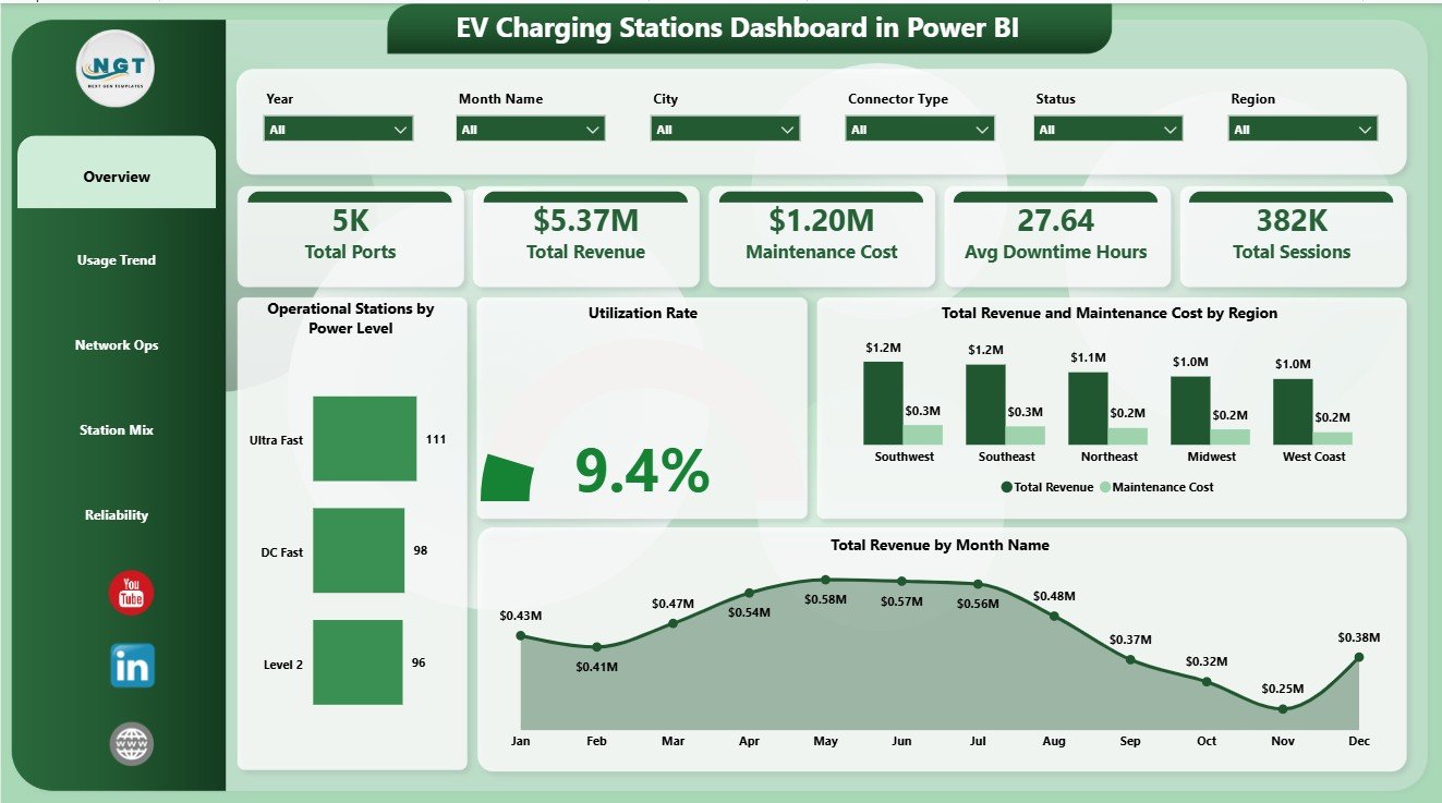
1. Overview Page
The Overview Page is the executive landing page of the report. The cards at the top show Total Ports, Total Revenue, Maintenance Cost, Avg Downtime Hours, and Total Sessions, giving leaders a fast snapshot of charging network scale, commercial performance, cost pressure, service interruption, and charging activity.
Operational Stations by Power Level shows how active stations are distributed across charger power levels. This helps infrastructure teams understand whether the operational network is balanced between slower chargers, fast chargers, and high-power charging locations.
Utilization Rate tracks how strongly charging assets are being used. It helps operators identify underused stations, busy locations, and places where customer demand may justify expansion.
Total Revenue and Maintenance Cost by Region compares income with service cost across regions. It is useful for identifying high-performing regions and regions where maintenance spending may be reducing profitability.
Total Revenue by Month Name reviews monthly revenue movement. It helps finance and operations teams see seasonal patterns, strong months, and weaker months that need deeper review.
2. Usage Trend
The Usage Trend page focuses on charging demand over time and capacity distribution by city. It is useful for monthly reporting, utilization reviews, and infrastructure planning conversations.
Utilization Rate by Month Name shows whether charger usage is improving or weakening over the year. Total Sessions by Quarter summarizes charging activity by quarter, making it easier to report demand trends. Total Ports by City compares city-level charging capacity and helps identify where the network is dense or thin.

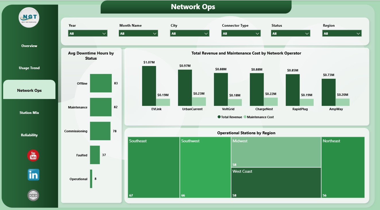
3. Network Ops
The Network Ops page reviews reliability and operator-level performance. Avg Downtime Hours by Status shows service interruption patterns by station status. Total Revenue and Maintenance Cost by Network Operator compares operator performance from both revenue and cost angles. Operational Stations by Region helps teams see where the active network has stronger or weaker coverage.
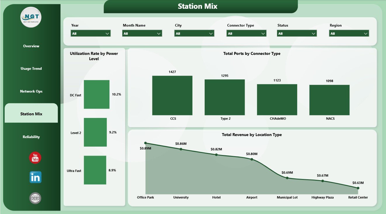
4. Station Mix
The Station Mix page explains how charging infrastructure is distributed across charger speed, connector type, and location type. Utilization Rate by Power Level helps compare demand across power classes. Total Ports by Connector Type shows connector compatibility across the network. Total Revenue by Location Type helps users understand which types of sites generate stronger revenue.
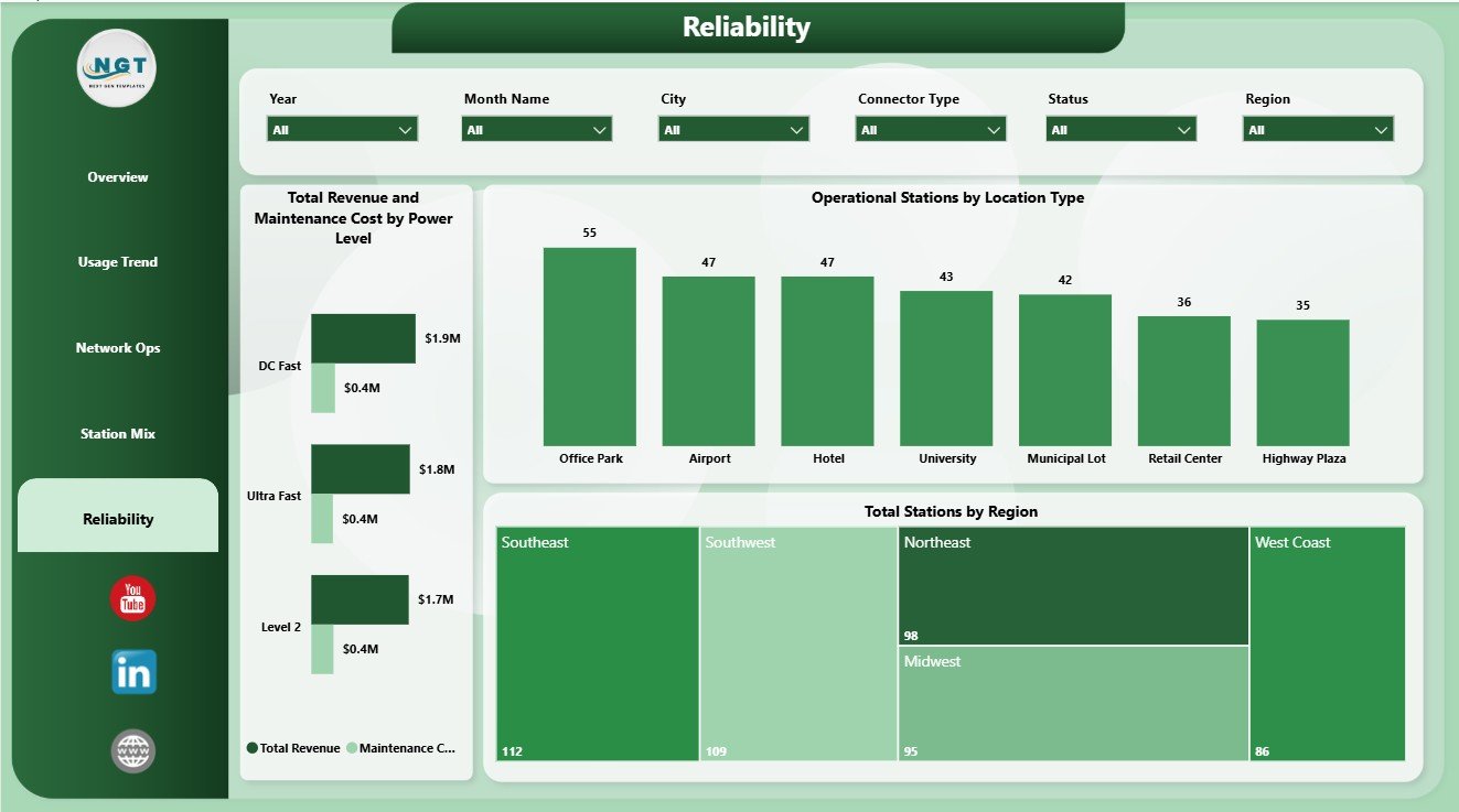
5. Reliability
The Reliability page supports maintenance and uptime review. Total Revenue and Maintenance Cost by Power Level connects charger class with financial performance. Operational Stations by Location Type shows where active stations are operating by site category. Total Stations by Region gives a regional footprint view that helps with capacity and reliability planning.
EV Charging Stations Dashboard in Power BI vs. Tableau vs. Paid CRM/SaaS – Feature Comparison
| Feature | This Power BI Dashboard | Tableau Alternative | Paid Charging SaaS |
|---|---|---|---|
| Cost | $17.99 one-time | License plus dashboard build time | Monthly or annual subscription |
| Platform | Power BI Desktop / Power BI Service | Tableau Desktop / Cloud | Vendor cloud application |
| Setup time | Open PBIX, replace or connect data, refresh | Build model and visuals manually | Implementation and onboarding |
| Real-time team collaboration | Available through Power BI Service with licensing | Available through Tableau Cloud with licensing | Usually included by plan |
| Mobile access | Power BI mobile app after publishing | Tableau mobile after publishing | Vendor app or browser |
| Customizable fields | Editable visuals, relationships, fields, and measures | Editable with Tableau skills | Limited by vendor configuration |
| Share with link | Possible through Power BI Service permissions | Possible through Tableau permissions | Usually login controlled |
| Year-1 cost at 5 users | $17.99 plus any Microsoft licensing | Usually much higher | Often hundreds or thousands |
| EV station analytics | Built across 5 pages | Requires custom design | Depends on module and plan |
Who Should Use This Template
This template is useful for EV charging station operators, electric utilities, city mobility programs, fleet charging teams, infrastructure planners, charging network operators, consultants, finance managers, and Power BI analysts who need a structured reporting layer for charging station records.
It is not designed to replace a live OCPP control system, charger payment platform, customer mobile app, real-time alerting system, field service dispatch tool, or enterprise data warehouse. It works best when you already have clean data exports and want a ready visual reporting structure.
Real-World Use Cases
Priya, charging network manager: Priya opens the Overview and Network Ops pages before weekly operations meetings to explain ports, sessions, revenue, downtime, maintenance cost, and active station coverage.
Daniel, utility program analyst: Daniel uses Usage Trend and Station Mix to review utilization by month, sessions by quarter, connector type, city-level port capacity, and demand movement.
Asha, infrastructure planner: Asha uses Reliability to compare station footprint, operational stations, power-level cost, revenue, and location type before making capacity recommendations.
Advantages of EV Charging Stations Dashboard in Power BI
- It brings revenue, sessions, ports, utilization, maintenance, and downtime into one reporting view.
- It gives executives a fast Overview page while still offering focused operations and reliability pages.
- It is editable in Power BI Desktop, so users can adapt visuals and fields to match their dataset.
- It supports better monthly review without a full custom BI project.
- It pairs naturally with Excel exports, CSV files, database tables, and other structured data sources.
Opportunities for Improvement
Larger operators may want to connect the PBIX file to a governed database, scheduled refresh process, API export, or Power BI Service workspace. Teams can also add measures for uptime percentage, charger fault categories, customer wait time, kWh delivered, payment method, service ticket aging, or charger-level SLA compliance as their data maturity improves.
Best Practices
- Keep column names and data types consistent when replacing the sample source.
- Refresh the model after every data update and validate the KPI cards before sharing.
- Review revenue and maintenance cost together so financial performance is not judged by revenue alone.
- Use slicers during management reviews to answer follow-up questions quickly.
- Save a backup before changing Power Query steps, relationships, or DAX measures.
Explore Relevant Templates
You can download the product from EV Charging Stations Dashboard in Power BI. You may also want to compare it with the EV Charging Stations Dashboard in Excel, EV Fleet Dashboard in Power BI, and Solar Energy Dashboard in Power BI. Browse more Power BI Dashboard Templates on NextGenTemplates.
Frequently Asked Questions
What KPI cards are included?
The Overview page includes KPI cards for Total Ports, Total Revenue, Maintenance Cost, Avg Downtime Hours, and Total Sessions.
How many report pages are included?
The dashboard includes 5 Power BI pages: Overview, Usage Trend, Network Ops, Station Mix, and Reliability.
Do I need Power BI Desktop?
Yes. You need Power BI Desktop to open, edit, and refresh the PBIX file. Publishing and sharing through Power BI Service may require Microsoft licensing.
Can I use my own charging station data?
Yes. Replace the sample source or connect the report to your own structured EV charging station data, then refresh the model.
Does this replace charging station management software?
No. It is a reporting dashboard for analysis, not a live charger control system, payment platform, customer app, or field service system.
Can I customize the dashboard?
Yes. You can edit visuals, slicers, report pages, colors, fields, relationships, Power Query steps, and DAX measures in Power BI Desktop.
About the Author
Built by PK – Microsoft Certified Professional with 15+ years of Excel, Google Sheets, and Power BI experience. Founder of NextGenTemplates, reaching 300K+ subscribers across YouTube channels. Every template is hand-built and tested before release.
Conclusion
The EV Charging Stations Dashboard in Power BI is a practical reporting template for teams that want a clearer view of charging ports, revenue, sessions, maintenance cost, downtime, utilization, station mix, regional footprint, network operations, and reliability. It gives charging operators a ready structure for business review while keeping the PBIX file open for customization.
Visit YouTube.com/@PKAnExcelExpert for more Power BI and Excel dashboard tutorials.