Hydropower projects bring together engineering, finance, construction, operations, sustainability, and stakeholder reporting. One project can involve multiple countries, regions, river basins, developers, plant types, turbine types, investment sources, risk levels, and construction phases. When that information sits in separate files, monthly reporting becomes slow and decision-making becomes reactive.
The Hydropower Projects Dashboard in Excel gives teams a ready-to-use workbook for tracking Total Revenue, Total Installed Capacity, Total Actual Generation, Total Committed Investment, actual cost, planned budget, project status, construction phase, developer, location, risk, and operational performance. Users can replace the sample records, click Refresh All, and review multiple dashboard pages with cards, slicers, pivot charts, and supporting pivot tables.
Click here to view the Hydropower Projects Dashboard in Excel.
Key Features of Hydropower Projects Dashboard in Excel
- 4 executive KPI cards for Total Revenue, Total Installed Capacity, Total Actual Generation, and Total Committed Investment.
- 5 dashboard pages for Overview, Project Trend, Location, Risk, and Operations analysis.
- Interactive slicers to filter project data quickly by available workbook fields.
- Pivot-based charts for revenue, cost, project count, generation, budget, risk, availability, plant type, turbine type, and developer analysis.
- Data Sheet tab where users add or replace hydropower project records in the same format.
- Support Sheet tab containing pivot tables that power the entire dashboard dynamically.
Dashboard Pages Explanation
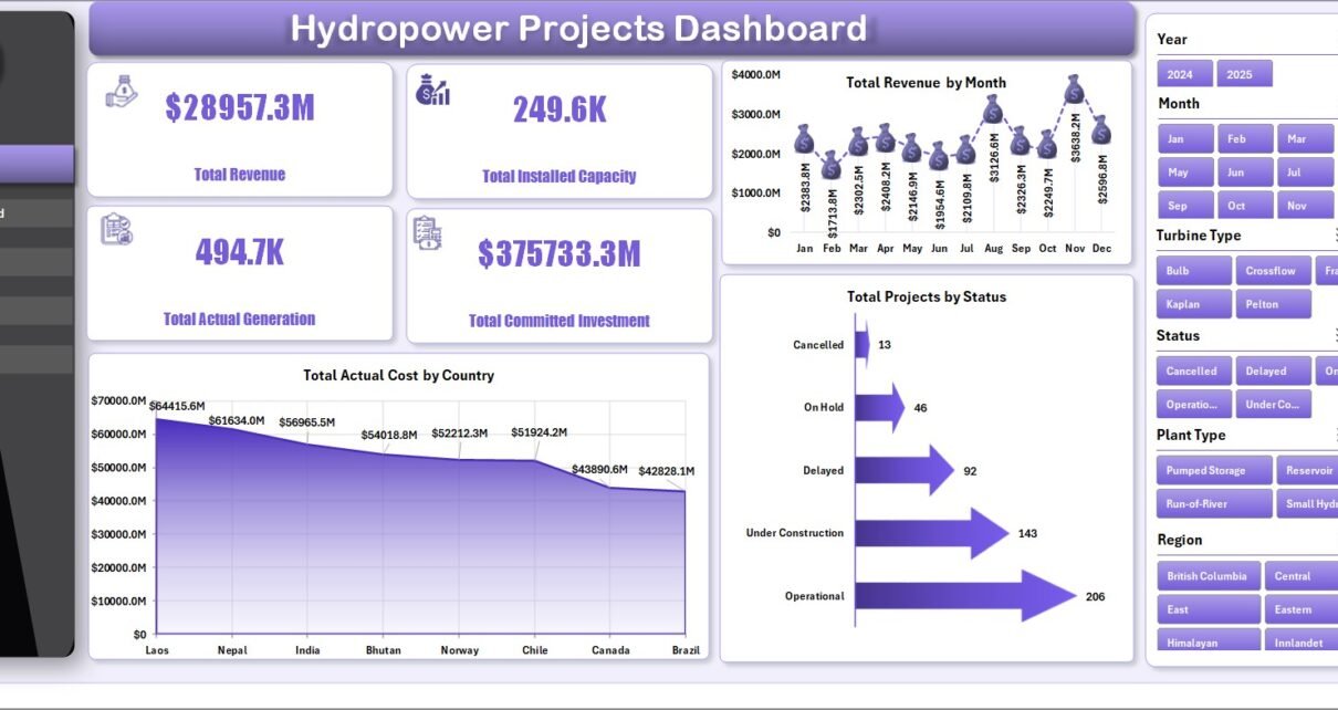
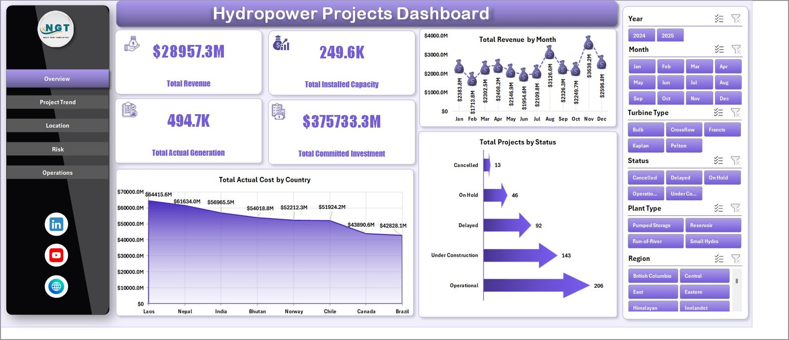
1. Overview Page
The Overview Page gives the first snapshot of hydropower portfolio performance. At the top, cards show Total Revenue, Total Installed Capacity, Total Actual Generation, and Total Committed Investment. These cards help leaders understand commercial value, production scale, and investment exposure before reviewing detailed charts.
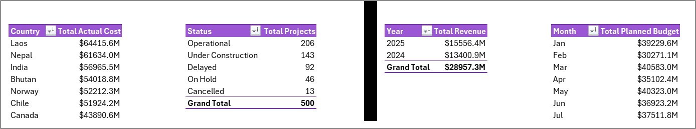
Total Revenue by Month: This chart shows revenue movement across months. It helps project and finance teams identify seasonality, stronger billing periods, or months where revenue may need investigation.
Total Actual Cost by Country: This chart compares actual cost across countries. It supports location-level cost review and helps identify markets with higher project execution spend.
Total Projects by Status: This visual shows the project count by status. It helps managers see how many projects are active, completed, delayed, cancelled, or in another reporting status.
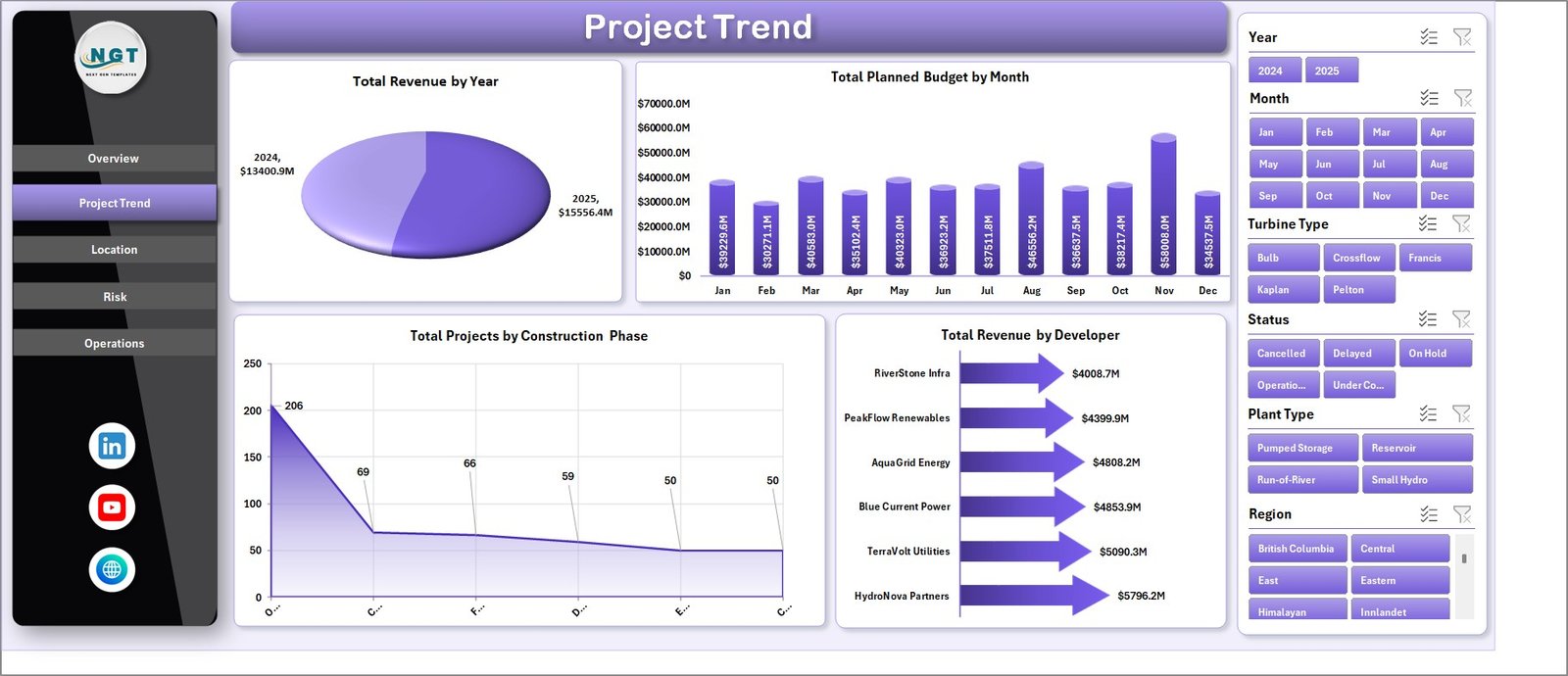
2. Project Trend
The Project Trend page focuses on time-based and developer-level analysis. It is useful for management reviews where teams need to explain how revenue, budget, and project pipeline are changing.
Total Revenue by Year: This chart compares annual revenue across the project portfolio. It helps leadership understand whether the hydropower pipeline is growing, flattening, or declining over time.
Total Planned Budget by Month: This chart shows planned budget by month. It helps finance teams prepare cash flow commentary and compare expected spending patterns.
Total Projects by Construction Phase: This visual shows where projects sit in the delivery pipeline. It helps teams understand whether more projects are in feasibility, design, construction, commissioning, or operations phases.
Total Revenue by Developer: This chart compares revenue contribution by developer. It is useful for identifying the developers or partners that contribute the highest commercial value.
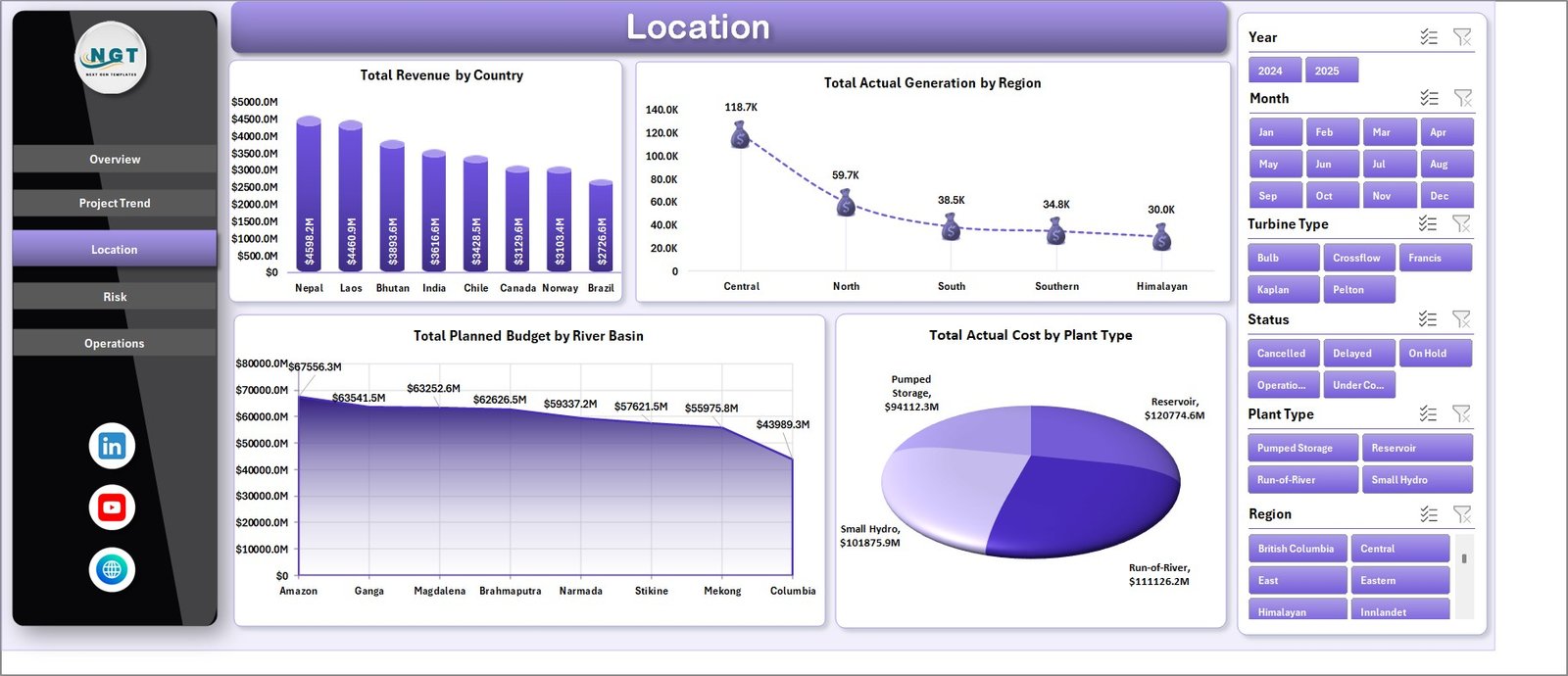
3. Location
The Location page supports geographic and asset-structure analysis. Hydropower performance can vary heavily by country, region, river basin, and plant type, so this page helps users compare projects from multiple location angles.
Total Revenue by Country: This chart identifies countries that generate the highest revenue. It helps teams compare market contribution and prioritize leadership attention.
Total Actual Generation by Region: This chart compares generation output by region. It helps operations and planning teams understand where production is concentrated.
Total Planned Budget by River Basin: This chart shows planned investment by river basin. It supports basin-level budgeting, development planning, and stakeholder reporting.
Total Actual Cost by Plant Type: This visual compares actual cost across plant types. It helps users understand whether certain plant categories are more expensive to develop or operate.
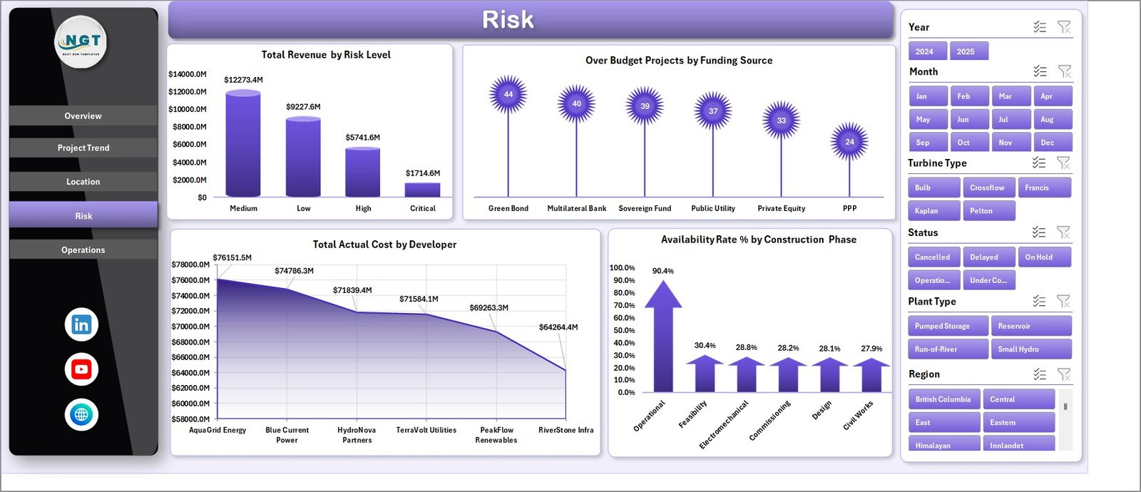
4. Risk
The Risk page is designed for cost control, funding review, and execution monitoring. It connects revenue, cost, over-budget projects, funding source, developer, risk level, and construction phase.
Total Revenue by Risk Level: This chart shows how much revenue is associated with each risk category. It helps leaders see whether high-value projects also carry higher execution or delivery risk.
Over Budget Projects by Funding Source: This chart compares over-budget project counts by funding source. It helps finance and governance teams identify funding groups that need tighter review.
Total Actual Cost by Developer: This chart compares actual cost by developer. It helps teams understand developer-level cost exposure and supports vendor or partner conversations.
Availability Rate % by Construction Phase: This chart compares availability by construction phase. It helps users connect delivery stage with operational readiness and performance expectations.
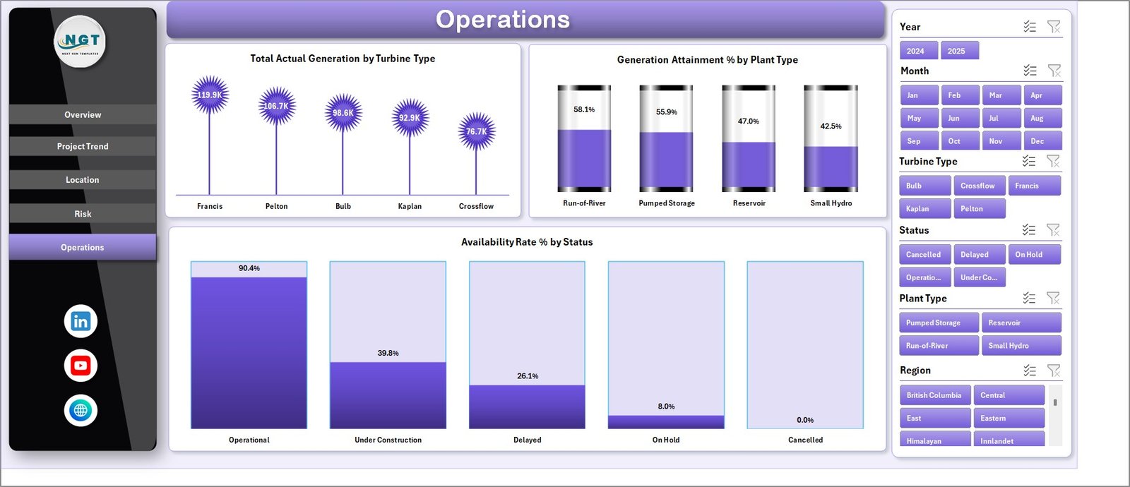
5. Operations
The Operations page helps teams review generation and availability performance. It is useful for operations managers, asset analysts, and plant performance teams.
Total Actual Generation by Turbine Type: This chart shows generation output by turbine type. It helps teams compare equipment groups and understand which turbine categories drive the most production.
Generation Attainment % by Plant Type: This chart compares actual generation attainment by plant type. It helps identify plant categories that are closer to or further from expected generation levels.
Availability Rate % by Status: This visual compares availability rate by project or plant status. It helps operations teams understand how status groups relate to availability performance.
6. Data Sheet Tab
The Data sheet is the input layer. Add your hydropower project records in the same format as the sample data. Keep country, region, river basin, developer, construction phase, status, plant type, turbine type, risk level, funding source, revenue, cost, budget, generation, and capacity fields consistent so the dashboard refreshes correctly.

7. Support Sheet Tab
The Support sheet contains multiple pivot tables used to create the entire dashboard dynamically. After updating the Data sheet, go to the Excel Data ribbon and click Refresh All. All pivots and connected charts refresh together. Microsoft also documents this workflow in its guidance for refreshing PivotTable data in Excel. You can keep this sheet hidden during normal reporting.
Hydropower Projects Dashboard in Excel vs. Google Sheets vs. Paid Project SaaS – Feature Comparison
| Feature | Hydropower Projects Dashboard in Excel | Google Sheets alternative | Paid project SaaS |
|---|---|---|---|
| Cost | $17.99 one-time | Low software cost but manual build effort | Monthly or annual subscription |
| Platform | Microsoft Excel | Google Sheets | Vendor cloud system |
| Setup time | Replace data and refresh | Build formulas, pivots, and charts manually | Configuration and onboarding |
| Real-time team collaboration | Available through OneDrive or SharePoint | Native | Usually included by plan |
| Mobile access | Excel mobile app for viewing and light edits | Sheets mobile app | Usually included |
| Customizable fields | Editable workbook, pivots, charts, and sheets | Editable but manual | Depends on vendor permissions |
| Share with link | Available through Microsoft 365 | Native sharing | Usually login controlled |
| Year-1 cost at 5 users | $17.99 plus Microsoft licensing if needed | Low license cost but more labor | Often hundreds or thousands |
| Hydropower-focused pages | Included across five analysis tabs | Must be built manually | Depends on module and setup |
Who Should Use This Template
This template is ideal for hydropower project managers, renewable energy analysts, infrastructure developers, EPC teams, finance controllers, operations managers, asset performance analysts, investment teams, and consultants who use Excel for recurring project reporting.
It is also useful for small and mid-sized energy teams that need structured reporting but are not ready to buy a larger project management or asset management platform. It is not a live SCADA system, engineering design tool, automated finance close tool, or regulatory submission platform.
Real-World Use Cases
Arjun, hydropower project manager: Arjun reviews revenue, installed capacity, actual generation, and project status before monthly steering committee meetings.
Meera, renewable energy analyst: Meera compares generation by region, turbine type, plant type, and river basin to prepare operational commentary.
Daniel, infrastructure finance lead: Daniel monitors planned budget, actual cost, committed investment, and over-budget projects by funding source.
Advantages of Hydropower Projects Dashboard in Excel
The biggest advantage is speed. The workbook gives prebuilt pages, cards, charts, slicers, and pivot tables so users do not need to design a dashboard from scratch. Because it is built in Excel, users can also edit chart titles, colors, fields, and sheet layouts.
The dashboard also keeps analysis practical. Instead of focusing only on financial numbers or only on operational data, it combines revenue, cost, investment, generation, capacity, risk, location, and operations into one workbook.
Opportunities for Improvement
This template depends on consistent data entry. If country names, developers, river basins, construction phases, or project statuses are typed inconsistently, pivot charts may split similar values into separate groups. Teams with live plant systems, automatic meter feeds, or ERP integrations may need a custom Power BI model or database connection.
Best Practices
Keep the Data sheet structure unchanged when replacing sample records. Standardize developer names, country names, river basin names, risk levels, and construction phases before refreshing. Update the dashboard on a fixed monthly cycle and hide the Support sheet after setup so everyday users focus on dashboard pages and the Data sheet.
Explore Relevant Templates
You can download the Hydropower Projects Dashboard in Excel from NextGenTemplates. You may also like the Hydropower Projects KPI Dashboard in Excel, the Hydropower Projects KPI Dashboard in Power BI, and the Energy ESG Sustainability Bundle. Browse more Excel dashboard templates.
Frequently Asked Questions
What is the Hydropower Projects Dashboard in Excel?
It is a ready-to-use Excel dashboard for tracking hydropower project revenue, installed capacity, actual generation, committed investment, planned budget, actual cost, status, risk, location, and operations.
What pages are included in the workbook?
The workbook includes Overview, Project Trend, Location, Risk, Operations, Data Sheet, and Support Sheet tabs.
Can I replace the sample data?
Yes. Add or replace records in the Data sheet, keep the same column format, and click Refresh All from the Excel Data ribbon.
Does this dashboard require macros?
No macro workflow is required for normal dashboard use. The dashboard uses Excel data, pivot tables, charts, slicers, and refresh logic.
Can I hide the Support sheet?
Yes. The Support sheet contains pivot tables used by the dashboard and can be hidden after setup.
Is this template a subscription?
No. It is a one-time purchase Excel template from NextGenTemplates.
About the Author
Built by PK – Microsoft Certified Professional with 15+ years of Excel, Google Sheets, and Power BI experience. Founder of NextGenTemplates, reaching 300K+ subscribers across YouTube channels. Every template is hand-built and tested before release.
Conclusion
The Hydropower Projects Dashboard in Excel is a practical reporting tool for teams that need to monitor revenue, capacity, generation, investment, cost, budget, risk, location, and operations in one workbook. It is especially useful for project and operations teams that already manage records in Excel and want a cleaner way to present monthly performance.
Visit our YouTube channel for step-by-step Excel and dashboard tutorials: Youtube.com/@PKAnExcelExpert.