Last-mile delivery is often the most expensive and most customer-visible part of logistics. Industry studies regularly place last-mile costs as a major share of total shipping cost, and even small delays can reduce repeat purchase intent. The Last-mile Delivery Dashboard in Excel gives delivery teams a practical way to review revenue, cost, delivery volume, status, regional success, driver quality, penalties, incidents, and customer rating without paying for a monthly analytics platform.
This Excel dashboard is built for teams that already have delivery records in Excel, CSV exports, ERP reports, courier exports, or dispatch sheets. Replace the sample data in the Data Sheet, click Refresh All in Excel, and the dashboard pages update through pivot tables and slicers.
Click here to purchase the Last-mile Delivery Dashboard in Excel
Last-mile Delivery Dashboard in Excel
Key Features of Last-mile Delivery Dashboard in Excel
- 5 dashboard pages: Overview Page, Delivery Trend, Region Ops, Driver Quality, and Exception Watch.
- Executive KPI cards: Total Delivery Revenue, Net Delivery Profit, Total Packages, Total Records, and Avg. Customer Rating.
- Interactive slicers: Quickly filter dashboard views by your delivery dimensions such as month, year, region, city, driver, vehicle type, priority, service type, delivery status, and customer segment.
- Revenue and cost analysis: Compare Total Delivery Revenue with Total Delivery Cost by month and region.
- Driver performance review: Track on-time percentage, customer rating, and delivery success views that support coaching and accountability.
- Exception monitoring: Review incidents, slow cities, and vehicle types that increase delivery hours.
- Data Sheet plus Support Sheet: Enter data in one structured sheet and let pivot tables drive the dashboard pages.
Dashboard Pages Explanation
The workbook includes five main dashboard pages plus a Data Sheet and a Support Sheet. Each page answers a specific operations question: How are we performing overall? Where are delivery trends changing? Which regions and cities need attention? Which drivers or service types affect quality? Where are incidents and delays concentrated?
1 – Overview Page
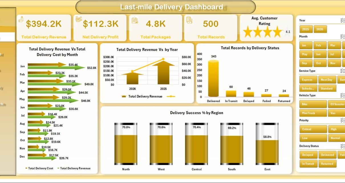
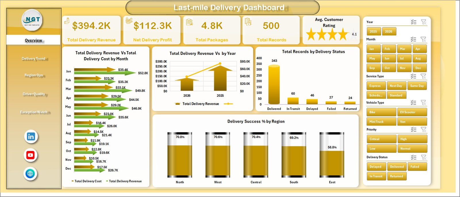
The Overview Page starts with the most important delivery cards: Total Delivery Revenue, Net Delivery Profit, Total Packages, Total Records, and Avg. Customer Rating. These cards give managers a fast summary before they move into detailed analysis.
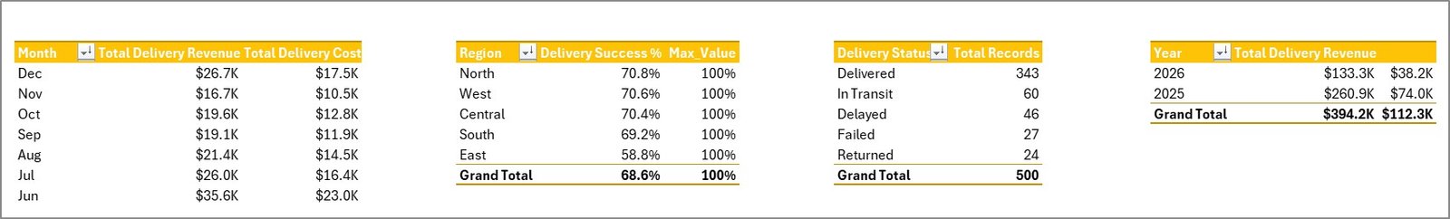
The Total Delivery Revenue vs Total Delivery Cost by Month chart shows whether monthly delivery activity is profitable or becoming expensive. The Total Delivery Revenue by Year chart helps leadership compare annual delivery growth. Total Records by Delivery Status shows the split between delivered, failed, pending, delayed, or other status categories. Delivery Success % by Region highlights regional service quality so teams can focus improvement work where the success rate is low.
Overview Page
2 – Delivery Trend
The Delivery Trend page is designed for time-based and cost-based review. Total Packages by Month shows volume seasonality and helps teams understand peak delivery months. Avg. Delivery Hours by Service Type compares delivery speed for express, standard, same-day, scheduled, or other service categories.
Total Penalty Amount by Priority shows whether urgent orders, high-priority shipments, or premium service commitments are creating penalty exposure. Total Delivery Revenue vs Total Delivery Cost by Region compares margin pressure across territories and helps managers decide where route planning, courier allocation, or pricing needs attention.
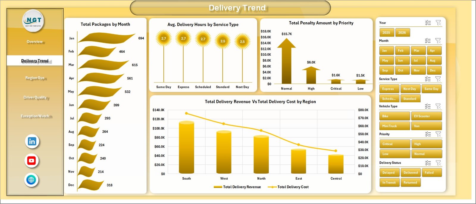
Delivery Trend
3 – Region Ops
The Region Ops page focuses on geographic and operating performance. Total Packages by City reveals where delivery workload is concentrated. Total Distance by Vehicle Type helps teams compare bikes, vans, trucks, electric vehicles, or other delivery modes by total route distance.
Net Delivery Profit by Customer Segment shows which customer groups contribute the most margin after delivery cost. Avg. Customer Rating by Driver helps managers identify strong performers and drivers who may need coaching, route support, or service training.
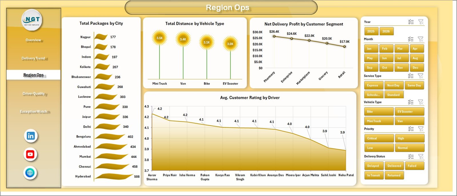
Region Ops
4 – Driver Quality
The Driver Quality page is built for service review. On Time % by Driver makes punctuality visible and supports fair comparison across routes. Delivery Success % by Priority shows whether high-priority deliveries are being handled with the expected reliability.
Total Records by Year gives a simple long-term volume view, while Avg. Customer Rating by Service Type shows how service promises translate into customer experience. This page is useful for daily standups, weekly driver reviews, and monthly quality meetings.
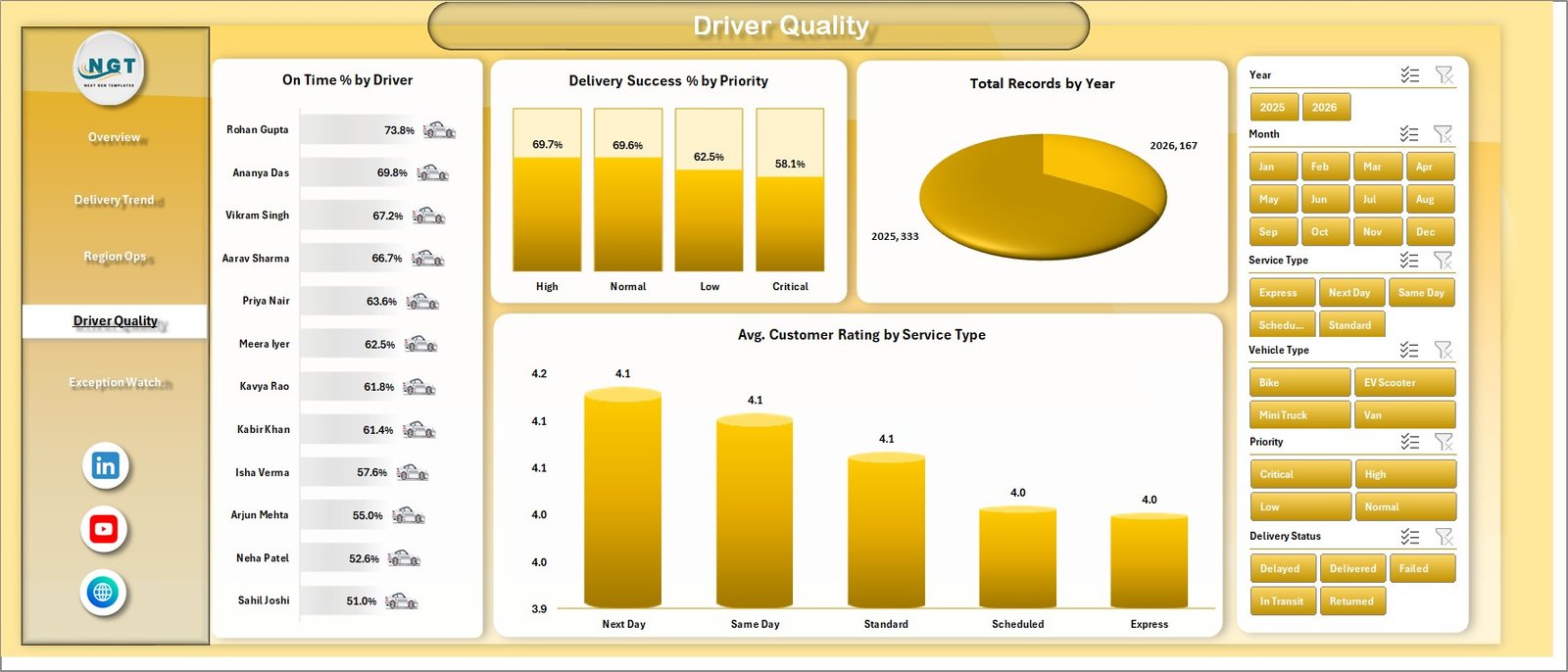
Driver Quality
5 – Exception Watch
The Exception Watch page helps teams focus on delays and issues. Total Incidents by Region shows where operational problems are concentrated. On Time % by City reveals city-level delay patterns that may be caused by traffic, route density, courier availability, warehouse dispatch timing, or customer availability.
Avg. Delivery Hours by Vehicle Type helps teams compare whether the chosen vehicle mix is suitable for each delivery environment. A vehicle that works well in one city may create delay in another, and this page makes that discussion easier.
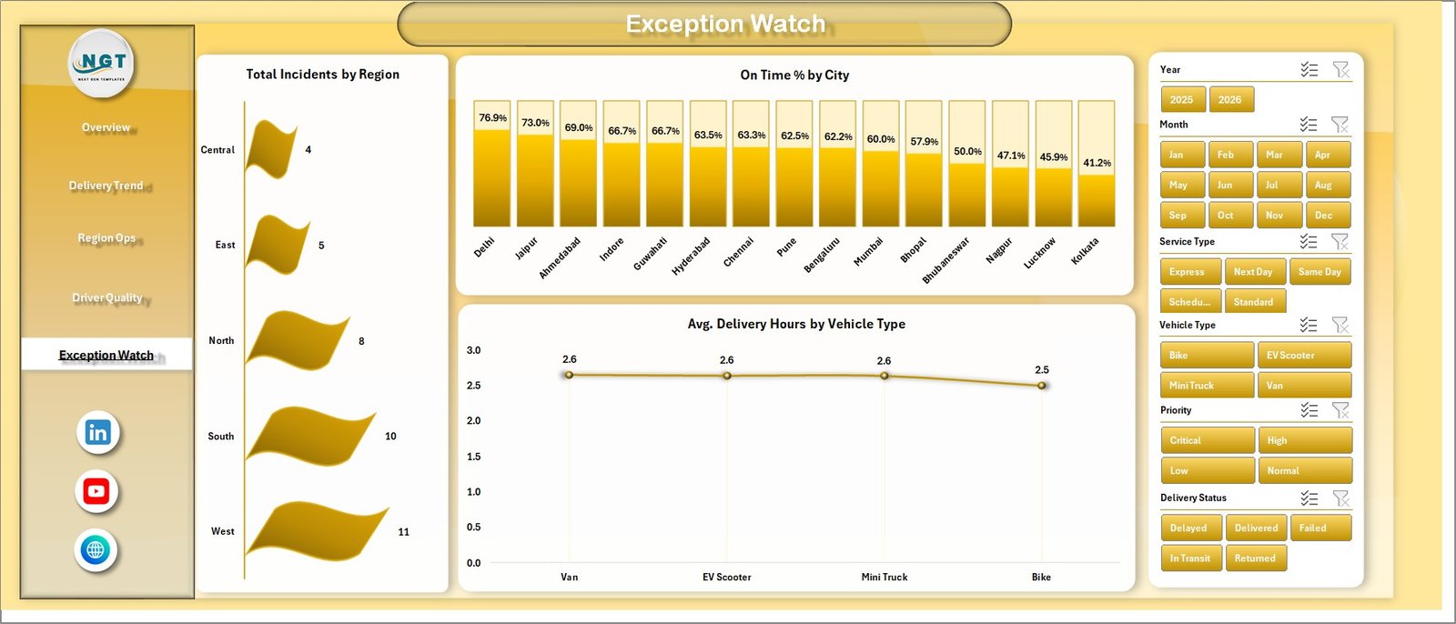
Exception Watch
6 – Data Sheet Tab
The Data Sheet tab is where you add your delivery records in the same format as the sample data. Keep the column structure consistent so the pivot tables and charts continue to work correctly.
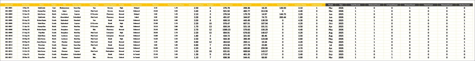
Data Sheet tab
7 – Support Sheet Tab
The Support Sheet contains multiple pivot tables used to build the dashboard dynamically. After you update the Data Sheet, go to the Data tab in the Excel Ribbon and click Refresh All. All pivots and charts will refresh. You can keep this sheet hidden after setup.
Support Sheet tab
Last-mile Delivery Dashboard in Excel vs. Google Sheets vs. Paid CRM/SaaS – Feature Comparison
| Feature | Last-mile Delivery Dashboard in Excel | Google Sheets alternative | Paid delivery SaaS |
|---|---|---|---|
| Cost | $17.99 one-time | Template or custom build | Monthly subscription |
| Platform | Microsoft Excel | Google Sheets | Vendor-hosted system |
| Setup time | Replace data and refresh pivots | Import data and adjust formulas | Onboarding and configuration |
| Real-time team collaboration | Possible with OneDrive or SharePoint | Native collaboration | Usually included |
| Mobile access | Excel mobile with limitations | Google Sheets mobile | Usually included |
| Customizable fields | Fully editable workbook | Editable sheet | Plan dependent |
| Share with link | Possible through Microsoft 365 | Yes | Login controlled |
| Year-1 cost at 5 users | $17.99 plus Microsoft licensing | Template cost plus maintenance | Often hundreds or thousands |
| Delivery analytics pages | 5 ready-made pages | Must be built or adapted | Depends on vendor module |
For teams already using Excel, this dashboard sits between raw spreadsheets and expensive delivery software. It does not replace dispatch automation, but it gives managers a cleaner reporting layer for recurring performance reviews.
Who Should Use This Template
- Ecommerce operations managers who need delivery revenue, cost, and package visibility.
- Courier and parcel teams that want to compare delivery status, city performance, and regional success.
- 3PL analysts who prepare client-facing delivery performance reports.
- Fleet coordinators who need vehicle-type distance and delivery-hour analysis.
- Driver supervisors who review on-time %, success %, and customer rating.
Real-World Use Cases
Ravi manages ecommerce fulfillment. Every Monday he checks monthly revenue vs cost and regional delivery success before meeting courier partners.
Meera leads city operations for a delivery network. She uses Region Ops and Exception Watch to identify cities with high incident counts or low on-time performance.
Daniel is a 3PL reporting consultant. He prepares a weekly delivery scorecard by exporting client data, pasting it into the Data Sheet, and refreshing the workbook.
Advantages of Last-mile Delivery Dashboard in Excel
- Fast setup: Replace sample data and refresh the dashboard instead of building charts from scratch.
- No subscription: The workbook is a one-time purchase and runs in Microsoft Excel.
- Editable structure: You can adjust chart titles, slicers, pivot tables, formulas, colors, and source fields.
- Management-ready pages: Each page is designed for a recurring operations question.
- Excel ecosystem: You can use Excel tables, PivotTables, and refresh workflows supported by Microsoft. See Microsoft’s guide to creating PivotTables for more background.
Opportunities for Improvement
- It is not a live GPS or dispatch system. Use it for reporting after data is collected.
- Teams with complex source systems may need to standardize exports before pasting data into the Data Sheet.
- If you need automated refresh from databases or APIs, you may want to adapt the workbook with Power Query.
Best Practices
- Keep a master copy of the original workbook before adding your own data.
- Use consistent driver, region, city, service type, and status names so slicers stay clean.
- Refresh all pivots after each data update.
- Review Exception Watch weekly to catch operational issues early.
- Hide the Support Sheet for everyday users, but keep it available for the dashboard owner.
Explore Relevant Templates
- Last-Mile Delivery KPI Dashboard in Excel
- Freight Cost KPI Dashboard in Excel
- Freight Insurance Providers Dashboard in Excel
- Procurement and Vendor Management Kit
- Browse Logistics Excel Templates
Frequently Asked Questions
What is the Last-mile Delivery Dashboard in Excel?
It is an editable Excel dashboard for reviewing delivery revenue, cost, packages, status, region performance, driver quality, incidents, penalties, and customer rating.
How do I update the dashboard?
Add or paste your delivery records into the Data Sheet, keep the same format, then click Refresh All from the Excel Data tab.
Does the workbook include slicers?
Yes. The dashboard pages use slicers so you can filter reports quickly by the relevant delivery dimensions in the workbook.
Can I customize charts and formulas?
Yes. The workbook is built in Excel, so you can edit charts, formulas, pivot tables, colors, labels, and slicers.
Is this a dispatch or tracking system?
No. It is a reporting dashboard. It does not include live GPS tracking, route planning, driver mobile apps, barcode scanning, or proof-of-delivery capture.
Can I hide the Support Sheet?
Yes. The Support Sheet contains pivot tables used to drive the dashboard and can be hidden after setup.
About the Author
Built by PK – Microsoft Certified Professional with 15+ years of Excel, Google Sheets, and Power BI experience. Founder of NextGenTemplates, reaching 300K+ subscribers across YouTube channels. Every template is hand-built and tested before release.
Conclusion
The Last-mile Delivery Dashboard in Excel gives operations teams a clean, editable way to review last-mile performance without starting from a blank workbook. With five dashboard pages, executive KPI cards, slicers, a Data Sheet, and a pivot-powered Support Sheet, it is a practical reporting layer for delivery teams that want better visibility into cost, revenue, packages, status, city performance, driver quality, and exceptions.
Click here to purchase the Last-mile Delivery Dashboard in Excel
For step-by-step Excel tutorials, visit YouTube.com/@PKAnExcelExpert.
Last updated: June 30, 2026