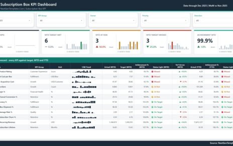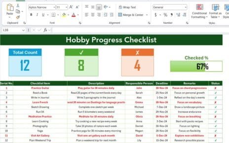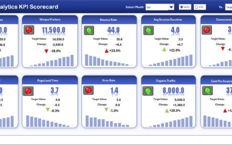
OKR Management Dashboard in Power BI helps leadership teams track objectives, key results, initiatives, budget, actual spend, risk, and alignment in one interactive report. Many teams run quarterly OKR cycles, but the reporting often lives across spreadsheets, meeting notes, and disconnected status updates. This Power BI template brings the review process into a visual dashboard with 5 report pages, 4 high-level cards, and 16 chart views for faster management review.
The template is built for teams that already collect OKR data and want a ready reporting layer in Power BI Desktop. You can replace the sample source, refresh the model, and use slicers to review the dashboard by cycle, team, owner, department, status, risk, priority, and other OKR dimensions. For more information on working with Power BI files, you can also review Microsoft’s Power BI Desktop documentation.
Key Features of OKR Management Dashboard in Power BI
- 5 Power BI pages: Overview, Progress, Teams, Risk, and Financials.
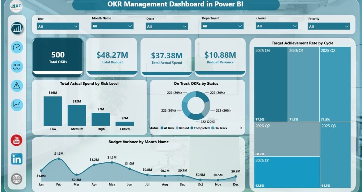
- Executive cards: Total OKRs, Total Budget, Total Actual Spend, and Budget Variance.
- OKR progress analysis: Review completed initiatives, achievement rate, status, and key result type completion.
- Budget tracking: Compare total budget, actual spend, budget variance, team spend, and cycle spend.
- Risk visibility: Track at-risk OKRs, confidence level, priority, and risk level in separate visuals.
- Owner and team review: Compare OKRs by owner and actual spend by team.
- Editable Power BI model: Customize pages, visuals, slicers, relationships, and measures in Power BI Desktop.
Dashboard Pages Explanation
1 – Overview Page
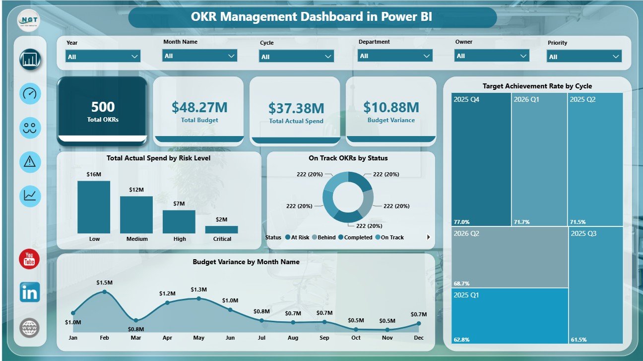
The Overview Page is designed for the first question in every OKR review: where are we now? The top cards show Total OKRs, Total Budget, Total Actual Spend, and Budget Variance, giving leadership a quick read on scope and financial position.
Total Actual Spend by Risk Level shows how much spend is attached to low, medium, or high-risk objectives. This helps teams see whether large spending areas are also carrying execution risk.
On Track OKRs by Status shows how OKRs are distributed by progress status. It is useful for identifying whether the current portfolio is mainly on track, delayed, completed, or at risk.
Budget Variance by Month Name shows the month-by-month gap between budget and actual spend. Finance teams can use this chart to spot months where spending moved away from plan.
Target Achievement Rate by Cycle compares achievement across OKR cycles. This helps leaders evaluate whether cycle discipline and execution quality are improving over time.
2 – Progress
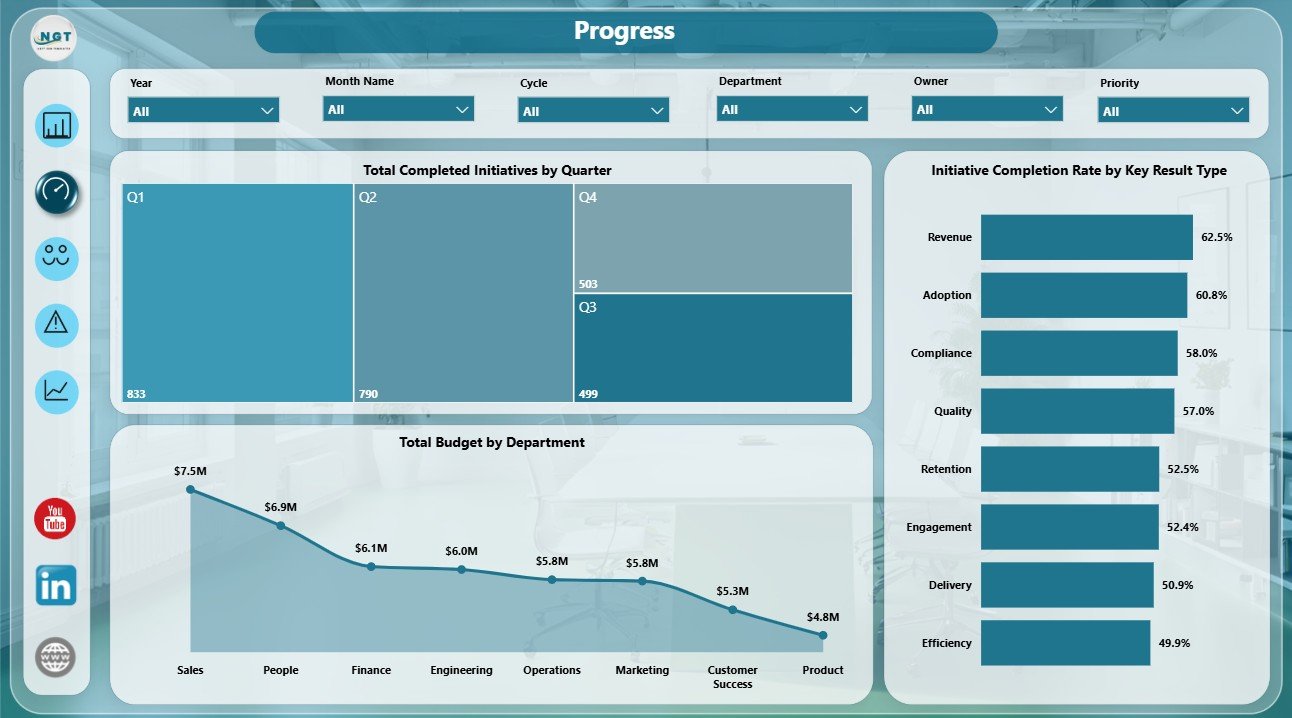
The Progress page focuses on initiative completion, department budget, and key result type performance. It is useful for PMO users, department heads, and strategy managers who need to understand execution movement beyond top-level totals.
Total Completed Initiatives by Quarter shows how many initiatives were completed in each quarter. This makes seasonal delivery patterns easier to review.
Total Budget by Department compares planned investment across departments. Leadership can use this chart to see whether the largest budget areas match the organization’s strategic priorities.
Initiative Completion Rate by Key Result Type shows which key result categories are being completed most consistently. This can reveal whether product, operations, financial, customer, or internal initiatives need additional support.
3 – Teams
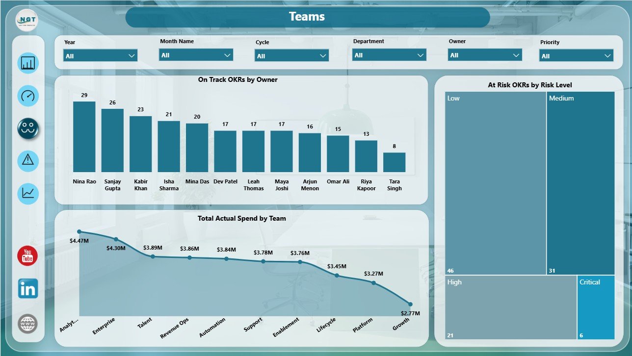
The Teams page connects OKR ownership with team-level spending and risk. This view is helpful when managers need to follow up with specific owners, teams, or departments instead of discussing OKR health only at a summary level.
On Track OKRs by Owner shows which owners have the most OKRs currently on track. It supports coaching conversations and makes execution ownership more visible.
Total Actual Spend by Team compares actual spend across teams. It helps finance partners and team leads review whether spend patterns are aligned with priorities.
At Risk OKRs by Risk Level highlights objectives that may require action before the next OKR review. This visual supports early intervention and clearer management follow-up.
4 – Risk
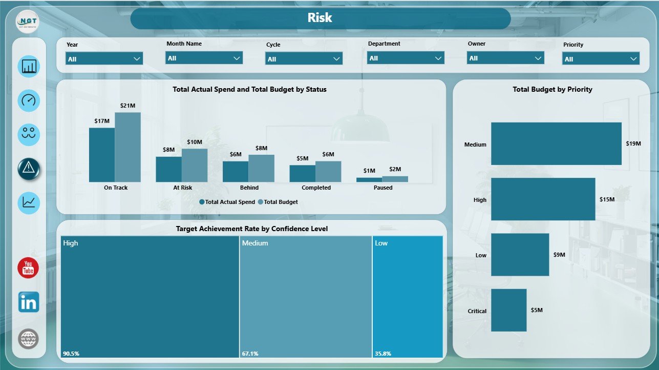
The Risk page helps teams understand whether budget, status, confidence, and priority are pointing in the same direction. It is especially useful before leadership reviews, steering committees, and quarterly planning conversations.
Total Actual Spend and Total Budget by Status compares planned and actual money by OKR status. This can reveal whether delayed or at-risk OKRs are still consuming meaningful resources.
Target Achievement Rate by Confidence Level checks whether confidence ratings are realistic. If high-confidence OKRs show low achievement, the team may need to revisit scoring habits.
Total Budget by Priority shows how budget is distributed across priority levels. Leaders can quickly see whether high-priority OKRs are receiving appropriate investment.
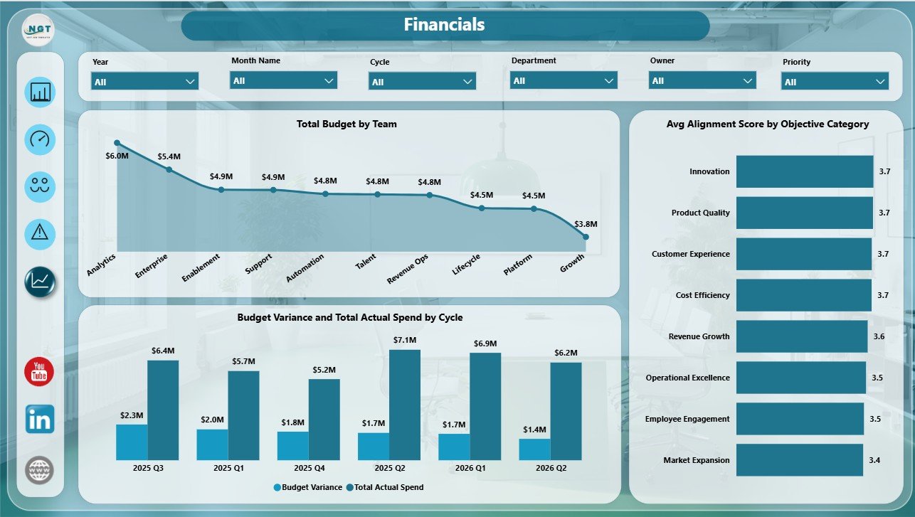
5 – Financials
The Financials page connects OKR execution with budget and spend. This is useful for finance teams, strategy offices, and executives who want OKR reporting to include cost and resource signals.
Total Budget by Team shows how planned budget is distributed across teams. This supports better review of whether team-level funding matches team-level objectives.
Budget Variance and Total Actual Spend by Cycle tracks financial performance across OKR cycles. It helps teams see whether spending discipline changes from one cycle to the next.
Avg Alignment Score by Objective Category shows which objective categories are most aligned with strategy. This makes it easier to connect financial review with strategic quality.
OKR Management Dashboard in Power BI vs. Tableau vs. Paid CRM/SaaS – Feature Comparison
| Feature | OKR Management Dashboard in Power BI | Tableau Alternative | Paid OKR SaaS |
|---|---|---|---|
| Cost | One-time template price | Requires Tableau licensing and build time | Recurring subscription |
| Platform | Power BI Desktop and Power BI Service | Tableau Desktop or Cloud | Vendor-hosted application |
| Setup time | Replace or connect data, then refresh | Build data model and visuals manually | Implementation and onboarding |
| Customizable fields | Editable Power BI model and visuals | Editable if built internally | Plan and vendor dependent |
| Real-time collaboration | Available through Power BI Service if licensed | Available through Tableau Cloud if licensed | Usually included |
| Workflow automation | Reporting-focused | Reporting-focused | May include check-ins and reminders |
| Year-1 cost at 5 users | Template price plus any sharing license | Often higher licensing and implementation cost | Often hundreds or thousands per year |
Who Should Use This Template
This dashboard is useful for strategy leaders, founders, CEOs, PMO teams, department heads, finance business partners, operations leaders, and consultants who need a Power BI view of OKR performance. It works best when your OKR data is already structured and you want a reporting layer for recurring review meetings.
Real-World Use Cases
Quarterly business review: A leadership team reviews achievement rate by cycle, budget variance, risk level, and team spending before setting the next quarter’s priorities.
PMO follow-up meeting: A PMO manager filters the Teams and Risk pages to identify owners with at-risk OKRs and plan follow-up actions.
Finance review: A finance partner uses the Financials page to compare budget, actual spend, and variance by team and cycle.
Advantages of OKR Management Dashboard in Power BI
- It gives a visual OKR review layer without building a report from scratch.
- It connects progress, owners, teams, risk, confidence, budget, and spend in one Power BI file.
- It can be customized in Power BI Desktop for your own OKR labels, colors, fields, and measures.
- It supports leadership review, finance review, and PMO follow-up from the same model.
Opportunities for Improvement
This template is not a complete OKR software platform. It does not provide automated check-in reminders, user permissions, employee comments, approval workflows, or HRIS integrations. Teams that need those features may still need a dedicated OKR application. The dashboard is best used as a reporting and analysis layer.
Best Practices
- Keep your OKR source data structured and consistent.
- Use standard status, risk, confidence, and priority labels.
- Review budget variance alongside achievement rate instead of looking at financials alone.
- Refresh the model before each leadership meeting.
- Use slicers to focus each discussion on the right cycle, team, owner, or department.
Explore Relevant Templates
You can get the OKR Management Dashboard in Power BI from NextGenTemplates. You may also like the OKR Management Dashboard in Excel and the Power BI Industry Dashboards Vol.2.
Frequently Asked Questions
What is included in the OKR Management Dashboard in Power BI?
It includes five report pages: Overview, Progress, Teams, Risk, and Financials. It also includes cards and charts for OKRs, budget, actual spend, budget variance, achievement rate, risk, owners, teams, departments, and cycles.
Can I use my own data?
Yes. Replace the sample source with your own structured OKR data and refresh the Power BI model.
Do I need Power BI Desktop?
Yes. You need Power BI Desktop to open and edit the PBIX file. Power BI Desktop is available from Microsoft.
Can I customize the dashboard pages?
Yes. You can edit visuals, measures, relationships, slicers, colors, and page layouts in Power BI Desktop.
Is this an OKR workflow tool?
No. It is a dashboard and reporting template. It does not replace a full OKR platform with reminders, comments, permissions, or approvals.
About the Author
Built by PK – Microsoft Certified Professional with 15+ years of Excel, Google Sheets, and Power BI experience. Founder of NextGenTemplates, reaching 300K+ subscribers across YouTube channels. Every template is hand-built and tested before release.
Conclusion
The OKR Management Dashboard in Power BI is built for teams that want a clearer way to review objectives, budget, ownership, risk, and progress. Instead of reading OKR updates from several scattered files, leadership can use one Power BI dashboard to review the most important signals by cycle, team, owner, department, and financial view.
For more tutorials and dashboard examples, visit PK An Excel Expert on YouTube.