Online Parenting Communities Dashboard in Power BI is built for teams that manage parenting groups, family-support communities, online parent education programs, and membership-based support networks. These teams often track revenue, cost, posts, answered questions, retention, satisfaction, acquisition, risk, moderation, and regional performance in separate exports. This Power BI dashboard brings those measures into one report with 5 report pages, 5 KPI cards, multiple slicers, and 19 analysis visuals.
The goal is simple: help community teams move from scattered spreadsheets and platform exports to a repeatable Power BI reporting file. Open the .pbix file in Power BI Desktop, connect or replace the sample source, refresh the report, and use slicers to review performance by topic category, platform, membership tier, region, child age group, engagement type, moderator, month, and other available fields.
Key Features of Online Parenting Communities Dashboard in Power BI
- 5 Power BI report pages: Overview, Engagement, Membership, Moderation, and Regional.
- 5 high-level cards: Total Revenue, Total Posts, Net Contribution, Total Cost, and Answered Questions.
- 19 chart visuals: Analyze revenue, cost, posts, communities, members, retention, satisfaction, contribution, and platform performance.
- Multiple slicers: Filter the dashboard quickly during community reviews and leadership meetings.
- Power BI Desktop workflow: Edit visuals, measures, fields, colors, labels, pages, and data connections.
- Membership and engagement reporting: Review acquisition channel, risk level, membership tier, child age group, posts, and answered questions.
- Moderation and regional views: Compare satisfaction, moderator performance, cost, revenue, retention, and contribution across regions and platforms.
Dashboard Pages Explanation
1. Overview Page
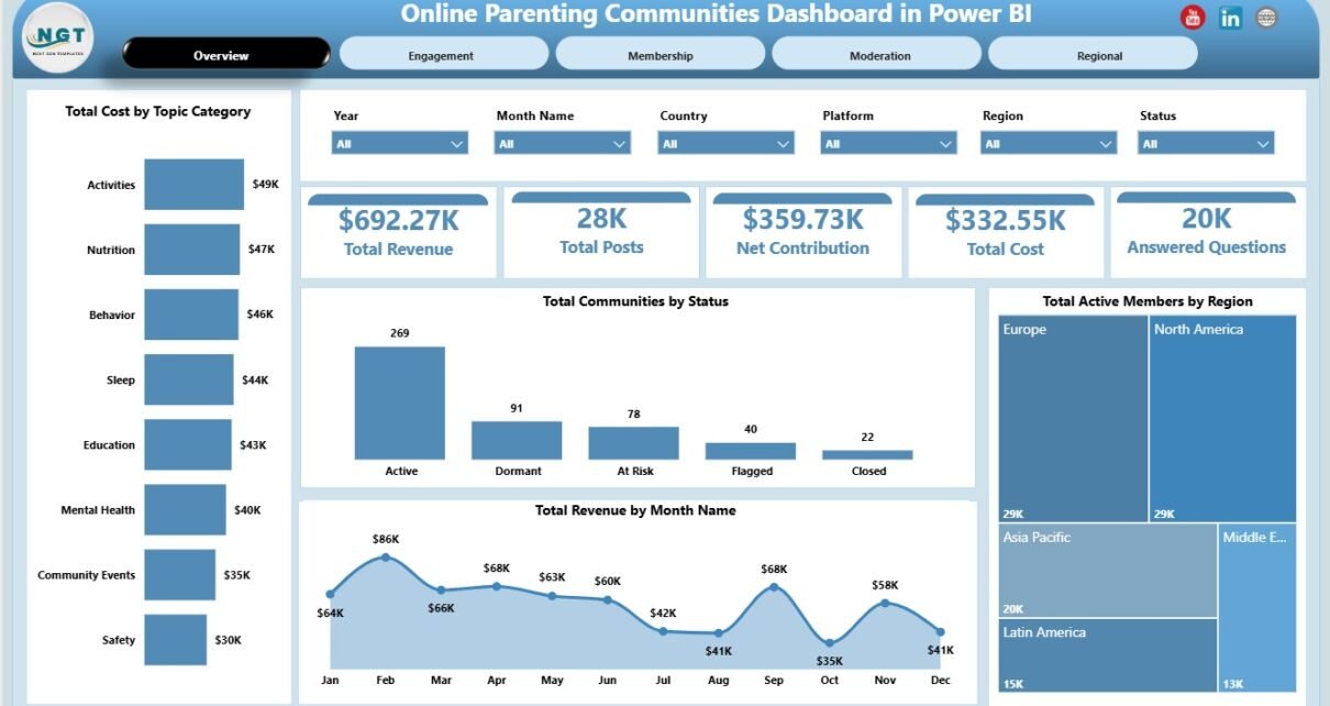
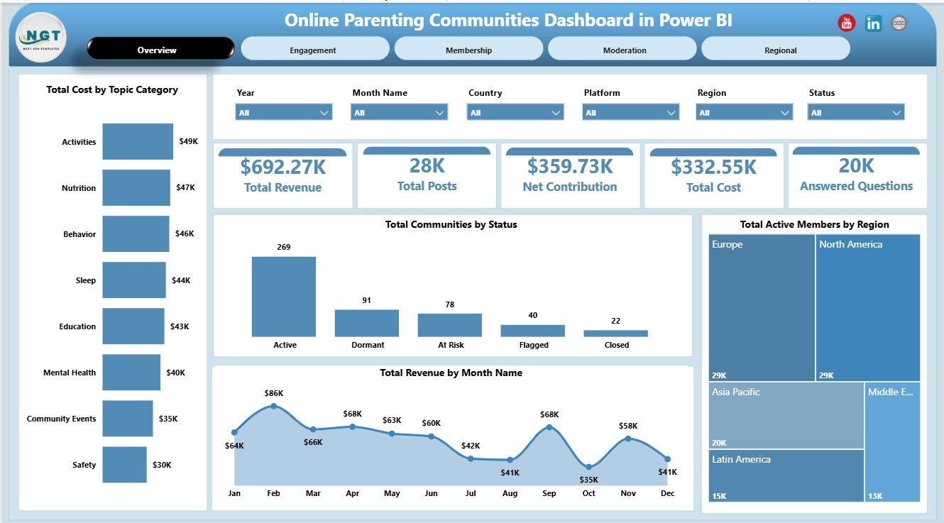
The Overview page provides the executive summary of the report. At the top, the cards show Total Revenue, Total Posts, Net Contribution, Total Cost, and Answered Questions so leaders can quickly understand community health.
Total Cost by Topic Category: This chart shows which parenting topic categories require the most operating spend. It helps teams review content investment, support effort, moderation workload, and platform costs by topic.
Total Communities by Status: This visual groups communities by status. It helps managers see whether the overall portfolio is active, inactive, pending, or at risk.
Total Revenue by Month Name: This trend shows revenue movement by month. It helps teams identify growth periods, seasonal changes, campaign impact, and weaker months.
Total Active Members by Region: This chart compares active member volume across regions. It helps identify strong geographies and regions where engagement support may be needed.
2. Engagement
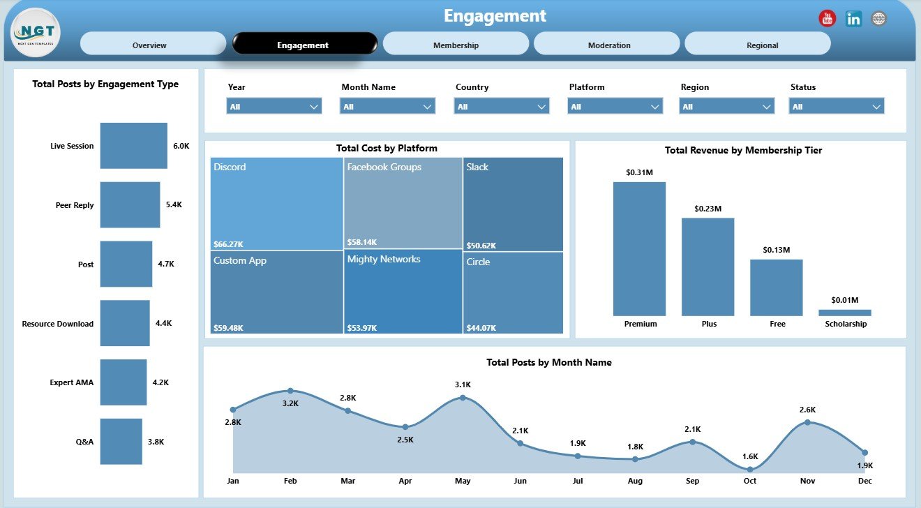
The Engagement page focuses on participation, platform cost, tier revenue, and month-wise post volume. It is useful for community managers who need to understand how parents are interacting inside the community.
Total Posts by Engagement Type: This chart compares posting activity by engagement type. It helps reveal whether parents are asking questions, answering others, sharing experiences, or participating in discussions.
Total Cost by Platform: This visual compares cost across platforms. It helps identify where hosting, tools, ads, content, or operations are consuming the most budget.
Total Revenue by Membership Tier: This chart compares revenue by membership tier. It supports decisions about pricing, tier benefits, upgrades, and membership value.
Total Posts by Month Name: This chart tracks monthly posting activity. It helps teams spot engagement spikes, quiet months, and the effect of events, campaigns, or seasonal parenting topics.
3. Membership
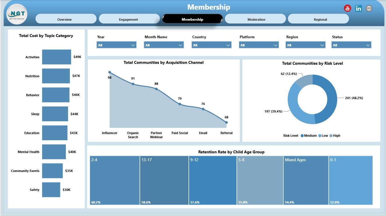
The Membership page is built for understanding growth, acquisition, retention, and risk. It helps membership leads compare where communities are coming from and which member groups remain engaged.
Total Cost by Topic Category: This chart shows topic-level cost from a membership angle. It helps teams understand which parenting themes require more support, moderation, or content resources.
Total Communities by Acquisition Channel: This visual compares communities by acquisition channel. It helps growth teams see which sources bring more communities into the program.
Total Communities by Risk Level: This chart groups communities by risk level. It helps managers prioritize follow-up before engagement or retention declines.
Retention Rate by Child Age Group: This chart compares retention across child age groups. It helps identify life-stage segments where parents stay engaged and where extra support may improve retention.
4. Moderation
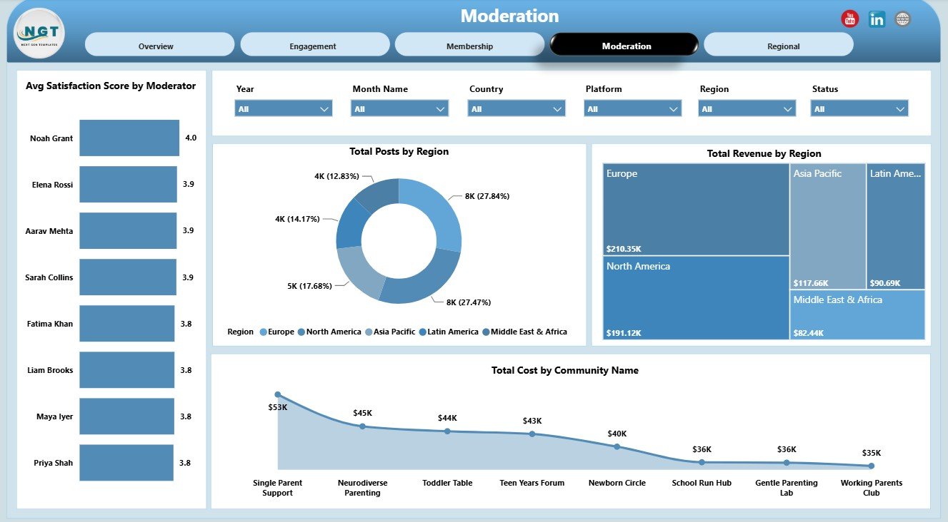
The Moderation page connects activity, revenue, cost, and satisfaction to moderation decisions. It supports coaching, staffing, and community-level cost review.
Avg Satisfaction Score by Moderator: This chart compares satisfaction by moderator. It supports quality review and helps managers identify coaching or workload issues.
Total Posts by Region: This chart compares post volume by region. It helps moderation leads understand where activity is highest and where coverage may need adjustment.
Total Revenue by Region: This chart shows revenue by region. It helps compare commercial performance with member activity and moderation demand.
Total Cost by Community Name: This visual identifies communities with higher operating cost. It helps teams investigate whether cost is linked to size, topic complexity, platform use, or moderation intensity.
5. Regional
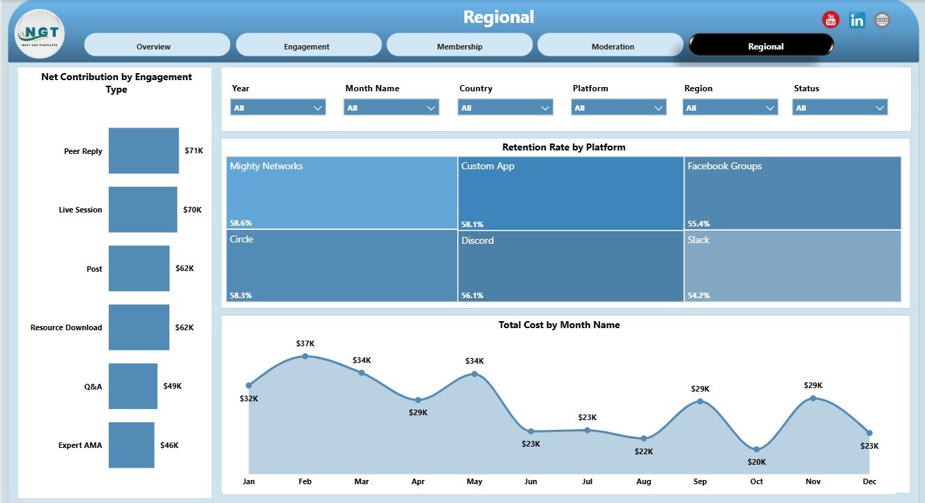
The Regional page focuses on contribution, retention, and cost by engagement type, platform, and month. It is helpful for leadership reviews where geography and channel performance matter.
Net Contribution by Engagement Type: This chart compares contribution after cost by engagement type. It helps identify which types of interaction create stronger financial value.
Retention Rate by Platform: This chart compares retention across platforms. It helps teams understand whether certain platforms keep parenting communities more engaged.
Total Cost by Month Name: This chart shows monthly cost movement. It helps budget owners spot cost spikes, seasonal spending, and months that need deeper review.
Online Parenting Communities Dashboard in Power BI vs. Tableau vs. Paid Community SaaS – Feature Comparison
| Feature | This Power BI Dashboard | Tableau Alternative | Paid Community SaaS |
|---|---|---|---|
| Cost | One-time template purchase | License plus dashboard build time | Monthly or annual subscription |
| Platform | Power BI Desktop | Tableau Desktop or Cloud | Vendor cloud platform |
| Setup time | Open .pbix, connect data, refresh | Build or customize workbook | Implementation and onboarding |
| Real-time team collaboration | Available after Power BI Service publishing | Available through Tableau Cloud | Usually included by plan |
| Mobile access | Available after publishing | Available after publishing | Usually included |
| Customizable fields | Editable model, visuals, pages, and measures | Editable if you own the workbook | Depends on vendor settings |
| Share with link | Use Power BI Service sharing | Use Tableau sharing | Login controlled |
| Year-1 cost at 5 users | Template cost plus Microsoft licensing if needed | Usually much higher | Often hundreds or thousands |
| Parenting-specific reporting | Built around parenting communities | Requires custom dashboard design | Depends on export access and plan |
Who Should Use This Template
This dashboard is a good fit for parenting community managers, family support organizations, online education programs, membership teams, community moderation leads, parent coaching businesses, content teams, and analysts who already use Power BI or want to start reporting in Power BI Desktop.
It works best when your source data can be exported or connected in a structured format. It is not a replacement for a live community platform, payment system, CRM, messaging app, or automated moderation tool.
Real-World Use Cases
Weekly community review: A community manager filters the Overview and Engagement pages to review revenue, posts, answered questions, active members, and topic cost before a weekly meeting.
Membership planning: A membership lead uses the Membership page to compare acquisition channels, risk levels, retention by child age group, and revenue by membership tier.
Moderation planning: A moderation lead reviews satisfaction by moderator, posts by region, and cost by community to decide where staffing or coaching support is needed.
Advantages of Online Parenting Communities Dashboard in Power BI
- It combines financial, engagement, membership, moderation, and regional views in one Power BI report.
- It gives leadership fast KPI visibility through cards and slicers.
- It can be edited in Power BI Desktop instead of being locked inside a SaaS product.
- It supports segment analysis across platforms, tiers, regions, topics, moderators, and child age groups.
- It gives teams a repeatable reporting structure for weekly, monthly, or quarterly community reviews.
Opportunities for Improvement
The dashboard depends on clean source data, consistent fields, and a refresh workflow. It does not automatically connect to every community platform, and it does not replace a live analytics API. Teams with real-time reporting requirements may want a direct database connection, Power BI Service refresh schedule, or custom connector. Microsoft explains Power BI Desktop as the tool for connecting to data, shaping it, and creating reports here: What is Power BI Desktop?
Best Practices
- Keep naming consistent for regions, platforms, topic categories, tiers, moderators, and community statuses.
- Validate date, revenue, cost, member count, post count, and satisfaction fields before refreshing.
- Use slicers during review meetings instead of making separate copies of the report.
- Publish to Power BI Service only after validating the refreshed numbers in Power BI Desktop.
- Save a backup copy before changing measures, model relationships, or page layouts.
Explore Relevant Templates
- Online Parenting Communities Dashboard in Power BI
- Online Parenting Communities Dashboard in Excel
- Online Fitness Communities Dashboard in Power BI
- Browse Power BI Dashboard Templates
Frequently Asked Questions
What is included in the Online Parenting Communities Dashboard in Power BI?
The report includes Overview, Engagement, Membership, Moderation, and Regional pages, plus KPI cards, slicers, and chart visuals for community performance analysis.
Can I use my own data?
Yes. Open the .pbix file in Power BI Desktop, replace or connect your own source data, and refresh the report.
Do I need Power BI Desktop?
Yes. Power BI Desktop is used to open, refresh, customize, and save the file.
Can this work for multiple parenting communities?
Yes. The report is designed to compare multiple communities by status, region, platform, topic, moderator, membership tier, acquisition channel, and other dimensions.
Can I customize the charts?
Yes. You can edit visuals, labels, colors, fields, measures, slicers, and pages in Power BI Desktop.
Does this replace community management software?
No. It is a reporting dashboard for prepared community data, not a member portal, chat system, payment gateway, CRM, or moderation automation tool.
About the Author
Built by PK – Microsoft Certified Professional with 15+ years of Excel, Google Sheets, and Power BI experience. Founder of NextGenTemplates, reaching 300K+ subscribers across YouTube channels. Every template is hand-built and tested before release.
Conclusion
The Online Parenting Communities Dashboard in Power BI gives parenting community teams a clear way to review revenue, cost, posts, net contribution, answered questions, membership performance, moderation quality, retention, and regional trends from one report. Use the slicers to move from executive summary to focused analysis and use Power BI Desktop to adapt the report to your own data model.
For more Power BI, Excel, and dashboard tutorials, visit PK: An Excel Expert on YouTube.