The Tutoring Business Dashboard in Power BI is a $17.99 one-time analytics file that tracks 5 core KPIs — Total Sessions, Total Revenue, Net Revenue, Total Materials Fee, and Avg Student Rating — across 5 interactive report pages with 15+ pre-built visuals and cross-page slicers. Built in Power BI Desktop, it gives tutoring academy owners, solo tutors, and multi-location coaching centers a full view of revenue, tutor payments, and student engagement without per-user SaaS fees. Setup takes under 10 minutes.
🌍 Used by 8,400+ teams in 40+ countries. Instant download. One-time payment. No subscription.

Introduction
Tutoring businesses live or die on three numbers: how many sessions actually get delivered, how much of the revenue survives tutor payouts, and whether students keep coming back. Most academy owners try to track this in a spreadsheet — and most of them eventually lose control of it. The Tutoring Business Dashboard in Power BI solves that by pulling all session-level data into one .pbix file and turning it into 5 focused report pages that a non-analyst can read in under a minute.
This blog post walks through every page of the dashboard, what each chart answers, and who should (and shouldn’t) use it. If you prefer Excel, the same template is available as a Tutoring Business Dashboard in Excel.
Key Features of Tutoring Business Dashboard in Power BI
The dashboard is built around four design principles: KPIs at the top, visuals below, slicers on the side, and every page filterable independently. Below are the features that matter most for running a tutoring business.
📊 5 focused pages, not 20 — Overview, Subject Analysis, Tutor Performance, Revenue Insights, and Student Engagement. Each page answers a specific business question instead of dumping every chart on one screen.
💰 5 executive KPI cards on the Overview page: Total Sessions, Total Revenue, Net Revenue, Total Materials Fee, and Avg Student Rating. Net Revenue is calculated after tutor payment and materials fees, so it reflects real money the business keeps.
🎯 Tutor economics built-in — Total Revenue vs Total Tutor Payment is shown side by side by subject and by tutor name. That’s the single most useful view for deciding who to keep, who to coach, and which subjects to promote.
📈 Completion Rate visual — session completion rate is the strongest leading indicator of student churn. A falling completion rate shows up weeks before revenue drops, and this dashboard surfaces it on the Overview page.
🎧 Referral Source profitability — Net Revenue by Referral Source and Profit Margin by Referral Source tell you whether Google Ads, word-of-mouth, or school partnerships are actually worth reinvesting in.
🎚️ Consistent slicers on every page — Tutor, Subject, Month, Grade Level, Session Type, Payment Status. Filters persist within each page so drill-downs stay focused.
Dashboard Pages Explanation
This section walks through each of the 5 pages in order, starting with the Overview.
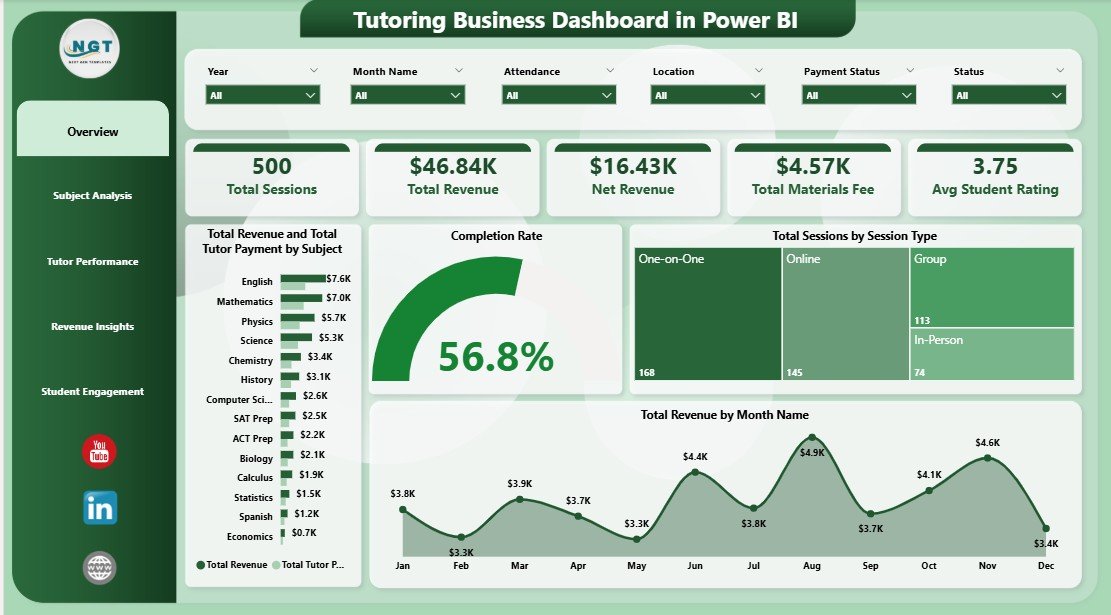
Page 1 — Overview
The Overview is designed for a 30-second glance. At the top sit 5 KPI cards — Total Sessions, Total Revenue, Net Revenue, Total Materials Fee, and Avg Student Rating — showing the current state of the business across whatever filter range is applied. Below the cards sit four visuals: Total Revenue and Total Tutor Payment by Subject (to see margin per subject), Completion Rate (to spot churn signals early), Total Sessions by Session Type (1-on-1 vs group vs online), and Total Revenue by Month Name (seasonality trend). A slicer panel covers Tutor, Subject, Month, Grade, Session Type, and Payment Status.
Overview — KPI Cards and Monthly Revenue Trend
Page 2 — Subject Analysis
This page answers one core question: which subjects and which tutors are actually making money? Three visuals work together — Total Revenue and Total Tutor Payment by Tutor Name (who generates revenue net of payout), Total Revenue by Grade Level (where demand sits), and Avg Student Rating by Subject (which subjects deliver quality). Use this page when you’re redesigning your subject offering or promoting top tutors.
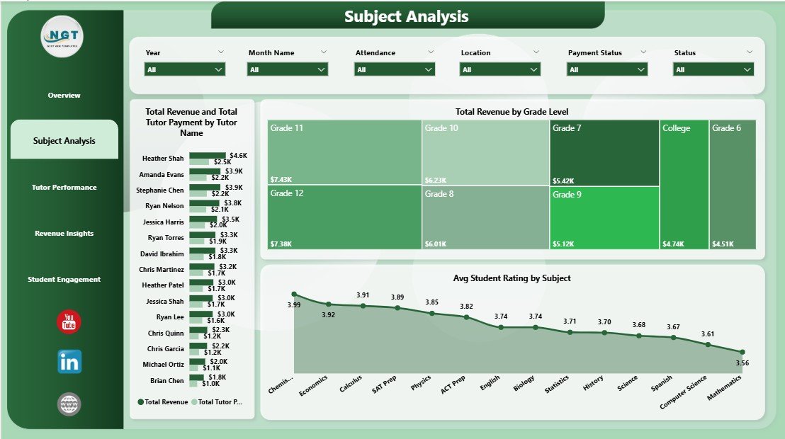
Subject Analysis — Revenue and Tutor Payment by Tutor
Page 3 — Tutor Performance
Built for monthly tutor reviews and payroll. Total Hours by Tutor Name ranks workload, Avg Student Rating by Tutor Name surfaces quality outliers, and Net Revenue by Month Name shows how earnings (after tutor payment) trend over time. Tutors with high hours plus falling ratings usually need a check-in before burnout turns into a resignation.
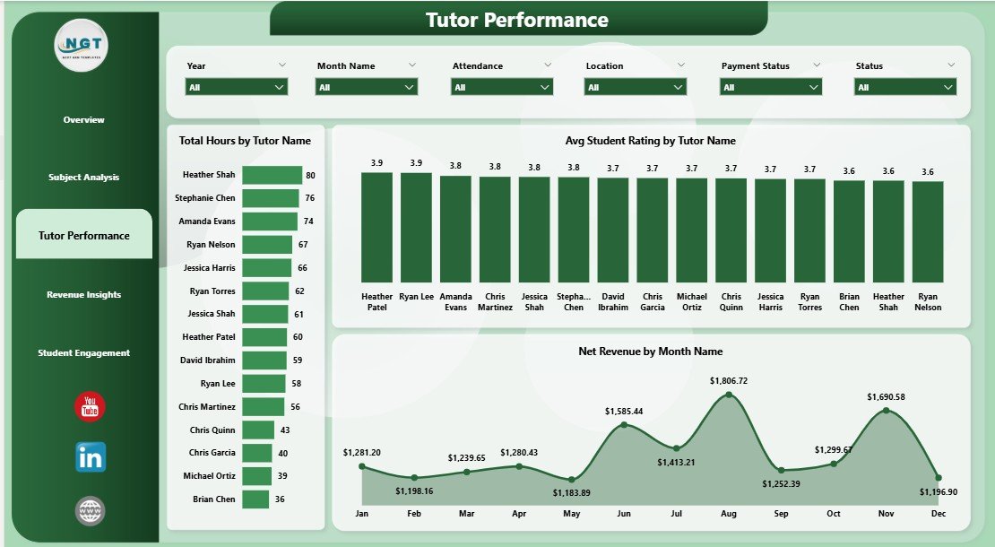
Tutor Performance — Hours, Rating and Net Revenue
Page 4 — Revenue Insights
Three visuals that separate where money is earned, where it’s stuck, and which channels are profitable. Total Sessions and Completed Sessions by Grade Level shows where demand is converting into delivery. Net Revenue by Referral Source highlights which acquisition channels are worth reinvesting in. Total Sessions by Payment Status flags unpaid or partially paid sessions — real cash that’s still sitting on the books.
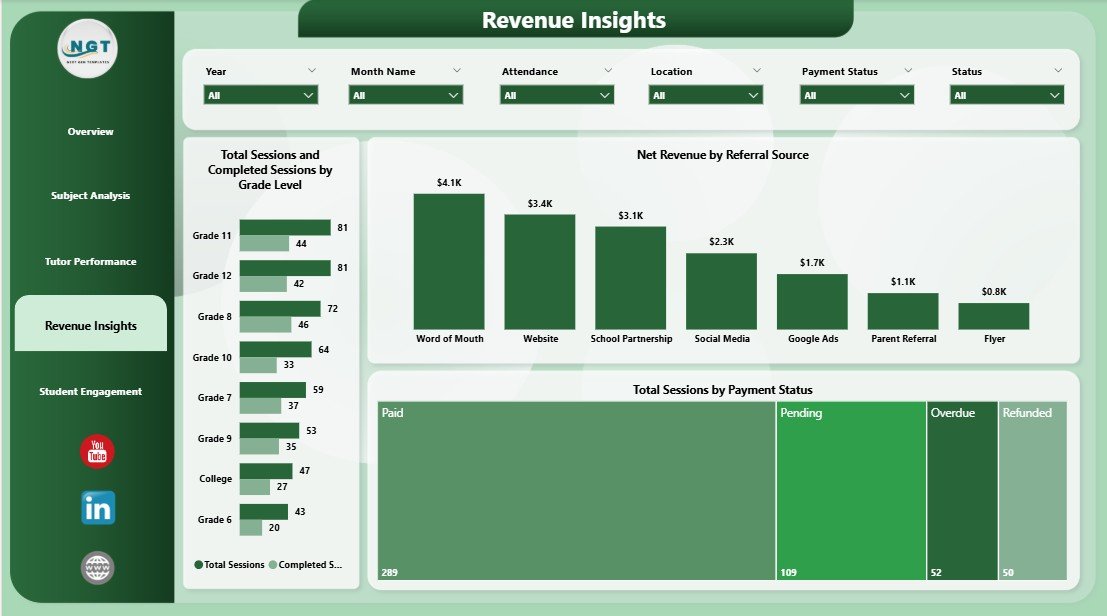
Revenue Insights — Grade Level, Referral Source and Payment Status
Page 5 — Student Engagement
Where the business meets the student experience. Total Sessions by Attendance reveals how many booked sessions students actually show up to. Profit Margin by Referral Source compares channel quality beyond raw revenue (a cheap channel with thin margins may be worse than an expensive channel with strong ones). Avg Student Rating by Location helps multi-location owners catch service-quality gaps before they leak into reviews.
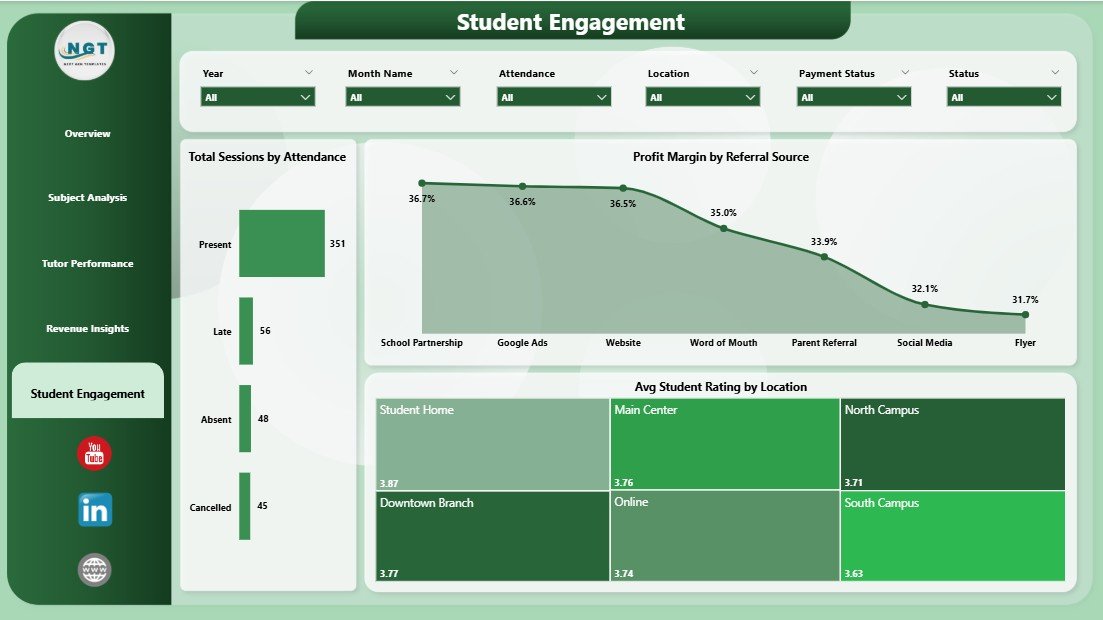
Student Engagement — Attendance, Profit Margin and Rating by Location
Tutoring Business Dashboard in Power BI vs. Tableau/Qlik vs. Paid Tutoring SaaS — Feature Comparison
| Feature | Tutoring Business Dashboard in Power BI | Tableau / Qlik Equivalent | TutorCruncher / Teachworks |
|---|---|---|---|
| Cost | $17.99 one-time | $15-75 / user / month | $27-149 / month |
| Platform | Power BI Desktop (free) | Paid BI platform | Closed SaaS |
| Setup time | Under 10 minutes | 3-7 days | 1-2 weeks onboarding |
| Fully customizable fields | ✅ Yes | ✅ Yes | ❌ Limited |
| Own your data locally | ✅ Yes (.pbix file) | ⚠️ Partly | ❌ Vendor-hosted |
| Tutor payment tracking | ✅ Built-in | Manual build | ✅ Yes (priced up) |
| Rating + attendance views | ✅ Built-in | Manual build | Partial |
| Year-1 cost at 3 users | $17.99 total | ~$540-2,700 | ~$972-5,364 |
For tutoring founders who want revenue, tutor, and student analytics without paying per-user SaaS fees, the Tutoring Business Dashboard in Power BI sits in the sweet spot.
Who Should Use This Template
Perfect for:
- Solo tutors and academies with 2-25 tutors who want revenue, payout, and rating analytics in one place
- Tutoring academy owners running a mix of in-person and online sessions across multiple subjects and grade levels
- Franchise or multi-location coaching centers comparing profitability by location, tutor, and referral source
- Finance or operations leads calculating monthly tutor payouts and net revenue from raw session data
Not a fit if:
- You run a large K-12 district needing SIS integration, parent portals, or formal report cards
- You don’t use Power BI Desktop and don’t want to install it (it’s free from Microsoft Learn)
- You need built-in scheduling, online payments, or student messaging — this is an analytics dashboard, not a tutoring LMS
Real-World Use Cases
Priya runs a 12-tutor after-school academy in Pune. Before the dashboard, she maintained a Google Sheet that slowly grew into 14 tabs. Now she uses the Tutoring Business Dashboard in Power BI every Monday morning. The Overview page tells her how last week’s revenue compares to the monthly run-rate, the Tutor Performance page tells her which tutors logged the most hours, and the Revenue Insights page tells her which grade levels have unpaid invoices. Her Monday meeting went from 90 minutes to 25.
Marcus runs an online SAT prep business with 4 contract tutors across 3 US states. He reviews the Revenue Insights page each month to watch Net Revenue by Referral Source. When he noticed that Facebook Ads delivered similar revenue to referrals but at half the profit margin, he shifted $2,000 of monthly ad spend to a school partnership program. He found that number because the dashboard surfaced it — not because he built a custom report.
Lena owns a small tutoring franchise with 3 locations. Her previous dashboard tracked only revenue, so she couldn’t tell why her North location had 30% more sessions but lower ratings. The Student Engagement page showed Avg Student Rating by Location: the North location was overloading two popular tutors, and ratings were suffering. Lena hired a third tutor in that region, and within 6 weeks the rating gap closed.
Advantages of Tutoring Business Dashboard in Power BI
The biggest advantage is cost structure: $17.99 one-time replaces $27-149/month of SaaS spend, which is $324-1,788 saved in the first year alone. The second advantage is data ownership — the .pbix file lives on your machine, so your session data never leaves your control. Third, the file is fully unlocked, so a mid-level Power BI user can add DAX measures, connect to SQL Server or Excel instead of the sample dataset, or build additional pages. Fourth, and most underrated, is speed to insight: under 10 minutes from download to a working dashboard means you use it the same day instead of letting it sit in a Downloads folder for a month.
Opportunities for Improvement
The template has real trade-offs worth naming. It doesn’t include scheduling, invoicing, or automated reminders — those belong in a tool like TutorCruncher. It also assumes your session data is already clean; if you track sessions inconsistently across Google Calendar, WhatsApp, and memory, you’ll spend time normalizing the data before the dashboard is useful. Finally, the visuals use default Power BI colors and fonts; branding the dashboard for a client-facing presentation requires a light theme customization. None of these are deal-breakers, but they’re honest limits.
Best Practices
A few habits make the Tutoring Business Dashboard in Power BI dramatically more useful. First, log every session on the day it happens — even rough data beats no data. Second, refresh the dashboard weekly, not monthly; weekly refresh gives you 4 correction opportunities instead of 1. Third, always look at Net Revenue, not Total Revenue — gross numbers hide tutor payout problems. Fourth, use the Referral Source filter to compare channels by profit margin instead of by revenue. Fifth, review the Tutor Performance page during monthly 1-on-1s with each tutor; sharing the data reduces friction around payout conversations.
Explore Relevant Templates
Here are other templates worth pairing with the Tutoring Business Dashboard in Power BI:
- Tutoring Business Dashboard in Excel — same KPIs and layout, Excel-based workflow. Good for teams that prefer Excel over Power BI Desktop.
- Coaching & Tutoring Dashboard in Power BI — a related variant for coaching businesses.
- Teacher Training Institutes KPI Dashboard in Excel — for training center owners tracking trainer and course KPIs.
- Educational NGOs KPI Dashboard in Excel — for grant-funded education programs tracking impact KPIs.
- Driving School Dashboard in Excel — adjacent coaching-business dashboard, similar data structure.
Browse all Power BI Dashboards or the full Power BI tutorial category.
Frequently Asked Questions
What KPIs does the Tutoring Business Dashboard in Power BI track?
The Tutoring Business Dashboard in Power BI tracks 5 core KPIs on the Overview page — Total Sessions, Total Revenue, Net Revenue, Total Materials Fee, and Avg Student Rating — plus 15+ supporting visuals including Completion Rate, Total Hours by Tutor, Net Revenue by Month, and Profit Margin by Referral Source across 4 analysis pages.
How long does setup take?
Setup for the Tutoring Business Dashboard in Power BI takes under 10 minutes. Open the .pbix file in Power BI Desktop, point the data source to your own session log, click Refresh, and every card, chart, and slicer updates automatically. No DAX writing is required for basic use.
How does this compare to TutorCruncher or Teachworks?
TutorCruncher and Teachworks are full-featured SaaS platforms starting around $27-149 per month. The Tutoring Business Dashboard in Power BI is a $17.99 one-time analytics file that sits on top of your existing data. If you already use a simpler tool or just spreadsheets, this dashboard delivers BI-grade reporting without monthly fees.
Do I need the paid version of Power BI?
No. The Tutoring Business Dashboard in Power BI works fully in Power BI Desktop, which is free from Microsoft. You only need Power BI Pro if you want to publish and share reports via Power BI Service with other users. Analysis on your own machine is 100% free.
Can I edit the visuals and add my own measures?
Yes. The Tutoring Business Dashboard in Power BI is fully unlocked — you can edit any visual, add DAX measures, change colors, add new pages, or connect to SQL, Excel, or CSV sources. The file is yours to customize once you download it.
Is the dashboard also available for Excel?
Yes. The Tutoring Business Dashboard in Excel is available as a cross-platform equivalent if you prefer Excel over Power BI. Both files are priced identically and cover the same set of KPIs and pages.
Will the dashboard update as I add new session data?
Yes. The Tutoring Business Dashboard in Power BI refreshes all KPI cards, visuals, and slicers automatically when you click Refresh in Power BI Desktop. As long as the new rows match the column headers in the sample data, the dashboard will include them with no manual rebuild.
About the Author
Built by PK — Microsoft Certified Professional with 15+ years of Excel, Google Sheets, and Power BI experience. Founder of NextGenTemplates, reaching 300K+ subscribers across YouTube channels. Every template is hand-built and tested before release.
Conclusion
The Tutoring Business Dashboard in Power BI replaces 14 tabs of spreadsheets, a monthly SaaS subscription, or a custom BI build with a single $17.99 file that works the day you download it. If you run a tutoring business and want one place to see revenue, tutor payouts, student ratings, and referral channel profitability — this is the fastest way to get there.
👉 Click here to Purchase the Tutoring Business Dashboard in Power BI
✅ Instant download · One-time payment · No subscription
📺 Watch step-by-step tutorials on our YouTube channel: Youtube.com/@PK-AnExcelExpert
📅 Last updated: April 2026