Leather Processing Dashboard in Excel helps leather manufacturers turn daily production, quality, costing, supplier, facility, and customer records into clear management insight. Instead of reviewing scattered sheets, this workbook brings 7 worksheet tabs, 5 high-level KPI cards, 19 charts, and multiple slicers into one ready-to-use Excel dashboard. For leather processing teams, even a small defect rate, cost increase, or facility delay can reduce margin. This dashboard gives managers a practical way to monitor revenue, net profit, output area, cost, defects, quality score, completion percentage, and supplier performance in one place.
Click here to buy Leather Processing Dashboard in Excel
Key Features of Leather Processing Dashboard in Excel
- 7 worksheet tabs covering Overview, Production, Quality, Costing, Operations, Data, and Support.
- 5 executive KPI cards for Total Revenue, Net Profit, Total Output Area, Total Records, and Avg. Quality Score.
- 19 built-in charts for revenue, profit, cost, output area, defects, completion, quality, supplier, customer, process stage, leather type, grade, and facility analysis.
- Multiple slicers to filter the dashboard quickly and review specific segments.
- Editable Data sheet where users can replace the sample data in the same format.
- Support sheet with pivot tables that refresh the full dashboard dynamically.
Dashboard Pages Explanation
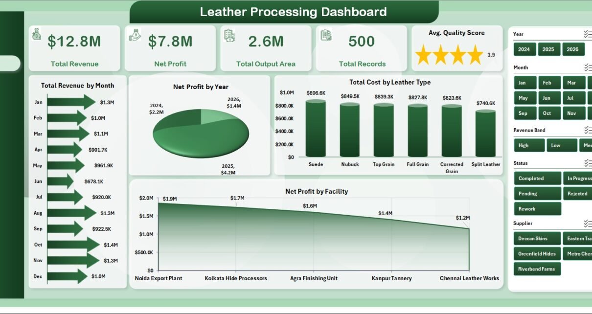
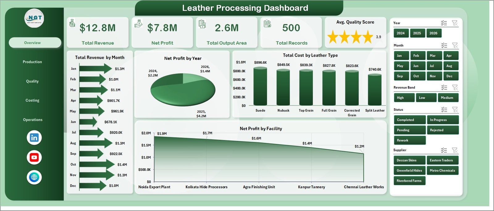
1 – Overview Page
The Overview Page is the main executive view. At the top, it shows the most important cards: Total Revenue, Net Profit, Total Output Area, Total Records, and Avg. Quality Score. These cards give decision-makers a quick picture of business performance before they move into detailed analysis.
Total Revenue by Month: This chart shows monthly revenue movement. It helps identify strong sales months, weak periods, and seasonal demand patterns.
Net Profit by Year: This chart compares annual profit performance. It helps leadership understand whether leather processing profitability is improving over time.
Total Cost by Leather Type: This chart breaks down cost by leather type. It helps costing teams identify which leather categories are consuming the most resources.
Net Profit by Facility: This chart compares facility-level profit. It helps management find high-performing plants and locations that may need operational improvement.
Leather Processing Dashboard in Excel
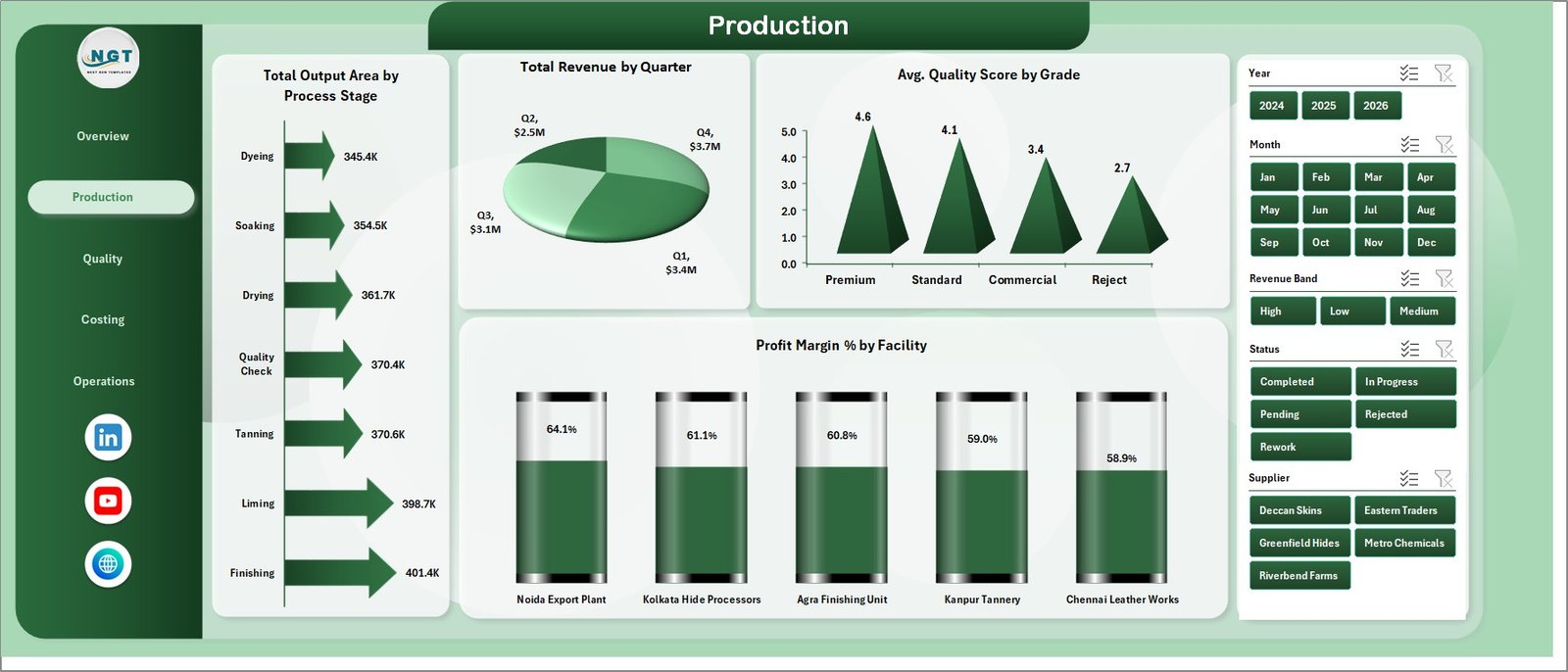
2 – Production
The Production sheet focuses on output, revenue, quality score, and margin. It is useful for production heads who need a focused view of process stages, quarters, grades, and facilities.
Total Output Area by Process Stage: This chart shows where output area is generated across the leather processing flow. It helps teams see which stages are producing volume and where bottlenecks may exist.
Total Revenue by Quarter: This chart groups revenue by quarter. It helps managers compare quarterly performance and plan capacity, labor, and material requirements.
Avg. Quality Score by Grade: This chart compares average quality by grade. It helps quality teams see whether higher grades are consistently meeting expected standards.
Profit Margin % by Facility: This chart compares margin across facilities. It helps leaders understand which facilities are turning production activity into stronger profitability.
Production
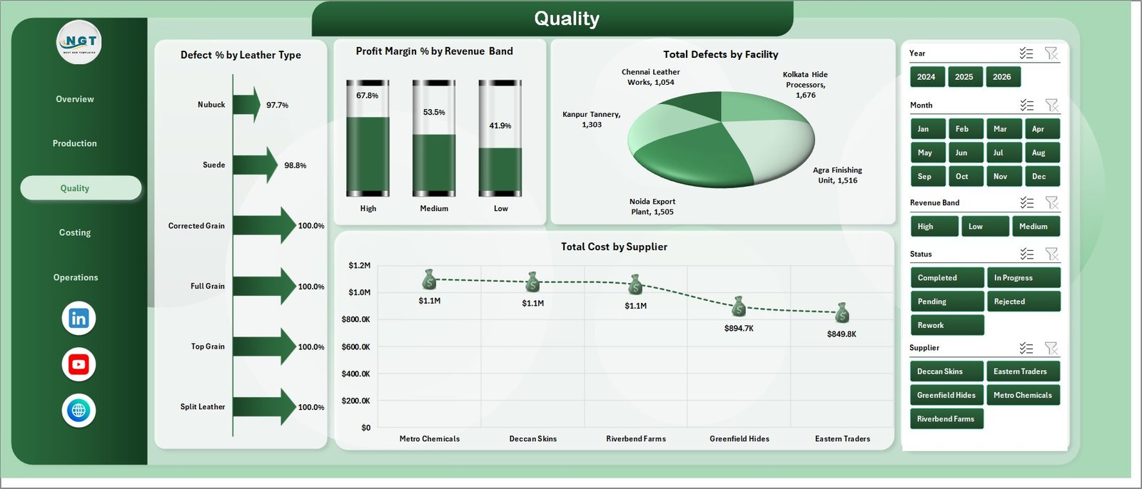
3 – Quality
The Quality sheet connects defects, leather type, suppliers, revenue bands, and facility performance. It gives quality and procurement teams a useful place to review problems that affect both finished quality and profitability.
Defect % by Leather Type: This chart compares defect percentage across leather types. It helps identify material categories that need better inspection, process control, or supplier follow-up.
Profit Margin % by Revenue Band: This chart shows margin performance across revenue bands. It helps determine whether larger or smaller orders are generating better profit percentages.
Total Defects by Facility: This chart compares defect counts by facility. It helps quality leaders identify locations where corrective action may be required.
Total Cost by Supplier: This chart shows supplier-level cost contribution. It helps procurement teams understand supplier impact on total cost.
Quality
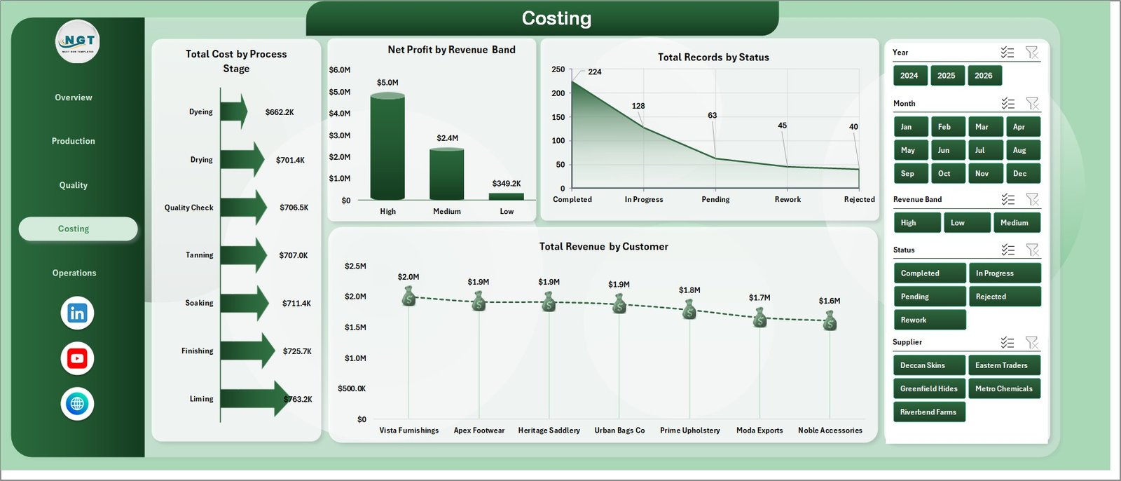
4 – Costing
The Costing sheet supports finance and operations review. It highlights process-stage cost, net profit by revenue band, status counts, and customer revenue contribution.
Total Cost by Process Stage: This chart shows cost distribution across processing stages. It helps identify high-cost stages where process improvement may create savings.
Net Profit by Revenue Band: This chart compares profit across revenue ranges. It helps finance teams understand which order values create stronger net profit.
Total Records by Status: This chart summarizes records by status. It helps teams track completed, pending, and in-progress activity.
Total Revenue by Customer: This chart compares customer revenue. It helps sales and operations teams understand account contribution.
Costing
5 – Operations
The Operations sheet gives a compact view of completion percentage, supplier quality, and margin by process stage. It is useful for weekly production and operations review meetings.
Completion % by Facility: This chart compares completion performance by facility. It helps managers see which locations are completing work efficiently.
Avg. Quality Score by Supplier: This chart compares quality score by supplier. It helps procurement teams connect supplier selection with finished leather quality.
Profit Margin % by Process Stage: This chart compares margin by process stage. It helps identify stages that support or reduce overall profitability.

Operations
6 – Data Sheet Tab
The Data sheet stores the source records. Users should add data in the same format as the sample data so the pivots, charts, slicers, and cards continue to update correctly.
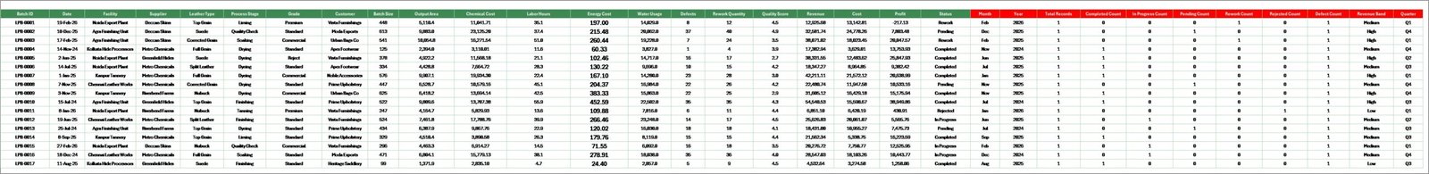
Data Sheet tab
7 – Support Sheet
The Support sheet contains the pivot tables used to create the dashboard dynamically. After updating the Data sheet, go to the Data tab in the Excel Ribbon and click Refresh All. The pivots and charts will refresh, and you can keep this sheet hidden.
Support sheet tab
Leather Processing Dashboard in Excel vs. Google Sheets vs. Paid CRM/SaaS – Feature Comparison
| Feature | Leather Processing Dashboard in Excel | Google Sheets alternative | Paid SaaS / ERP analytics |
|---|---|---|---|
| Cost | One-time download | Free to build manually | Subscription or implementation cost |
| Platform | Microsoft Excel | Browser-based spreadsheet | Vendor platform |
| Setup time | Replace data and refresh | Build formulas, pivots, and charts | Configuration project |
| Real-time team collaboration | Possible through OneDrive or shared workbook | Native collaboration | Usually included |
| Mobile access | Excel mobile or shared file | Google Sheets mobile/browser | Usually included |
| Customizable fields | Editable workbook | Editable sheet | Depends on vendor settings |
| Share with link | Possible through OneDrive | Yes | Login controlled |
| Year-1 cost at 5 users | Low one-time template cost | Your build time | Often much higher |
| Leather-specific pages | 7 included pages | Must be created | Depends on module |
Who Should Use This Template
This dashboard is useful for tannery owners, production managers, quality control teams, costing analysts, plant heads, procurement teams, sales operations teams, and consultants working with leather manufacturing or finishing businesses. It is especially helpful when the team already stores operational data in Excel and needs a structured reporting layer.
Real-World Use Cases
Production review: A plant manager reviews output area by process stage and completion percentage by facility before the weekly production meeting.
Quality improvement: A quality head checks defect percentage by leather type and total defects by facility to prioritize corrective action.
Supplier review: A procurement manager compares total cost by supplier and average quality score by supplier before negotiating rates.
Customer and margin review: A finance analyst reviews revenue by customer, profit by facility, and margin by process stage before month-end reporting.
Advantages of Leather Processing Dashboard in Excel
- It keeps revenue, cost, profit, quality, and operations analysis in one workbook.
- It uses familiar Excel features such as slicers, charts, pivots, and refresh workflows.
- It gives managers a quick overview while still allowing page-level analysis.
- It avoids the cost and setup time of a full analytics platform for teams that only need reporting.
- It can be customized by users who understand Excel.
Opportunities for Improvement
This template is a reporting dashboard, so it does not replace an ERP, inventory management system, barcode system, approval workflow, or live machine-data system. Advanced users may extend it by adding Power Query imports, automated data validation, monthly archive sheets, or Power BI reporting if the business later needs cloud dashboards.
Best Practices
- Keep the Data sheet column format unchanged when adding new records.
- Refresh all pivots after every major data update.
- Use consistent names for facilities, suppliers, grades, customers, and process stages.
- Validate revenue, cost, defect, and output area fields before monthly review.
- Keep a backup copy before making layout or formula changes.
Microsoft also provides guidance on PivotTables, which are useful for summarizing worksheet data. You can review the official Microsoft support page here: Create a PivotTable to analyze worksheet data.
Explore Relevant Templates
You may also like the Leather Processing KPI Dashboard in Excel, Leather Processing KPI Dashboard in Power BI, and Industrial Gas Production Dashboard in Excel. You can also browse more Excel Dashboard Templates.
Frequently Asked Questions
What is the Leather Processing Dashboard in Excel?
It is an Excel dashboard template for tracking leather processing revenue, net profit, output area, records, quality score, defects, costs, suppliers, customers, facilities, and process stages.
How many pages are included?
The workbook includes 7 worksheet tabs: Overview, Production, Quality, Costing, Operations, Data, and Support.
Can I add my own leather processing data?
Yes. Replace the sample data in the Data sheet using the same format, then refresh all pivots and charts.
Do I need advanced Excel skills?
No. Basic Excel knowledge is enough for data replacement and refresh. Advanced users can customize charts, pivots, and layouts.
Can I hide the Support sheet?
Yes. The Support sheet contains pivot tables used for the dashboard and can be hidden after setup.
Is this a full ERP system?
No. It is a dashboard template for reporting and analysis, not a full leather ERP, inventory system, or production workflow system.
About the Author
Built by PK – Microsoft Certified Professional with 15+ years of Excel, Google Sheets, and Power BI experience. Founder of NextGenTemplates, reaching 300K+ subscribers across YouTube channels. Every template is hand-built and tested before release.
Conclusion
The Leather Processing Dashboard in Excel gives leather manufacturing teams a structured way to review performance without starting from a blank workbook. With overview cards, slicers, 19 charts, and focused pages for production, quality, costing, and operations, it helps managers spot trends, compare facilities, review suppliers, and control cost more clearly.
Click here to buy Leather Processing Dashboard in Excel
Visit our YouTube channel to learn step-by-step Excel dashboard tutorials.