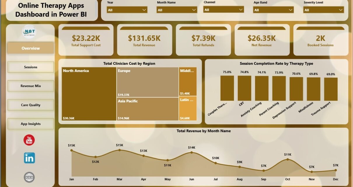
Online Therapy Apps Dashboard in Power BI is a ready-to-use Power BI dashboard for digital mental health teams that need to monitor support cost, total revenue, refunds, net revenue, booked sessions, clinician cost, session completion rate, completed sessions, therapy type, acquisition channel, region, app name, user segment, age band, subscription plan, and monthly trends.
Online therapy apps have moved from a convenience feature to a serious operating model for mental health and wellness teams. As more care journeys happen through apps, video sessions, subscriptions, referrals, and hybrid channels, managers need more than a revenue report. They need to see whether sessions are booked, completed, refunded, profitable, and sustainable across regions and user groups. This Power BI dashboard gives that view in a clean five-page report that can be refreshed and customized in Power BI Desktop.
Key Features of Online Therapy Apps Dashboard in Power BI
- 5 Power BI report pages: Overview, Sessions, Revenue Mix, Care Quality, and App Insights.
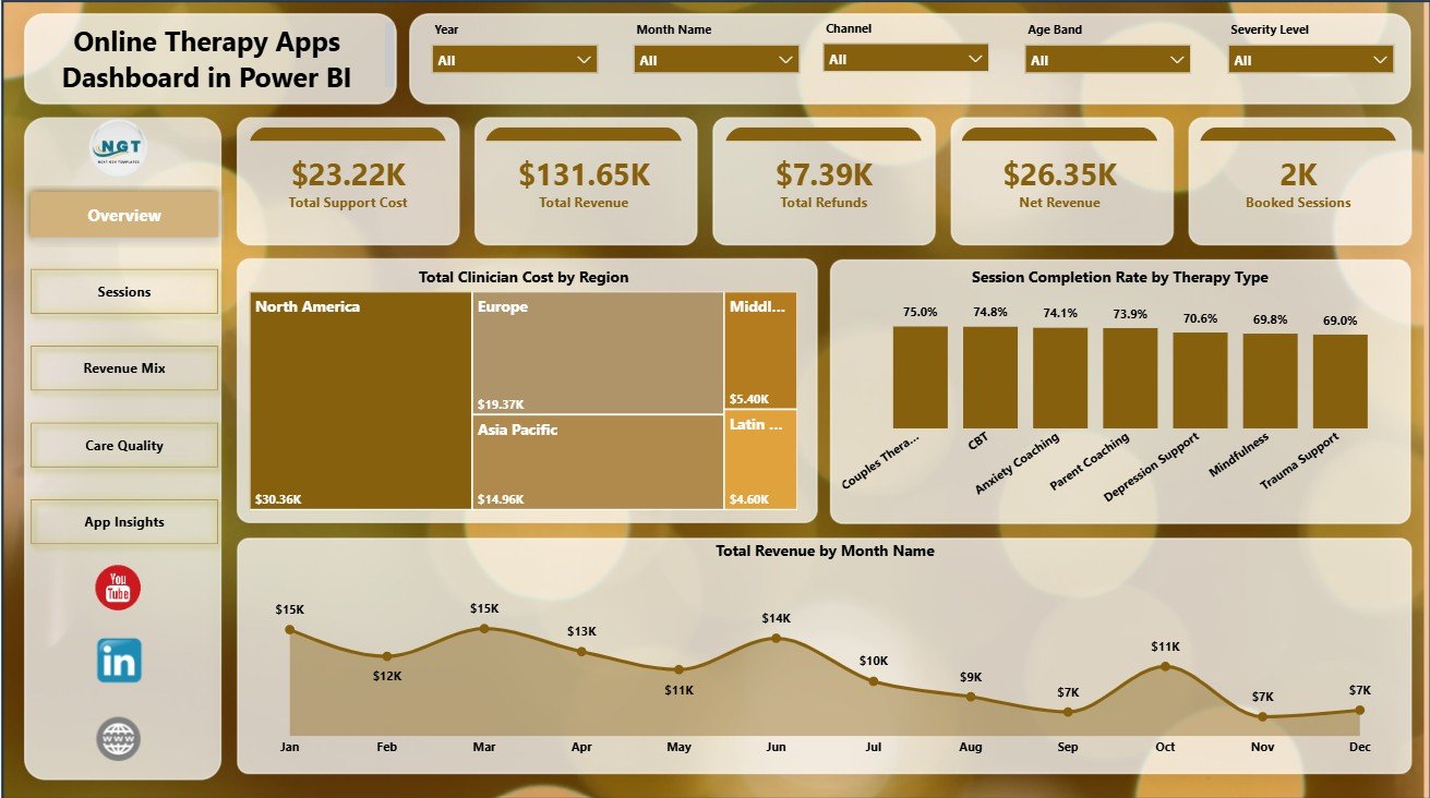
- 5 high-level cards: Total Support Cost, Total Revenue, Total Refunds, Net Revenue, and Booked Sessions.
- Multiple slicers: Filter the report quickly using available app, region, channel, month, plan, therapy, user, and age-band fields.
- Session performance analysis: Review completion rate by channel, therapy type, subscription plan, month, and region.
- Revenue mix analysis: Compare net revenue by acquisition channel and region, plus total revenue by app name and month.
- Care quality and cost views: Analyze clinician cost by region, user segment, age band, and month.
- Editable .pbix file: Change visuals, measures, colors, fields, slicers, and pages in Power BI Desktop.
Dashboard Pages Explanation
1 – Overview Page
The Overview page gives a leadership-level view of the online therapy app business. The top cards show Total Support Cost, Total Revenue, Total Refunds, Net Revenue, and Booked Sessions so decision-makers can see cost, revenue, refund exposure, and demand in one place.
Total Clinician Cost by Region: This chart compares clinician cost across regions. It helps finance and operations teams identify where service delivery is more expensive and where staffing, pricing, or care delivery processes may need review.
Session Completion Rate by Therapy Type: This visual compares completion rate across therapy types. It helps clinical and product teams understand which care programs convert scheduled sessions into completed sessions more consistently.
Total Revenue by Month Name: This monthly trend shows how revenue moves across the year. It helps teams spot seasonality, campaign impact, and periods where revenue may be rising or slowing.
2 – Sessions
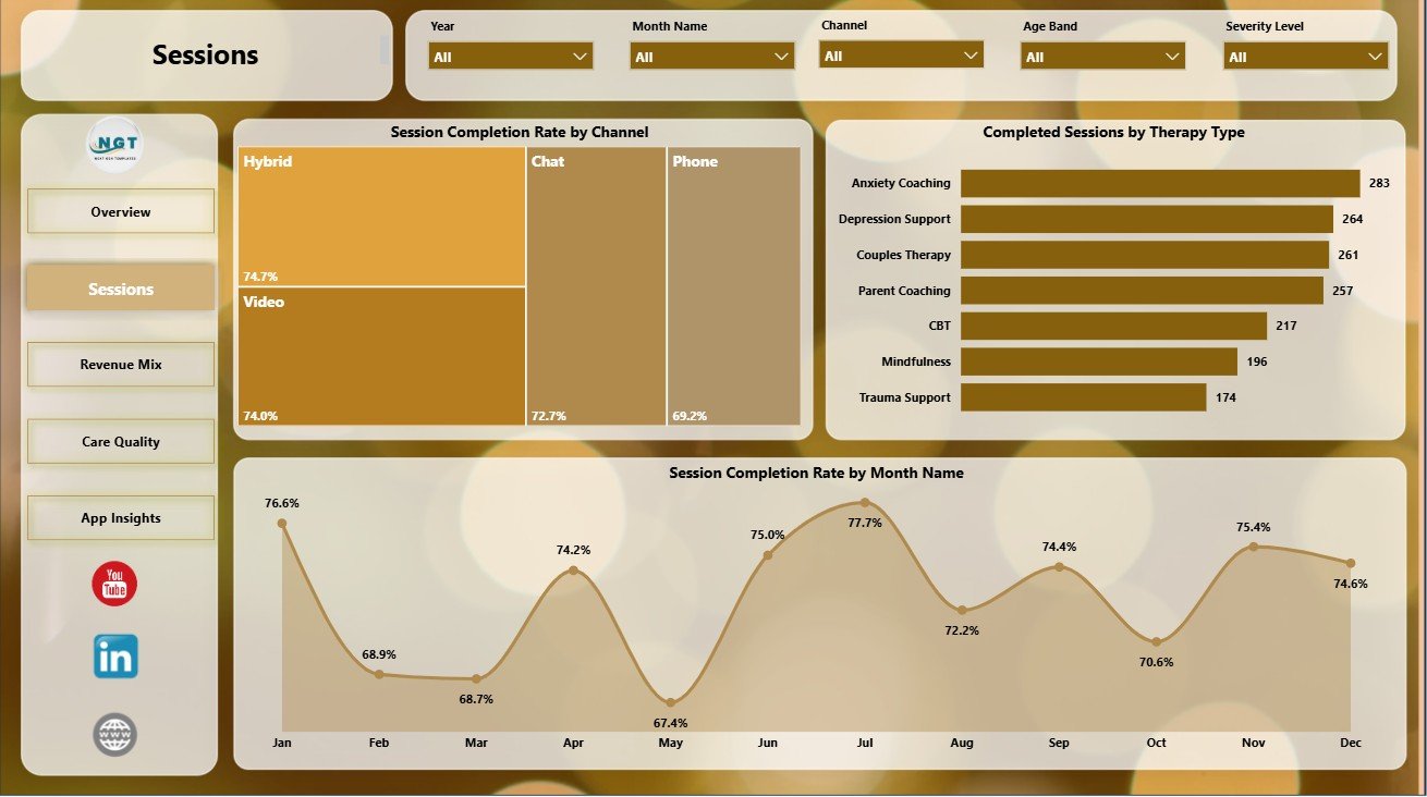
The Sessions page focuses on how booked care turns into completed care. For therapy apps, this is often one of the most important operational questions because low completion rates can hurt revenue, user outcomes, clinician utilization, and customer trust.
Session Completion Rate by Channel: This chart compares completion rates across channels. It helps growth and operations teams understand whether users from certain acquisition or booking sources are more likely to complete care.
Completed Sessions by Therapy Type: This visual shows completed session volume by therapy type. It helps managers see which therapy programs have the highest actual utilization.
Session Completion Rate by Month Name: This trend tracks completion performance over time. It helps teams investigate whether changes in scheduling, staffing, reminders, pricing, or user experience affected follow-through.
3 – Revenue Mix
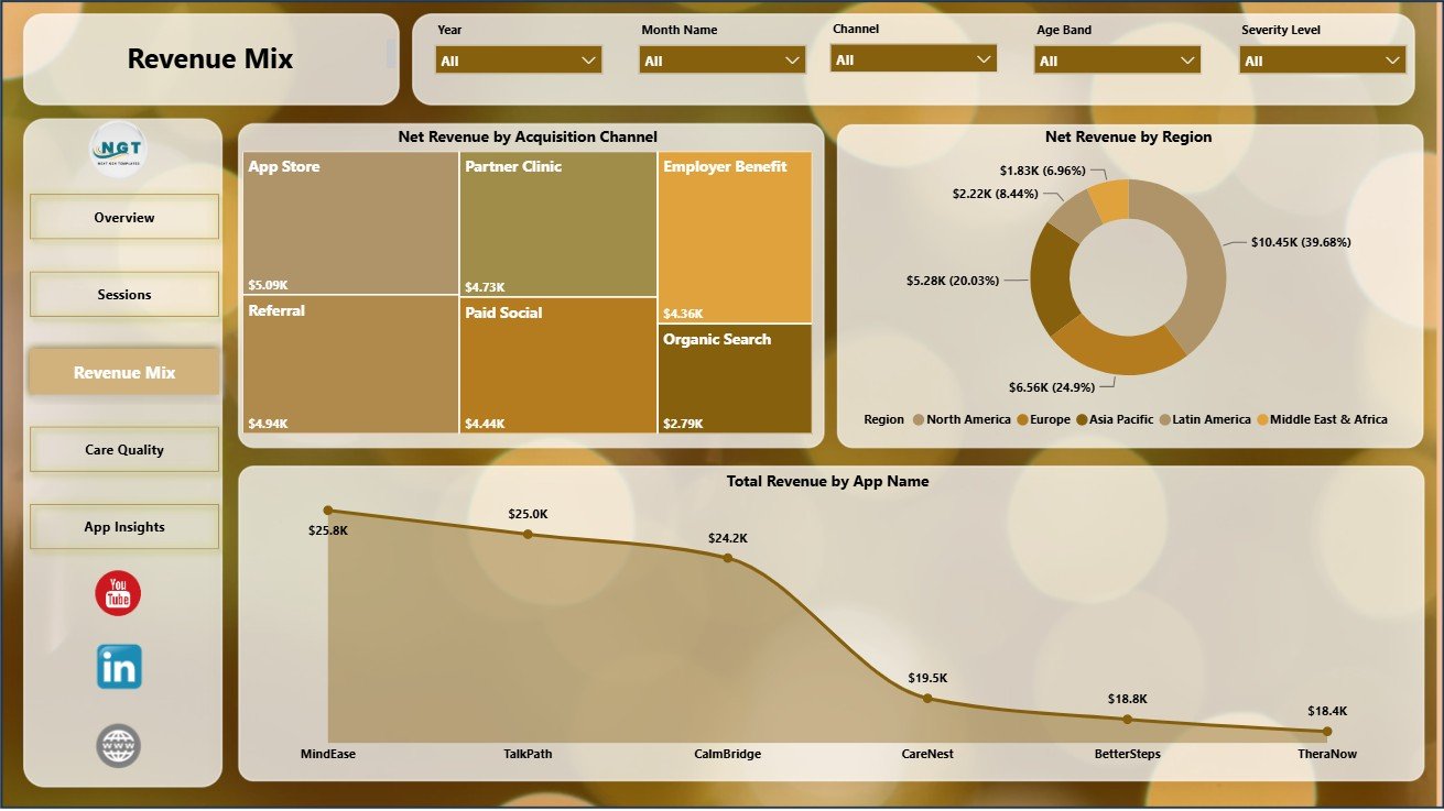
The Revenue Mix page is built for finance, product, and marketing teams. It helps answer where revenue is coming from, which acquisition channels create stronger net revenue, and which regions or app brands deserve closer attention.
Net Revenue by Acquisition Channel: This chart compares net revenue by channel. It helps teams separate high-volume acquisition from high-value acquisition and focus on channels that create better financial outcomes.
Net Revenue by Region: This visual compares net revenue across regions. It supports regional pricing, marketing budget, support coverage, and clinician capacity decisions.
Total Revenue by App Name: This chart compares revenue by app name. It is useful for companies managing multiple therapy apps, branded experiences, or program lines.
4 – Care Quality
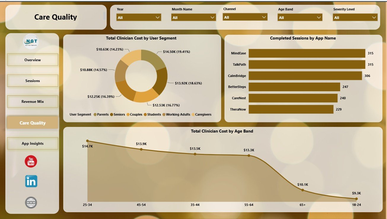
The Care Quality page connects cost and care delivery patterns by user segment, app name, and age band. It helps teams review whether different groups are using care differently and whether the delivery cost profile makes sense.
Total Clinician Cost by User Segment: This chart compares clinician cost by user segment. It helps teams identify which user groups require more clinician time or more expensive delivery support.
Completed Sessions by App Name: This visual compares completed session volume across app names. It helps leaders review utilization by product or app brand.
Total Clinician Cost by Age Band: This chart compares clinician cost across age bands. It can support deeper analysis of care intensity, program design, and segment-level cost planning.
5 – App Insights
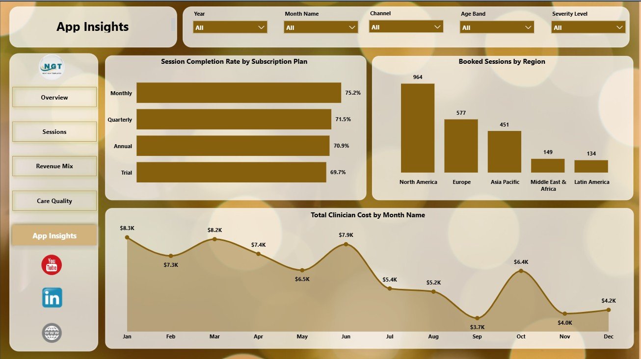
The App Insights page gives product and operations teams a practical view of plans, regions, monthly cost, and demand. It is useful when the team wants to compare engagement and clinician cost across the business model.
Session Completion Rate by Subscription Plan: This chart compares session completion rate by subscription plan. It helps product teams see whether plan structure or benefits are linked with stronger follow-through.
Booked Sessions by Region: This visual compares booked session volume by region. It helps operations teams understand where demand is concentrated.
Total Clinician Cost by Month Name: This trend tracks clinician cost by month. It helps finance teams spot cost spikes and compare clinician cost with revenue movement.
Online Therapy Apps Dashboard in Power BI vs. Tableau vs. Paid CRM/SaaS – Feature Comparison
| Feature | This Power BI dashboard | Tableau alternative | Paid healthcare SaaS |
|---|---|---|---|
| Cost | One-time template purchase | License plus dashboard build time | Monthly or annual subscription |
| Platform | Power BI Desktop | Tableau Desktop or Cloud | Vendor cloud platform |
| Setup time | Open .pbix, connect data, refresh | Build or customize workbook | Implementation and onboarding |
| Real-time team collaboration | Available after publishing to Power BI Service | Available through Tableau Cloud | Usually included by plan |
| Mobile access | Available after Power BI publishing | Available after publishing | Usually included |
| Customizable fields | Editable model, visuals, measures, and pages | Editable if you own the workbook | Often limited by vendor settings |
| Share with link | Use Power BI Service sharing | Use Tableau sharing | Login-controlled sharing |
| Year-1 cost at 5 users | Template price plus any Microsoft licensing | Usually much higher | Often hundreds or thousands |
| Therapy app metrics | Pre-built pages for sessions, revenue, refunds, cost, apps, plans, and regions | Requires custom dashboard design | Depends on vendor reporting access |
Who Should Use This Template
This template is useful for online therapy app founders, digital health analysts, care operations managers, product managers, finance analysts, growth marketers, and consultants. It is best for teams that already have exported or connected data and want a repeatable Power BI reporting layer.
It is not a clinical record system, appointment scheduler, billing product, therapy platform, or compliance system. Use it for management reporting and analysis after the data has been prepared in a structured format.
Real-World Use Cases
Monthly leadership review: A founder reviews revenue, refunds, support cost, booked sessions, and completion performance before a board or investor update.
Operations review: A care operations manager filters the report by region, therapy type, subscription plan, and month to identify completion-rate gaps.
Finance analysis: A finance analyst reviews clinician cost by region, user segment, age band, and month to understand cost pressure and margin risk.
Advantages of Online Therapy Apps Dashboard in Power BI
- It gives online therapy teams a ready Power BI structure instead of starting with a blank report.
- It connects financial, operational, and care-delivery views in one report.
- It helps users compare performance across channels, regions, plans, therapy types, and app names.
- It can be customized in Power BI Desktop as reporting requirements change.
- It supports better recurring reviews because the same metrics can be refreshed and compared over time.
Opportunities for Improvement
- Add data validation rules before loading new source data.
- Create clear KPI definitions for support cost, net revenue, refunds, and completion rate.
- Connect the report to a cleaned Power Query source if data comes from multiple systems.
- Publish to Power BI Service for controlled sharing and scheduled refresh if your team has the right Microsoft setup.
Best Practices
- Keep one consistent source table or model for therapy app sessions and revenue records.
- Use the same region, app name, therapy type, channel, and plan names every month.
- Check refunds and support cost before reviewing net revenue.
- Review completion rate together with booked sessions so low volume does not mislead the analysis.
- Use Power BI Desktop documentation from Microsoft when customizing data connections, visuals, or refresh behavior: Get started with Power BI Desktop.
Explore Relevant Templates
You can download the Online Therapy Apps Dashboard in Power BI from NextGenTemplates. You may also like Online Therapy Apps Dashboard in Excel, Occupational Therapy Dashboard in Power BI, and Online Parenting Communities Dashboard in Power BI.
Frequently Asked Questions
What is included in the Online Therapy Apps Dashboard in Power BI?
It includes five Power BI pages: Overview, Sessions, Revenue Mix, Care Quality, and App Insights, with KPI cards, slicers, and analysis visuals.
Can I use my own online therapy app data?
Yes. Replace or connect your own data source in Power BI Desktop and refresh the report after checking that your fields match the model.
Do I need Power BI Desktop?
Yes. Power BI Desktop is required to open, edit, refresh, and save the .pbix file.
Can I publish the report to Power BI Service?
Yes, if your Microsoft account, workspace, and license support Power BI publishing and sharing.
Is this a HIPAA compliance product?
No. This is an analytics dashboard template, not a compliance platform, EHR, billing system, or therapy documentation tool.
Can I customize the dashboard pages?
Yes. You can customize visuals, fields, slicers, measures, colors, and pages in Power BI Desktop.
About the Author
Built by PK – Microsoft Certified Professional with 15+ years of Excel, Google Sheets, and Power BI experience. Founder of NextGenTemplates, reaching 300K+ subscribers across YouTube channels. Every template is hand-built and tested before release.
Conclusion
The Online Therapy Apps Dashboard in Power BI gives digital mental health teams a practical way to review support cost, revenue, refunds, booked sessions, clinician cost, session completion, app performance, user segments, plans, and regions in one editable report. It is a strong fit when your team already has data available and needs a faster way to turn that data into monthly operating insight.
For more tutorials and templates, visit PK An Excel Expert on YouTube.