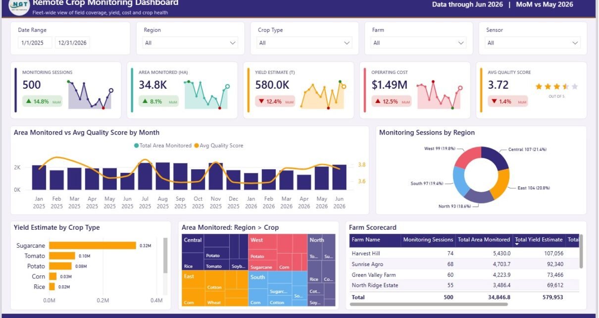
Global agriculture teams are using more remote sensing, drone visits, and field monitoring data than ever, but the reporting layer often remains scattered across spreadsheets, field logs, and one-off summaries. A crop program monitoring 40 farms once per month can create 480+ monitoring sessions per year before counting crop, region, field zone, alert, water, and operator details. The Remote Crop Monitoring Dashboard in Power BI turns that data into a 5-page analytical report for monitoring sessions, hectares covered, yield estimate, operating cost, quality score, alerts, water efficiency, crop health, and drone operator performance.
👉 Click here to purchase the Remote Crop Monitoring Dashboard in Power BI
This ready-to-use PBIX template is built for farm owners, agribusiness managers, field supervisors, precision agriculture consultants, and drone monitoring teams that need faster reporting without building every page from scratch. You can open it in Power BI Desktop, replace the sample source with your own crop monitoring data, refresh the report, and start reviewing trends through interactive visuals and slicers.
Key Features of Remote Crop Monitoring Dashboard in Power BI
- 5 report pages: Overview, Crop Trends, Field Health, Cost Analysis, and Operator View.
- 5 top-level KPI cards: Monitoring Sessions, Area Monitored (HA), Yield Estimate (T), Operating Cost, and Avg Quality Score.
- Crop production analysis: Review yield estimate, yield per hectare, crop type performance, monthly trends, and water intensity.
- Field health reporting: Track alerts raised, alerts resolved, monitoring status, healthy fields percentage, pest risk, and farm health logs.
- Cost visibility: Analyze operating cost, cost per hectare, sensor type spending, crop type cost, and farm cost breakdown.
- Operator scorecards: Compare area covered, quality score, alert resolution percentage, alert load, and sensor usage by drone operator.
- Interactive slicers: Filter the dashboard quickly by month, region, crop type, farm name, sensor type, field zone, alert level, and monitoring status.
Dashboard Pages Explanation
Overview Page
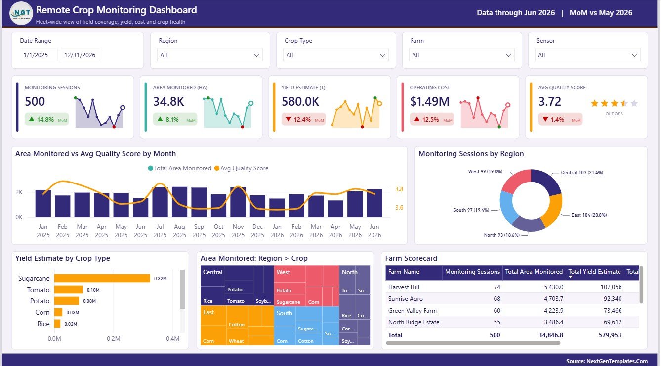
The Overview page gives users a high-level summary of crop monitoring activity. The top cards show Monitoring Sessions, Area Monitored (HA), Yield Estimate (T), Operating Cost, and Avg Quality Score, so managers can understand coverage, productivity, spend, and data quality before moving into deeper pages.
Area Monitored and Avg Quality Score by Month
This chart compares the number of hectares monitored with the average quality score month by month. It helps users confirm whether wider monitoring coverage is still producing reliable, high-quality inspection results.
Monitoring Sessions by Region
This chart shows how monitoring sessions are distributed across regions. It helps field managers spot regions with strong coverage and regions that may need additional drone visits or field checks.
Yield Estimate by Crop Type
This visual compares expected yield across crop types. It helps agronomy teams identify crops with stronger production outlooks and crops that may need closer review.
Area Monitored by Region and Crop
This chart breaks monitored hectares by both region and crop. It supports regional planning, crop portfolio review, and better allocation of monitoring resources.
Farm Scorecard by Farm Name
This scorecard compares farm-level results in one table. Users can review each farm by monitoring activity, yield, cost, and quality indicators to find priority follow-up areas.
Crop Trends
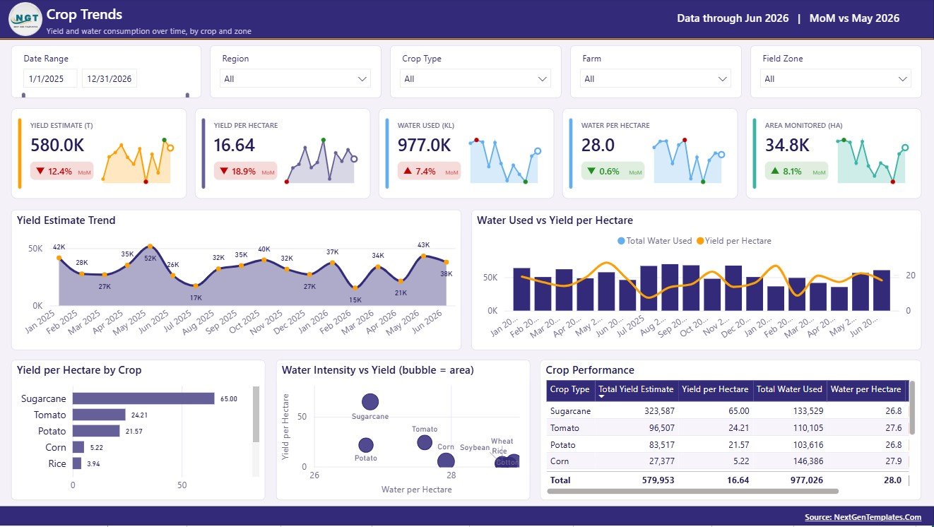
The Crop Trends page focuses on yield movement, crop efficiency, and water productivity. Yield Estimate by Month shows whether expected production is rising or falling over time. Water Used and Yield per Hectare by Month compares resource use with output so users can evaluate efficiency. Yield per Hectare by Crop ranks crop productivity, while Water Intensity and Yield by Crop helps identify crops that may consume more water for lower yield. The Crop Performance by Crop Type table brings these measures together for crop-level review.
Field Health
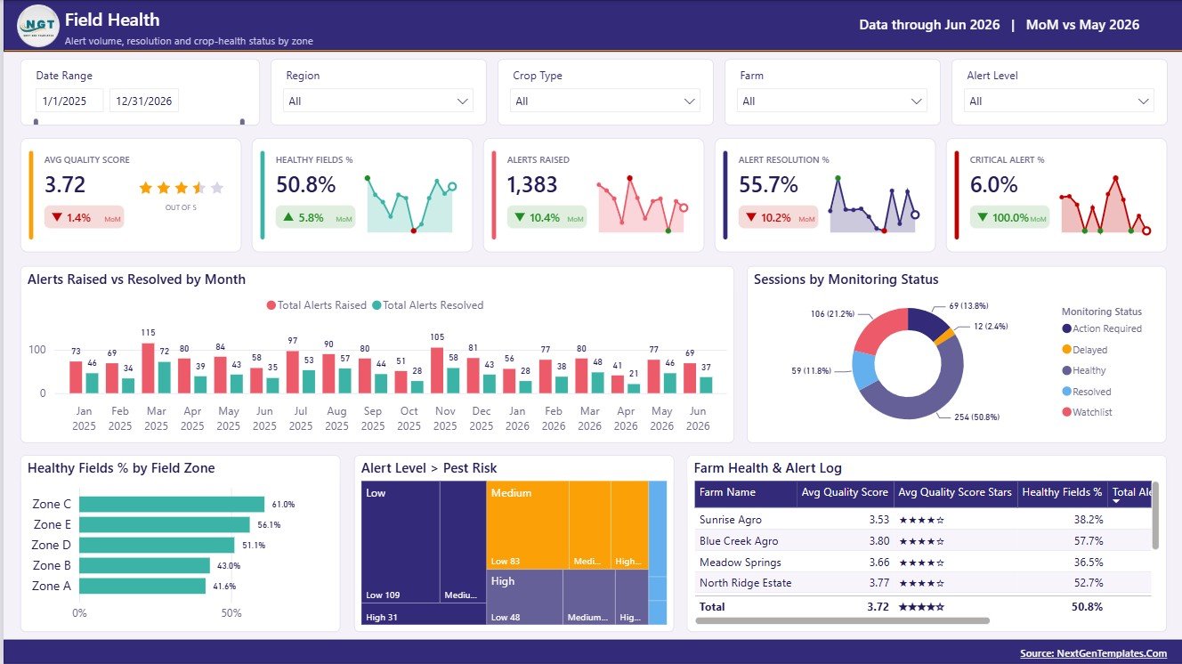
The Field Health page is designed for monitoring risk and response. Alerts Raised and Alerts Resolved by Month shows whether field issues are being closed as fast as they appear. Sessions by Monitoring Status displays monitoring progress by status. Healthy Fields % by Field Zone compares field condition across zones, while Alert Level by Pest Risk connects pest exposure with alert severity. The Farm Health and Alert Log by Farm Name table gives managers a farm-level action list for review meetings.
Cost Analysis
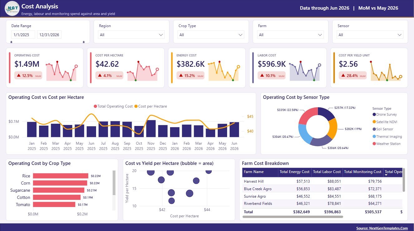
The Cost Analysis page helps users understand monitoring spend. Operating Cost and Cost per Hectare by Month shows whether costs are scaling efficiently with area coverage. Operating Cost by Sensor Type compares the cost of different monitoring technologies. Operating Cost by Crop Type shows crop-level spending, and Cost and Yield per Hectare by Farm compares cost efficiency with productivity. The Farm Cost Breakdown by Farm Name table gives finance and operations teams the detail needed for budget review.
Operator View
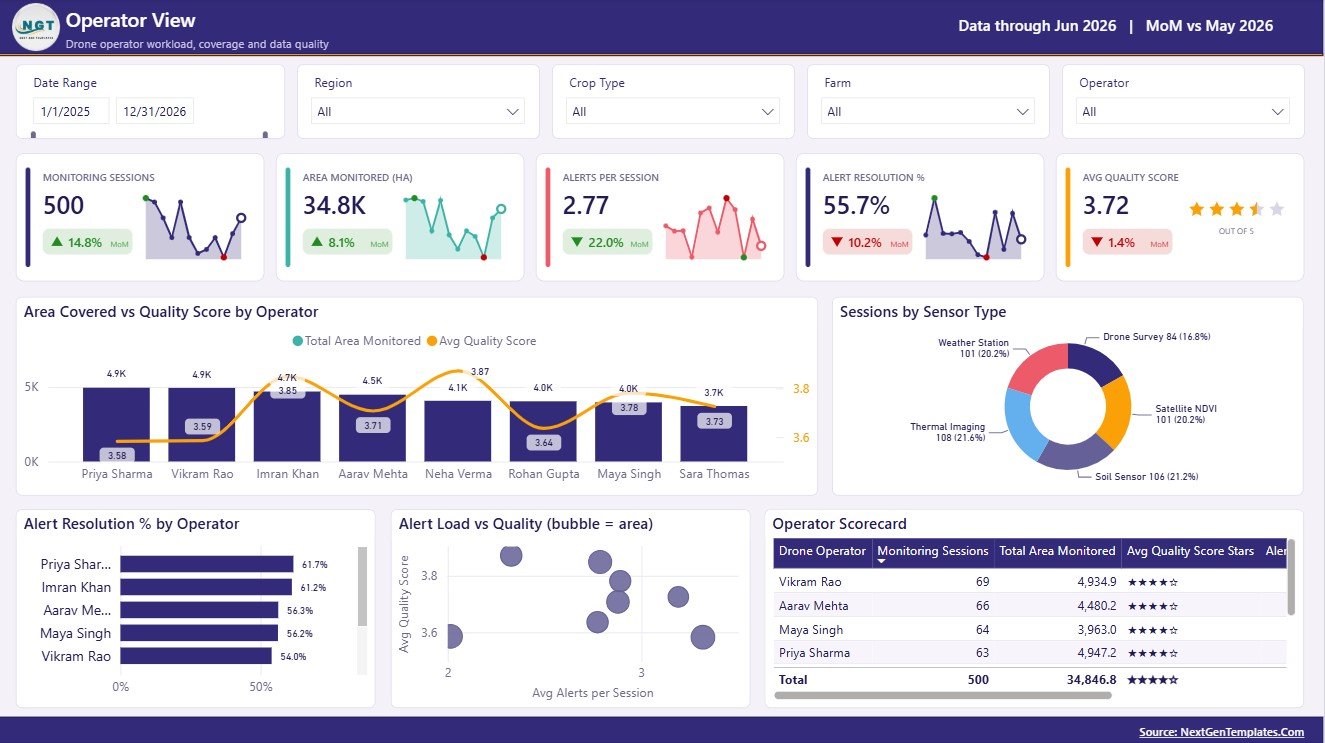
The Operator View page supports drone operator and monitoring team management. Area Covered and Quality Score by Operator compares workload with output quality. Sessions by Sensor Type shows which monitoring tools are used most often. Alert Resolution % by Operator measures response performance, while Alert Load and Quality by Operator helps managers balance assignments. The Operator Scorecard by Drone Operator provides a clear operator-level view for coaching and planning.
Remote Crop Monitoring Dashboard in Power BI vs. Tableau vs. Paid CRM/SaaS – Feature Comparison
| Feature | This Power BI template | Tableau or Qlik alternative | Paid farm management SaaS |
|---|---|---|---|
| Cost | $17.99 one-time sale price | License cost plus dashboard build time | Monthly or annual subscription |
| Platform | Power BI Desktop and optional Power BI Service | Tableau or Qlik environment | Vendor-hosted web application |
| Setup time | Open PBIX, replace source, refresh | Build data model and visuals manually | Vendor onboarding and configuration |
| Real-time team collaboration | Available after publishing to Power BI Service | Available by plan | Usually included |
| Mobile access | Available through Power BI mobile after publishing | Available by platform | Usually included |
| Customizable fields | Edit model, visuals, slicers, measures, and pages | Editable with analyst skills | Often limited by vendor permissions |
| Share with link | Available through Power BI workspace permissions | Available through server permissions | Usually login controlled |
| Year-1 cost at 5 users | Template cost plus Microsoft licensing choice | License cost plus analyst time | Often hundreds or thousands per year |
| Crop monitoring metrics | Sessions, hectares, yield, water, alerts, cost, quality, region, farm, crop, sensor, and operator | Must be designed manually | Depends on reporting module |
Who Should Use This Template
This template is useful for crop monitoring teams, farm owners, agribusiness analysts, field supervisors, regional agriculture managers, drone operators, and consultants who need a clean reporting layer for prepared crop monitoring data. It is also helpful for organizations that already collect farm, crop, sensor, and alert data but do not yet have a repeatable Power BI report.
Real-World Use Cases
Anika, agribusiness manager: uses the Overview page each month to compare hectares monitored, yield estimate, quality score, and regional session coverage before assigning the next monitoring schedule.
Rohan, crop consultant: reviews Crop Trends and Field Health during client meetings to explain yield movement, water intensity, pest risk, unresolved alerts, and healthy field percentage.
Meera, drone operations lead: uses Operator View to balance field assignments, compare alert load, and identify operators who need coaching on quality score or alert resolution.
Advantages of Remote Crop Monitoring Dashboard in Power BI
The biggest advantage is speed. Instead of building five Power BI pages from a blank canvas, users start with a prepared layout, KPI cards, charts, slicers, and page structure. The dashboard also keeps crop, cost, health, and operator data in one report, which reduces back-and-forth between separate files.
Because it is a Power BI template, users can customize the data model, visuals, measures, colors, and labels. Teams can keep it in Power BI Desktop for local analysis or publish it to Power BI Service for sharing, scheduled refresh, and mobile access. Microsoft’s official Power BI Desktop documentation is a helpful starting point for users new to the platform.
Opportunities for Improvement
This dashboard does not directly control drones, process satellite imagery, or connect automatically to every IoT sensor system. Users need structured source data before refreshing the report. If your organization requires live sensor streaming, automated drone dispatch, prescription maps, or agronomy recommendations, this template should be used as the reporting layer alongside those operational systems.
Best Practices
- Keep source data structured with consistent farm, region, crop, operator, sensor, and month fields.
- Refresh the report on a fixed schedule so trend views remain reliable.
- Review unresolved alerts and pest-risk visuals before routine field visits.
- Compare cost per hectare with yield per hectare before changing monitoring routes or sensor mix.
- Use the Operator View page for coaching, workload balancing, and quality improvement.
Explore Relevant Templates
For related agriculture reporting, explore Plant Nurseries Dashboard in Power BI, Indoor Farming Systems Dashboard in Power BI, Indoor Farming Systems Dashboard in Excel, and Aquaculture KPI Scorecard in Excel. You can also browse more Power BI Dashboard templates on NextGenTemplates.
Frequently Asked Questions
What is the Remote Crop Monitoring Dashboard in Power BI?
It is an editable PBIX dashboard template for analyzing crop monitoring sessions, hectares monitored, yield estimate, operating cost, quality score, water use, alerts, farm health, and drone operator performance.
Can I use my own farm data?
Yes. Replace the sample data source with your own structured crop monitoring data and refresh the report in Power BI Desktop.
Does this dashboard include multiple pages?
Yes. It includes Overview, Crop Trends, Field Health, Cost Analysis, and Operator View pages.
Do I need Power BI Desktop?
Yes. Power BI Desktop is required to open and edit the PBIX file. Power BI Service is optional for sharing and scheduled refresh.
Can the dashboard connect directly to drone systems?
No. It is a reporting template for prepared data. Direct drone, satellite, or IoT integrations require separate data connection work.
Is this a subscription product?
No. It is sold as a one-time downloadable dashboard template.
About the Author
Built by PK – Microsoft Certified Professional with 15+ years of Excel, Google Sheets, and Power BI experience. Founder of NextGenTemplates, reaching 300K+ subscribers across YouTube channels. Every template is hand-built and tested before release.
Conclusion
The Remote Crop Monitoring Dashboard in Power BI gives agriculture teams a practical way to review crop coverage, yield, water efficiency, field alerts, monitoring cost, quality score, and operator performance in one report. It is best for teams that already collect crop monitoring data and want a faster way to analyze it through Power BI.
👉 Click here to purchase the Remote Crop Monitoring Dashboard in Power BI
Visit our YouTube channel for step-by-step tutorials: Youtube.com/@PKAnExcelExpert