Most SaaS teams already have the numbers. They are just scattered – MRR in the billing system, CAC in a spreadsheet somebody maintains, churn in a Customer Success tool, uptime in an incident log. The monthly review then becomes an exercise in copy-paste, and nobody can remember how last quarter’s churn figure was calculated.
The SaaS Business KPI Dashboard in Power BI is built for exactly that gap. It is a KPI scorecard: 14 SaaS metrics on one page, each with a month-to-date and a year-to-date actual, a target you type yourself, a traffic light and a 12-month sparkline. The file is a single .pbix containing 6 report pages and 38 DAX measures, and it reads a 4-sheet Excel data pack rather than a live billing connection. Nothing in the report hard-codes a KPI name, so the 14 shipped metrics are a starting point, not a limit.

One thing to be clear about before anything else: this is the scorecard line, not the analytical line. NextGenTemplates publishes both, and the names are close enough to confuse. A scorecard answers “did these 14 numbers hit target in December?”. An analytical dashboard slices a transaction table by segment, plan and region. If you want the second thing, the SaaS Metrics Dashboard in Power BI is a separate template – not an upgrade of this one.
Key Features of the SaaS Business KPI Dashboard in Power BI
Fourteen KPIs across seven groups
The shipped set covers Revenue (Monthly Recurring Revenue), Retention (Net Revenue Retention %, Gross Revenue Churn %, Logo Churn Rate %), Sales & Marketing (Customer Acquisition Cost, CAC Payback Period, LTV to CAC Ratio), Growth (New ARR Booked, Trial to Paid Conversion %, Product Qualified Leads), Product (DAU to MAU Ratio %, Feature Adoption Rate %), Reliability (Platform Downtime Minutes) and Support (First Response Time). Each one also carries an owner and a priority, so a KPI has a name against it in the review.
A month picker that drives the whole page
Five slicers sit across the top of the scorecard – Month, KPI Group, Owner, Priority and Direction. Change the month and every card, light, sparkline and table re-reads MTD and YTD for that month. Filter to a group and the counts recalculate for just those KPIs.
Direction-aware scoring
This is the detail that separates a working scorecard from a broken one. Each KPI is flagged UTB (higher is better) or LTB (lower is better) in the data pack. Higher-is-better KPIs score Actual / Target. Lower-is-better ones – CAC, churn, downtime, first response time – score Target / Actual, so beating a cost target reads above 100% rather than below it. Without that flip, every cost metric looks like a failure the moment it improves.
Traffic lights on both MTD and YTD
The template ships with On Target at 100% or more, At Risk between 95% and 100%, and Missed below 95%. Those are the file’s defaults – they are not an industry standard and there is nothing authoritative about them. Change them if your business runs to different tolerances.
Rate-safe year-to-date
Money, volume and counts accumulate from January. Percentages, ratios and index values average across the months instead. This matters more than it sounds: a retention percentage that sums month by month reaches roughly 1,900% by December and makes every YTD chart meaningless.
Right-click drillthrough to the definition
Right-click any scorecard row and choose Drillthrough > KPI Definition. The target page is bound on seven fields – KPI Name, KPI Group, Unit, Type, Direction, Owner and Priority – and shows that KPI’s formula and plain-English definition alongside a month-by-month table. Both of those text fields come from your workbook, so the definition lives with the number instead of in a document nobody opens. Microsoft documents the underlying feature in its Power BI drillthrough guide.
Dashboard Pages Explanation
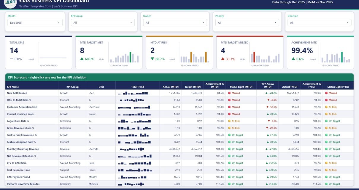
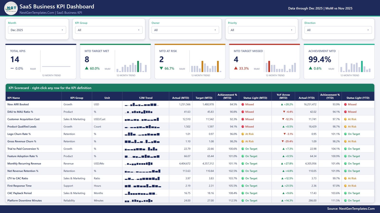
Page 1 – KPI Scorecard
The landing page, and the one that gets screenshotted into board decks. Five header cards carry Total KPIs, MTD Target Met, MTD At Risk, MTD Target Missed and Achievement MTD, each with a month-on-month delta and a 12-month trend bar. Below them, a 12-column table lists every KPI with its group, unit, 12-month sparkline, MTD actual and target, achievement %, status light, YoY arrow, then YTD actual, achievement % and status light. In the demo month shipped with the file – December 2025 – 8 KPIs are On Target, 2 At Risk and 4 Missed at 99.4% overall. Those are sample numbers generated for the template, not real operating data.
Page 2 – KPI Trend
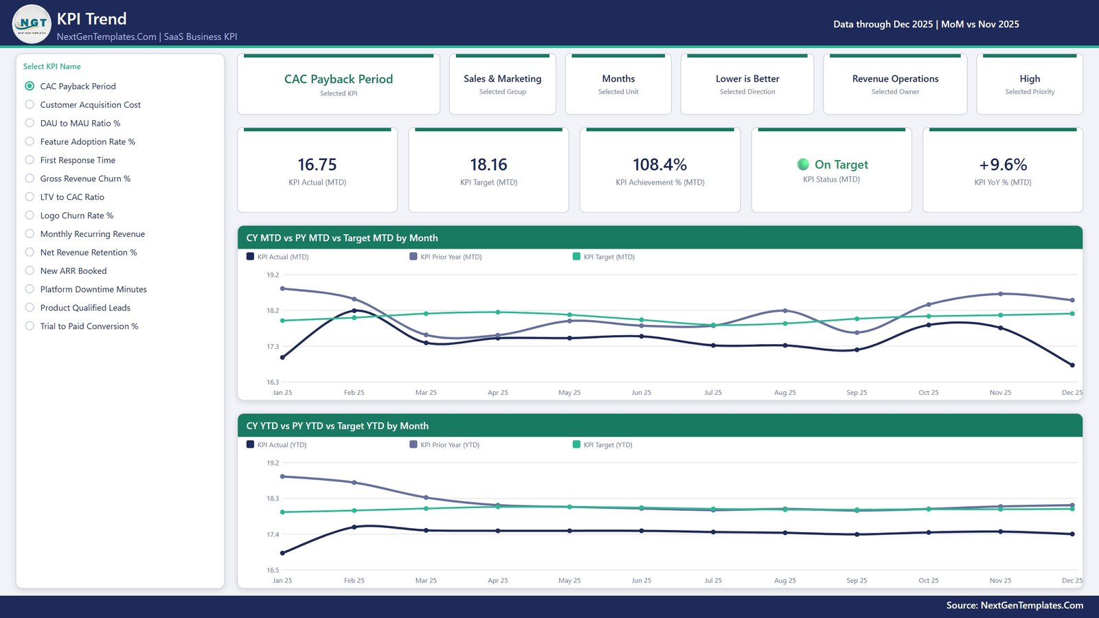
A single-select list of the 14 KPI names runs down the left edge. Pick one and the entire page becomes that KPI. Six context cards restate its group, unit, direction, owner and priority; five value cards show Actual (MTD), Target (MTD), Achievement % (MTD), Status and YoY % (MTD). Then two line charts: CY MTD vs PY MTD vs Target MTD by Month and CY YTD vs PY YTD vs Target YTD by Month. Three series on each – this year, last year, target – which is usually enough to see whether a bad month is a trend or a blip.
Page 3 – KPI Definition
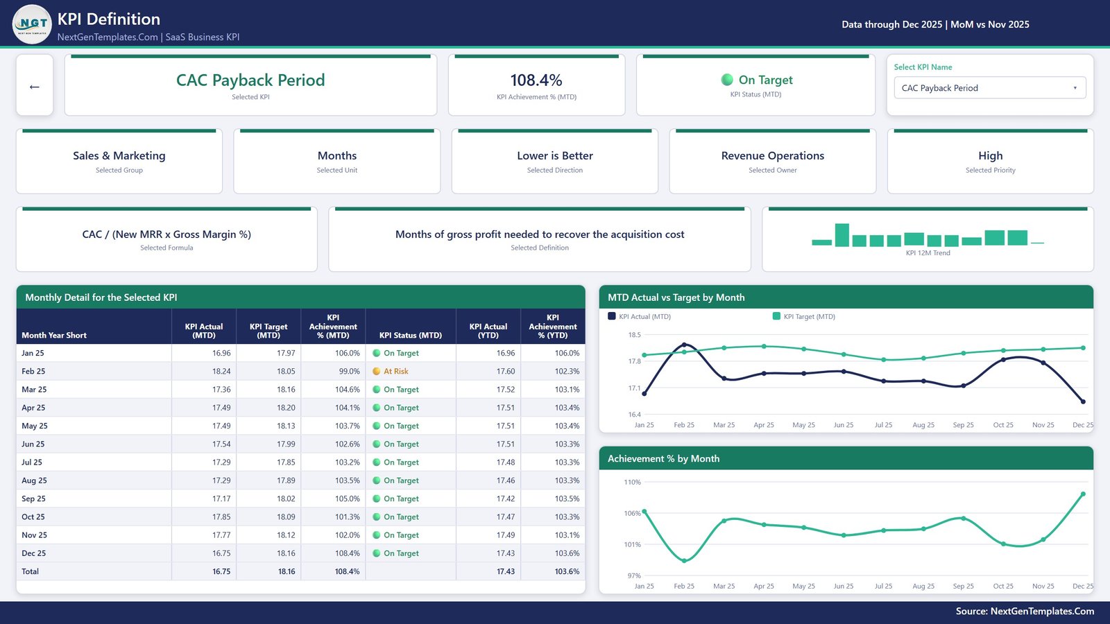
The drillthrough target, also reachable from its own KPI picker. It shows the selected KPI’s achievement and status at the top, then the group, unit, direction, owner and priority, then the two fields that end arguments: Selected Formula and Selected Definition. CAC Payback Period, for example, displays “CAC / (New MRR x Gross Margin %)” next to “Months of gross profit needed to recover the acquisition cost”. A 12-month detail table with a total row sits beside the MTD Actual vs Target by Month and Achievement % by Month charts, and a back button returns you to the scorecard.
Page 4 – Get More Templates
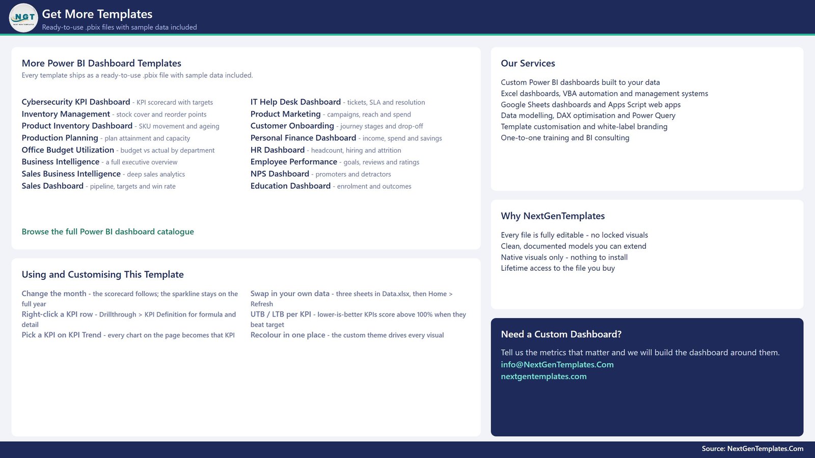
An in-file reference page. Alongside other NextGenTemplates Power BI titles it carries a short “Using and Customising This Template” list – change the month, right-click to drill through, pick a KPI on the Trend page, swap in your own data, understand UTB/LTB, and recolour in one place through the report theme.
Two hidden tooltip pages
The report also holds two 280×360 tooltip pages, KPI Detail and Trend Detail, hidden in view mode. They surface on hover so a chart point gives context instead of a bare number.
The Excel data pack
Data.xlsx has four sheets. Read Me explains the rules. Input_ Target holds 168 rows – 14 KPIs across 12 months. Input_ Actual holds 336 rows – the same KPIs across 24 months, because the prior year is what every PY and YoY figure reads from. KPI Definition is 14 rows by 9 columns: number, group, name, unit, formula, definition, type, owner, priority. The KPI name is the join key across all three, so renaming means renaming in all three.
SaaS Business KPI Dashboard in Power BI vs. Tableau vs. Paid SaaS Analytics – Feature Comparison
| This template (Power BI) | Tableau / Qlik build | Subscription analytics SaaS | |
|---|---|---|---|
| Cost | $12.99 one-off | Licence plus build time | Recurring monthly fee |
| Platform | Power BI Desktop (free) | Paid desktop licence | Vendor-hosted browser app |
| Setup time | Paste numbers into 3 sheets, refresh | Model and design from scratch | Connect billing, then map fields |
| Real-time team collaboration | Publish to your Power BI workspace | Publish to your server | Built in |
| Mobile access | Power BI mobile app | Vendor mobile app | Yes |
| Customizable fields | Every KPI, target, formula, owner and label | Yes, if you build it | Only what the vendor exposes |
| Share with link | Yes, via your workspace | Yes, via your server | Yes |
| Year-1 cost at 5 users | $12.99 | Licences plus development days | Twelve monthly invoices |
| Add a metric the vendor never modelled | One workbook row, then refresh | Rebuild the visual | Usually not possible |
| Works before a billing integration exists | Yes – exported or typed numbers are fine | Yes | Usually no |
Who Should Use This Template
It suits a founder or RevOps lead who assembles the monthly numbers by hand and wants one page to review them against targets. It suits a Head of Customer Success who needs NRR, gross revenue churn and logo churn scored the right way round. It suits a product manager who wants DAU/MAU and feature adoption sitting next to the commercial metrics rather than in a separate tool. And it suits anyone presenting the same metric set to a board every month, because the format does not change between meetings.
It is a poor fit if you need a live feed from Stripe, Chargebee or a CRM; if you need cohort or per-customer analysis, since the grain here is one KPI per month; or if you are looking for guidance on what a good churn rate is. There is none in the file, by design.
Real-World Use Cases
Monthly leadership review. A RevOps lead at a 40-person B2B SaaS exports MRR, new ARR and CAC on the first working day, pastes them into two sheets, refreshes, and drops the scorecard screenshot into the leadership doc. The MoM deltas on the header cards are what actually gets read.
Retention deep-dive. A Customer Success lead filters KPI Group to Retention so only NRR, gross revenue churn and logo churn remain, then drills through when someone questions a definition. The formula is on screen in two clicks.
Quarterly product review. A product manager opens the KPI Trend page on DAU to MAU Ratio % and Feature Adoption Rate % and compares this year against last year on the same axis before the roadmap discussion.
Advantages of the SaaS Business KPI Dashboard in Power BI
- The KPI set is data, not code. Add a row to KPI Definition plus its target and actual rows, refresh, and the counts, scorecard, KPI list and every chart pick it up automatically.
- Definitions travel with the numbers. Formula and definition are fields, so the review never stalls on “how is that calculated?”.
- Prior-year comparison is built in because the actuals sheet carries 24 months rather than 12.
- Native visuals only – cards, tables, line and bar charts, slicers. Nothing to install, nothing to break on a corporate tenant.
- One theme drives the colours, so rebranding is a single edit rather than a pass over 60 visuals.
- Your data stays yours. The file reads a local workbook; nothing is uploaded to a third party.
Opportunities for Improvement
Honest limitations, so nobody is surprised after buying:
- No live connector. The model reads
Data.xlsx. Pointing it at a database or API means replacing the query in Power Query – doable, but it is work you do. - Monthly grain only. There is no weekly or daily view, and no per-customer or cohort breakdown.
- Targets are manual. Twelve months x 14 KPIs is 168 target rows to fill the first time. Worth budgeting an hour.
- Renaming a KPI means renaming it in three places, because the name is the join key. Miss one sheet and the KPI shows blanks.
- The status bands are opinionated defaults. 100 / 95 / below-95 is a starting point, not a recommendation.
Best Practices
- Set the UTB / LTB flag before anything else. It is one letter and it decides how every light on the page is coloured.
- Load the prior year even if it is approximate – without it the PY series on both trend charts is empty.
- Keep rate KPIs as rates. Do not convert a percentage into a running total to make YTD “add up”.
- Write the definition field as if a new joiner will read it, because one eventually will.
- Assign a real owner per KPI. A red light with no name against it does not get fixed.
- Keep
Data.xlsxbeside the.pbix, or update the path under Home > Transform data > Data source settings. - Review the thresholds once a quarter rather than mid-month, so the scorecard’s history stays comparable.
Explore Relevant Templates
- SaaS Business KPI Dashboard in Power BI – the template described in this post.
- SaaS Metrics Dashboard in Power BI – the analytical counterpart, a different template.
- Subscription Business KPI Dashboard in Power BI – the same scorecard pattern for subscription businesses generally.
- SaaS Renewal KPI Dashboard in Power BI – renewals and expansion in more depth.
- Subscription Retention KPI Dashboard in Power BI – a retention-only view.
- All Power BI KPI Dashboards
Frequently Asked Questions
Does the dashboard tell me whether my churn or NRR is good?
No. There are no benchmarks, industry averages or recommended targets anywhere in the file. Every target is a number you type, and every traffic light scores against your own number.
Can I connect it to Stripe, Chargebee or my CRM?
Not out of the box – it reads an Excel workbook. You can replace the Excel query in Power Query with your own source, and the model and visuals keep working as long as the column names match.
Can I change or add KPIs?
Yes. Nothing in the report hard-codes a KPI name. Add, rename or delete rows in all three input sheets, then refresh.
Why does a KPI read above 100% when the actual is below the target?
Because it is a lower-is-better KPI. CAC, churn, downtime and first response time score Target / Actual, so coming in under target is the good result.
Is this suitable for revenue recognition or statutory reporting?
No. It is an internal management scorecard. It does not compute recognised or deferred revenue and makes no accounting, audit or compliance claim.
What do I need to run it?
Power BI Desktop, free from Microsoft, plus anything that can edit an .xlsx file. The report uses native visuals only.
Are the figures in the screenshots real?
No. Every number shipped in the file is sample data created for the template. Replace it with your own and refresh.
About the Author
Built by PK – Microsoft Certified Professional with 15+ years of Excel, Google Sheets, and Power BI experience. Founder of NextGenTemplates, reaching 300K+ subscribers across YouTube channels. Every template is hand-built and tested before release.
Conclusion
A SaaS scorecard fails for boring reasons: cost metrics scored backwards, a percentage summed into nonsense by December, no prior year to compare against, and definitions that live somewhere nobody can find. The SaaS Business KPI Dashboard in Power BI handles all four – direction-aware achievement, rate-safe YTD, 24 months of actuals, and the formula sitting one right-click away from the number it explains. Fourteen KPIs are shipped, but the model does not care how many you keep.
Get it here: SaaS Business KPI Dashboard in Power BI – $12.99, down from $19.99. One-time purchase, fully editable, no subscription. For Power BI and Excel walkthroughs, subscribe at youtube.com/@PKAnExcelExpert.