Most angel investors and small venture teams already track the right numbers. Deal flow, check size, capital deployed, how many portfolio companies are still standing. The problem is almost never the metrics – it is that they live in a different spreadsheet every quarter, with a different layout, and nobody can tell at a glance whether this month was better or worse than last year.
The Angel Investors KPI Dashboard in Excel is a fixed scorecard for exactly that job. You type your monthly figures into three input sheets, pick a month from one dropdown, and the whole workbook re-reads: month-to-date and year-to-date actual, target, achievement percentage, a traffic-light status and a prior-year comparison, for all 14 KPIs at once.
Before anything else, two things worth being straight about. This is a reporting template, not advice and not a valuation tool. And metrics like IRR, TVPI and DPI are figures you enter – the workbook compares and charts them, it does not derive them from cash flows. More on both below.
What the workbook actually contains
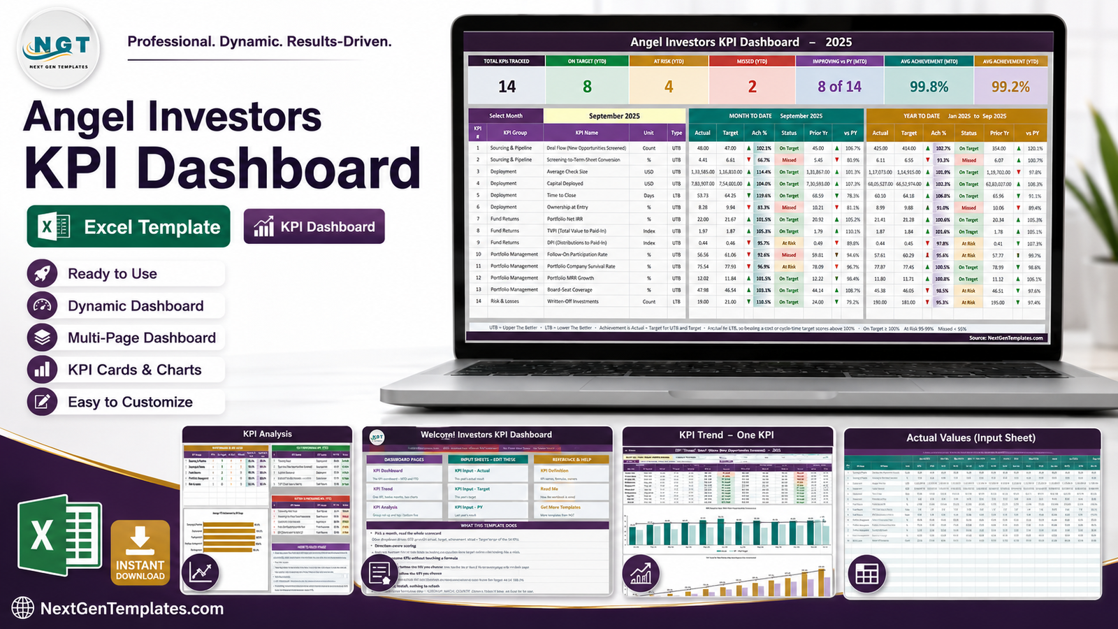
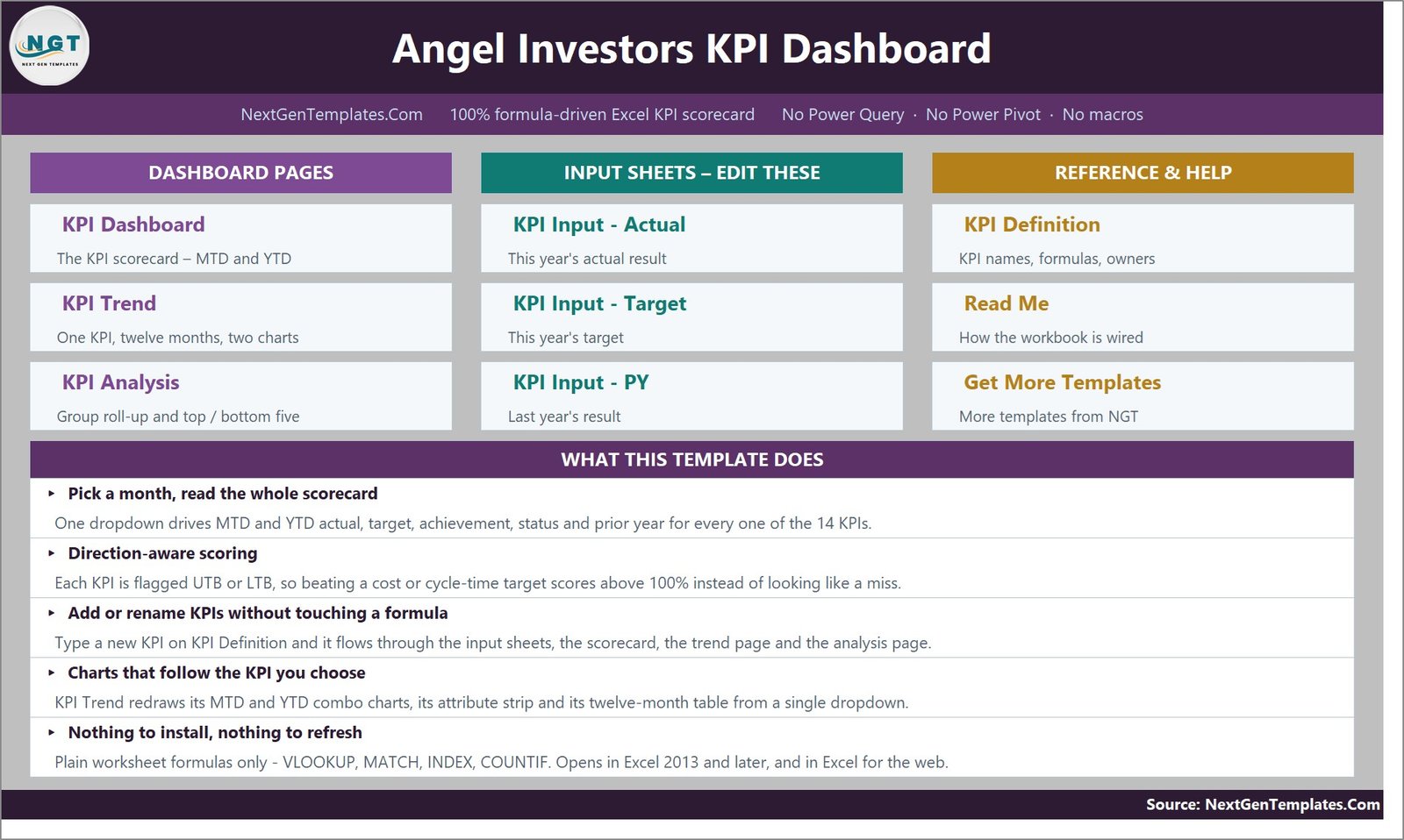
Ten sheets, split three ways. Three dashboard pages you read, three input sheets you type in, and four reference sheets – a KPI master list, a Read Me, a Support sheet of helper calculations and a links page. A home page ties them together and every sheet carries a HOME link back to it.
The 14 KPIs, and the five groups they sit in
The shipped KPI set is built around the shape of an angel or seed-stage operation – funnel at the top, deployment in the middle, returns and portfolio health at the bottom.
- Sourcing & Pipeline – Deal Flow (New Opportunities Screened), Screening-to-Term-Sheet Conversion.
- Deployment – Average Check Size, Capital Deployed, Time to Close, Ownership at Entry.
- Fund Returns – Portfolio Net IRR, TVPI (Total Value to Paid-In), DPI (Distributions to Paid-In).
- Portfolio Management – Follow-On Participation Rate, Portfolio Company Survival Rate, Portfolio MRR Growth, Board-Seat Coverage.
- Risk & Losses – Written-Off Investments.
None of that is fixed. The KPI Definition sheet is the master list and every other sheet reads from it, so renaming a KPI changes it everywhere and clearing a row makes the dashboard row go blank and the summary cards recount themselves. The sheets are wired for 22 KPIs with 14 filled in, so there are eight live, empty rows waiting – adding a KPI needs no formula work at all.
The KPI Dashboard: one dropdown, the whole scorecard
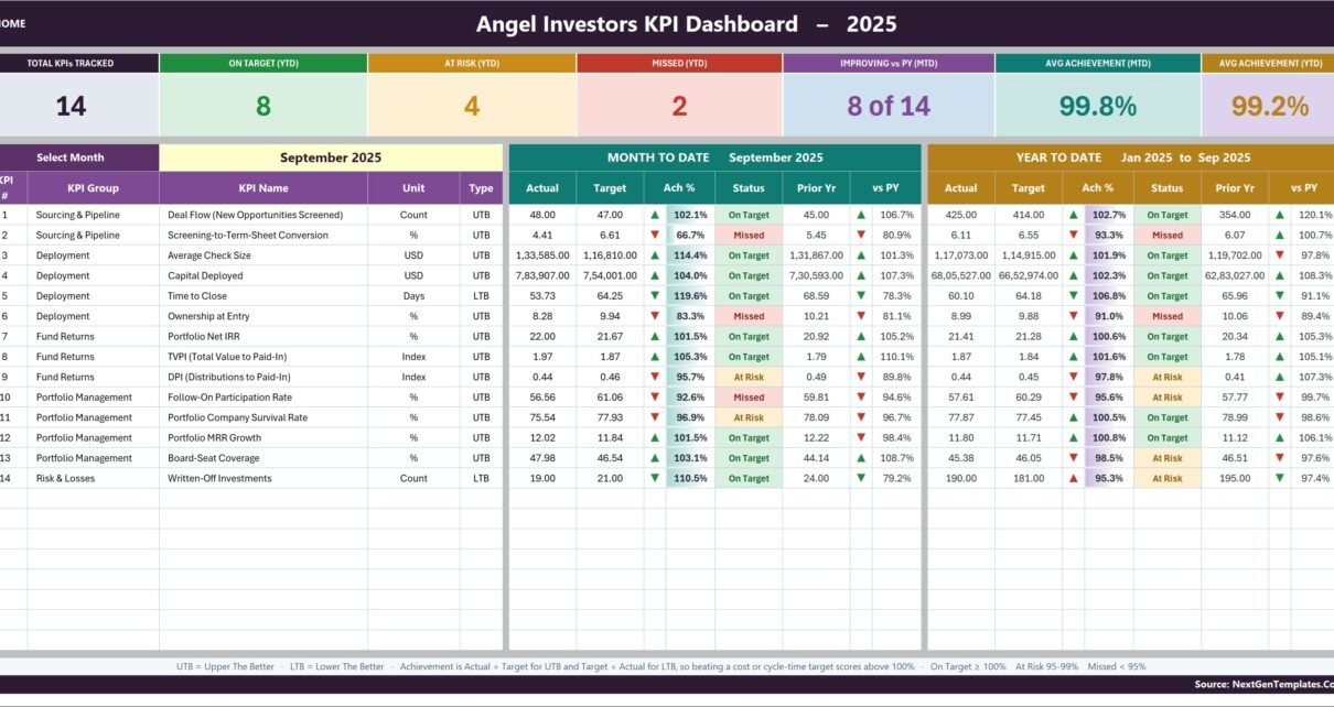
This is the page you will spend your time on. Seven summary cards run across the top – Total KPIs Tracked, On Target (YTD), At Risk (YTD), Missed (YTD), Improving vs PY (MTD), Avg Achievement (MTD) and Avg Achievement (YTD). Underneath, the month selector sits beside a MONTH TO DATE block and a YEAR TO DATE block, each carrying Actual, Target, Achievement %, Status, Prior Yr and vs PY for every KPI.
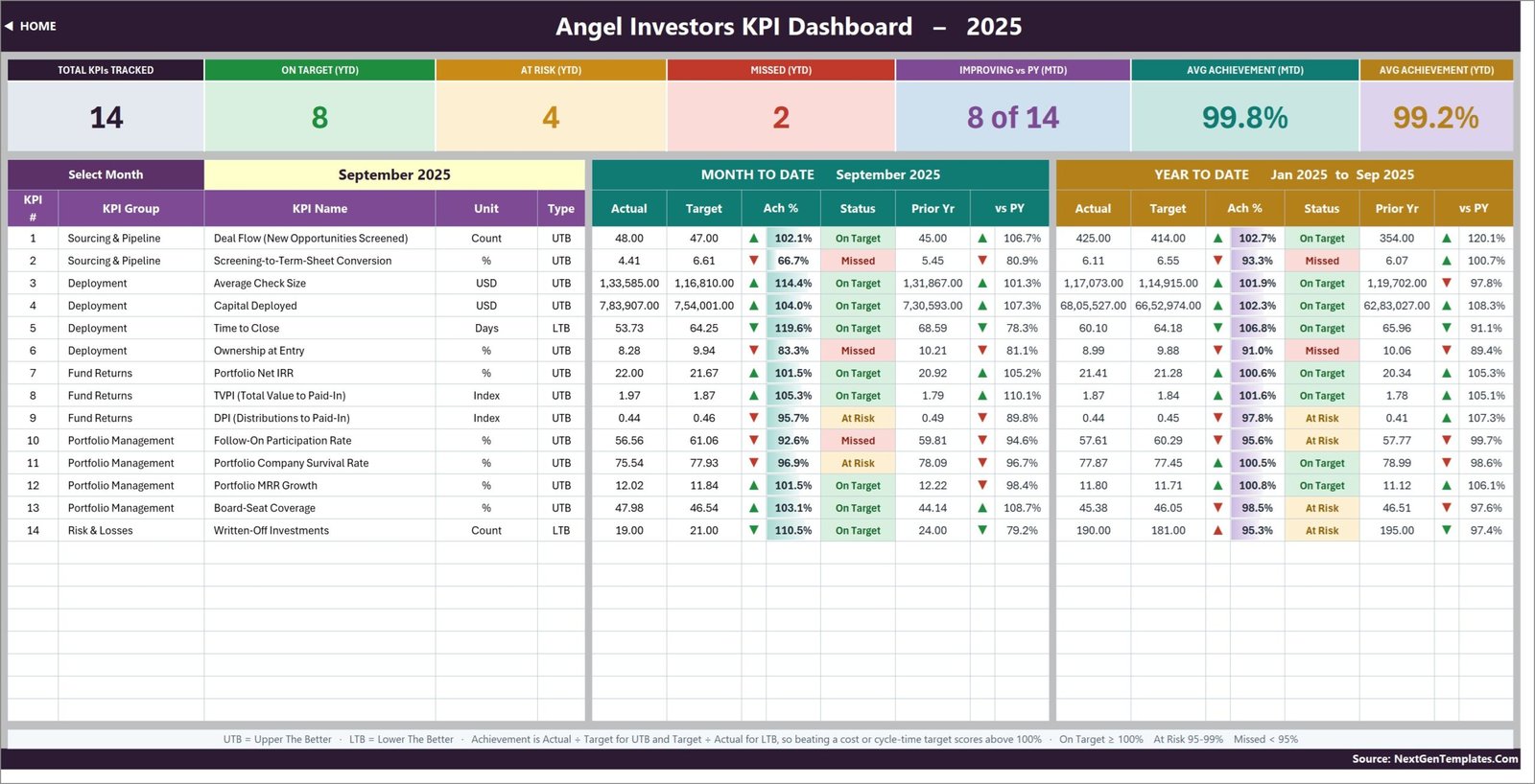
In the demo file, September 2025 reads 8 On Target, 4 At Risk and 2 Missed, with 8 of the 14 KPIs improving on prior year. Change the month in cell D6 and every one of those figures moves. There is no refresh step, because there is no query to refresh.
Why a “lower is better” KPI can score 119%
This is the detail that makes the scorecard honest, and it is worth understanding before you set your own KPIs up. Every KPI is flagged UTB (Upper The Better) or LTB (Lower The Better) in column G of KPI Definition. Achievement is then calculated as:
- UTB: Actual ÷ Target – more is better, so beating a revenue-style target scores above 100%.
- LTB: Target ÷ Actual – less is better, so beating a cost or cycle-time target also scores above 100%.
Time to Close in the demo data comes in at 53.7 days against a 64.3-day target. That is a good month, and it scores 119.6% rather than reading as a 84% shortfall. Get this flag wrong on your own KPIs and the traffic lights will be backwards, so it is the one field worth double-checking.
The status thresholds themselves are On Target from 100%, At Risk 95-99% and Missed below 95%. They live in the formulas in columns L and U of the KPI Dashboard sheet, so if your governance uses different bands you can edit them there.
KPI Trend: one metric, twelve months, two charts
The scorecard tells you where you are. The trend page tells you how you got there. Cell B4 is a dropdown of every KPI on the definition list; pick one and the entire page redraws – the attribute strip (group, unit, type, owner, priority, frequency), the formula and definition text, a twelve-month table of MTD and YTD actual, target, prior year, achievement and status, and two combo charts.
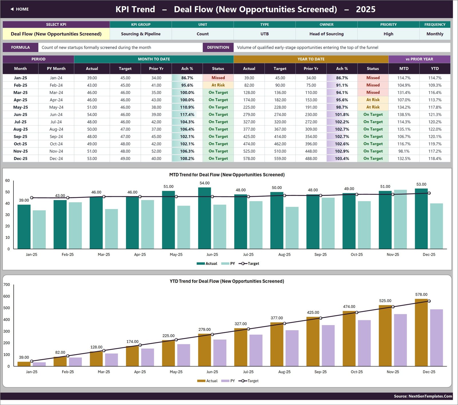
The screenshot shows MTD Trend for Deal Flow (New Opportunities Screened) and YTD Trend for Deal Flow (New Opportunities Screened). Both plot actual and prior-year as columns with the target as a line – so a month that beat target but fell behind last year is visible in one glance, which is exactly the pattern a monthly scorecard tends to hide.
KPI Analysis: the roll-up and the ranking
The third dashboard page answers “which part of the operation is dragging?” without any sorting on your part. A Performance by KPI Group table counts how many KPIs in each group are On Target, At Risk or Missed and averages their MTD and YTD achievement. An Average YTD Achievement by KPI Group bar chart plots the same numbers. And Top 5 / Bottom 5 Performing KPIs (YTD) rank every KPI automatically.
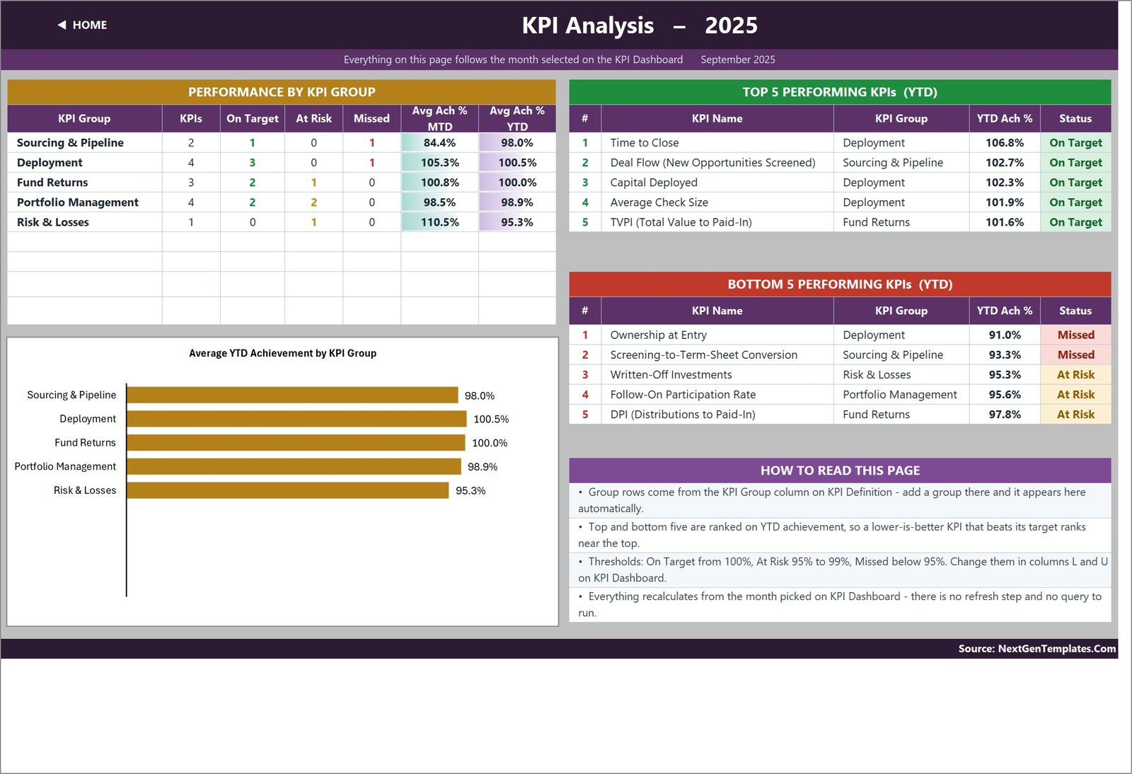
Because the ranking uses YTD achievement rather than raw value, an LTB KPI that beats its target rises to the top of the list rather than sinking to the bottom – in the demo data Time to Close is the number-one performer at 106.8%. Everything on this page follows the month you picked on the KPI Dashboard.
The three input sheets
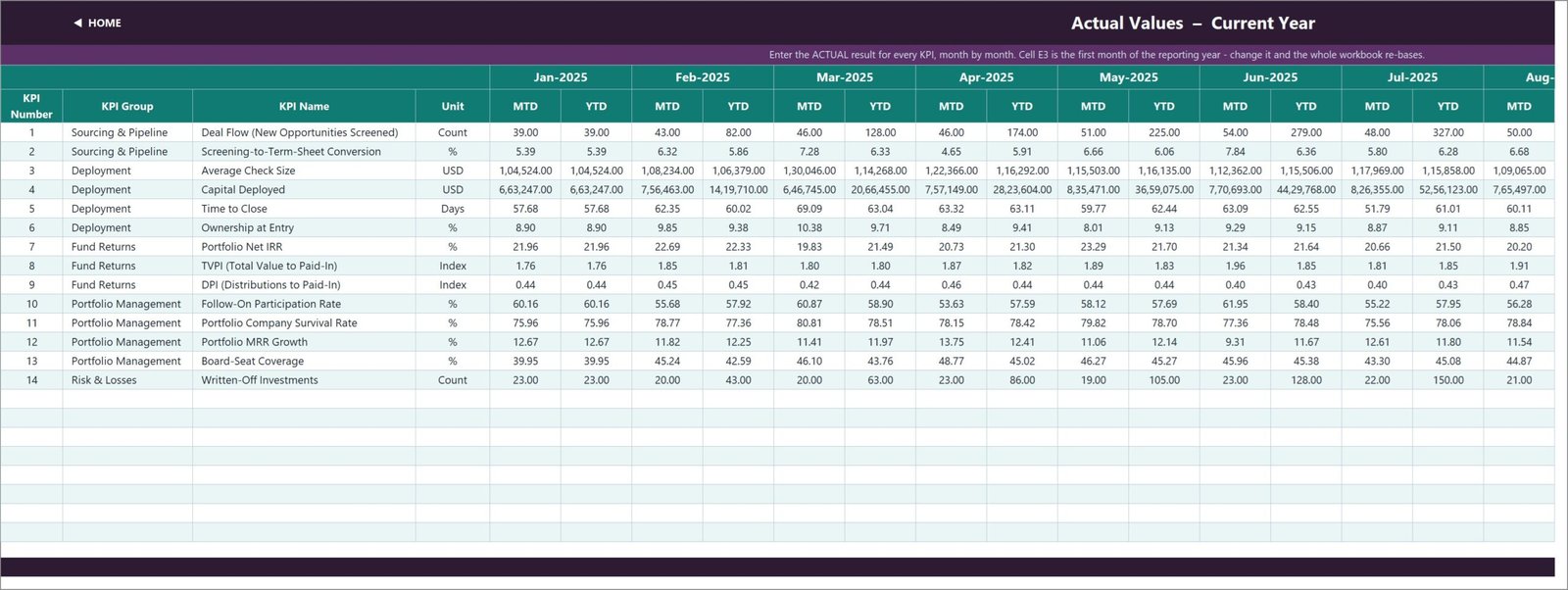
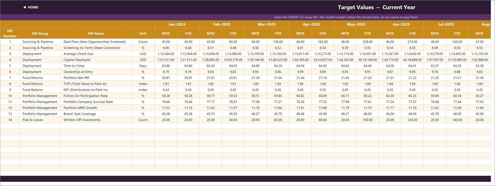
These are the only sheets you normally type in, and they share one grid: a row per KPI, an MTD and a YTD column for every month.
KPI Input – Actual holds this year’s results, and it is also where the reporting year is set. Cell E3 is the first month of the year; change it and the Target sheet, the Prior Year sheet, the month dropdown and every sheet title re-base automatically.
KPI Input – Target is the same grid for targets. The month headers follow the Actual sheet, so you never re-type them.
KPI Input – PY holds last year’s result, shifted back twelve months. This is what feeds the Prior Yr and vs PY columns on the scorecard and the prior-year series on both trend charts.
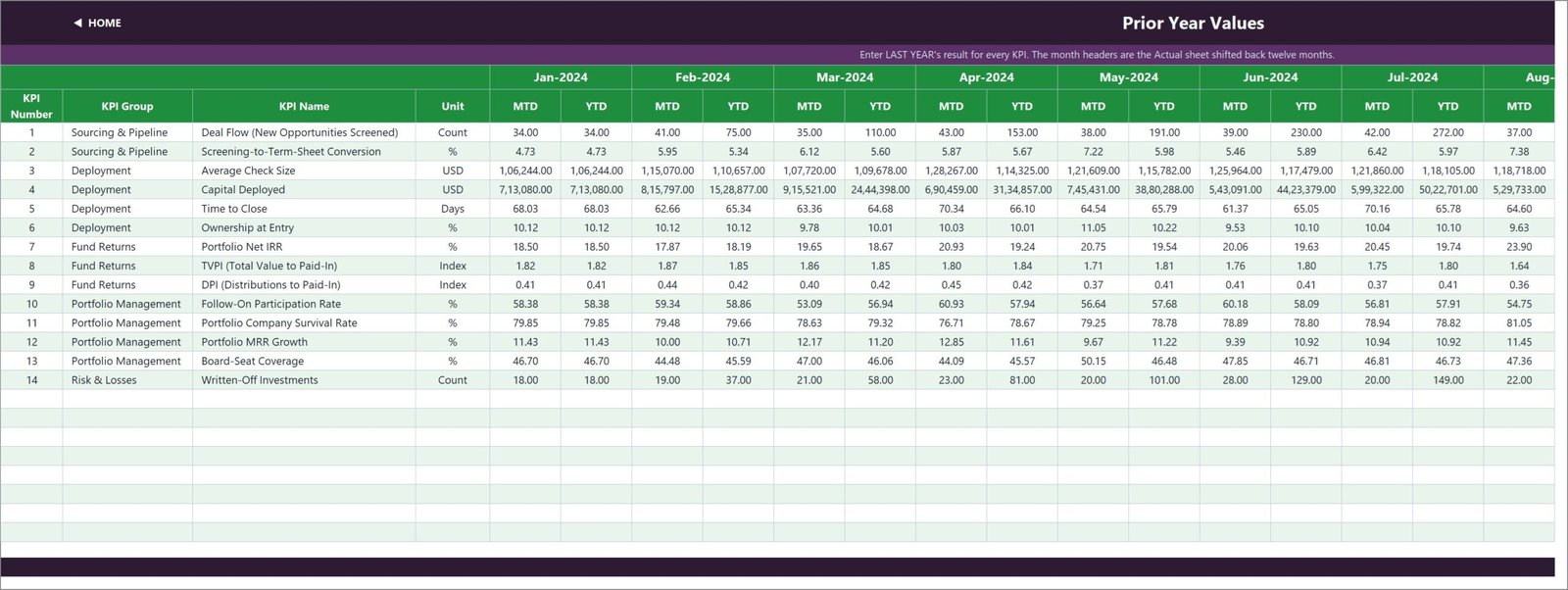
One design decision worth calling out: YTD is entered, not summed. That looks like extra typing, but it is deliberate. Counts accumulate through the year while rates, ratios and indices are running averages – and a fund that reports a compliance percentage summing to 1,100% by December has an invented KPI pack. Letting you supply the YTD figure means you keep control of how each metric rolls up.
KPI Definition and Read Me
The KPI Definition sheet is the master list: number, group, name, unit, formula, definition, type, owner, priority and frequency, one row per KPI. It is the single place to add, rename or remove a metric.
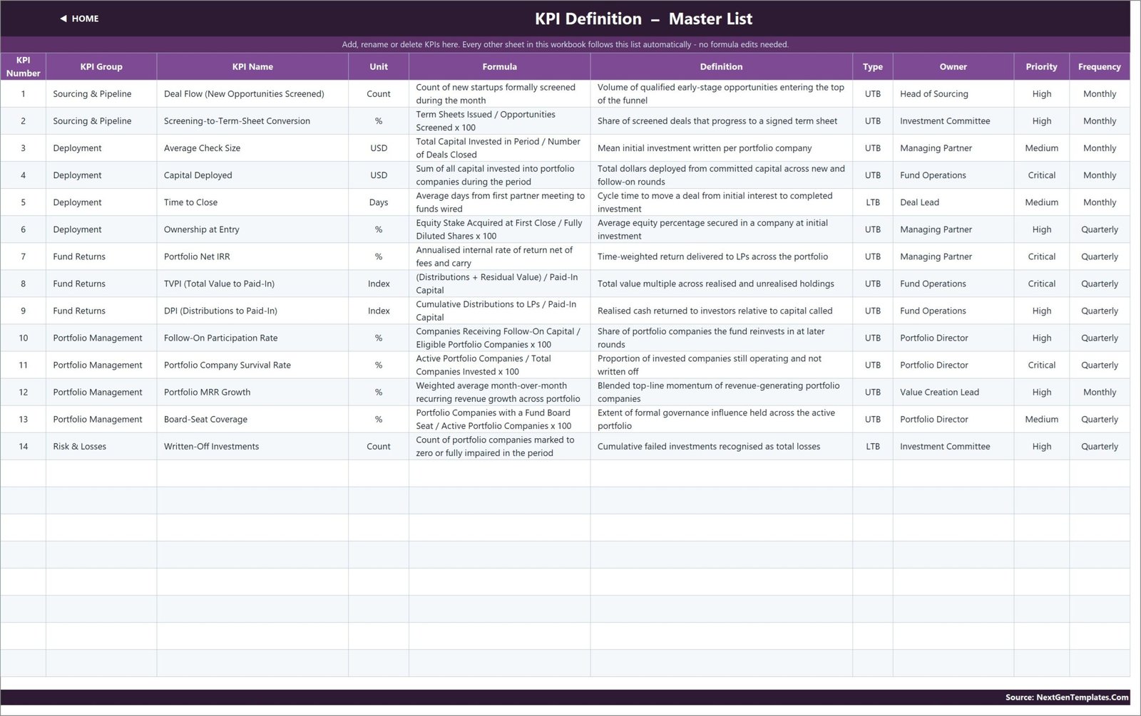
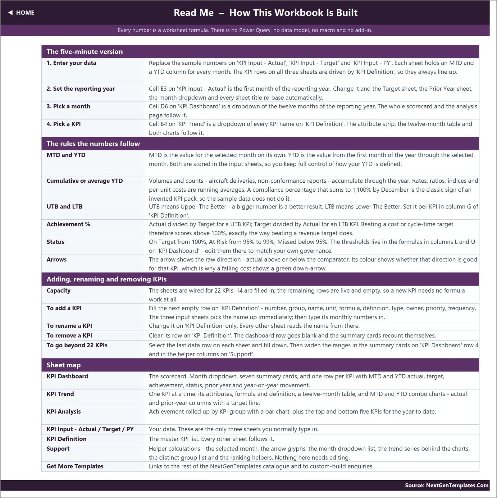
The Read Me sheet is a complete manual in one page – a five-minute quick start, the rules the numbers follow, how to add or rename KPIs, how to go beyond 22 of them, and a sheet-by-sheet map. If you read one non-dashboard sheet, read this one.
Getting started in about half an hour
- Open it and look around with the demo data still in place, so you can see what each page expects.
- Set your reporting year in cell E3 on KPI Input – Actual.
- Edit the KPI list on KPI Definition – rename, clear or add rows. Set UTB or LTB carefully.
- Type your figures into the Actual, Target and PY sheets.
- Pick a month in cell D6 on KPI Dashboard.
- Adjust the thresholds in columns L and U if 100 / 95 is not your standard.
Limitations – what this template does not do
Worth reading before you buy rather than after.
- It does not calculate returns. Portfolio Net IRR, TVPI and DPI are input rows. You enter the value; the workbook compares, charts and scores it. If you need returns derived from cash flows, calculate them in your fund accounting system and bring the result here.
- It is not advice, and not a valuation. Nothing in the workbook recommends or evaluates any investment, and it makes no claim of conformity with any valuation or reporting framework.
- It is not a fund accounting system, cap table, deal CRM or LP reporting pack. It is a scorecard that sits on top of whatever you already use for those.
- There is no live connection. No connectors, no API calls, no internet requirement. You type the figures in.
- All the sample data is fictional. Every figure, owner name and month in the shipped file was generated to fill the layout. It describes no real fund, syndicate, portfolio or company.
Two build quirks in the shipped file
We would rather flag these than have you discover them:
- The USD figures use Indian digit grouping. Average Check Size and Capital Deployed display as
1,33,585.00and68,05,527.00rather than133,585.00and6,805,527.00. Every value and every calculation is correct – only the placement of the thousands separator follows the Indian numbering system. It is a cell number format, so selecting the affected columns on the KPI Dashboard, the three input sheets and KPI Trend and applying your own format fixes it in a few seconds. - One Read Me line carries example text from another industry. The “Cumulative or average YTD” row illustrates its point with “aircraft deliveries, non-conformance reports”. The explanation itself is correct and applies to any KPI set – only the two examples are left over from a different build.
Frequently asked questions
Do I need macros, Power Query or an add-in?
No. It is a plain .xlsx workbook built from worksheet formulas – VLOOKUP, MATCH, INDEX and COUNTIF. There is no VBA, no data model and no connector, so there is nothing to enable or whitelist.
Which versions of Excel does it work in?
Excel 2013 and later on Windows, Excel for Mac, and Excel for the web. Because there is no data model and no query, the browser version behaves the same as the desktop one.
Can I track more than 14 KPIs?
Yes. The sheets are wired for 22 and 14 are filled in, so eight more need nothing but typing. The Read Me explains how to extend past 22 – select the last data row on each sheet, fill down, then widen the ranges in the summary cards and the Support helper columns.
How is this different from an angel or VC dashboard?
A KPI dashboard of this kind is a monthly scorecard: fixed metrics, a month picker, traffic lights and trend pages, driven by figures you type. Our analytical dashboards are pivot-and-slicer reports built over a flat deal-level table, for slicing and dicing raw records. Plenty of people use both – the scorecard for the monthly partner pack, the dashboard for digging into the underlying data.
What is in the download?
A zip containing the .xlsx workbook with all ten sheets and the demo data in place, plus an Excel KPI Dashboard user manual PDF.
Get the template
The Angel Investors KPI Dashboard in Excel is available now on NextGenTemplates – one payment, lifetime access, unlimited re-downloads and free minor updates.
If your setup is a little different, these are the closest neighbours:
- Business Angel Networks KPI Dashboard in Excel – the same scorecard design aimed at a network rather than an individual investor.
- Business Angel Networks Dashboard in Excel – the analytical cousin, built on pivots and slicers over a deal-level table.
- VC Portfolio Dashboard in Google Sheets – for teams that live in Google Sheets.
- Investor Relations Dashboard in Power BI – the LP-communication side of the same workflow.
Built by PK – Microsoft Certified Professional with 15+ years of Excel, Google Sheets and Power BI experience, and founder of NextGenTemplates.