Mobile banking teams can collect dozens of operational measures, yet a management review often needs a smaller, stable set. The Mobile Banking KPI Dashboard in Excel starts with 14 defined KPIs across five groups and turns them into a month-driven MTD/YTD scorecard. It compares actuals with targets and prior year, scores upper- and lower-is-better measures correctly, and flags each result as On Target, At Risk, or Missed. The workbook is formula-only: no macros, Power Query, Power Pivot, add-ins, or refresh steps. It is designed for monthly management reporting, not live transaction monitoring or regulatory submission.
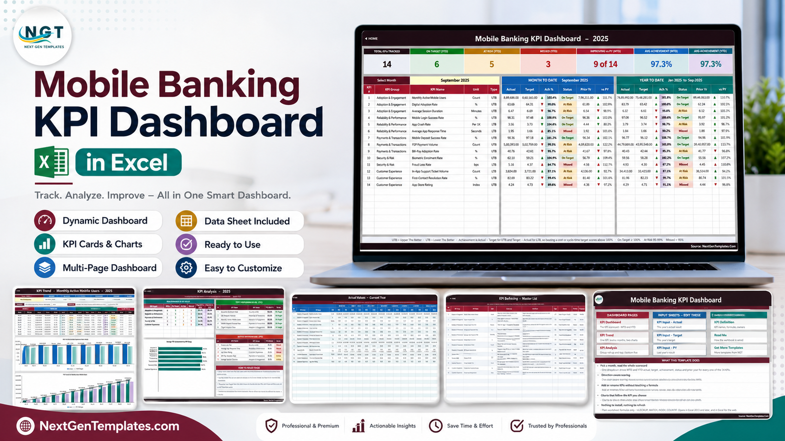
Key Features of Mobile Banking KPI Dashboard in Excel
The dashboard tracks 14 KPIs grouped into Adoption & Engagement, Reliability & Performance, Payments & Transactions, Security & Risk, and Customer Experience. The ready-made list includes monthly active mobile users, digital adoption rate, average session duration, mobile login success, app crash rate, average app response time, mobile deposit success, P2P payment volume, bill-pay adoption, biometric enrolment, fraud loss rate, in-app support ticket volume, first-contact resolution, and app store rating.
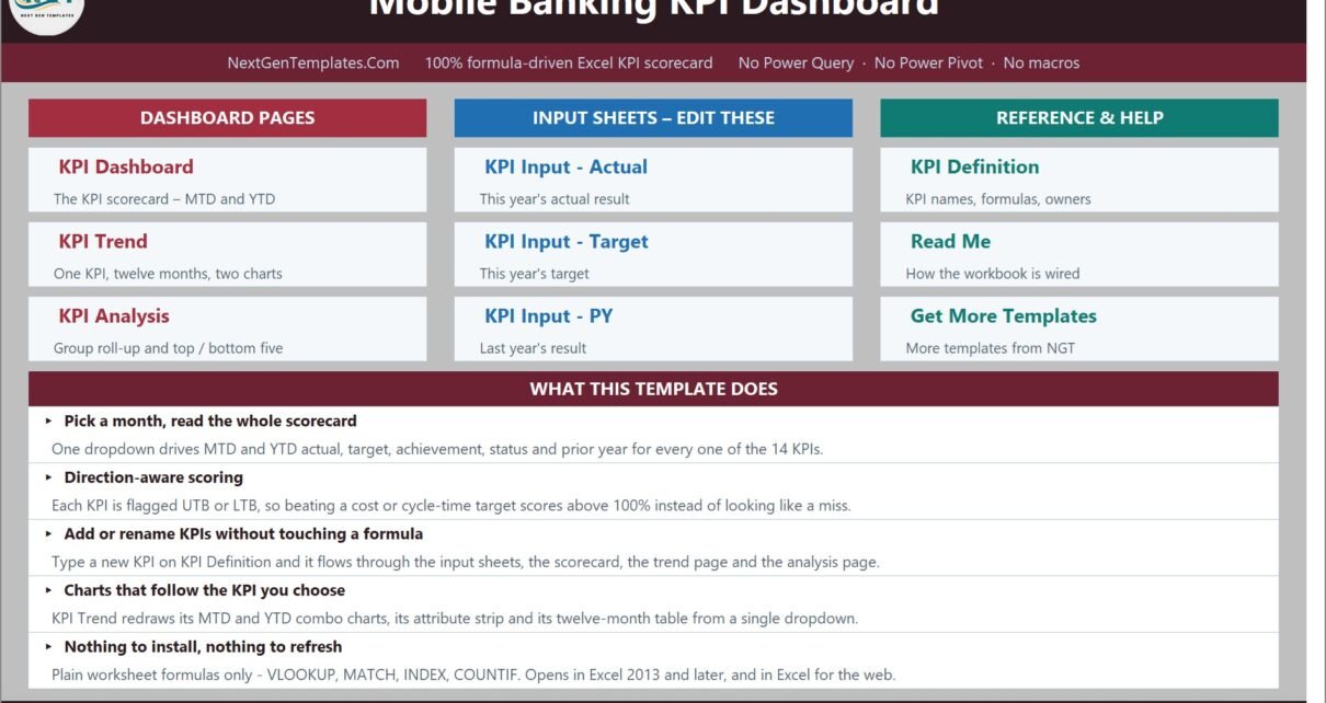
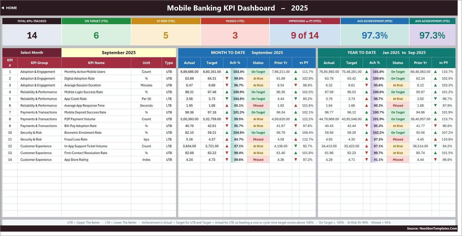
A single month selector drives the scorecard and analysis pages. Each KPI displays MTD and YTD actual, target, achievement, status, prior-year result, and movement versus prior year. Seven cards summarise how many KPIs are tracked, on target, at risk, missed, improving, and the average MTD/YTD achievement. The workbook distinguishes UTB (Upper The Better) from LTB (Lower The Better), which prevents falling crash rates or response times from being misread as poor performance.
Dashboard Pages and Workbook Sheets Explained
1. Home Page
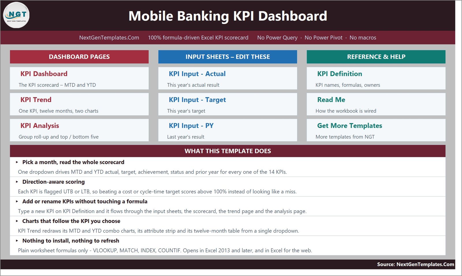
The Home page is a visual workbook map. It separates the three reporting pages, three editable input sheets, and reference/help sheets. It also states the 14-KPI scope, formula-only design, and the core workflow.
2. KPI Dashboard
This is the monthly scorecard. In the September sample, six KPIs are on target YTD, five are at risk, three are missed, and nine of 14 improve versus prior year MTD. These are sample figures, not industry benchmarks. Every row combines the current result, target, status, and prior-year comparison.
3. KPI Trend
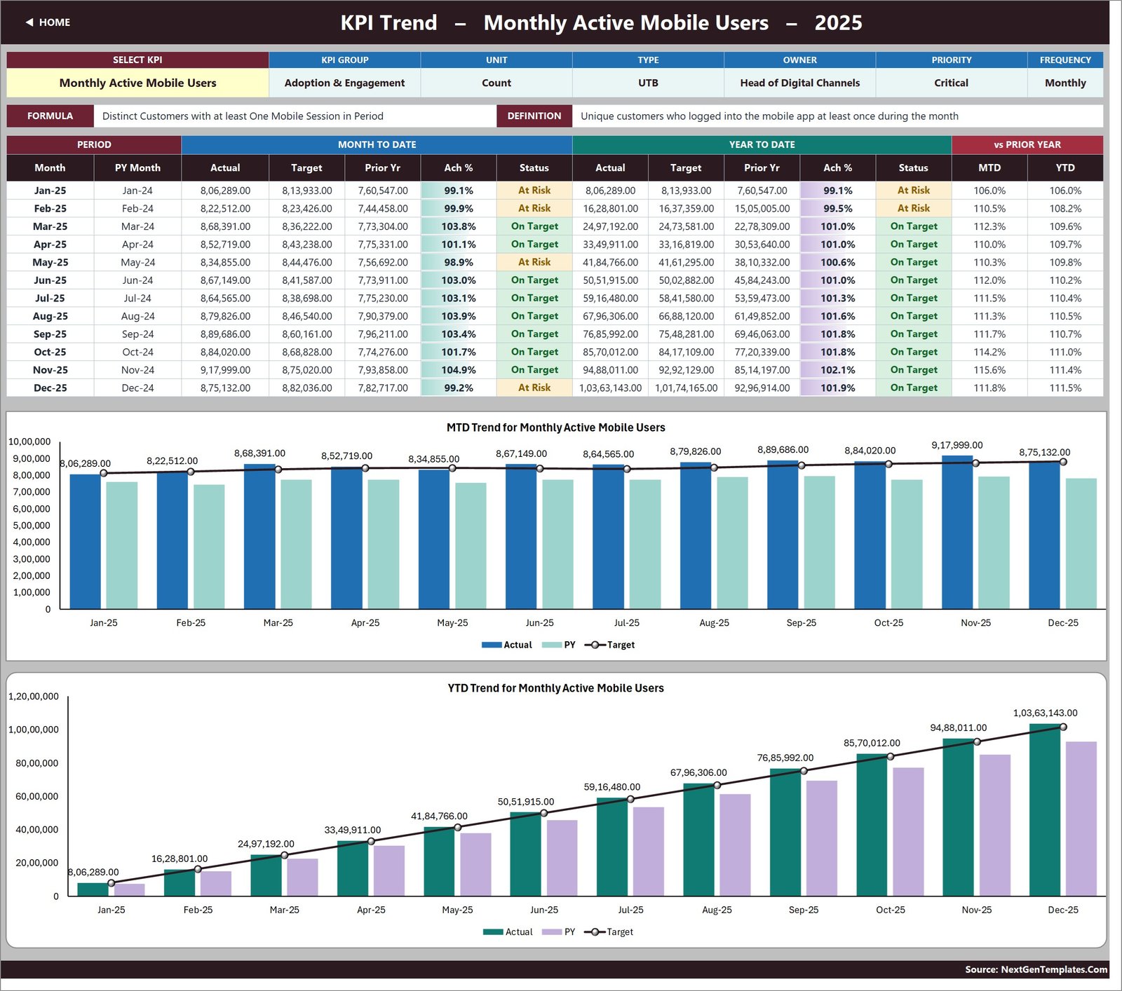
Select one KPI to show its group, unit, UTB/LTB type, owner, priority, frequency, formula, and definition. A 12-month table and two charts compare actual, target, and prior year for MTD and YTD. The example displays Monthly Active Mobile Users.
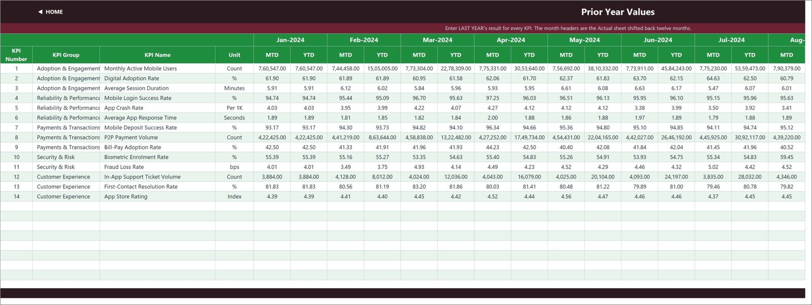
4. KPI Analysis
The analysis page rolls results up by KPI group, charts average YTD achievement, and ranks the top and bottom five KPIs. It follows the month selected on KPI Dashboard, so a review meeting stays on one reporting period.
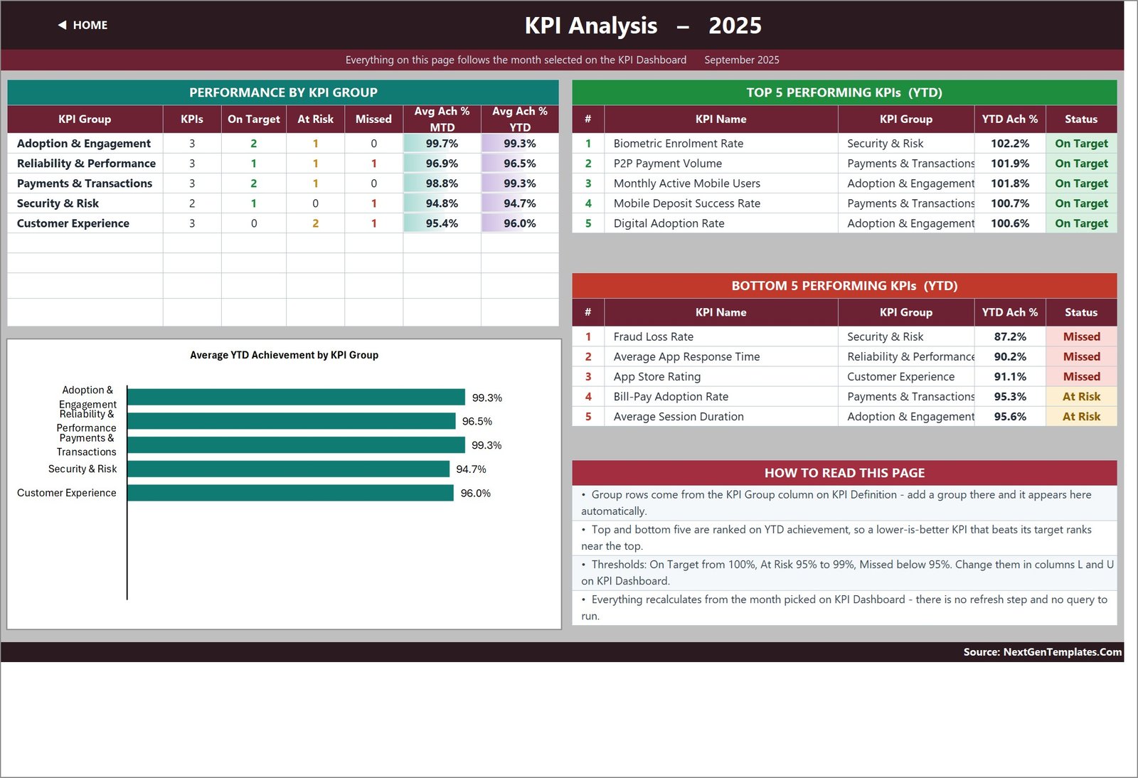
5. Actual Values – Current Year
Enter monthly MTD and YTD actuals here. Cell E3 defines the first month of the reporting year; changing it rebases the month headers and linked reporting sheets.
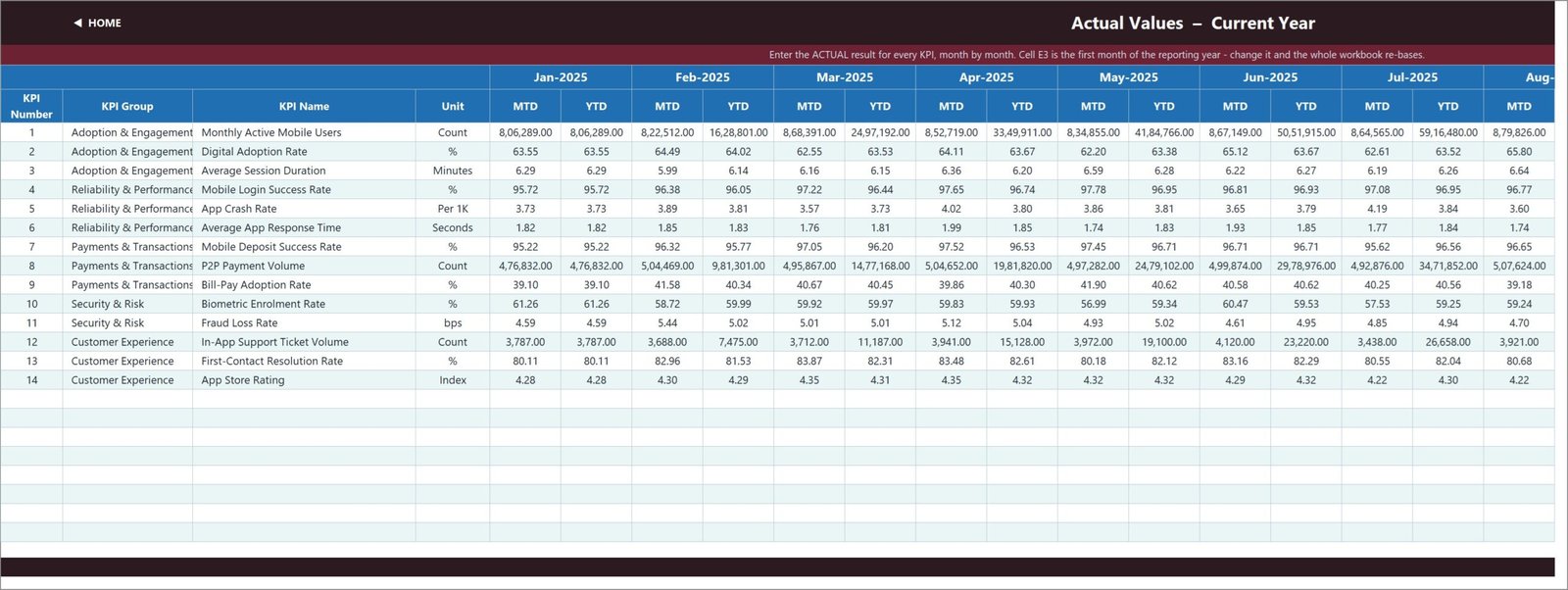
6. Target Values – Current Year
This sheet stores each monthly target. Its period headings follow the Actual sheet, avoiding repeated setup and keeping row definitions aligned.
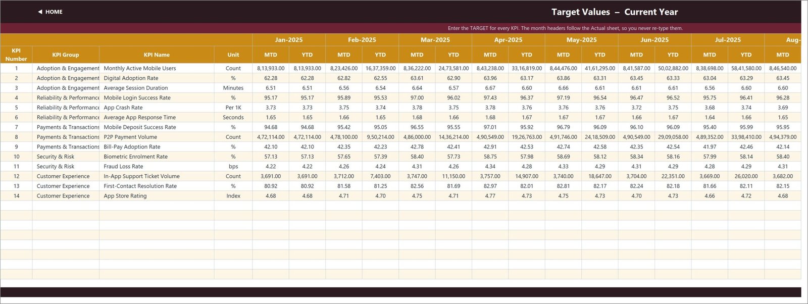
7. Prior Year Values
Enter comparable prior-year MTD and YTD figures. These values feed both the scorecard’s year-on-year columns and the two trend charts.
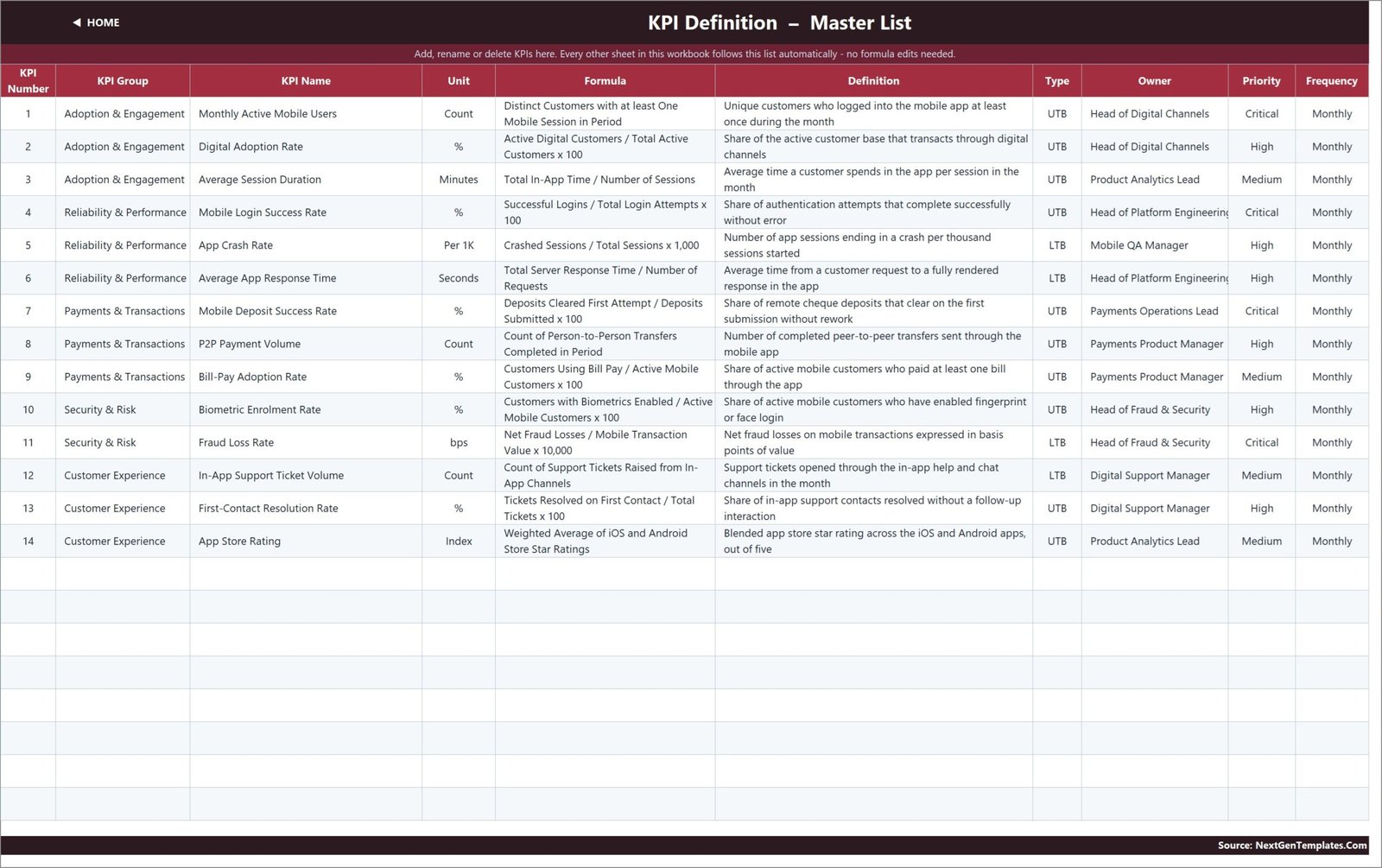
8. KPI Definition – Master List
This is the control table for KPI number, group, name, unit, formula, definition, type, owner, priority, and frequency. Add or rename a KPI here and the linked sheets follow it. Fourteen rows are populated and the workbook is wired for 22.
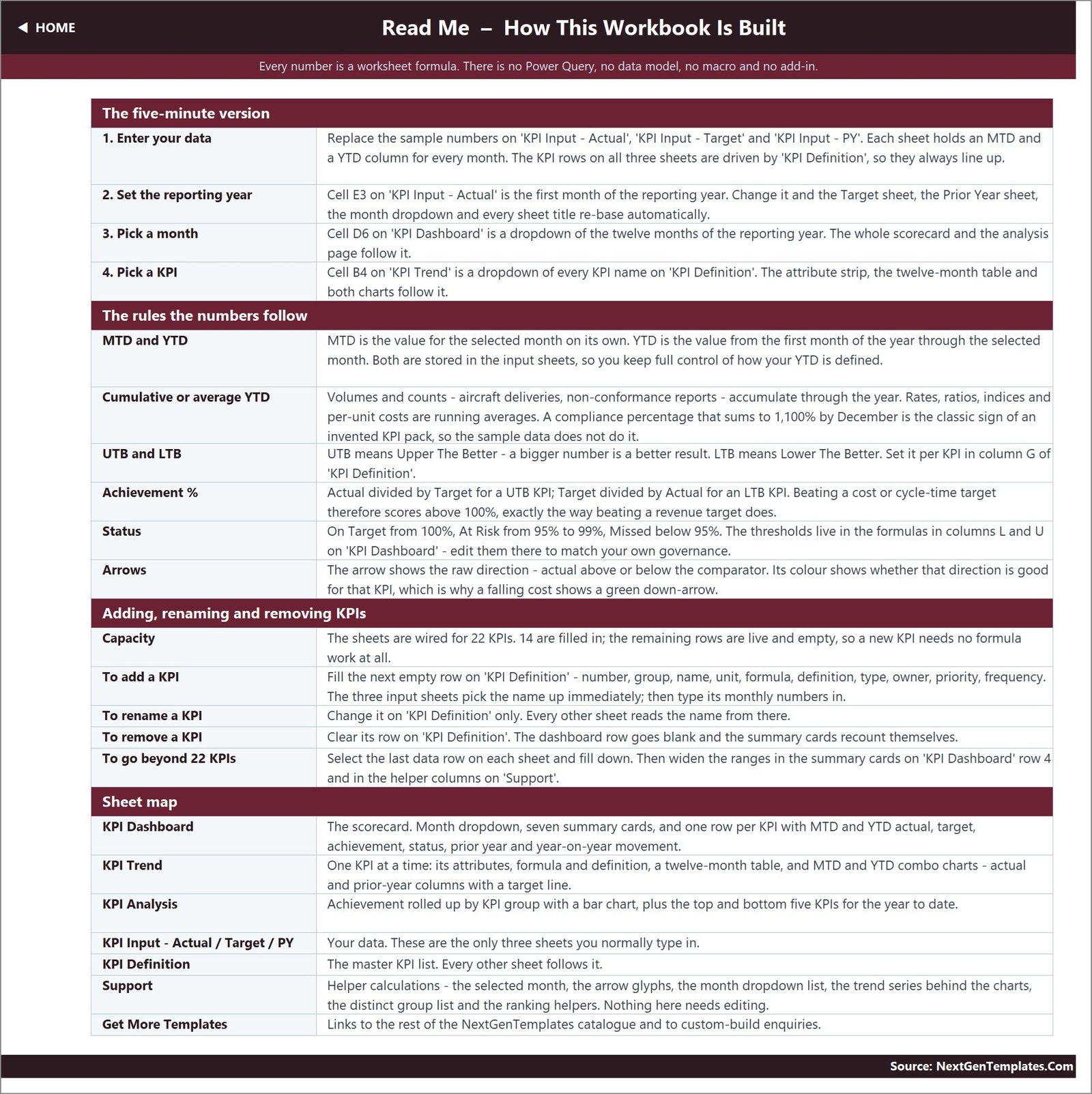
9. Read Me
The guide explains the five-minute setup, MTD/YTD treatment, UTB/LTB logic, achievement formulas, status thresholds, arrows, capacity, and the exact cells used for month and KPI selection.
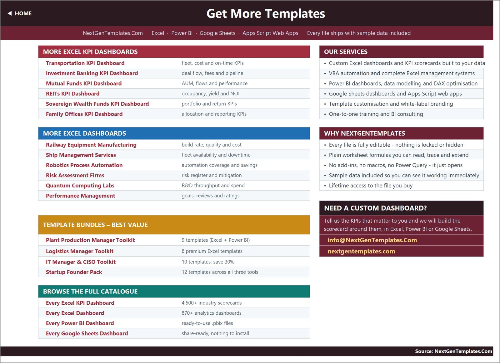
10. Get More Templates
The final page links to related Excel KPI dashboards, analytical dashboards, bundles, and custom build services.
Mobile Banking KPI Dashboard in Excel vs. Google Sheets vs. Banking Analytics SaaS – Feature Comparison
| Area | Excel KPI template | Google Sheets alternative | Banking analytics SaaS |
|---|---|---|---|
| Pricing model | One-time template purchase | Low platform cost plus build time | Recurring licence |
| Setup | Replace sample inputs | Create logic and visuals | Configure data integrations |
| Offline access | Yes | Limited | Usually no |
| Simultaneous editing | Possible through Microsoft 365 | Native | Usually supported |
| Live production feeds | No | No by default | Often available |
| Custom KPI definitions | Editable master list | Editable | Vendor dependent |
| Transparent formulas | Yes | Yes | Often hidden |
| Best use | Monthly management scorecard | Shared lightweight tracker | Enterprise telemetry |
Who Should Use This Template
Digital channels heads can use it for an executive monthly pack. Mobile product managers can monitor adoption, engagement, reliability, and ratings together. Payments leaders can focus on deposit success, P2P volume, and bill-pay adoption. Fraud and security teams can track biometric enrolment and fraud loss without confusing lower-is-better measures. Customer support leaders can compare ticket volume and first-contact resolution with prior year.
It is not suitable as a fraud alert engine, core-banking interface, payment processor, real-time application-performance monitor, or regulatory return. The values are entered into Excel and the included records are sample data. KPI definitions should be reviewed against your organisation’s governance before use.
Real-World Use Cases
Monthly digital banking review
A Head of Digital Channels picks the reporting month and uses the summary cards to open the meeting. Owners then work through only the At Risk and Missed rows.
Mobile release impact review
A product analyst selects app crash rate, login success, response time, or app store rating on KPI Trend to compare the release period with target and prior year.
Payments and risk prioritisation
An operations lead uses KPI Analysis to see whether Payments & Transactions or Security & Risk is dragging the average, then assigns work from the bottom-five list.
Advantages of Mobile Banking KPI Dashboard in Excel
- The master definition list keeps metric meaning, formula, owner, and frequency beside each KPI.
- UTB/LTB logic makes status direction explicit.
- MTD and YTD views are available without pivot-table refreshes.
- The formula-only design is inspectable and works in Excel 2013 and later, including Excel for the web.
- Capacity for 22 KPIs gives room to extend the 14-item starter pack.
Opportunities for Improvement
The workbook intentionally has no live data connector, automated import, role-based access, audit trail, or alert distribution. Teams that need those capabilities can combine it with a governed data process, use Microsoft 365 sharing controls, or move to a BI platform. For collaborative Excel guidance, see Microsoft’s co-authoring documentation.
Best Practices
- Agree each KPI’s formula, unit, owner, frequency, and UTB/LTB type before loading results.
- Keep actual, target, and prior-year definitions consistent.
- Validate the reporting-year start month before entering the first period.
- Use approved aggregate figures; do not place customer-level or sensitive banking data in a broadly shared workbook.
- Record commentary and actions outside the scorecard so the source values remain controlled.
- Review the status thresholds against your governance; the default bands are editable.
Explore Relevant Templates
For adjacent use cases, review the Investment Banking KPI Dashboard in Excel, Banking KPI Scorecard in Excel, Banking Operations KPI Dashboard in Excel, and Banking KPI Dashboard in Power BI. Related new topics include the WealthTech KPI Dashboard in Excel and FinOps Teams KPI Dashboard in Excel.
Frequently Asked Questions
How many KPIs are included?
Fourteen definitions are filled in, and the prepared workbook capacity is 22 KPIs.
Can I rename or add KPIs?
Yes. Edit the KPI Definition master list. Linked input and reporting sheets follow it within the prepared rows.
How does the month selector work?
Choose one of the 12 reporting months on KPI Dashboard. The scorecard and KPI Analysis page recalculate for that month.
What do UTB and LTB mean?
UTB means Upper The Better; LTB means Lower The Better. The achievement formula reverses for LTB metrics so a lower loss, cost, or response time can score above target.
Does the workbook contain customer data?
No. It ships with sample aggregate KPI figures. Replace them with authorised reporting data and follow your organisation’s data-handling rules.
Does it work without macros?
Yes. The workbook uses worksheet formulas only and requires no macro enablement.
Is this the same as a general banking dashboard?
No. This is a KPI scorecard line with month selection, traffic-light status, KPI Trend, and KPI Analysis pages. It is distinct from analytical dashboards built around transaction-level exploration.
About the Author
Built by PK – Microsoft Certified Professional with 15+ years of Excel, Google Sheets, and Power BI experience. Founder of NextGenTemplates, reaching 300K+ subscribers across YouTube channels. Every template is hand-built and tested before release.
Conclusion
The Mobile Banking KPI Dashboard in Excel gives digital banking teams a controlled monthly scorecard without a BI implementation. Its value is the combination of clear definitions, MTD/YTD comparisons, direction-aware achievement, trend analysis, and group prioritisation in one editable workbook. View the product and download the template, then visit PK-AnExcelExpert on YouTube for Excel tutorials.