Most cyber risk registers die in a spreadsheet. The rows go in, the severities get typed, and once a quarter somebody pastes a few screenshots into a slide deck. The Cyber Risk Management Dashboard in Power BI is built for the step after that: taking a register you already keep and turning it into five report pages that a security committee can read in two minutes.
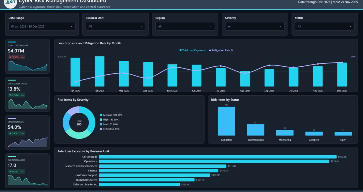
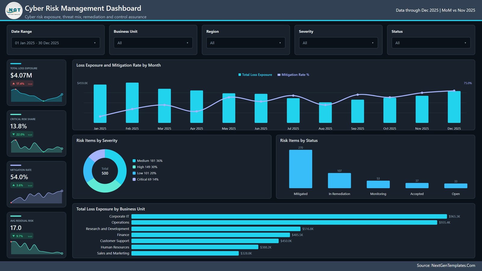
The sample file ships with a 500-row register and opens on $4.07M of total loss exposure, a 13.8% critical risk share, a 54.0% mitigation rate and an average residual risk score of 17.0 – each of them a DAX measure, each carrying a month-on-month delta and a twelve-point sparkline. Point the model at your own workbook, refresh, and every one of those numbers becomes yours.
This post walks through what is in the file, what it deliberately does not do, and who it actually suits. If you would rather have the same subject in a plain workbook, the Cyber Risk Management Dashboard in Excel is the companion edition.
Key Features of the Cyber Risk Management Dashboard in Power BI
- Five analysis pages – Overview, Risk Trends, Threat Analysis, Business Units and Compliance & Controls – each with its own KPI rail and its own question to answer.
- Sixteen KPI cards across those pages. No card shows a bare number: every one carries a delta badge and a sparkline so direction travels with value.
- Five slicers per page. Date Range, Business Unit, Region and Severity are synced across pages, so a filter you set on Overview survives the jump to Threat Analysis. The fifth slot changes per page – Status, Threat Category, Asset Category or Compliance Framework.
- Three scorecard tables with in-row exposure bars, by threat category, business unit and compliance framework.
- A Details drillthrough page wired to seven fields: Business Unit, Region, Asset Category, Threat Category, Compliance Framework, Severity and Status.
- Two hover tooltip pages – Metric Detail and Trend Detail – that keep secondary context off the main canvas.
- 39 DAX measures drive the visuals, including the card, delta and sparkline variants. Nothing is locked and there are no custom visuals to licence.
- Six compliance frameworks modelled as a dimension: ISO 27001, NIST CSF, SOC 2, PCI DSS, GDPR and HIPAA.
- A custom theme JSON registered inside the file, so the whole report recolours from one place.
Dashboard Pages Explained
Overview
The page you show the committee. Four cards – Total Loss Exposure, Critical Risk Share, Mitigation Rate, Avg Residual Risk – then four visuals underneath.
Loss Exposure and Mitigation Rate by Month is a combo chart running Jan to Dec 2025, with exposure as columns and the mitigation rate as a line, so a month where spend went up and mitigation did not is immediately visible. Risk Items by Severity splits the 500 register rows into Medium 181 (36%), High 149 (30%), Low 101 (20%) and Critical 69 (14%). Risk Items by Status shows the remediation funnel – Mitigated 270, In Remediation 107, Monitoring 53, Accepted 37, Open 33. And Total Loss Exposure by Business Unit ranks the seven units, from Corporate IT at $965.3K down to Sales and Marketing at $328.8K.
Risk Trends
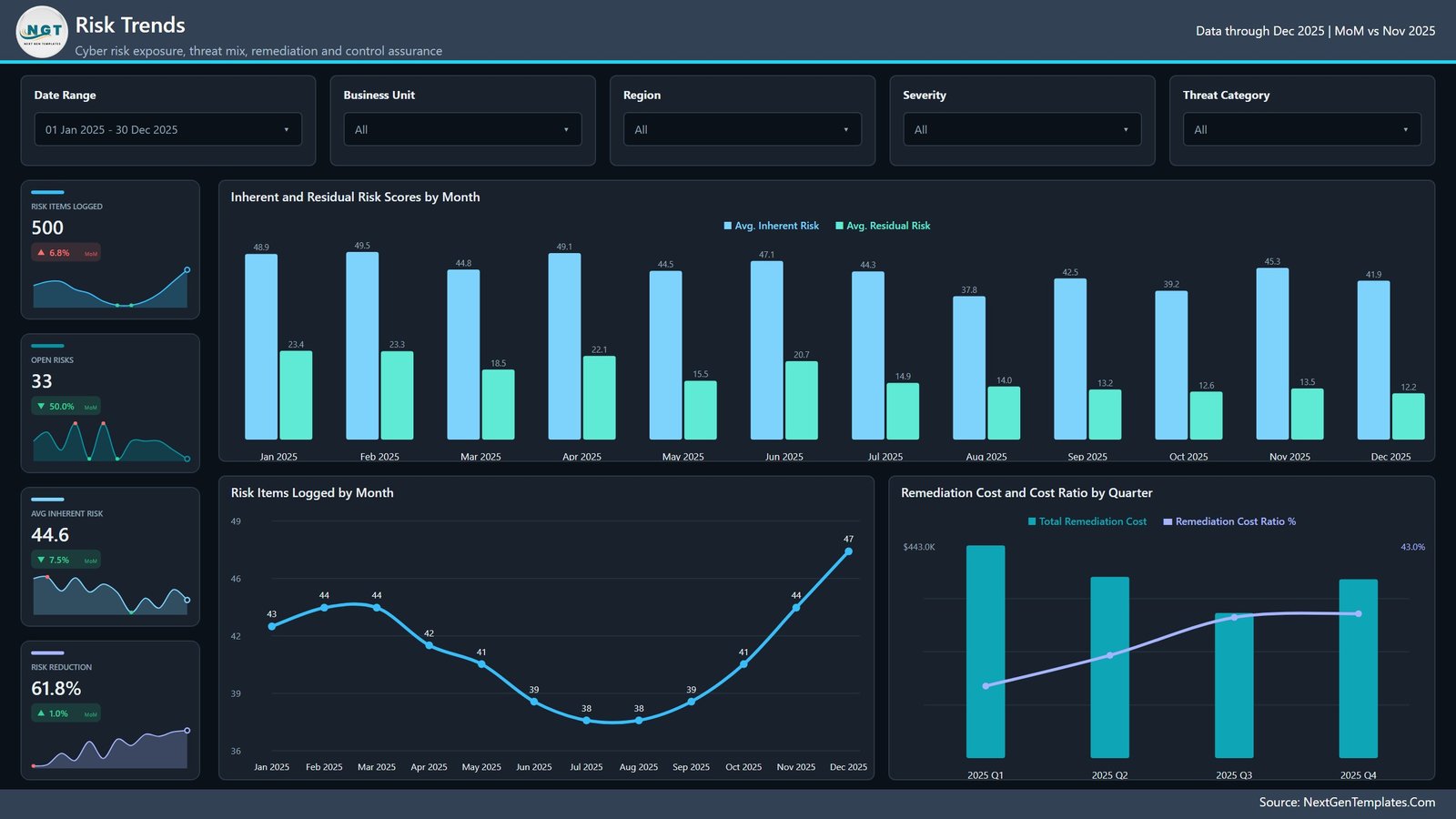
The direction-of-travel page: Risk Items Logged, Open Risks, Avg Inherent Risk and Risk Reduction. Inherent and Residual Risk Scores by Month is the one that earns the page – the two scores sit side by side each month, so the widening gap between them is the visual argument that controls are working. Risk Items Logged by Month tracks intake volume, and Remediation Cost and Cost Ratio by Quarter pairs quarterly spend against the ratio it bought across 2025 Q1–Q4.
Threat Analysis
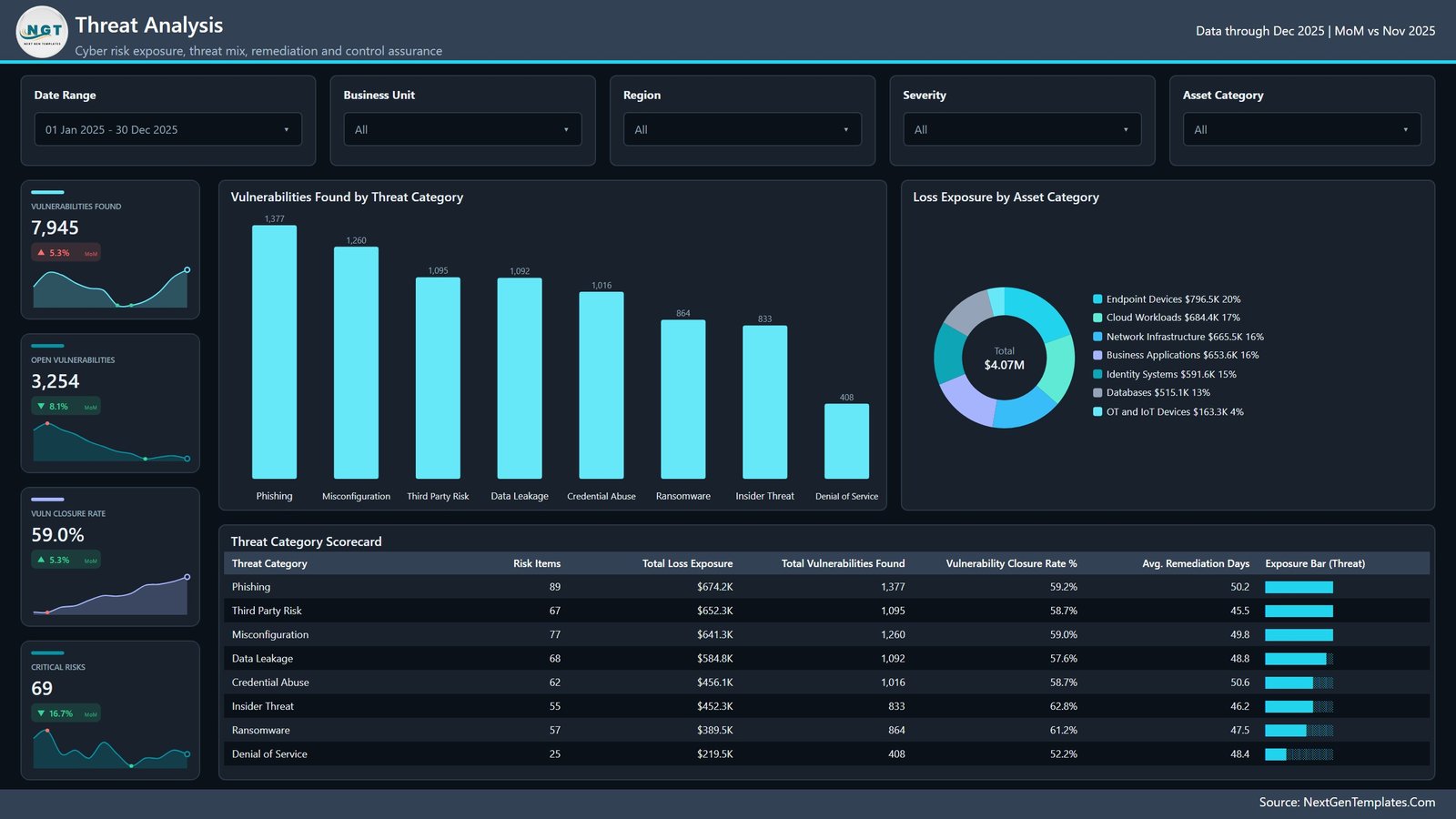
Where the volume actually is. The rail carries Vulnerabilities Found, Open Vulnerabilities, Vuln Closure Rate and Critical Risks. Vulnerabilities Found by Threat Category ranks eight categories – Phishing 1,377, Misconfiguration 1,260, Third Party Risk 1,095, Data Leakage 1,092, Credential Abuse 1,016, Ransomware 864, Insider Threat 833, Denial of Service 408. Loss Exposure by Asset Category distributes the $4.07M across seven asset classes, led by Endpoint Devices at $796.5K. The Threat Category Scorecard then puts risk items, exposure, vulnerabilities found, closure rate and average remediation days on one row per category – which is where the useful tension shows up, because the category with the most vulnerabilities is not the one with the slowest remediation.
Business Units
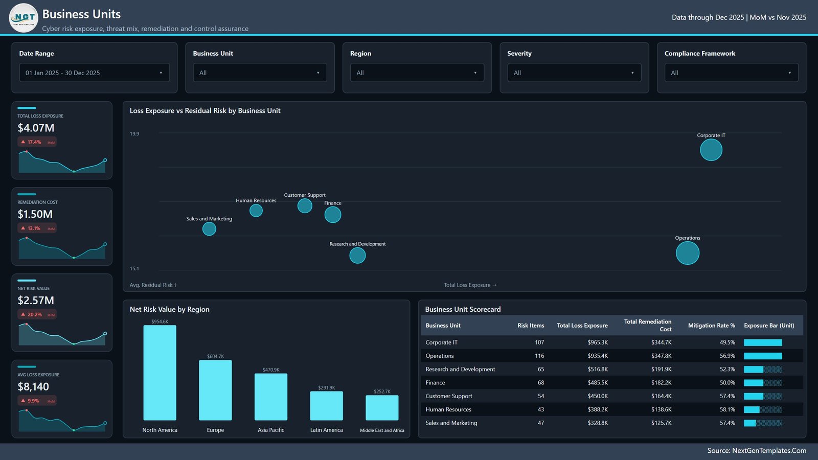
The accountability page: Total Loss Exposure, Remediation Cost, Net Risk Value and Avg Loss Exposure. Loss Exposure vs Residual Risk by Business Unit plots the seven units as bubbles on two axes, so a unit that is both expensive and unresolved separates itself from the pack without anybody needing to sort a table. Net Risk Value by Region ranks five regions from North America at $954.6K down to Middle East and Africa at $252.7K, and the Business Unit Scorecard lists risk items, exposure, remediation cost and mitigation rate per unit.
Compliance & Controls
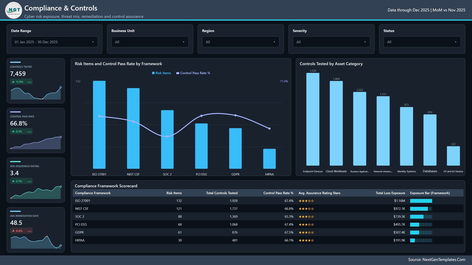
The assurance page: Controls Tested, Control Pass Rate, Avg Assurance Rating and Avg Remediation Days. Risk Items and Control Pass Rate by Framework puts volume and pass rate together across the six frameworks; Controls Tested by Asset Category shows where the testing effort actually went, from Endpoint Devices at 1,538 down to OT and IoT Devices at 322; and the Compliance Framework Scorecard adds a star rating column, so a framework that is heavily tested but weakly assured is easy to spot.
Get More Dashboards
The sixth page in the file is a catalogue page listing other NextGenTemplates Power BI reports. It is honest marketing rather than analysis – delete it before you share the file internally if you would rather it were not there.
Power BI vs. Tableau vs. a Paid GRC Platform – Feature Comparison
| This Power BI template | Tableau / Qlik build | Paid GRC SaaS | |
|---|---|---|---|
| Cost | $17.99 one time | $70–$75 per user per month for Tableau Creator | Typically five figures a year |
| Platform | Power BI Desktop (free) and Power BI Service | Tableau Desktop or Qlik Sense | Vendor-hosted web app |
| Setup time | Repoint the file path and refresh – minutes | Weeks to rebuild model and visuals | Weeks to months of implementation |
| Real-time team collaboration | Via Power BI Service workspaces after publishing | Via Tableau Server or Cloud | Yes, built in |
| Mobile access | Power BI mobile app after publishing | Tableau mobile app | Yes |
| Customisable fields | Every column, measure and visual is editable | Fully, if you build it | Configurable inside the vendor model |
| Share with link | Yes, after publishing | Yes, after publishing | Yes |
| Year-1 cost at 5 users | $17.99 plus Power BI Pro if you publish | Roughly $4,200 in licences alone | Commonly $20,000+ |
| Automated control testing | No – results are typed in | No | Yes, workflow driven |
| Drillthrough to record level | Yes, on seven fields | Build it yourself | Yes |
Who Should Use This Template
It suits a security or IT risk lead who already maintains a register and needs a board-ready view without a BI project; an internal audit or compliance manager reporting across several frameworks at once; a consultant who wants a working model to reshape per engagement; and an analyst learning how synced slicers, drillthrough and tooltip pages fit together in a real multi-page report.
It is a poor fit if you expect the dashboard to find risk for you. It is a reporting layer over data you supply, and everything below in Opportunities for Improvement is what it does not do.
Real-World Use Cases
Quarterly risk committee pack
Filter Business Units to one unit, export the page to PDF, and the committee gets exposure, remediation spend and mitigation rate on a single sheet. The bubble chart makes the case about the most expensive unit without anyone reading a table.
Audit preparation
Slice Compliance & Controls to ISO 27001, read the pass rate and the assurance stars, then drill through to the records behind the failures. The dashboard does not prove compliance; it tells you which rows need evidence.
Board reporting on remediation spend
Remediation Cost and Cost Ratio by Quarter answers the question a CFO asks every year – what did we spend, and what did the spend buy? Pairing it with the inherent-versus-residual gap on the same page turns that into an argument rather than a number.
Advantages of the Cyber Risk Management Dashboard in Power BI
- It opens populated. Sample data ships inside the ZIP, so you learn the layout against real-looking numbers rather than an empty canvas.
- Filters survive page changes. Four synced slicers mean an investigation that starts on Overview keeps its context on Threat Analysis.
- Record-level answers are one right-click away thanks to the seven-field drillthrough – the difference between a dashboard people trust and one they quietly re-export to Excel.
- It is genuinely editable. No locked visuals, no external image dependencies, no third-party custom visuals with their own licence.
- The theme is one file. Rebranding for a client or an internal style guide is a JSON edit, not a visual-by-visual slog.
- Running cost is zero. Power BI Desktop is free; you only pay if you publish and share.
Opportunities for Improvement
Being clear about the ceiling matters more on a security template than anywhere else, so here is the honest list.
- It scans nothing. There is no live threat feed and no connector to Qualys, Tenable, Rapid7, CrowdStrike, Splunk or ServiceNow. You export from those tools and load the result.
- It does not test controls. Controls Tested, Controls Passed and Assurance Rating are numbers you type. The Assurance Rating in particular is a 1–5 judgement, not an audited score, and the star column simply renders it.
- It does not assess or certify compliance. ISO 27001, NIST CSF, SOC 2, PCI DSS, GDPR and HIPAA appear as a dimension you tag rows with. Nothing in the file checks a control against a standard.
- It is not a GRC workflow platform. No approvals, no owner task queues, no evidence attachments, no audit trail.
- It is not incident response tooling. For alert triage and SOC throughput, look at the Cybersecurity Operations Center Dashboard in Power BI instead.
- Refresh is manual by default. The model reads a local
Data.xlsx; scheduled refresh needs the Power BI Service and, for an on-premises file, a gateway. - The sample data is synthetic. Every figure quoted in this post and shown in the screenshots comes from generated sample rows. None of it is a real organisation’s security posture.
Best Practices
- Keep the 21 column names. The measures reference columns by name in
Data.xlsx– renaming or reordering is what breaks visuals; adding rows never does. - Repoint the source properly. Use Transform data → Data source settings in Power BI Desktop rather than editing the query by hand, then refresh once and check the four Overview cards before going further.
- Agree what Loss Exposure means before anyone reports on it. The model sums whatever you put in that column; if half the team enters annualised loss expectancy and the other half enters worst case, the $ figure is meaningless.
- Date the register. Assessment Date drives every trend on the file. Rows without one drop out of the monthly visuals silently.
- Use the drillthrough in meetings. Right-clicking a bar to show the twenty underlying records ends more arguments than any slide.
- Publish rather than email. One workspace copy in the Power BI Service beats seven forwarded
.pbixfiles. Microsoft’s drillthrough documentation is worth reading before you extend the Details page.
Explore Relevant Templates
- Cyber Risk Management Dashboard in Excel – the same subject in a plain workbook, for teams without Power BI.
- Cybersecurity Operations Center Dashboard in Power BI – SOC alerts and incident throughput rather than register-level risk.
- Risk Management Dashboard in Power BI – enterprise risk across every category, not only cyber.
- Risk Assessment Firms Dashboard in Power BI – written for the firm delivering assessments.
- Data Protection Office Dashboard in Excel – privacy operations and DSAR handling.
Frequently Asked Questions
Do I need a paid Power BI licence to use it?
No. Power BI Desktop is free and runs the entire report, drillthrough and tooltips included. Power BI Pro is only needed if you want to publish to the Service and share a link.
How do I load my own risk register?
Open Data.xlsx, delete the 500 sample rows, paste yours under the same header row, then repoint the data source in Power BI Desktop and refresh. Keep all 21 column names exactly as shipped.
Can I add my own KPIs or pages?
Yes. Nothing is locked. Add a measure in the model, copy an existing card, repoint it, and it inherits the theme automatically.
Does it integrate with my scanner or SIEM?
No. There is no connector and no live feed. It reads an Excel workbook you maintain.
Is there an Excel edition?
Yes – the Cyber Risk Management Dashboard in Excel. It covers the same subject with pivot tables and slicers. The two are companions, not duplicates: the page layouts and the measure lists differ.
Will it tell me whether we are ISO 27001 compliant?
No. It reports on the framework you tag each row with and on the control results you enter. It performs no assessment and issues no certification of any kind.
What does the download contain?
A single ZIP with the .pbix, a user manual PDF and Data.xlsx. It is an instant download, yours for life.
About the Author
Built by PK – Microsoft Certified Professional with 15+ years of Excel, Google Sheets, and Power BI experience. Founder of NextGenTemplates, reaching 300K+ subscribers across YouTube channels. Every template is hand-built and tested before release.
Conclusion
A cyber risk register only earns its keep when somebody can read it. The Cyber Risk Management Dashboard in Power BI takes 500 rows and 21 columns and turns them into five pages that answer the questions a risk committee actually asks: what is exposed, which way is it moving, where is it concentrated, and are the controls holding. It will not scan your estate or certify your compliance – but for the reporting layer over data you already collect, it is a working model you can have running against your own numbers this afternoon.
Get the Cyber Risk Management Dashboard in Power BI – $17.99, instant download, lifetime use.
For step-by-step Power BI and Excel walkthroughs, subscribe on youtube.com/@PKAnExcelExpert.