Most septic businesses already know their month was good or bad. What they usually cannot do, on the spot, is say why – which of the fifteen things that actually move the business went the wrong way, by how much, and whether it has been drifting for three months or just had one bad week. The Septic Tank Service KPI Dashboard in Excel exists to answer that question in one screen, from numbers you already collect.
It is a month-picker scorecard: one dropdown, fifteen septic-service KPIs, month-to-date and year-to-date side by side, each with a target, an achievement percentage, a traffic light, last year’s figure and the year-on-year movement. Behind it sit a twelve-month trend page and a group analysis page. And it is a plain .xlsx – worksheet formulas only, no macros, no Power Query, no add-ins.
Why a septic business needs its own KPI set
Generic field-service dashboards measure jobs, revenue and satisfaction. A septic operation lives or dies on three more things that those templates never carry: how long a truck spends on site, whether the inspection checklist and waste manifest actually got filed, and what a gallon of septage costs to dispose of. Miss those and the scorecard is pretty but useless.
So this one is built around six groups that reflect how a septic business is actually run:
- Service Delivery – On-Time Arrival Rate, First-Time Pump-Out Success Rate, Average Pump-Out Cycle Time, Emergency Response Time
- Compliance & Safety – Tank Inspection Compliance, Permit & Manifest Filing Compliance
- Quality – Callback / Re-Service Rate, Customer Satisfaction (CSAT)
- Workforce – Technician Utilisation, Route Efficiency (Jobs per Truck-Day)
- Volume – Jobs Completed, Septic System Installations
- Financial – Average Job Value, Waste Disposal Cost per Gallon, Days Sales Outstanding
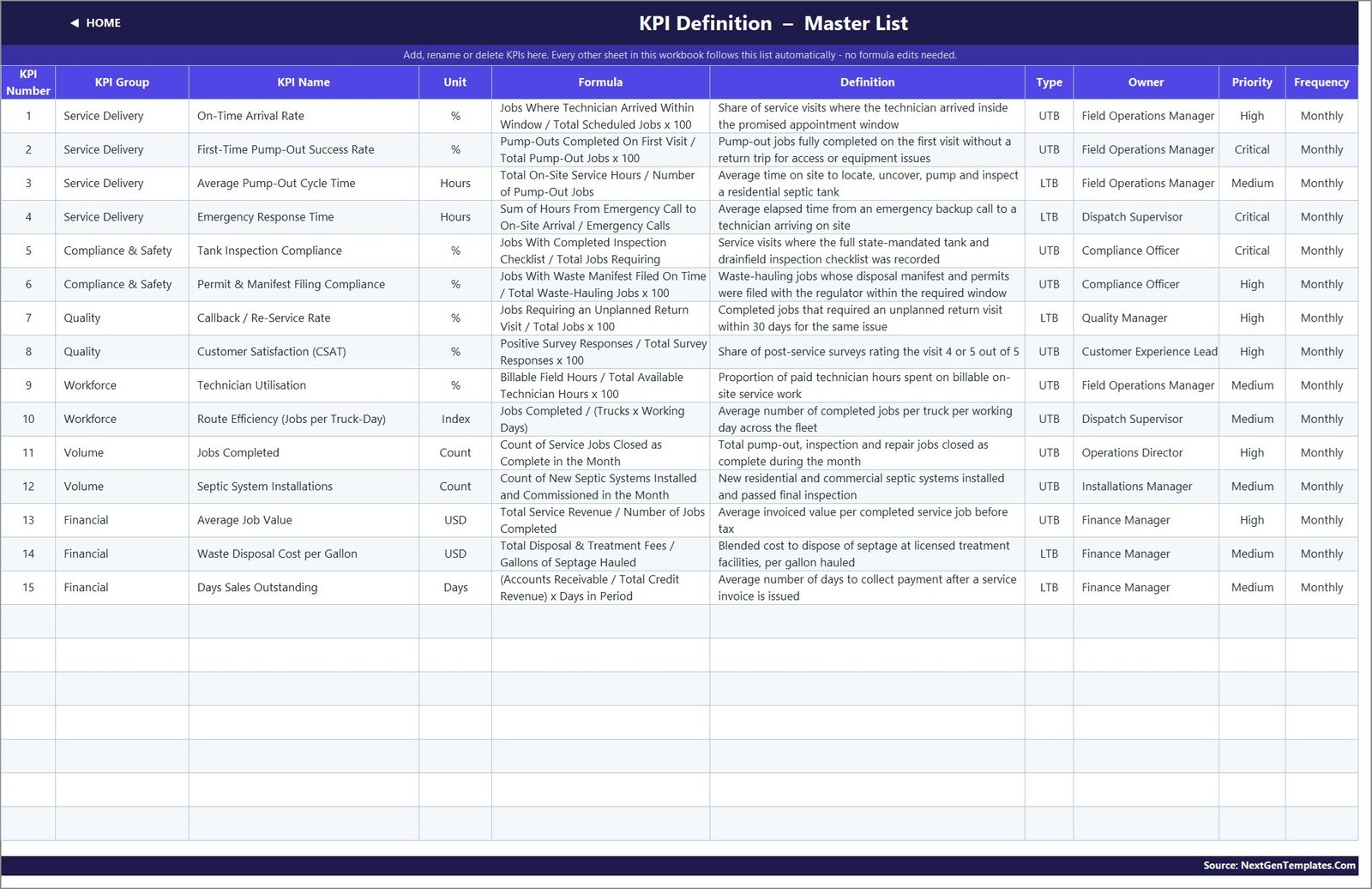
Fifteen KPIs in total. Each one carries its own formula, a plain-English definition, a unit, an owner, a priority and a review frequency, all recorded on a single KPI Definition sheet that the rest of the workbook reads from.
The bit most KPI templates get wrong: direction
Ten of these fifteen KPIs are better when the number goes up. Five are better when it goes down – cycle time, emergency response time, callback rate, disposal cost per gallon and days sales outstanding. If a scorecard treats all fifteen the same way, cutting your average pump-out cycle time from 2.13 hours to 2.07 hours shows up as a 97% miss, and cutting your recordable callback rate looks like failure.
Every KPI here is flagged UTB (upper the better) or LTB (lower the better), and achievement is calculated accordingly: actual divided by target for UTB, target divided by actual for LTB. Beat a cost or a cycle-time target and you score above 100%, with a green down-arrow, exactly as you should. It is a small piece of logic that decides whether the whole scorecard tells the truth.
What you get in the Septic Tank Service KPI Dashboard in Excel
Eleven sheets. Three of them you type in; the rest calculate.
KPI Dashboard – the month-picker scorecard
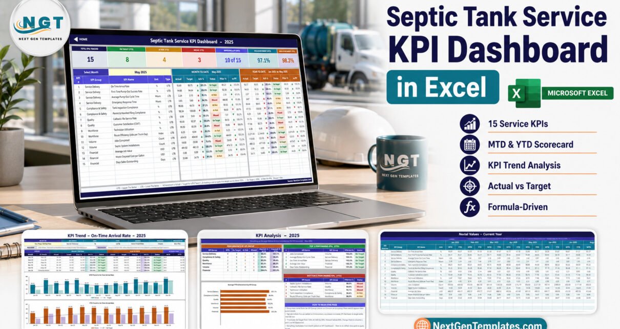
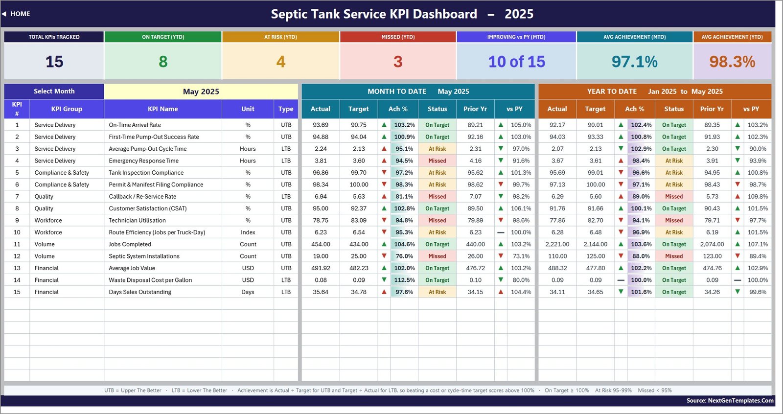
Pick a month in cell D6 and the whole page follows. Seven summary cards across the top – total KPIs tracked, On Target, At Risk, Missed, how many are improving against prior year, and average achievement for the month and for the year. Underneath, one row per KPI with an MTD block and a YTD block: actual, target, achievement %, status, prior year and vs PY in each.
In the bundled May 2025 sample the cards read 15 tracked, 8 On Target, 4 At Risk and 3 Missed on a year-to-date basis, with 10 of 15 improving against 2024 and average achievement of 97.1% MTD and 98.3% YTD. Move the dropdown and every one of those recounts.
KPI Trend – one KPI, twelve months, two charts
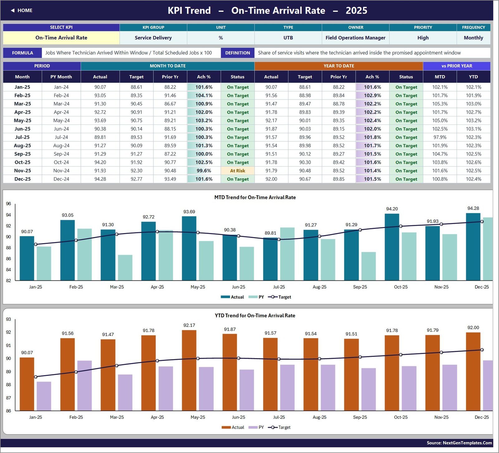
Choose any KPI from the dropdown and the page rebuilds around it: attributes, formula and definition at the top, then a twelve-month table of MTD and YTD actual, target, prior year, achievement and status, then MTD and YTD combo charts – actual and prior-year columns with a target line running across them.
KPI Analysis – where the argument actually happens
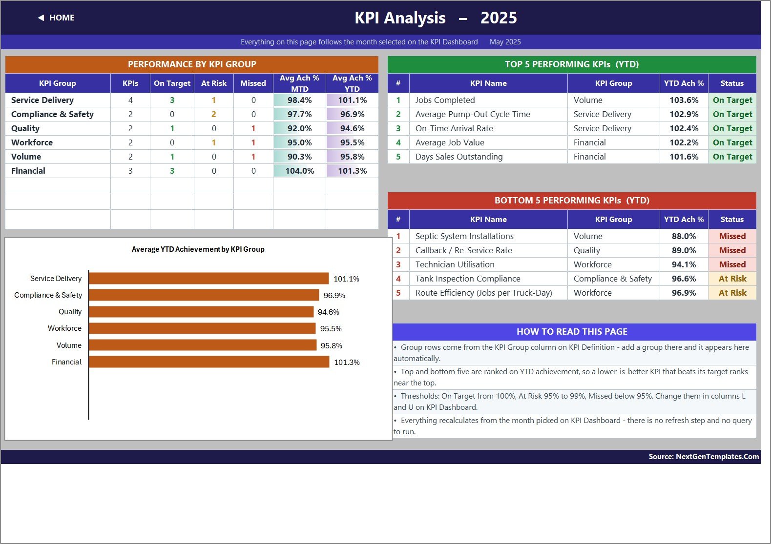
Achievement rolled up by KPI group, with the count of On Target, At Risk and Missed in each, a bar chart of average YTD achievement by group, and then the two lists that get read first in any review: the top five and bottom five KPIs for the year to date.
The three input sheets
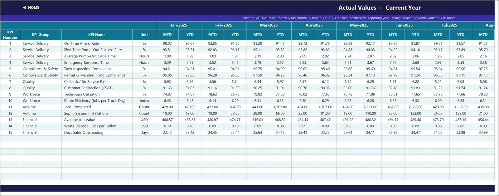
KPI Input – Actual, – Target and – PY. Each holds an MTD and a YTD column for every month, and all three take their KPI rows from KPI Definition, so they can never fall out of step with each other. Cell E3 on the Actual sheet sets the first month of your reporting year; change it and the target sheet, the prior-year sheet, the month dropdown and every sheet title re-base themselves.
KPI Definition – the one sheet that governs the rest
Fifteen rows filled in, room for 22. Rename a KPI here and every other sheet picks up the new name. Add one on the next empty row – number, group, name, unit, formula, definition, UTB or LTB, owner, priority, frequency – and it appears on the input sheets, in the scorecard, in the trend dropdown and in the group roll-up, with no formula work at all.
Setting it up in about ten minutes
- Unzip and open the .xlsx. There is no macro prompt and nothing to enable.
- Set your reporting year in cell E3 on KPI Input – Actual.
- Go to KPI Definition and rename anything that does not match the language your crew uses. Add KPIs of your own if you want to.
- Type your actuals, targets and last year’s figures onto the three input sheets, MTD and YTD per month.
- Pick a month on KPI Dashboard and read the result.
- If your governance uses different bands, edit the thresholds in the formulas in columns L and U on KPI Dashboard. The defaults are On Target from 100%, At Risk 95-99%, Missed below 95%.
How to actually run the monthly review
The workbook rewards a particular order. Start on KPI Analysis and read the bottom five – those are the year-to-date problems, ranked, with their group and status. Take the worst one to KPI Trend, select it in the dropdown, and look at the twelve-month chart: a steady decline needs a different conversation from a single bad month. Then go back to KPI Dashboard and check whether the MTD column agrees with the YTD column, because a KPI that is red for the year but green for the month is already being fixed.
Compliance is worth its own two minutes. Tank Inspection Compliance and Permit & Manifest Filing Compliance sit in their own group with a named owner precisely so they do not get lost between revenue and utilisation. They are the two numbers that cost the most when they slip.
What it does not do
Being straight about this saves everybody time. The workbook does not schedule jobs, dispatch trucks, route drivers or run a technician app. It does not generate waste manifests or file anything with a regulator – it tracks the rate at which you filed on time, not the filing itself. It holds no customer records and no invoice ledger, so Days Sales Outstanding is a figure you enter monthly rather than one it derives. And it does not connect to your field-service software: numbers go in by hand or by paste, which is the deliberate trade for a file with no dependencies that opens anywhere.
One more design decision worth knowing: both MTD and YTD are entered, not calculated. That is on purpose. Jobs Completed accumulates through the year; CSAT and cost per gallon are running averages. A workbook that assumed one rule would be wrong for half the KPI list, so it lets you decide.
Excel, Google Sheets or Power BI?
The same fifteen-KPI scorecard exists in all three. Excel is the right choice if you want it offline, on your own machine, with every formula readable. The Google Sheets edition is better if you would rather share a link with a crew that never opens a desktop app. A Power BI edition is on the way for teams that already report through Power BI.
There is also a lighter product for the same trade: the Septic Tank Service KPI Scorecard in Excel, which comes from our KPI Scorecard line rather than the KPI Dashboard line. If you want a compact monthly scorecard rather than the month picker with trend and analysis pages, start there.
Related dashboards from the same line
If you run more than one trade, or you want to see the same structure applied elsewhere before buying, these use the identical engine:
- Paving Contractor KPI Dashboard in Excel
- Concrete Contractor KPI Dashboard in Excel
- Insulation Contractor KPI Dashboard in Excel
- Masonry Contractor KPI Dashboard in Excel
- Flooring Installation KPI Dashboard in Excel
- Swimming Pool Service KPI Scorecard in Excel
Frequently asked questions
How many KPIs are included?
Fifteen, across six groups, each with a formula, definition, unit, direction flag, owner, priority and frequency. The sheets are wired for 22, so there is room for seven more without touching a formula.
Do I need macros or Power Query?
No. It is a plain .xlsx built from VLOOKUP, MATCH, INDEX and COUNTIF. It runs in Excel 2013 and later, Excel for Mac and Excel for the web.
Can I add my own KPIs?
Yes. Fill the next empty row on KPI Definition and the input sheets, the scorecard, the trend dropdown and the analysis page all pick it up automatically.
Is there sample data?
Twelve months of realistic 2025 figures with a matching 2024 comparative year, so every chart and traffic light is populated the moment you open the file. Replace it with your own.
What is in the download?
A single ZIP with the .xlsx workbook and the Excel KPI Dashboard User Manual PDF.
Get the template
The Septic Tank Service KPI Dashboard in Excel is available now on NextGenTemplates – instant download, lifetime access, and nothing locked or hidden inside the file.
Download the Septic Tank Service KPI Dashboard in Excel
Need it reshaped around a different KPI list, or built for a sister company in another trade? Write to info@NextGenTemplates.Com and tell us the metrics that matter to you.